huw
Bio
Participation3
I live for a high disagree-to-upvote ratio
Posts 4
Comments373
For Kalshi specifically, it seems to have essentially become a backdoor to deregulate sports gambling in every US state. The mass deregulation of gambling in the US this decade feels harmful and like something we’ll probably really regret (legalisation seems fine but not like this).
It doesn’t seem popular to criticise the gambling aspects of prediction markets here, but it does seem strange to me that EAs seem to care a lot about reducing harms from tobacco and alcohol, but seem indifferent to gambling.
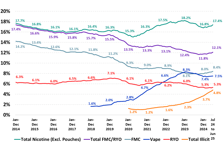
Here’s the data from Australia:
(FMC: Factory Made Cigarettes; RYO: Roll Your Own)
Australia instituted a full vaping ban in 2024 to combat the rise in total nicotine use, which had been trending toward before 2020. It’s a little early to tell, but a similar rise in taxation for cigarettes seems to have really pumped up the illicit market because the price of illegal cigarettes inverted below the price of legal ones. Anecdotally, there are way more drugstores than before that are straight up selling illegal cigarettes, and enforcement has been lacking.
I think this kind of generational ban can be done, but governments need to strictly enforce and tamp down on the underground market. I don’t know what the right policies are here.
The problem here is that mental health is just unbelievably neglected and cheap. You can plausibly provide a WELLBY (a tenth of a year of full wellbeing) for $20 or so. Saving lives or reducing disease is often substantially more expensive, to the point where it washes out, even if the per unit gains are massive. If you naïvely valued WELLBYs 1:1 with life years, you could spend around $200 per DALY, but that assumes people saved by GiveWell interventions live 10/10 lives, which they don’t.
There are some promising NCD interventions, usually around nutritional deficiencies or poisonings, that could be better than that (see HLI for more). Livelihoods may also fall into this category as a way of systematically preventing some diseases of despair.
Anyhow, the crux of my point was more that an evaluator with different moral weights could produce different results from GiveWell, which is the thesis (and to my understanding, the conclusion) of GWWC’s Evaluations of Evaluators project, which I think we broadly agree on.
FWIW, I was mostly referring to this article and the one it’s responding to. Given that StrongMinds’ cost per participant is now 75% lower, it should appear cost-effective with AMF under GiveWell’s assumptions. However, my understanding is that they simply don’t take a worldview that values wellbeing a priori, and existing DALY computations undercount WELLBYs for, say, mental health. So if they changed their worldview, it seems reasonable they could value mental health as a top cost-effective option, and a future EA Global Health Fund could try and hedge against these positions if it wanted to expand.
Yeah, this is a trend I’ve seen a lot in these circles—I think the broader thing you’re looking at is people who are very good at systems thinking (ex. programming) assuming that social dynamics are, in fact, ordered and well-behaved enough to be manipulated in a particular way. Whereas instead, they are actually highly chaotic and unpredictable.
(I think the same impulse leads people to believe in longtermism, specifically tractability/cluelessness)
I'm interested in exploring whether there are additional ways GHDF can add value beyond that model. But this is not the most immediate priority given GiveWell's continued support.
FWIW, it could be interesting to look at cruxes in GHD where GiveWell have taken a specific philosophical position, and hedge against those. I’m in mental health, so we see this in our field—lots of great EA charities with a lot of potential, but it really depends on your worldview and GiveWell don’t share one which would make mental health compelling.


Ex-DeepMind scientist David Silver has just raised a $5 billion valuation for his new startup, and pledged to donate 100% of the proceeds from his equity stake via Founders Pledge.
Are we prepared for the AI money to start hitting?