This is the third in a sequence of posts taken from my recent report: Why Did Environmentalism Become Partisan?
Summary
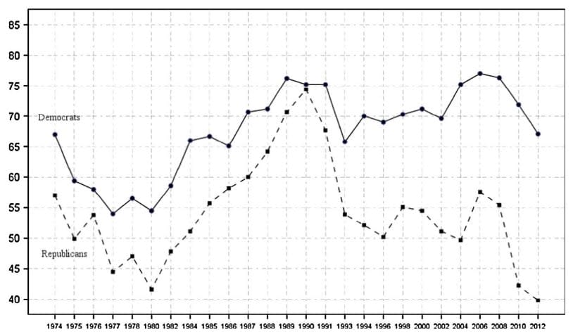
Rising partisanship did not make environmentalism more popular or politically effective. Instead, it saw flat or falling overall public opinion, fewer major legislative achievements, and fluctuating executive actions.
Public Opinion...
This post presents the executive summary from Giving What We Can’s impact evaluation for 2025. At the end of this post we share links to more information, including the full report and...
Why building and backing Welfare Tech companies may be one of the most promising things we can do for billions of animals.
I used AI to assist in writing this post, but I’ve rewritten it extensively and endorse it.
* Announcing the launch of Spring Innovation Fund, a not-for-profit venture philanthropy studio and fund built specifical...

Would it be possible to know a breakdown of the grants by geography and outcome type?
We are still working on the map visualizing grant recipient locations but hope to have it published online within the next few weeks. As for the outcome types, does this bar chart illustrate what you're looking for?
Note that some of the 49 grants fall under more than one outcome. We have more info about how we define these outcomes here.
Hi Erika, thanks for you reponse. I did see this graph, but the map is what I'd be interested in, and specifically looking at the distribution of outcome type(s) by geography.
Thanks for clarifying, I had a feeling that is what you meant. I will let you know when the map is published :)
Here is a link to the webpage with the map embed. You can also view it directly via this Data Studio dashboard. We weren't able to parse the outcome types by geographic location, but we are looking at other software we can use. For now, at least, you can see the grant amounts by geographic location. I will keep you posted.