One sentence summary:
When we want to figure out whether one intervention is more cost-effective than another, without knowing the true value of the weighting between high intensity pain and low intensity pain, we can sweep the weighting across its entire range and see how the two interventions compare across these values.
Introduction
In my previous post, I discussed how the Cumulative Pain Framework (CPF) can be combined with Multi-Objective Optimisation (MOO) to help us narrow down a list of interventions to find the Pareto frontier: the set of interventions which are more cost-effective than the others. This is useful, as without some framework along these lines it is difficult to choose one intervention over another, as different interventions reduce suffering of differing intensities, and we don't know the correct way tradeoff between high intensity suffering and low intensity suffering. However, that system does not help us in deciding between two interventions which are both in the Pareto frontier, i.e. it can help us find the set of best interventions, but not the best of the best, which is what we’re ultimately looking for.
This post describes a system which is useful for comparing interventions within the Pareto frontier. The basic idea is we have two interventions, A and B, and we know how many hours of each pain-intensity they are expected to reduce and how much they are expected to cost, and we want to know which is more cost effective. We can’t calculate their relative cost-effectiveness directly, as this depends on the total expected pain reduction, which in turn depends on the pain-intensity-weighting. Instead, we will let the weighting range across all possible values and see the resulting range of relative cost-effectiveness. So we will end up with a statement something like: “A is between 80% as effective, and 200% more cost effective than B”. Along with some heuristics, we can use this to build up some confidence about which intervention is most cost-effective.
The maths of how this works is discussed in Appendix 1, but for now I will go straight into how this can be used in practice
How this can be used
Step by Step
Here are the steps to follow when given a list of interventions and the aim is to choose the one which is most cost-effective.
Step 1: Plot the interventions on a pain-dimension plot, adjusted for cost
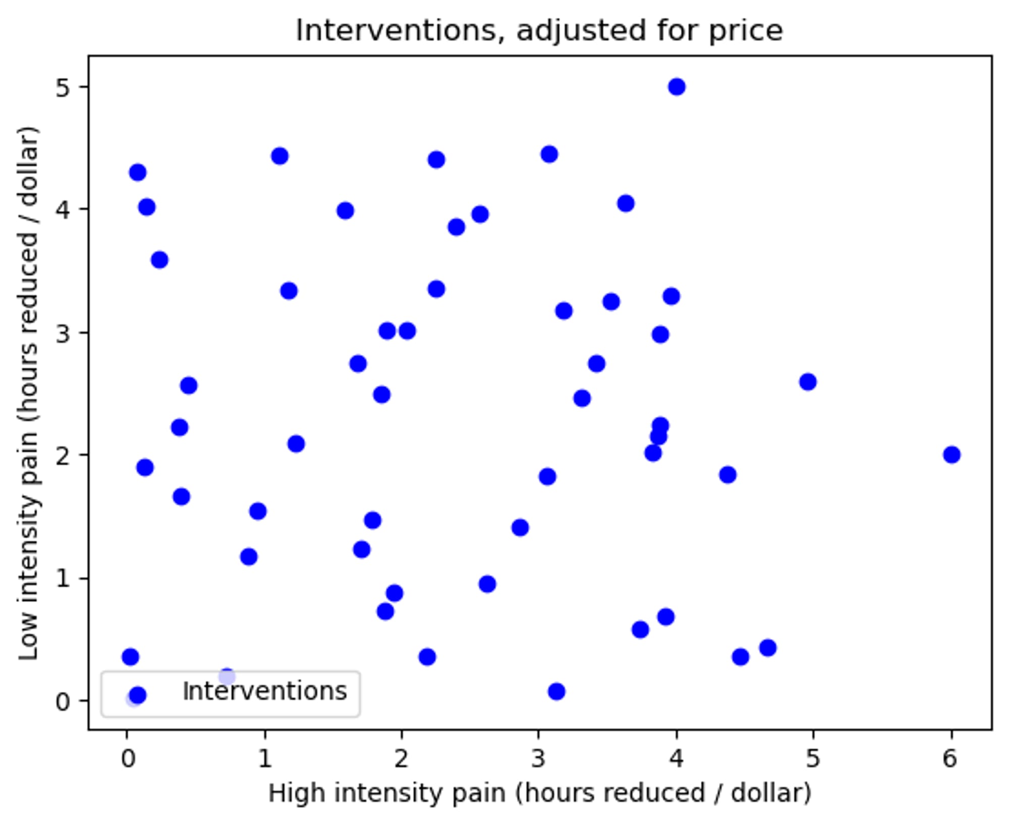 Figure 1: The interventions plotted according to their reductions in pain of differing intensities, adjusted for cost
- Where the x axis signifies the reduction in high intensity pain, and the y axis is the reduction for low intensity pain.
Step 2: Use CPF-MOO to find the Pareto frontier
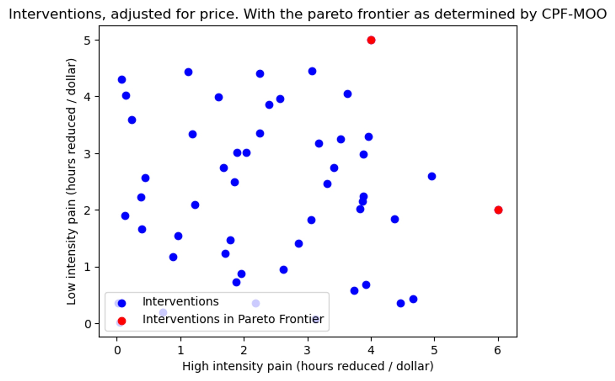 Figure 2: The pareto frontier found with CPF-MOO shown in red
- The process (discussed here in detail) guarantees that the Pareto frontier (consisting of the two points [6, 2], and [4, 5], shown in red) reduce more pain than any of the blue points, with no knowledge of the weighting between high and low intensity pain.
Step 3: For each pair of interventions in the Pareto frontier, see how they compare at the two extreme weights
- When comparing between two interventions, we care about 3 key things:
- How much better A is than B when the weighting between high intensity pain and low intensity pain (denoted by β) is 1 (i.e. when high intensity pain is equally as bad as low intensity pain)
- How much better A is than B when β=∞ (i.e. when high intensity pain is infinitely more important than the low intensity pain)
- The weighting (β) for which the two interventions are equally good
For the points above (D_A = [6, 2], and D_B = [4, 5]), the answers to these questions are:
- f(β = 1) = (6+2)/(4+5) = 48% (“A is 89% as good as B” → “B is 112% as good as A”)
- f(β=∞) = 6/4 = 150% (“A is 150% as good as B”→ “B is 67% as good as A”)
- βcrossover= (5-2)/(6-4) = 1.5 (“A and B are equally good when high intensity pain matters 1.5 times more than low intensity pain”)
It is important to understand that for any two points in the Pareto frontier, the comparison range will always contain 100% (i.e. in one extreme, intervention A will be superior, and in the other extreme, intervention B will be superior). This has to be the case, as if an intervention was superior to another for both extremes, then the other point would not have made it into the Pareto frontier.
Thoughts on this example, and which way I would lean:
- After reading through the sort of numbers that are found in studies on humans (examples are discussed here, usually on the order of 10 to 100), a crossover point of 1.5 seems unusually low, so this points in the direction of A being superior to B. (of course the pain intensities of “high” and “low” haven’t actually been defined, so this is just a vague example).
- The curve is skewed to higher values of β, i.e. A is a safer choice due to the upside being higher (if the true value of β happens to be unusually low (e.g. 1.1, making B 110% as good as A), then this would not push us towards choosing intervention B as much as if β happened to be unusually high (e.g. 100, making A 149% as good as B.)), so this also points in the direction of A being superior to B.
This was an easy example, and if the numbers were changed so that the low intensity pains were made much higher, then the situation would be a lot more ambiguous and this system would not offer us much help in picking one intervention over the other. To be precise, if the low intensity pains in the previous example were made 10 times higher (so the two points in question were [6,20] and [4,50]), then the range would be from 48% to 150%, and the β crossover point would be 15. In that case it would much less obvious which option is more cost-effective.
Some heuristics:
- If the crossover point seems unrealistically high or low, this gives us information about which intervention to choose.
- The greater the range between two interventions, the more time we should spend deciding between them.
- The relative upside from picking A or B should be considered, reasoning about what it would mean if β were on the surprisingly low or surprisingly high side.
In an ideal world, we would have a probability distribution of the weightings (e.g. “there is less than 10% probability that high intensity pain is less than 3 times as bad low intensity pain”), so that we could combine it with this result to get the probability of the cost efficacy for the two interventions (“There is an 80% probability that intervention A is more cost-effective than intervention B”).
It turns out, that the function of relative cost-effectiveness is monotonic with respect to β in 2 dimensions (proof in Appendix 3). This means that the maximum value will occur for one of the two extremes, and the minimum value for the other extreme. This is very convenient, as we can simply check the two edge cases, and know the full range.
Interactive Graph
In this interactive graph, the two pain reduction vectors of interventions A and B can be dragged around. The x axis is high intensity pain, and the y axis is low intensity pain, and the position of the points →DA and →DB determine how much pain each of the interventions reduces. Don’t forget that the points →DA and →DB, are the reductions in pain due to the interventions, and so the bigger the reductions the better. Note that it is possible for points to be negative in 1 dimension, as some interventions increase one intensity of pain while reducing another.
The graph of how good A is compared to B as a function of the weighting is overlayed on top, where the x-axis is the weighting between high and low intensity (β), and the y-axis is how good intervention A is compared to B (e.g. if the curve has a value of 1 on the y-axis for some value of β on the x-axis, this means that A is equally as good as B for that value of the weighting).
In this screenshot, we can see →DA and →DB at the same locations as in the previous example ([6,2], and [4,5]).
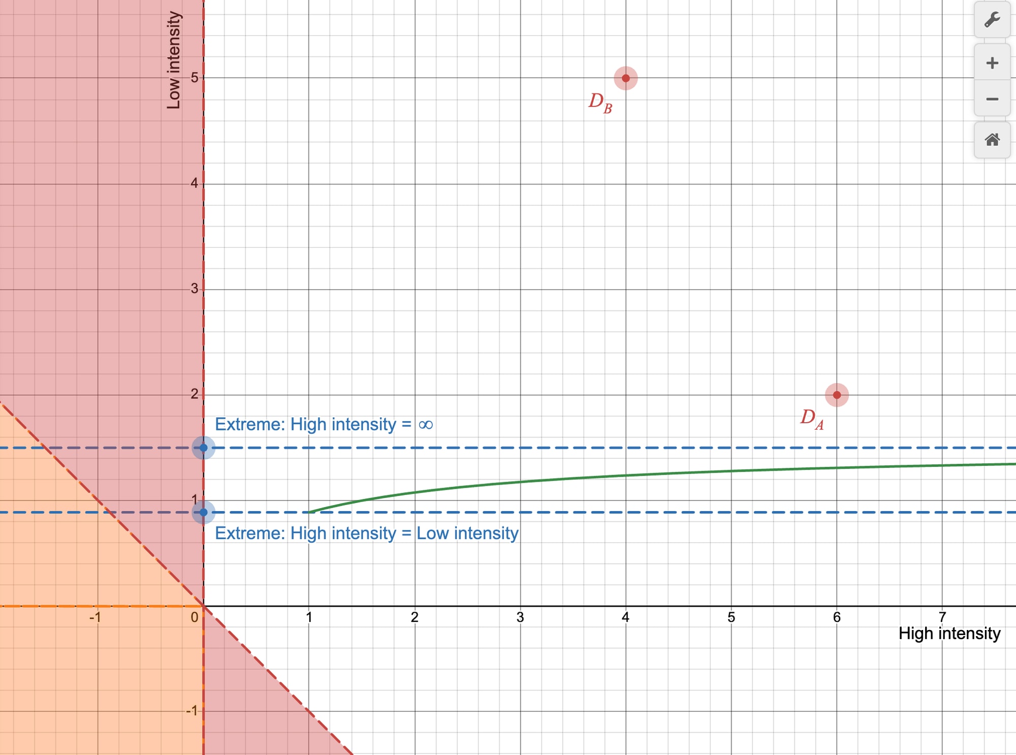 Figure 3: A screenshot of the interactive graph linked above, showing two interventions in phase space (red points), and a graph of their relative cost-effectiveness as a function of the weighting between high intensity pain and low intensity pain (green curve)
In the extreme case, where the high intensity is equally as bad as low intensity, then we see that (6+2)/(4+5) = 89% (marked by the lower dashed blue line), or where the green curve meets β=1. In the extreme case where high intensity pain is infinitely worse than low intensity pain, the green curve approaches 6/4 = 150% (marked by the upper dashed blue line).
The regions shaded red are the “danger zones” (if →DB is in one of these zones, this will cause the ratio to blow up. See Appendix 2 for details). The region shaded orange is the “net-negative zone” (if an intervention is in the net-negative zone, it causes more suffering than it prevents (independent of the weights). There are other regions which are also net-negative depending on the weighting).
The spreadsheet
I also built a prototype spreadsheet, which has the same idea as the interactive Desmos graph, but with more details. I chose to do it in Google Sheets rather than python so that people who can’t code could still mess around with it. It has some issues, but I think it works as a proof of concept.
Here is what the input looks like:
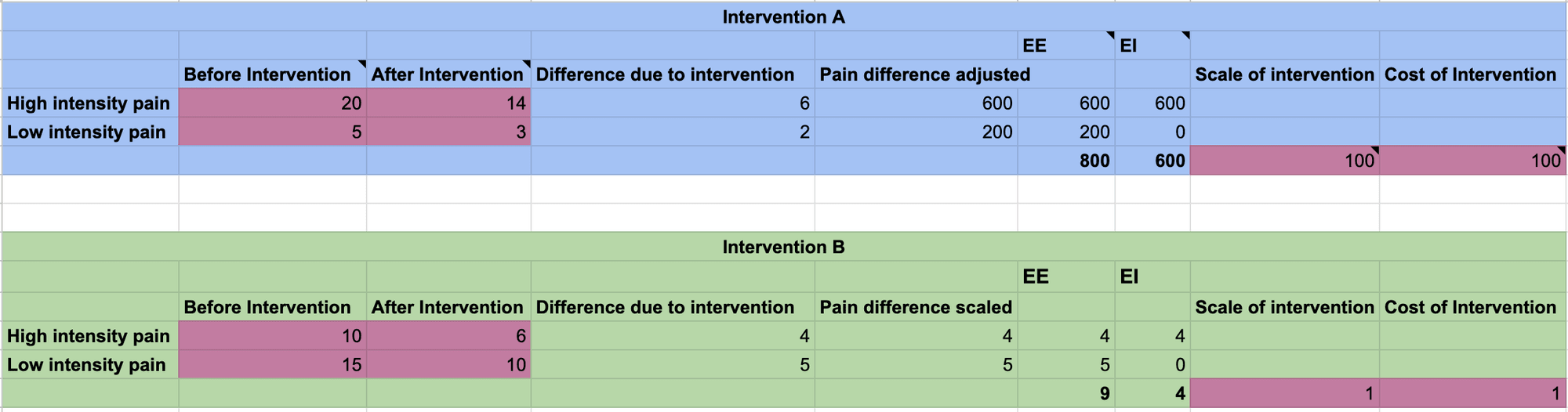 Figure 4: A screenshot of the inputs to the prototype spreadsheet linked above
The magenta cells are the editable inputs for interventions A and B
How to use the spreadsheet:
- Input the estimated pain levels before and after the interventions, and the estimated costs and scales for both interventions (e.g. if the pain track is for one individual, then the scale would be the number of individuals expected to be impacted, and the cost would be the expected price of the entire intervention, or it could all be done per individual)
- The graph on the top right shows you the position of the two interventions in pain-intensity phase space
- The graph below that is the same but scaled for the cost of the intervention
- The third graph is the curve of the relative cost-effectiveness of the two interventions, as a function of the weighting β.
Conclusions
This post describes a method of finding the range of values of relative cost-effectiveness for one intervention compared to another. With increased knowledge of the true value of the weighting between pain intensities, this method will become increasingly helpful.
In a real-world scenario, I would not be very surprised if the ranges provided by this tool would be very large (possibly unhelpfully so). However, if there is an org looking for a systematic way to sort through interventions, then I hope this is of some use.
I would like to thank the following people for fruitful discussions on this topic (listed alphabetically): Wladimir J. Alonso, Jonas Becker, Michael St Jules, Tamas Madl, Isidor Regenfuß, and Cynthia Schuck-Paim
Appendix 1: Maths
An intervention is defined as something which transforms the conditions from one painful experience, to another (hopefully less) painful experience. E.g. an intervention which enables caged hens to live in a cage-free warehouse, where both of these conditions cause the hens different kinds of pain. To judge how effective an intervention is, we need to know the difference between the pains caused by these situations. The pain event of the status quo is labelled →E0 (it is a vector as each pain intensity is a dimension in this framework), for two pain intensities this might look something like →E0 = [Disabling = 5, Annoying = 20], where the numbers express the amount of time the individual is subjected to the respective pain intensity.
An intervention is thus characterised by the Difference: →DA=→EA0−→EA1, where →E0 is the pain vector of the situation before the intervention, and →E1 is the pain vector of the situation after the intervention. This is what is plotted on the phase space diagrams.
The weight vector contains the true weights between the different pain intensities. e.g. if high intensity pain is 10 times as bad as low intensity pain, then the weight vector would be →W= [10, 1]. When we take the dot product of the weight vector with a pain vector, it gives us the total pain. If we knew the true weights between the pain intensities we could use this to express the total amount of pain in one number e.g. if high intensity pain was known to be 100 times worse than low intensity pain, then this pain event would be equivalent to →E0⋅→W=[5,20]⋅[100,1]=520 hours of low intensity pain, or [5,20]⋅[1,0.01]=5.2 hours of high intensity pain. This is the absolute pain, and this is the quantity we care about reducing.
Thus, for an intervention A,
→DA=→EA0−→EA1
RA=→DA⋅→W
Where RA is the reduction in pain due to intervention A.
When we are comparing between two interventions, we care about the most suffering reduced for the cheapest price, i.e. the cost-effectiveness, C=RP, where P is the price of the intervention.
Now, imagine there are two different interventions, A and B, and we want to figure out which has a greater cost efficacy, C. i.e. we want to know whether CA>CB. This is equivalent to asking whether CACB>1, which is equivalent to asking if RARB∗PBPA>1
I am going to assume that the price of the interventions have already been estimated, and thus PBPA is known. We need to find RARB
RARB=→DA⋅→W→DB⋅→W=(→EA1−→EA2)⋅→W(→EB1−→EB2)⋅→W
What do we know about →W? Not much, but at the very least we know that high intensity pain is worse than low intensity pain, and so the vector →W = [β, 1], where β>1. So what we can do is let β range from 1 to infinity, and see the range of possible RARB. Sometimes this range will be unhelpfully large, but sometimes it will be small enough to be helpful.
The two implausible extremes are when:
- High intensity pain and low intensity pain are equally bad → →W = [1, 1] (β=1)
- High intensity pain is infinitely worse than low intensity pain → →W = [1, 0] (β=∞).
This is full uncertainty. We know the truth lies in between these values. If we have less uncertainty (more knowledge of the weights), then we can limit the range, and say that β is between e.g. 10 and 100,000.
The crossover point (the β for which RA=RB) is given by
βcrossover=yB−yAxA−xB
Ideally, we would have a probability distribution of the different weights, and we could link this distribution to our function, to give us a probability of which is more cost-effective.
Appendix 2: Dividing by zero
Danger zone info
The ratio will blow up if the denominator is 0. There are two scenarios in which this can occur:
- →EB0=→EB1
- i.e. intervention B has no effect
- This happens when →DB is sitting on the origin.
- The weight vector →W is perpendicular to the difference vector →DB, this means that the difference vector has a tradeoff which cancels out perfectly, e.g. the intervention reduces 1 hour of high intensity pain, but causes an additional 2 hours of low intensity pain, and the weight vector just happens to weight high intensity pain as twice as bad as low intensity pain, causing the total change in pain to be 0.
- This corresponds to the difference vector being perpendicular to the weighting vector. As the weighting vector is limited to its 45 degree region, and we will be sweeping the vector through that whole region: We know that we are going to have issues when the →DB vector is in either of the regions which contain vectors perpendicular to the weight-region (and it is these two regions which I call the danger zones).
If the numerator is in the danger zone, it won’t cause a problem, as it’s fine for the ratio to be 0, that just tells us that intervention A is worthless for some value of β, i.e. tells us that the resulting RARB will pass through 0 for some value of β. This tells us that intervention A is net-positive for some values of β, and net-negative for other values of β.
If the denominator is in the danger zone, a cheap trick is to simply invert the ratio, so →DB is on top, and it’s no big deal if the numerator is 0 for some value of β. If both →DA and →DB are in the danger zone, then this won’t work.
Appendix 3: Proof of monotonicity
As we sweep the weight vector through all possible values (from high intensity pain being equally bad as low intensity pain, to high intensity being infinitely worse), it is important to know whether the relative value of the reductions due to interventions A and B is monotonic or not.
i.e. is RARB=→DA⋅→W→DB⋅→W monotonic as we rotate →W from one extreme to another?
Here is a proof to show that in two dimensions it is monotonic. I have not been able to prove this in more than 2 dimensions.
Proof
The ratio of reduction in pain due to intervention A, and due to intervention B:
RARB=→DA⋅→w→DB⋅→w=|→DA||→w|cos(θw−θA)|→DB||→w|cos(θw−θB)
The derivative w.r.t. the angle of the weight vector
ddθwcos(θw−θA)cos(θw−θB)=−sin(θw−θA)cos(θw−θB)−−sin(θw−θB)cos(θw−θA)cos2(θw−θB)=sin(θA−θB)cos2(θw−θB)
The resulting derivative of the ratio:
⇒ddθwRARB=|→DA||→DB|sin(θA−θB)cos2(θw−θB)
The weight vector is limited to its 45 degree region as we know high intensity pain is worse than low intensity pain. →DA can be in any region except for the "net-negative" zone. →DB can be in any region except for the net-negative zone, and the two danger zones (as otherwise the ratio would blow up). See Figure 3 for details. These limitations mean:
0<θw<π4−π2<θA<3π4−π4<θB<π2
And the relevant ranges we need to know for the derivative are:
−π<θA−θB<π−π2<θw−θB<π2
The second inequality ensures that the denominator of the derivative will never equal 0, and thus won't blow up.
The only way the numerator of the derivative can equal 0 is if θA=θB, which means that intervention A and B would only differ in scale, and thus their ratio will be constant with respect to the weight.
As the derivative of the function is non-zero (except in the trivial case where →DA=→DB) over the interval we care about, the function is monotonic.
Moreover, the following is also true.
θA>θB⇒f′>0θA<θB⇒f′<0
Similarly, if the function is also monotonic in 4 dimensions, then we can simply check the result with the 4 basis vectors (shown below), select the two most extreme values, and then know the upper and lower bound of the relative reductions due to intervention A and B. But, like I said, I haven’t proven that this holds in 4d.
→W={⎛⎜
⎜
⎜⎝1000⎞⎟
⎟
⎟⎠,⎛⎜
⎜
⎜⎝1100⎞⎟
⎟
⎟⎠,⎛⎜
⎜
⎜⎝1110⎞⎟
⎟
⎟⎠,⎛⎜
⎜
⎜⎝1111⎞⎟
⎟
⎟⎠}