Comments
Thank you for this work, Marius, it fits well into a systematic approach that should be developed, as suggested in Preparatory Notes for the Measurement of Suffering.
Thank you for this work, Marius, it fits well into a systematic approach that should be developed, as suggested in Preparatory Notes for the Measurement of Suffering.

Disclaimer: This post is a cross-post from my personal blog.
As an Effective Altruist with a quantitative mindset, I ask myself many different questions about the suffering in the world. A very fundamental question that I have asked myself for a long time is "How much suffering exists in total?". I could finally bring myself to crunch the numbers and produce a rough estimate. Especially when it comes to cause prioritization it would be important to have some approximations of net human suffering, for example, to compare the suffering of animals to that of humans. In this post, I will try to give a rough estimate of the absolute and relative amounts of suffering of humans that exists now and has existed in the last 30 years. In part II, I tried to approximate the suffering of animals created by humans.
The hard work has not been done by me. The data come from our world in data and prb.org who themselves have aggregated many many sources - I merely crunched some numbers, plotted, and interpreted them.
If you are already familiar with the concepts of burden of disease and DALYs you can skip to the "Shut up and calculate section".
Following the article, I had some interesting discussions that lead me to write this short update.
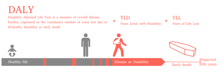
Burden of disease quantifies the impact of a health problem by financial cost, mortality, morbidity, or other indicators. It is often quantified in terms of quality-adjusted life years (QALYs) or disability-adjusted life years (DALYs). Both metrics approximate the number of years lost due to disability (YLDs), sometimes also known as years lost due to disease or years lived with disability/disease.
DALYs are calculated using two components - years of potential life lost (YLL), i.e. how early did you die compared to your life expectancy, and years of life lost due to disability (YLD), i.e. the number of years of good health that were taken away from you by the disease. The formula is a simple non-weighted sum: DALY = YLL + YLD. The following figure from Wikipedia should make the concept more clear.
In my approximations, I use DALYs and not QALYs because the data was only available for DALYs and I think the metric is more common when it comes to quantifying public health than QALYs because QALYs operate on a more individual level. DALYs are probably far from a perfect measure for suffering as I will discuss in the last section but it's the only one we have wide-spread data for.
The Wikipedia articles for QALYs, DALYs, and disease burden are really informative and easy to understand. I would recommend checking them out if you haven't already.
The OWID data on disease burden provides 'DALYs per 100K people' for every year since 1990 and nearly every country in the world. We will therefore first have a look at the relative measures and then multiply these with the respective population of the country to account for the global population growth since 1990. There are lots of other interesting facts about disease burden in DALYs that I will not discuss in this post such as an analysis of disease burden by age or cause over time. I would highly recommend checking out ourworldindata.org and have a look at their charts - they are amazing and every data nerd's wet dream.
Let's first look at the seven countries that have the lowest average DALYs over the years from 1990 to 2017.
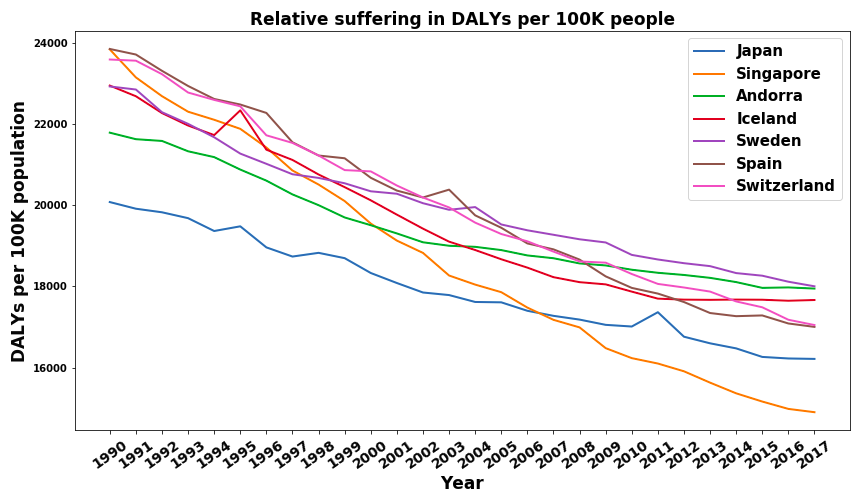
I found the results a bit surprising. Iceland, Sweden, and Switzerland were the ones I expected most. I would have also expected Norway, New Zealand, and Canada to be there (they are in the top 20). I was a bit surprised by Japan's and Singapore's very good results. Further analysis shows that other East Asian countries such as South Korea and Taiwan also perform very well. My hypothesis is that these countries have generally well run health care systems, healthier diets, and a more caring mentality towards their elderly than western countries do and therefore have smaller disease burdens. The countries that surprised me the most were Spain and Andorra. I would have, for example, predicted Germany to be above Spain. Further analysis shows that a lot of the Mediterranean Countries (Italy, Greece, Cyprus, Malta) have very low disease burdens. My current hypothesis is that the Mediterranean diet is very healthy and is less prone to lead to cardiovascular diseases who are by far the largest contributor to disease burden in developed countries. I want to emphasize that I am no health expert and my explanations for East Asia and the Mediterranean countries are of a very speculative nature.
To compare this, let's have a look at the countries with the highest average relative suffering over the years from 1990 to 2007. Once with Rwanda
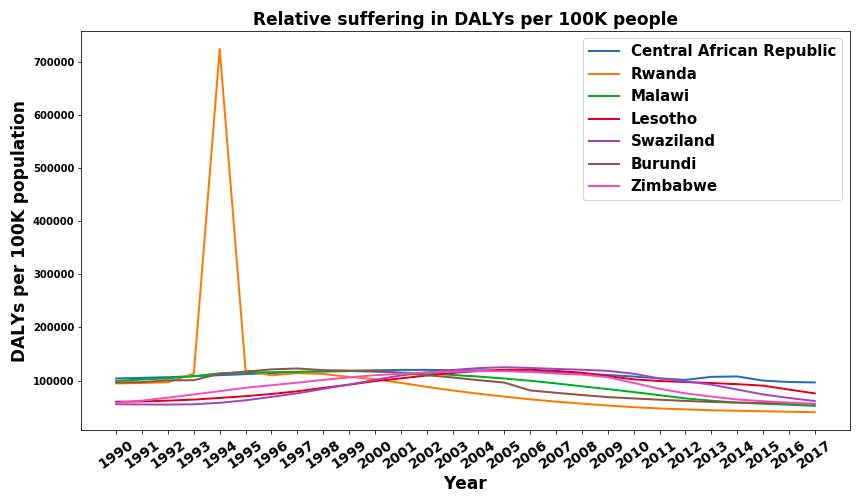
and once without Rwanda.
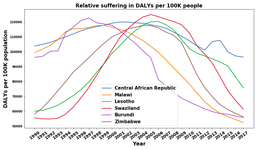
Let's first discuss the elephant in the room - Rwanda 1994. I knew the genocide was really really bad, I had read the Wikipedia article, seen documentaries, and knew of the killings, the rapes, and the torture. But holy shit did I underestimate the suffering that must have been inflicted in the 1994 Rwandan genocide. 724,000 DALYs per 100,000 people means that in just one year, on average, every single person in Rwanda was robbed of more than 7 years of a good life. That's just crazy.
Looking at the other trends we find that all seven countries are located in Sub-Saharan Africa and that their trajectory is not linear. In fact, all of them seem to have a period of increasing relative disease burden before it decreases again. In all cases, this is a longer, multi-year span and can therefore not really be attributed to specific coups, civil wars, or political events. Even after informing myself on all countries that display this trend I still can't find a coherent, unifying hypothesis for this behavior. I would be interested in more expert opinions (please contact me if you have one).
Lastly, I want to compare the scope between the countries with the highest to the ones with the lowest disease burden. The disease burden per 100K people for the Central African Republic was around 100,000 while for Singapore it was around 16,000. If we use disease burden as a proxy for suffering, the amount of suffering for an average Singaporeanfavor would be around 6 times lower than that of the average citizen of the African Central Republic. This seems like some pretty clear evidence in favour of the lottery of birth argument to me - if you disagree I'd be happy to hear your explanation.
Not only the high and low ends of the spectrum are interesting and I, therefore, want to have a last look at a selected group of countries. These are some of the world's largest and most influential ones.
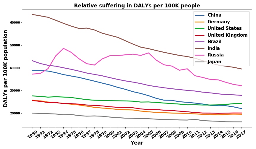
We can see that the general trend is a nearly linear decrease in DALYs per 100K per year. This is a good sign, especially since the two most populated countries in the world, China and India, have a steep downward trend. Russia, on the other hand, does not show the same decrease. After the break down of the UdSSR, Russia seemed to have a significant increase in average suffering. Another small but potentially significant detail is the trajectory of the USA. It decreases lower than other developed nations and also shows a slight upward trend in the last couple of years. I guess the effects of systematic wealth inequality, a broken democracy, and a terrible health care system slowly had to catch up at some point.
The relative suffering is interesting but we can look at suffering from a different angle as well. Instead of only looking at the disease burden per 100K we can also account for the increase in population over the last thirty years. The decrease in average relative suffering in the world could, for example, be negated by the increase in the number of people and therefore the aggregate disease burden could have stayed constant.
The sum of DALYs per year for selected countries can be found in the following figure.
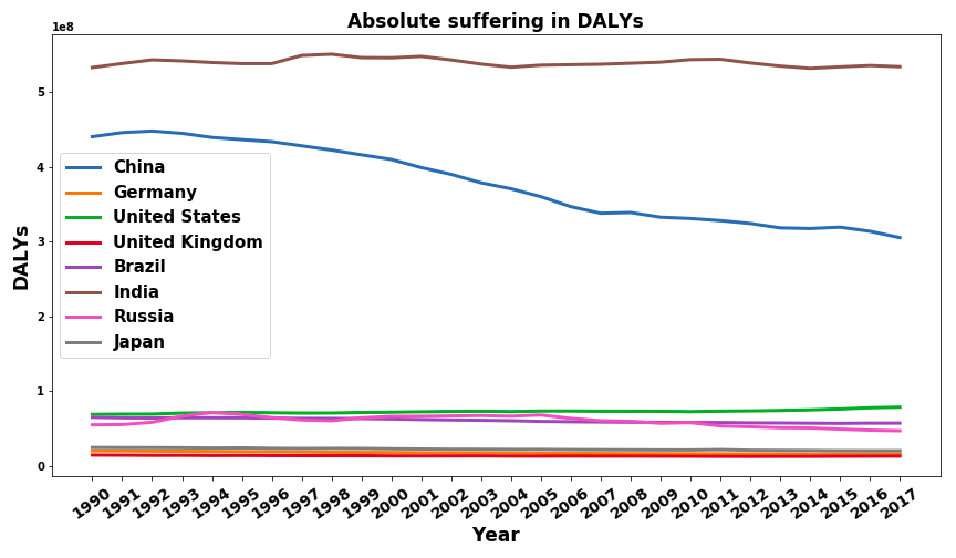
This seems to indicate that China was able to improve the quality of life faster than its population growth since the aggregate is decreasing. India's population grew as fast as the quality of life per individual improved.
Removing China and India from the graph to get a better picture of the other countries we get:
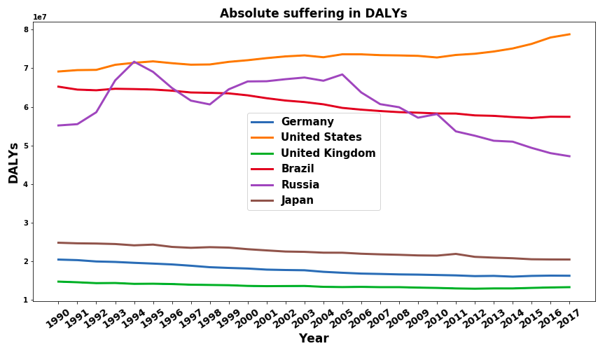
We see that Germany, Japan, the UK, and Brazil follow a somewhat similar trend. Their overall disease burden decreases slightly. As we have seen before their relative disease burden decreases more drastically, implying that they are able to keep up with their low to medium population growth. The USA, in contrast, is one of the few developed nations, that has an increased absolute disease burden over this time period. Even in the times in which their relative disease burden decreased the population grew faster than the living standards improved. Russia has had nearly no change in the size of its population and therefore the absolute disease burden shows the same trajectory as its relative counterpart.
Lastly, I want to present a holistic comparison of the relative and absolute global disease burden. The relative disease burden is weighed by the countries population.
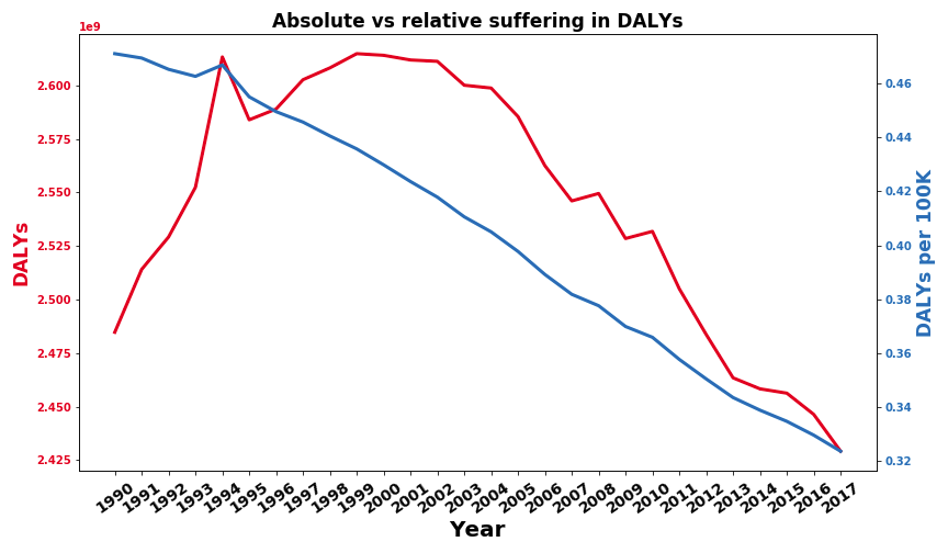
The positive news is that the relative disease burden seems to decline steadily. The alleviation of poverty and the eradication of diseases seem to work well on average. The absolute disease burden has increased from 1990 to 2000 but has since then decreased below the point of 1990. This seems to indicate that the progress humanity has made on improving living standards is faster than the growth rate of the global human population. One event that stands out in both metrics is the Rwandan genocide from 1994 which, again, I really did not expect. A country that had around 7.2 Mio inhabitants before the genocide and 5.8 Mio after it has had a visible impact on the global disease burden of 5.7 Billion people.
Skip this section if you don't care about the data preparation process.
I used three datasets in total. The burden of disease dataset (see here) to get the DALYs per 100k people numbers, the population by country dataset from our world in data (which includes data from 1500-2000 in gaps of at least ten years) and a population by country snapshot by prb.org for the year 2019. Since the burden of disease dataset only includes the years from 1990 to 2017 I removed all data prior to 1990 from the population by country dataset which then included data points for 1990 and 2000. All three datasets included some countries that are not in the other two so I removed all countries that are not in the burden of disease dataset and used estimates to fill gaps in the 1990 and 2000 data points for missing countries. This means that there are some countries for which I don't have any data points but most of them are very small like Saint Kitts and Nevis and Micronesia and therefore should not be a large source of error. To get the population estimates for the years from 1991 to 1999 and 2001 to 2018 I used a linear interpolation. I then cut the years 2018 and 2019 from the population data and merged it with the burden of disease dataset. This linear interpolation is definitely inaccurate but it is a sufficient proxy to start with. I am aware that population growth is usually approximated with a sigmoid but if you only have three datapoints the result is probably as bad as a linear estimate.
Some conclusions I reached during the entire process of researching and writing this post.
While this was an interesting and partly disturbing mental exercise for me, I think that it also yields some benefits.
My approximations make a couple of crucial assumptions, all of which could be improved with more effort and research. Sources of error include
I could not answer a lot of interesting questions that could be asked about global suffering such as "which causes have become more prominent over time?" or "Can we extrapolate from the last 30 years to the future in a meaningful way?". While I intend to model some of these questions in future blog posts you might be interested in trying to improve the model by using better data or incorporating more features or just ask other interesting questions. If you want to build on my work don't hesitate to pull the respective github repo and contact me to coordinate the research.
One big issue with using DALYs as a proxy for suffering is that they count years of life lost due to death (up to some reference, I think the average of the longest life expectancy of any country, so 80-90 years), but you do not suffer after you are dead. I think you only want the YLDs, if you're just trying to estimate suffering. I think some datasets will give you both DALYs and YLLs, so you can just take the difference: YLDs = DALYs - YLLs.
You might find some other useful posts with the Subjective Well-Being tag. Or, specifically, see the research by the Happier Lives Institute and Rethink Priorities on this topic.
Thank you very much. Unfortunately the source I'm using (Our World in Data) doesn't report YLLs. Sources that report YLLs are so sparse that I couldn't have used them for an overview. I'm also not sure whether the results I'm drawing here are in any way conclusive or whether DALYs are such a bad metric of suffering that I'm just reading tea leaves.
Hmm, this one has Deaths, YLDs and DALYs (among others in the advanced settings), so you could just use YLDs.