Many EAs have cited the statistic that ~2% of US GDP goes to charity. However, we usually refer to personal giving as a percent of pretax income (adjusted gross income or AGI in the US). If you add up all the pretax income in the US, it was only $10.9 trillion out of the GDP of $19.5 trillion in 2017, or 56%. This is because growth in retirement accounts is not taxed (and you avoid tax on a Roth IRA at the end and on a regular IRA at the beginning). Other adjustments include tuition, alimony, etc. Also, there are many benefits that are not taxed, such as medical, life insurance, employer contributions to retirement, etc. Also, there may be other parts of the economy that would not be potential income at all. This would mean people in the US donate on average about 3.6% of the pretax income. Here is a graph that shows a synthesis of many different studies of charity. You can see there is quite a bit of variation, but I think it is broadly consistent with 4% of pretax income. Perhaps less certain is the conclusion of a U curve where the lowest and highest income people give the greatest percentage.
Though of course it will be different (and generally lower) in other countries, I think it is useful to have a comparison for things like One for the World, Giving What We Can, and current EA giving.
Some EAs also have goals of consumption after charity related to a mean or median consumption. For instance, US mean per capita GDP was $60,000 in 2017, but mean per capita AGI was only $36,000. In the US, the median appears to be approximately two thirds of the mean, so that would imply a median AGI of about $24,000 per capita (though this source has a broader definition of income which comes out to $32,000 per capita median). This is also relevant for happiness studies; not only do we need to be careful about whether it is household versus individual income, but whether that income is AGI or includes other things such as benefits.
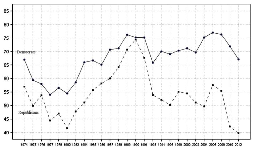
Thanks. The graph you link to (the sentence that starts "Here") is interesting. (I take it that this is the one you mean?)
Possibly you could have highlighted that more in your post.
Thanks - I wasn't sure it was OK to reproduce it.