Cool, thanks for doing that analysis! I'm wondering whether the scores you derived would be a great additional performance metric to provide to forecasters, specifically
a) the average contribution over all questions, and
b) the individual contribution for each question.
Analysing Individual Contributions to the Metaculus Community Prediction — EA Forum
Analysing Individual Contributions to the Metaculus Community Prediction
This is the third in a sequence of posts taken from my recent report: Why Did Environmentalism Become Partisan?
Summary
Rising partisanship did not make environmentalism more popular or politically effective. Instead, it saw flat or falling overall public opinion, fewer major legislative achievements, and fluctuating executive actions.
Public Opinion...
I think right now EAs might be making a significant mistake by paying insufficient attention to the political realm. As EAs we tend to figure out what’s most impactful for us to work on and focus hard. That’s great! But there are various actions that are ‘non-delegatable’ - the extent to which an individual can do the action is limited (like voting, going to a protest, making hard money contributions to particular campaigns). It might be useful if we were all more in the habit of doing variou...
New Video from AI in Context: The Fall and Rise of Sam Altman
If you want to skip straight to the video, here it is!
AI in Context is excited to be back with our fourth video! For those just hearing from us, we make videos for 80,000 Hours, telling stories about transformative AI...
This post investigates the contribution of individual forecasters and their predictions to the Metaculus Community Prediction (CP).
Generally, individual contributions have only small effects, but in about 10% of cases, they can change the Brier score of the CP by more than 2%.
The average contribution improves the CP, whereas the average user makes the CP slightly worse.
Beneficial contributions are related to good Brier scores, but even predictions with 'bad' Brier scores can make positive contributions.
Predictions far from the current CP probably tend to lead to larger contributions, but the relationship is weak and even predicting the current CP can have a very large effect.
Predictions that make beneficial contributions tend to be more confident than the CP at the time a user makes a prediction.
I am an employee of Metaculus. I think this didn't influence my analysis, but then of course I'd think that, and there may be things I haven't thought about.
Introduction
The wisdom of the crowd is a known phenomenon in forecasting. Ask a lot of forecasters (all else being equal), and you will likely get a better forecast. On average, an additional forecast should therefore make a positive contribution and improve the combined forecast.
However, not all contributions are made equal.
Forecasters can obtain very good scores without contributing much (e.g. by just copying the crowd forecast). On the other hand, a user can make a really bad forecast and still make an important contribution. Imagine a forecaster who looks at the current crowd forecast for a question, which is around 90%. They might say "hm that's much too high" and predict 5% instead. That might not be a good forecast after all, but it could be directionally correct and provide important information to the crowd forecast.
Using data from the prediction platform Metaculus this post will look at how much individual forecasts and forecasters contribute to the Metaculus Community Prediction (CP).
Methods
To assess the contributions a user made to a crowd forecast I essentially recomputed the Metaculus Community Prediction (CP) without that user and compared it to the regular CP with that user. Here is a more detailed overview of what I did:
For every binary question
for every user
I computed the Community Prediction with that user removed (meaning that I removed all forecasts / updates from that user and consider the CP as though the user had never contributed to it),
computed the Brier score for the Community Prediction without that user (meaning the Brier score averaged over the whole time the question was active)
and compared it to the Brier Score for the Community Prediction with that user (i.e. the regular Community Prediction). I looked at
the absolute difference in Brier scores (i.e. Brier score of the CP with the user−Brier score without the user), as well as
Relative Brier scores (i.e. Brier score of the CP with the user/Brier score without the user)
The Brier score is a proper scoring rule (it can't be cheated). Lower scores are better. It is computed as the squared difference between predicted probability and outcome (which can be either 0 or 1). If I give a 70% probability that it rains tomorrow and it does indeed rain, then my Brier score would be (1−0.7)2=0.21. Had it not rained, my Brier score would have been (0−0.7)2=0.49.
The Metaculus Community Prediction is a recency-weighted median of all predictions.
I removed questions that had an average community prediction of over 95% or under 5%. Gains in accuracy on these are somewhat hard to compare against gains on other questions.
I also removed questions with fewer than 5 forecasters.
Results (and some discussion)
Overview
The following plot shows how Brier scores changed due to the contribution of a user. Negative values (for differences) or values smaller 1 (for the relative score) means that the Brier score has improved due to the contribution made by a particular user.
Note that both metrics, the difference in Brier score and the relative Brier score can be a bit tricky to interpret. The problem with the differences is that they don't take the overall baseline into account. However, it matters whether a forecast was originally 0.5 or 0.9. Changing a forecast for an event that later happens (resolution = 1) from 0.5 to 0.51 would result in a reduction (improvement) in Brier score of (1−0.51)2−(1−0.5)2≈−0.01, whereas a change from 0.9 to 0.91 would only result in a change of (1−0.91)2−(1−0.9)2≈−0.002. Relative scores may be a bit more intuitive, but they are tricky as well. For relative scores, the result can get arbitrarily large when the denominator shrinks. For example, predicting 0.98 instead of 0.99 leads to a relative score of (1−0.98)2/(1−99)2=4, meaning that the resulting score is four times worse.
In this case, however, histograms for both look very similar:
Figure 1: Histograms showing an overview of all individual contributions for all users across all questions. A: Differences in Brier scores (Brier score of CP with user included - Brier score without that user). Negative means improvement. B: relative Brier scores (i.e. ratio of Brier score for the Community Prediction with the user included over the Community Prediction without that user). Values smaller than 1 mean an improvement.
We see that individual contributions are centered around 0 (or 1 for relative scores) and tend to be rather small in most cases. More than 90% of all individual contributions don't move the resulting Brier score by more than 2%, as we can see in the next plot. But then again: almost 10% of all contributions do!
Figure 2: Cumulative proportion of the absolute or relative changes in Brier score. The curve essentially says: what percentage (number on the y-axis) of all observed values are smaller than x (number on the x-axis).
Here is a numerical summary of the results. Both the mean and the median contribution are negative, meaning that they on average improve the Brier score of the CP. I'm not showing summary statistics for relative scores as I feel those may be a bit misleading. When you average ratios all sorts of funny things can happen. As shown above, ratios can get quite large if the denominator is small and I'm not confident that the averages are very meaningful.
Description
min
mean
median
max
sd
Difference in Brier scores
-0.44
-1.9 ×10⁻⁵
-3.6 ×10⁻¹⁶
0.52
0.0036
Table 1: Summary statistics for contributions (i.e. changes in the CP) across all individual forecasts. Lower values are better.
Relationship between contributions and the number of forecasters present
All of this is obviously confounded by the number of forecasters contributing to a given question. If you are one of ten forecasters, chances are you will move the Community Prediction quite a bit. If there are already hundreds of forecasters, your expected contribution will be smaller.
In the following plot, every point represents a single contribution by a user to a question. We see that the contribution from a single forecaster tends to be smaller for questions with a larger number of forecasters. The bottom row of the plot shows the same thing, but with the x-axis on the logarithmic scale in order to show more clearly what happens for lower number of forecasters.
Figure 3: Contributions / relative Brier scores for different numbers of forecasters who contributed to a question. Each point represents one individual contribution by a user. Bottom row: Same as top row, but with the x-axis on a logarithmic scale. The shade overlayed shows the density of observations- blue means there are a lot of observations, white means there are not so many observations.
We clearly see that contributions tend to become much smaller as the number of forecasters increases. But even for more than a 100 forecasters it is possible for individual forecasters to singlehandedly improve or deteriorate scores for the CP by 5-10%.
Individual forecasters
The interesting question is of course: can we identify (ideally beforehand) when and how users make positive or negative contributions? I found this quite difficult, so consider the following as a humble attempt to establish some basic understanding.
Overview
In order to determine contributions by individual users, I averaged individual contributions (i.e. changes in Brier scores) for a given user across all questions they forecast on. For simplicity, I'm not showing the relative Brier scores here, but overall they don't look a lot different. The following plot shows an overview of average contributions by Metaculus users.
Figure 4: Histograms showing average contributions per user (negative means improvement).
We see that average contributions by individual users are not very large. The following table again provides a numerical summary of the results.
Description
min
mean
median
max
sd
Avg. contribution
(diff in score) per user
-0.075
1.2 ×10⁻⁵
6.9 ×10⁻¹⁸
0.15
0.0019
Table 2: Summary statistics for average contributions (i.e. changes in the CP) per users. (Note that this is the min, mean etc. of an average per user). Negative values mean improvement.
Interestingly, the average contribution by the average Metaculus user is larger than 0, which means that the average user is making the CP slightly worse. Note that this includes a lot of users who have only forecast a few times. As we've seen above, the average contribution improves the CP. This mismatch suggests that an important part of the heavy lifting is done by the more prolific forecasters.
Contributions and individual performance
The natural place to start an investigation into which users contribute most is to look for a relationship between individual performance and average contribution. The following plot shows average contributions per user vs. average Brier scores for that user.
Figure 5: Average contributions to the CP by a user vs. their average Brier score. Lower means better. Every point represents a single user. The shade overlayed shows the density of observations- blue means there are a lot of observations, white means there are not so many observations.
It seems that forecasters with better scores also tend to contribute more to the CP. However, there still is a surprising number of users with bad scores and good contributions and vice versa. For an average Brier score of 0.25 (which is on average equivalent to predicting 50% on every question), there seem to be about as many positive as negative contributions to the CP.
To obtain a more complete picture, let's look at the relationship between contribution to the CP and user score for all individual predictions (rather than averages per user). This is shown in the following plot.
Figure 6: Contributions to the CP from individual forecasts and Brier scores associated with that forecast. Every point represents the contribution / score from the forecast (+ updates) of a single user on a single question. The shade overlayed shows the density of observations- blue means there are a lot of observations, white means there are not so many observations.
We see that there is clearly a relationship between the contribution from a forecast and the associated Brier score. At least, it's pretty clear that forecasts with a very 'bad'[1] score usually also don't contribute much. But for anything less than that (and even for forecasts which receive a Brier score > 0.25), the situation is much less clear-cut.
The difference between the left and the right panel can be explained by the fact that you can receive a 'good' score and still make a negative contribution. For example, when the Community prediction is at 97% and you predict 90% and the event happens, you'll get a decent score even though you probably harmed the CP.
Contributions and number of questions forecast on
Earlier, we saw a mismatch between the average contribution (which was < 0 and therefore improved the CP) and the average contribution by the average user (which was > 0 and therefore harmful to the CP). I concluded that there must be some relationship between contributions and the number of questions a user has forecast on.
The following plot shows average contributions, as well as average Brier scores per user as a function of the number of questions they forecast on. The top row shows the average (every point represents a single user), whereas the bottom row shows the cumulative average, i.e. the development of the average over time (every line represents a user).
Figure 7: Avg. contributions and Brier scores as a function of the number of questions forecast on. Top: average, Bottom: cumulative average (development over time). The shade overlayed shows the density of observations- blue means there are a lot of observations, white means there are not so many observations.
Both for average contributions as well as Brier scores, we see a clear regression to the mean as user forecasts more over time. It's a bit hard to read from the plots, but I think I see average Brier scores for most users improve as they forecast more. This seems a bit less clear for average contributions. However, most of the prolific forecasters on average seem to make positive contributions.
The following table shows the average contributions for only those users who have forecast on at least 100 questions. Both the mean and the median are negative (indicating beneficial contributions), but still small in absolute numbers. Both min and max are lower (better) for the power users and the standard deviation is smaller.
Description
min
mean
median
max
sd
Avg. contribution
(diff in score) per
power user
-0.0021
-1.8 ×10⁻⁵
-2.5 ×10⁻⁶
0.0016
0.0003
Table 3: Summary statistics for average contributions (i.e. changes in the CP) per users for those users who have forecast on at least 100 questions. (Note that this is the min, mean etc. of an average per user). Negative values mean improvement.
For completeness, here is also an overview of the cumulative distributions for power users (i.e. the sum, instead of the average of all contributions made by the power user):
Description
min
mean
median
max
sd
Sum contributions
per power user
-0.54
-0.009
-0.00034
0.228
0.084
We saw earlier that there is a relationship between contribution to the CP from a user forecast and the associated Brier score, and also that that relationship is not clear cut. Let's dive a bit deeper into this and look at relationship between contributions and the distance between forecast and CP.
Contributions and difference to the CP
We would expect to see a relationship between the amount a person contributes and how far away from the current CP their prediction is. This is shown in the following plot[2].
Figure 8: Contributions and relative Brier scores vs. the difference between prediction and CP the user saw (If a user updated multiple times, then that's the average distance). Every point represents a single forecast. The shade overlayed shows the density of observations- blue means there are a lot of observations, white means there are not so many observations.
As with the relationship between contributions and scores previously, the relationship between contribution and distance from the CP is not clear-cut. A few things stand out from this plot:
Firstly, predictions very close to the current CP can have a large effect. I think that's because predicting exactly the CP makes it a bit more sticky and slower to update in the future. This can be good, or bad. I must admit though, that I'm genuinely surprised about the size of the effect (i.e. predicting the median can affect scores by more than 10%).
Secondly, contributions far away from the CP don't seem to matter that much. I think this is in part a visual effect that is due to the fact that there just aren't that many predictions that far away from the CP (and therefore also not that many outliers to be seen on the plot). In addition to that I think this is related to the fact that the CP is computed as a recency-weighted median. This median can be a bit jumpy at times and therefore even if you predict very far away from the CP you might not be changing it much.
Thirdly, there seems to be a very subtle effect that people who predict lower than the CP tend to make more beneficial contributions than those who predict higher than the current CP. That one is interesting. I think it might be related to whether or not a forecast is more or less confident than the CP (around 60-70% of all binary questions on Metaculus resolve negatively).
The next plot shows by how much a prediction is more or less confident than the CP. A prediction is more confident than another one if it is closer to 0 (or 1, whichever is nearer). For example, a forecast of 0.2 is more confident than a forecast of 0.4, and a forecast of 0.95 is more confident than one of 0.8.
Figure 9: Contributions and relative Brier scores vs. how confident a prediction was relative to the CP that the user saw. Here I operationalised confidence as "closer to 0 or 1 respectively". Again, if a user updated multiple times, then that's the average difference in confidence. The shade overlayed shows the density of observations- blue means there are a lot of observations, white means there are not so many observations.
We don't see much when looking at differences in Brier scores, but looking at relative Brier scores reveals an interesting pattern. It seems like predictions that are more confident than the current CP tend to improve it, while predictions that are less confident seam to be harmful. My interpretation is that this an interesting way to come to a known result: you can often improve a binary prediction by 'extremising'. Extremising means that you slightly push a consensus forecasts towards 0 or 1 (whichever is nearer). The idea is that if several people (instead of just one) independently come to the conclusion that something is say 90% likely, then that should make you more confident that it's actually going to happen.
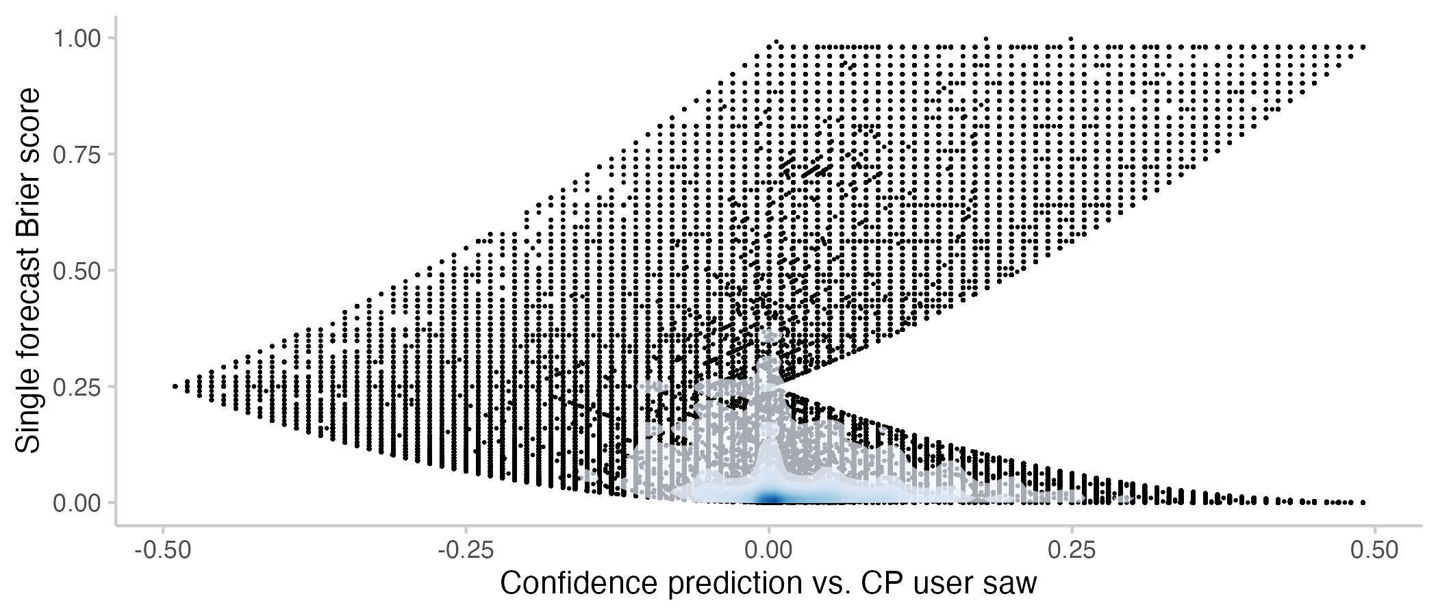
As an aside, there is also a relationship between confidence and Brier scores. The shape of the plot is due to the constraints imposed by the relationship between confidence and Brier scores. For example, you can only get a Brier score of 0.25 if you predict 50% while the CP is at either 100% of 0%.
Figure 10: User Brier score vs. how confident a prediction was relative to the CP that the user saw. Note that the Brier scores here are different from the ones used throughout the rest of the post: Points show Brier scores for a single forecast made by a user. If a user makes three forecasts one a single question, this will show up as three dots. In all other plots, Brier scores are a single time-weighted score for the entire activity of a user on a question (including all forecast updates). The shade overlayed shows the density of observations- blue means there are a lot of observations, white means there are not so many observations.
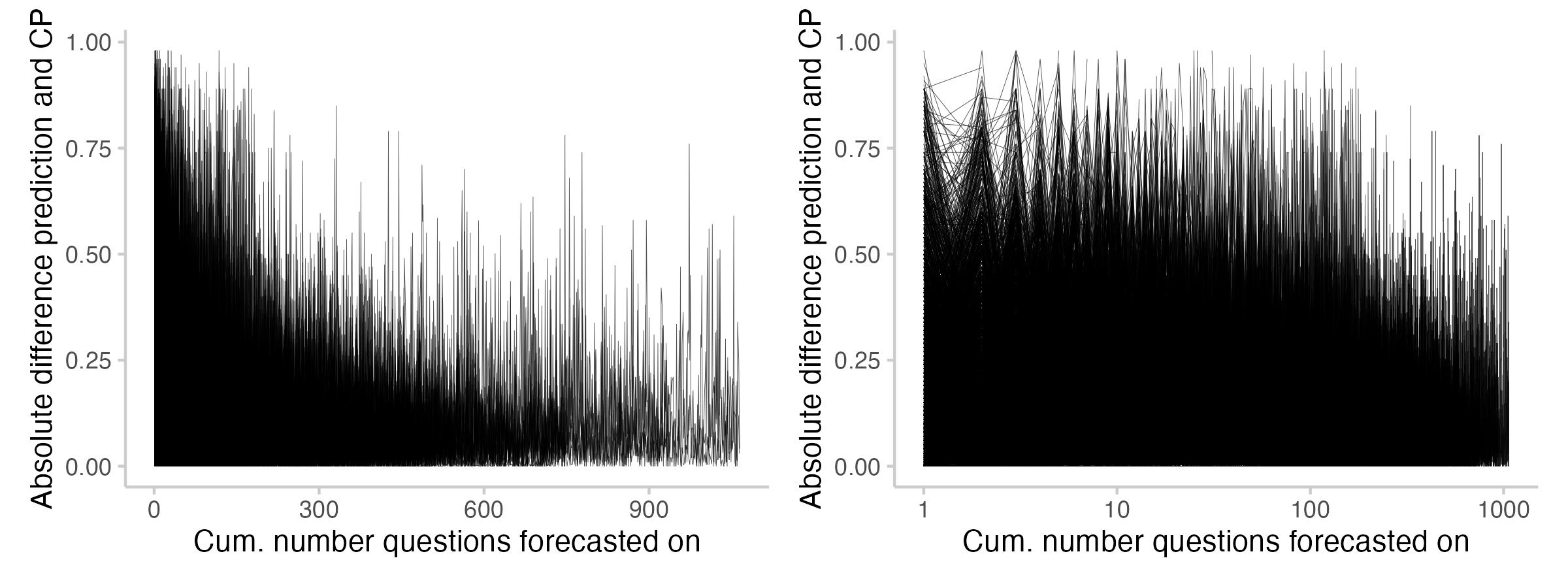
There is one last thing that I found interesting related to the difference between the CP and prediction: its evolution over time as users forecast more. The following plot shows the absolute difference between prediction and CP across the forecasts users made (every line represents one user).
Figure 11: User Brier score vs. how confidence a prediction was relative to the CP that the user saw.
It seems like users tend to predict closer to the CP as they forecast more. It also seems like (maybe?) there are fewer instances where users predict exactly the CP. I'm not entirely sure about that though - the plot might be a bit misleading, as there are fewer lines for users who forecast on 900 questions than for those with 50.
Conclusions
All of this should be considered "exploratory data analysis". I haven't run any statistical analyses, so this is more of an attempt to provide a high-level overview of the data. I think it would be interesting to run some regressions or similar analyses and see what comes out.
My overall impression is that the data is quite noisy - most forecasts don't contribute very much, but then again some surprisingly do. I was particularly surprised about how much of an effect simply predicting the exact value of the current Community Prediction could have. I think this somewhat unpredictable behaviour is to a large extent due to the way the Metaculus Community Prediction is calculated. The recency-weighted median can be a bit jumpy or behave in unexpected ways[3]. I would assume that other aggregation mechanisms, such as e.g. a geometric mean of odds, might lead to different results.
To be precise, you can't really conclude that a forecast is "good" or "bad" based on a single realisation. If the true probability for an event is 90% and you provide an ideal forecast of 90%, then 1 out of 10 times on average you will receive a bad score.
Presumably we should measure distance in odds-space rather than just taking the difference between the prediction and CP. This, however, is for now left as an exercise to the reader.
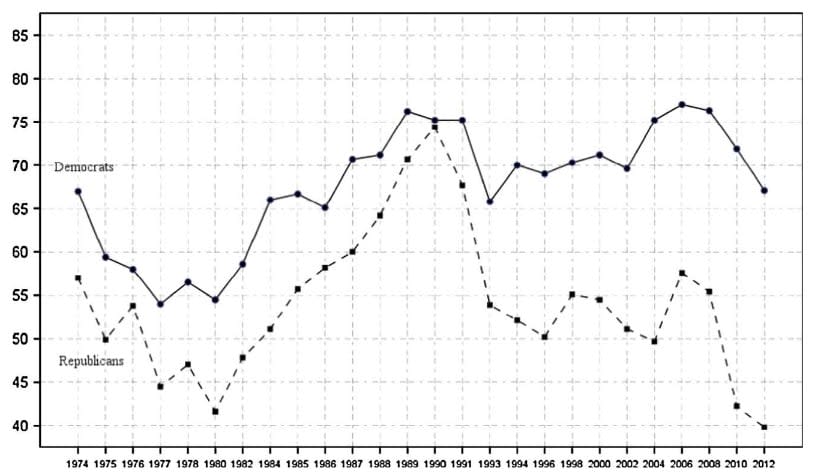


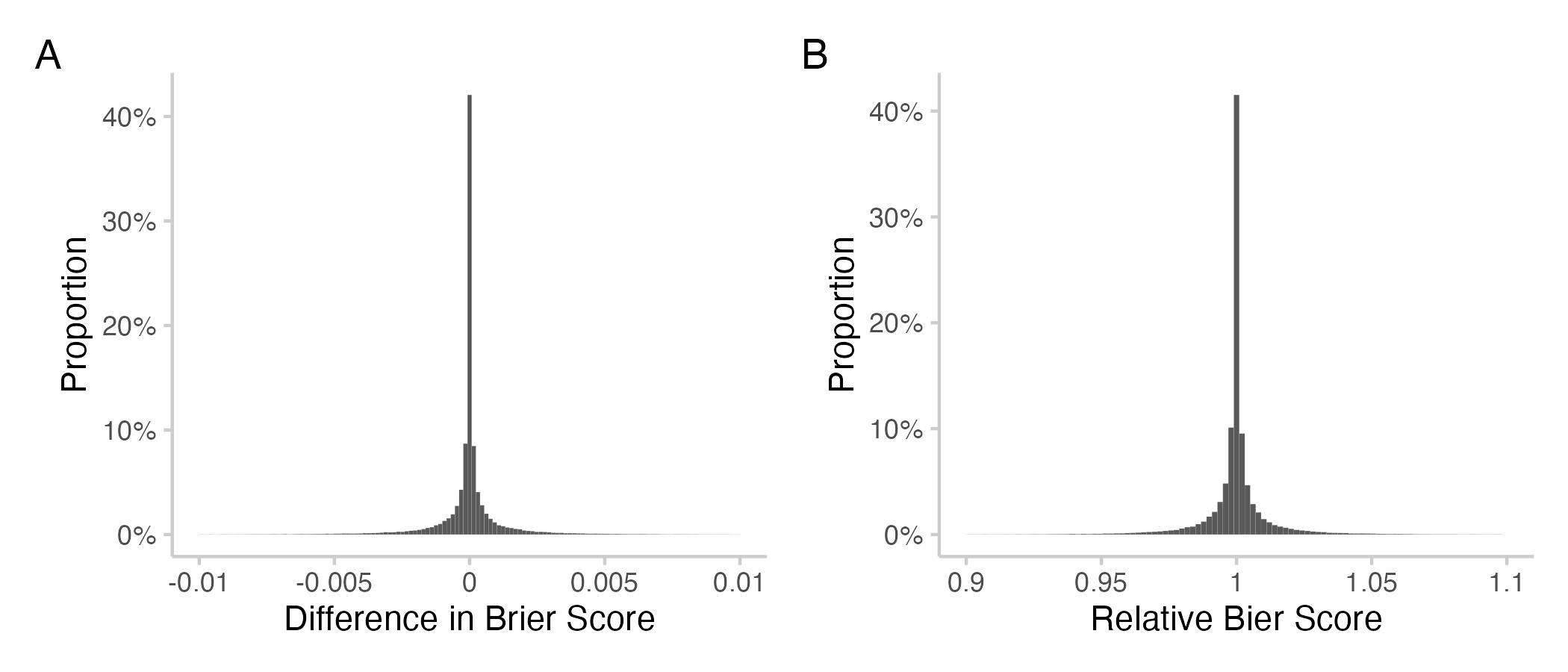
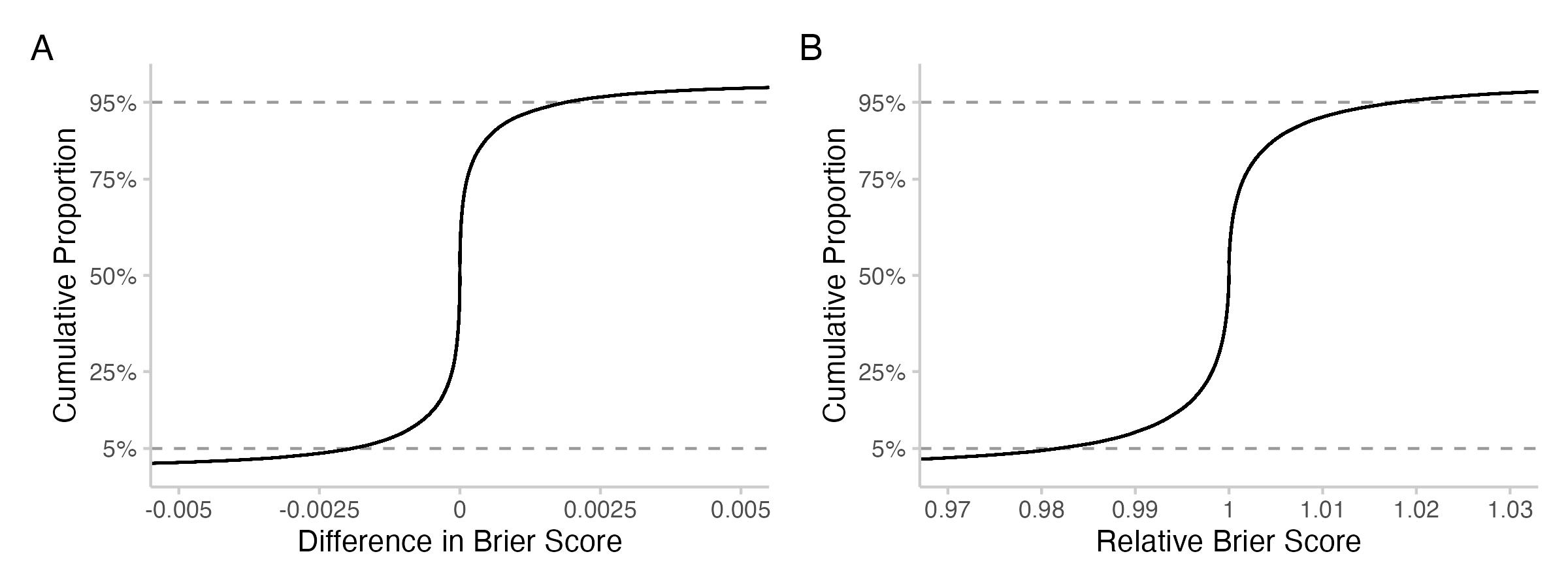
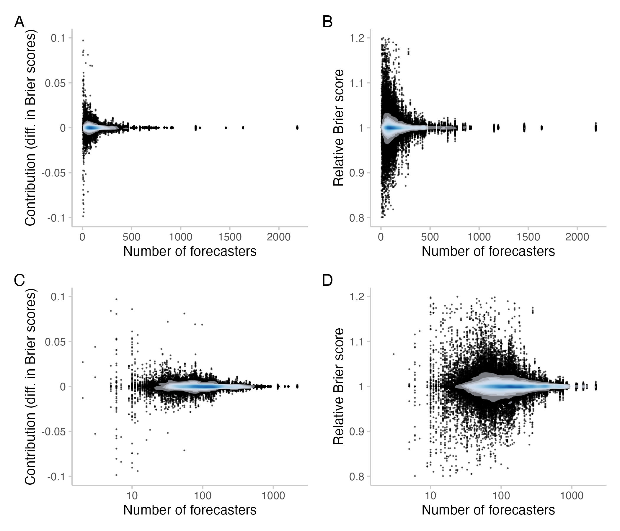
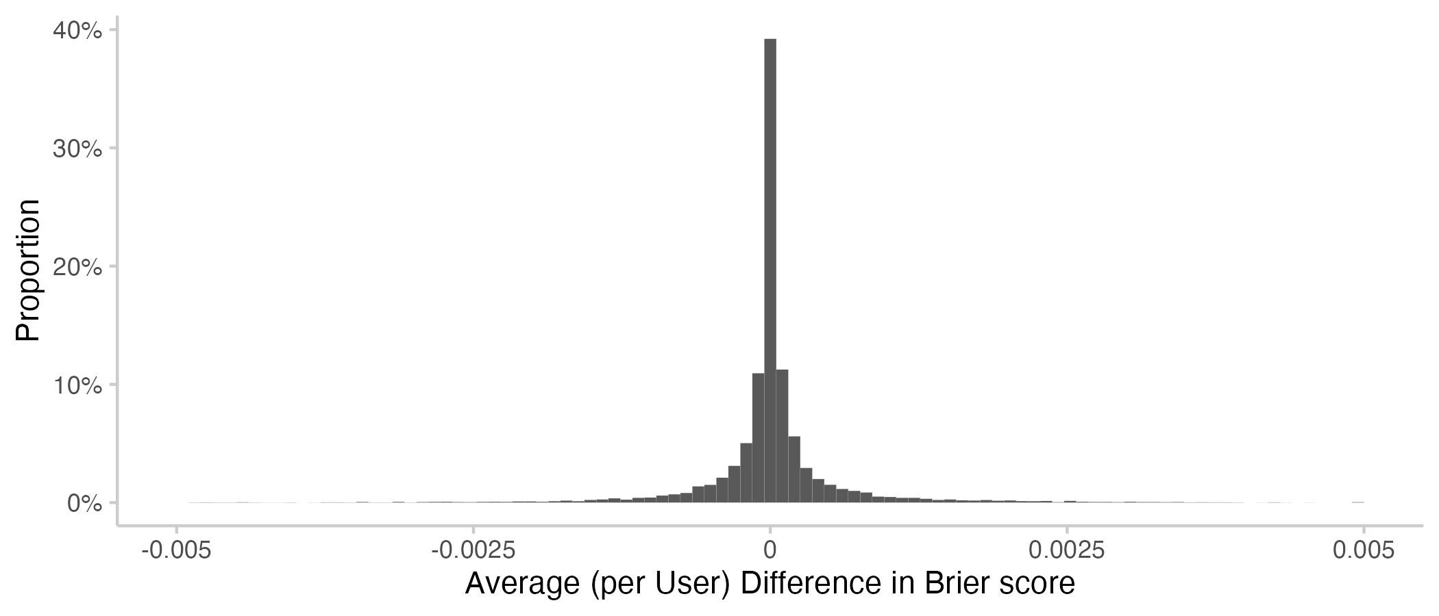
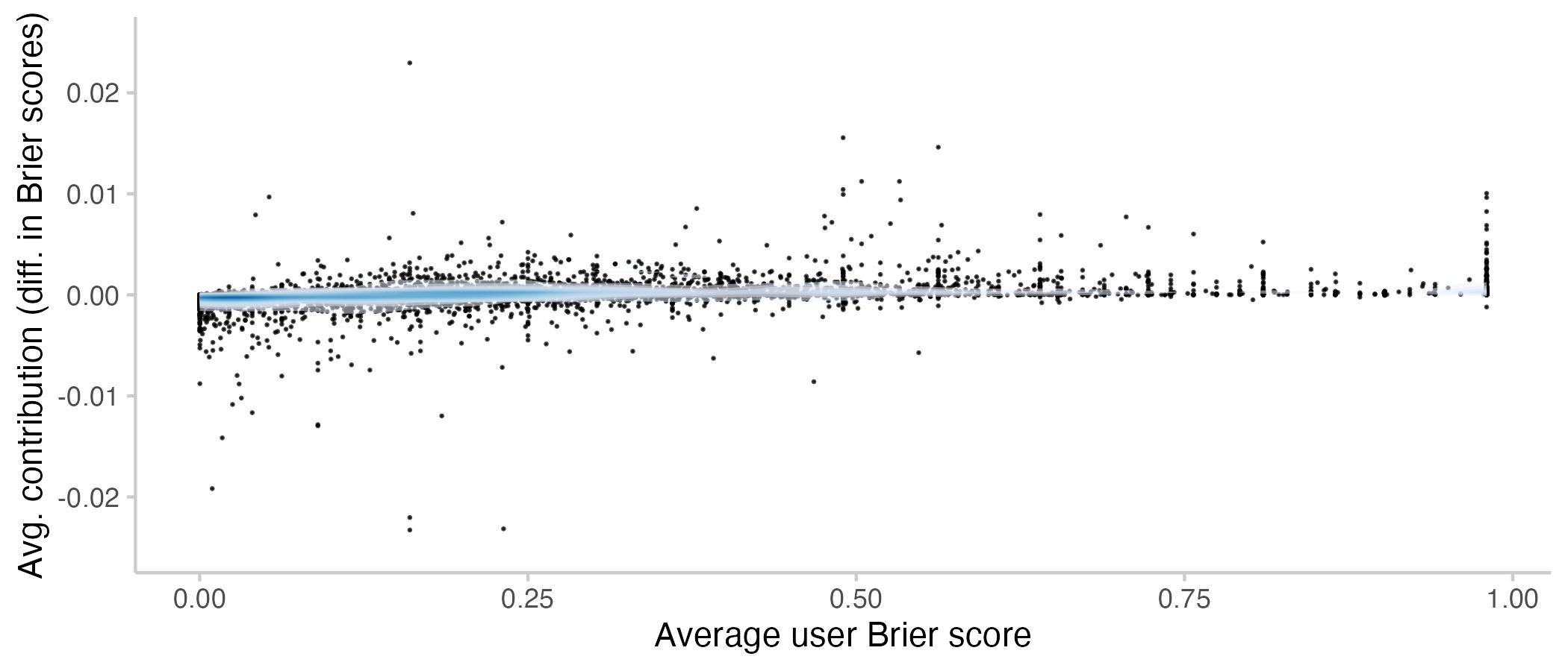
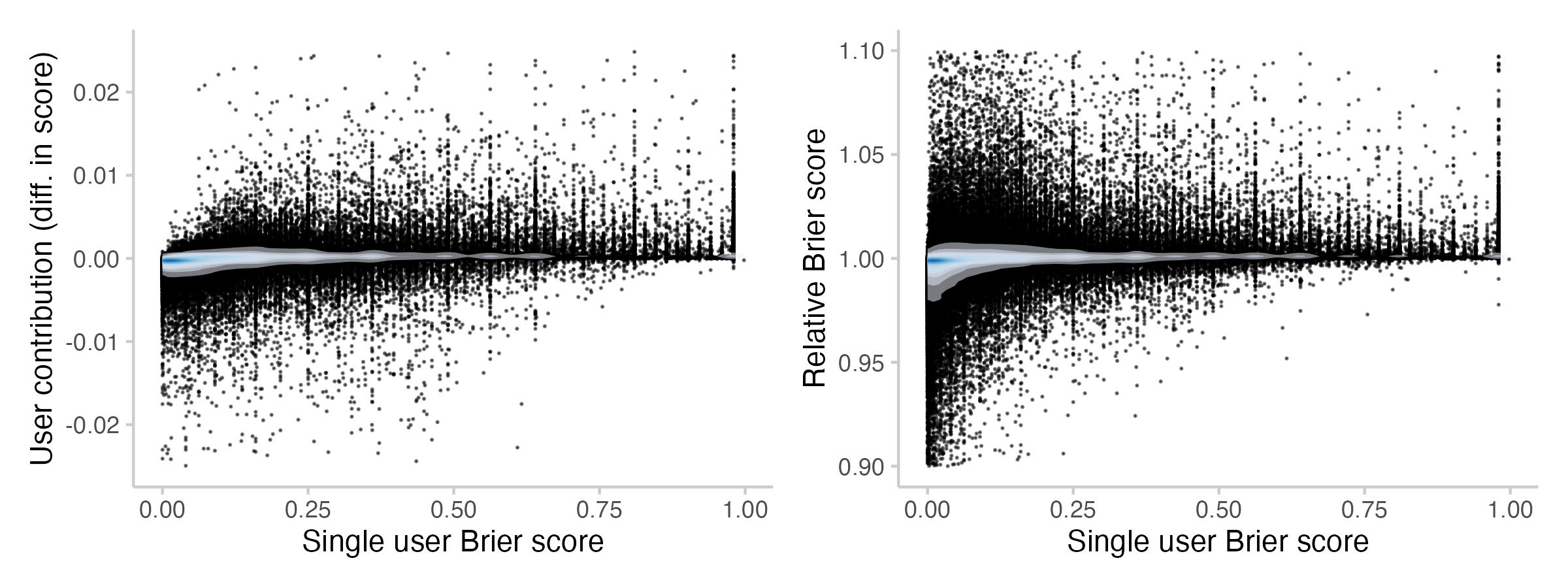
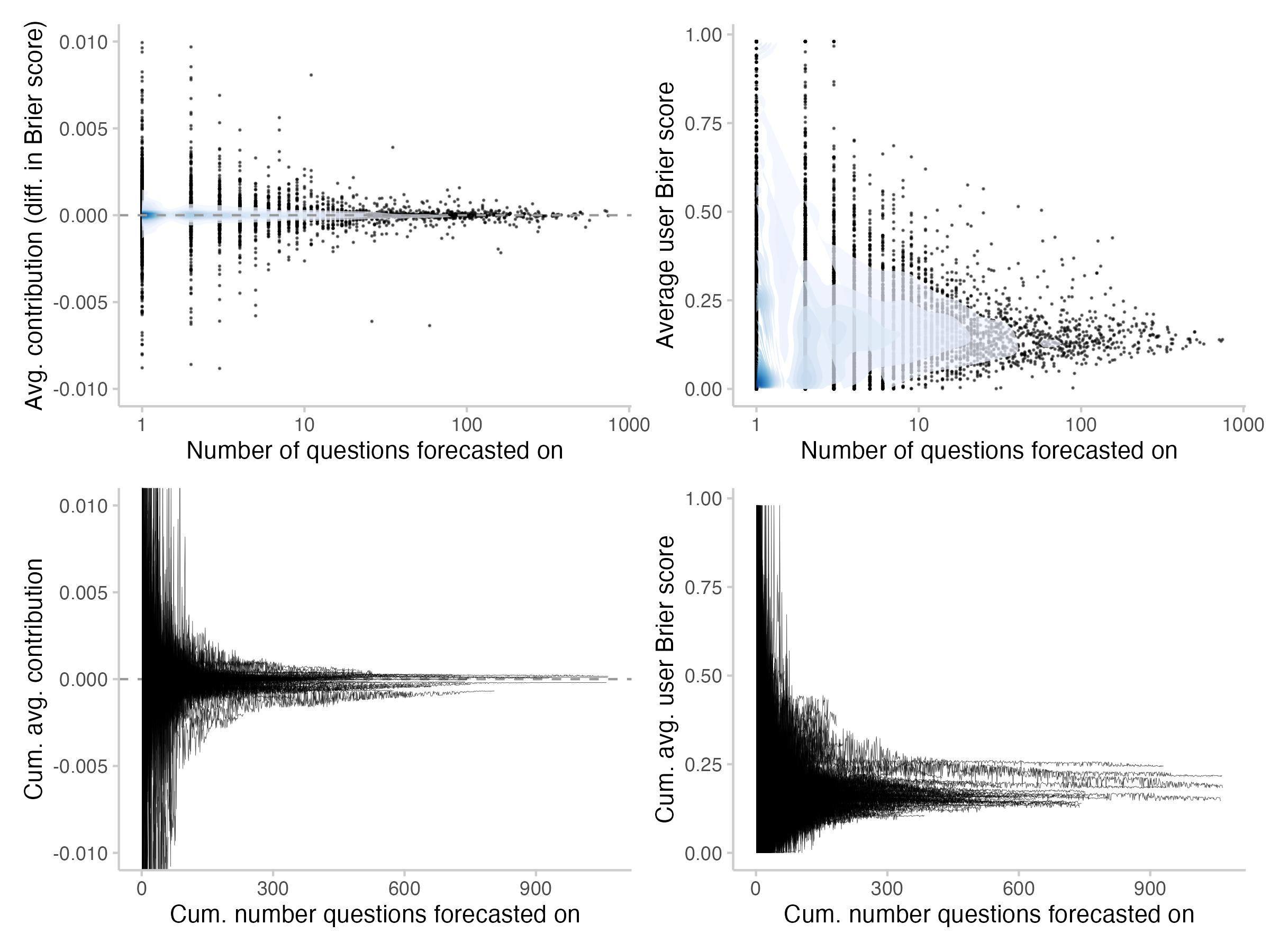
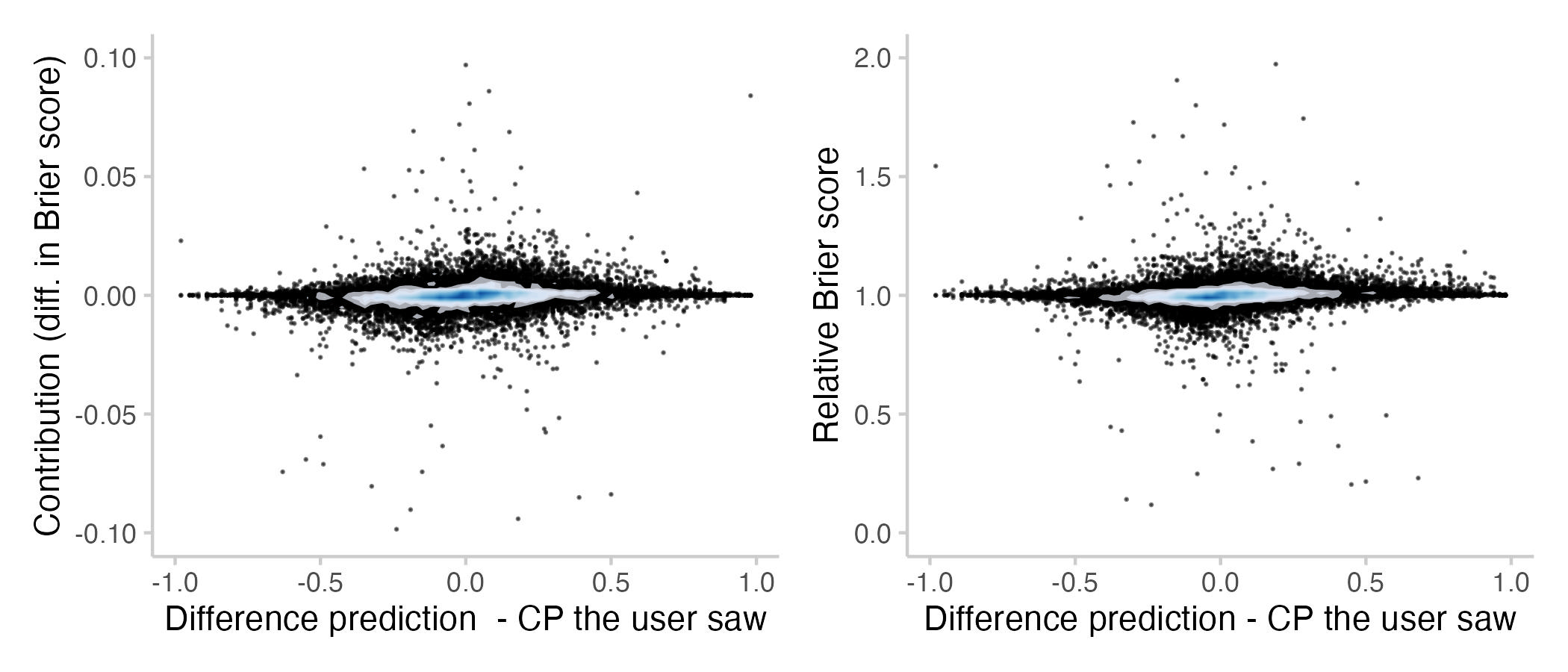 Figure 8: Contributions and relative Brier scores vs. the difference between prediction and CP the user saw (If a user updated multiple times, then that's the average distance). Every point represents a single forecast. The shade overlayed shows the density of observations- blue means there are a lot of observations, white means there are not so many observations.
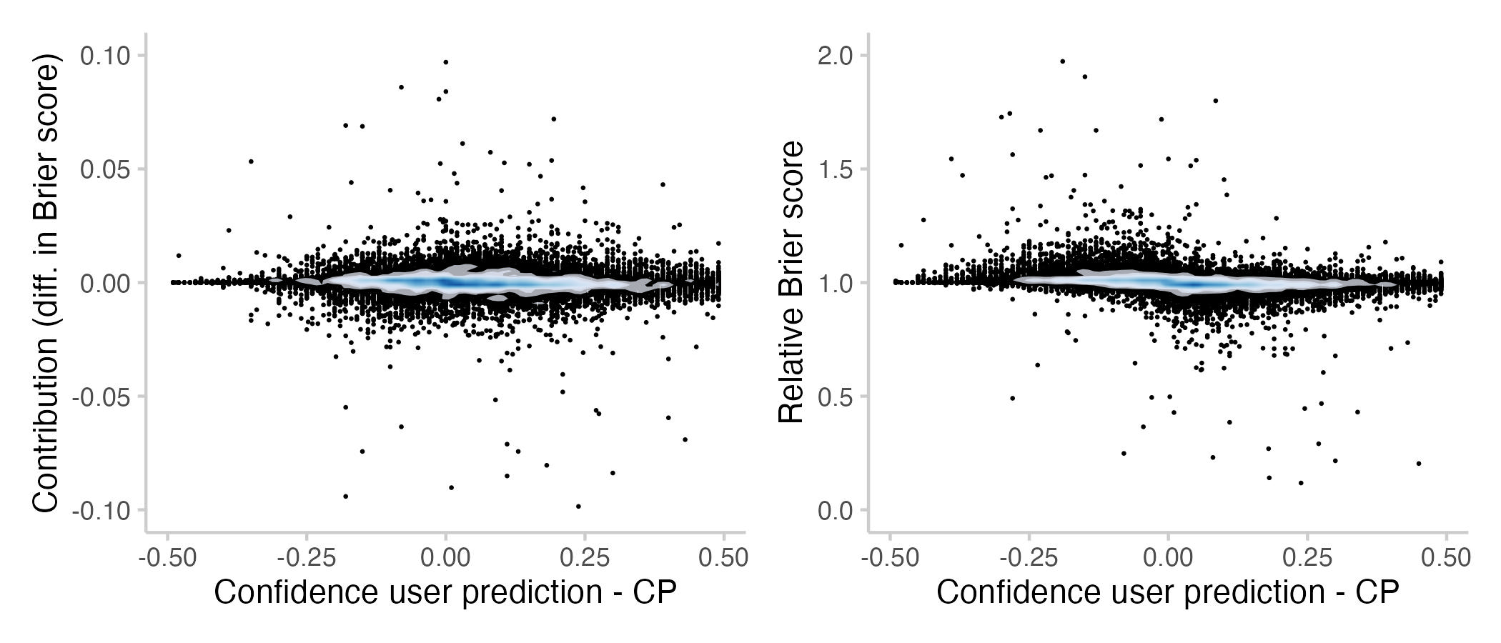
Cool, thanks for doing that analysis! I'm wondering whether the scores you derived would be a great additional performance metric to provide to forecasters, specifically
a) the average contribution over all questions, and
b) the individual contribution for each question.