Comments
(Cleaned) EA Forum data for your interest and enjoyment

2 min readJul 3, 2022
I have not rigorously scrutinized my code and the graphs below for accuracy. This post is primarily intended to share the data and a few examples of what can be done. But if you spot an inaccuracy, please let me know. Thanks!
Edit: also adding my code, which is hideously messy but maybe better than nothing!
A few weeks ago, Jacques Thibs scraped the forum and put some data in the EA Twitter group for anyone to check out.
Long story short, I’ve cleaned the data a bit and figured some other users here might like to check it out! The data files are:

4. Small sample version of #3 (.csv, 41kb, and you can open in Excel - the other ones you can’t, at least on my computer)
For all of these, each row or observation in one forum post, and each column or variable is some bit of information about that post, like its author, text, or date of publication.
I’m posting the cleaned version because the raw data .csv has ~21,000 variables, some of which have rather unfriendly names like
comments.comments.comments.comments.comments.date_published...66(variable 626), or
comments.comments.comments.comments.comments.comments.comments.comments.comments.comments.comments.comments.comments.omega_karma...1031(variable 20,112)
And below are just a few graphs I made using ggplot and shiny in R:
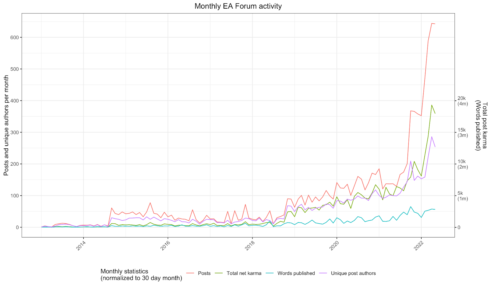
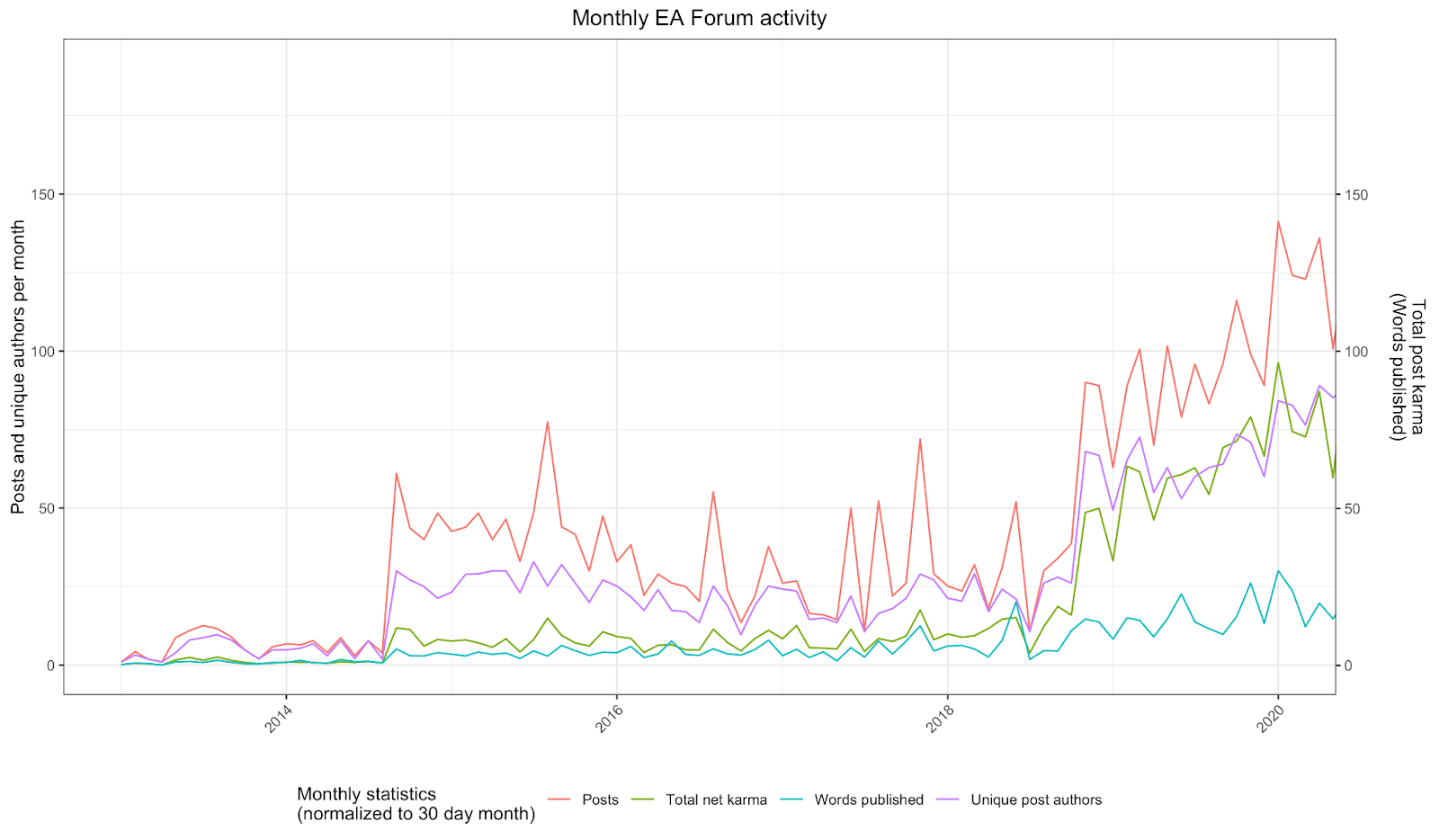
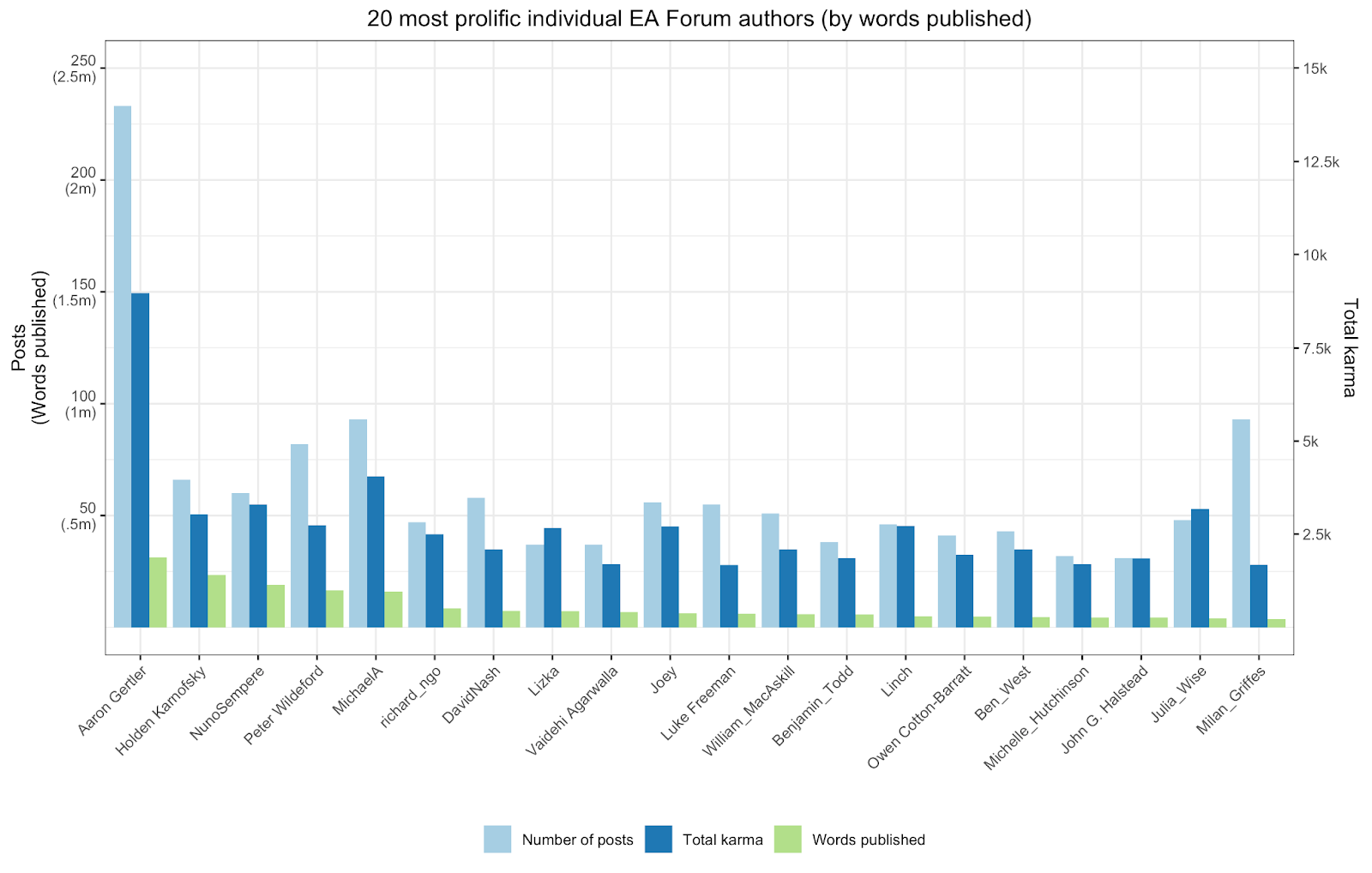
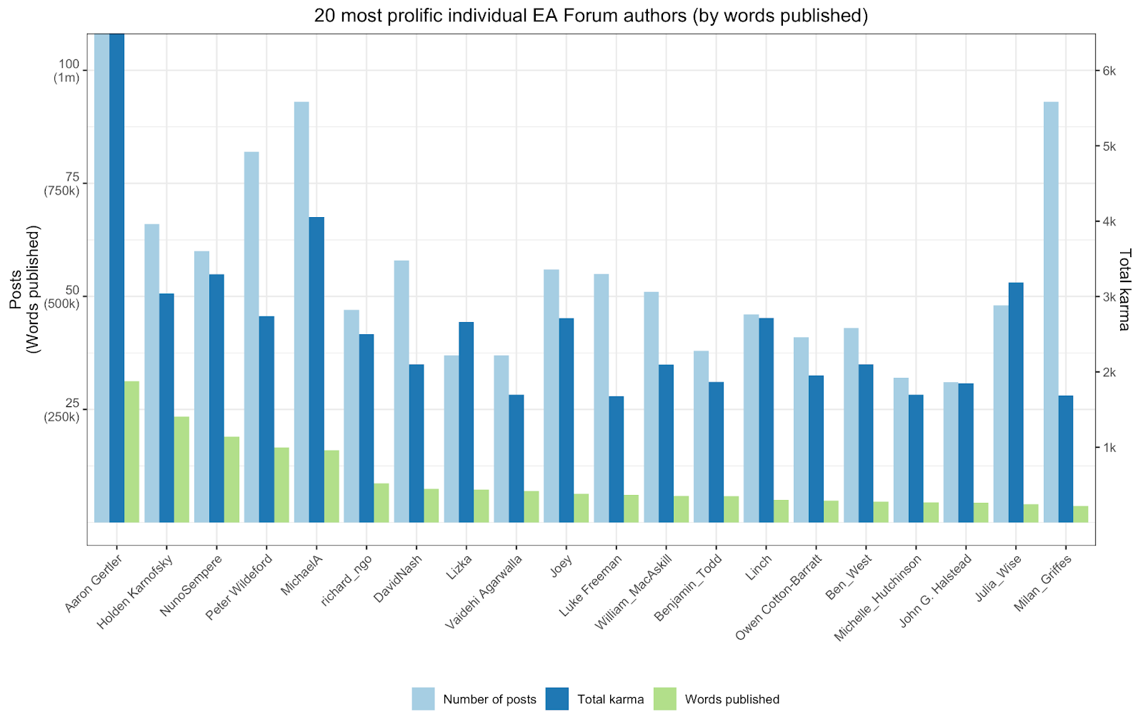
You can find that here, which is an interactive version of the following screenshot:
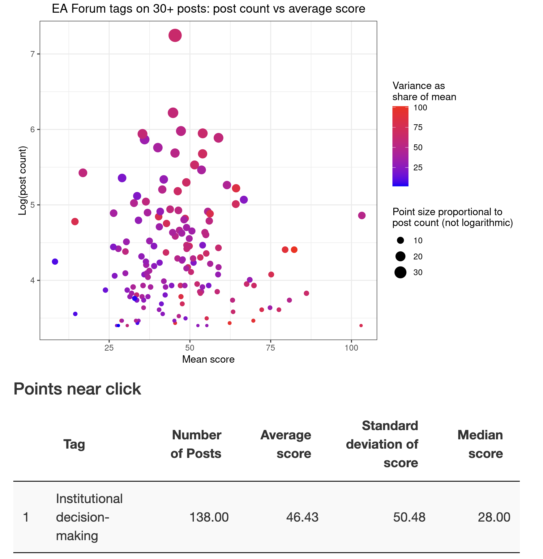
Oh yeah, if there are any questions you think I should look into using this data, I'd love to to know! I'm half-decent at data cleaning and reshaping in R, econometrics in R and Stata, and data visualization, and not a whole lot else.
Thanks for reading and I look forward to whatever insights or visualizations others generate!