(edited based on feedback)
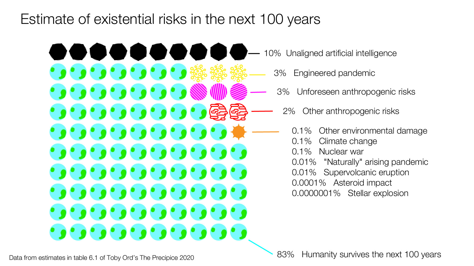
I've been reading Toby Ord's thoughtful book, The Precipice. In it, he estimates there's a 1 in 6 chance of humanity not surviving the next century. He has a table that summarizes the main sources of risk as he sees them that I thought could be more sharable and comparable if it were put into a diagram. So I made the following diagram in Illustrator (here's the file if you want to play with it). If this seems like a useful thing to do, I'd love to get feedback on how it can be improved:

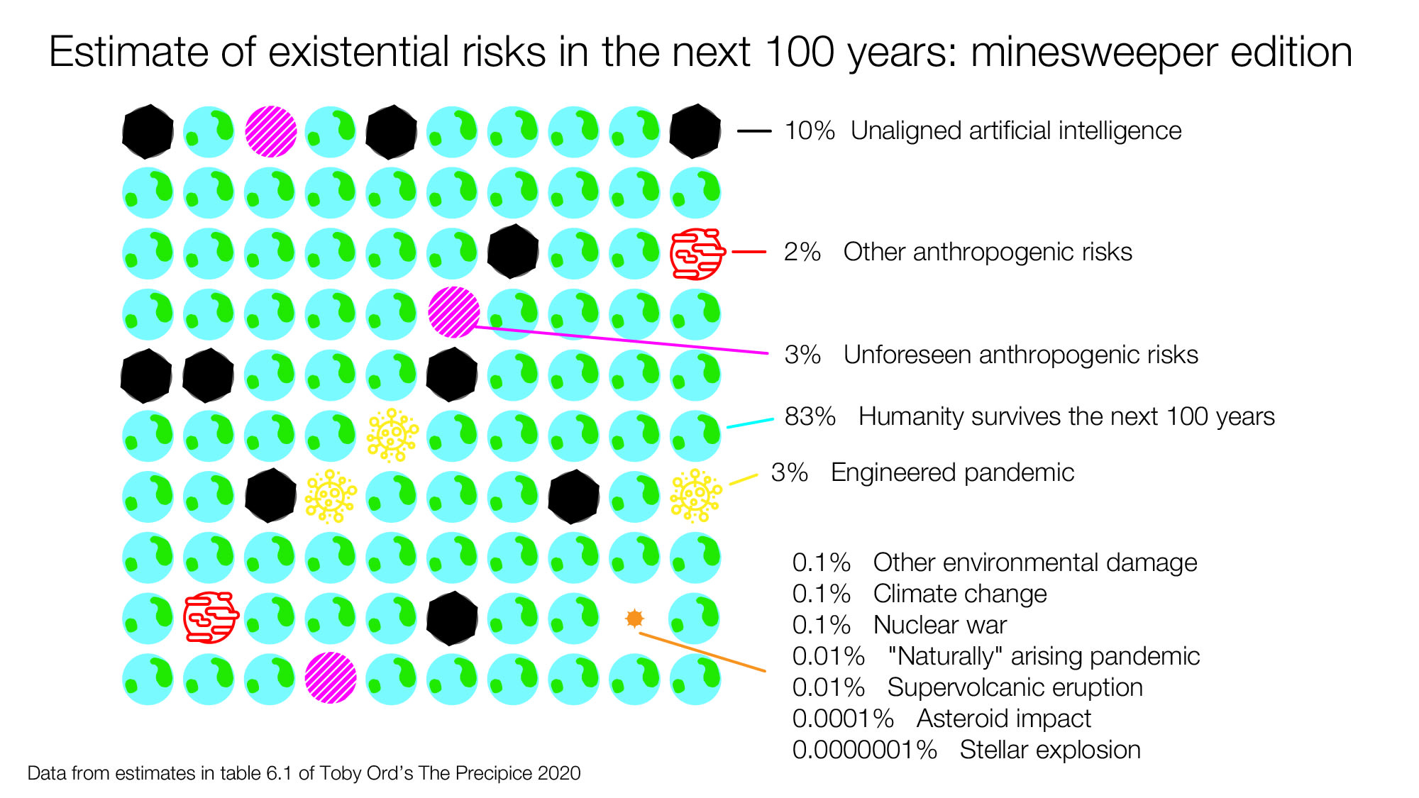
Here's another version, that I set up more like minesweeper with 100 possible futures:

There is a lot of research and data that went into Toby's estimates, so the downside of making a diagram that's less accurate since it will not be wrapped in all of the context from the book, but the upside is that it's potentially more sharable. (this seems to be an unanswered question) But it could still work as a good conversation starter for those thinking about cause prioritization and longtermism.

Just speaking impressionistically, the minesweeper version looks much more "hazardous" than the first version.
There's something about the neatly arranged units that seems very manageable.
Obviously there's just some biases at play here, but something to be conscious of depending on the use case
Oh, and great work!