I suggest making clearer that these are one researcher's rough estimates. Otherwise I think it gives a false sense of precision. Maybe by titling the infographic "Rough guess at global catastrophic risks from The Precipice" or similar.
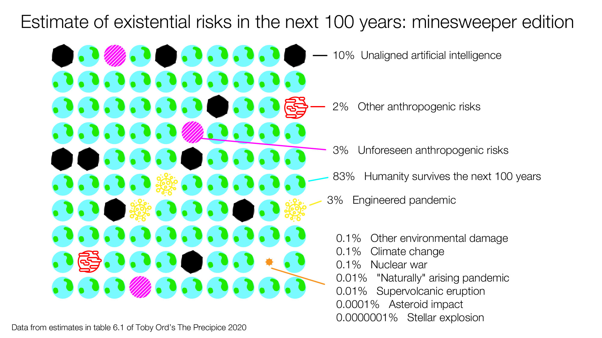
This looks great! And I agree with Aslan that the minesweeper edition feels very different and I am glad you created it.
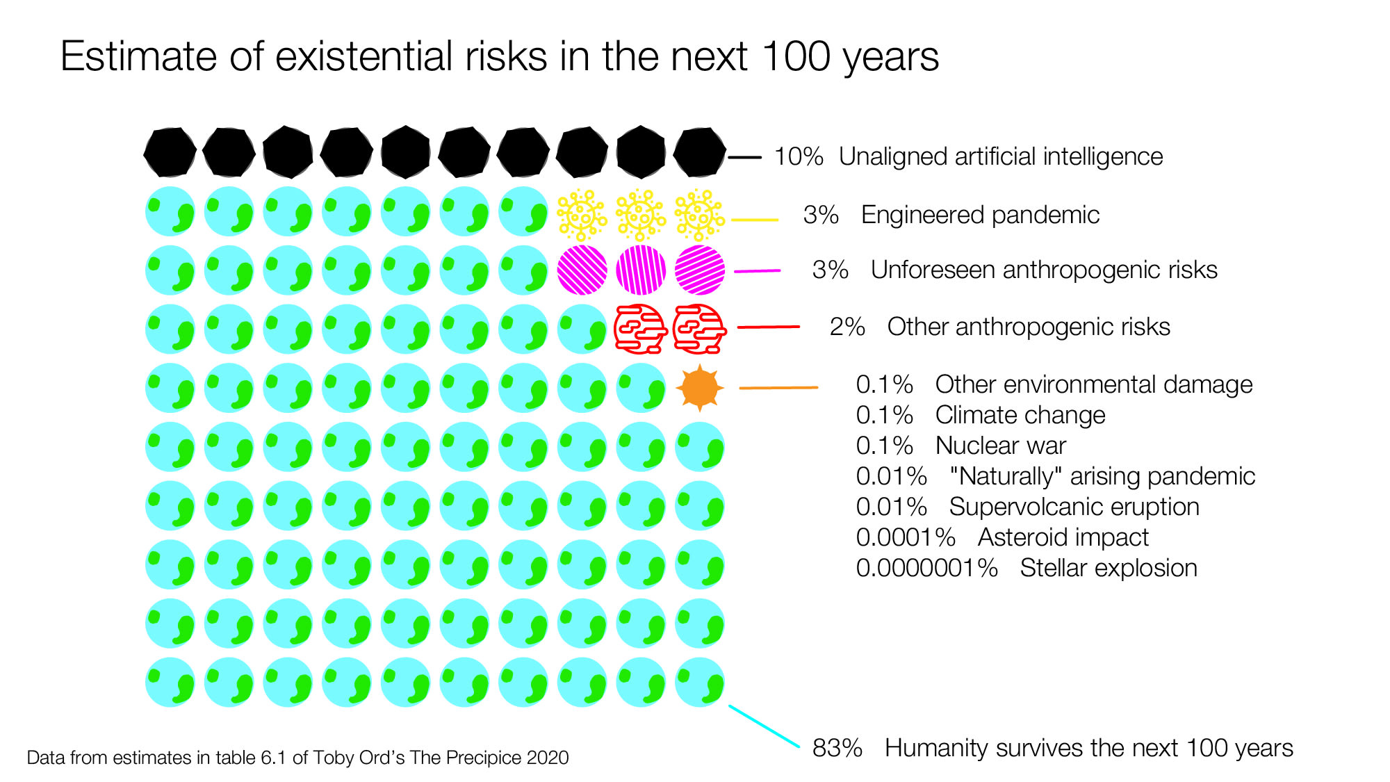
One note: existential risks are a distinct concept to both extinction risks and global catastrophic risks. Table 6.1 in Toby's book describes existential risks which is what you are depicting here - existential risks include extinction risk but also the risk that humanity will turn into a permanent dystopia as well as permanent civilisational collapse (but humanity lives on).
Global catastrophic risks are different again: they are risks that kill at least 10% of the human population.
I've been reading Toby Ord's thoughtful book, The Precipice. In it, he estimates there's a 1 in 6 chance of humanity not surviving the next century. He has a table that summarizes the main sources of risk as he sees them that I thought could be more sharable and comparable if it were put into a diagram. So I made the following diagram in Illustrator (here's the file if you want to play with it). If this seems like a useful thing to do, I'd love to get feedback on how it can be improved:
Here's another version, that I set up more like minesweeper with 100 possible futures:
There is a lot of research and data that went into Toby's estimates, so the downside of making a diagram that's less accurate since it will not be wrapped in all of the context from the book, but the upside is that it's potentially more sharable. (this seems to be an unanswered question) But it could still work as a good conversation starter for those thinking about cause prioritization and longtermism.
This post presents the executive summary from Giving What We Can’s impact evaluation for 2025. At the end of this post we share links to more information, including the full report and...
I used AI to fix transcription errors, rerrarange the ideas, and suggest tweaks to the title and some sentences.
Three of the most exciting projects to come out of EA in recent years are, in a vague sense, CEA spinouts:
* Kairos is directly a spinout of CEA and now handles most support for university AI safety groups. Basically everyone I've found who knows them is really excited about what they do
* NEST is an opinionated ideas-fi...

I suggest making clearer that these are one researcher's rough estimates. Otherwise I think it gives a false sense of precision. Maybe by titling the infographic "Rough guess at global catastrophic risks from The Precipice" or similar.