I’m looking to write an article that tries to make the case for effective giving in 7 charts.
To do so, I'm currently working to compile a document of the most compelling charts, graphs, statistics, or other data visualizations related to effective giving.
Here is a link to what I have so far. What am I missing?
I’d really appreciate it if you could take a look and then suggest some that I might’ve missed in the comment section below. It would be preferable if you could share the chart, but it would still be great if you could even just describe it (so I can find it/make it later).
After this, I’ll create a poll so we can vote on the top 7.
Thanks!

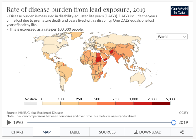
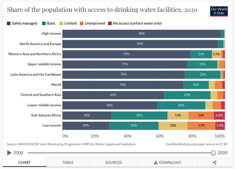
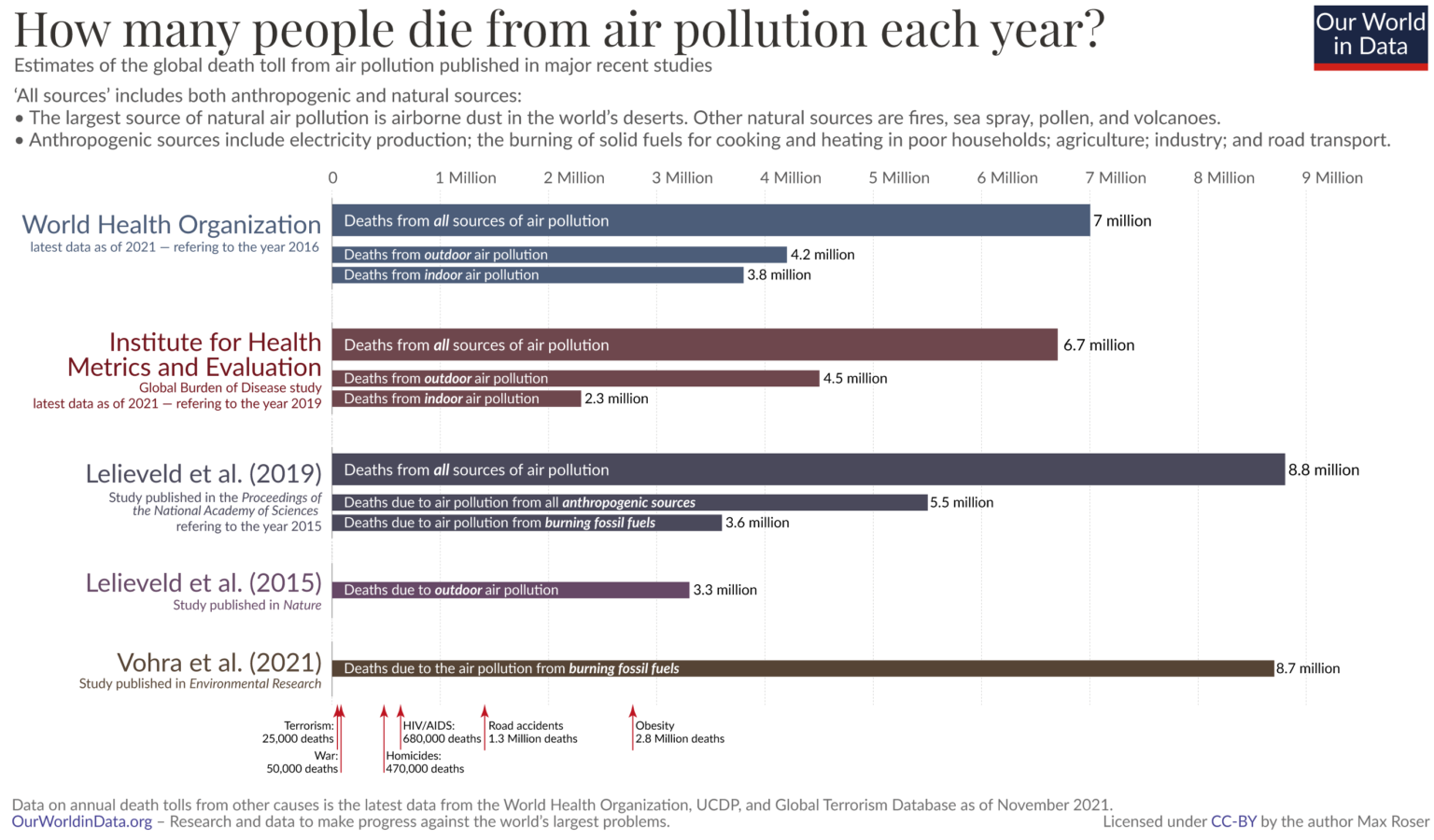

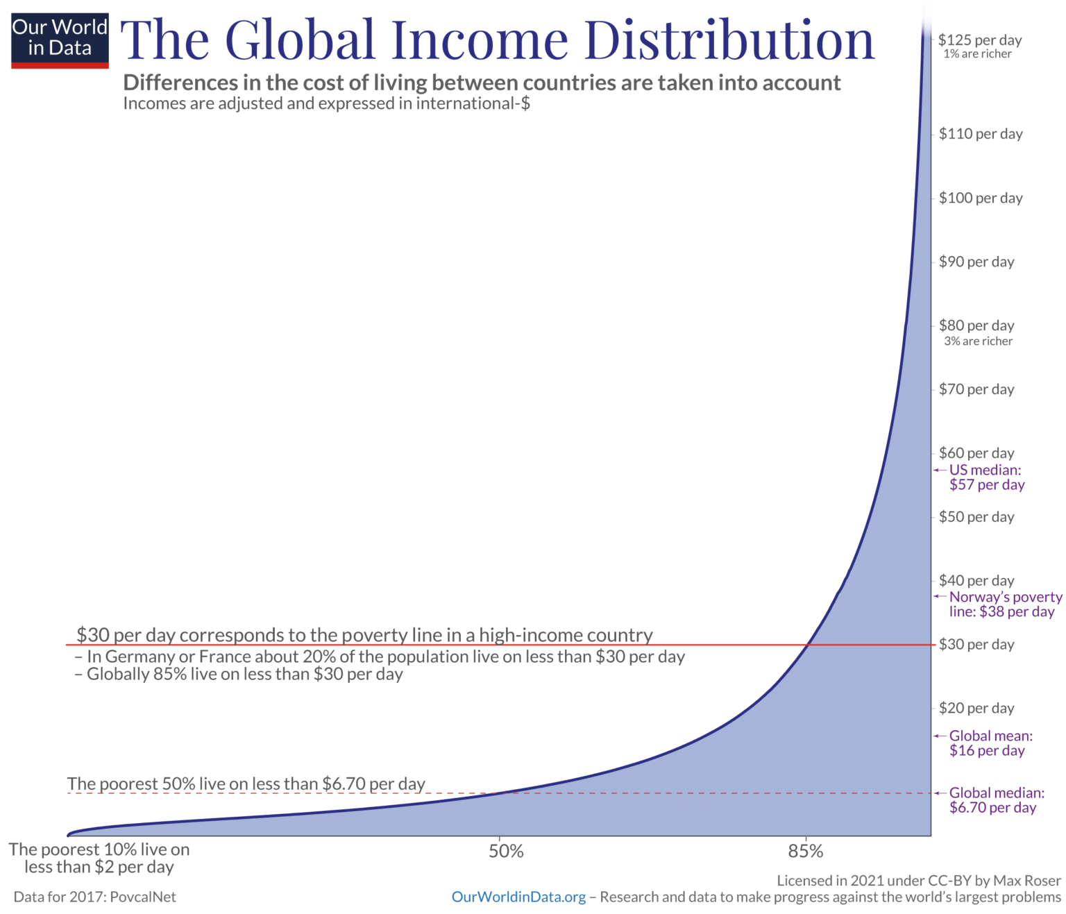
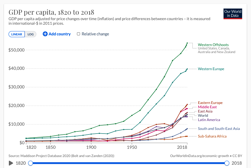
Could you provide sources to the charts you added there? It'd be nice to take into account how up-to-date it is or what's the underlying data source when we'll be voting on them :) Also I'm thinking of redoing & sharing some of these in my language.