This post is a tutorial for Visualisation of Probability Mass, a tool that lets you represent credences as percentages in a 10x10 grid. It's useful for turning visual intuitions into coherent percentages, or numerical intuitions into a visual representation.
At the end, I'll briefly mention other tools useful for visualising quantitative beliefs.
When can Visualisation of Probability Mass be Useful?
- Visually demonstrate your expectation of how a project will turn out, or how likely it is to succeed on some metric, to show your manager
- Turn a rough intuition about the harms and benefits of veganism into coherent[1] percentages
- Compare your AI worries to a friends'
- Guess how many people at a party are your friends vs your friends' friends vs your friends' friends' friends
- Forecast the contents of your fridge by category (It's fine! I'm working, I promise! I have to get calibrated!)
Tutorial
Visualisation of Probability Mass is a tool for quickly representing images of percentages in a 10x10 grid, where each box represents 1%. You can click on any colour (on the right) and then on any tile (on the left) to change its colour.
You can add a title and description for each colour or for the graph in total, and export it as a jpeg. 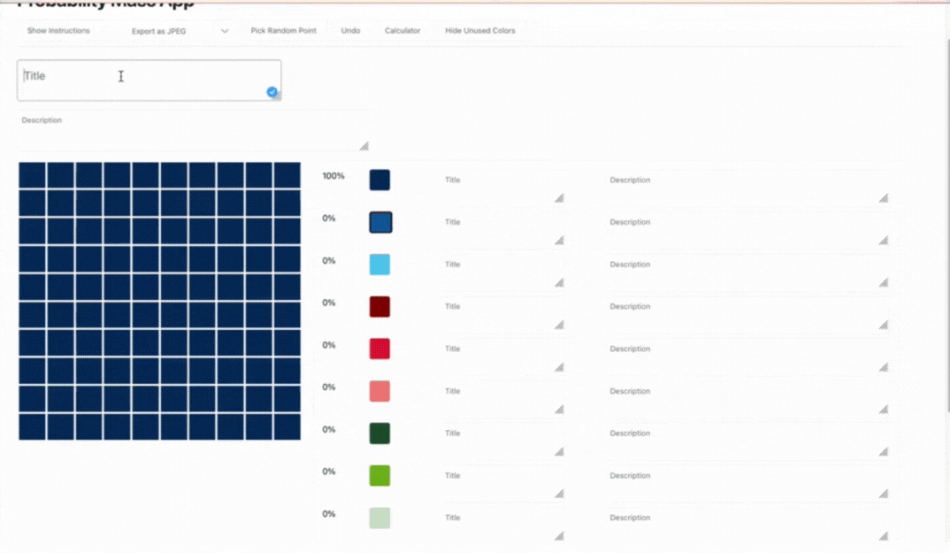
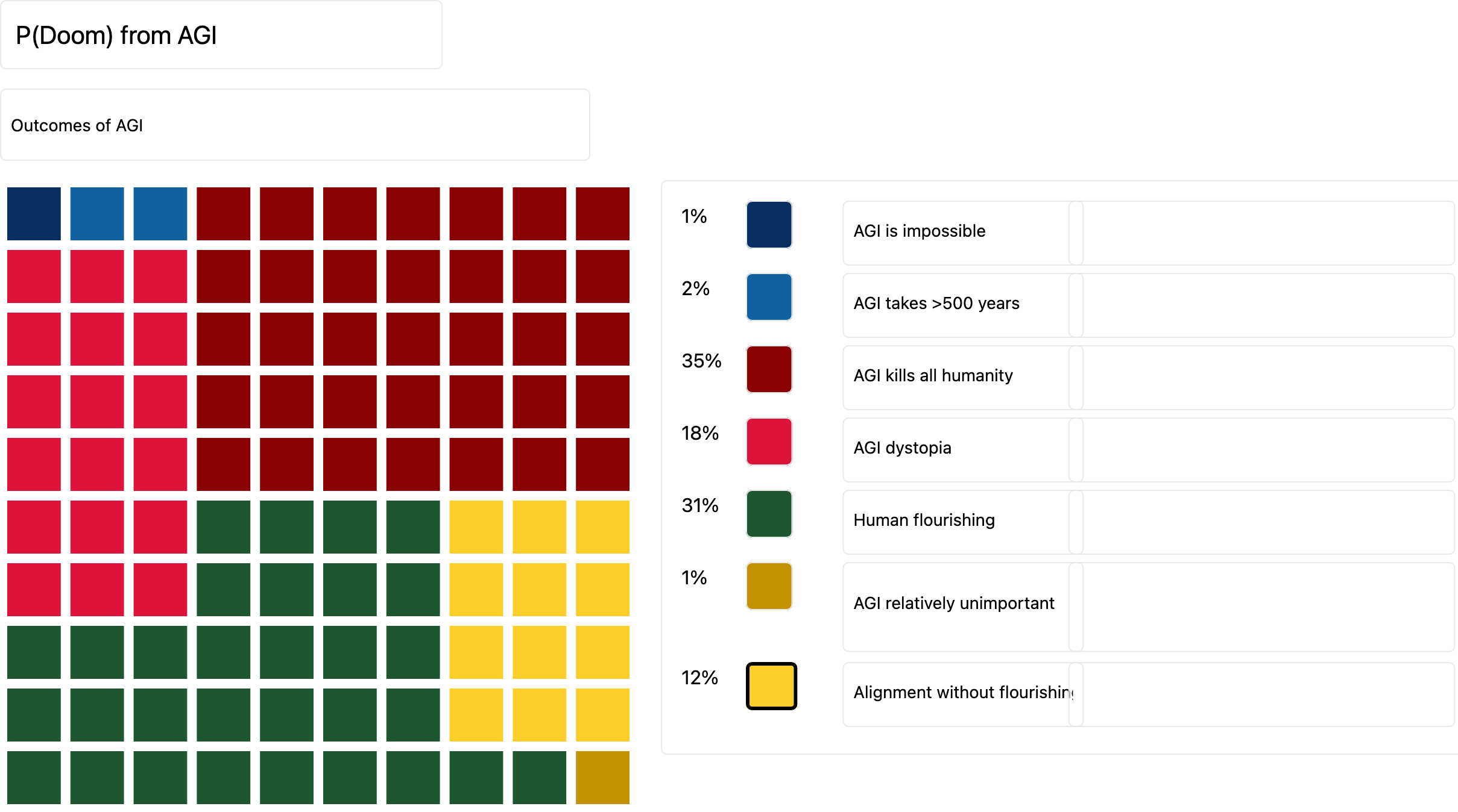
Here's a worked example (numbers picked mostly at random, not intended as a true claim on this topic):
Personal Experience
Honestly, I find the visual output of Visualisation of Probability Mass more confusing than useful, though when I discussed it with others they found it quite useful. I expect that for some, most of the value is in using the visual half of the tool as an input to turn an intuition into percentages that are coherent[1], rather than as an output, unless you have <4 possible outcomes.
Tools for Related Tasks
Another tool which can be used to represent probability density intuitively is Click and Drag Probability Elicitation. However, the web demo is currently too limited to be useful, but I’m excited about its potential when fully usable. If you're building a survey (in Qualtrics, LimeSurvey, or oTree) where people can input probability density graphs, consider using it.
Tools that can be used to share quantitative beliefs as whole models include coding languages like Squiggle, Guesstimate, and Python.
Try it Yourself!
Show us your beliefs on a topic! Post it in the comments. If you can't think of anything, try looking in the comments to get ideas & compare your beliefs with others. Here's some other suggestions:
- How did you meet your friends? (i.e. work, sports, other friends, EA, etc.)
- How do you spend most of your time in an average week? How would you like to spend your time each week?
- How many people apply to EA jobs they're not suited for vs how many don't apply to enough that they are (and how many get it just right)?
- How many people live on each continent?
- How many people have been born in total in each of the last 10 centuries?
- How many EAs are working on different cause areas?
- How many EAs do you think should be working on different cause areas?
I'll also be running an event in the EA GatherTown today at 6pm GMT to get a feel for the tool together, please come along!
Tomorrow: Loom, a tool for recording videos! I used it to record all the videos for this sequence. I'll be running another event in the GatherTown tomorrow for Loom.
- ^
I.e. sum to 100%
I don't know if it's exactly this that will save all communication or anything, but I would be excited to see if this kind of thing could be used to quickly convey takes on even hard community issues in addition to object level things, especially since it points in the direction of considering multiple hypotheses.
e.g. I really loved this picture from this post and even made this speadsheet so you could put in your own numbers, and it seems like a standard part of data visualization to let people see the differences between distributions clearly
Cool spreadsheet! Yeah a tool similar to the square one but in a horizontal line instead seems more useful.
Also: Confido works for intuitively eliciting probabilities
Seeing Theory is also a beautiful guide to visualizing probability.
It looks great, and there are a few others I like as well, but does this let you visualize your own credences? That's what seems like the value here, to me.
Nope, I skimmed the post and missed that that was the specific goal. My bad!