A primer on how to tell if your country is prepared for future pandemics, and biological risks more generally. This is a cross-post from my Medium.
🦠 Intro
🦠 How to measure preparedness?
- To measure pandemic preparedness at the country-level, you need to look at how well countries prevent, detect, characterise, and respond to biological threats.
- There’s a bunch of composite and country-level metrics that exist, and get updated over time.
These are the ones I’ve focussed on in this essay:
But they’re by no means the only metrics that can inform you about a country’s pandemic preparedness. Some additional, related metrics include:
- INFORM risk index — Developed by European Commission — 2014 onwards: Global, open-source risk assessment for humanitarian crises and disasters. Evaluates a country’s risk across hazards, exposure, vulnerability, and coping capacity.
- Crisis Preparedness Gap Analysis (CPGA) — Developed by World Bank’s “Global Crisis Risk Platform (GCRP) Secretariat” — 2022 onwards: Designed for poorer countries belonging to the International Development Association (IDA), to help them evaluate how prepared they are for a crisis. Not many CPGA results are published online, but you can find briefing notes summarising the results for some countries.
- COVID Resilience Ranking — Developed by Bloomberg — 2020 onwards: uses a “range of datapoints to capture a monthly snapshot of how the world’s biggest economies were handling” the COVID pandemic.
- COVID Economic Recovery Index (CERI) — 2020 onwards: “measures the degree to which countries have the right policies, institutions, and factors in place to rapidly recover to pre-COVID-19 levels of socioeconomic performance”. As far as I understand, this is a retired metric…it was a one-and-done project using 2018–2020 data to rank countries based on pandemic preparedness and economic resilience.
- Surge capacity: describes how well a healthcare facility / system can accommodate a greater number of patients in response to a catastrophe.
- Universal Health Coverage (UHC) index
- Sustainable Development Goals (SDGs), e.g. those outlined by the UN
1️⃣ States Parties Annual Report (SPAR)
❓Background
- Developed by WHO.
- First created in 1969 but revised a few times since.
- The SPAR questionnaire is mandatory for all 194 WHO member states to complete, after each annual World Health Assembly.
- It measures each country’s adherence to the International Health Regulations (IHR).
- It’s helpful because it’s reported on annually. However, because the results are self-reported, countries have an incentive to make themselves look better than they actually are .
❓How is it calculated?
- As of 2026, the most current version is the “2nd Edition” of SPAR which came out in 2021 .
- The SPAR is designed to examine a country’s preparedness across 15 core public health capacities.
- Each capacity is measured using 1 to 3 specific indicators, adding up to 35 indicators total (see Figure 1 below).
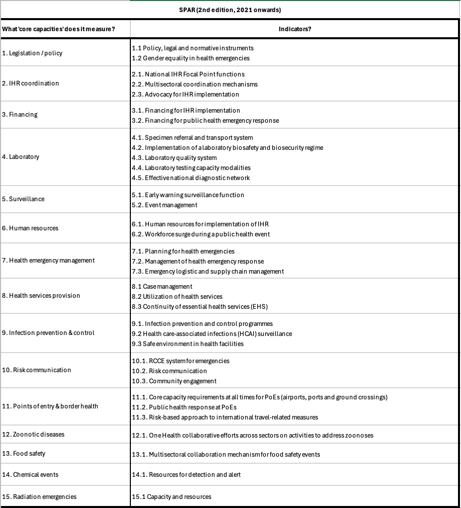
Figure 1. Summarising the capacities covered by the SPAR, 2nd edition. Sources: (1) (2)
❓Interesting findings
Countries in Europe tend to have the best SPAR scores across all capacities.
The best summary I could find of SPAR results was a meta-analysis by Santalucia et al, 2025. It summarises 9 studies between 2020–2024, each of which compared SPAR scores with outcomes from the COVID-19 pandemic. They found that:
- In general, SPAR scores correlated with (1) lower COVID-19 incidence, (2) lower mortality, (3) more successful vaccination campaigns, and (4) “a slower rise in peak incidence” at the start of the pandemic (see also: Wong et al 2021, Duong et al., 2022).
- But some studies failed to show a significant relationship between SPAR scoring and ability to manage COVID-19 (see also: Saengtabtim et al 2023, Yuan et al 2023).
- In fact, one study by Kachali et al, 2022 actually suggested the inverse — that the rankings didn’t indicate how well a country could handle the COVID-19 pandemic and it might have even led to a false sense of confidence among higher-ranked countries [1].
“The scatter plot shows a slight indication that the better ranked countries seem to have higher mortality rates than the countries with lower ranks. However, it is important to note that the mortality data were extracted on June 1st and some of the regions had not yet peaked in terms of mortality at the time (e.g., Latin America). […]
Put another way, the countries with better preparedness did not have better health outcomes in the first wave as measured by the number of COVID-19 deaths.
For this pandemic, national level health preparedness rankings were not an indicator of how well a country handled the pandemic. In fact, we ask the question, did the health rankings lead to a false sense of confidence among countries or was COVID-19 impossible to prepare for, is the COVID-19 pandemic much different from previous pandemics?” — Kachali et al, 2022
Another report analysed in the meta-analysis by Santalucia et al was Satria and Tsai 2022, which looked at improvement in SPAR scores between 2019 — 2020 across 154 countries.
- They found that average SPAR scores increased between 2019 — 2020, mostly seeing improvements in risk communication, national health emergency frameworks, and ports of entry (p < 0.05).
- They also found that ~38% of lower-middle-income countries improved in SPAR scores between 2019 and 2020. By contrast, fewer high income / low income countries improved.
Satria and Tsai went on to write a 2025 paper further discussing the limitations of the SPAR metric.
- This paper evaluated the relationship between Bloomberg’s COVID resilience score (CRS) and SPAR across 80 countries.
- The CRS looks at three indicators: reopening status, COVID status, and quality of life.
- Turns out, “Among the CRS indicators, the SPAR was significantly associated with only the Quality of Life indicator (Adjusted R2 = 0.37, p < 0.05).” but “not the Reopening Status and COVID Status indicators.”
Echoing some of these aforementioned criticisms, a 2022 article by Sakiko Fukuda-Parr criticised the SPAR for not actually helping countries to prepare for pandemics in the long term.
“this indicator has generated few discursive or policy consequences. It appears to be immune to challenge even from the experience of COVID-19” […]
❓Relevant papers
❓Background
- Developed by WHO.
- Created 2016 but revised a few times since.
- The JEE is very similar to the SPAR, but broader, more in-depth, and evaluated every 4–5 years by an external panel of experts.
- Because results are not self-reported, it’s more objective…but it’s also voluntary, so not all states are reported on.
- As of 2026, the most current version is the “3rd Edition” (2022) of JEE.
❓How is it calculated?
- The current “3rd Edition” (2022) of JEE looks at 19 core capacities and a total of 56 indicators (see Figure 2 below).
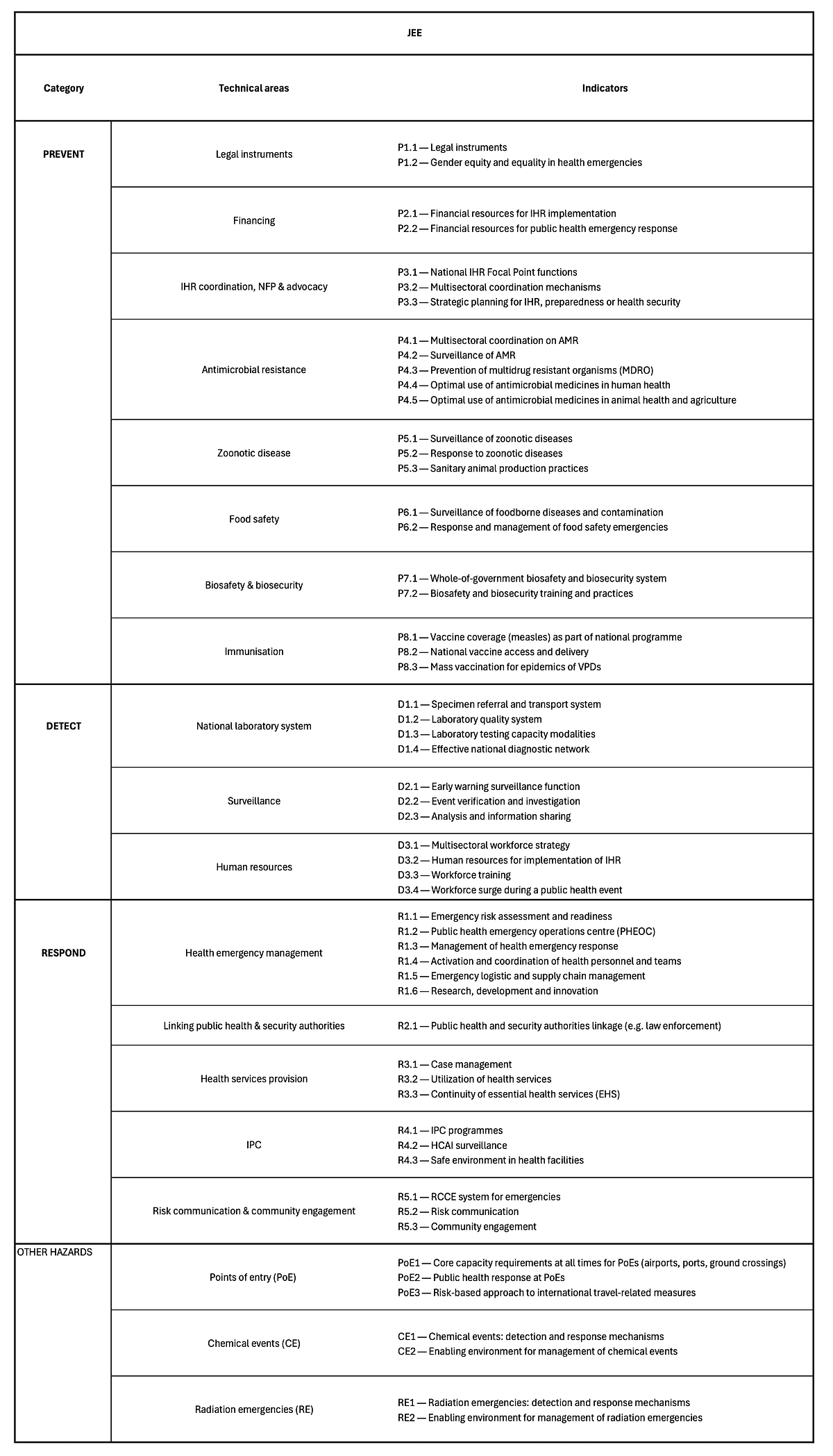
Figure 2. The JEE core capacities and indicators. Source: (1)
❓Interesting findings
- The countries with the best average JEE scores include the US, Canada, Australia, Finland, South Korea, and Japan — see diagram from the paper “Protecting the world from infectious disease threats: now or never” (ironic title, given the timing) by Shahpar et al.
- Countries perform the best (by far) on “immunization” and “surveillance” (see WHO data).
- Countries perform the worst on “biosafety and biosecurity” and “chemical events” (see WHO data).
- The JEE and SPAR scores do correlate, which suggests that the external evaluation and self-reported results by WHO member states are relatively consistent.
I found an article by Jain et al in 2022 summarises the limitations of the JEE pretty well…
- They analysed a total of 96 JEE reports.
- Like SPAR, better JEE scores did not necessarily translate to better COVID-19 outcomes.
- They fitted different regression models (univariable and multivariable) to see if there was a relationship between JEE scores and (a) COVID-19 deaths (used multivariable analysis to look at deaths at 3, 6, and 12 months into the COVID-19 pandemic) and (b) other communicable disease deaths.
- Like with the SPAR, they concluded that the JEE didn’t adequately predict COVID-19 outcomes as well as it did outcomes for other communicable diseases.
- They suggested that this is because the JEE largely measures how well countries can handle known pathogens through diagnostic tests, real-time indicators and surveillance, etc. But the JEE doesn’t focus specifically on things like surge capacity, and availability of rapid-testing which were more relevant with COVID-19.
“While universal health coverage indices (β -0.04 p<0.001) and international tourist arrivals were associated with log communicable disease deaths (β 0.02, p = 0.002), they were not associated with log COVID-19 deaths.
Although the same tool is used to assess capacities for both epidemics and pandemics, the JEE may be better suited to small outbreaks of known diseases, compared to pandemics of unknown pathogens.” — Jain et al in 2022
Lee et al, 2024 further evaluated the predictive accuracy of the JEE.
- They looked at how well the JEE could predict health outcomes for various infectious diseases (including COVID-19, influenza, HIV, TB, malaria, hepatitis B, and pneumonia) across 96 countries.
- The way they measured health outcomes for COVID was by looking at the number of cases, number of deaths, and number of deaths per million as reported by the Worldometer database. For other infectious diseases, they extracted data about deaths from the World Health Rankings and World Health Statistics 2020 (which at the time provided the most recent statistics available).
- TLDR, you would expect that better JEE scores would translate to better national preparedness, and therefore lower fatality rates. But this wasn’t statistically significant (see Figure 3 below) .
- There was a correlation between having a higher JEE score and more COVID-19 infections per million, which likely indicates that better-prepared countries were better at reporting COVID-19 infections due to widespread testing and documentation capabilities.
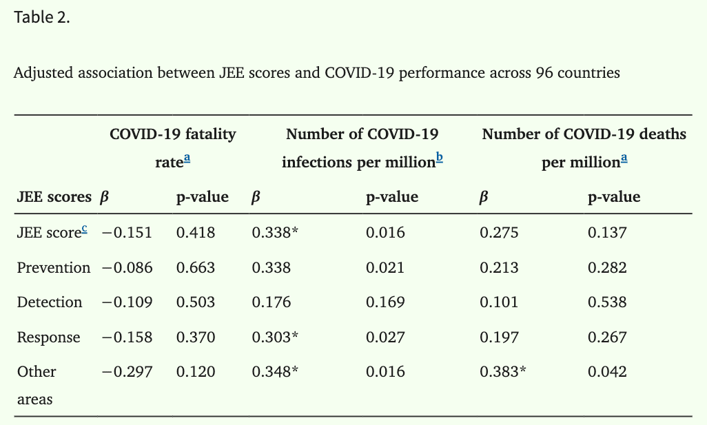
Figure 3. There was no statistically significant relationship between any of the JEE score categories and COVID-19 fatality rate. There was a significant relationship between some of the categories and infections per million / deaths per million, though. P-values are Table 2 in Lee at al, 2024.
- However, much like Jain et al found in 2022, better JEE scores are associated with better outcomes when it comes to some other infectious diseases.
- For instance, higher JEE capacity scores were associated with lower deaths per capita for influence and pneumonia, and better HPV immunisation coverage (see Table 3 from the paper to get a full look at which capacities were correlated).
- That same study also looked at whether other factors that aren’t included in the JEE correlated with infectious disease outcomes — as a way of figuring out how to enhance the JEE’s predictive reliability.
- They found that traits covered by Sustainable Development Goals (SDGs) and the Universal Health Coverage (UHC) index were correlated with better infectious disease outcomes.
- SDGs such as good health and well-being were associated with lower mortality rates for influenza and pneumonia (β=−0.656, p<0.001). Similarly, zero hunger, quality education, and decent work / economic growth were inversely associated with COVID-19 fatality rate.
- UHC indices were not strongly associated with COVID-19 outcomes, but were associated with lower influenza and pneumonia mortality rates.
❓Relevant papers
3️⃣ Global Health Security (GHS) Index
❓Background
- Developed by WHO, used from 2019 onwards.
- Measures how well countries can prevent, detect, and respond to an epidemic or pandemic.
❓How is it calculated?
The GHS rates the following across 195 countries (see Figure 4 and Figure 5 below for more details on each category):
- Prevention
- Detection & reporting
- Rapid response
- Health systems
- Norms
- Risk environment
For all categories, countries are scored between 0 to 100 where 100 is the most favourable score.
❓Interesting findings
- Virtually none of the scores changed between 2019–2021.
- And the majority of countries didn’t do well with any of the metrics in either report.
- The worst struggle was with prevention.
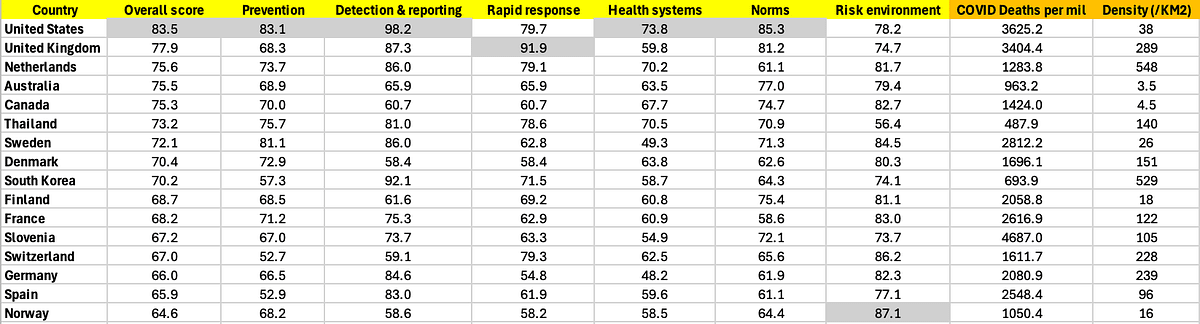
Figure 4. Table listing the top 10 countries with the highest ‘overall’ GHS scores, per the 2019 GHS report. I also added the number of COVID deaths per million, as reported by ‘Our World in Data’. In the last column I added each country’s population density per Km² (not weighted), just to provide a rough idea of population clustering.
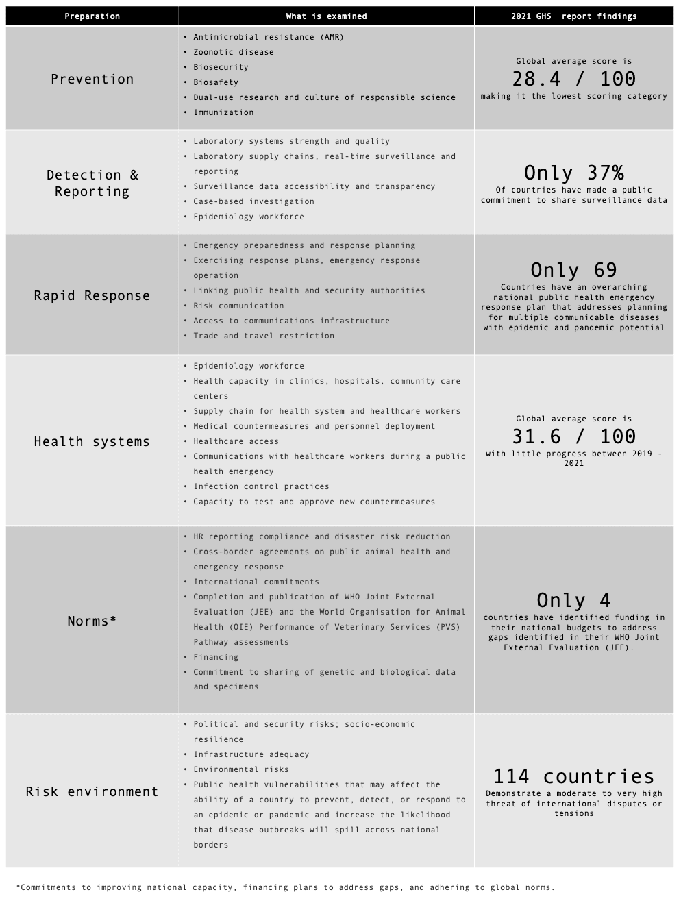
Figure 5. Summary of the metrics examined, and some findings for each category in the GHS 2021 report.
The GHS 2019 report highlighted Thailand as a particularly good example of a low-and-middle-income country that was pandemic-prepared — being the only non-high-income country that had an overall score above 66.7 / 100.
- When this was put to the test during COVID, Thailand indeed fared pretty well .
- Thailand was among the first countries to be afflicted by COVID.
- They also faced a pretty intense wave of anti-lockdown protests in the early stages of the pandemic.
- Despite this, all the sources I found suggest they faced under 500 deaths per million (see Wikipedia, OurWorldInData, Grokipedia).
- That’s en par with countries like Iceland, which has a population that’s about 200X smaller with WAY less dense cities to handle.
❓Relevant papers
4️⃣ Dynamic Preparedness Metric
❓Background
- Developed by WHO, used from 2022 onwards.
- Measures a country’s hazard, vulnerability, and capacity to cope with a pandemic…focussing on 5 specific syndromes.
- Intended to improve on other composite metrics, by being more frequently updated with publicly available (open-source) data.
❓How is it calculated?
The DPM framework assesses the preparedness of countries to five specific disease syndromes:
- Respiratory
- Diarrhoeal
- Neurological
- Haemorrhagic
- Acute febrile syndromes in an initial phase
Preparedness is quantified using three dimensions, measured from 1 to 5 where 5 represents the lowest risk (see Figure 6 below for more detail):
- Hazard (severity, probability)
- Vulnerability (socioeconomic vulnerability, population vulnerability, climate change and ecosystem)
- Capacity (infrastructural and institutional capacity, health systems for health security)
“The DPM is a composite measure that provides preparedness risks for five syndromes for all 196 State Parties […] using multisector open-source data to perform up-to-date contextual assessments.”
“The potential pathways of spread and the impact on society for each syndrome are heterogeneous; thus, the preparedness capacities and actions needed to contain each syndrome are specific.”
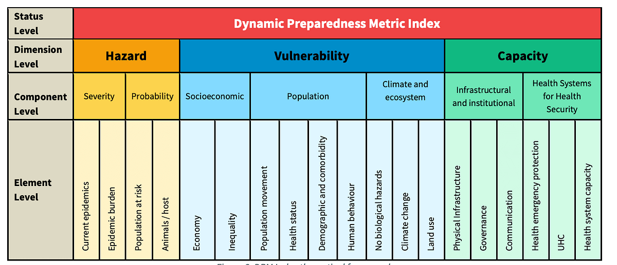
Figure 6. Taken from the Dynamic Preparedness Metric methodology report by the WHO, figure 3 on page 6.
❓Interesting findings
A 2025 analysis by Vernaccini et al examined the DPM indices across 196 States Parties, across the following six WHO regions (see Figure 7 and Figure 8 below):
- WPR: Western Pacific Region
- SEAR: South-East Asia Region
- EUR: European Region
- EMR: Eastern Mediterranean Region
- AMR: Region of the Americas
- AFR: African Region
At a high level, their analysis indicated that 46% of the world’s population is at risk of health emergencies across all syndromes covered in the DPM index.
Africa (AFR) had the largest percentage (57%) of the population at risk, while South-East Asia (SEAR) had the largest absolute number of people at risk (1.1 billion, 51%).
The syndromes of greatest risk for each region were:
- EMR, EUR, WPR, SEAR: Respiratory syndrome
- AMR: Neurological syndrome
- AFR: Diarrhoeal syndrome
The American (AMR) and Western Pacific (WPR) regions showed the greatest variability in hazard scores.
“in [The Americas], 25 countries (71%) had a score of four or above for diarrhoeal syndromes, yet only 18 (51%) had the same score for neurological syndromes.”
Most countries (93%) in Europe (EUR) saw a decrease in their DPM scores (i.e increased risk) between 2018–2021.
In EUR, the main risk factors are related to urbanization, the elderly population with comorbidities, and international movements.
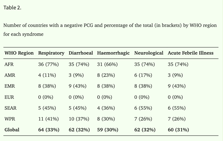
Figure 7. Different WHO regions and the % that have a Preparedness Capacity Gap (PCG). This metric combines the three DPM dimensions. The difference between a country’s capacity and threat is the PCG, where negative values correspond to a preparedness gap. Table 2 in Vernaccini et al.
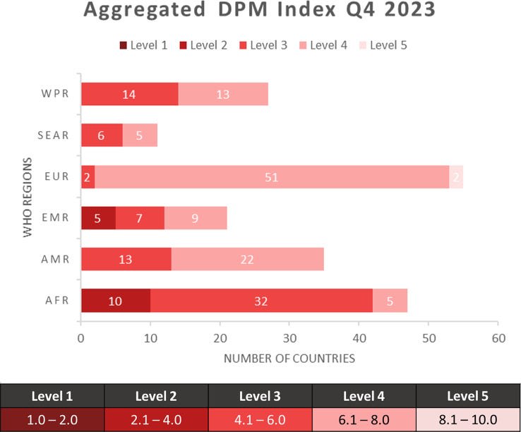
Figure 8. Breakdown of the DPM scores for countries, aggregated per WHO region. Taken from Figure 1 in Vernaccini et al.
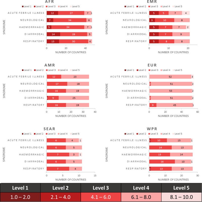
Figure 9. Breakdown of DPM scores, by syndrome, for different WHO regions. Taken from Figure 2 in Vernaccini et al.
❓Relevant papers
2022 paper — Dynamic preparedness metric: a paradigm shift to measure and act on preparedness
2024 WHO report — Dynamic preparedness metric: methodology report
2025 paper — The dynamic preparedness metric: results from a global and regional analysis of health emergency preparedness
🦠 My personal main takeaways…
- Europe seems to be the best prepared for a pandemic / lowest risk across the SPAR, JEE, GHSI and DPM.
- Africa seems the least prepared for a pandemic / highest risk by most available metrics, across the SPAR, JEE, and DPM.
- Overall, better scores across these metrics translate to better epidemic outcomes.
- Low income countries seem to be improving in disease preparedness over time.
- However, most countries globally perform poorly in the GHS metric, and they didn’t see any significant improvement between 2019–2021.
- Implementing safety standards seems tough for countries to do well. By comparison, the world seems to be good at running vaccination programs nowadays.
- For the Eastern Mediterranean region, Europe, Western Pacific, and South-East Asia, respiratory diseases present the biggest risk.
- The SPAR and JEE frameworks so far seem limited in their utility for predicting fatality rate in an unknown, novel pandemic situation (see: COVID-19).
- Metrics of pandemic preparedness like the SPAR and JEE could stand to improve from incorporating information about social dynamics. Especially the SPAR, since countries in the WHO have to be assessed by that framework.

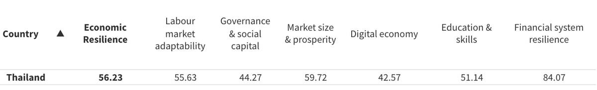 CERI index row for Thailand (