Comments
appreciate the public accountability here!
appreciate the public accountability here!
Thanks for sharing, super interesting!
The organization-wide Brier score (measuring both calibration and resolution) is .217, which is somewhat better than chance (.250). This requires careful interpretation, but in short we think that our reasonably good Brier score is mostly driven by good calibration, while resolution has more room for improvement (but this may not be worth the effort). [more]
Another explanation for the low resolution, besides the limited time you spend on the forecasts, might be that you chose questions that you are most uncertain about (i.e. that you are around 50% certain about resolving positively), right?
This is something I noticed when making my own forecasts. To remove this bias I sometimes use a dice to chose the number for questions like
By Jan 1, 2018,the grantee will have staff working in at least [insert random number from a reasonable range] European countries
Interesting, thanks for sharing that trick!
Our forecasting questions are indeed maximally uncertain in some absolute sense because our base rate is ~50%, but it may also be the case that they're particularly uncertain to the person making the prediction as you suggest.
This is a great exercise. I am definitely concerned about the endogenous nature of predictions: I think you are definitely right that people are more likely to offer predictions on the aspects of their project that are easier to predict, especially since the prompt you showed explicitly asks them in an open-ended way. A related issue is that people may be more comfortable making predictions about less important aspects of the project, since the consequences of being wrong are lower. If this is happening, then this forecasting accuracy wouldn't generalize at all.
Both of these issues can be partly addressed if the predictions are solicited by another person reading the writeup, rather than chosen by the writer. For example, Alice writes up an investigation into human challenge trials as a strategy for medical R&D, Bob reads it and asks Alice for some predictions that he feels are important to complementing the writeup e.g. "will human challenge trials be used for any major disease by the start of 2023?" and "will the US take steps to encourage human challenge trials by the start of 2024?"
This obviously helps avoid Alice making predictions about only easier questions, and it also ensures that the predictions being made are actually decision-relevant (since they are being solicited by someone else who serves the role of an intelligent layperson/policymaker reading the report). Seems like a win-win to me.
A related issue is that people may be more comfortable making predictions about less important aspects of the project, since the consequences of being wrong are lower
I'm actually concerned about the same thing but for exactly the opposite reason, i.e. that because the consequences of being wrong (a hit to one's Brier score) are the same regardless of the importance of the prediction people might allocate the same time and effort to any prediction, including the more important ones that should perhaps warrant closer examination.
We're currently trialing some of the stuff you suggest about bringing in other people to suggest predictions. This might be an improvement, but it's too early to say, and scaling it up wouldn't be easy for a few reasons:
There are several different sorts of systematic errors that you could look for in this kind of data, although checking for them requires including more features of each prediction than the ones that are here.
For example, to check for optimism bias you'd want to code whether each prediction is of the form "good thing will happen", "bad thing will happen", or neither. Then you can check if probabilities were too high for "good thing will happen" predictions and too low for "bad thing will happen" predictions. (Most of the example predictions were "good thing will happen" predictions, and it looks like probabilities were not generally too high, so probably optimism bias was not a major issue.)
Some other things you could check for:
We do track whether predictions have a positive ("good thing will happen") or negative ("bad thing will happen") framing, so testing for optimism/pessimism bias is definitely possible. However, only 2% of predictions have a negative framing, so our sample size is too low to say anything conclusive about this yet.
Enriching our database with base rates and categories would be fantastic, but my hunch is that given the nature and phrasing of our questions this would be impossible to do at scale. I'm much more bullish on per-predictor analyses and that's more or less what we're doing with the individual dashboards.
Thanks for sharing this! I've been forecasting myself for 5 months now (got 1005 resolved predictions so far), and I adopted a slightly different strategy to increase the number of samples: I only predict in the range [50%-100%]. After all, there doesn't seem to be any probabilistically or cognitively relevant difference between [predicting X will happen with 20% probability] and [not-X will happen with 80% probability]
What do you folks think about this?
Thanks! That's a reasonable strategy if you can choose question wording. I agree there's no difference mathematically, but I'm not so sure that's true cognitively. Sometimes I've seen asymmetric calibration curves that look fine >50% but tend to overpredict <50%. That suggests it's easier to stay calibrated in the subset of questions you think are more likely to happen than not. This is good news for your strategy! However, note that this is based on a few anecdotal observations, so I'd caution against updating too strongly on it.
Thanks for your reply. The possibility of asymmetry suggests even more that we shouldn't predict in the whole [0%-100%] range, but rather stick to whatever half of the interval we feel more comfortable with. All we have to do is to get in the habit of flipping the "sign" of the question (i.e, taking the complement of the sample space) when needed, which usually amounts to adding the phrase "It's not the case that" in front of the prediction. This leads to roughly double the number of samples per bin, and therefore more precise estimates of our calibration. And since we have to map an event to a set that is now half the size it was before, it seems easier for us to get better at it over time.
Do you see any reason not to change Open Philanthropy's approach to forecasting besides the immense logistic effort this implies?
I echo the props; what a great way to live up to your name!
Thanks!
On Number 3's criticism, that's just using approximated Solonomoff Induction, which is indeed a vaild method. Of course, we do have biases that lead us astray, which is the problem with Solonomoff Induction.
What kinds of predictions do we make? Here are some examples:
Who suggests the outcomes that are predicted? Are these taken from the application or from a predefined set? Are you keeping/updating a database of outcomes that you try to achieve (e. g. complementary aspects of long-term wellbeing and security)?
How do you combine the estimates? Is there a function or conditional expression?
Considering the unparalleled computing power and breadth of prioritized knowledge of the human brain, would it be better to use intuition of the grant managers? Especially since the quantification depends on expert insights so does not avoid subjectivity.
Does the engagement of multiple evaluators reduce biases when quantifications are used? Human group dynamic navigation[1] in qualitative discussions can optimize for accuracy. Discussants perceive others' expertise and make complex weighing of everyone's' perspectives, while developing these viewpoints.[2]
A relevant expressive statement can be: Don't get tricked by AI, it is better to be human.
if no threats are present
Individual quantitative estimates can be subject to 'normative' bias, where respondents reply by what is the most appropriate assuming static norms. Discussions can optimize for (collective) problem solving, notwithstanding traditional norms. This could also apply to evaluation of subjective outcomes, such as 'has the grantee influenced expert X well?'


When investigating a grant, Open Philanthropy staff often make probabilistic predictions about grant-related outcomes they care about, e.g. “I’m 70% confident the grantee will achieve milestone #1 within 1 year.” This allows us to learn from the success and failure of our past predictions and get better over time at predicting what will happen if we make one grant vs. another, pursue one strategy vs. another, etc. We hope that this practice will help us make better decisions and thereby enable us to help others as much as possible with our limited time and funding.[1]
Thanks to the work of many people, we now have some data on our forecasting accuracy as an organization. In this blog post, I will:
Grant investigators at Open Philanthropy recommend grants via an internal write-up. This write-up typically includes the case for the grant, reservations and uncertainties about it, and logistical details, among other things. One of the (optional) sections in that write-up is reserved for making predictions.
The prompt looks like this (we’ve included sample answers):
Do you have any new predictions you’re willing to make for this grant? […] A quick tip is to scan your write-up for expectations or worries you could make predictions about. […]
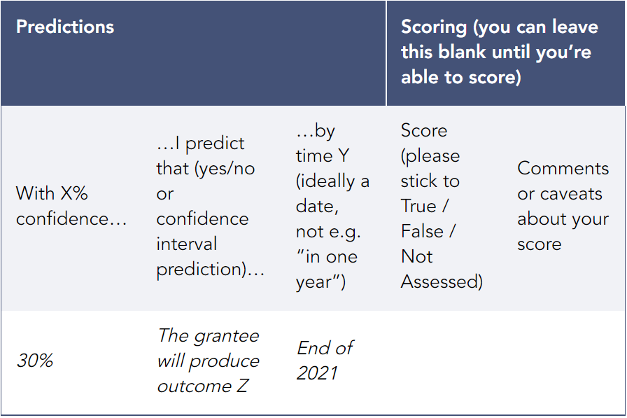
After a grant recommendation is submitted and approved, the predictions in that table are logged into our Salesforce database for future scoring (as true or false). If the grant is renewed, scoring typically happens during the renewal investigation phase, since that’s when the grant investigator will be collecting information about how the original grant went. If the grant is not renewed, grant investigators are asked to score their predictions after they come due.[2] Scores are then logged into our database, and that information is used to produce calibration dashboards for individual grant investigators and teams of investigators working in the same focus area.
A user’s calibration dashboard (in Salesforce) looks like this:
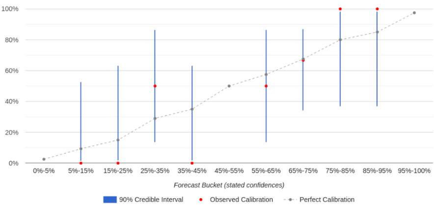
The calibration curve tells the user where they are well-calibrated vs. overconfident vs. underconfident. If a forecaster is well-calibrated for a given forecast “bucket” (e.g. forecasts they made with 65%-75% confidence), then the percent of forecasts that resolved as “true” should match that bucket’s confidence level (e.g. they should have come true 65%-75% of the time). On the chart, their observed calibration (the red dot) should be close to perfect calibration (the gray dot) for that bucket.[3] If it’s not, then the forecaster may be overconfident or underconfident for that bucket — for example, if things they predict with 65%-75% confidence happen only 40% of the time (overconfidence). (A bucket can also be empty if the user hasn’t made any forecasts within that confidence range.)
Each bucket also shows a 90% credible interval (the blue line) that indicates how strong the evidence is that the forecaster’s calibration in that bucket matches their observed calibration, based on how many predictions they’ve made in that bucket. As a rule of thumb, if the credible interval overlaps with the line of perfect calibration, that means there’s no strong evidence that they are miscalibrated in that bucket. As a user makes more predictions, the blue lines shrink, giving that user a clearer picture of their calibration.
In the future, we hope to add more features to these dashboards, such as more powerful filters and additional metrics of accuracy (e.g. Brier scores).
2.1 Key takeaways
2.2 How many predictions have we made?
As of March 16, 2022, we’ve made 2850 predictions. Of the 1345 that are ready to be scored, we’ve thus far assessed 743 of them as true or false. (Many “overdue” predictions will be scored when the relevant grant comes up for renewal.) Further details are in a footnote.[4]
What kinds of predictions do we make? Here are some examples:
Some focus areas[5] are responsible for most predictions, but this is mainly driven by the number of grant write-ups produced for each focus area. The number of predictions per grant write-up ranges from 3 to 8 and is similar across focus areas. Larger grants tend to have more predictions attached to them. We averaged about 1 prediction per $1 million moved, with significant differences across grants and focus areas.
2.3 Calibration
Good predictors should be calibrated. If a predictor is well-calibrated, that means that things they expect to happen with 20% confidence do in fact happen roughly 20% of the time, things they expect with 80% confidence happen roughly 80% of the time, and so on.[6] Our organization-wide calibration curve looks like this:
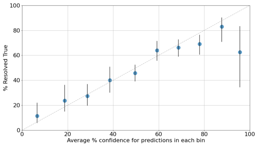
To produce this plot, prediction confidences were binned in 10% increments. For example, the leftmost dot summarizes all predictions made with 0%-10% confidence. It appears at the 6% confidence mark because that’s the average confidence of predictions in the 0%-10% range, and it shows that 12% of those predictions came true. The dashed gray line represents perfect calibration.
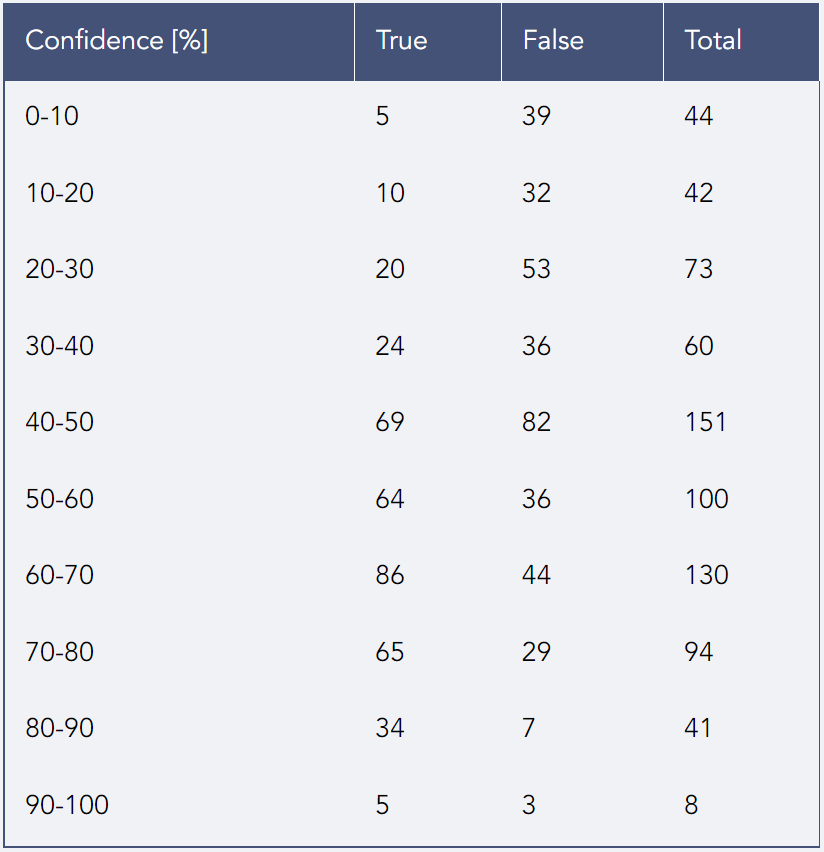
The vertical black lines are 90% credible intervals around the point estimates for each bin. If the bar is wider, that generally means we’re less sure about our calibration for that confidence range because we have fewer data points in that confidence range.[7] All the bins have at least 40 resolved predictions except the last one, which only has 8 – hence the wider interval. A table with the number of true / false predictions in each bin can be found in a footnote.[8]
The plot shows that Open Philanthropy is reasonably well-calibrated as a whole, except for predictions we made with 90%+ confidence (those events only happened slightly more than half the time) and possibly also in the 70%-80% range (those events happened slightly less than 70% of the time). In light of this, the “typical” Open Phil predictor should be less bold and push predictions that feel “almost certain” towards a lower number.[9]
2.4 Brier scores and resolution
On top of being well calibrated, good predictors should give high probability to events that end up happening and low probability to events that don’t. This isn’t captured by calibration. For example, imagine a simplified world in which individual stocks go up and down in price but the overall value of the stock market stays the same, and there aren’t any trading fees. In this world, one way to be well-calibrated is to make predictions about whether randomly chosen stocks will go up or down over the next month, and for each prediction just say “I’m 50% confident it’ll go up.” Since a randomly chosen stock will indeed go up over the next month about 50% of the time (and down the other 50% of the time), you’ll achieve perfect calibration! This good calibration will spare you from the pain of losing money, but it won’t help you make any money either. However, you will make lots of money if you can predict with 60% (calibrated) confidence which stocks will go up vs. down, and you’ll make even more money if you can predict with 80% calibrated confidence which stocks will go up vs. down. If you could do that, then your stock predictions would be not just well-calibrated but also have good “resolution.”
A metric that captures both aspects of what makes a good predictor is the Brier score (also explained in a footnote[10]). The most illustrative examples are:
The mean Brier score across all our predictions is 0.217, and the median is 0.160. (Remember, lower is better.) 75% of focus area Brier scores are under 0.25 (i.e. they’re better than chance).[11]
This rather modest[12] Brier score together with overall good calibration implies our forecasts have low resolution.[13] Luke’s intuition on why there’s a significant difference in performance between these two dimensions of accuracy is that good calibration can probably be achieved through sheer reflection and training, just by being aware of the limits of one’s own knowledge, whereas resolution requires gathering and evaluating information about the topic at hand and carefully using it to produce a quantified forecast, something our grant investigators aren’t typically doing in much detail (most of our forecasts are produced in seconds or minutes). If this explanation is right, getting better Brier scores would require spending significantly more time on each forecast. We’re uncertain whether this would be worth the effort, since calibration alone can be fairly useful for decision-making and is probably much less costly to achieve, and our grant investigators have many other responsibilities besides making predictions.
2.5 Longer time horizons don’t hurt accuracy
Almost half of all our predictions are made less than 2 years before they will resolve (e.g. the prediction might be “X will happen within two years”),[14] with ~75% being less than 3 years out. Very few predictions are about events decades into the future.
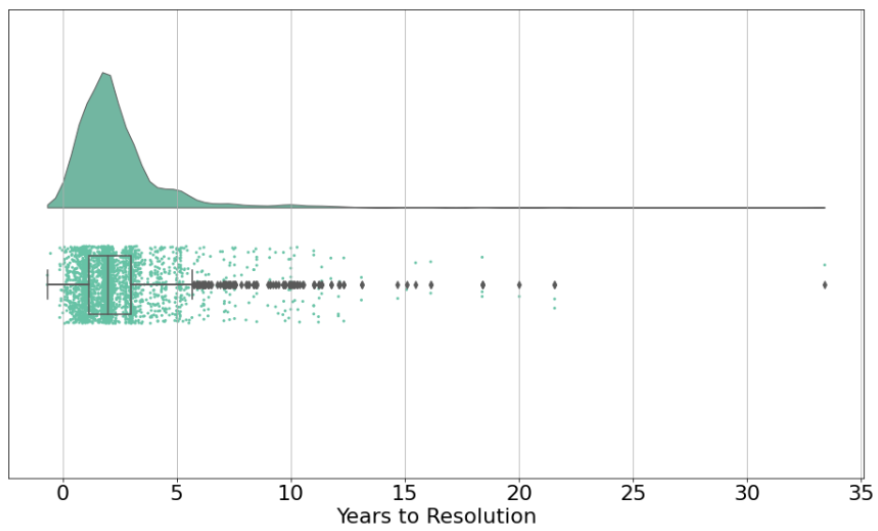
It’s reasonable to assume that (all else equal) the longer the time horizon, the harder it is to make accurate predictions.[15] However, our longer-horizon forecasts are about as accurate as our shorter-horizon forecasts.
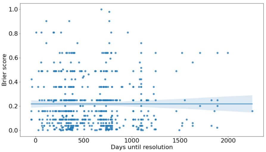
One possible explanation is question selection. Grant investigators may be less willing to produce long-range forecasts about things that are particularly hard to predict because the inherent uncertainty looks insurmountable. This may not be the case for short-range forecasts, since for these most of the information is already available.[16] In other words, we might be choosing which specific things to forecast based on how difficult we think they are to forecast regardless of their time horizon, which could explain why our accuracy doesn’t vary much by time horizon.
There are several reasons why our data and analyses could be biased. While we don’t think these issues undermine our forecasting efforts entirely, we believe it’s important for us to explain them in order to clarify how strong the evidence is for any of our claims. The main issues we could identify are:
Here is a fuller list of reasons we make explicit quantified forecasts and later check them for accuracy, as described in an internal document by Luke Muehlhauser:
In some rare cases, it’s possible for the people managing the database to score predictions using information available to them. However, predictions tend to be very in-the-weeds, so scoring them typically requires input from the grant investigators who made them.
The horizontal coordinate of the gray dots is calculated by averaging the confidence of all the predictions in each bin. Note that this is in general different from the midpoint of the bin; for example, if there are only two predictions in the 45%-55% bin and they have 46% and 48% confidence, respectively, then the point of perfect calibration in that bin would be 47%, not 50%.
This footnote produced errors in the Forum editor — read it here.
We’re leaving out focus areas with less than $10M moved in the subsequent analyses. The excluded focus areas are South Asian Air Quality, History of Philanthropy, and Global Health and Wellbeing.
This sentence and some other explanatory language in this report are borrowed from an internal guide about forecasting written by Luke Muehlhauser.
These intervals assume a uniform prior over (0, 1). This means that, for a bin with T true predictions and F false predictions, the intervals are calculated using a Beta(T+1, F+1) distribution.
Detailed calibration data for each bin are provided below. Note that intervals are open to the left and closed to the right; a 30% prediction would be included in the 20-30 bin, but a 20% prediction would be included in the 10-20 bin.
However, given that there is high variance in calibration across predictors, this may not be the best idea in all cases. For personal advice, predictors may wish to refer to their own calibration curve, or their team’s curve.
This footnote produced errors in the Forum editor — read it here.
A score of 0.25 is a reasonable baseline in our case because the base rate for past predictions happens to be very close to 50%. This means that predictors in the future could state 50% confidence on all predictions and, assuming the base rate stays the same (i.e. the population of questions that predictors sample from is stable over time), get close to perfect calibration without achieving any resolution.
For comparison, first-year participants in the Good Judgment Project (GJP) that were not given any training got a score of 0.21 (appears as 0.42 in table 4 here; Tetlock et al. scale their Brier score such that, for binary questions, we’d need to multiply our scores by 2 to get numbers with the same meaning). The Metaculus community averages 0.150 on binary questions as of this writing (May 2022). Both comparisons have very obvious caveats: the population of questions on GJP or Metaculus is very different from ours and both platforms calculate average Brier scores over time, taking into account updates to the initial forecast, while our grant investigators only submit one forecast and never try to refine it later.
For a base rate of 50%, resolution ranges from 0 (worst) to 0.25 (best). OP’s resolution is 0.037.
A caveat about this data: I’m taking the difference between ‘End Date’ (i.e. when a prediction is ready to be assessed) and ‘Investigation Close Date’ (the date the investigator submitted their request for conditional approval). This underestimates the time span between forecast and resolution because predictions are made before the investigation closes. This explains the fact that some time deltas are slightly negative. The most likely explanation for this is that the grant investigator wrote the prediction long before submitting the write-up for conditional approval.
This is in line with evidence from GJP and (less so) Metaculus showing that accuracy drops as time until question resolution increases. However, note that the opposite holds for PredictionBook, i.e. Brier scores tend to get better the longer the time horizon. Our working hypothesis to explain this paradoxical result is that, when users get to select the questions they forecast on (as they do on PredictionBook), they will only pick “easy” long-range questions. When the questions are chosen by external parties (as in GJP), they tend to be more similar in difficulty across time horizons. Metaculus sits somewhere in the middle, with community members posting most questions and opening them to the public. We may be able to test this hypothesis in the future by looking at data from Hypermind, which should fall closer to GJP than to the others because questions on the platform are commissioned by external parties.
This selection effect could come about through several mechanisms. One such mechanism could be picking well-defined processes more often in long-range forecasts than in short-range ones. In those cases, what matters is not the calendar time elapsed between start and end but the number and complexity of steps in the process. For example, a research grant may contain predictions about the likely output of that research (some finding or publication) that can’t be scored until the research has been conducted. If the research was delayed for some reason, or if it happens earlier than expected due to e.g. a sudden influx of funding, that doesn’t change the intrinsic difficulty of predicting anything about the research outcomes themselves.
Minor point, but I disagree with the unqualified claim of being well calibrated here except for the 90% bucket, at least a little.
Weak evidence that you are overconfident in each of the 0-10, 10-20, 70-80, 80-90 and 90%+ buckets is decent evidence of an overconfidence bias overall, even if those errors are mostly individually within the margin of error.
Very good point!
I see a few ways of assessing "global overconfidence":
(+)sign next toDetails). A score between 0 and 1 indicates overconfidence. Open Phil's score is 0.175, so this is evidence that we're overconfident. I don't know how to put a meaningful confidence/credible interval on that number, so it's hard to say how strong this evidence is.One thing to note here is it is plausible that your errors are not symmetric in expectation, if there's some bias towards phrasing questions one way or another (this could be something like frequently asking "will [event] happen" where optimism might cause you to be too high in general, for example). This might mean assuming linearity could be wrong.
This is probably easier for you to tell since you can see the underlying data.
I haven't seen a rigorous analysis of this, but I like looking at the slope, and I expect that it's best to include each resolved prediction as a separate data point. So there would be 743 data points, each with a y value of either 0 or 1.
I'm probably missing something but doesn't the graph show OP is under-confident in the 0-10 and 10-20 bins? e.g. those data points are above the dotted grey line of perfect calibration where the 90%+ bin is far below?
I think overconfident and underconfident aren't crisp terms to describe this. With binary outcomes, you can invert the prediction and it means the same thing (20% chance of X == 80% chance of not X). So being below the calibration line in the 90% bucket and above the line in the 10% bucket are functionally the same thing.
I'm using overconfident here to mean closer to extreme confidence (0 or 100, depending on whether they are below or above 50%, respectively) than they should be.