Hide table of contents

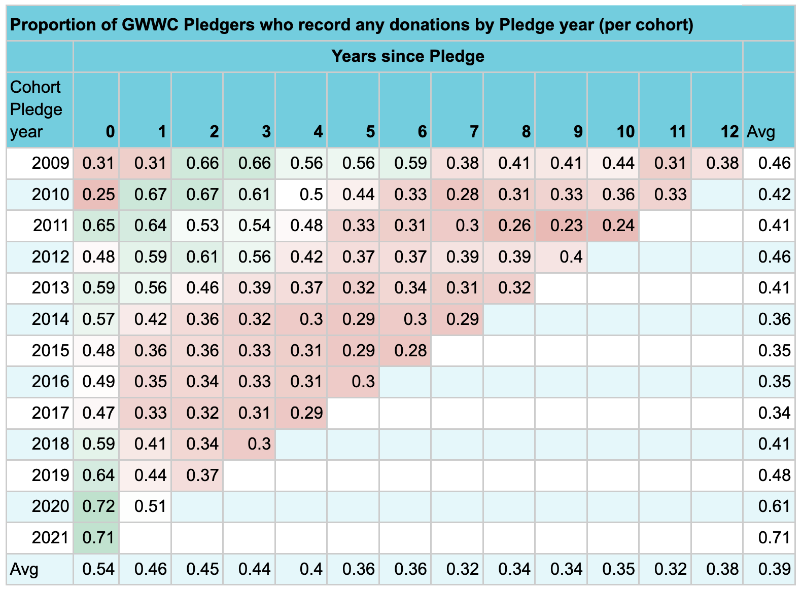
A few weeks ago Giving What We Can published their impact evaluation. As an organization that supports people in making long term altruistic commitments, the question of how much people stick to those commitments is pretty important. We don't know what people are actually doing, but whether they're reporting donations to GWWC is a decent proxy, and the evaluation includes a table of how many members were still reporting donations:

This is interesting data, but I found it a bit hard to think about. I tried a few ways of visualizing it, and made a pair of charts:

code

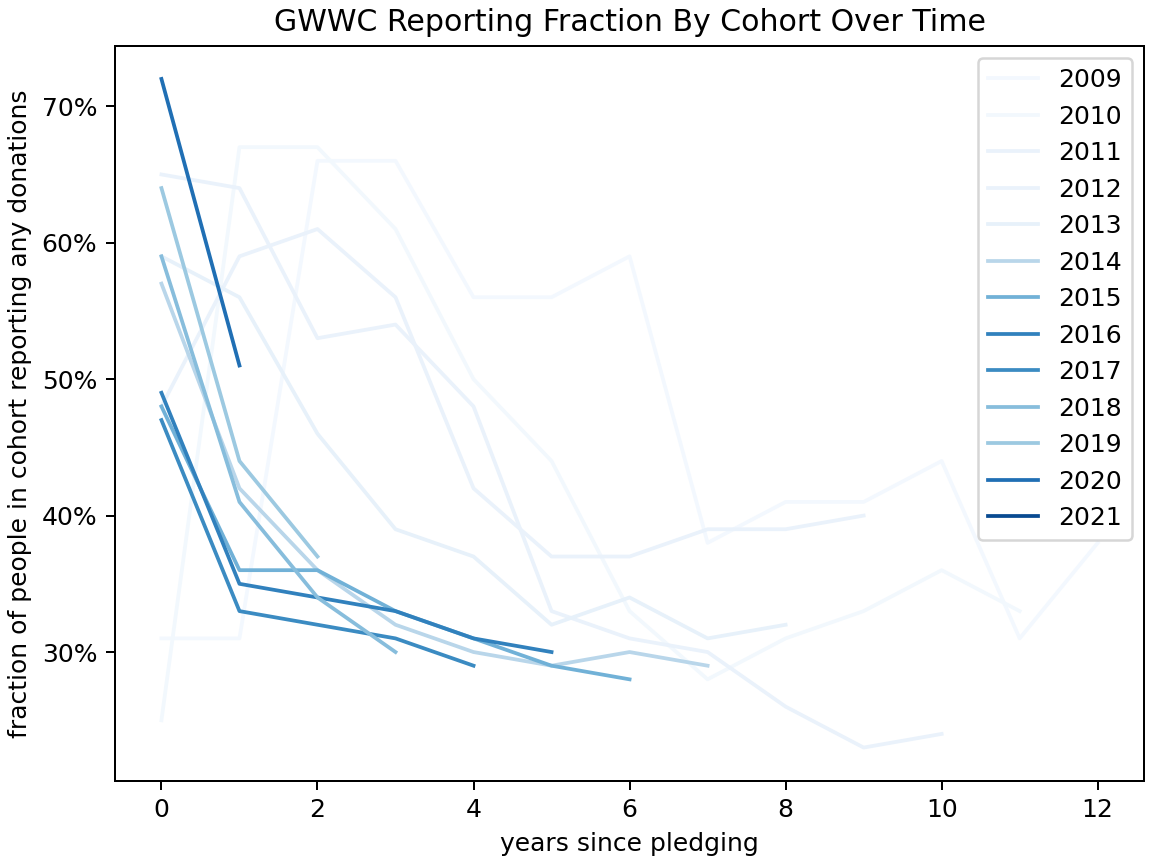
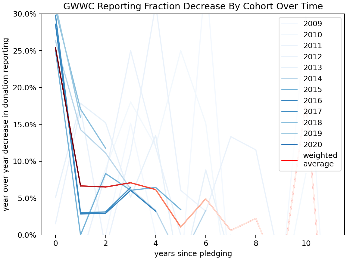
I colored each line with an intensity proportional to the number of people in the cohort, since that represents how much information it represents. The weighted average line fades out over time as it represents progressively fewer members.

Some thoughts, looking at the charts:

  • Later cohorts, starting around 2015, fall off faster than earlier cohorts.

  • Reporting attrition is quite sharp at first, and then slows down, but it doesn't go to zero.

  • After the initial attrition it seems to end up around 2-6% annually, though this depends a lot on where you see "initial attrition" ending.

  • There's probably some sort of effect of the calendar year ("how hard did GWWC push people to report donations") and I haven't looked at this.

Disclosure: my wife used to be President of GWWC. I haven't run this post by her and I don't know her views here. I shared a draft of with GWWC before posting.

47

0
0

Reactions

0
0
Comments10


Sorted by Click to highlight new comments since:

As a datapoint - I haven't got round to reporting my donations for a few years.

Yeah, I also don't report despite continuing to make my pledge donations. It doesn't feel like a core part of the pledge to me.

Same, I also decided my comparative advantage isn't to give to registered charities but to more idiosyncratic one-off stuff (though this isn't always enough to add up to 10%)

It doesn't feel like a core part of the pledge to me.

I mean, reporting isn't (and hasn't been) part of the pledge while giving is, so that makes sense!

I recognise that I can use part of my income to do a significant amount of good. Since I can live well enough on a smaller income, I pledge that from __ until __ I shall give __ to whichever organisations can most effectively use it to improve the lives of others, now and in the years to come. I make this pledge freely, openly, and sincerely.

I have also barely reported, despite keeping the pledge for 10 years. Will finally get my reckoning with missing out on the pin though...

Thanks for writing this! I've been wondering about these numbers for a while, and it's nice to see that retention is higher than I feared (for such a weighty commitment w/no serious enforcement). 

This is also a good reminder for me to update the last few years of my GWWC records next time I donate, since I've become part of the problem :-(

It's interesting that the year 0 reporting rate has changed so much recently. I wonder if there is less focus on students?

I think it's also that more people report by default in year 0 because more new pledgers use the donation platform (thus reporting donations automatically) rather than doing manual reporting.

Makes sense, good point!

Eyeballing the chart, it seems like more than a "years since pledge" dependence, there's a "actual year" dependence independent of the pledge year, at least after year 0. The most stark change is from 2010 to 2011, when reporting rates increased significantly for both of the first two cohorts. I'm guessing that this is due to some technicality rather than an actual behavior change. There also seems to be a significant decay across all cohorts from 2015 to 2016 that would likely be even more obvious if plotted. Maybe this also has a boring explanation, or maybe it has to do with identifiable events in 2016.

Curated and popular this week
Paul Present
 ·  · 28m read
 · 
Note: I am not a malaria expert. This is my best-faith attempt at answering a question that was bothering me, but this field is a large and complex field, and I’ve almost certainly misunderstood something somewhere along the way. Summary While the world made incredible progress in reducing malaria cases from 2000 to 2015, the past 10 years have seen malaria cases stop declining and start rising. I investigated potential reasons behind this increase through reading the existing literature and looking at publicly available data, and I identified three key factors explaining the rise: 1. Population Growth: Africa's population has increased by approximately 75% since 2000. This alone explains most of the increase in absolute case numbers, while cases per capita have remained relatively flat since 2015. 2. Stagnant Funding: After rapid growth starting in 2000, funding for malaria prevention plateaued around 2010. 3. Insecticide Resistance: Mosquitoes have become increasingly resistant to the insecticides used in bednets over the past 20 years. This has made older models of bednets less effective, although they still have some effect. Newer models of bednets developed in response to insecticide resistance are more effective but still not widely deployed.  I very crudely estimate that without any of these factors, there would be 55% fewer malaria cases in the world than what we see today. I think all three of these factors are roughly equally important in explaining the difference.  Alternative explanations like removal of PFAS, climate change, or invasive mosquito species don't appear to be major contributors.  Overall this investigation made me more convinced that bednets are an effective global health intervention.  Introduction In 2015, malaria rates were down, and EAs were celebrating. Giving What We Can posted this incredible gif showing the decrease in malaria cases across Africa since 2000: Giving What We Can said that > The reduction in malaria has be
Rory Fenton
 ·  · 6m read
 · 
Cross-posted from my blog. Contrary to my carefully crafted brand as a weak nerd, I go to a local CrossFit gym a few times a week. Every year, the gym raises funds for a scholarship for teens from lower-income families to attend their summer camp program. I don’t know how many Crossfit-interested low-income teens there are in my small town, but I’ll guess there are perhaps 2 of them who would benefit from the scholarship. After all, CrossFit is pretty niche, and the town is small. Helping youngsters get swole in the Pacific Northwest is not exactly as cost-effective as preventing malaria in Malawi. But I notice I feel drawn to supporting the scholarship anyway. Every time it pops in my head I think, “My money could fully solve this problem”. The camp only costs a few hundred dollars per kid and if there are just 2 kids who need support, I could give $500 and there would no longer be teenagers in my town who want to go to a CrossFit summer camp but can’t. Thanks to me, the hero, this problem would be entirely solved. 100%. That is not how most nonprofit work feels to me. You are only ever making small dents in important problems I want to work on big problems. Global poverty. Malaria. Everyone not suddenly dying. But if I’m honest, what I really want is to solve those problems. Me, personally, solve them. This is a continued source of frustration and sadness because I absolutely cannot solve those problems. Consider what else my $500 CrossFit scholarship might do: * I want to save lives, and USAID suddenly stops giving $7 billion a year to PEPFAR. So I give $500 to the Rapid Response Fund. My donation solves 0.000001% of the problem and I feel like I have failed. * I want to solve climate change, and getting to net zero will require stopping or removing emissions of 1,500 billion tons of carbon dioxide. I give $500 to a policy nonprofit that reduces emissions, in expectation, by 50 tons. My donation solves 0.000000003% of the problem and I feel like I have f
LewisBollard
 ·  · 8m read
 · 
> How the dismal science can help us end the dismal treatment of farm animals By Martin Gould ---------------------------------------- Note: This post was crossposted from the Open Philanthropy Farm Animal Welfare Research Newsletter by the Forum team, with the author's permission. The author may not see or respond to comments on this post. ---------------------------------------- This year we’ll be sharing a few notes from my colleagues on their areas of expertise. The first is from Martin. I’ll be back next month. - Lewis In 2024, Denmark announced plans to introduce the world’s first carbon tax on cow, sheep, and pig farming. Climate advocates celebrated, but animal advocates should be much more cautious. When Denmark’s Aarhus municipality tested a similar tax in 2022, beef purchases dropped by 40% while demand for chicken and pork increased. Beef is the most emissions-intensive meat, so carbon taxes hit it hardest — and Denmark’s policies don’t even cover chicken or fish. When the price of beef rises, consumers mostly shift to other meats like chicken. And replacing beef with chicken means more animals suffer in worse conditions — about 190 chickens are needed to match the meat from one cow, and chickens are raised in much worse conditions. It may be possible to design carbon taxes which avoid this outcome; a recent paper argues that a broad carbon tax would reduce all meat production (although it omits impacts on egg or dairy production). But with cows ten times more emissions-intensive than chicken per kilogram of meat, other governments may follow Denmark’s lead — focusing taxes on the highest emitters while ignoring the welfare implications. Beef is easily the most emissions-intensive meat, but also requires the fewest animals for a given amount. The graph shows climate emissions per tonne of meat on the right-hand side, and the number of animals needed to produce a kilogram of meat on the left. The fish “lives lost” number varies significantly by