We'll be posting results from this survey to the frontpage one at a time, since a few people asked us not to share all of them at once and risk flooding the Forum. You can see the full set of results at our sequence.
This post is part of a series on Open Phil’s 2020 survey of a subset of people doing (or interested in) longtermist priority work. See the first post for an introduction and a discussion of the high-level takeaways from this survey. Previous posts discussed the survey’s methodology and background statistics about our respondent pool. This post will discuss the different ways we asked, in this survey, the basic question “What was important in your journey towards longtermist priority work?”, how those different questions gave rise to the different quantitative metrics we referenced in the first post, and the pros and cons of those different metrics.
You can read this whole sequence as a single Google Doc here, if you prefer having everything in one place. Feel free to comment either on the doc or on the Forum. Comments on the Forum are likely better for substantive discussion, while comments on the doc may be better for quick, localized questions.
Summary of Key Background Info
- There were two main sections of the survey where we asked respondents what had impacted their trajectories towards doing longtermist priority work. (More precisely, we asked “What increased your expected positive impact on the world?”):
- In one section, we asked respondents to simply list answers to this question, with some high-level prompting, and then choose the ones they felt were most important. This was called the “Factors” section.
- In the other, we listed 34 specific EA/EA-adjacent organizations, pieces of content, etc., and asked respondents multiple-choice questions about each one. This was called the “Influences” section.
- Based on questions asked in these sections, we calculated different quantitative metrics. There were four metrics aimed at measuring “all-things-considered” impact, and two metrics aimed at measuring how often respondents said positive or negative things about these items.
- There are a variety of pros and cons to each of the impact metrics, insofar as they attempt to measure “all-things-considered” impact. We recommend reading through the linked section to understand the pros and cons. Then, if you aren’t strongly drawn to a different approach, we recommend:
- Using the weighted versions of these metrics — the ones that incorporate our quantitative assessments of the value of each respondents’ career — over the unweighted ones, which treat the same impact on any two respondents as being of equal value. (See the methodology post for more info on what “weighted” means.)
- Among those, giving each of the four impact metrics roughly an equal “vote.”
- Note that we see these metrics, and our results generally, as merely an input to our models about what is having an impact — not as a replacement for them.
Summary of Key Results
Some conclusions based on looking at the metrics (with the approach recommended above, where we use the weighted versions of the metrics but give them each an “equal vote”):
- Before doing this survey, we would have thought it plausible that a small number of community-building efforts would have had >100x more impact on our respondents than the rest of the community-building efforts. But according to the data we gathered, this doesn’t look like the situation. The distribution of impact across efforts looks substantially flatter, though there are still relatively large differences. (see more.)
- Among the 34 EA/EA-adjacent items we explicitly asked about, organizations got 60-70% of the total impact reported by our respondents, pieces of content (books, blog posts, etc.) got 20-30%, and meetup groups/discussion platforms (which includes university and local or national EA groups) got 10-20%. (see more.)
- When “interactions with specific people” (focused on direct interactions, e.g. conversations, not e.g. reading something a person wrote) is additionally introduced into the above categories, the credit breakdown is roughly 40% organizations, 30% specific people, 15% pieces of content, and 10% meetup groups/discussion platforms. This is according to just one metric based on a question about the few largest impacts on each respondent. (see more.)
- There are some individuals who, through these types of interactions (e.g. giving advice, connecting others), have had an impact-according-to-this-metric competitive with whole organizations or the whole works of significant authors. But keep in mind that this is a conclusion reached only by one metric; see here for more thoughts on how to interpret such conclusions.
- Among the organizations, pieces of content, and meetup groups/discussion platforms we explicitly asked about, the ones that seemed to have been most impactful on our respondents robustly, across multiple metrics, were 80,000 Hours, CEA, local and university EA groups, FHI, Nick Bostrom’s works, Eliezer Yudkowsky’s works, and Peter Singer’s works. (see more.)
- A corollary of this is that the impact on our respondents of some individuals’ written work looks to have been on par with, or greater than, the work of whole organizations.
- OpenAI, CFAR, and LessWrong seemed to occupy a “second tier” of impact; they looked to have had as much or more impact than the above according to some metrics (and/or some versions of those metrics), but worse according to others or other versions.
- There was a pattern where organizations, pieces of content, and meetup groups/discussion platforms associated with rationalist ideas tended to get negative responses more often than non-rationalist ones, though there were exceptions. Respondents more frequently said both that they felt negatively about these organizations etc. than others and that these organizations etc. had negatively impacted them. This is distinct from the question of what had the most net impact on our respondents (some of these things had fairly high net impact, regardless). (see more.)
We’re including only a truncated version of our numerical results for these metrics in this public version of the report — the top 10 scorers for each metric. Publicly listing the full results, including those for influences that got a lower score, seems to us to have significant costs. In particular, we’re concerned that making this kind of info public might cause stronger negative impressions of low-scoring orgs etc. to be formed than we think the evidence supports, given the complexity of our survey respondent selection strategy and methodology, and the background context needed to know when various organizations’ programs were most active (and thus most likely to be reported as impactful by our respondents). However, if you think being able to see this data might help you in your work, please get in contact with us (eli.rose@openphilanthropy.org or claire@openphilanthropy.org) and we can discuss versions of it that we might be able to share, though we can’t guarantee anything.
Description of Impact Metrics
Factors Section
The beginning of our survey asks respondents very open-endedly to think of events in their life, since they became teenagers, that they think significantly increased their expected positive impact on the world (relative to that of their peers). Since we selected our respondents for their (according-to-us) high expected positive impact on the world, you could think of this section as asking, “How did you get here? What factors in your life were most important in getting things to the state they’re in now where we’re surveying you?”
We gave a few prompts designed to help our respondents brainstorm answers to this question. Then we asked our respondents to choose, out of the items they had come up with in brainstorming, the four that they felt had most increased their expected positive impact. The text of the questions we asked is as follows. (It comes right after we ask for a brief biography/”origin story” of how the respondent came to be involved in longtermist priority work.)
The next few questions are on the same theme, but are intended to get you brainstorming a bit more about factors which you think significantly increased your expected positive impact on the world, over and above what you think is the “default outcome” for people in your intellectual + socioeconomic peer group.
By “intellectual + socioeconomic peer group,” we mean people with roughly your skills and abilities (but not necessarily altruistic inclinations and interests), who were born in roughly similar situations. Possible examples might include your siblings, or classmates/friends from high school or university. The idea here is to get a rough baseline for outcomes in your life by looking at other people with similar “starting conditions” related to innate abilities and environment, while acknowledging that the attempt will be fairly crude and flawed, and won’t account for other innate qualities that may have caused you to seek out different things from otherwise-similar peers.
- Please try to cast as wide a net as possible here. Don’t limit yourself to influences from within the EA community.
- Please write no more than 1-2 sentences for each factor right now; we’ll ask you to elaborate later about the most important ones.
- If you’re unsure whether to include something, please err on the side of including it. If something had a significant impact on you but you’d prefer not to discuss, please list as “other, prefer not to disclose.” A reminder that if you’d like to share something with us anonymously, you can use <span style="text-decoration:underline;">this form</span>.
- This question is about factors which increased your expected positive impact on the world beyond what you think is the “default outcome” for people in your intellectual + socioeconomic peer group. So, please avoid listing things like “went to university,” or “did well in school” if you think these are also true of most people in your intellectual + socioeconomic peer group. However, if you’re not sure about something, please do err on the side of including it.
- This is a brainstorming exercise; the goal of this series of questions is to come up with a lot of factors, while the next section will ask you to winnow them down to the most important ones, as well as ask about counterfactuals and replaceability ("would another event have had a similar impact if this one didn’t?"). So don’t worry about counterfactuals and replaceability right now.
We’ll ask you about factors that increased your expected positive impact in several broad categories, then give you space to discuss anything else which comes to mind.
First, think back to when you were a teenager. (11-19 years old.) What about that time in your life stands out as important to your expected positive impact? Examples might include something a friend or acquaintance said or did, an interest or hobby you developed, a particular book/blog/article, a commitment or lifestyle change you made, or a particular event or program.
Now think about everything that’s happened since you were 19 years old. (If this doesn’t apply to you, feel free to skip.) What from that time period stands out as important to your expected positive impact? Examples might include any of the above, plus an experience you had or work you did at university or in a job, or being responsible for something like running an event or group.
Which people have been important to your expected positive impact? (If you haven’t already mentioned them above.) We’re particularly interested in people who affected you via direct interaction with you, rather than people who affected you by e.g. writing a book that you read. This could include friends, colleagues, classmates, people you talked to once, people you have ongoing relationships with, etc.
Do any other factors which you haven’t mentioned already seem important?
Now, out of all the factors you came up with, choose 4 factors from among the ones that you feel most increased your expected positive impact[1]. (No need to put them in order. If you came up with fewer than 4 factors overall, just list the ones you have.) Next, we’ll give you a chance to mention anything about those factors you haven’t already. Give each factor a short name, since we'll be referring to them later.
There were 867 listings of top factors overall. That’s not 867 unique factors, since some people listed the same things as one another. But since the question was so open-ended and explicitly designed to not focus on EA/EA-adjacent topics in particular, there was huge variety among these responses. Responses also came at many levels of abstraction: some were specific events like “Conversations with <name>” or ”Medical school,” while others were large categories like “EA community” or stable factors like “Generally altruistic mindset.”
~38% of factor listings corresponded either to specific people or to items listed in our "influences" section — specific EA/EA-adjacent organizations, pieces of EA/EA-adjacent content, and EA/EA-adjacent online or offline meeting areas. We called these categories “specific people,” “orgs,” “works,” and “discussion platforms” for short. I’ll refer to these as “categorized factors.” The remaining ~62% of listings went to uncategorized factors. About 11% of the total number of listings were clearly related to the EA/EA-adjacent community but fell into the uncategorized bucket since they were not specific people or influences (e.g. “EA community” or “conversations with EAs”) . See our analysis of the breakdown below for more information.
Top Factor Listings
Using this data, we calculated the “% of top factor listings” metric for each categorized factor. Conceptually, this is just the number of listings for a given factor divided by the total number of listings for all factors (including uncategorized ones). Calculating the number of listings involved some human discretion, since the answers were given in free text format. For example, if one respondent’s top factors list includes “Finding 80K online,” another’s includes “80,000 Hours,” and another’s includes “80k Coaching,” we would lump these under the item “80,000 Hours” and say that it got three listings. In practice, we sometimes judged that a single listing should be seen as partial credit for multiple items, instead of full credit for just one. For example, the listing “Reading <X> and <Y>” would cause us to increment the number of listings for X and Y each by 0.5[2].
“Weighted % of listings” is the same, but with our respondent weights taken into account. So instead of a respondent’s listing contributing one point to e.g. 80,000 Hours, it contributes a number of “weight-points” equal to that respondent’s weight. The same credit-splitting from above is applied. Then we divide by the total number of respondent weight-points across all factors.
The below table includes the top 10 factors by “weighted % of listings.” In order to avoid giving too much of an illusion of precision for these results, I’ve rounded the values to the nearest multiple of 0.2 percentage points. Note that the ordering by “unweighted % of listings” would look fairly different in this case.
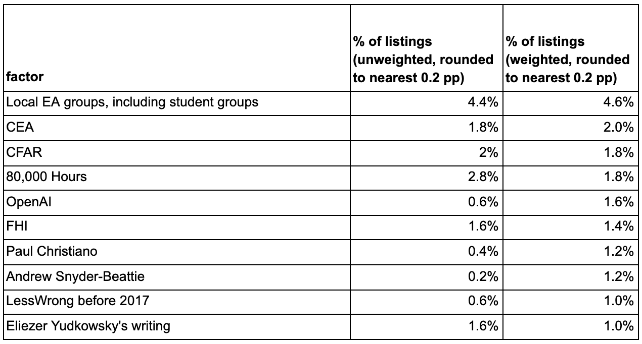
Because the denominator included all uncategorized factors, the percentages were very small even for the most successful categorized factors.
By Factor Category
Below is the breakdown of (unweighted) top factor listings by factor category. Organizations, works, discussion platforms (including local and university groups), and specific people — the categorized factors — together get ~38% of the listings.

The remaining ~62% goes to the uncategorized factors, which are the orange and teal slices. There are two slices because, although these factors were not categorized granularly, it was possible to put them into two buckets — “dependent on EA/EA-adjacent” for factors which were about EA/EA-adjacent ideas or seemed to flow directly from their presence in the world, and “independent of EA/EA-adjacent” for factors which did not. For example, some respondents listed something like “the EA community” as one of their factors; that would get the “dependent” tag. Another example is something like “conversations about AI,” where the conversations were not with a specific named person, but the context makes it clear that the conversations were strongly influenced by EA/EA-adjacent ideas. If the factor was something like “naturally open-minded mindset” or “supportive family,” it would get the “independent” tag. Most of the cases were about this straightforward.
The weighted version of this chart is barely different, and what differences do exist I suspect are just noise, so I don’t include it here.
Overall, it looks like about 45-50% of the listings[3] are clearly related to EA/EA-adjacent ideas and communities. To reiterate, the other listings were spread across many levels of abstraction, so EA/EA-adjacent factors have to compete with things like “inherent altruism,” or “my mom.”
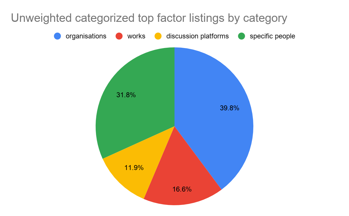
Here’s what the breakdown looks like among only the categorized factors. (Again, I present just the unweighted version since the weighted version looks basically the same.)
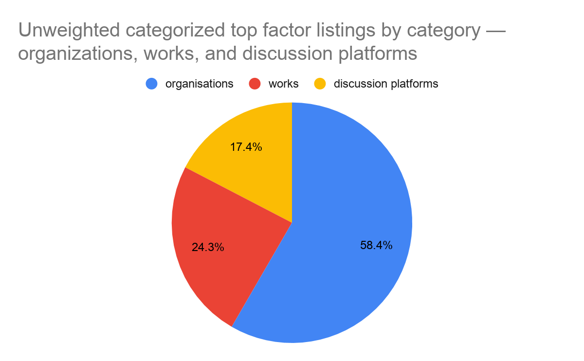
And what it looks like among only organizations, works, and discussion platforms (the types of things we asked about in our “influences” section).
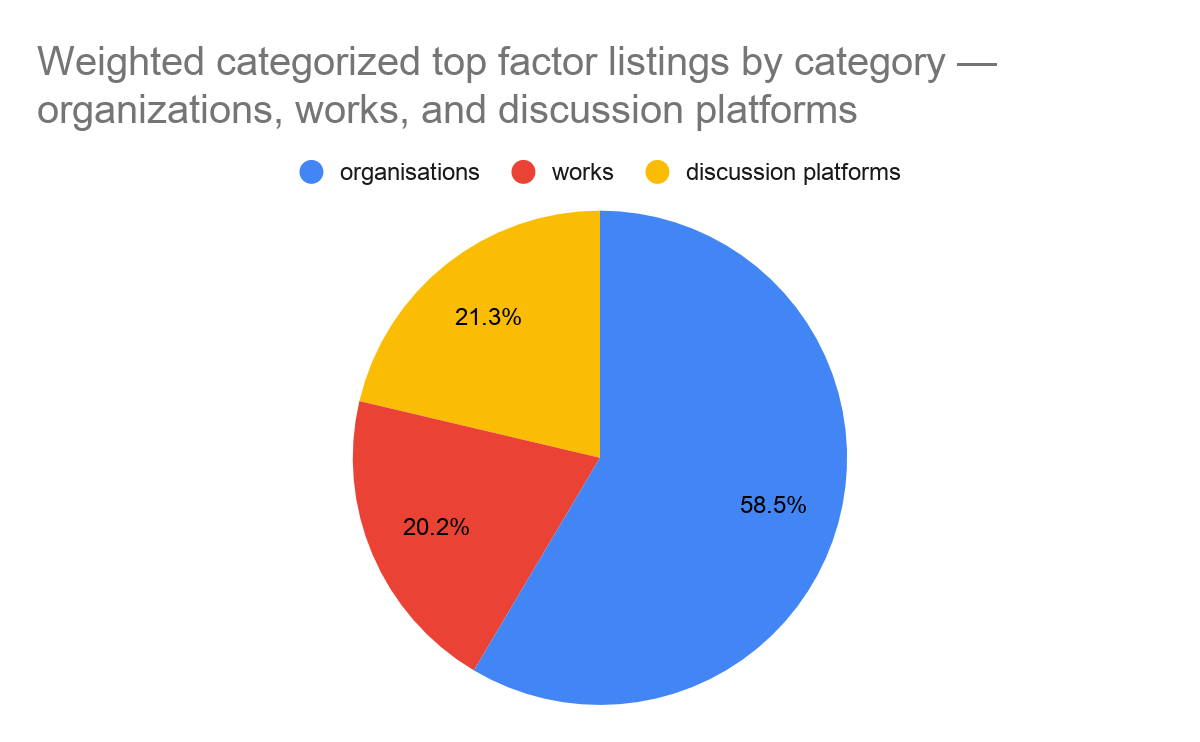
The weighted version for this one is substantively different. Works look a bit less popular in this version, and discussion platforms a bit more.
Mentions in Free Text
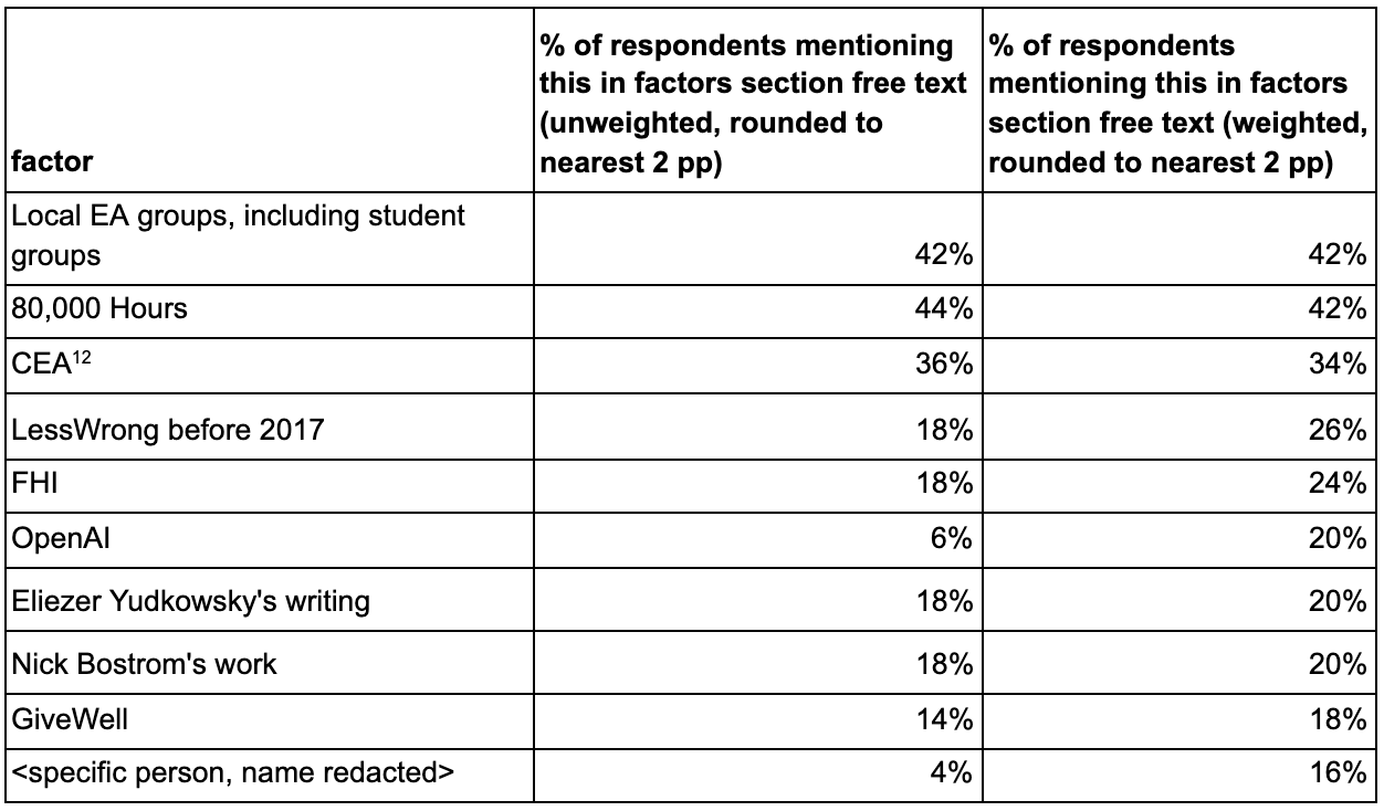
We can also use the answers our respondents gave to the brainstorming prompts to measure how common certain factors are, regardless of whether they are among anyone’s most impactful factors. We called this metric “% of respondents mentioning this in factors section free text.”
This is a fairly crude metric which isn’t sensitive at all to differences in amount of impact[4], but (at least conceptually) it does have some advantages over “top factors.” It’s not a relative measure, so it stands a better chance of illuminating things which had a moderate amount of impact on a lot of people. And it’s backed by much more data, so it might “thicken up” the top factors metric and reduce the impact of luck.
To gather this data, I read each survey response and manually tagged the items that were mentioned in any of the free-text responses from this section. We looked for mentions of a broad set of items, but here I just focused on categorized factors.
Here are the top 10 categorized factors (specific people or orgs/works/discussion platforms) by score on “% of respondents mentioning in factors section free text (weighted).” The values are rounded to the nearest multiple of 2 percentage points.
Influences Section
A significant chunk of our survey was devoted to eliciting respondents’ thoughts on 34 specific EA and EA-adjacent organizations, pieces of content, and online or offline meeting areas (e.g. forums and in-person meetup groups). We called these categories, respectively, “orgs,” “works,” and “discussion platforms” (for lack of a better term). Collectively, we refer to these 34 items as “influences.” “Influences” are a subset of “categorized factors.”
This section was in some ways the opposite of the “factors” section described above. That section tried to elicit the things that were most important to our respondents’ personal positive impact, regardless of whether they had anything to do with EA. As a result, we got isolated dollops of qualitative information on a wide variety of topics which our respondents found very important. In this section, we focused on a narrow set of things — the 34 influences — which perhaps capture more of the total impact on our respondents but less of the instances of very large impact, and got a lot of quantitative information about each one.
The first part of this section had 34 rows, one for each influence. It was broken into sections by influence type. Here’s an example. (No need to squint; the text is replicated below — this is just for illustration.)


The first question is “How did this influence affect you?” with the following response options:
Hindered my positive impact a lot (choose up to 3 times)
Hindered my positive impact
Slightly hindered my positive impact
Significant interaction; neutral effect
No significant interaction
Slightly helped me to have positive impact
Helped me to have positive impact
Helped me a lot to have positive impact (choose up to 3 times)
Choosing multiple of these options was allowed. The “(choose up to three times)” on the most extreme options was intended to impose some normalization on different respondents’ results.
Some other instructions we included:
If you haven't significantly interacted with an influence, please leave the questions for that influence blank or choose “no significant interaction."
If you have significantly interacted with an influence but think it didn't impact you much one way or another, please choose "Significant interaction; neutral effect."
The second question is “How do you feel about this influence?” It had these possible answers (again, where choosing multiple was allowed):
Feel very negatively
Feel negatively
Neutral
Feel positively
Feel very positively
In an attempt to encourage franker-than-usual criticism, we also included the following paragraph in the instructions:
Sometimes, people feel that criticism inherently demands a higher bar than praise, such that they’d feel uncomfortable saying something critical about a person or organization without conclusive evidence that the critique was valid. We encourage you to work against that impulse here; we want you to feel comfortable giving criticism, and think criticisms that are based on intuitions or gut feelings can track very important things which would otherwise go unsaid. Even weak impressions are often pointing at something real. We think this sort of data is very important to helping these people and organisations improve, and can have a big positive impact.
We used the data we got here to calculate three metrics: impact points, “% of non-neutral sentiments that were positive,” and “% of non-neutral impacts that were positive.”
Impact Points
This was our attempt at an all-things-considered metric of how much positive impact each influence had had on our respondents, based on the multiple-choice responses about it. Impact points were calculated by assigning a numerical value to each option for “How did this influence affect you?”:
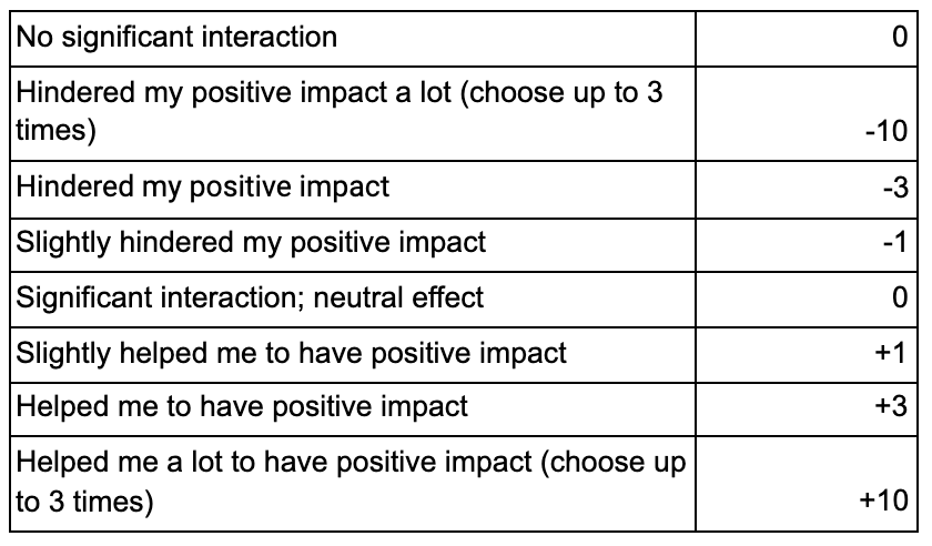
We then summed the values from each influence’s ratings to get the net impact points for that influence. Dividing by the total net impact points across all answers (including write-in answers), we got “% of net impact points.” Doing the same calculation while taking respondent weight into account (multiplying each rating’s numeric value by its rater’s weight before summing) gave “% of weighted net impact points.”
In cases where a respondent gave multiple ratings — for example, “slightly hindered my positive impact” and “helped me to have positive impact” — we averaged the numeric values of all the ratings given. So if someone chose “slightly hindered my positive impact” and “helped me to have positive impact” for a single influence, they would contribute (-1 + 3)/2 = 1 net impact point to that influence’s total.
For those who might find the mathematical notation clearer:

Here are the results for the top 10 influences by “% of net impact points (weighted).” The names are displayed exactly as they appeared to respondents. The values are rounded to the nearest multiple of 0.2 percentage points.
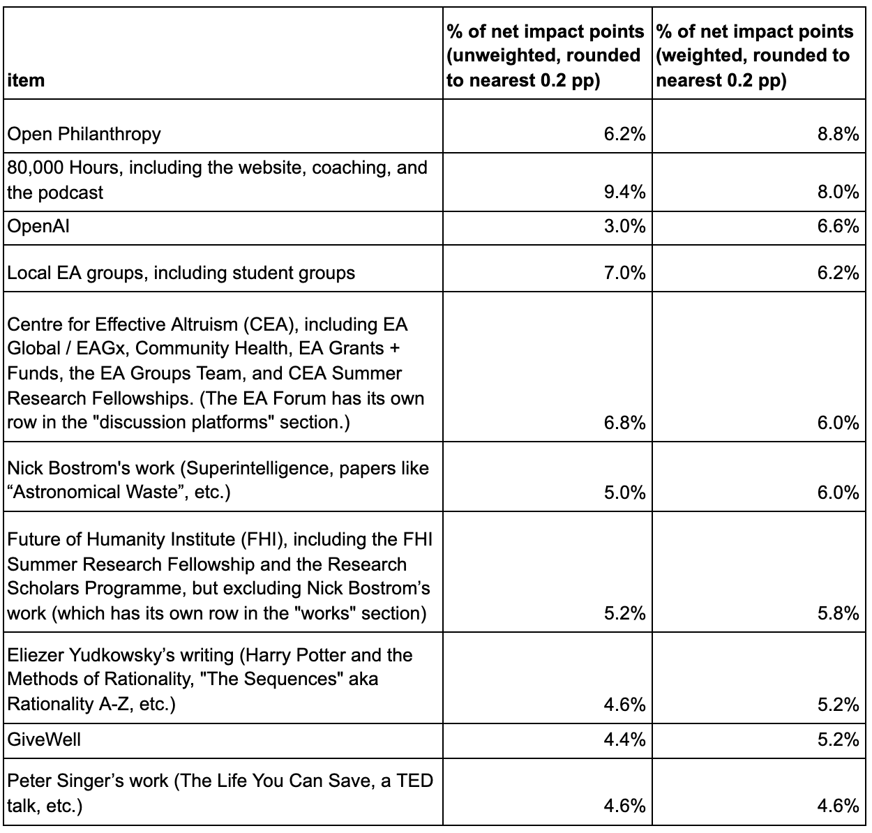
Every influence got at least some impact points. The best-performing influences got about 40x more impact points than the worst-performing ones. No influence got over 10% of the points.
Open Philanthropy’s ranking should perhaps be mostly ignored. There’s a significant issue here where we’re not sure to what extent respondents were giving us credit for funding other items on this list. Also, we’re the ones who administered the survey (and it was not anonymous from our perspective).
OpenAI does very well in the weighted metrics, but its unweighted scores are substantially lower. This is due to OpenAI employees tending to get high weight and tending to rate their employer as increasing their expected positive impact. (The survey took place before the recent departure of employees from OpenAI and the forming of Anthropic.)
Most of CEA’s impact points are from EA Global and EAGx.
By Category
Here’s the breakdown of impact points by influence category — organization, work (book, article, blog, or other piece of content), or discussion platform (online or offline meeting place, like groups or forums). This uses the weighted version of the metric; I didn’t include the unweighted version because it’s barely any different.
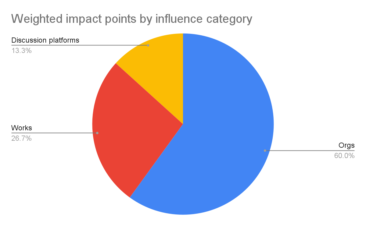
The differences between this breakdown and the breakdown by category for top factor listings are not large. Here, “discussion platforms” gets a bit less credit relative to works and orgs.
Top Influence Listings
After gathering our respondents’ thoughts on our big table of influences, we asked them to choose the influences from the table which had the biggest positive impact on them.
Please list the three influences from all the tables above that had the biggest positive impact on you. (No need to put them in order, and listing fewer than three is fine.)
We used this to calculate a “% of top influence listings metric.” You could think of this as being something in between “top factors” and “impact points.” Like “top factors,” it aims at determining which things were very impactful and ignores moderate impacts. But like “impact points,” it’s mostly about a narrow set of things (the 34 influences)[5].
We calculated “% of top influence listings” analogously to the way the “% of top factor listings” metric is calculated. We counted up the number of listings each influence got, then divided by the total number of listings. For the weighted version we did the same thing, but listings coming from an individual counted as (that individual’s weight) of a listing, instead of as 1 listing.
Since these were free-text answers we were attempting to put into categories, some human discretion was involved in the categorization. When called for, we split credit in a way similar to what we did in the top factors section. The most common case in which we split credit was when someone listed AIRCS or AISFP/MSFP, two programs which are run by MIRI and CFAR jointly. As in the top factors section, we gave MIRI and CFAR equal credit for these items.
Here are the results sorted by “% of top influence listings (weighted)” for the top 10 out of the 34 influences, by that metric. (Write-ins are not included in this table.) The values are rounded to the nearest multiple of 0.2 percentage points.
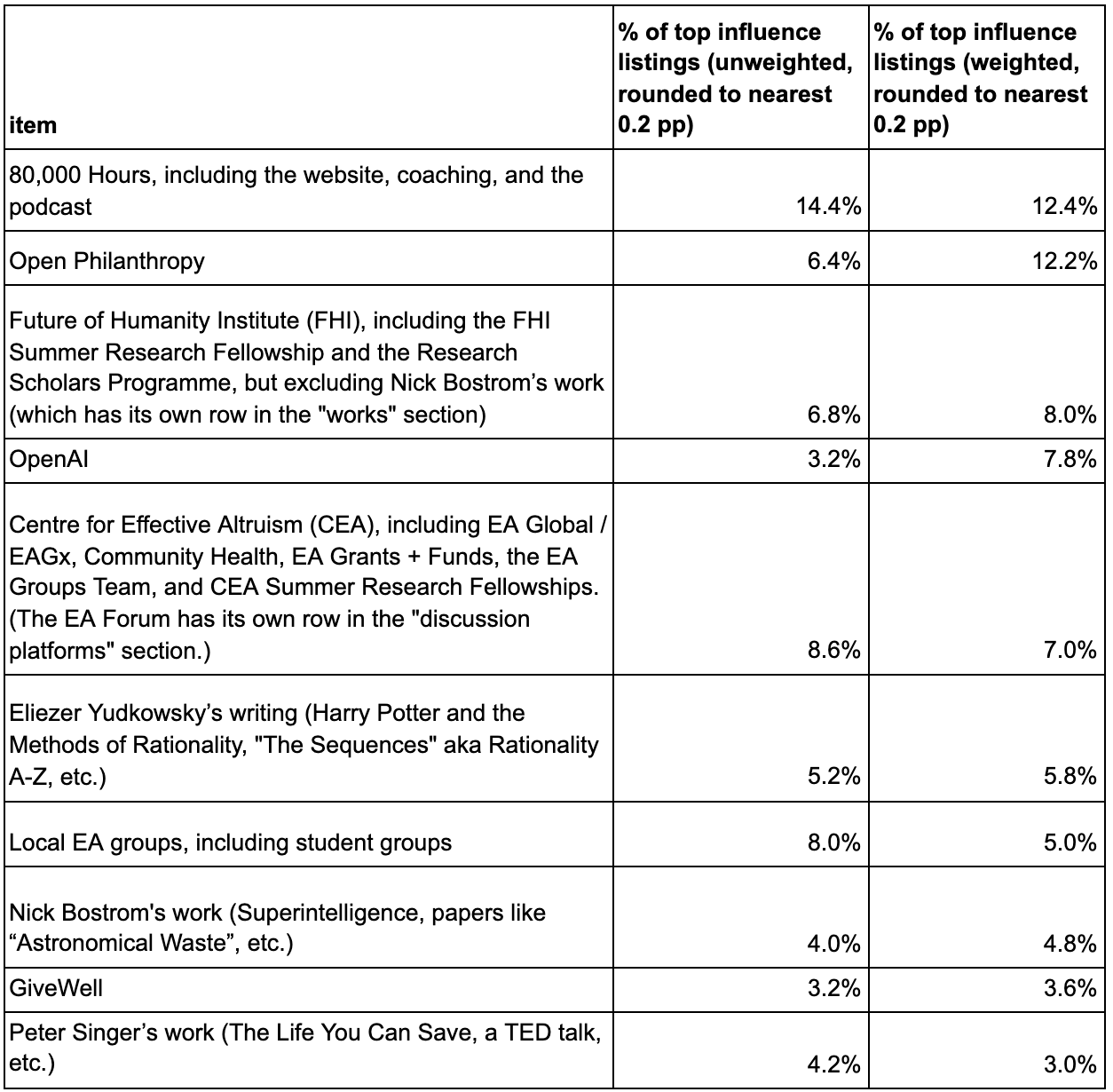
Again, Open Philanthropy’s ranking here should perhaps be mostly ignored. There’s a significant issue here where we’re not sure to what extent respondents were giving us credit for funding other items on this list. Also, we’re the ones who administered the survey (and it was not anonymous from our perspective).
OpenAI again does very well in the weighted metrics, but its unweighted scores are substantially lower. This is due to OpenAI employees tending to get high weight and tending to rate their employer as increasing their expected positive impact (in some cases, it might be more accurate to attribute these benefits to individuals or small teams within the organization, rather than the organization as a whole).
By Category
Here are the breakdowns of top influence listings, by influence category. The categories are organization, work (book, article, blog, or other piece of content), or discussion platform (online or offline meeting place, like meetup groups or forums).
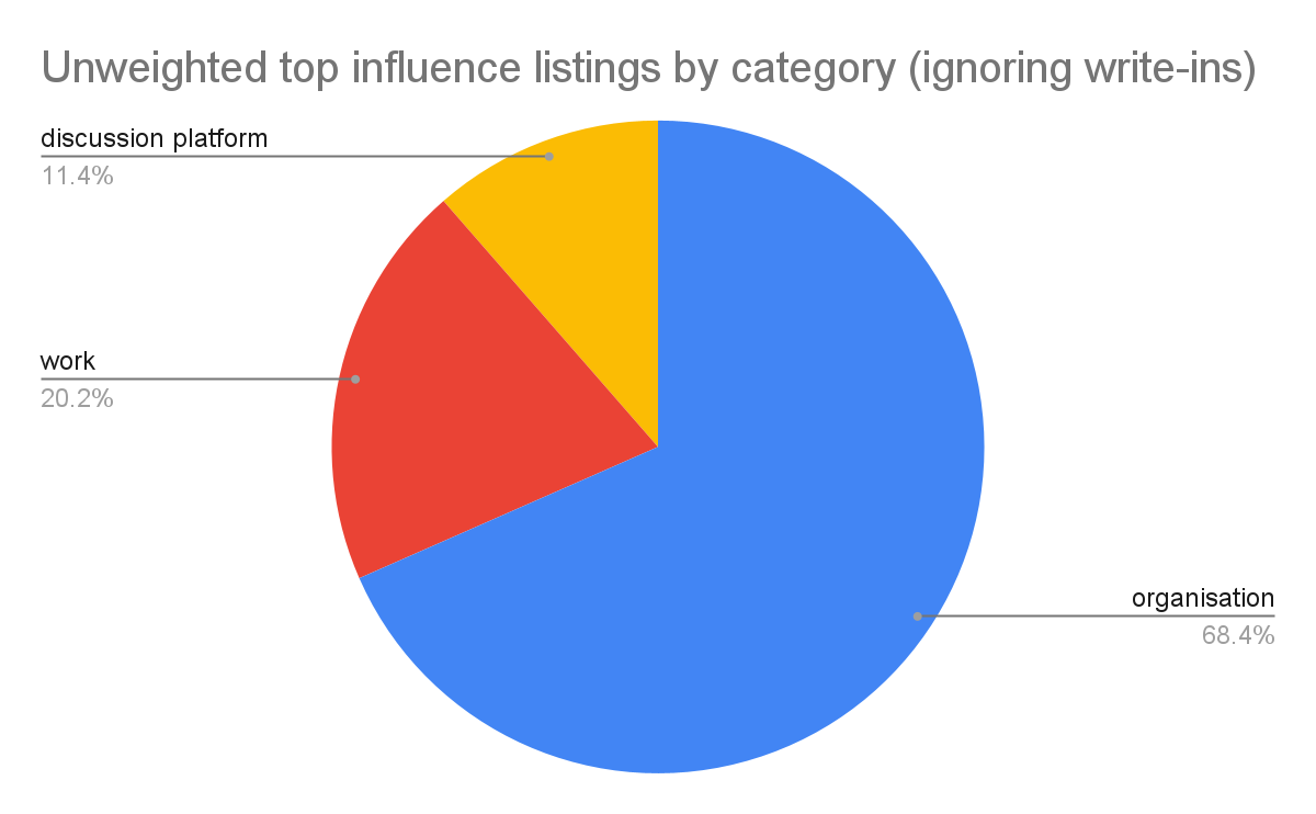
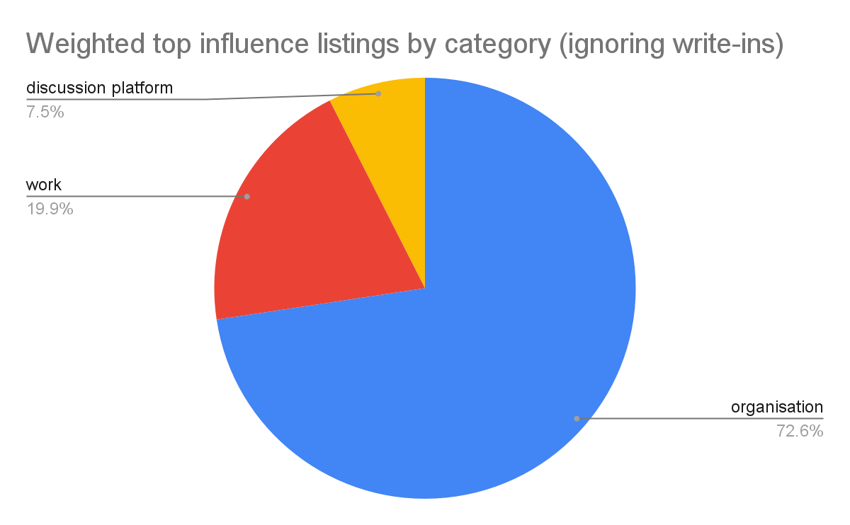
Compare to the earlier results for impact points by category and top factor listings by category.
Here, about 10 percentage points more of the impact is allocated to organizations than it is according to impact points or top factor listings. I’m not sure why. The major differences between this metric and others are that this metric a) counts only large impacts, like “top factor listings” does, and b) is based on prompting respondents with a list of EA/EA-adjacent things they could have been impacted by, in the same way “impact points” is.
Which Impact Metrics To Look At?
I’ve laid out four[6] impact metrics: top factor listings, mentions in the factors free text section, impact points, and top influence listings. For the 34 influences — organizations, works, and discussion platforms — we listed, these are four different ways of answering the question, “How much positive impact has this thing had on our respondents?” As you’ve seen above, the answers the metrics provide diverge from one another somewhat.
So which should we put the most weight on? Here’s some features of the different metrics that I think are relevant when thinking about this.
Capturing negative impacts: “% of impact points” is the only one of these metrics which takes into account harms or hindrances as well as positive impacts, so you might expect this to be an important reason that it is better. However, I don’t think that ends up being important, because negative impacts are relatively rare. The percentage of all impact points that were negative (i.e. came from “slightly hindered,” “hindered” or “hindered a lot” responses, which were worth -1, -3, and -10 impact points respectively) is less than 10%, weighted or unweighted, for all but a few influences. So a version of this metric which didn’t capture negative impacts at all would not have very different results.
Aggregating many small impacts vs. capturing just the large ones: The “% of top factor listings” and “% of top influence listings” metrics both only try to measure the impacts our respondents think are the largest. So although influences which have deep impacts on a few people and influences which have moderate impacts on many people might have similar impact overall, these metrics will favor the former. I think there’s a plausible view that’s skeptical of self-reported moderate impacts; this view would say that people generally tend to overestimate how important particular events were to the stories of their lives, and in particular tend to overestimate how important non-obvious factors were (e.g. “I guess that literature class made me more empathetic”) relative to large, obvious effects. On this view, it’s good to focus on only the largest impacts, as these are the most likely to be real; smaller impacts just add noise. I’m not sure to what extent I actually hold this view.
Prompted vs unprompted answers: “% of impact points” and “% of top influence listings” are computed from data we got via asking questions which suggested to our respondents things that could have impacted them, rather than letting them suggest those things to us. That’s the type of question the influences section was based around[7]. We observe differences between these metrics and the other metrics — “% of top factor listings” and “factors section free text mentions” — which are based on unprompted answers. For example, “Local EA groups, including student groups” is either first or tied for first with 80,000 Hours according to the (weighted) metrics based on unprompted answers, but 4th or 7th according to the (weighted) metrics based on prompted answers. The most extreme example is Open Philanthropy, which is 1st or 2nd on the “prompted” metrics, but 13th or 15th on the unprompted ones.
In a sample of 50 respondents that I looked at in detail, I saw about 20% of them list an org, work, or discussion platform as a top factor in the factors section, but then choose to list a different org/work/discussion platform (which hadn’t been one of their top factors) over it, once they got to the top influences question. Naively, you’d expect every respondent’s top influences to be a subset of the orgs/works/discussion platforms they listed as top factors, since the former are an answer to “What helped you the most (out of these 34 things)?” and the latter are an answer to “What helped you the most (out of everything)?” But it looks like our respondents did not behave this way, and this is at least partially driving the differences in the metrics. Our respondents are not ideal reasoners, but rather humans filling out very long web forms. So we should expect some inconsistency, particularly since our questions require a lot of difficult introspection and counterfactual reasoning.
I think the prompted answers should be under the most suspicion here by default, for the same reason evidence obtained via leading questions is suspicious. For example, it seems like being prompted with “did this organization help you?” is sometimes going to cause people to unconsciously substitute the question “do I like this organization?” and answer that. To the extent this happens, it makes the prompted answers systematically less accurate. But I think prompting may also sometimes help respondents answer these difficult questions more accurately — it might remind them of important effects they had forgotten (though just for the influences we listed). This can be a systematic effect too, if some things are generally more memorable or salient than others.
I don’t have a clear answer as to why some things perform better on the unprompted section vs. the prompted one or vice versa, or as to which is overall more accurate.
There’s also probably a “background prompting” effect, even in the factors section — respondents are prompted to think about EA/EA-adjacent things since they know that’s the point of this survey. This might or might not be a large effect.
Sparsity: The “% of top factor listings” metric ranks factors by how many people said that this was one of the most important things in their stories. Since respondents answered in such diverse ways, even the most-commonly-listed factors will tend to have a fairly small number of listings. For example, CEA, CFAR, and FHI all got listed by fewer than 16/217 ~= 8% of respondents. But that’s enough for them to come 3rd, 4th, and 5th respectively in the rankings for “unweighted % of top factor listings.” So this makes the data more noisy. The “factors section free text mentions” metric is less noisy because it captures all sizes of impact, not just the biggest ones.
A summary of what this means for each metric:
-
% of impact points is based on prompting. It provides only relative information about whether one influence did better than another influence (since it’s a percentage of impact from things inside the EA/EA-adjacent community) and not absolute information about how many respondents were impacted and how strongly. One might disagree with its particular mapping of “slightly helped” to +1, “helped” to +3, and “helped a lot” to +10 (and the corresponding mappings of “slightly hindered,” etc.).
-
% of top influence listings is best thought of as a version of impact points that is more focused on the largest impacts. You might pay more attention to this metric if you think the largest self-reported impacts are the most important.
-
% of top factor listings provides some insight into the absolute amount of impact an EA/EA-adjacent influence had on our respondents. This is in contrast to the previous two metrics, which provide only relative information, in the sense that they just tell us which EA/EA-adjacent things did better than which other EA/EA-adjacent things[8]. It’s free of prompting. But its wide-openness makes it noisy. You might pay more attention to this metric if you think the self-reported largest impacts are the most important, and/or you’re worried about prompting.
-
% of factors section free text mentions doesn’t take magnitude of impact into account at all, since it rates every mention equally. It’s based on unprompted questions, but counts all sizes of impacts. It also gives some non-relative information, though of course ranking influences based on it still only gives relative information. You might pay more attention to this metric if you are worried about prompting, but want to capture all sizes of impacts.
None of our metrics are flawless, and it doesn’t seem clear how to weigh their flaws against one another. So I recommend putting about equal weight on each of them. This might also make you want to treat our results in general with a degree of suspicion, since the answers we’ve gotten seem to depend, to some extent, on how we ask the question (and we probably didn’t cover the entire space of ways to ask the question).
What about weighted vs. unweighted? I think the weighted versions of metrics are more informative, provided you’re interested in something like “expected impact on the world” (as opposed to something more like “impact on people in the EA community”) and you trust our evaluation of the altruistic impact of respondents’ careers. Below I’ve defaulted to considering the weighted versions of metrics, but will sometimes refer to the unweighted versions as a check.
Results
General Findings on Impact
Before doing this survey, we would have thought it plausible that a small number of community-building efforts were >100x more impactful than others. Our results caused us to update towards a flatter distribution of impact. Here’s the shapes of the distributions of the 34 influences’ scores on our four impact metrics (it doesn’t matter which is which for the point I’m making here). While the differences between the most and the least impactful influences are fairly large, the >100x picture doesn’t look to be a good description of the situation.

This list of influences that we came up with ahead of time turned out to be a fairly good prediction of the most common things to have influenced our respondents. On open-response questions in the factors section, where respondents described what had been important to their expected positive impacts without anchoring on our list, many of the answers they gave were indeed not included on our list, but these answers were quite various. They didn’t reveal any “dark-horse” influences — any EA/EA-adjacent things that a lot of respondents would say were important to their positive impact, but weren’t on our radar. The most dark-horse-like result was for the blog Wait But Why, which wasn’t on our list; it was important to just a few respondents. We did list a few things that we probably should have left off; they didn’t seem to be important to many of our respondents.
The influences fell into three categories; a) organizations, mostly those doing meta work, b) pieces of content like books, blog posts, etc, c) meetup groups, Facebook, and other discussion platforms. Across the different ways of measuring it, the organizations got ~60-70% of the reported impact, while the books, blog posts etc. got ~20-30% and the meetup groups/discussion platforms etc. got ~10-20%.
When “d) interactions with specific people” (focused on direct interactions, e.g. conversations, not e.g. reading something a person wrote) is additionally introduced into the above categories, the credit breakdown is roughly 40% organizations, 30% specific people, 15% books, blog posts etc., and 10% meetup groups etc. This is according to just the “top factor listings” metric. (An apples-to-apples comparison with “specific people” on our other metrics is not possible.)
An interesting corollary of these results is that it looks like some individuals, through their written work, have been more important to our respondents’ aggregate impact than some entire organizations. Eliezer Yudkowsky, Nick Bostrom, and Peter Singer are prominent examples of such individuals.
This amount of impact seems to have been had even by some individuals who are not primarily known for their written work (and instead seem to have had their effects via interpersonal interactions), when we look at metrics from the factors section, which allow a clean comparison between organizations and people. But since it’s based on a smaller set of metrics, this result is less robust.
Weighting Respondents
The expected values of our respondents’ careers seemed to us to have a fairly wide range across different respondents. In computing our metrics, we attempted to take this into account by assigning each respondent a numeric weight according to our (highly-uncertain) best guess at the altruistic value of their career. We then incorporated these weights into our metrics, producing “weighted” and “unweighted” versions of each metric — the unweighted version is what you’d get if you set each respondent’s weight to 1. We were interested in seeing if some community-building efforts were disproportionately helping the people who later went on to have high-EV careers. I described this process in more detail in a previous post.
The weighted and unweighted versions of our metrics diverged from each other a moderate amount. Things that helped a lot of people were generally also likely to have helped a large share of the people with very valuable-seeming-to-us careers. There were a handful of exceptions — for example, OpenAI looks much better on the weighted versions of metrics.
Influence Tiers (by impact)
Below are some influences which performed well on our impact metrics, sorted into two tiers. (We asked about 34 influences; this is just the subset of influences that were best-performing.) Influences which look to have been the most robustly important to our respondents’ impact (scoring in at least the top 10 across many of our metrics) are in the first list. Tier 2 contains influences that scored near the top according to some metrics, but much less well on others. I see the Tier 2 results as interesting, but less robust to different ways of asking the question “what most helped our respondents to have positive impact on the world?” (depending on how you ask the question, they either might look as good as Tier 1 items, or nowhere near).
The listings are unordered within each tier. These listings are not adjusted for the size or cost of the influence.
Tier 1
- 80,000 Hours, through all its programs.
- CEA, with about half its impact coming through EA Globals and EAGxes and half through its other programs.
- Local or university EA groups, mostly university groups, with about half of overall impact from these groups coming from groups at top-15 universities.
- FHI, mostly through employing respondents to do research or giving them internship/fellowship or opportunities to do research.
- Nick Bostrom’s works, mostly Superintelligence.
- Eliezer Yudkowsky’s works, mostly Harry Potter and the Methods of Rationality and “The Sequences” aka Rationality A-Z.
- Peter Singer’s works: The Life You Can Save, Famine, Affluence and Morality, Animal Liberation, The Most Good You Can Do, and his TED talk were all mentioned roughly equally often.
Tier 2
-
OpenAI, through employing some of our respondents.
- OpenAI was Tier 1 according to the weighted versions of our metrics — those that tried to measure impact by incorporating the relative values of our respondents’ careers — but did much worse according to impact metrics that didn’t (effectively treating every respondent’s career as of equal value). This is primarily because of respondents who are or were OpenAI employees saying that OpenAI helped them have positive impact, and us tending to assess such people as having highly valuable careers, though they make up a small fraction of our respondent pool. So OpenAI does indeed look to be helping our respondents have a lot of impact (if you believe our assessments of career value) but in a different way than most of the other items here. FHI is the other item discussed so far whose reported impact primarily comes via employing people.
-
CFAR, through both its main workshops and through its support for MIRI’s AIRCS workshops and AISFP program.
- CFAR was high Tier 1 according to the top factor listings metric, which measured how often respondents named something as one of the 4 most important things to their positive impact when we asked them that question without anchoring them on or prompting them with the names of specific EA/EA-adjacent things. But it did substantially less well on the other metrics. This is some evidence towards the idea that CFAR’s rate of very large and perhaps especially memorable impacts is among the top few highest out of all the EA/EA-adjacent things we asked about, while its rate of smaller or less memorable impacts is lower. However, I’m generally skeptical of conclusions reached by only one metric; see Which Impact Metrics To Look At? for more information.
-
LessWrong (before 2017 and since 2017)[9]
- LessWrong is Tier 1 when we ask respondents to list things which were important to their positive impact, without anchoring them on or prompting them with the names of specific EA/EA-adjacent things. It’s also frequently listed as one of someone’s top 4 most important things in this context — roughly as frequently as Tier 1 things are, using the weighted version of metrics (it does less well on the unweighted versions). But like CFAR, it doesn’t do as well on the other metrics. Most of the mentions here are for LessWrong before 2017, not the current LessWrong.
Frequency-of-Positive-Report Metrics
In addition to metrics which attempt to capture net impact on our respondents, we also computed two metrics which attempt to capture the frequency (or the weighted frequency) of various types of positive reports that our respondents gave about influences.
Percentage of Non-Neutral Sentiments That Were Positive
This is a measure of the prevalence (and not the intensity) of positive feelings about an influence among the respondents who registered a positive or negative feeling about it. It was computed by taking all respondents’ answers to the “How do you feel about this influence?” question, throwing out the “neutral” ones[10], and calculating (number of “feel positively” or “feel very positively” answers)/(number of total non-neutral answers). The weighted version of this metric is calculated in the same way, but counts each answer as (that respondent’s weight) of an answer, instead of as 1 answer.
I haven’t included the top 10 influences by this metric here, since I think it wouldn’t convey much information — the range of this metric was small except for some outliers at the bottom, and many influences got 100% on this metric.
Percentage of Non-Neutral Impacts That Were Positive
This is a measure of the prevalence (and not the intensity) of positive impacts attributed to an influence by our respondents, among the respondents who said that they were positively or negatively impacted by the influence. It’s calculated exactly analogously to “percentage of non-neutral sentiments that were positive.” For the same reasons as above, I haven’t included the top 10 influences here.
The results for this metric were directionally similar to the results for “percentage of non-neutral sentiments that were positive,” though the lows were less low, since negative impacts are fairly rare, and rarer than negative sentiments.
Results
Using these metrics, we found a noticeable pattern where rationalist-associated things tended on average to evoke more negative reactions than non-rationalist things did (i.e. they tended to be more controversial, even when their net performance was strong). Here are the distributions of scores on the (weighted) sentiments metric for these influences[11], and for all influences[12]. There were 10 influences I classified as “rationalist/rationalist-adjacent” out of 34 total.
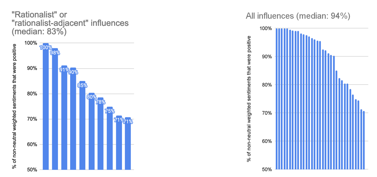
Note that the effect is not uniform across all rationalist-ish influences; some rationalist orgs and pieces of content score highly on these metrics.
The ~20 respondents in our beta or alpha testers group answered a version of the survey that asked respondents to list their top 5 factors instead of their top 4. The analysis counts these listings (so these testers “got an extra vote.”) ↩︎
Splitting credit in this way, when we did it, was a subjective judgment call. We most frequently split credit 50/50 between two items, but any breakdown was possible. The most common cases in which we split credit were a) when someone listed 80k’s coaching, we split credit 50/50 between 80,000 Hours and the person who was their coach, and b) when someone listed AIRCS or AISFP/MSFP, two programs run by MIRI and CFAR jointly, we split credit 50/50 between MIRI and CFAR — this was the ratio recommended by Anna Salamon. ↩︎
We tagged mentions of all specific people, not just “EA/EA-adjacent people.” But they ended up mostly being that anyway; I’d guess between 0 and 5 percentage points out of the 12 points for specific people refer to “non EA/EA-adjacent people,” so I’m subtracting that from my estimate. ↩︎
Nor even to the sign of the impact, though since the prompt was about positive impacts (and most impacts seem to be positive, generally) the vast majority of what people listed in this section was positive. ↩︎
We allowed write-ins, but they were just 6% of all top influence listings. I count them in the denominator of this metric, but don’t list them in the table below. ↩︎
I’m ignoring “percentage of non-neutral sentiments that were positive” and “percentage of non-neutral impacts that were positive” here, because they’re trying to measure something different from (net) impact. ↩︎
We did allow our respondents to write in their own influences in this section, but the volume of data collected about write-ins was much smaller than the volume of data collected about items on our 34-item list. ↩︎
Of course, we frequently use the “% of top factor listings” to rank EA/EA-adjacent things, and in this usage it provides only relative information. ↩︎
Since approximately 2017, LessWrong has been run by a new team; the survey asked about two separate items, “LessWrong before 2017,” and “LessWrong 2.0 (LessWrong since 2017).” But this bullet point is about impacts from LW before 2017 and LW 2.0 combined. Note also that respondents were asked to separate impact due to LessWrong from impact due to Eliezer’s “The Sequences” and other Eliezer writing; this bullet point does not include impacts from Eliezer’s writing (if respondents used the categorization we requested). ↩︎
Ideally you’d like to count these (e.g. to distinguish between an influence which is strongly liked by 10% of people and regarded neutrally by 90% of people and an influence which is strongly liked by everyone who comes into contact with it.) But, after looking at the results, I began to suspect that since we didn’t provide an option for “no significant interaction” for the “How do you feel about this influence?” question, some of the “neutral” ratings actually mean “no opinion,” rather than “I have an opinion, and it’s neutral.” Since I wasn’t sure which was which, I thought it was safer to just throw the “neutral” ratings out. ↩︎
Note the low score for one of the rationalist influences is plausibly due to chance; a low number of people reported any sentiments about it at all. ↩︎
One influence from the general pool (not classified as “rationalist”) is not visible on this graph because it is below the x-axis; it scored a 17% on this metric. ↩︎
