Willem Sleegers
Posts 16
Comments12
Thanks for the feedback huw.
The question should be interpreted as being about the substantive cause area of mental health (https://forum.effectivealtruism.org/topics/mental-health-cause-area), not as a subset of movement building by providing mental health services for EAs, so we've added 'not as part of EA movement building' to the question to make it clearer.
Hi Jessica,
Just to clarify the plot a bit: The y-axis is the racial category and in addition to showing each category and their average + 95% CI, I also added histograms to show the underlying distribution of values. This is helpful for assessing whether the average is actually a good summary of the data (not to actually figure out the distribution in and of itself). In this case, it shows that the distribution of community satisfaction for Black or African American people in the EA community looks a bit unusual, with more observations on the lower and higher end. However, the total sample size for this category is only 34. This is quite low so I wouldn't be surprised if the distribution will end up looking differently if the sample size was greater.
Thanks for the question James.
There are some differences between regions (USA, UK, Other Europe, Rest of the world), as you can see in the graphs below.
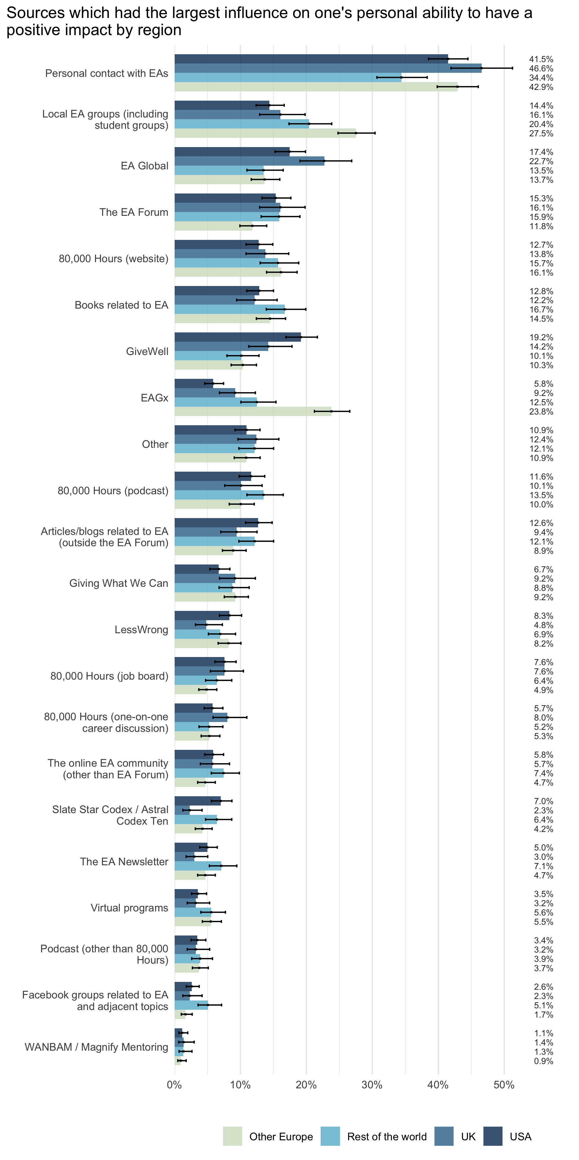
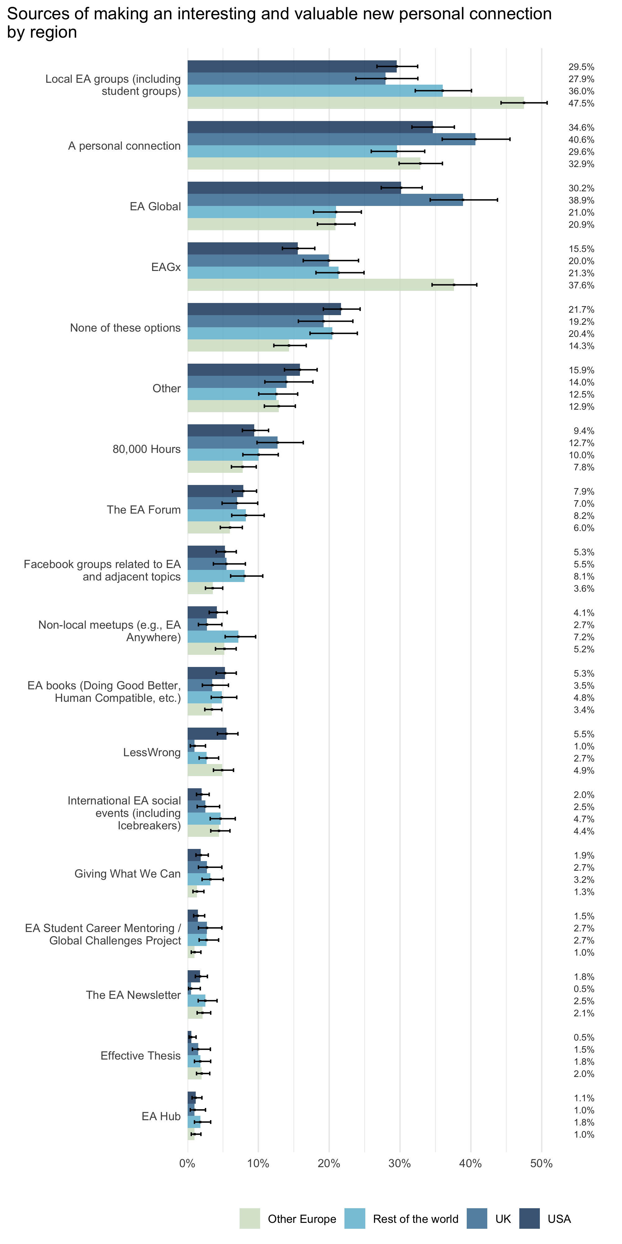
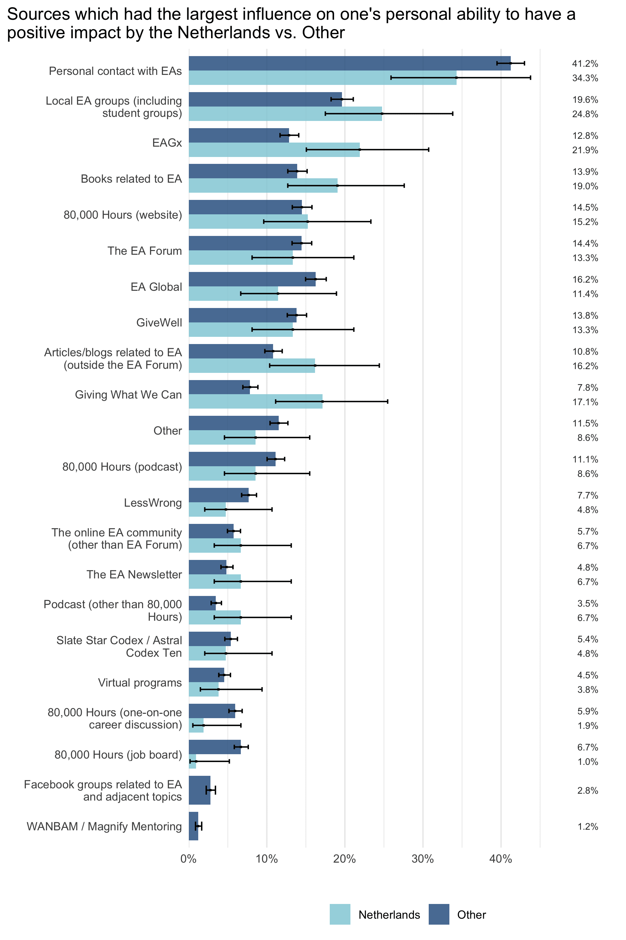
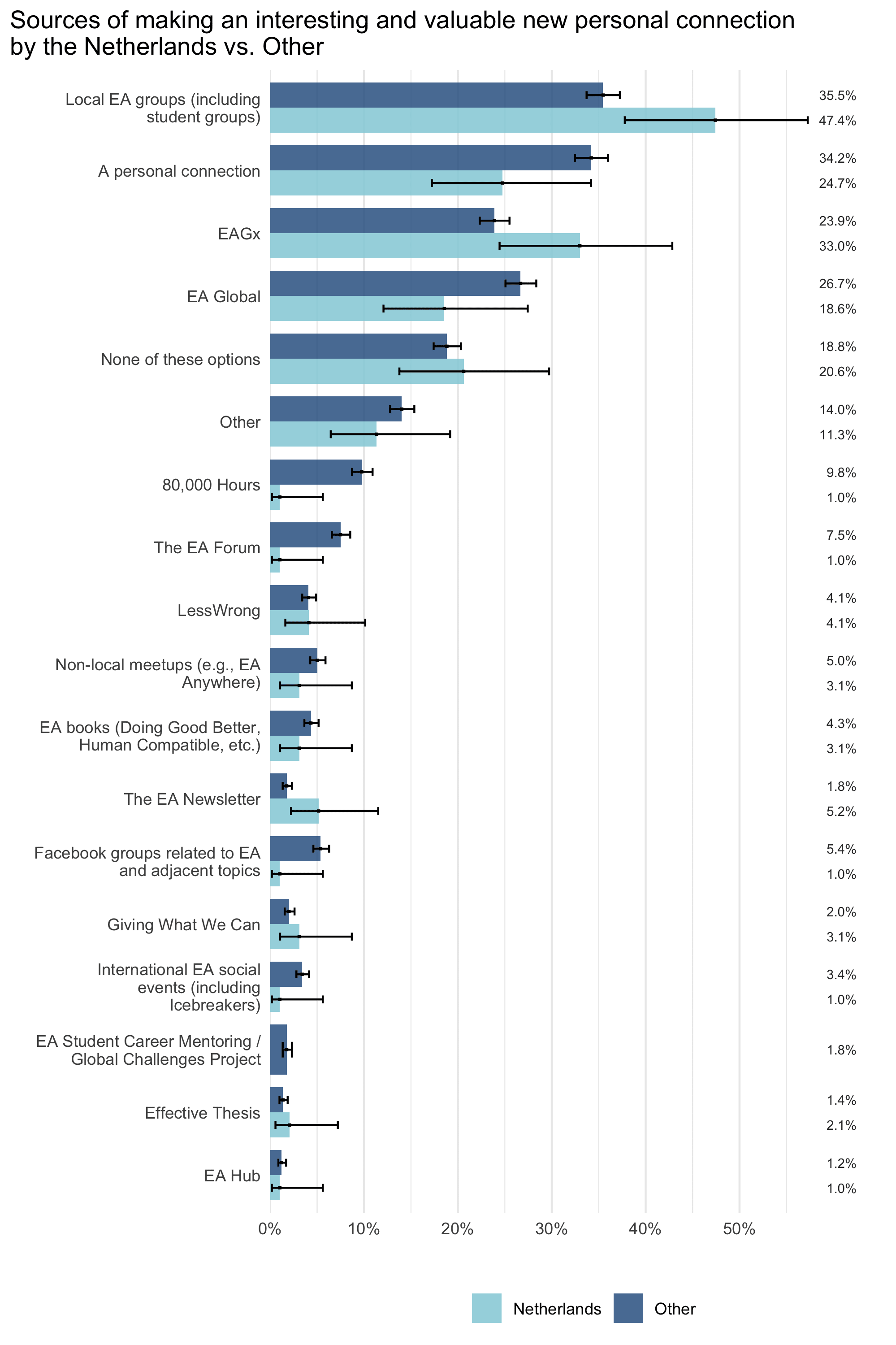
Since you also specifically mentioned the Netherlands, I also looked at the differences between the Netherlands and all other countries. There were only a total of 108 respondents from the Netherlands, so the confidence intervals are pretty wide, but some of the differences seem large enough to be potentially interesting.
Feel free to ask any questions you might have about these results!
Sure!
Sam Harris' audience consists largely of respondents identifying as a man (n = 125, 86.8%). Respondents identifying as a woman made up the remaining numbers (n = 19, 13.2%), no respondents indicated being binary or preferred to self-describe.
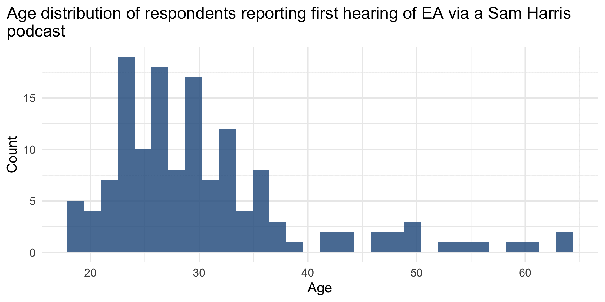
Their average age is 30.69 (median of 28), with a minimum of 19 and maximum of 64, see below.
Regarding racial identity, a large majority reported identifying as White (n = 117, 86.0%).
Finally, there was a roughly even split between less engaged (in EA) respondents (n = 66, 45.5%) and more engaged respondents (n = 79, 54.5%).
Hi Rockwell, thanks for the question.
In response to your comment I went over the descriptions from respondents who said they first heard of EA via a podcast and coded, where possible, the name of the podcast or podcast host. I also included the numbers from respondents who first heard of EA via 80,000 Hours and who specifically mentioned the 80,000 Hours podcast. The results are in the graph below.
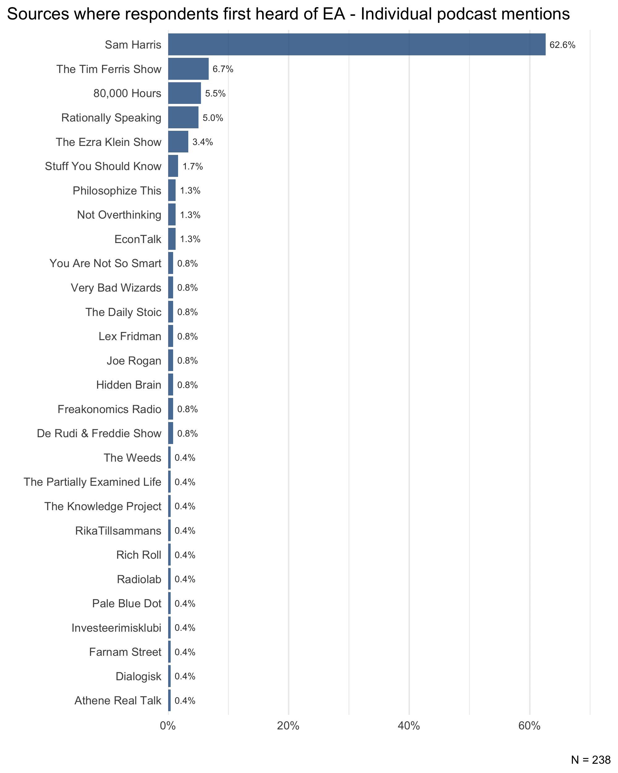
It shouldn't be too surprising to hear people who enter EA mention Sam Harris because his podcast is by far the most popular podcast mentioned, at 62.6% of all podcasts.
Yes we do (and thanks for the comment!).
First, 80.1% of respondents who were asked to answer additional questions about FTX decided to do so. This is similar to the number of respondents (83.1%) who agreed to answer the ‘extra credit’ questions prior to us adding the FTX questions. So, it does not seem like there was a large tendency for respondents to not answer the FTX questions, compared to just a general tendency to not answer extra questions at all.
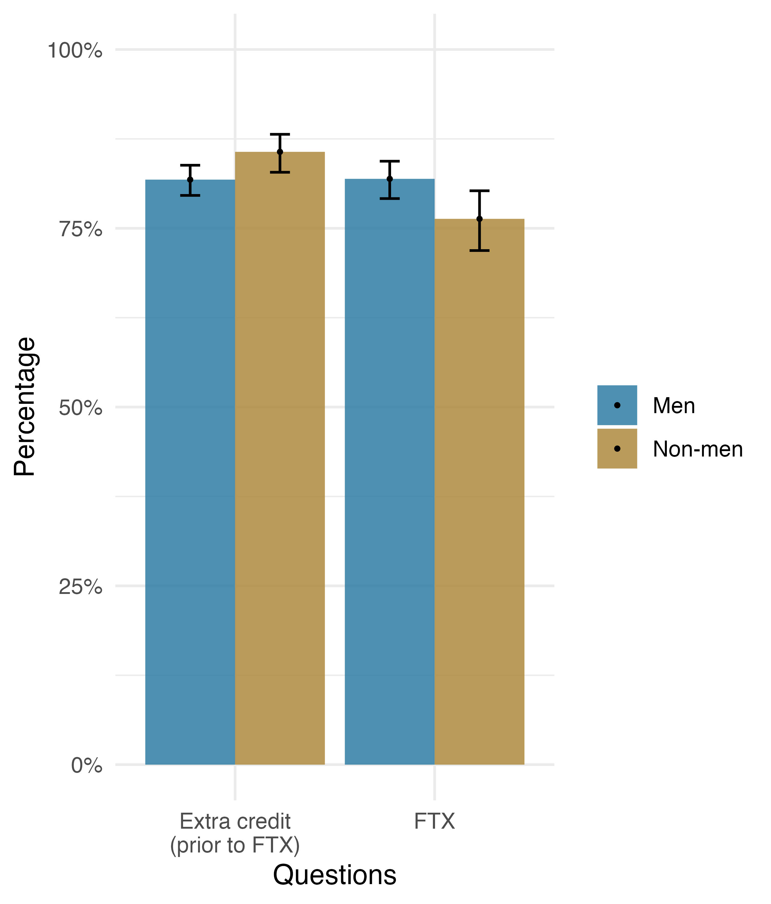
Second, we looked at whether there are differences in demographics between those who answered the FTX questions and extra credit questions (prior to FTX). We found that men were slightly less likely to answer the extra credit questions (81.8% for men and 85.7% for non-men) but more likely to answer the FTX questions than non-men (81.9% for men and 76.3% for non-men).
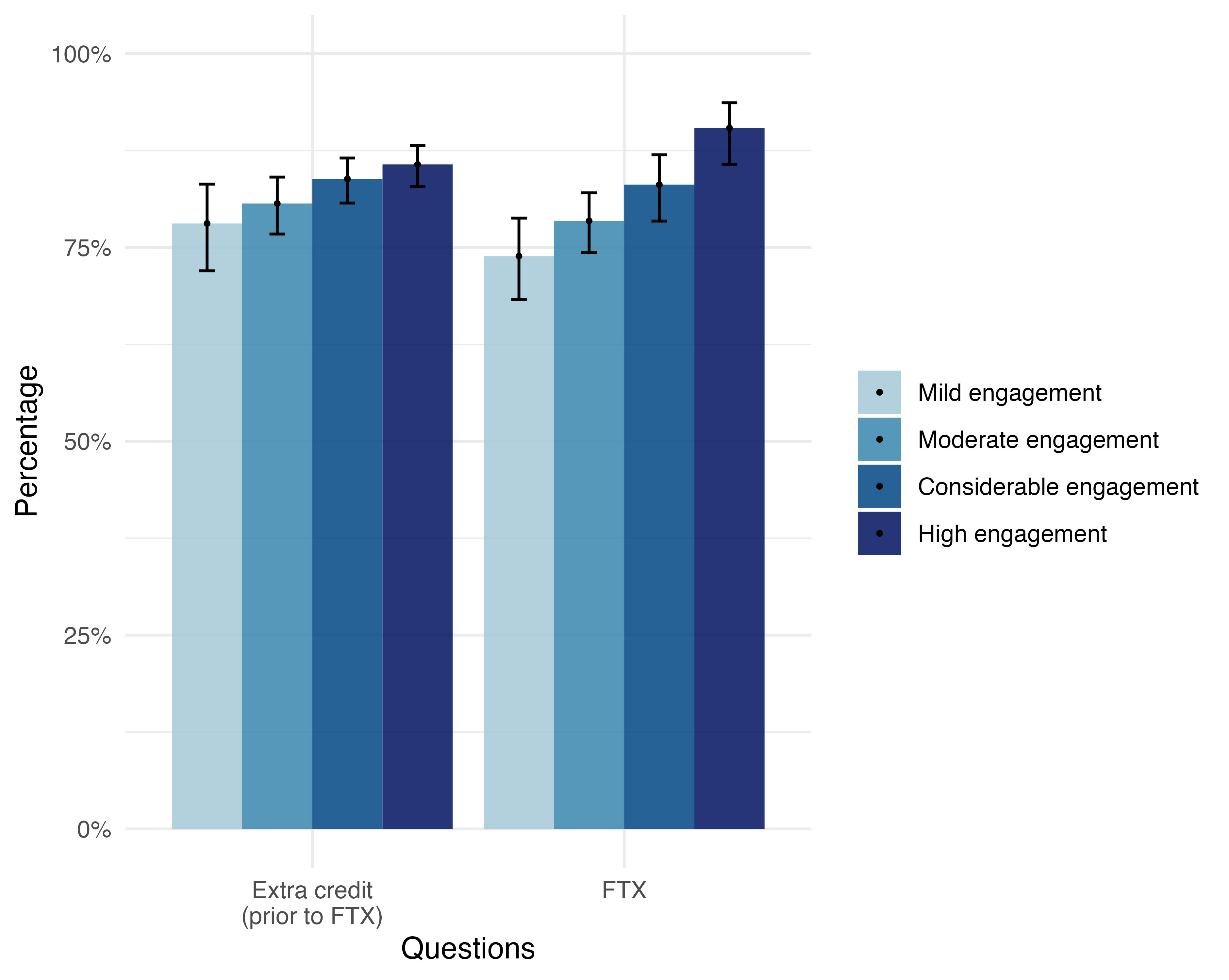
We also find that more engaged respondents are more likely to answer the additional questions (no surprise there).
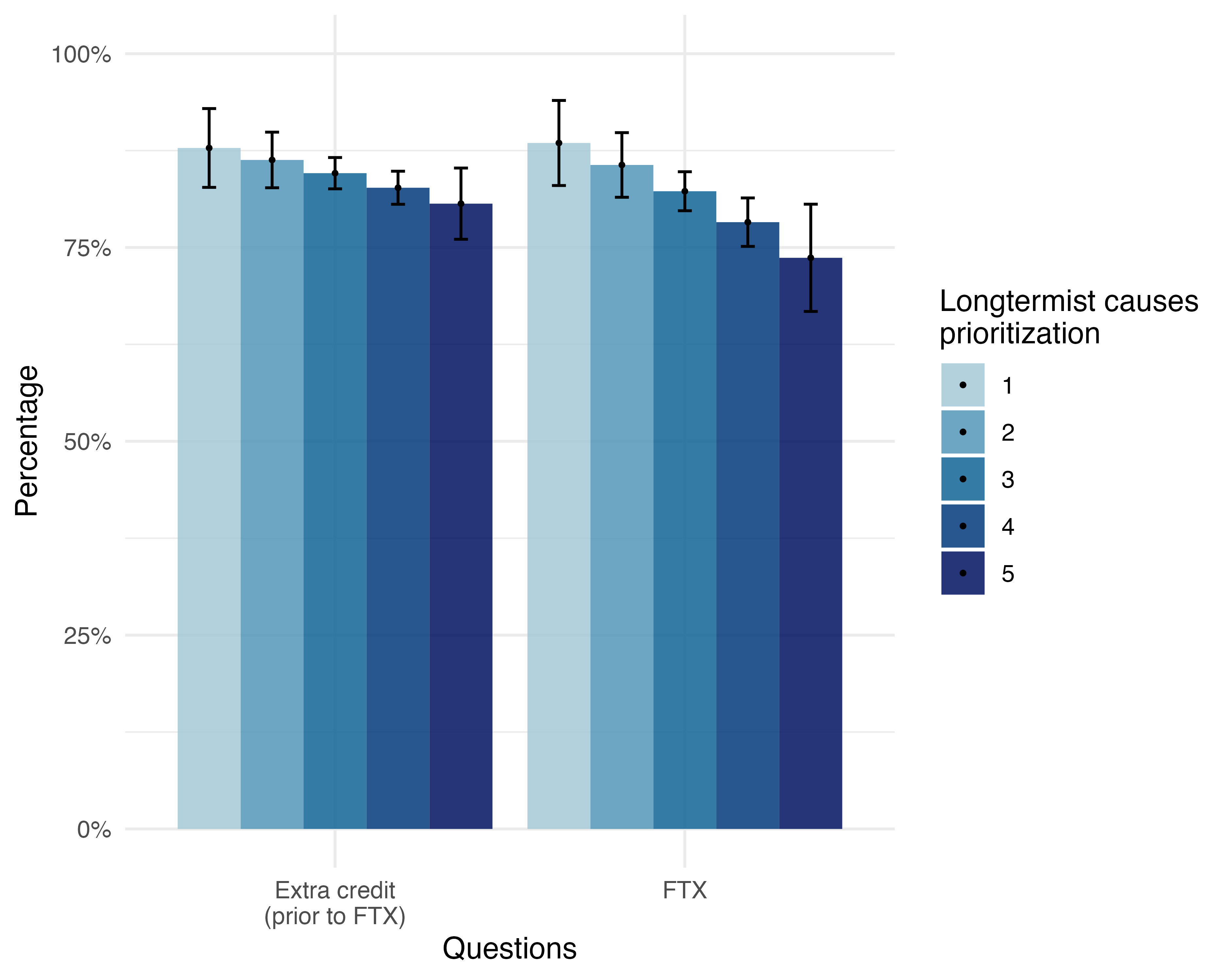
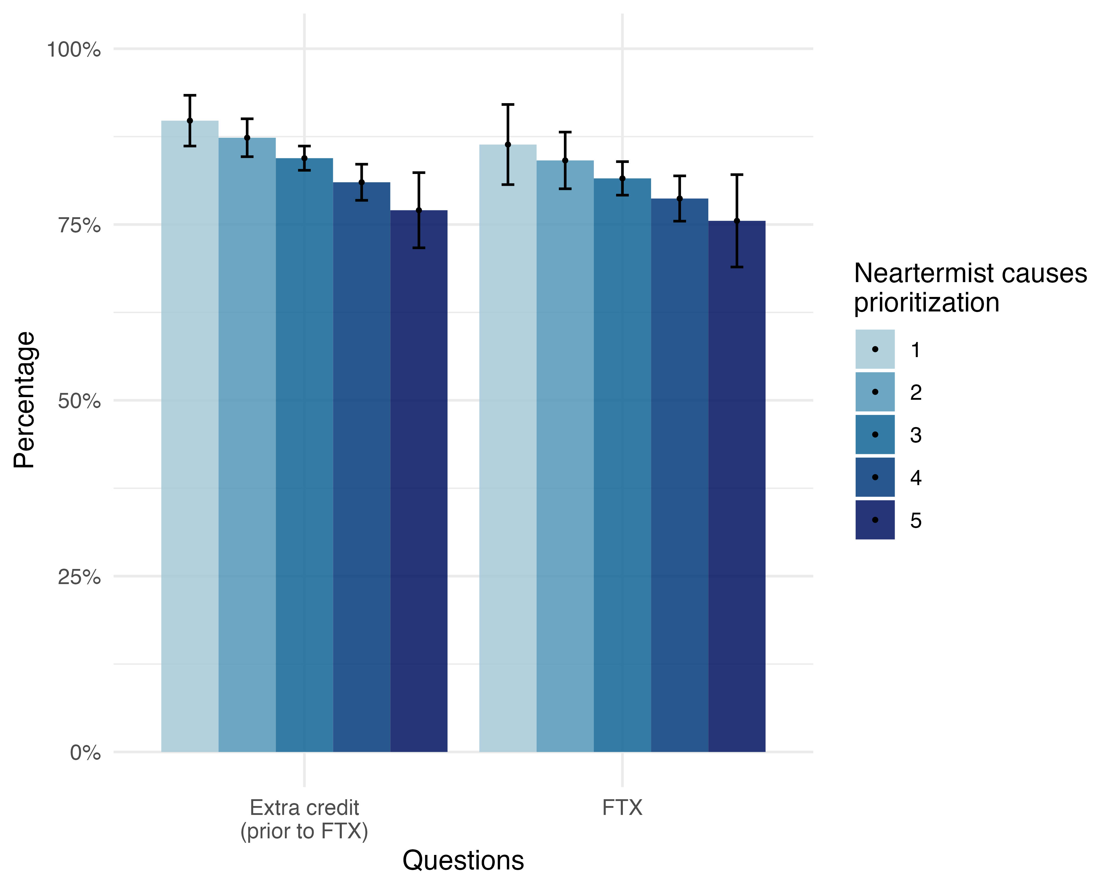
Looking at cause prioritization, we found that higher ratings of longtermist causes and higher ratings of neartermist causes were associated with being less likely to answer this section. So, these do not seem to show a distinctive effect of longtermism or neartermism. This could simply be explained by a third factor or reflect an association with general ‘cause positivity’ (e.g. people who generally tend to rate all causes more highly are less likely to answer these questions).
We conducted a further analysis based on a cluster analysis which we had conducted previously (and which we will outline in the forthcoming cause priortization post). This groups respondents into three discrete groups: longtermists, neartermists, and a group which rates both cause areas highly (this group is disproportionately newer EAs). In this analysis there was no significant difference in likelihood to answer these questions, but people in the ‘high everything’ cluster were substantially less likely to answer these questions.
We did not find any statistically significant differences regarding race (White vs. Non-white) and age.
Yeah it’s fair to worry about the causal interpretation of the satisfaction results, although I think the pre-trend you mention is mostly a result of the GAM model pulling the regression line down a bit due to the later observations. Limiting the analysis to the period before, say, November 9th, shows no such pre-trend. I’m personally more worried about possible confounds such as the one we note about engagement. It could also be that the FTX crisis motivated a certain group of people to take the survey and share their dissatisfaction. So, it’s true that the design of the survey does not lend itself to easily answer questions of causality, leaving it a matter of interpretation based on the results as a whole and context.
Regarding the overall interpretation, I think it might still be fair to conclude that the FTX crisis has decreased satisfaction if we take into account the other results, including the recalled satisfaction pre and before the FTX crisis and the explicit reports of concerns related to FTX, decreased trust etc.
We used the same rubric as in previous analyses (e.g., see here), but it makes sense to repeat it so I also added a footnote.