Comments
This is really cool.
One self-aggrandizing nitpick - You have me at under 3000 karma but I see on my profile that I have 7771 karma... did something go wrong in your calculations there?
This is really cool.
One self-aggrandizing nitpick - You have me at under 3000 karma but I see on my profile that I have 7771 karma... did something go wrong in your calculations there?
Also on the self-aggrandizing arena, you can't see the 5th 6th authors by word count.
I only included karma from posts you're the first author of.
So the missing karma is probably from comments or second author posts.
Oh yeah, must be due to comment karma.
I absolutely love the work you have done, thank you so much!
Well, 139k words. That escalated quickly.
Nice visualization, I wonder how it's doing now? Curious about any post-mortem comments.
Followup to: EffectiveAltruismData.com: A Website for Aggregating and Visualising EA Data
EffectiveAltuismData.com now has a much fancier interface:
Highlights:
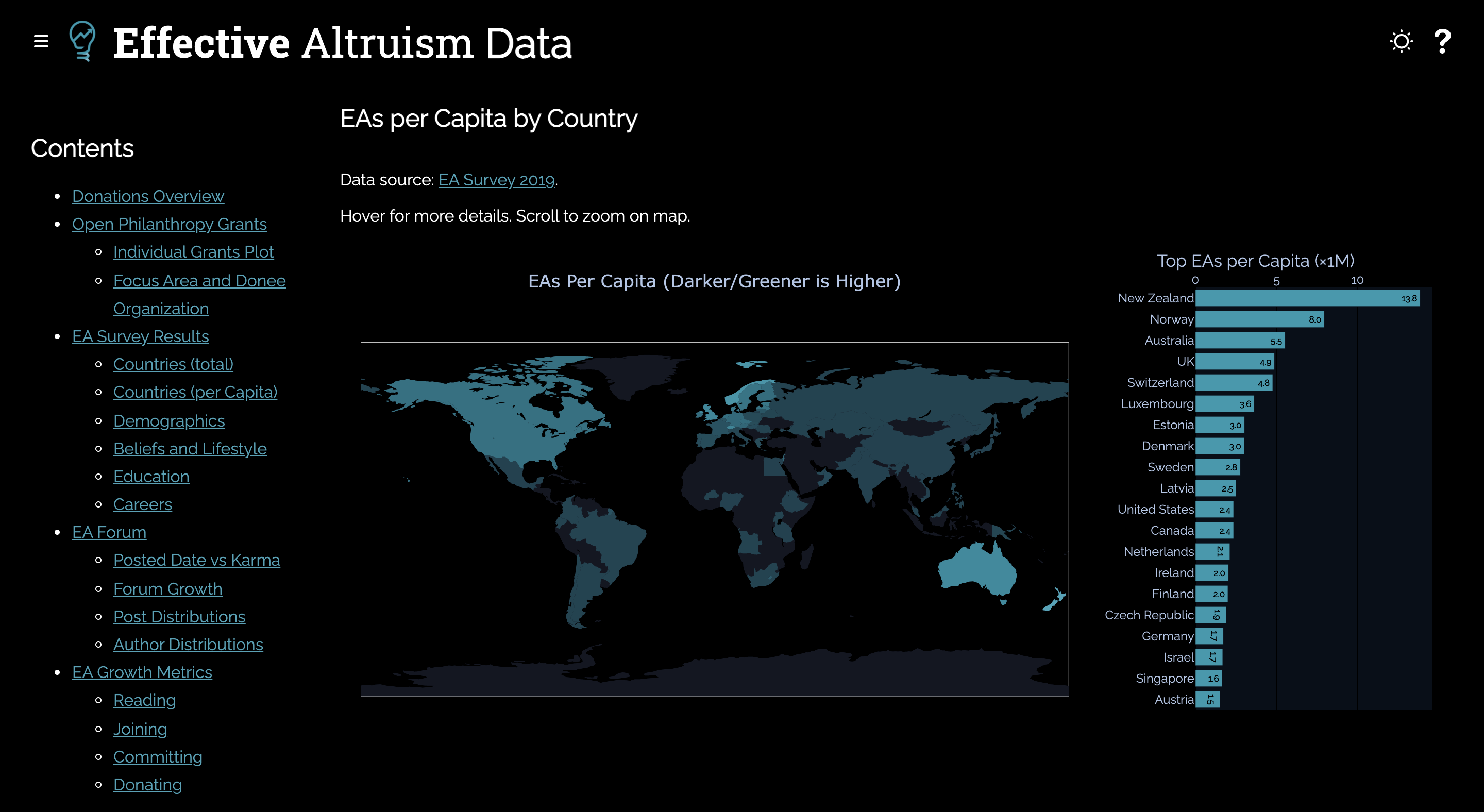
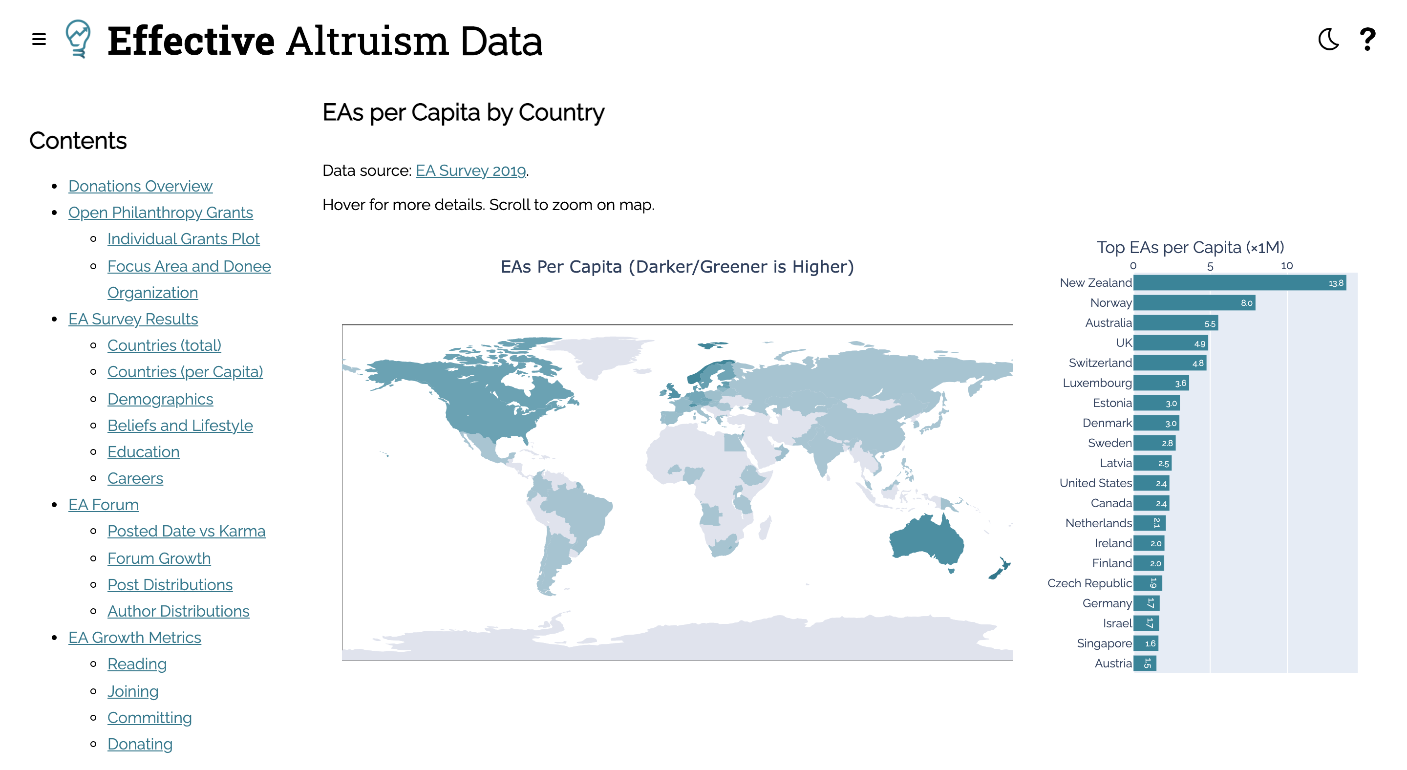
I collected a bunch of data on the EA Forum via the GraphQL interface and created some visualisations form it.
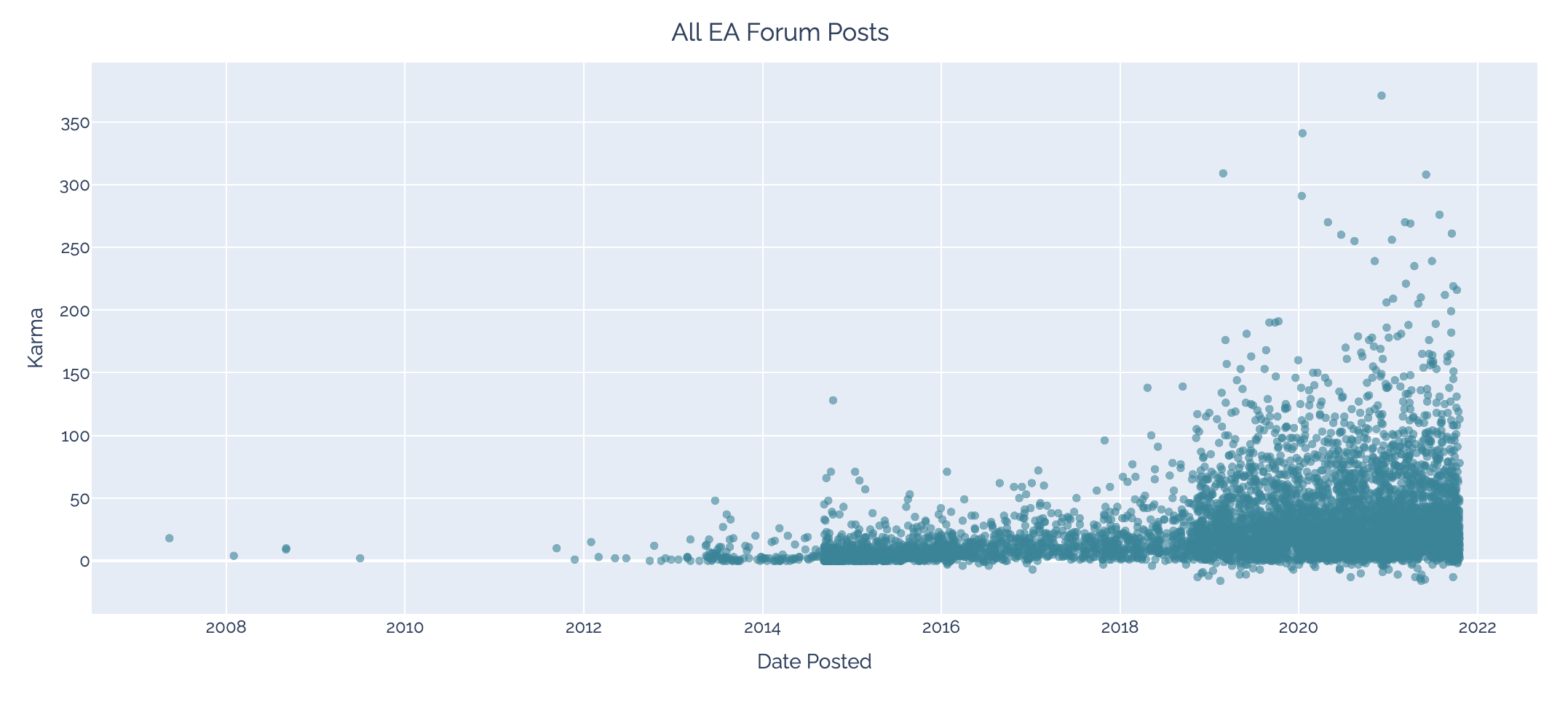
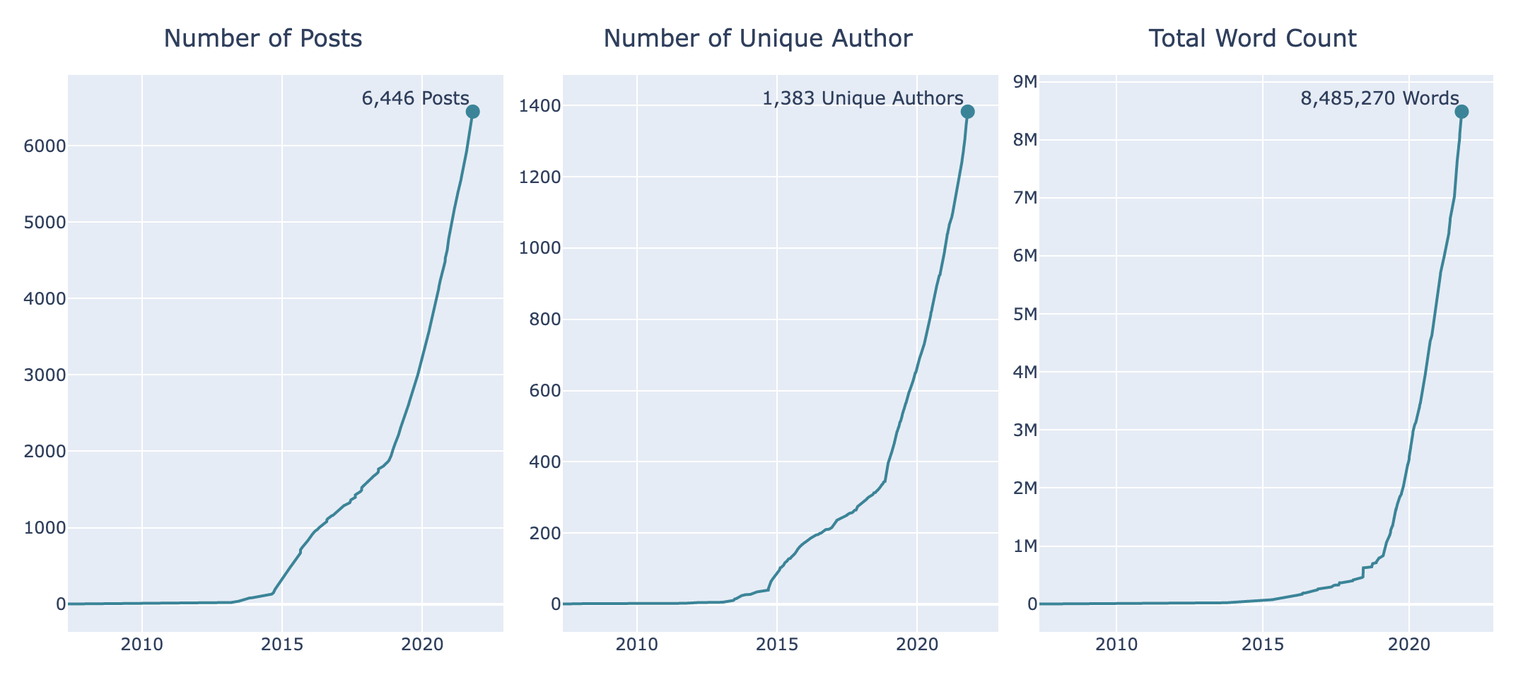
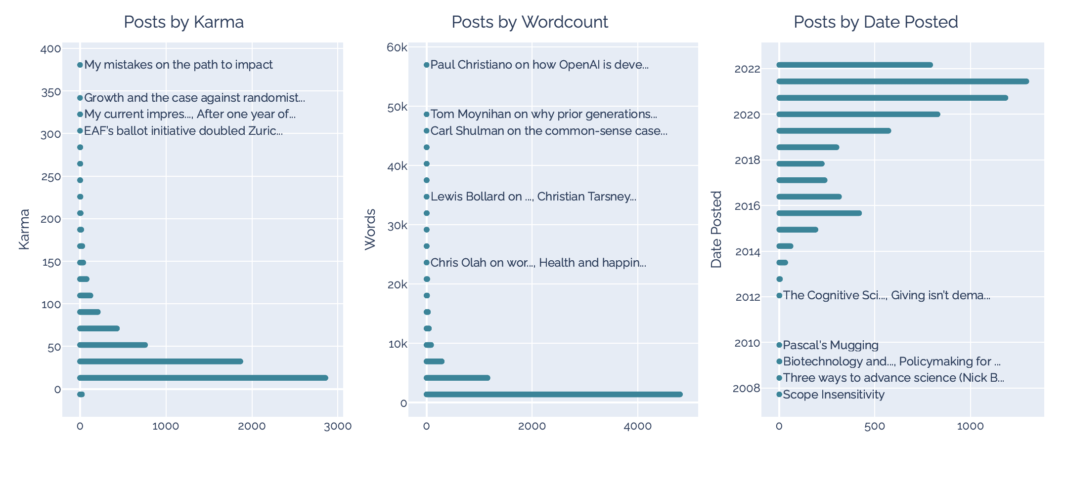
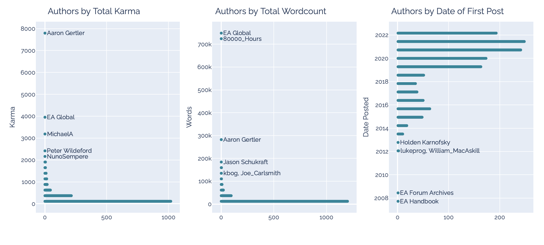
The visualisations are interactive on EffectiveAltuismData.com.
Note that I filtered out a few extremely low karma outliers. They made karma axes harder to read, and it seemed best not to draw attention to them.
These visualisations took something like a full-time week to make.
What's next?
I'm planning a 3-6 month hiking trip in a few weeks, so hopefully I'll be able to get one or two of these done before going off the grid.
If you have any data visualisation suggestions or requests, let me know in the comments, by direct message, or by email.
Nice logo!
Thank you!