Hide table of contents

There’s lots of cool data floating around in EA: grant databases, survey results, growth metrics, etc. I’m a data scientist and enjoy data visualisation, so thought it would be a fun project to build a website which aggregates EA data into interactive plots.

The website is now live at EffectiveAltruismData.com. Source code is available on Github

This project is still a work in progress: the data is pretty out of date and I’ve got lots of future work planned. But it’s far enough along that I’d like some public feedback.

The website is responsive and should look good on any desktop or tablet screen. If you’re viewing on a phone it will probably look ok, but you may need to alternate between portrait and landscape.

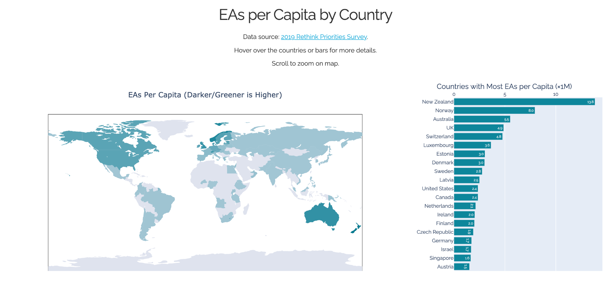
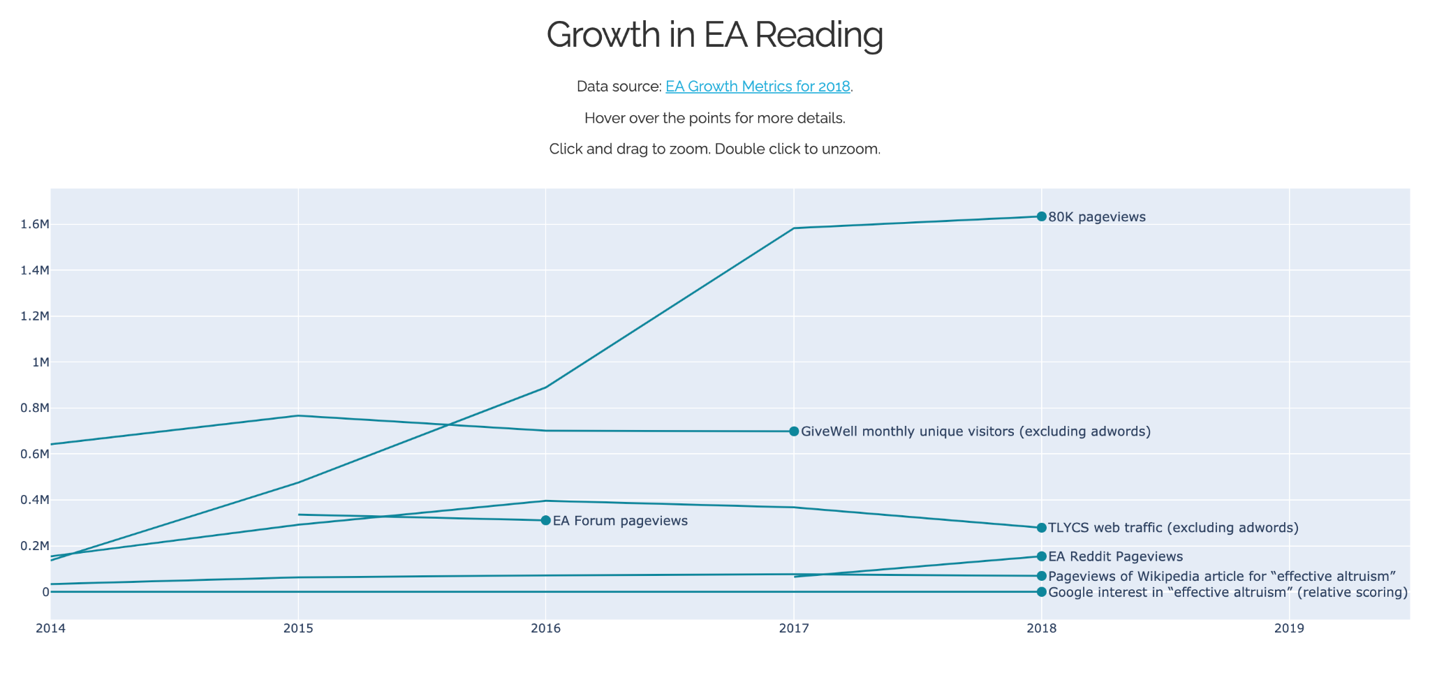
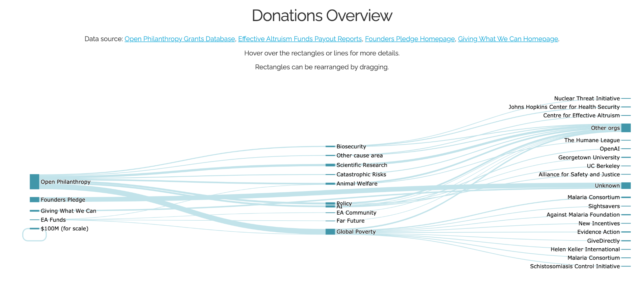
Here are a few screenshots:

Implementation Details

The website is mostly coded in Python. The main libraries I used were:

  • Pandas for data handling.
  • Plotly for creating the interactive plots.
  • Dash for the web framework.

I also wrote a bunch of vanilla CSS for the frontend styling.

The web server is currently deployed with Heroku, which costs $7/month.

I have vague ambitions to re-implement the frontend with D3.js or Chart.js. This should cut down the loading time and give me more control over how the visualisations work.

Design Philosophy

I aimed to follow the data visualisation principles laid out in Information Dashboard Design and Storytelling with Data. These include:

  • Minimise the “ink-to-data” (or “pixel-to-data”) ratio to avoid distracting clutter.
  • Encoding data in length or distance is much higher fidelity than area or angle.
    • Avoid pie charts, stacked area plots, radar charts, violin plots.
    • Stick to bar charts, scatter plots, and line graphs as much as possible.
  • Don’t make the reader rotate their head.
    • Use horizontal bar charts rather than vertical ones.
  • Minimise the total length the eye has to travel to take in all the data.
    • Avoid legends.
    • On line graphs, put the labels directly on the ends of the lines.

Why I Did This

I said earlier that this project was motivated by my fancy for data visualisation. But I do think there’s a lot of scope for valuable data visualisation and data wrangling work within Effective Altruism. 

For example, I’ve found it difficult to get a sense of the scale of donations within EA. Are total donations basically Open Philanthropy plus a rounding error? Or do donations from all the little guys like me actually make a difference in the big picture? 

This isn’t just an interesting question in itself: it also informs my life decisions. If the total donations of people in my reference class is enough to make a noticeable change to AMF funding, then I’m more likely to steadily earn-to-give on a moderately affluent career path. If my reference class is totally overwhelmed by a handful of mega-donors, then I’m more likely to drop everything and spend a year figuring out if I can contribute to AI safety. 

This was some of the motivation behind the first panel of EffectiveAltruismData.com. Ultimately, I’d like to have a plot which puts all the major stocks and flows of EA money on a common scale and puts my personal earning-to-give into perspective.

Another example: I have a vague sense that EAs are getting more diverse over time. Is this true? Currently, answering this question would require going through all the EA survey reports, reading numbers from images of plots, and typing them into a spreadsheet. It would be nice if all the data was easily accessible from some central repository and ready for analysis. 

Data visualisation is a great tool for getting lots of people quickly up to speed on quantitative facts. Gapminder and Our World in Data do this to great effect. If we want EA to be an efficient machine for turning smart people into utils, then we should make full use of data visualisation’s affordances.

This Took Surprisingly Long

I started this project in June last year, a full 14 months ago. This is why the survey data is from 2019.  The git repository has about 170 commits. I reckon each commit represents somewhere between 10 minutes and one hour of work, so I think I’ve spent something like 50-100 hours on this so far.

The website isn’t super complicated. Why did it take so long?

For one thing I wasn’t very good at staying focused and making steady progress until Ivan agreed to be my boss for this project and check in on my progress every week. Thanks Ivan!

Other protracting factors include:

  • Putting this data together required web scraping, exchanging emails, manually typing out numbers from images of tables, correcting typos, and standardising terminology across data sets.
  • The Dash API is kind of a pain. It took me so long to figure out how to customise hover text on bar charts.
  • My goal changed several times throughout the project. First I was going to make a dashboard like the Johns Hopkins one, but with Effective Altruism instead of COVID. But I couldn’t pack all the data into a single screen, so I broke it up into sections with 4-6 plots each. But it was still hard to arrange all the plots harmoniously, so in the end I limited myself to having one or two plots on the screen at a time.
  • There are many tiny decisions which go into each plot. How big do I make the font? Do I leave long labels as they are, or abbreviate them? What order should the bars go in? Each plot needs dozens of iterations before I can settle on answers to these questions.

Future work

A sample from my todo list:

  • Make a line plot of cumulative grants from Open Philanthropy (for each focus area individually and in total).
  • Do all the same plots I have for Open Philanthropy for EA Funds as well.
  • Put a navigation bar on the side.
  • Extract the data from the 2020 EA Survey report.

At a higher level, I’m also thinking about spinning off a Python library for using EA data so that anyone who wants to do any analysis doesn’t have to worry about the arduous data collection process.

And as mentioned earlier, I have vague ambitions to re-implement the plots using D3.js or Chart.js to avoid backend hosting costs and to improve performance.

Request for Feedback

I intend to apply for an EA Funds grant to work full time on building a central repository of EA data with a visualisation frontend. If you might benefit from having better access to EA data, data visualisations, or data analysis, please drop a comment to let me know. If it’s crickets out there then maybe I shouldn’t be spending resources on this.

Examples of feedback which would help:

  • What do you like or dislike about EffectiveAltruismData.com?
  • Are there any data you’d like to see aggregated or compared?
  • Are there any plots you’d like enhanced with interactivity?
  • Have you got any data you can give me?

Thanks

Thanks to Ivan Burduk for volunteering to be my boss for this project.

Thanks to David Moss for help with the EA Survey data. 

Thanks to Mac Jordan for helping get this project off the ground. The first few sessions of work on this were largely excuses to hang out with Mac.

Comments13


Sorted by Click to highlight new comments since:

At least for me, this is broken now :(

That's beautiful! Thanks for creating the website and for this interesting writeup :) 

Hey, can you manage the project on github and, like, make issues and break up the stuff you have planned into chunks? That way, people can help out with stuff if they have time. Or maybe you can look for someone else who is interested in working on this?

Thanks for the suggestion. I don't have a super clear idea of what the main issues/chunks actually are at the moment, but I'll work towards that.

Awesome work!  I remember when Ivan mentioned your project to me.  Really cool to see it come to fruition.  I like the idea of a central data repository and would benefit from it. I think that having an accompanying visualisation like this could add value to the annual EA survey data. 

I also think that creating data visualisations could also help to increase the dissemination and impact of EA research.  I'd like to see more work there too.

I see the website is no longer functional?

Great stuff! Can one use the graphics in articles / blogposts, what is the licensing?

Very exciting! In case funding would help with further developing this project, consider applying here, our process is designed to be fast and easy.

Edit: Ah, I can see that you mention this in your post - we're looking forward to receiving your application!

Thanks to Hamish for also helping me with some of the parsing in moving content from the dynamic document (Rmd/Bookdown) here into the EA forum format for the EAS donations post here.

I hope we can continue to work to develop tools to integrate data visualization and dynamic document formats into the EA forum.

This is very cool! I share your view that comprehensive data is an important part of my personal e2g decision-making (and can be difficult to find).

If you haven't seen it already, this recent post by Ben Todd is probably the best source I know of as far as resource allocation.

  • Make a line plot of cumulative grants from Open Philanthropy (for each focus area individually and in total).
  • Do all the same plots I have for Open Philanthropy for EA Funds as well.

I made a rough attempt to this effect earlier this year (there you can also find a link to the source code).

Oh, great! Your post looks very helpful!

This is truly awesome!!  Adding to upcoming EA Software Engineers newsletter.

This is awesome. Thank you for creating this!

Curated and popular this week
Paul Present
 ·  · 28m read
 · 
Note: I am not a malaria expert. This is my best-faith attempt at answering a question that was bothering me, but this field is a large and complex field, and I’ve almost certainly misunderstood something somewhere along the way. Summary While the world made incredible progress in reducing malaria cases from 2000 to 2015, the past 10 years have seen malaria cases stop declining and start rising. I investigated potential reasons behind this increase through reading the existing literature and looking at publicly available data, and I identified three key factors explaining the rise: 1. Population Growth: Africa's population has increased by approximately 75% since 2000. This alone explains most of the increase in absolute case numbers, while cases per capita have remained relatively flat since 2015. 2. Stagnant Funding: After rapid growth starting in 2000, funding for malaria prevention plateaued around 2010. 3. Insecticide Resistance: Mosquitoes have become increasingly resistant to the insecticides used in bednets over the past 20 years. This has made older models of bednets less effective, although they still have some effect. Newer models of bednets developed in response to insecticide resistance are more effective but still not widely deployed.  I very crudely estimate that without any of these factors, there would be 55% fewer malaria cases in the world than what we see today. I think all three of these factors are roughly equally important in explaining the difference.  Alternative explanations like removal of PFAS, climate change, or invasive mosquito species don't appear to be major contributors.  Overall this investigation made me more convinced that bednets are an effective global health intervention.  Introduction In 2015, malaria rates were down, and EAs were celebrating. Giving What We Can posted this incredible gif showing the decrease in malaria cases across Africa since 2000: Giving What We Can said that > The reduction in malaria has be
LintzA
 ·  · 15m read
 · 
Cross-posted to Lesswrong Introduction Several developments over the past few months should cause you to re-evaluate what you are doing. These include: 1. Updates toward short timelines 2. The Trump presidency 3. The o1 (inference-time compute scaling) paradigm 4. Deepseek 5. Stargate/AI datacenter spending 6. Increased internal deployment 7. Absence of AI x-risk/safety considerations in mainstream AI discourse Taken together, these are enough to render many existing AI governance strategies obsolete (and probably some technical safety strategies too). There's a good chance we're entering crunch time and that should absolutely affect your theory of change and what you plan to work on. In this piece I try to give a quick summary of these developments and think through the broader implications these have for AI safety. At the end of the piece I give some quick initial thoughts on how these developments affect what safety-concerned folks should be prioritizing. These are early days and I expect many of my takes will shift, look forward to discussing in the comments!  Implications of recent developments Updates toward short timelines There’s general agreement that timelines are likely to be far shorter than most expected. Both Sam Altman and Dario Amodei have recently said they expect AGI within the next 3 years. Anecdotally, nearly everyone I know or have heard of who was expecting longer timelines has updated significantly toward short timelines (<5 years). E.g. Ajeya’s median estimate is that 99% of fully-remote jobs will be automatable in roughly 6-8 years, 5+ years earlier than her 2023 estimate. On a quick look, prediction markets seem to have shifted to short timelines (e.g. Metaculus[1] & Manifold appear to have roughly 2030 median timelines to AGI, though haven’t moved dramatically in recent months). We’ve consistently seen performance on benchmarks far exceed what most predicted. Most recently, Epoch was surprised to see OpenAI’s o3 model achi
Rory Fenton
 ·  · 6m read
 · 
Cross-posted from my blog. Contrary to my carefully crafted brand as a weak nerd, I go to a local CrossFit gym a few times a week. Every year, the gym raises funds for a scholarship for teens from lower-income families to attend their summer camp program. I don’t know how many Crossfit-interested low-income teens there are in my small town, but I’ll guess there are perhaps 2 of them who would benefit from the scholarship. After all, CrossFit is pretty niche, and the town is small. Helping youngsters get swole in the Pacific Northwest is not exactly as cost-effective as preventing malaria in Malawi. But I notice I feel drawn to supporting the scholarship anyway. Every time it pops in my head I think, “My money could fully solve this problem”. The camp only costs a few hundred dollars per kid and if there are just 2 kids who need support, I could give $500 and there would no longer be teenagers in my town who want to go to a CrossFit summer camp but can’t. Thanks to me, the hero, this problem would be entirely solved. 100%. That is not how most nonprofit work feels to me. You are only ever making small dents in important problems I want to work on big problems. Global poverty. Malaria. Everyone not suddenly dying. But if I’m honest, what I really want is to solve those problems. Me, personally, solve them. This is a continued source of frustration and sadness because I absolutely cannot solve those problems. Consider what else my $500 CrossFit scholarship might do: * I want to save lives, and USAID suddenly stops giving $7 billion a year to PEPFAR. So I give $500 to the Rapid Response Fund. My donation solves 0.000001% of the problem and I feel like I have failed. * I want to solve climate change, and getting to net zero will require stopping or removing emissions of 1,500 billion tons of carbon dioxide. I give $500 to a policy nonprofit that reduces emissions, in expectation, by 50 tons. My donation solves 0.000000003% of the problem and I feel like I have f