
Open Philanthropy’s Global Health and Wellbeing team continues to investigate potential areas for grantmaking. One of those is education in poorer countries. These countries have massively expanded schooling in the last half century. but many of their students lack minimal numeracy and literacy.
To support the team’s assessment of the scope for doing good through education, I reviewed prominent research on the effect of schooling on how much children earn after they grow up. Here, I will describe my reanalysis of a study published by Esther Duflo in 2001. It finds that a big primary schooling expansion in Indonesia in the 1970s caused boys to go to school more — by 0.25–0.40 years on average over their childhoods — and boosted their wages as young adults, by 6.8–10.6% per extra year of schooling.
I reproduced the original findings, introduced some technical changes, ran fresh tests, and thought hard about what is generating the patterns in the data. I wound up skeptical that the paper made its case. I think building primary schools probably led more kids to finish primary school (which is not a given in poor regions of a poor country). I’m less sure that it lifted pay in adulthood.
Key points behind this conclusion:
- The study’s “margins of error” — the indications of uncertainty — are too narrow. The reasons are several and technical. I hold this view mostly because, in the 21 years since the study was published, economists including Duflo have improved collective understanding of how to estimate uncertainty in these kinds of studies.
- The reported impact on wages does not clearly persist through life, at least according to a method I constructed to look for a statistical fingerprint of the school-building campaign.
- Under the study’s methods, normal patterns in Indonesian pay scales and the allocation of school funding can generate the appearance of an impact even if there was none.
- Switching to a modern method that filters out that mirage also erases the statistical results of the study.
My full report is here. Data and code (to the extent shareable) are here.
Background
The Indonesia study started out as the first chapter of Esther Duflo’s Ph.D. thesis in 1999. It appeared in final form in the prestigious American Economic Review in 2001, which marked Duflo as a rising star. Within economics, the paper was emblematic of an ascendant emphasis on exploiting natural experiments in order to identify cause and effect (think Freakonomics).
Here, the natural experiment was a sudden campaign to build tens of thousands of three-room schoolhouses across Indonesia. The country’s dictator, Suharto, launched the big push with a Presidential Instruction (Instruksi Presiden, or Inpres) in late 1973, soon after the first global oil shock sent revenue pouring into the nation’s treasury. I suspect that Suharto wanted not only to improve the lot of the poor, but also to consolidate the control of his government — which had come to power through a bloody coup in 1967 — over the ethnically fractious population of the far-flung and colonially constructed nation.
I live near the Library of Congress, so I biked over there to peruse a copy of that 1973 presidential instruction. It reminded me of James Scott’s Seeing Like a State, which is about how public bureaucracies impose homogenizing paradigms on the polities they strive to control. After the legal text come neat tables decreeing how many schools are to be built in each regency. (Regencies are the second-level administrative unit in Indonesia, below provinces.) After the tables come pages of architectural plans, like the one at the top of this post.
The instruction even specifies the design of the easels, chairs, and desks. Here’s a desk:

Sure enough, if you search Google images for “Inpres Sekolah Dasar” (Inpres primary school), you’ll find those schools and those desks (source):

The Inpres campaign doubled the stock of primary schools in the country in just six years.[1] Economists call that a "schooling shock."
Methods and results
The Duflo study looks for reverberations of this educational earthquake in data from a household survey that the Indonesian government fielded in 1995. By 1995, the first kids who went to the schools had grown up and started working. The study examines whether boys with more opportunity to attend a new school, by virtue of how young they were and where they lived, actually went to school more and then earned more.[2]
To perform this calculation, the study takes difference-in-differences. It looks not at whether men from regencies that got more schools earned more—a difference—but whether the pay differential between young and old men in 1995 was narrower for natives of regencies that got more schools, which is a difference in differences.[3]
Why look at that? Regencies ranged along a spectrum in how many new schools they got per child. To understand the study’s theory of measurement, I like to split the spectrum into regencies that got fewer schools and those that got more. If the Inpres schools did increase future pay, here’s how the world would look in this framing. In reading this table, bear in mind that it is normal for older workers to earn more than younger ones, as I'll document later. So if something bumps up the pay of younger workers, it narrows the old-young pay gap:
| Regencies getting fewer schools per child in 1970s | Regencies getting more schools per child in 1970s |
|---|---|
| Older natives too old to have gone to new schools | Older natives too old to have gone to new schools |
| Fewer young natives could have gone to the schools | More young natives could have gone to the schools |
| Fewer young natives get pay boost in adulthood | More young natives get pay boost in adulthood |
| Larger old-young pay gap among natives in 1995 | Smaller old-young pay gap among natives in 1995 |
The bottom line (as it were): natives of places that got more schools in the 1970s would exhibit a smaller old-young pay gap in 1995. That is the correlation that the Duflo study looks for…
…and finds. The study (Table 4, panel A) calculates that each additional planned Inpres school, per 1,000 children in a regency, increased boys’ future wage earnings by about 1.5%. The 1.5% number pertains to employees, meaning people who work for other people. (The government surveyors in 1995 didn’t ask self-employed people, including farmers, how much they earned, so they fall out of this analysis.)
In the same way, it is calculated that during childhood those future workers spent a fifth of a year more in school for each Inpres school built per 1,000 children. I think of that finding as an extra year in school for every fifth boy.
If an extra fifth of a year of schooling bumped wages by an average of 1.5%, then a full year would have increased them by about 5 × 1.5% = 7.5%.
Association and causation
That 7.5% payoff rate for a year in the classroom is known as the “return to schooling.” Economists have estimated it thousands of times using data from various contexts. Yet among all the estimates, Duflo’s stands out. It comes from the developing world, which is where most people live. It comes from a big schooling expansion, which adds realism if you’re interested in national-level education policy. And the use of difference-in-differences gives the study a certain rigor, for it rules out some potential critiques. Few other studies can check all those boxes (though some can — see this from Kenya or this from India).
To expand on that last strength: If the Duflo study had only computed differences, then, for example, a simple finding that men from regencies that got more schools earned more, if presented as evidence of impact, could be easily challenged. Maybe everything just costs more — and everyone earns more — in the megalopolis of Jakarta; and maybe Jakarta, as the capital, got more schools per capita. Then we would not need to believe that Inpres schools made a difference in order to explain why men from regencies that got more schools earned more. On the other hand, if urban inflation raised everyone’s wages within Jakarta the same amount, then the old-young pay gap would be the same in Jakarta and beyond. It would not be misleadingly associated with the number of schools each district got. And that, as I said, is what the Duflo study actually checks.
Notice that “if urban inflation…” in the previous paragraph. Despite the rigor of difference-in-differences, you still need to assume something nontrivial about the world in order to fully buy the study’s findings.
Fortunately, the Duflo analysis contains a potentially more compelling basis for proving impact. It has to do with timing.[4] Think of the opportunity to go to one of the new Inpres schools as a medicine. The dosing of that educational opportunity depended on kids’ ages. Approximately speaking, those 12 and up in 1974 were too old to get any of this schoolhouse-shaped drug, for they had aged out before any new schools got built. Kids who were 11 in in 1974 could get a one-year dose before aging out, at least if they lived near one of the new schools. Kids who were 10 could get a two-year dose. And so on. Because every year more neighborhoods and villages got new schools, well into the 1980s, the average schooling opportunity continued rising for younger and younger kids.
So the graph of Inpres schooling opportunity looks like this:

If we found a similar bend around age 12 in other data, such as on earnings in 1995, that would look like the fingerprint of Inpres carrying through, from cause to effect. And that is exactly what the Duflo study suggests happened, if with statistical noise. This graph is from the study:
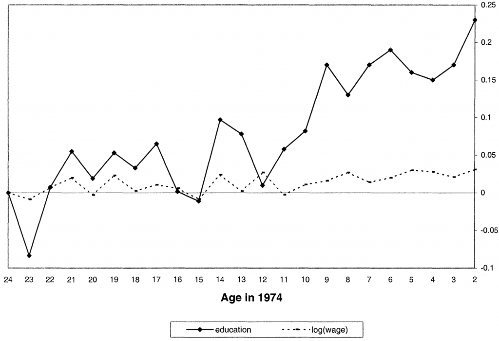
Each dot in this graph is a measurement of the association framed in that table above, between the old-young gap in schooling or pay and how many schools a regency was to receive per child. In that framing, we expect no association for the oldest men in the study, for all were too old to have gone to the new schools. But it should start to emerge—the dots should start to rise—as we scan to men who were 12 or younger in 1974. Duflo wrote:
These coefficients fluctuate around 0 until age 12 and start increasing after age 12. As expected, the program had no effect on the education of cohorts not exposed to it, and it had a positive effect on the education of younger cohorts.
Looking at that graph I wondered: do the trends really bend around age 12? Or should they be seen as straight? Because of the noise, neither characterization completely nails it; the question is whether one model clearly out-fits the other. If the overall trends were straight and long-term, perhaps they had little to do with Inpres. Just as in my reanalyses of Hoyt Bleakley’s studies of hookworm and malaria eradication, I set out to probe this question with a mathematical test.
Starting the reanalysis
I started my quest with a request for the study’s data and computer code. Ironically, Duflo is now the editor of the journal that published her paper. That puts her in charge of enforcing the data and code-sharing policy that applied to her study. Sure enough, she promptly sent me files for reproducing most of the results.[5]
Once I had anchored myself in exact reproduction, I made changes to the code. Most owe to the passage of time: methods in empirical economics have improved since 2001, and Indonesian men of the generation in the Duflo study have continued tracing their way through life (and through government survey data).
While my biggest question going in was about timing, I stumbled on another first-order issue: an alternative explanation for the numerical findings.
I’ll explain a few technical concerns first, as non-technically as I can, then move to that alternative explanation and the search for bends in trends.
Data corrections
Some numbers in the Duflo study come from government documents published in the 1970—presidential instructions and reports on Indonesia’s 1971 census. At the Library of Congress, I scanned pages in these books and double-checked the numbers Duflo sent me. In my experience, it is normal for such a check to expose errors, and normal for them not to affect conclusions much—as happened here. For about a tenth of regencies, my figures for planned new schools per 1,000 children differ from Duflo’s. (See my Github repo.)
Clustering
It’s a truism that the larger your sample, the more precise your statistics. The margin of error is tighter if you poll 1,000 people than if you poll 10. But margins of error must themselves be estimated, and determining the effective sample size for this purpose is often a head-scratcher. Should we view a study of the impact of state air pollution rules on asthma rates as being about 50 states or, say, 50 million people? The answer can radically affect how precise we take the results to be. One rule of thumb: the effective sample size is the number of treatment units. There are 50 states, with 50 air pollution laws, so 50 is your number, not 50 million.
In a striking turnabout, soon after finalizing the Indonesia study, Duflo coauthored a paper raising doubts about the methods she had just used: “How Much Should We Trust Differences-in-Differences Estimates?” This new paper was not purely destructive, for it demonstrated the value of a particular mathematical correction, called clustering, which allows one to crunch data on millions of individuals while computing margins of error as if the sample is much smaller. Under the influence of that paper, in returning to the Indonesia study, I cluster standard errors by regency. This widens confidence ranges by a factor of two or three.
Overrepresentation of wealthy families
Governments run many surveys--to track how much people work, how healthy they are, how much they pay for housing, etc. Some surveys are censuses, which ideally entail knocking on everyone‘s door, and even reaching the people who don’t have doors. But finding all those people, asking them lots of questions, and collating the answers all costs money. This is why most surveys, like polls, take samples.
As soon as one gives up on surveying everyone, the question arises: what is the best way to allocate surveying resources to get the most accurate statistical picture? Often, it is not to take a plain random sample, as when pollsters dial random phone numbers. It can be better to split the sample into strata — urban and rural, rich and poor. If some strata are known from censuses to be more homogeneous, then governments can get more precision for the money by sampling those strata less and others more. In a history of one of Indonesia’s national surveys, Parjung Surbakti explains it well:
The fact that an orange taken from a truckload of oranges all coming from the same orchard is sweet, gives adequate evidence to conclude that all the oranges in the truck are sweet. In this example, a very small sample size can provide an accurate conclusion about a large population when the population is homogeneous. It would be a different story if the oranges came from a number of orchards and consisted of different varieties. Then a sample of size 10 might not give as accurate a conclusion as that of the previous example. However, if the truckload of oranges can be sorted by varieties, i.e., the population is stratified, then sampling once again may be made more efficient.
It seems that in Indonesia, poorer people are thought to be more like oranges from the same orchard. For the government surveyors disproportionately visit wealthy households, where wealth is indicated by possessions such as toilets and diplomas.
The Indonesia survey data used in the Duflo study are accompanied by weights to document the oversampling of some groups. They indicate, say, that each surveyed household with a toilet stands for 100 others while each without stands for 200. However, the Duflo study mostly does not incorporate these weights.[6] As a result, wealthier people are overrepresented.
Whether such weights should in general be factored in is a confusing question, so much so that three respected economists wrote “What Are We Weighting For?” to dispel their colleagues’ befuddlement. Here, my concern is that the data are being tilted on the basis of the outcomes of interest. People with more education and higher incomes were more likely to get a knock on the door from a surveyor in 1995 and thus to appear in the Duflo analysis. Imagine a study of the impact of smoking in which people who live are oversampled at the expense of people who die. That would make smoking look safer than it is.
That is why I prefer to incorporate the weights in the Indonesia analysis. For technical reasons, this not only shifts the impact estimates, but further widens margins of error.[7]
Instability of ratios
I quoted the estimate that the Inpres campaign raised wages by 7.5% per year of extra schooling. That is a ratio: a 1.5% wage boost divided by 0.2 years (a fifth of a year) of extra schooling. Because the numbers going into the ratio are themselves averages from samples of Indonesians, each comes with its own margin of error. The true value of the schooling increase in the full population might be 0.3 years or 0.1 years — or 0.0. And if, as far as the math goes, there’s a nontrivial chance that Inpres led to zero additional years of schooling, then there’s a nontrivial chance that the ratio of wage increase to schooling increase is infinite.
The point is not that I think the return to schooling could be infinity (or negative infinity), but that ratios emerging from this sort of analysis can range wildly. Standard methods for computing margins of error can underestimate this uncertainty.
Since Duflo wrote about Indonesia, economists have made a lot of progress in recognizing and working around this devil in the details, which is called “weak identification.” In my reanalysis, I marshal a modern method called the wild-bootstrapped Anderson-Rubin test, which happens to be performed by a cool program I wrote. Like the clustering and weighting corrections, the new method widens the uncertainty bands around the estimated return to schooling.
Bottom line after incorporating the technical comments
After I fix data errors, cluster, and compensate for the oversampling of wealthy households, it is surprisingly unclear whether Inpres caused boys to spend any more time in school. And because dividing by a number that is hard to distinguish from zero produces unstable results, the impact on wages per extra year in school is even less clear. Where Duflo brackets that 7.5% schooling return rate with a 95% confidence range of 1–15%, I widen to a huge span, –44% to +164%.[8]
To be fair, that wide range can mislead. My 70% confidence range is 0–23%. I conclude that incorporating the technical comments into the core Duflo analysis leaves it weakly favoring the view that Inpres-stimulated schooling raised wages.
The alternative explanation: wage scale dilation
As I wrangled with those technicalities and worked to answer my original question about trend bending, I discovered another reason to doubt the Duflo study’s results. And once I did, I realized that Clément de Chaisemartin and Xavier D’Haultfœuille had already pointed to the heart of the issue. It turns out that some more mundane patterns in the data, when fed into the difference-in-differences machine, can produce the same statistical results.
Here are some universal truths, or at least as close as you get to that in economics:
- Those who go to school more earn more, on average.
- The earnings gap between the more- and less-schooled rises with age.
As an example of the second point, in the 1995 Indonesia data, the average employed, college-educated 21-year-old man earned 744 rupiah per hour, only 18% more than the 633 rupiah earned by a contemporary who dropped out of school before fourth grade. But at age 61, in the same data, the hourly pay for the primary school dropout was basically unchanged, 642 rupiah, while pay for the college graduate was more than six times higher than at age 21, at 4,852 rupiah.
This graph shows more fully how the wage scale widened with age among employed Indonesian men in 1995:
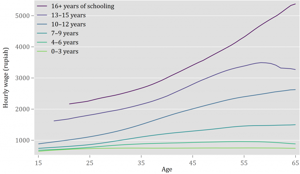
I imagine the people behind the bottom curve as farm workers whose pay had little to do with age. And I imagine that the top curve traces how the elite ascend the ranks of big corporations and government.
The widening of the wage scale feeds into the Duflo study in a mind-bending way. Suppose (correctly) that poorer regencies — the ones that produced more day laborers and fewer doctors and lawyers — received more Inpres schooling funding per child. Then we would see:
| Regencies getting fewer schools per child in the 1970s | Regencies getting more schools per child in the 1970s |
|---|---|
| Natives better off on average | Natives poorer on average |
| More kids grow up to be CEOs | More kids grow up to be day laborers |
| Average pay rises a lot during career | Average pay rises little during career |
| Larger old-young pay gap among natives in 1995 | Smaller old-young pay gap among natives in 1995 |
This table starts and ends in the same places as the earlier table: getting more schools means a smaller old-young pay gap. But it goes by a different route. Nowhere does the new scenario assume or require that the Inpres school-building campaign had any effect.[9] Thus, the study’s methods could lead to the conclusion that Inpres schools raised wages even if they did not.
You might push back against my skepticism: I’m undercutting an argument that schooling increases earnings by invoking the universal truth, confirmed in the graph above, that pay and education go hand in hand — which itself seems like powerful evidence that education increases earnings!
To which I reply: The Duflo study strives not merely to prove that education raises wages, but to measure the impact more sharply. It invokes a natural experiment to remove sources of statistical bias, such as my urban inflation hypothetical. It matters whether the natural experiment is working as intended.
Fresh findings
To probe whether wage scale dilation is generating the Duflo study’s results — and to return to the search for bent trends — I pursued three strategies:
- As foreshadowed, I tested mathematically whether the trend really bends in that Duflo graph I showed earlier. The wage scale dilation theory amplifies the importance of this check: I have no reason to think that wage scale dilation suddenly kicks in at a particular age, so a clear bend in the trend of emergence of those differences-in-differences would favor the Duflo explanation as laid out in that first table above.
- I deployed a newer statistical method called changes-in-changes, which should be immune to wage scale dilation.
- I followed up later on the same generation of Indonesian men, in data from 2005, 2010, and 2013–14 (a selection dictated by whether the surveys asked the needed questions and whether the answers are publicly available). One reason was to see whether the reported link between schooling and earnings was consistent over men’s careers, or a one-off in 1995.
To convey the results, I’ll show you some graphs. All are constructed like that Duflo graph I showed before. But I’ve incorporated the technical fixes, such as correcting data errors, and added some visual elements.
First comes my update of the “education” contour in the Duflo graph. Again, a precise statement of the meaning of the dots — blue in mine, black in the Duflo graph — is a mouthful. Each shows how much the old-young gap in total years spent in school, among men of a particular age, was associated with how intense the Inpres program was in their home regency.[10] Around the dots I added gray bands to depict 95% confidence intervals.[11] They remind us that because of noise in the data, each dot could have landed a bit lower or higher than it does. And I fit a line to the data, in red, while allowing it to kink at age 12:

The schooling trend hardly bends. From the standpoint of this search for the fingerprint, it’s not clear that building Inpres schools contributed to rising school attendance. A statistical test for whether the slopes of the two red segments differ returns a p-value of 0.60, which I printed in the upper left. That high probability means that a bend this small could easily have happened by chance, because of statistical noise, if the true line did not bend at all.[12]
Now, the Inpres program built primary schools. So did it at least get more kids to finish primary school? Quite possibly. In the next graph, the vertical axis pertains to the share of workers in 1995 who had finished primary school rather than the total years they spent in school. Now the trend more clearly accelerates around age 12. The p-value for the bend is reassuringly low, at 0.01:

It’s a strange pair of findings: boys finished primary school more but didn’t go to school more? I have an explanation. The surveyors in 1995 didn’t actually ask people how many years they went to school, but rather the highest grade they attended. Probably, when the schools were first built, some kids who were officially too old to attend them went anyway, rather than going to junior high schools farther away.[13] Even if they spent exactly the same number of years in school, the study would have coded them as having spent fewer, since on paper they only got as far as sixth grade rather than seventh or eighth.[14]
If Inpres at least got more boys through primary school, did that suffice to raise their pay in adulthood? The next graph gets at that possibility by switching the vertical axis to wages. Again, the trend bends up, with a reassuringly low p-value:

If we assume that the deflection in the primary schooling trend caused the deflection in the wage trend, then we can divide the second by the first to gauge the rate of impact. Unfortunately, the first (the increase in primary school completion) still does not differ from zero with enough certainty to stabilize the ratio. In my paper (Table 7, panel B, column 2) I calculate that finishing primary school changed wages in adulthood by somewhere between –12% and +∞, as a 95% confidence range.[15]
Another source of doubt: when I checked on the same generation of men later in life, the upward bend in the wage trend didn’t persist as strongly. In 2005 (when the men aged 2–24 in 1974 had reached ages 33–55) and 2010 (ages 38–60), the line bends slightly downward.[16] In 2013–14 (ages 41–64), it bends more significantly upward. Rather than showing you all of those here, I’ll average them in a single graph:[17]
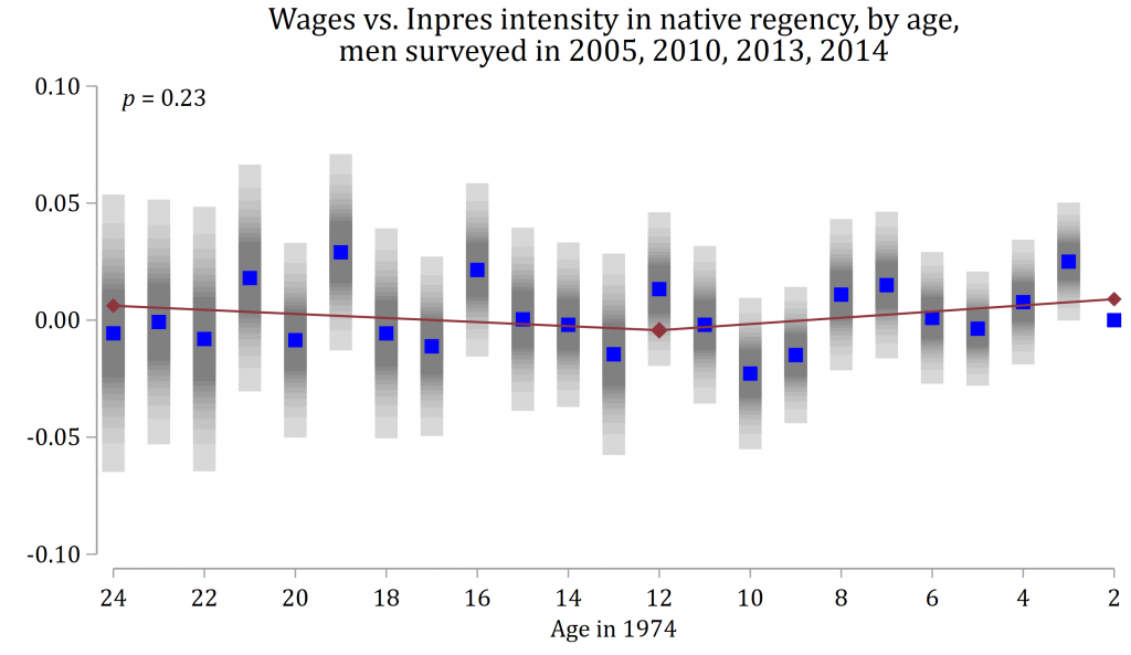
The red line bends upward, with a p-value of 0.23. I’m not one to mechanically dismiss a finding as “insignificant” when the p-value exceeds 0.05. At face value, p = 0.23 means there’s less than a 1-in-4 chance of a bend this big in the data if the true pattern is no bend at all. On the other hand, I could have put the finding to an even more rigorous test by including more of the control variables used in the Duflo study.[18]
Separately, I ran the changes-in-changes method I mentioned, the one that should be immune to wage scale dilation. This approach finds no wage boost from Inpres.
Conclusion
To recap:
- A representative result from the Duflo study is that Inpres-stimulated schooling increased future wages of boys by 7.5% per year of school, with a 95% confidence range of 1–15%.
- Technical adjustments widen that range hugely. The main reason is that it is surprisingly unclear whether the Inpres school construction led boys to go to school more. Dividing any wage increase by a number that cannot be confidently distinguished from zero makes for instability.
- It is more plausible that the program caused more boys to finish primary school.
- There’s another way to explain why the study finds that Inpres increased adult earnings. It is rooted in two facts: over their careers, more-educated people see their pay rise more (wage scale dilation); and poorer regencies got more schools per child.
- The changes-in-changes method, which is in effect designed to rule out wage scale dilation as an explanation, finds no wage boost from Inpres.
- On the other hand, an apparent fingerprint of Inpres, the trend bend, holds up fairly well in the wage data of 1995 despite my technical tweaks. And wage scale dilation would not be expected to cause such a bend.
- The fingerprint persists weakly later in life.
The findings reported here are important because they show that an unusually large government-administered intervention was effective in increasing both education and wages in Indonesia.
I am confident that, in retrospect, that reading is overconfident. But I wouldn’t swing to the opposite extreme of no confidence. It seems more likely than not that building all those schools (and hiring all those teachers) got more kids into school. And the big push may have left light fingerprints in the wage numbers decades later. Meanwhile, it is conceivable that the conservatism of the changes-in-changes method, which makes it less prone to generating false positives, also makes it more prone to generating false negatives.
Still, the rate of return to Inpres-stimulated schooling — wage gains per additional unit of schooling — is quite unclear.
One’s judgment about whether basic education in developing countries is a good thing should not hinge solely on the answers emerging from this study, nor even on the questions it asks. It could be that Inpres schools indeed made a large difference in Indonesia, but that the “natural experiment” was just not strong enough for the signal to shine through the noise. Or — more likely — the problem is that, as Lant Pritchett puts it, schooling ain’t learning. Maybe the Inpres schooling campaign was better at getting kids behind desks than knowledge into their heads. If billions of kids are passing through school and not learning much, there is huge room for improvement.
Moreover, higher pay is not the only reason to send kids to school. As I write, Duflo and coauthors are using randomly allocated scholarships in Ghana — an artificial rather than natural experiment — to research a wide array of potential consequences of secondary schooling, for girls as well as boys. Do the girls go on to have fewer unwanted pregnancies? Do fewer of their children die in the first year of life?
I am struck by how often the findings from studies of “natural experiments” fray under stress. An appreciation for that fact may explain why, soon after completing her dissertation, Esther Duflo became a champion of running actual experiments, such as the scholarship experiment in Ghana. Discarding some of what she learned in school would eventually pay high returns. It made Duflo the second woman to receive a Nobel prize in economics. And it drove her profession to produce more credible research.
- ^
- ^
The study restricts to men because they more uniformly engage in paid employment or self-employment across their careers, which enhances comparability across age groups. Separately, Duflo studied effects on girls.
- ^
More precisely, wages are taken in logarithms, so the “pay gap” is a ratio.
- ^
Duflo (2004, p. 350) sees an additional virtue in this natural experiment: “Identification is made possible because the allocation rule for schools is known (more schools were built in places with low initial enrollment rates).” But an allocation rule is no less endogenous for being known. And Duflo (2001, Table 2) shows that the non-enrollment rate was a secondary correlate of allocation. It matters even less after data corrections (figure 1 of my write-up).
- ^
Duflo’s license to the 1995 survey data did not permit her to share it. But through the gratefully appreciated assistance of Daniel Feenberg, I indirectly accessed the copy licensed by the NBER. Separately, IPUMS International hosts a large subset.
- ^
This is not documented in the text but is made plain in the code.
- ^
For intuition, imagine concentrating all weight on a few observations. This effectively slashes sample size.
- ^
Here, I express these results as percentages rather than log points, i.e. as exp(x) – 1 where x is a primary statistical result.
- ^
Formally, I am suggesting a violation of the parallel trends assumption required for causal interpretation of difference-in-differences results.
- ^
Each dot shows, for men who were a particular age in 1974, how much their total years spent in school increased for each additional Inpres school per 1,000 children in one’s native district, relative to the benchmark group, here taken to be those aged 2 in 1974. The sample is restricted to wage earners.
- ^
Figure 1 of the Duflo study also shows confidence intervals, but for the schooling contour only.
- ^
The same test applied to the uncorrected original returns a p-value of 0.09. See figure 6 of my write-up.
- ^
The primary school gross enrollment ratio, which is the ratio of the number of kids attending primary school to the number of official primary school age, temporarily surpassed 100% in the 1980s. Suharti, “Trends in education in Indonesia,” Figure 2.5.
- ^
In fact, the Duflo paper (page 804) finds a slight fall in secondary school attainment.
- ^
The statistical method cannot rule out with 95% confidence that the Inpres schooling campaign had zero effect on the rate of primary school completion, and thus that the impact on wages per unit of gain in primary schooling was infinite.
- ^
For reasons of data availability, wages are defined differently in different years. In 1995 and 2010, they are the log hourly wage for wage workers. In 2005, they are log hourly wages as imputed from a model calibrated to 1995 data. In 2013-14, they are log typical monthly pay from all sources, including self-employment. The 2010 data have the disadvantage of being coded only by regency of workplace, not regency of birth.
- ^
The regressions behind this plot pool the data from all post-1995 follow-ups. The dependent variable is the one defined within each survey sample. Year dummies are added as controls.
- ^
One of these, Inpres water and sewer spending, could plausibly generate a trend break.
I like this style of post and would love to see more of it on the forum. An interesting reanalysis.
I agree that this study is not remotely closing the book on whether educational interventions should be prioritized. Not least because even a significant effect on wages wouldn't rule out the possibility of negative spillovers - control students lose out because of labor market competition - which would of course matter a lot for policy implications.
I know it's very ancillary to the post, but I'm not a fan of the last paragraph. The findings of natural experiments are less robust because the world is a random place. Tons of important policies can't be studied through RCTs, and it feels wrong to have an outlook that throws out the signal from natural experiments just because there's more noise relative to RCTs. RCTs have their own problems, too - for example, an education scholarship RCT could give us clean estimates of the returns to education but it wouldn't be able to tell us the effects of a large-scale educational policy like Inpres, which will have problems of scaling, a different population, etc.
Hi Karthik. Without belaboring shades of emphasis, I basically agree with you. But you know, I've just spent thousands of words criticizing someone's work and I want to end positively, within reason.
Man this is one of the best posts I've ever read on the forum. Extremely educational while remaining very engaging (rare to find both). Thank you for writing this, I hope you'll do similar write-ups for other research you do!
Very interesting analysis! I didn't realize clustered standard errors weren't in use pre-2000. Is there are reason you published this result here rather than as a letter in the AER?
I can do both--economics has a long tradition of accepting circulation of "working papers" or "preprints" without jeopardizing publication in journals. In fact, Esther suggested I hold off submitting a comment to the AER until she steps down as editor in a few weeks.
Actually, if clustering was not as common in 2001 as now, it was not rare. She clustered standard errors in the other two chapters in her thesis. My future colleague Mead Over coauthored a program in 1996 for clustering standard errors in instrumental variables regressions in Stata.
Nice. Good luck in getting it accepted! Methinks that if she clustered in the other two chapters, but not this one, she actually did try clustering and didn't like what it showed... Not that I'm judging; we've all done it. I remember hearing a rumor in grad school that there was some time period in the 90s when there was a bug in stata, and basically all the standard errors are incorrect from that time.
I wouldn't be be too confident. Much more honest explanations exist eg they learnt about the technique later in their PhD and didn't go back to redo earlier analyses.
Seems doubtful as she published it in the American Economic Review after she'd completed her thesis. I'm surprised the reviewers didn't require that clustered standard errors be shown, but I can only guess it wasn't common back then.
wThanks for this reanalysis, David. It feels like those psychology exepriments being revisited and finding that not everything was as it seemed.
I am by no way an economists so pardon me for my question:
When Duflo's results pinpoint to the ratio of wage increase by schooling increase thanks to the Inpres program, and then you give the alternative explanation based on the "2 truths", I fail to see a difference in the basic structure of what happened between the two cases (putting aside the ratio in Duflo and the uncertainty of a ratio contribution in your reanalysis): Inpres schools got more kids to get schooled and it increased their earning VERSUS poorer regencies got more primary schools, which increased the chance of those kids getting to primary school and, comparatively with others who couldnt attend it, are more schooled and then -following one of the truths- more schooled is more earnings.
Am I missing something correct in my statement?
Furthermore, if schooling increases earnings and chances of getting schooled (reckoning schooling =/= learning) increase if there are schools available, should debates still focus on whether building schools increases schooling and then earnings or shift it to another area of attention? Im asking as someone who lives in an underdeveloped country.
Thanks a lot for this incredible work. I could read it through and like it. Now I will be re-reading Poor Economics with more skepticism.
Good question! I think it brings out a couple of subtleties.
First, in putting forward the "universal" truth that education and earnings go hand-in-hand, I mean that this is a regularly found society-level statistical association. It does not mean that it holds true for every individual and it does not take a position on causality. So I don't mean to imply that if a particular child is made to go to school more this will "universally" cause the kid to earn more later.
In particular, while I think poorer regencies got more schools and that increased primary school completion, and while I believe that in general education and earnings go together, I'm much less sure that this particular exogenous perturbation in life paths had much impact. (One reason, which falls outside the study, you allude to: I don't know if they learned much.)
Of course, it is entirely plausible that getting more kids into school will cause them to earn more later. Which brings me to the second subtlety. It would be easy to read this post (and perhaps I need to edit it to make it harder) as judging whether there's any affect: does education raise wages. But I want it to be read as asking, given all we know about the world outside the Duflo study, should the Duflo study cause us to update our views much about the size of the impact of education on earnings?
I think the paper comes off as rather confident that it should persuade skeptics---see the block quote toward the end of my post. That is, if you were generally skeptical that education has much effect on earnings before reading the paper, it should change your mind, according to its author, because of the techniques it uses to isolate one causal link, and the precision of the resulting estimates. When I wrote "I wound up skeptical that the paper made its case," this is what I was referring to. If you generally think education increases earnings on average because of all you know about the world, or if you think the opposite, this paper probably shouldn't move you much.
I think I had to reread the Methods and results several times before understanding what seemed very unintuitive -- I initially would've guessed that the young-old wage gap would've been higher among the more educated population. Since the more educated youngsters would have made more money.
I think upon rereading and brief reflection that the young-old wage gap is supposed to be a situation where older men make more money? And the gap is lower if younger men had more education. This makes sense but I got tripped up a few times (and am still not certain my reading is correct). Sorry if this question is really naive for people who understand the labor econ literature!
Thanks for the feedback. I can see why that is confusing. You figured it out. I inserted a couple of sentences before the first table to clarify. And I changed "young-old pay gap" to "old-young pay gap" because I think the hyphen reads, at least subliminally, like a minus sign.
Thank you so much! I'm embarrassed to admit that I was indeed probably subliminally affected here by the ordering.
Hi David, I really enjoyed this post. Your comment on the potentially infinite standard errors on ratio distributions has been something I have been mulling over for the last few months.
Outside of the context of weakly identified instrumental variable regressions, I'm wondering how much Givewell takes this into account in its cost effectiveness analysis, and how much EA in general should be considering this. In one sense, what we care about is not E(benefit)/E(cost), but rather E(benefit/cost). i.e. what we care about is if we reproduced the program elsewhere, that it would have a similar cost-effectiveness. If what's inside the expectation of the latter is the ratio of two independent normals, then we get a Cauchy, which has infinite fat tails and undefined standard errors. Am I right to say that cost-effectiveness analysis only has meaning if either
Does that imply that simply picking projects that have highest E(benefit)/E(lives saved) may not be the best solution? Have you read any good papers on this topic? (or perhaps this isn't an issue at all?) The only thing I could find is abstract, which has seen 0 citations in the last 2 decades since it was published.
(Also, this is trivial, but I thought the addition of the photos added a really nice touch as compared to the typical academic journal article.)
Interesting question! Certainly it is the nonlinearities in the cost-effectiveness analysis that makes uncertainty matter to an expected value maximizer. If we thought that the cost-effectiveness of an intervention was best modeled as the sum of two uncertain variables (a simple example of a linear model), then the expected value of the intervention would be the sum of the expected values of the two variables. Their uncertainty would not matter.
The most serious effort I know of to incorporate uncertainty into the GiveWell cost-effectiveness analysis is this post by Sam Nolan, Hannah Rokebrand, and Tanae Rao. I was surprised at how little it changed the expected values---I think by a typical 10-15%, but I'm finding it a little hard to tell.
I think when the denominator is cost rather than impact of school construction on years of schooling, our uncertainty range is less likely to put much weight on the possibility that the true value is zero. Cost might even be modeled as log normal, so that it can never be zero. In this case, there would be little weight on ~infinite cost-effectiveness.
Thank you again for taking the time to share your thoughts. I hadn't seen that link before, and you make a fair point that using distributions often doesn't change the end conclusions. I think it would be interesting to explore how Jensen's inequality comes into play with this, and the effects of differing sample sizes.
Ah, another article. It seems
uncertainty analysis is getting more traction: https://www.metacausal.com/givewells-uncertainty-problem/
But am I reading right that that one doesn't push through to a concrete demonstration of impacts on expected values of interventions?
You're right. His critique is mostly about the decision cutoff rule, and assumes that Givewell has accurately measured the point estimate, given the data. On the other hand, the url you provided shows that taking into account uncertainty can cause the point estimate to shift.
Like Karthik, I thought this post was really fantastic and I learned quite a bit from it. I did have a couple of questions/comments after reading it:
Thanks @MHR.
1. Is exactly the right question. My work is just one input to answering it. My coworkers are confronting it more directly, but I think nothing is public at this point. My gut is that the result is broadly representative and that expanding schooling supply alone is often pushing on a string. It is well documented that in many primary schools in poor countries, kids are learning pitifully little. Dig into the question of why, and it has do with lack of accountability of teachers and school systems for results, which in turn has to do with the distribution of power in society. That is not easily changed. But nor is it hopeless (this, this, this), so the problem is also potentially an opportunity.
2. Whoops! The table's header row got chopped during editing. I fixed it.
This sounds like a really interesting hypothesis to me. If it were true, I assume it would imply some specific solutions, similar to what you mentioned.
My guess is that the answer is no, but if there are other resources that explain or lay out this hypothesis further, I'd appreciate links to those.
Hi Ozzie. I'm out of my depth here, but what I had in mind was the Uwezo program at one of my "this" links, which I believe was inspired by Pratham in India. I think these organizations originally gained fame for conducting their own surveys of how much (or little) children were actually learning, in an attempt to hold the education system accountable for results.
But that's surely just a small part of a large topic, how a citizenry holds a public bureaucracy more accountable. Specific solutions include "democracy"... You know, so just do that.
I should say that there is a strong and arguably opposing view, embodied by the evidence-based Teaching at the Right Level approach. The idea is to completely script what teachers do every day. It's very top-down.
Thanks for your response!