This is a linkpost for https://ourworldindata.org/longtermism
Hi everyone! I'm Max Roser from Our World in Data.
I wanted to share an article with you that I published this week: The Future is Vast: Longtermism’s perspective on humanity’s past, present, and future.
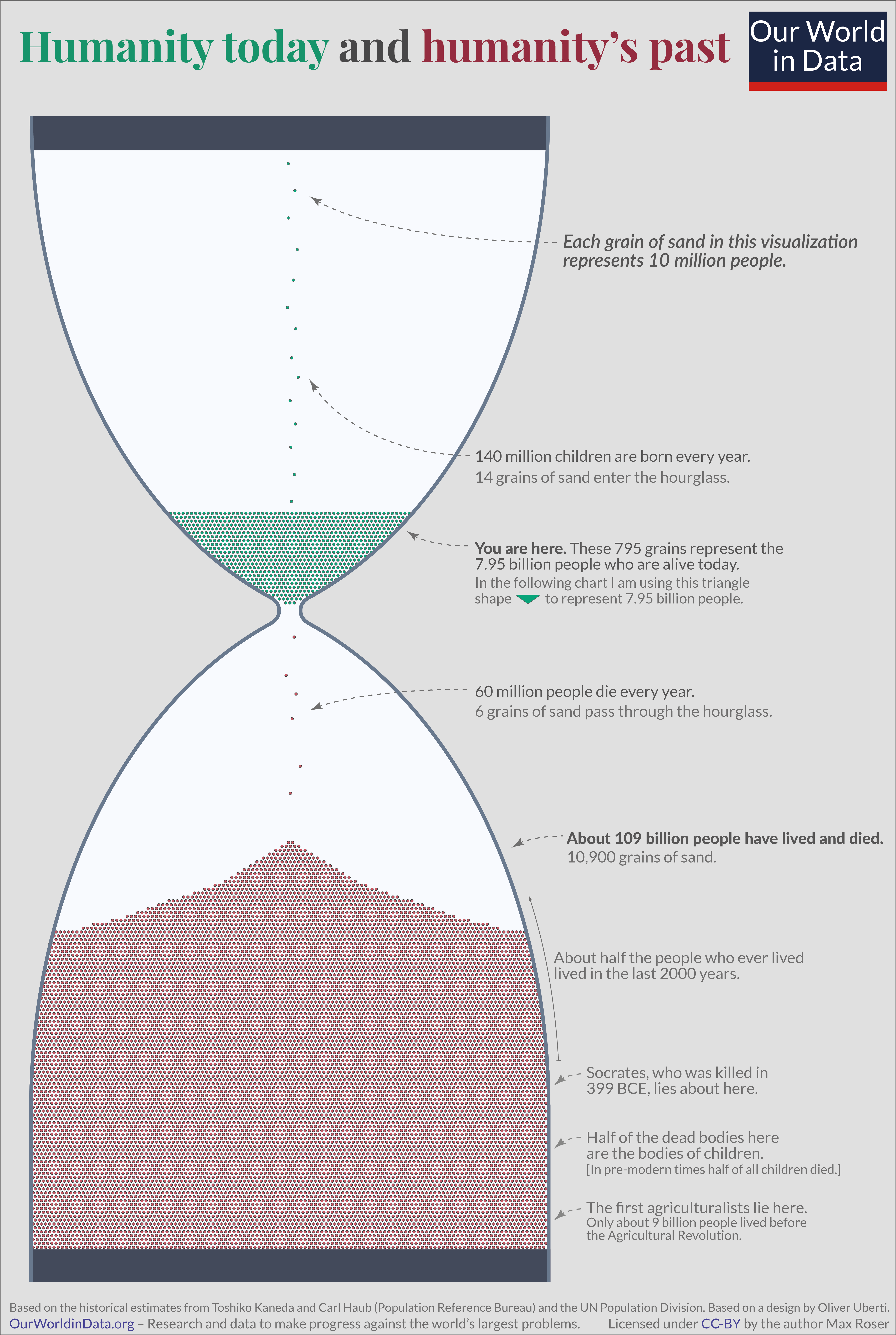
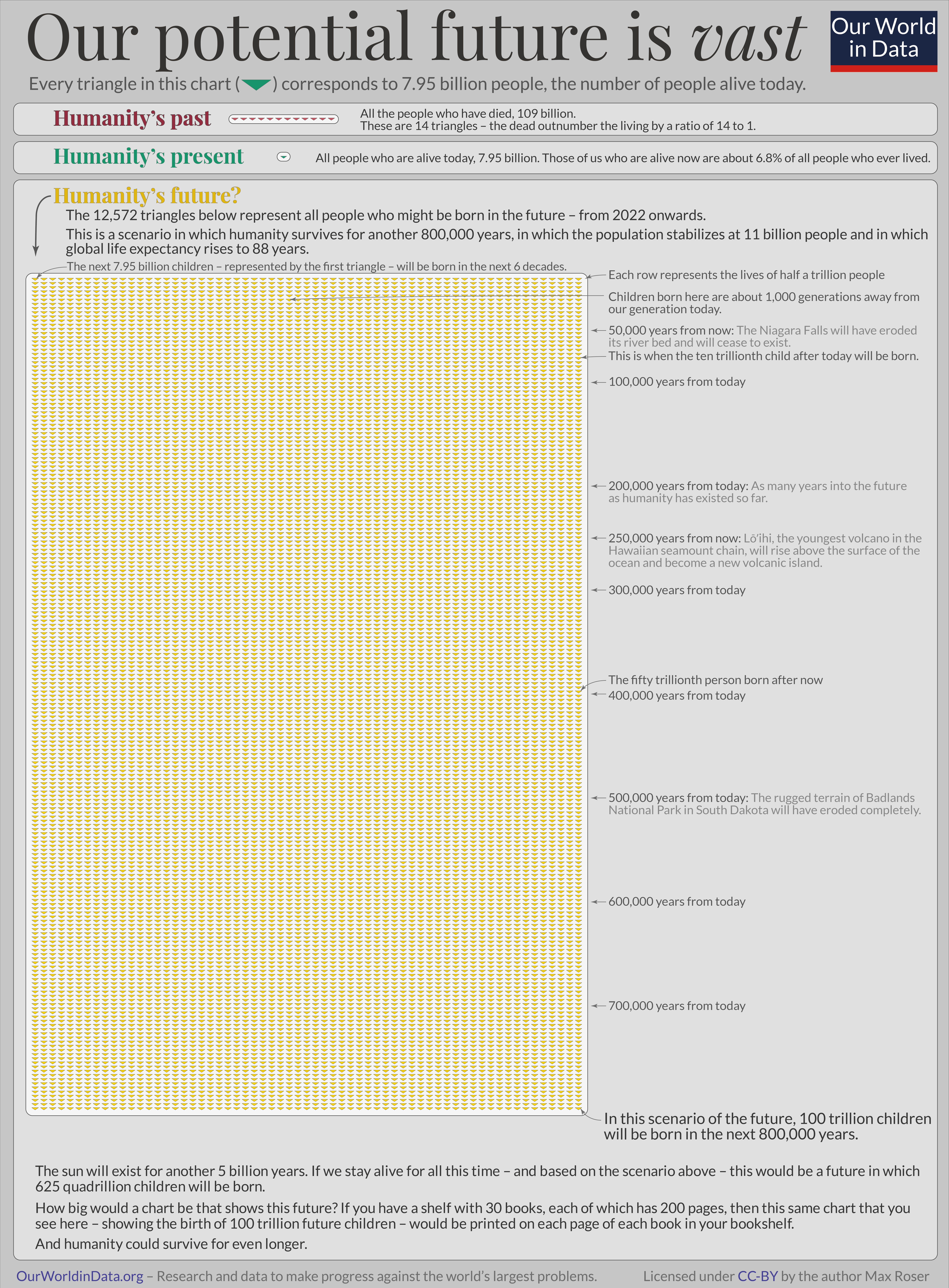
In it I try to convey some of the key ideas of longtermism in an accessible way—especially through visualizations like the ones below.
I hope it makes these ideas more widely known and gets many more people interested in thinking what we can do now to make the long-term future much better.
We have written about some related topics for a long time (in particular war, nuclear war, infectious diseases, and climate change), but overall we want to do more work that is helpful for longtermists and those who work on the reduction of catastrophic & existential risks. To link to one example, I recently wrote this about the risk from nuclear weapons.
My colleagues Charlie Giattino and Edouard Mathieu are starting to work on visualizing data related to AI (e.g., this chart on AI training compute).
Charlie, Ed, and I are sharing this here because we'd love to hear your thoughts about our work. We're always interested to hear your ideas for how OWID can be helpful for those interested in longtermism and effective altruism (here is Ed's earlier question on this forum).


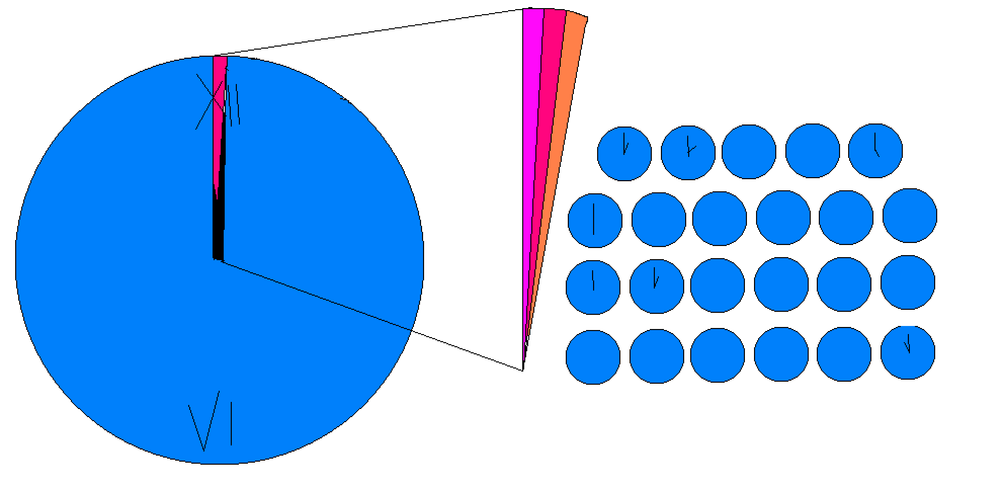
I was really struggling to find a way to make this work. I should have asked you earlier! Time could be a very nice way to illustrate that.
It would also work nicely with the metaphor of the earlier illustration in the post, the hour glass.
But I'm not sure it works nicely when I put numbers on it:
1 year are (60*60*24*365)=31,536,000 seconds
The point estimate for this year's global population is 7,953,952,577
So if 1 person equals 1 second then today's world population would be 7,953,952,577 /31,536,000=252.2 years.
And 625 quadrillion seconds are 625,000,000,000,000,000/31,536,000= 19,818,619,989.9 years. Almost 20 billion years. Way older than the Universe.
The numbers are so large that it is hard to make it work, no?
Making the time unit smaller would be another way to make this work.
Just for the sake of it:
One second is equal to 1,000,000,000 nanoseconds. One billion people are represented by each tick of a second.
So today's population are 7,953,952,577 /1,000,000,000=7.95 seconds.
1 year are (1,000,000,000*60*60*24*365)=31,536,000,000,000,000 nanoseconds.
This means the future population is represented by 625,000,000,000,000,000/31,536,000,000,000,000=19.8 years
So, if we go with the 1 person = 1 nanosecond illustration then today's world population is represented by 8 seconds and this future population would in contrast be 19.8 years.
That feels definitely more intuitive than the 1person=1second illustration, but it has the downside that no one has an intution of nanoseconds I guess.
–
What do you think? I like your idea of using time, but I find it hard to imagine 20 billion years and I also find it hard to have an intuition of nanoseconds (but maybe 1 billion people=1 second works).
Thanks for the idea! I'm not sure what I'm going to do, but it was fun to explore these numbers in this way.
Do you have another creative idea for how we could make this illustration work?