Comments
It would be useful for animal advocates to have your figures for population sizes in terms of numbers of individual animals, not just weight. I'm thinking pages like:
https://ourworldindata.org/mammals
https://ourworldindata.org/birds
https://ourworldindata.org/fish-and-overfishing
Pages for invertebrates (wild and farmed) would be nice, too!
+1 As well. I would emphasize that number of animal alive at any given time is significantly more important than slaughter as many animals die prior to slaughter.
+1 to reporting numbers of animals instead of tonnage or biomass. The OWID meat and dairy production page does have a "numbers of animals slaughtered" section, so it would be great for that to be expanded both to other large numbers of animals (like various fish species, crustaceans, invertebrates) and beyond slaughter (such as alive at any one time).
Here are some articles with sources of such data. I haven't really looked into how hard they would be to maintain and update. It is biased towards data collected by Rethink Priorities staff because it was the easiest I had to hand, but hopefully others can add anything major I missed:
Collaborate with Jaime Sevilla on datasets for various values related to size, performance, training expense, etc. of large machine learning models.
Having high quality data on this which one knows is going to be maintained makes it much easier to elicit forecasts about these topics, and eventually resolve those forecasts and keep track of track-records, and I know that Jaime has been working on this.
We now have a first chart based on their pre-print here: Estimated computation used in large training runs of AI systems
Wohoo, nice!
Create a page on biological weapons. This could include, for instance,
(This does sound useful, though I'd note this is also a relatively sensitive area and OWID are - thankfully! - a quite prominent site, so OWID may wish to check in with global catastrophic biorisk researchers regarding whether anything they'd intend to include on such a page might be best left out.)
Thank you! Just FYI, on (6) we have:
Not much yet, but on (5) we now have this world map: Number of biosafety level 4 facilities
Datasets on philanthropic funding.
How much are big donors giving where? Can it be easy for there to be a searchable database of projects.
I like this idea.
I tried to figure out how much funding there is for nuclear risk stuff, but it seems like the best source of data is the Peace and Security Funding Map tracking of spending on "Preventing and Mitigating Conflict > Nuclear Issues" (select "List"), and many grants that tracks really aren't about nuclear weapons issues but just happen to use the term "nuclear". These include medical research grants that use the term "nuclear" in a totally different sense and biosecurity-related grants to the Nuclear Threat Initiative. They also don't provide graphs of changes over time or breakdowns into categories or anything like that; you'd have to build that manually.
This makes it harder to know how neglected areas are, how this is changing over time, who the big players to learn from or complement or bear in mind are, etc.
I'd imagine the situation is similar in other longtermist areas, though I'm unsure.
Just want to say as an EA researcher your website is an absolute godsend.
Thanks for making this post! I think OWID is excellent, and I'm really excited that you're interested in making it even more useful to the EA community.
One thing I'd note: I expect OWID might be able to get funding from the EA community for high-impact moves, if such funding would be helpful. See List of EA funding opportunities and Things I often tell people about applying to EA Funds.
(Let me know if there's a way I can be helpful in working out what funders might be most relevant, what sort of funding proposals might make sense, etc.)
I know you've been campaigning for open access climate data - I'd be really excited for that. My policy team found your work on access to electricity pretty interesting.
A few things that jump to mind:
Talk to Hamish Huggard who made EffectiveAltruismData.com he seems really switched on. More here https://forum.effectivealtruism.org/posts/CQaNyJfsRFZhseiLZ/effectivealtruismdata-com-a-website-for-aggregating-and
Data on housing and transportation:
Info on nuclear yields
(This is a bit niche, but might also be quick to produce and could fit into the existing nuclear weapons article.)
As far as I’m aware, there’s no compilation of information related to the yields of various state’s arsenals that rivals the compilations of information on numbers of warheads created by the people such as the Federation of American Scientists. (Though I didn’t look very hard, so please tell me if I’m wrong! In any case, OWID-style visualiations would be handy too.)
I think that creating such a compilation would be at least somewhat useful (though I’m not sure how useful), e.g. for forecasting future changes.
More specifically, I’d like to be able to easily find answers to questions like:
I expect I could find answers or form educated guesses on each of those questions with some work, but it’d be nice to have the info compiled and organised already.
Scraps of info that I happen to already have include:
(I originally proposed people on Metaculus create this, but I expect that won't happen and OWID seems ideally suited for this.)
Civilizational collapse data
Anders Sandberg at FHI looked into this to some extent (see a talk here and slides here). I could connect you with him if that'd be helpful.
Some other global catastrophic risk researchers may also have looked into this somewhat, e.g. perhaps Luke Kemp, Luisa Rodriguez, Haydn Belfield, or Karim Jebari. Again, I could probably provide intros if helpful.
I imagine various people outside the global catastrophic risk community have also looked into this somewhat, e.g. Jared Diamond and Peter Turchin.
This has been recently brought up again, alongside individual species extinctions.
Funding by different cause. Cancer, heart disease deworming etc.
Thanks for asking!
On some of your graphs, eg https://ourworldindata.org/grapher/gdp-per-capita-maddison-2020, you have a box you can tick to get "relative change". On other graphs, eg https://ourworldindata.org/grapher/children-per-woman-un?tab=chart&time=1950..2015&country=OWID_WRL~HUN, you don't have that box. You can force the chart to do this by adding "?stackMode=relative" to the URL, but that is annoying and hard to remember. Please add the box to all graphs.
If you generate a graph like https://ourworldindata.org/grapher/children-per-woman-un?tab=chart&time=2008..2015&country=HUN~AUT~CZE~SVK~POL~UKR~HRV~SRB , it's hard to see what's going on, because all of the action is crammed into a tiny part of the graph - in this case between 1.3 and 1.6 children. I would be interested in either having it autozoom to the part where things are happening, or at least have an option to zoom into that part. Maybe this already exists and I am just missing it.
Another thing that would be neat (though a lot of work for maybe not much gain) would be the ability to graph algorithms, eg the fertility rate of Hungary minus the fertility rate of Austria, over time.
Here's a few things I'd like to see —
First, working with Hamish Huggard to port over some of the data from effectivealtruismdata.com (as Nathan Young suggests). In particular, I think it would be useful to have a better impression of how EA and EA-adjacent philanthropic money gets spent.
Second, some charts covering long-run trends, such as: GDP over time starting around 0AD, world temperature or CO2 concentration since the end of the last ice age, agricultural production over time, energy consumption per capita, or population over time over millennia (sorry if you already have some of this). Obviously (with the exception of the climate stuff) the data is very sparse on this, but I am pro "here's a reasonable guess and here's how wide our uncertainties are" over "we're not entirely sure so we're going to say nothing". And I trust OWID can do an excellent job at communicating the uncertainties and interpretational difficulties involved.
Third, maybe a page on space. For instance, number of launches over time, number of satellites in orbit over time, amount and size distribution on space debris, space debris incidents over time, cost of launching a kilogram into orbit over time. In particular, both the UN and the ESA have really detailed datasets for potential launches over time / objects in space graphs, but the UN one doesn't have have an API so needs to be scraped, and I haven't seen people present either datasets in an accessible way.
It would be nice to have more datasets that try to go way back before 1800 -- like those used by this OpenPhil report, or books like "Why The West Rules", "Secular Cycles", etc. Here is a link to a pdf will all the figures in "Why The West Rules", albeit they are mostly maps. I like graphs 3.1, 3.7, and 9.3.
As a stretch goal, once you have a bunch of super-long-ago data, it would be sweet to be able to graph the data not just linearly in time, but also along various warped scales so that instead of equal intervals representing equal years, equal intervals represent:
Size of different communities.
I think it's underrated how much identification affects decisionmaking. I'd love some graphs of the change of people who identify with different monickers over time.
eg:
- socialist, weeb, christian, protestant, goth, EA etc etc etc
Hi Ed!
One thing that falls potentially into all three categories of difficulty is food stocks/reserves, which is an issue with high relevance to exposure to shocks and food insecurity, but really hard to track.
It's a tricky issue, but could really help many researchers inside and outside of EA to improve!
A few issues we have found which would be very useful to see developed are:
The USDA PSD and FAOSTAT both have estimates for crop year end, but as crop years do not line up effective stocks are higher than this figure. These results are based on a few methodologies, but do not match reality exactly, and are better for globally traded crops.
Reconcilliation and improving on these estimates is possible, but requires detailed trade data or insider data, which is very commercially sensitive often. Big traders (ABCD companies/COFCO) would know this, but they do not disclose.
Stocks can be reasonably accurate at a global level and when averaged over a period of time, however fluctuations in demand, smuggling and delays in data releases mean they can be hard to track on a country by country basis for the poorest. These are often the countries we care most about for food insecurity.
Stocks in strategic reserves, private reserves and simply in transit can be difficult to divide out. In some cases this suggests chunks of available stocks are missing, or that stocks would not be available to the market if classed as "private" when actually state controlled.
How much negative carbon (carbon offsets) are being produced at different accreditation standards. IE carbon offsets always have to be accredited so it's not just a question of how many, but how much different orgs count them as.
Maybe just take Carbon Plan data and put it in an easier to read form.
Can you clarify what this means, for the benefit of all forum readers? I figured it has something to do with carbon offsets.
Thanks for asking.
I think it would be very beneficial to take advantage of a complementary software like Anki.
I'm wondering if it would be useful to track data on national legislatures (or maybe just heads of state) worldwide? This could include:
I'm not sure how feasible this is, but I imagine it could help EAs think more concretely about where they're likely to find support for different advocacy efforts.
Better tools for simple comparisons of different datasets and generating custom charts. For example, there have been a number of times when I wanted per-capita data but could only find charts for total, or vice versa. (This should be a low-priority request since it's primarily a convenience issue.)
I previously tried to think of "active grantmaking" ideas (here), i.e. things I might want EA funders to fund but for which no application has yet been made. Some of these were people/orgs I thought do cool work and so might be worth funding for something, and some of these were potentially cool ideas I might want some person/org to do.
Here's one of the (rough and vague!) ideas I had:
Fund OWID for something
Another idea I had was funding the creation of "new things kind-of like Our World in Data". (This is discussed briefly in this comment thread.)
I think the key bottlenecks to this are (1) a clearer sense of precisely what kind of org/project we'd want and (2) people who are willing and suited to making that happen.
I guess OWID could help facilitate that by suggesting types of OWID-like projects that would be great but for whatever reason might be better done elsewhere instead/as well, suggesting people who might be great at doing that, and/or agreeing to provide some advice/mentorship to whoever sets up this other thing.
Automated Local Regression Discontinuity Design Discovery
Automated discovery of outliers in multicountry datasets (i.e. where you can see where your country is 3 SDs away from the mean).
Maybe a page on AI capabilities and progress could be useful to explain to people why there are chances that very powerful AI appear this century m ? For instance one graph that I'd love to see would be when we expected a breakthrough and when it actually happened, things on the scaling of models and the scaling of performances, the evolution of the use of AI in industry, the evolution of investment in AI, the evolution of the distribution of funds or researchers between academia and private sector etc. I'm not sure that all of that is tractable but that would be great !
Data on trends in the influence of geopolitical "great powers," possibly going back to the beginning of civilization.
Ray Dalio has attempted to quantity and visualize similar: https://www.linkedin.com/pulse/big-cycles-over-last-500-years-ray-dalio
Collaborate or merge with New Things Under the Sun, a website that compiles social science research on innovation.
I would be especially interested in pieces on:
Hi Ed,
Here are some imaginary fruit:
1. At the Happier Lives Institute we would be very interested to see something like a global burden of disease except for suffering. What are the largest sources of unhappiness across the world?
2. OWID summarized the results of studies on important topics. That is, it collected and visualized meta-analytic information for important topics from databases like AidGrade or MetaPsy.
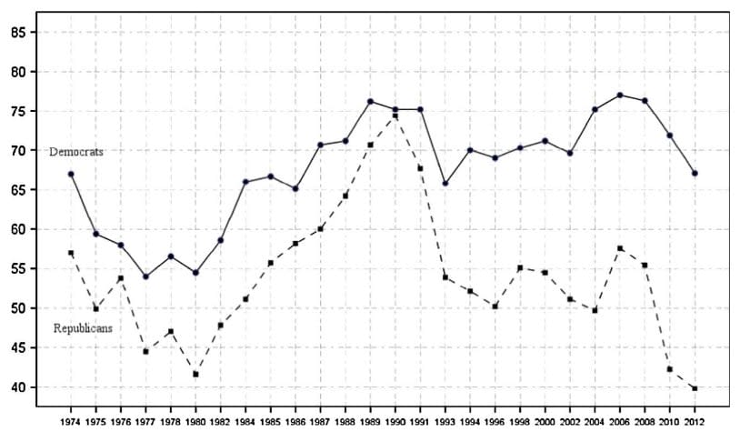
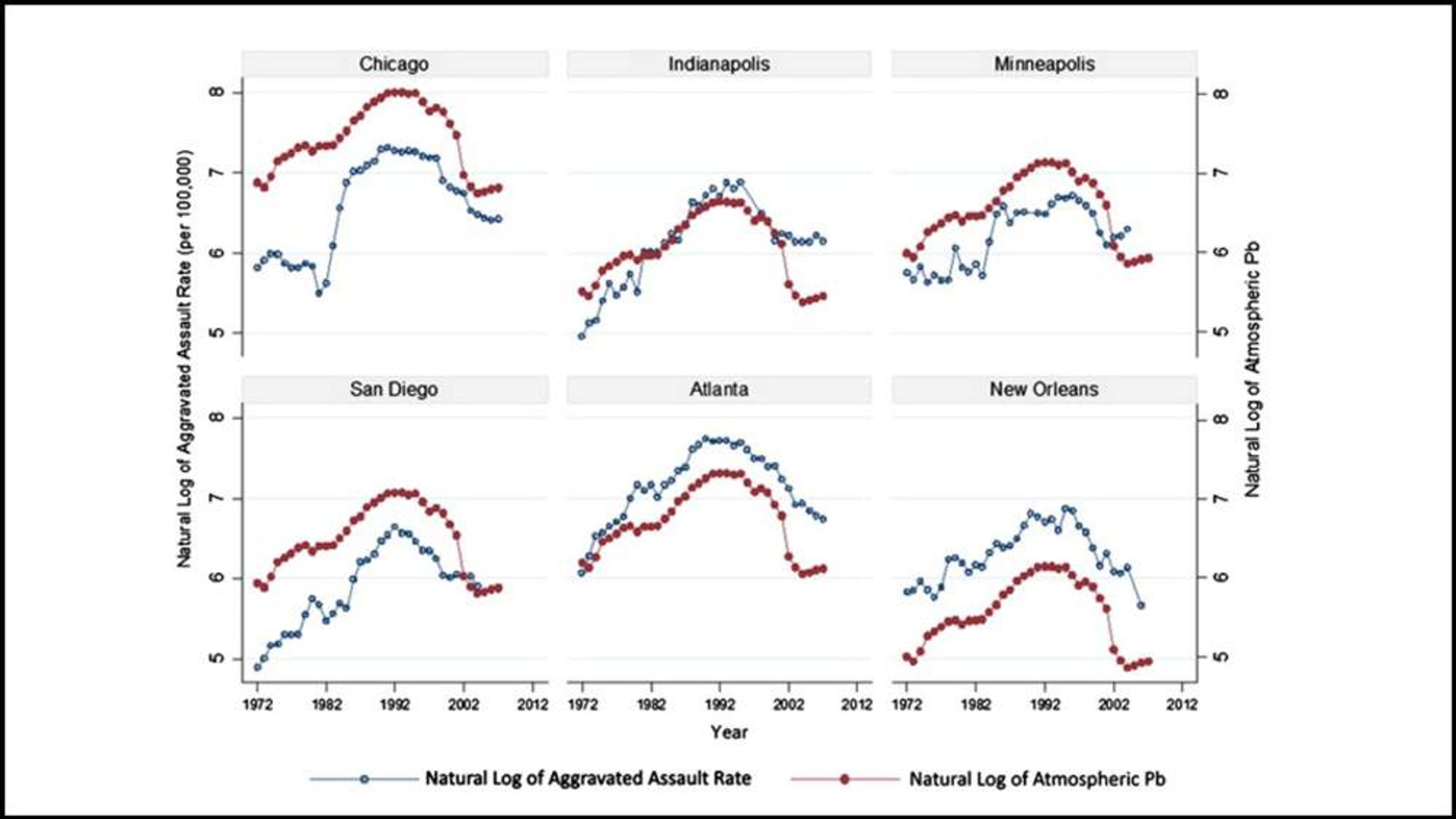
I'm not sure if you're still actively monitoring this post, but the Wikipedia page on the Lead-crime hypothesis (https://en.wikipedia.org/wiki/Lead%E2%80%93crime_hypothesis) could badly use some infographics!! My favorite graph on the subject is this one (from https://news.sky.com/story/violent-crime-linked-to-levels-of-lead-in-air-10458451; I like it because it shows this isn't just localized to one area), but I'm pretty sure it's under copyright unfortunately.

I work at Our World in Data, where we try to make research and data on the world's largest problems more accessible and understandable.
I attended EA Global this past weekend, where I received very interesting input from many lovely people on potential improvements. But I thought it'd also be worth asking here to get wider feedback. I'm interested in all the following:
Low-hanging 'data fruits': simple datasets or charts that you know to be readily available somewhere and that would add significant value, but that aren't already listed here.
High-hanging fruits: things we could add to the website in the medium term with a lot more work (new subjects, larger datasets, data that needs a lot of cleaning, etc.)
Imaginary fruits: what you'd like to see on OWID in your wildest dreams (e.g. global population projections to the year 10,000 under various scenarios).
Thank you!

Embed forecasts in your pages.
Work with metaculus to have forecasts on the future as well as past values.