Comments
Thanks for this post! I'm curious around when the EA Survey 2021 will be distributed?
Thanks for this post! I'm curious around when the EA Survey 2021 will be distributed?
Thanks for the question. We're planning to release the next EA Survey sometime in the middle of 2022. Historically, the average length of time between EA Surveys has been ~15 months, rather than every 12 months, and last year's survey was run right at the end of the year, so there won't be a survey within 2021 (the last time this happened was 2016).
Ah I see. Is the ~15 months gap between surveys to avoid survey fatigue? Or are there other reasons?
~15 months isn't necessary a target for the future. I think we could actually increase the gap to ~1.5 years going forward. But yes, the reasons for that would be to get the best balance between getting more repeated measurements (which increases the power, loosely speaking, of our estimates), being able to capture meaningful trends (looking at cross-year data, most things don't seem to change dramatically in the course of only 12 months), and reducing survey fatigue. That said, whatever the average frequency of the survey going forward, I expect there to be some variation as we shuffle things around to fit other organisations' timelines and to not clash with other surveys (like the EA Groups Survey) and so on.
For many of the breakdowns it would be helpful to understand the base rate in those countries to understand what the data means. For example, gender is easy enough since the base rate is usually close to 50/50, but for things like race I have no idea how many people identify as white, black, asian, etc. in each region to compare against. I realize not everything has a base rate to compare against, but for those that do having that data would really help contextualize what's going on here.
That makes sense. Reference numbers even for things like race is surprisingly tricky. We've previously considered comparing the percentages for race within the EA Survey to baseline percentages. But although this works passably well for the US (EAS respondents are more white) and UK (EAS respondents are less white)- without taking into account the fact that EAS respondents are disproportionately rich, highly educated and young and therefore should not be expected to represent the composition of the general population- for many other major countries there simple isn't national data on race/ethnicity that matches the same categories as the US/UK. I think people should generally be a lot more uncertain when estimating how far the EA community is representative in this sense. The figures still allow comparison within the EA community though.
Did you think of mapping the global distribution of EAs on a per-capita basis?
We have reported this previously in both EAS 2018 and EAS 2019. We didn't report it this year because the per capita numbers are pretty noisy (at least among the locations with the highest EAs per capita, which tend to be low population countries). But it would be pretty easy to reproduce this analysis using this year's data.
Here are the countries with the highest EAs per capita. Note that Iceland, Luxembourg and Cyprus, nevertheless have very low numbers of EA (<5) respondents. This graph doesn't leave out any countries with particularly high numbers of EAs, in absolute terms, though Poland and China are missing despite having >10.

Thanks for this!
Would it be helpful to put some or all of the survey data on a data visualisation software like google data studio or similar? This would allow regional leaders to quickly understand their country/city data and track trends. It might also save time by reducing the need to do so many summary posts every year and provide new graphs on request.
I suspect that it would probably be 20-50+ hours of work for an expert to build something like that but relatively little work to keep it updated (maybe 2-5 hours per survey, depending on new data). I am reasonably confident that it would increase the performance of movement-builder. Might be worth seeing if there is demand for it or I am the only person who thinks that they would use it.
Related to that, is there any way to download this data for personal analysis?
Just so you understand my personal use case/interest: I am loosely involved in growing some of these communities and might be more involved in the future. I'd love to quickly check the relevant communities needs, interests, diversity levels, and growth/change overtime etc. I often can't get the desired depth of info from the summaries that are shared. Ideally, I'd like to be able to do something quickly by using something like data studio but if I had more time, I'd be able to make do with just working off the raw data.
Would it be helpful to put some or all of the survey data on a data visualisation software like google data studio or similar? This would allow regional leaders to quickly understand their country/city data and track trends. It might also save time by reducing the need to do so many summary posts every year and provide new graphs on request.
We are thinking about putting a lot more analyses on the public bookdown next year, rather than in the summaries, which might serve some of this function. As you'll be aware, it's not that difficult to generate the same analysis for each specific country.
A platform that would allow more specific customisation of the analyses (e.g. breakdowns by city and gender and age etc.) would be less straightforward, since we'd need to ensure that no analyses could be sensitive or de-anonymising.
Unfortunately, we committed to not share any individual data available (except to CEA, if respondents opted in to do that). We're still happy to receive requests from people, such as yourself, who would like to see additional aggregate analyses (though the caveat about them not being potentially de-anonymising still applies, which is particularly an issue where people want analyses looking at a particular geographic area with a small number of EAs).
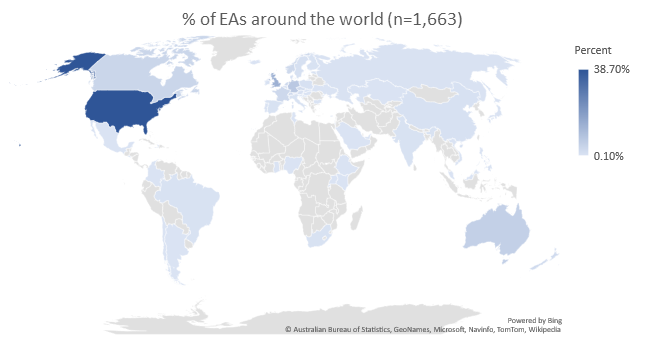
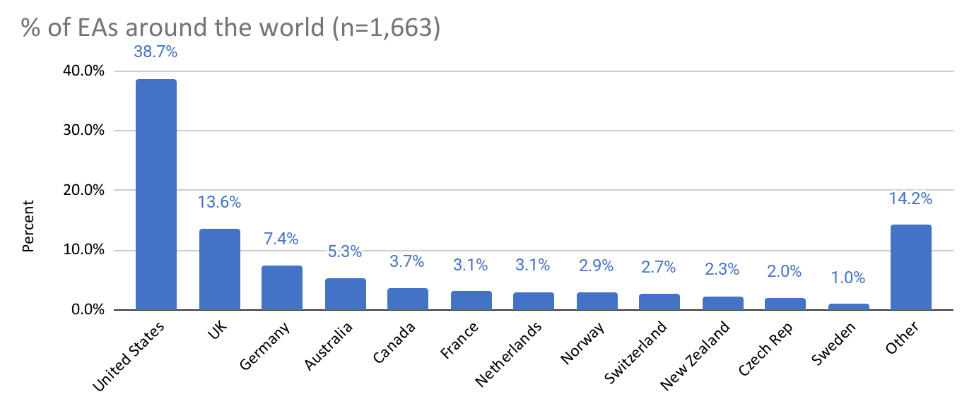
In this post, we examine where EAs are located and how the number of EAs in different areas is increasing or decreasing. We also explore differences in EAs across regional, country, and city divides, such as cause preferences, demographics, engagement, and career paths. All country-level analysis includes only countries with 30 or more responses to the survey. We include in the city analysis only the top eight EA hubs, as determined by the number of survey responses. (Note that the survey only asked where respondents currently reside but not their citizenship or country of birth.)
As in previous years, the EA community appears to mainly live in North America and Europe. In fact, top five countries EAs report living in have remained unchanged since the 2015 EA Survey. These are the US (39%), the UK (14%), Germany (7%), Australia (5%), and Canada (4%).
The proportion of EAs living outside of the top five has continued to grow, however, now standing at 31%, up from 26% in 2019 and 22% in 2018. In total, there were responses from 61 different countries, 21 of which had at least 10 responses.
The most commonly reported cities in which EAs live are the San Francisco Bay Area (6.3%), London (5.6%), and New York City (4.9%). Of the top ten cities with the most EAs, seven are in the US, two in the UK, and one in Australia. Hong Kong and Singapore are the only cities with 10+ responses which are not in North America, Europe, or Australasia.
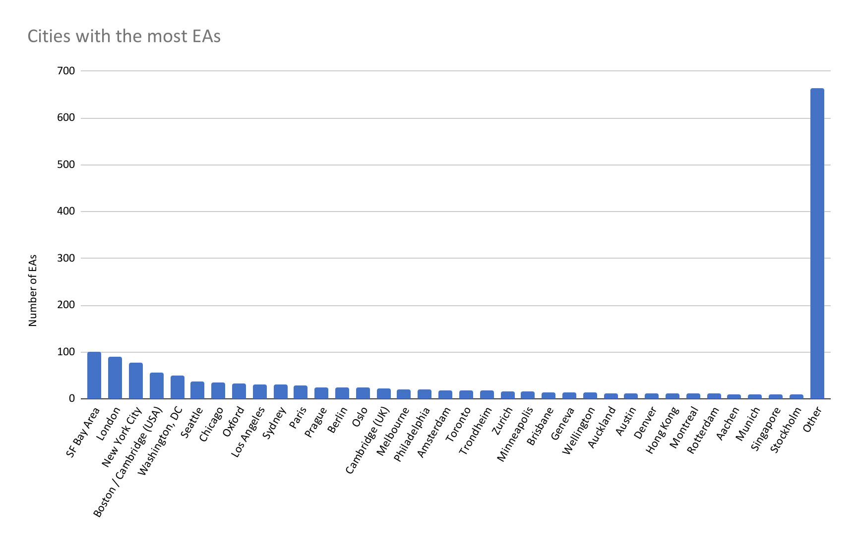
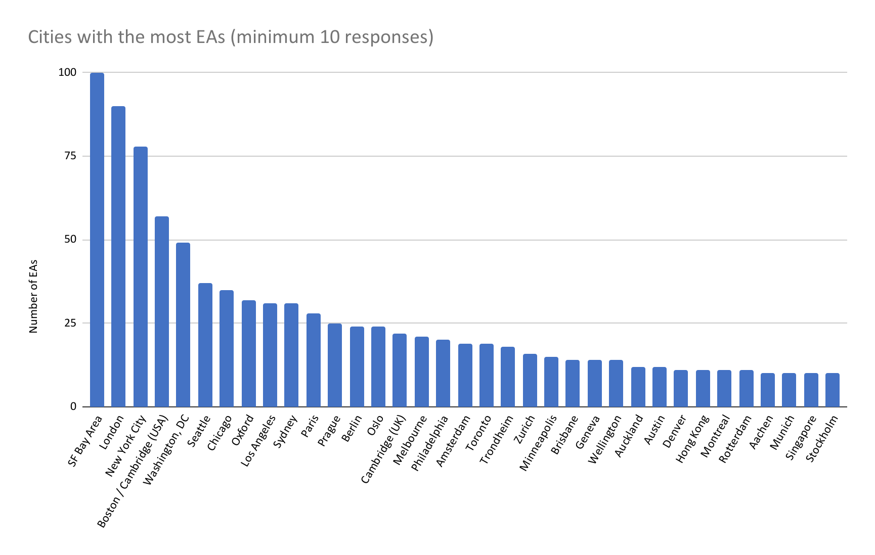
In the next figure we highlight only those cities with 10 or more responses for easier comparison.
While those EAs who joined the EA movement in the earliest years primarily live in the US and UK (85-91% in the earliest cohorts), later cohorts contain much larger percentages from other parts of the world (among those that reported joining in 2017 or later, 50% or more live from outside of the US and UK).
As a reminder, this data is referencing where the respondent lives and does not necessarily indicate their nationality or the location they were living in when they first heard about EA. These trends could also, in part, be explained by EAs from other parts of the world later moving to the US and UK (future survey questions could address this).
Because this analysis looks at the self-reported cohorts of people in the 2020 EA Survey, changes across cohorts could, in theory, also be explained by differential dropout (i.e. if people from the US or UK were more likely to remain in the movement than those from other regions) even if similar shares of EAs came from each region across time. We return to this below and also plan to analyze this in greater detail in a future post.
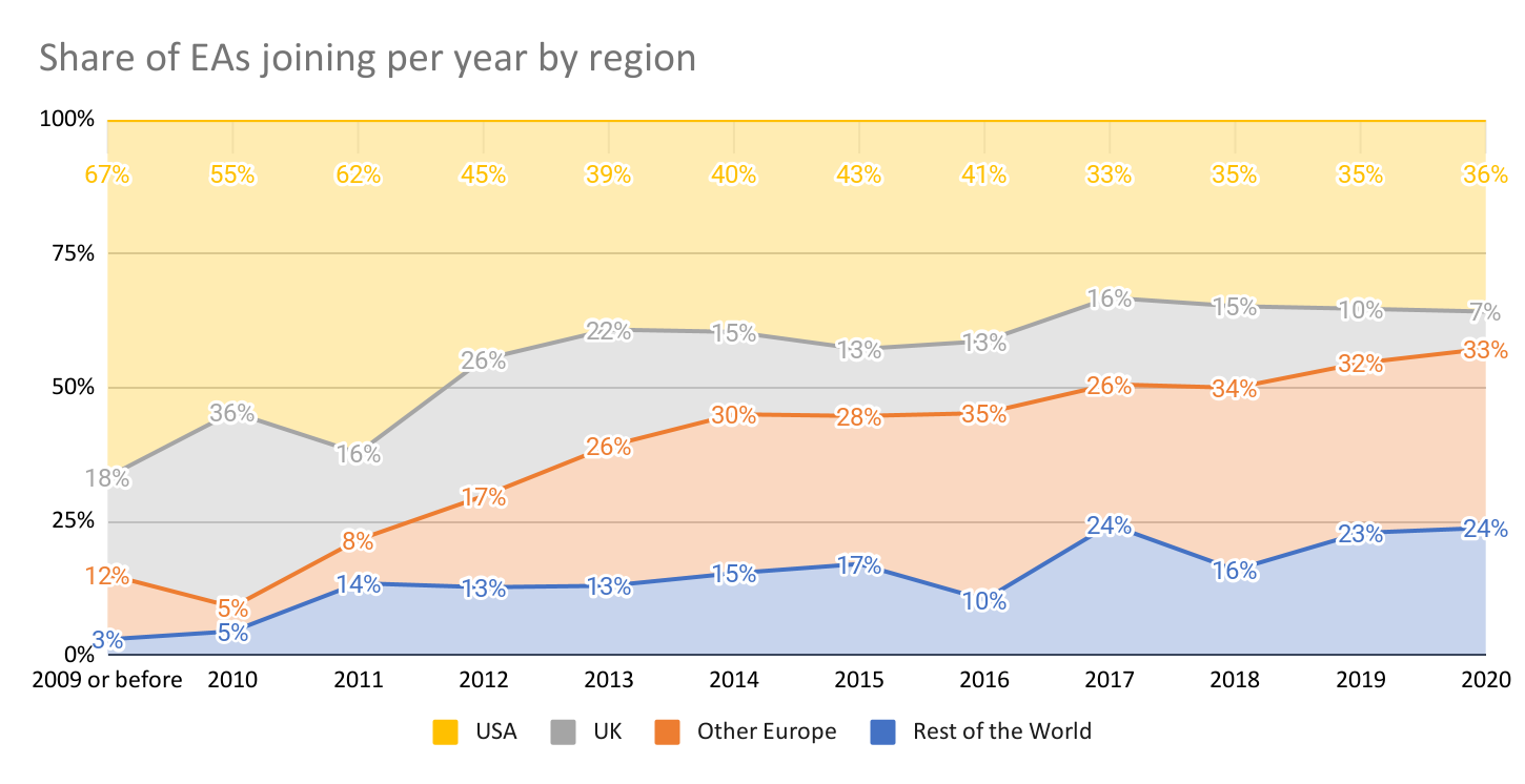
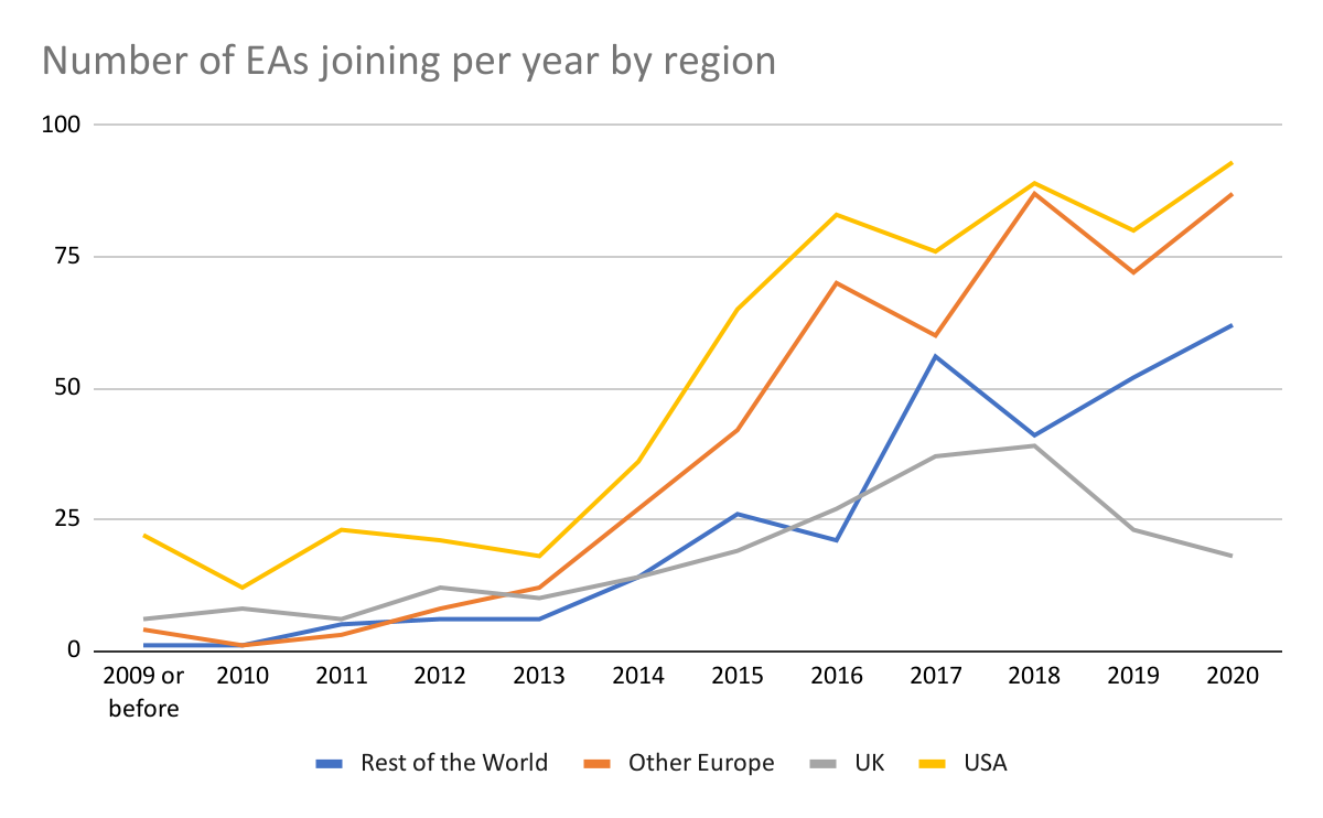
In terms of raw numbers, rather than percentages, while the number of EAs joining in the US, mainland Europe, and the rest of the world appear either steady or increasing in more recent cohorts, numbers coming from the UK appear to have declined since peaking in 2018.
In the graph below we plot the percentage of EAs reporting coming from the US/UK, who reported getting involved in each year, within each of the EA Surveys (2015-2020). This has the potential to illuminate possible differences in dropoff between years.
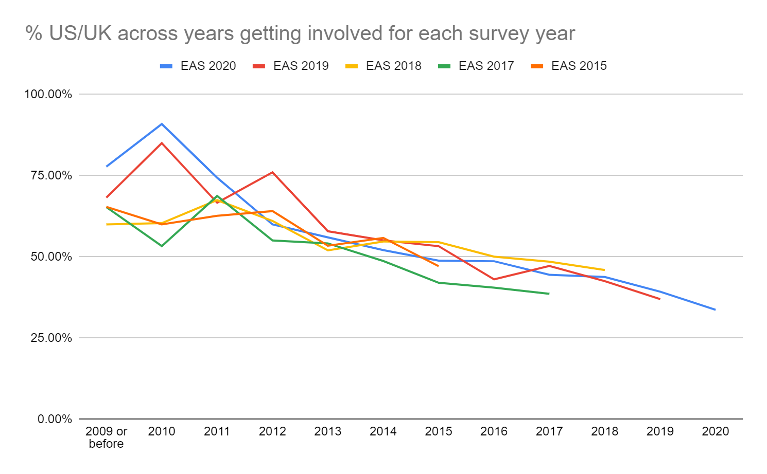
We can see that the percentage of EAs reporting coming from the US/UK declines in more recent ‘cohorts’ of EAs fairly consistently across EA Surveys. (Note that the error bars would be very wide for the earliest cohorts, because of very low numbers of respondents in these groups). This implies that more recent cohorts contain higher numbers of respondents from the rest of the world, proportionately. The fact that these numbers appear quite similar across years of the EA Survey increases our confidence that these changes are not simply driven by respondents from US/UK being less likely to drop out over time, as we do not observe a substantial tendency for the percentage of US/UK to decrease within cohorts across years of the EA Survey.
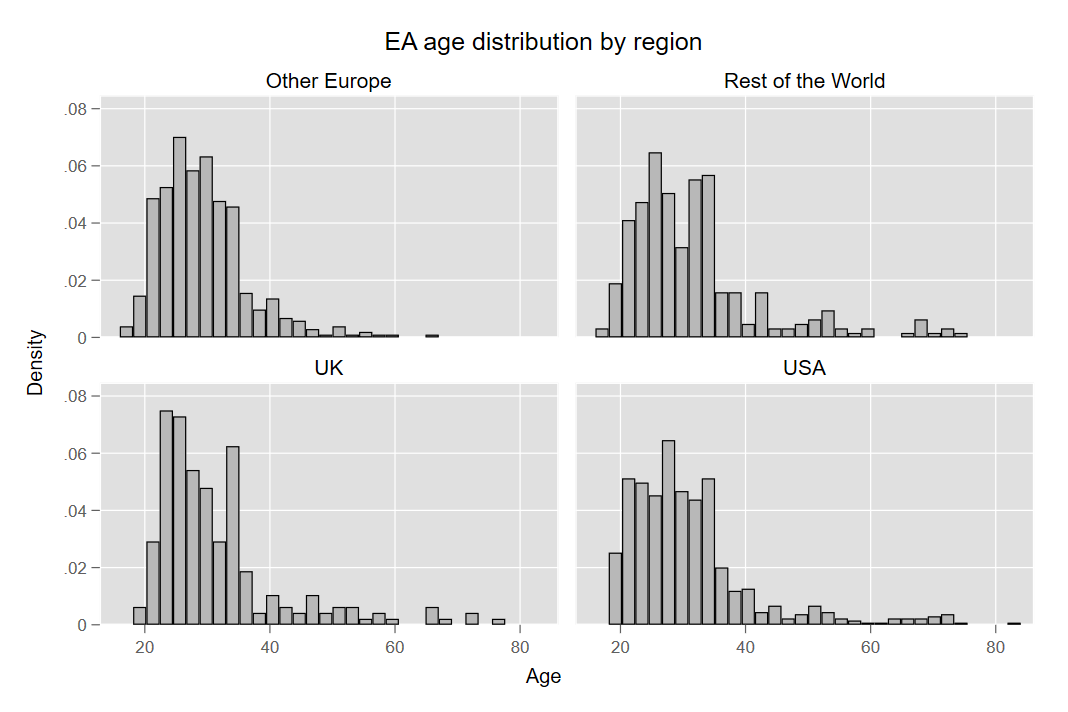
Demographic characteristics of EAs around the world are fairly consistent (young, white, and male), however there are a few differences across regions worth highlighting.
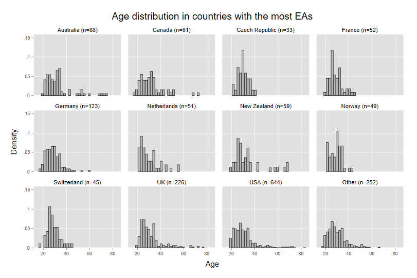
Europe has the lowest average age of EAs (28.1 years), followed by the US (29.9), the UK (30.6), and then the rest of the world (31.2).
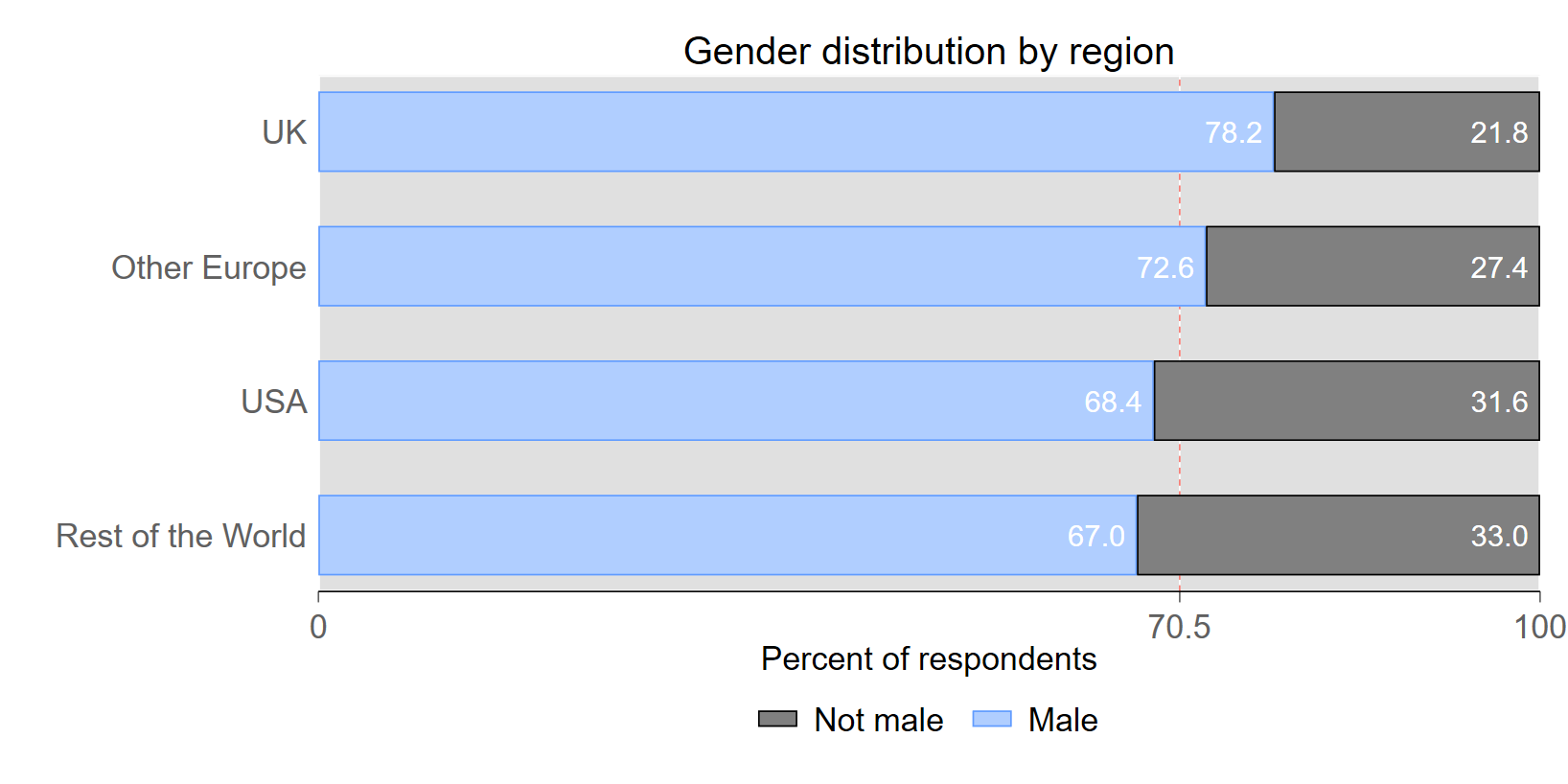
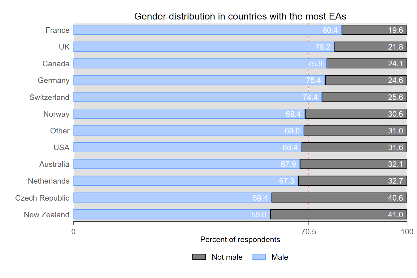
The UK has the highest proportion of male EAs (78%), followed by the rest of Europe (73%), and then the US and the rest of the world (67-68%).
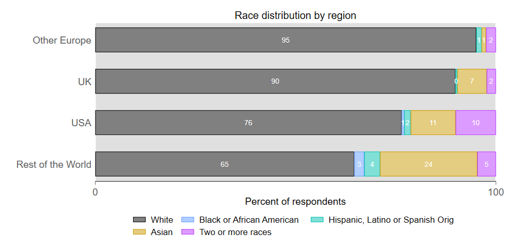
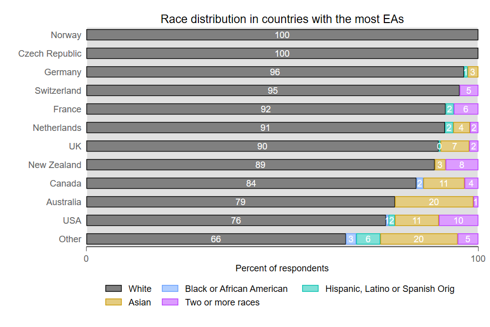
Europe and the UK have the highest share of EAs that reported being white, followed by the US and then the rest of the world.
The US has a relatively larger proportion of EAs that reported having two or more races. The rest of the world captures all EAs in Asia, Latin America, and Africa, and therefore has the highest share of Black, Hispanic, and Asian EAs.
The US has the lowest percentage of first generation students (12%), while Europe has the highest (24%).
Reported rates of childhood worry over financial or employment instability were highest in those currently residing in the rest of the world and lowest in the UK.
Here we report on differences among EA survey demographics for countries with 30 or more responses.
Age: New Zealand and Australia had the highest average ages of 34.2 years and 32.9 years respectively. Germany, France, Norway, and Switzerland all have a mean age of roughly 28.6.
Gender: France, the UK, Canada, Germany, and Switzerland have higher rates of male EAs than the overall average (70.5%). The Czech Republic and New Zealand have the highest gender parity of any country with more than 30 EAs.
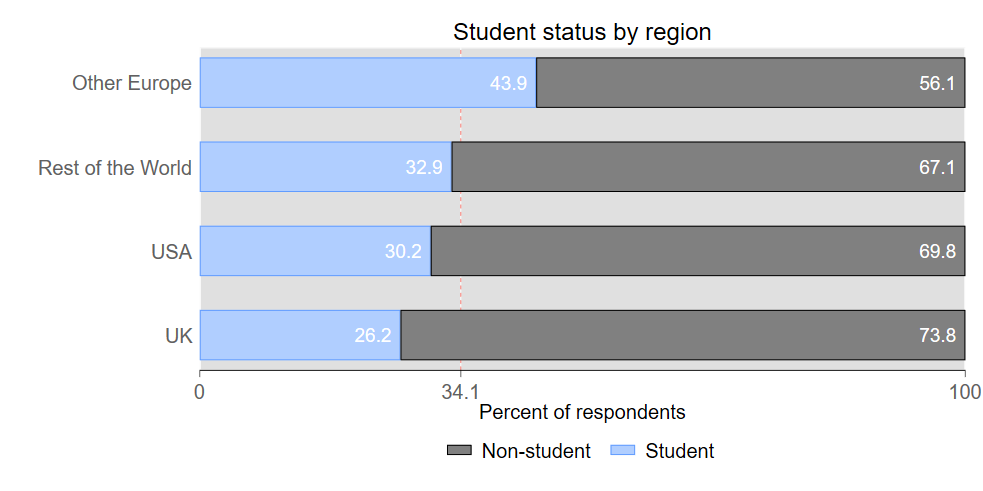
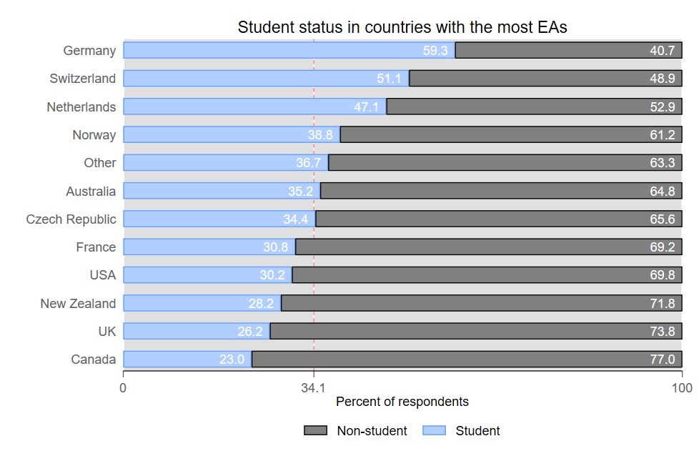
Student status: Australia and all countries in mainland Europe except France have higher rates of student EAs than the average (34.1%). Canada, the UK, New Zealand, and the US have the lowest share of students.
First-generation university students: Switzerland and the Netherlands reported the highest percentage of first-generation students (~31.1%), while the US, Australia, and New Zealand reported the lowest (11.5-12.5%).
Rates of worry over financial or employment instability are highest in Canada and in “all other countries” (19.7% and 16.9% respectively). The lowest rates of financial worry were reported in Norway (4.1%), Germany (8.9%), and Switzerland (9.1%).
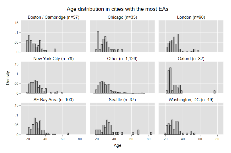
Of the eight most EA populated cities, Seattle has the highest average age (35.6), likely due to the low percent of students there and the high percent of established career professionals. Boston/Cambridge has the lowest average age (27.6), probably due in part to the high student population in that area.
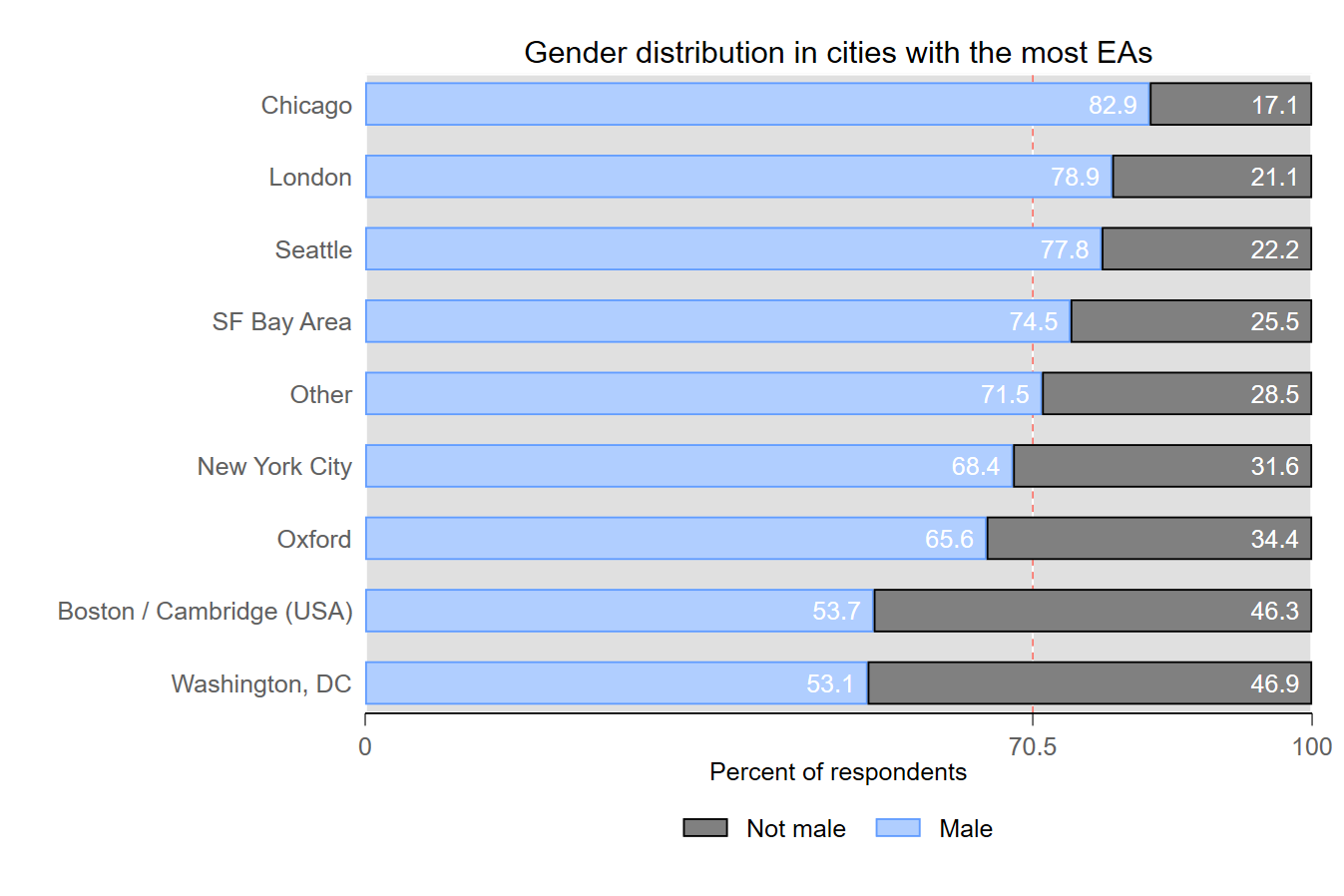
Chicago, London, Seattle, and the Bay Area have higher than average shares of male EAs, while Boston/Cambridge and DC have the lowest.
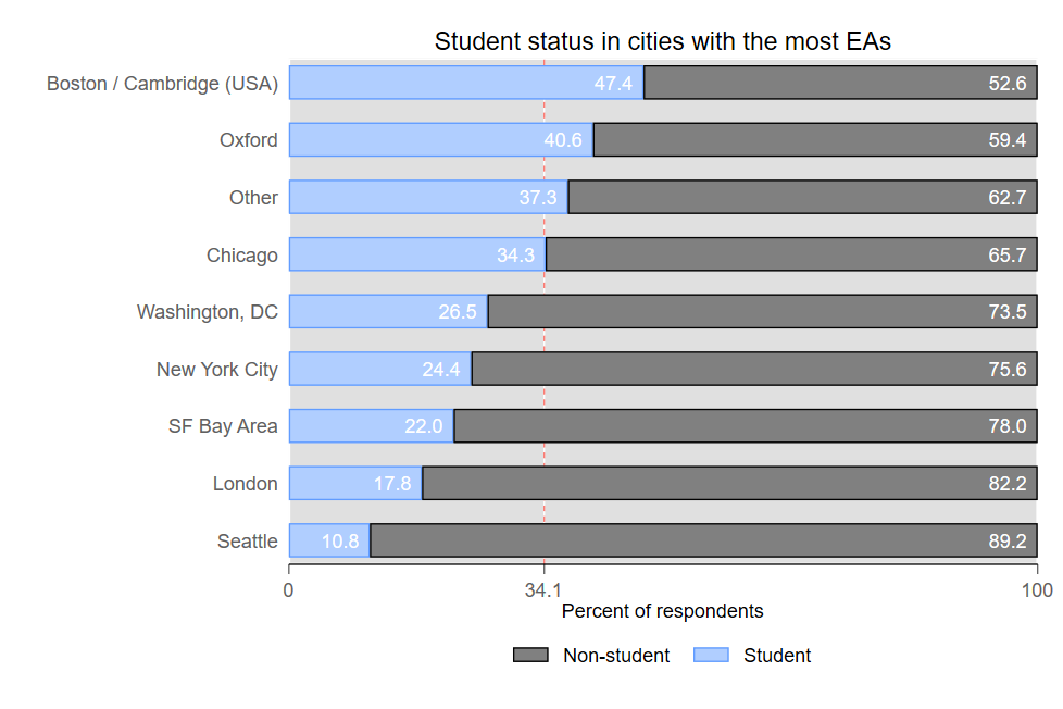
Boston/Cambridge and Oxford have the highest share of student EAs. The remaining EA hubs have lower proportions of students compared to the average (34.1%).
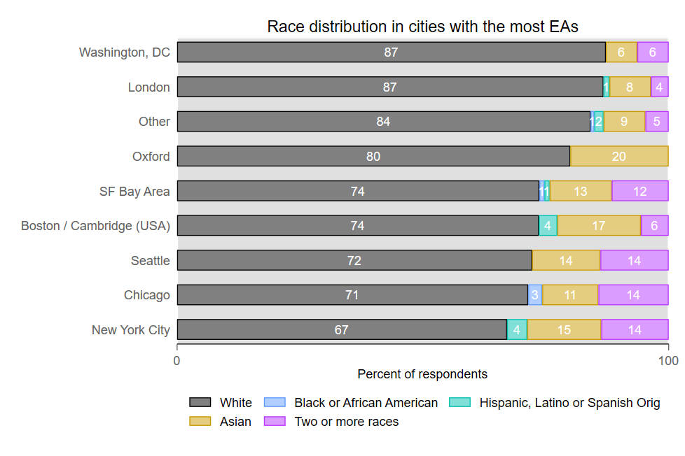
London, Oxford, Seattle, and EAs outside of the main hubs reported the highest percentage of first generation students (18.4-20%), while Boston/Cambridge, the Bay Area, and New York reported the lowest (5.2-7.9%).
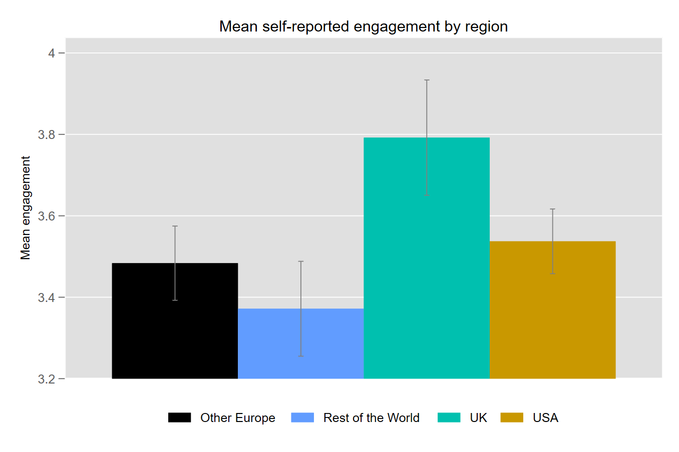
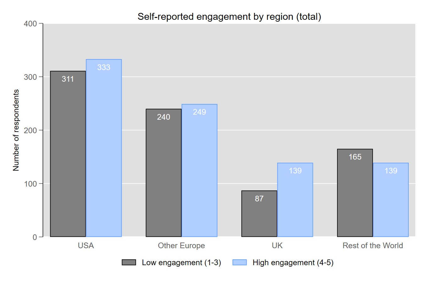
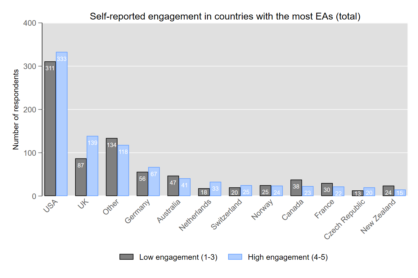
Survey participants were asked to report their level of engagement in EA on a five point scale of No Engagement to High Engagement. EAs living in the UK reported the highest average level of engagement, followed by the US, the rest of Europe, and then by the rest of the world. (The plots below are shown with 95% confidence intervals. Note that the y-axes are truncated to show the differences more clearly. In the plot below, the difference between the UK and Other Europe corresponds to an effect size of around d=0.3, which is roughly the average effect size in social psychology. You can get a sense of the magnitude of such an effect size here.)
These differences may be partly explained by limited access to various things associated with engagement, outside of EA’s core geographic areas, e.g. EAs might find it difficult to lead a local group, work/intern for an EA org, or attend an EA conference and so on.
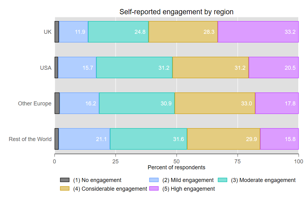
The largest shares of the most highly engaged EAs come from the US (39%), followed by Europe (25%) and then the UK (22%) and the rest of the world (14%).
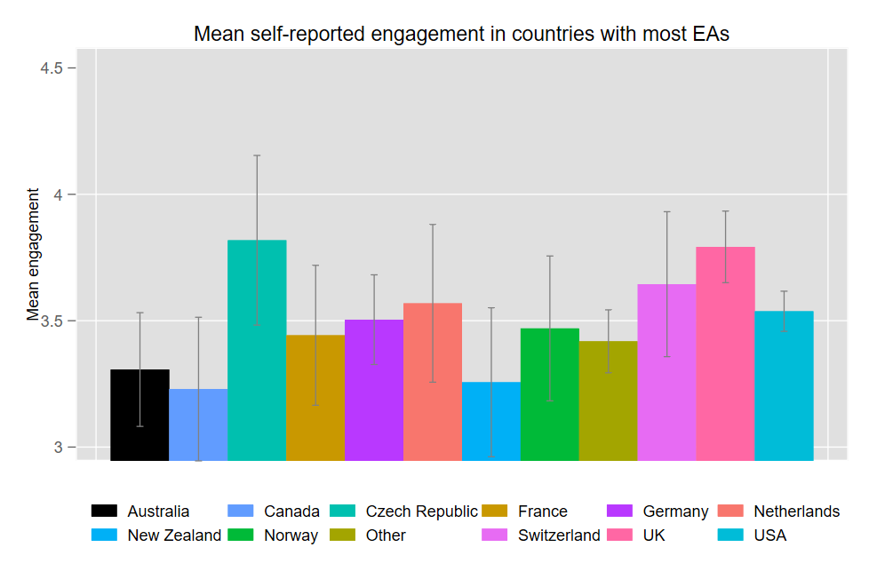
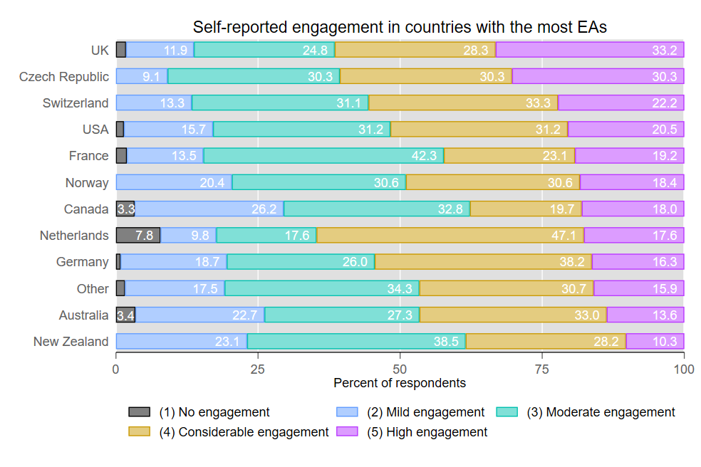
Of countries with 30 or more responses, the UK, Czech Republic, and Switzerland report the highest average engagement. However, given the low volume of responses in some countries, only the UK has significantly higher engagement than a handful of other countries.
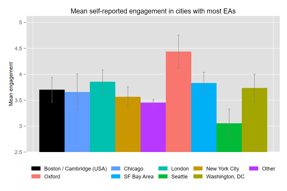
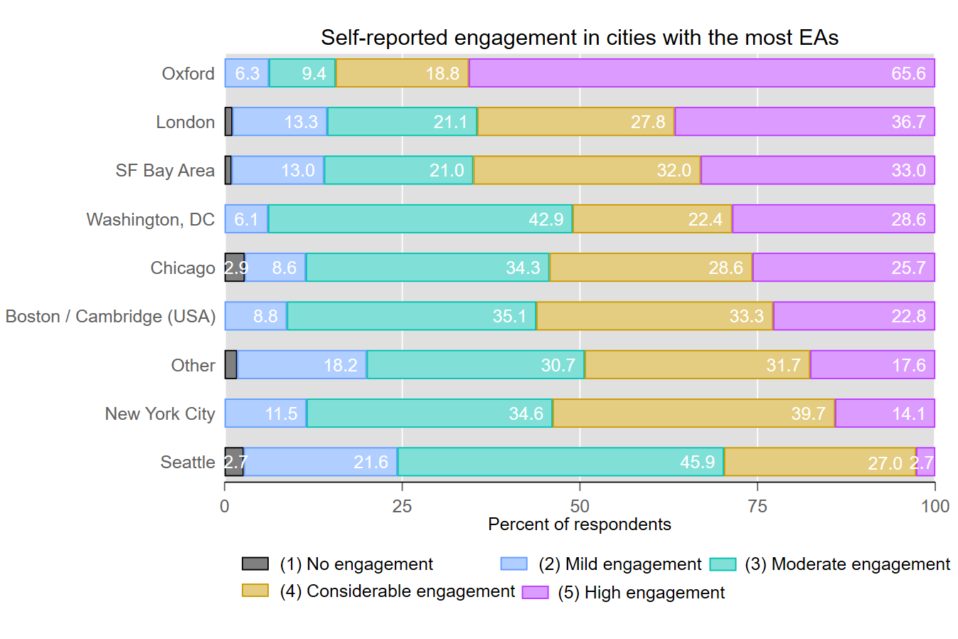
The average level of engagement among EAs living in Oxford is significantly higher than others. The San Francisco Bay Area and London are likewise significantly more engaged than all ‘Other’ cities (all other cities not listed on the plot above- which contains the majority of respondents). Seattle has significantly lower engagement than Other cities (though this may be explained, in part, by Seattle also having the lowest percentage of student respondents of all the major cities we examined). Pluralities of EAs in the Bay Area, London, and Oxford have more EAs are in the very highest engagement level.

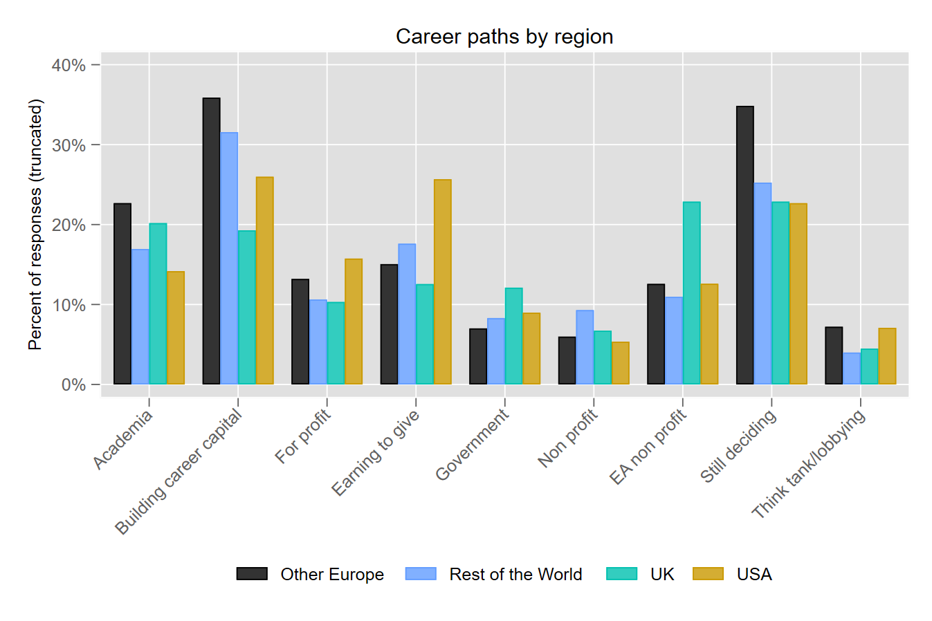
The survey asked respondents about their student/employment status and about their current career paths. EAs currently living in Europe are the most likely to be ‘building career capital’ and ‘still deciding on which career path to pursue’. This is unsurprising given that Europe has the highest proportion of current students (47.2%). The UK has the highest proportion of EAs working for an EA non-profit organization. This is likely due to the high volume EA organizations based in the UK, including FHI, GPI, 80,000 Hours, CEA, Founder’s Pledge, and CLR. EAs living in the US have a higher likelihood of working in an earning-to-give job or in the for-profit sector.
*Note: respondents were not limited to a single response for this question
The countries with the highest proportion of EAs in academia are primarily from mainland Europe, which is, perhaps, unsurprising given that Europe has the highest percent of students. Countries from mainland Europe also report high proportions of EAs who are building career capital and still deciding which career to pursue. EAs in the Czech Republic and Switzerland are more likely to be working in for profit and EA non profit organizations. While 16% of respondents in the UK reported currently working for an EA non-profit, over 28% of EAs currently living in the UK said they currently or previously worked at an EA org. EAs in Norway and the US have the highest likelihood of working towards earning to give. The highest proportions of EAs at non-profits are in Canada and France. Germany and Switzerland have the highest share of EAs at think tanks or working in lobbying.
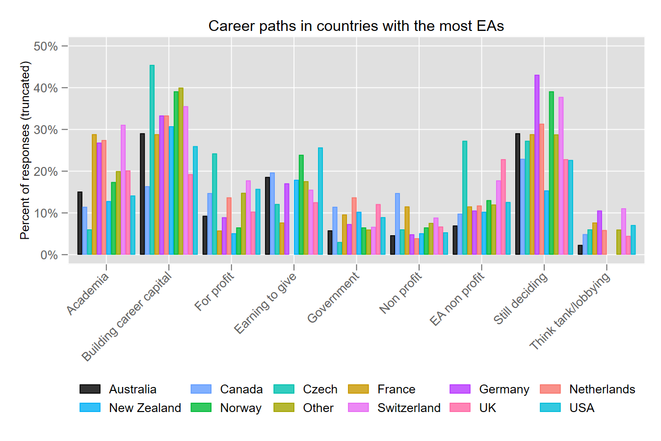
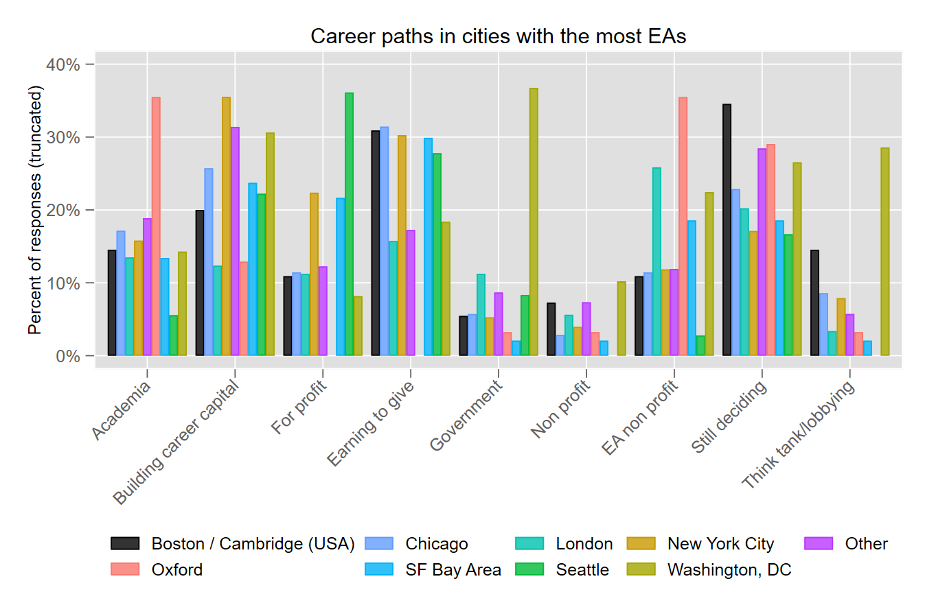
There is much more variation between career paths by city than by country or region, suggesting that certain EA hubs specialize in a given area. Oxford reports the highest share of EAs in academia and at EA non profits, although London, the Bay Area, and DC also have relatively high shares of respondents at EA non profits. New York, DC, and EAs outside of the main hubs have the highest proportion of EAs building career capital. Seattle has the highest share in the for profit sector, followed by New York and the SF Bay Area. These three, along with Boston and Chicago have high rates of EAs working toward earning to give. Unsurprisingly, DC has the highest share of EAs working in government, think tanks, and in lobbying. Boston has the highest share of respondents who are still deciding what career option to pursue, followed by Oxford, EAs outside of the main hubs, and DC.
Cause ratings by region follow closely ratings from last year’s survey results. EAs outside of Europe, the UK, and the US put a higher emphasis on global poverty and climate change and a lower rating on risks from AI. EAs in the UK gave higher average ratings for cause prioritization, EA movement building, and meta causes. Mental health has the lowest overall rating but is rated significantly less important in the UK and US. The US also puts a lower emphasis on cause prioritization and meta causes.
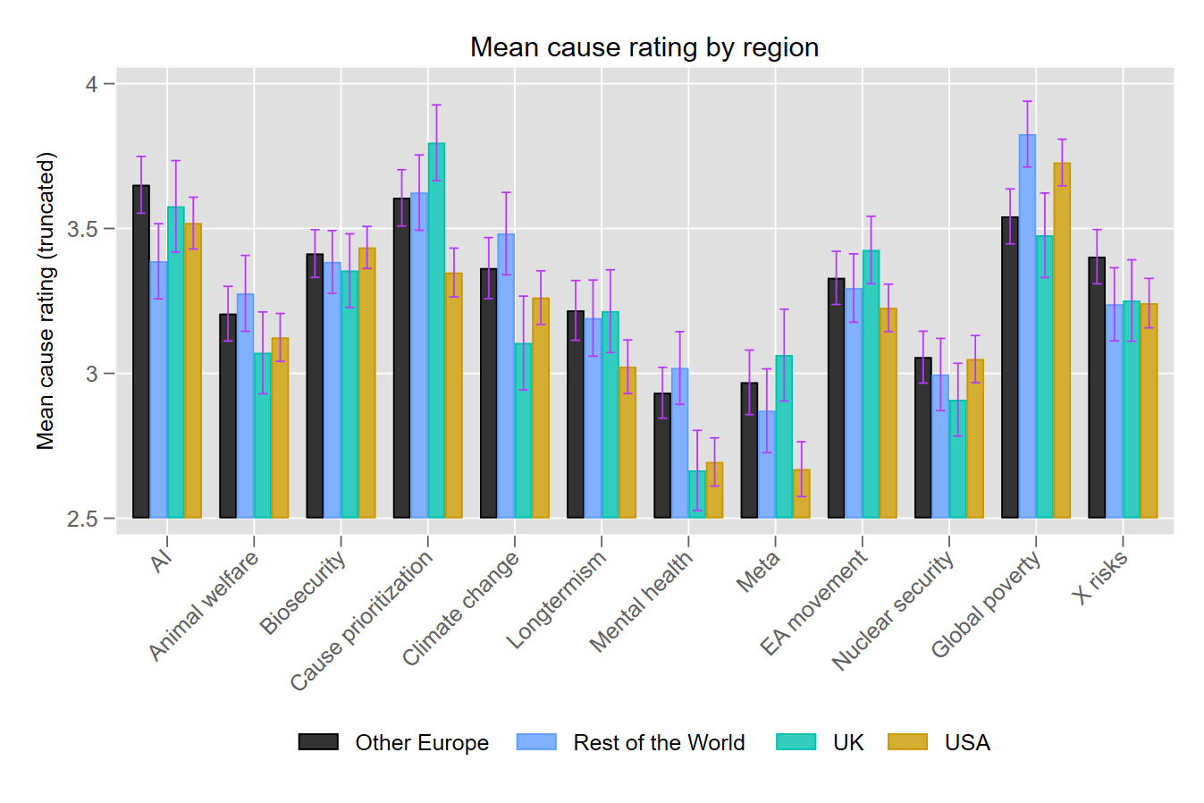
Due to the large number of cause areas, a figure showing mean cause ratings by city or country becomes too cluttered. However, there are a few key rating differences that are worth highlighting. We use one way ANOVAs with Bonferroni corrections to compare mean cause ratings between countries with 30 or more responses. Countries with fewer than 30 responses (referred to hereafter as “Other”) placed a higher emphasis on climate change than the UK and gave a higher rating to mental health than either the UK or the US. The US and Other ranked global poverty higher than Switzerland. The US ranks meta causes lower than the UK, and the Czech Republic ranks X risks higher than the UK, the US, and New Zealand. (These differences are statistically significant even after the multiple-comparisons correction.)
When comparing mean cause ratings by city, we find many statistical differences between Oxford and other hubs. Oxford rates longtermism and meta causes higher than Seattle, EA movement building higher than Boston, and AI risks higher than Chicago. Oxford also gives a higher rating tor cause prioritization than the Bay Area, Seattle, DC, Other, New York, and Boston. EAs in Oxford rate global poverty lower than Seattle, DC, NYC, Chicago, Boston, and Other. The Bay Area ranks global poverty lower than Other and AI risk higher than both Chicago and Other, while the Bay Area and London rank climate change lower than Other.
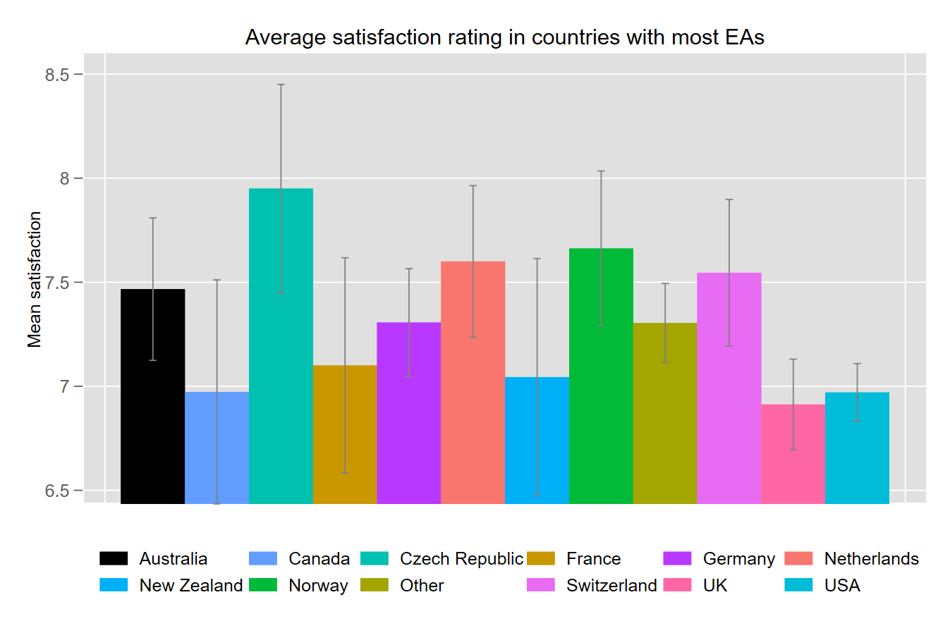
The survey included two questions asking respondents to provide their overall satisfaction with EA and how well the EA community compares to their ideal, both on a 1-10 scale. For ease of analysis, we took an average of these two ratings for an overall satisfaction rating. The US and UK have lower satisfaction with EA than mainland Europe and the rest of the world.
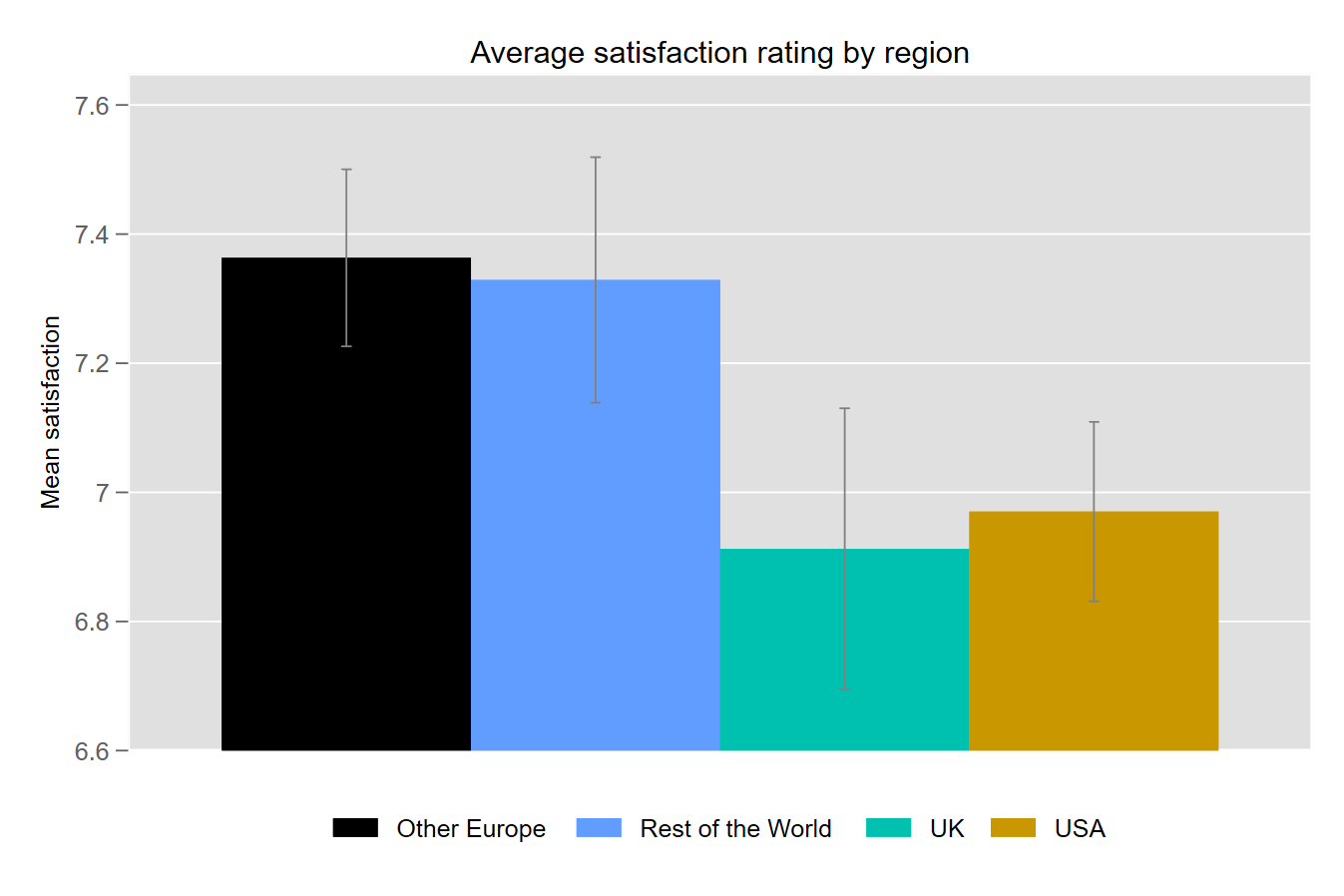
The US and UK also have lower satisfaction than the Czech Republic, the Netherlands, Norway, Other, and Switzerland.
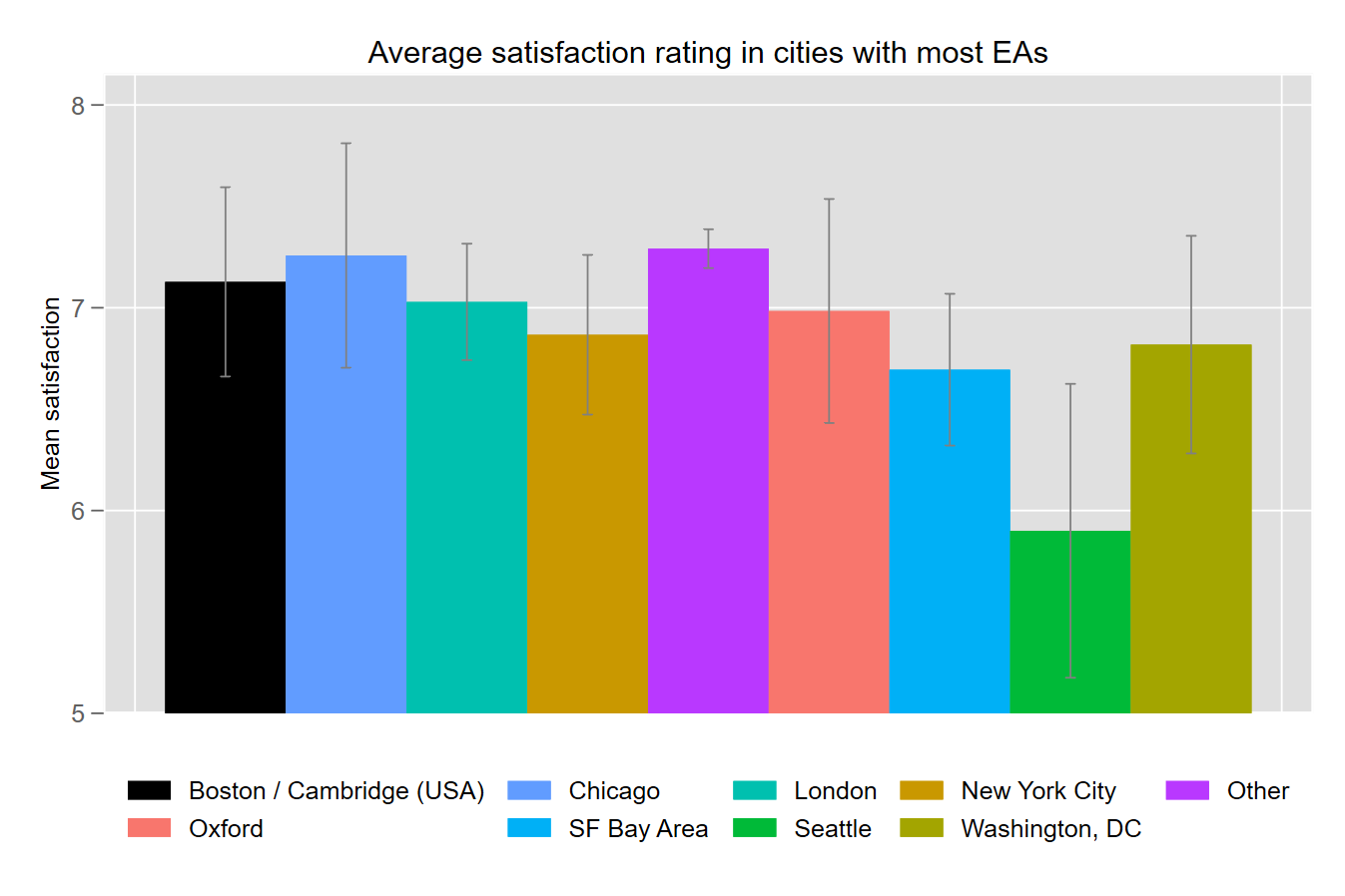
Overall satisfaction with EA varies little across major hubs, with the exception of Seattle whose rating is significantly lower than Boston, Chicago, London, and Other.

The annual EA Survey is a project of Rethink Priorities It was written by Jacob Schmiess with contributions from David Moss. Thanks to David Reinstein, Peter Wildeford and Ben West for helpful feedback.
We would also like to express our appreciation to the Centre for Effective Altruism for supporting our work. Thanks also to everyone who took and shared the survey.
If you like our work, please consider subscribing to our newsletter. You can see more of our work here.


Hello! I'm wondering if it's possible to share (an anonymised version of) the full dataset by country? I'm trying to use number of EAs in any given country as an input into thinking how easy it would be to hire someone for an EA talent search programme in a given country. But at the moment I can't easily compare between, say, India, South Africa, Saudi Arabia, and Pakistan.
Thanks!
We're planning to make more aggregate data about EAs per country available with the results of the next EA Survey (to be run this year).
In the meantime, I'll e-mail you about what results we can share about particular countries.