This post was written for Convergence Analysis.
Epistemic status: This is intended as a somewhat novel way of collecting and framing a variety of existing or intuitive ideas. It is also intended to complement rather than replace related existing work and models.
Overview
In this post, I present causal diagrams capturing some key paths to existential catastrophe, and key types of interventions to prevent such catastrophes.
This post should be useful for:
- Explicitly, visually representing such paths and interventions alongside each other, in order to facilitate thought and communication
- Highlighting certain paths and intervention which some readers may have previously neglected
- Serving as a starting point or inspiration for extending these causal diagrams, adapting the diagrams for specific existential risks and interventions, and building entirely new diagrams
The diagrams in this post are intentionally abstract and high-level. To aid understanding, I build the diagrams up gradually, giving examples and explaining my terms as I go. If you wish, you can skip directly to the full diagram by jumping to the section with that name.
After presenting the diagrams, I briefly discuss:
- things the diagrams weren’t designed to capture
- some potential uses of these diagrams
- how the diagrams compare to and were influenced by prior work
- some directions for future work
The causal diagrams
Causal diagrams can help us break down large, complicated, nebulous systems until we see the specific mechanisms and sequences that could lead to certain events. And once we see these mechanisms and sequences, we can better see points where we can intervene to shift things in a more positive direction. This post will build such diagrams for the analysis of existential risks.
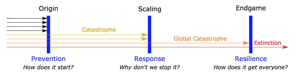
Simple diagram of risks from technological development
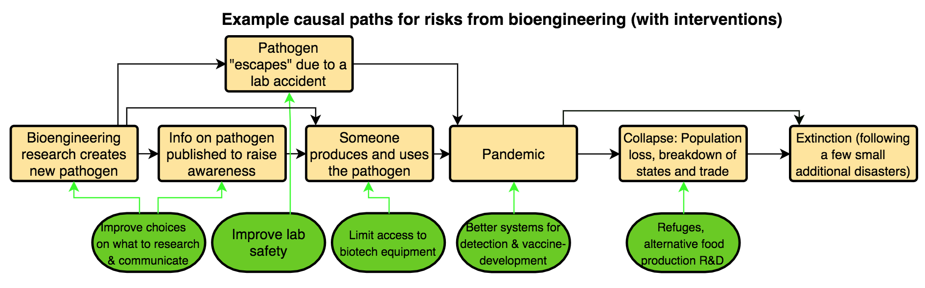
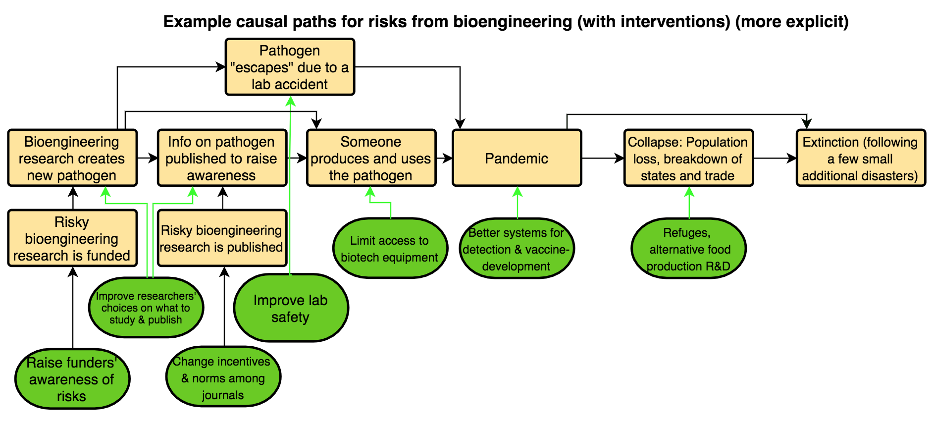
Let’s first consider an example of a causal path by which bioengineering could lead to extinction. To properly assess the risks and identify interventions options, it is not enough to just say “bioengineering could lead to extinction”. It is also not enough to say “bioengineering could lead to a new, dangerous pathogen, which could lead to a pandemic.” Creation of a pathogen does not automatically cause a pandemic, nor do pandemics necessarily lead to extinction.
Thus, it is important to outline each of the major steps in the process by which bioengineering could lead to extinction; to create a model or diagram outlining the potential causal path. Here is one such diagram:
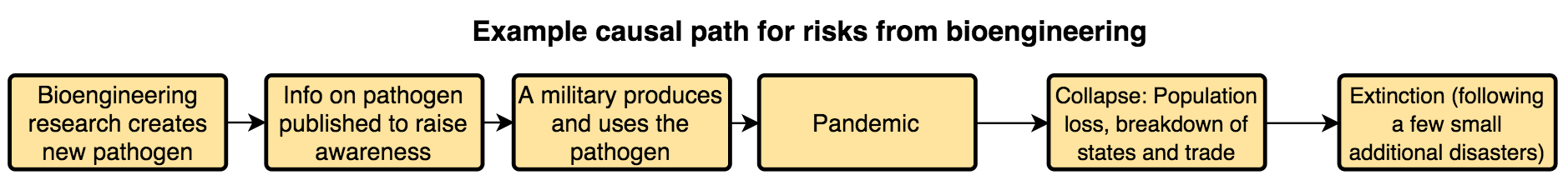
This highlights more areas for analysis and intervention than does “bioengineering could lead to extinction”. For example, perhaps bioengineering research is somewhat less risky than we thought, if pandemics are unlikely to lead to civilizational collapse, or collapse is likely to be recovered from? Perhaps instead of hindering the completion of certain bioengineering research, we can try to change norms about publication, if that would be more tractable, more neglected, or less likely to lead to downsides?
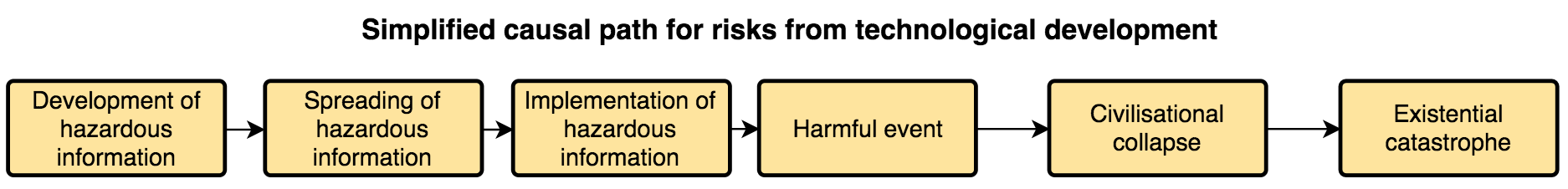
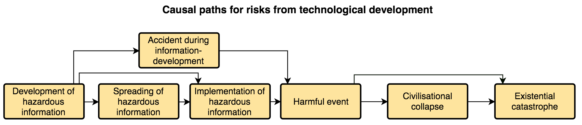
We can abstract away from that example’s specifics to get a simplistic diagram of a causal path from risky technological development of any kind to existential catastrophe:
I’ll now clarify the terms used in that diagram, though they’ll remain somewhat fuzzy.
By hazardous information, I mean information that would pose an information hazard: “A risk that arises from the dissemination or the potential dissemination of (true) information that may cause harm or enable some agent to cause harm” (Bostrom). In particular, I’m referring to facts, ideas, etc. that would create an information hazard of potentially catastrophic proportions. I expect such information to typically be related to emerging technologies.
Development of information means things like coming up with ideas and making discoveries via research.
Spreading of information means:
- intentional sharing: anything from telling one friend the information to publishing it in the mass media;
- unintentional sharing: e.g., sending an email to the wrong address; or
- unauthorised access: e.g., by hackers or eavesdroppers.
Implementation of information refers to “using” the information “in the real world”. For example, stockpiling a bioengineered pathogen, or “deploying” or “running” an AI system “outside of the lab”.
It’s worth noting that developing, spreading, and implementing hazardous information is mainly done by actors like scientists, governments, and corporations, but can also be done by “smaller” or “less influential” actors, such as bloggers or “DIY biologists”.
By a harmful event, I mean an event in which harm - as in “physical or other injury or damage” - actually does occur, rather than one where harm may occur or is likely to occur. This harm could be anything from a single death from an infection up to a global catastrophe with millions or billions of fatalities. Once a harmful event occurs, interventions focused on that event will be mitigating how much harm occurs, rather than preventing any harm from occurring. (That said, we may still be mostly interested in mitigating the harms in order to prevent the progression to civilizational collapse or existential catastrophe, rather than due to concern about the harms themselves.)
A civilizational collapse is essentially “a drastic decrease in human population size and/or political/economic/social complexity, across essentially the entire world, for an extended time.” This adapts Jared Diamond’s definition of collapse in order to focus it on particularly widespread collapses, by replacing “over a considerable area” with “across essentially the entire world.”
An existential catastrophe is “the premature extinction of Earth-originating intelligent life or the permanent and drastic destruction of its potential for desirable future development” (adapted from Bostrom). In Bostrom’s typology of existential risks, the types this post’s diagrams are most clearly applicable to are risks of extinction, unrecovered collapse, and recurrent collapse.
Alternative paths to risks from technological development
Earlier, I wrote “Creation of a pathogen does not automatically cause a pandemic, nor do pandemics necessarily lead to extinction.” Based on such considerations, I added steps for the spreading and implementation of hazardous information, and for civilizational collapse.
But with some existential risks, it’s plausible that those steps could be bypassed. Consider the following example, in which the causal paths that aren’t being taken are in grey:
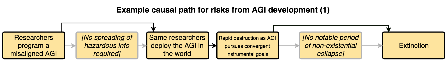
Here we have a “direct path” from developing information to implementing information. This path captures cases when the dangerous implementation could be done by the information-developers themselves. Another example would be the deliberate release of a dangerous pathogen by the same military scientists who developed it. This direct path highlights that the spreading of information may not always be necessary, and thus that interventions focused on that step in the causal chain may not always be relevant or sufficient.
In this example, we also have a “direct path” from the initial harmful event to the existential catastrophe. Another example of a risk that could follow that path, or where the initial harmful event may itself be the existential catastrophe, would be “a physics experiment disaster [which alters] the astronomical vicinity, rendering life on Earth impossible” (Baum et al.). This direct path highlights that a number of existential catastrophes would not be preceded by a relatively distinct period of civilizational collapse. Thus, interventions focused on improving chances of recovery (e.g., creating seed banks) may not always be relevant or sufficient.
In some cases, the step for implementation of hazardous information could also be skipped. Consider the following example, adapted from the above, and again showing in grey the causal paths that aren't being taken:
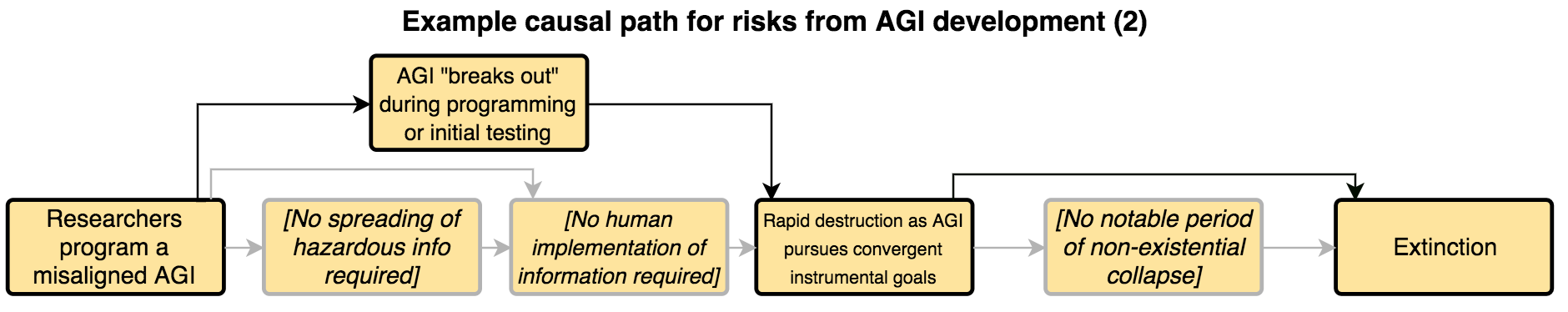
Here we have a harmful event caused by an accident during information-development. Additional examples of this include:
- a pandemic caused by an engineered pathogen “escaping” from a lab due to an accident
- a physics experiment disaster
This path highlights that there may be risks for which neither information-spreading nor even any deliberate implementation “in the real world” is necessary, and thus that interventions focused on those steps may not always be relevant or sufficient. It also highlights the possibility of “research-accident prevention efforts” (e.g., improving lab security), as discussed in the next section.
If we ignore causal paths that bypass the three steps bypassed in those examples, our risk estimates and intervention efforts could be fatally misguided. To account for this, we can add three possible alternative paths to the earlier diagram:
Interventions
We don’t want to merely analyse existential risks; we also want to come up with, prioritise, and implement interventions that reduce them. To help with this, we can extend the above diagrams to represent various interventions, or broad types of interventions, and how they relate to different steps on the causal paths to existential catastrophe.
Let’s start with some illustrative examples of interventions for the bioengineering risk example:
Each green arrow links a type of intervention to the causal step the intervention targets. The intervention is intended to either:
- reduce the chances that that step happens
- change how that step is likely to happen (including “how severely” it happens), and thereby the chances that that step will lead to the next one
For example, improving how researchers make choices regarding what to research is intended to either:
Abstracting away from that example’s specifics, we have this diagram:
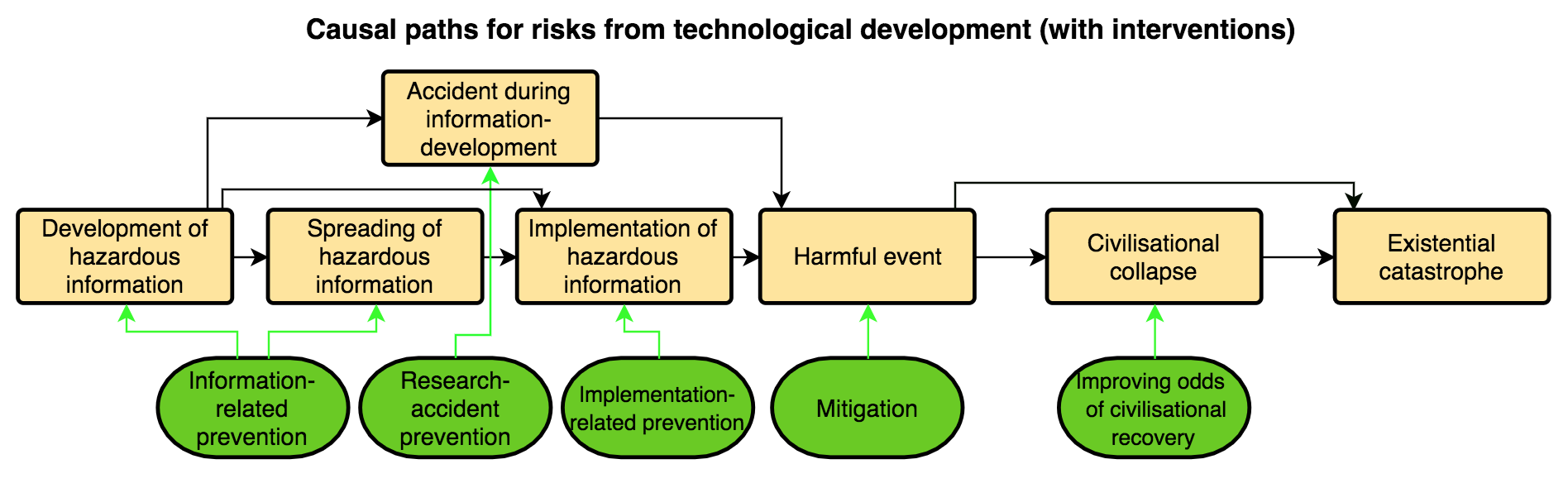
I’m here classifying interventions into three broad types: prevention, mitigation, and improving odds of civilizational recovery. Additionally, in this case, I’m dividing prevention into three subtypes.
By information-related prevention, I mean any intervention that changes what hazardous information is developed and spread, or how it’s developed and spread, such as:
By research-accident prevention, I mean things like:
- improving lab safety
- procedures to reduce risks of an AI harmfully “getting out into the real world”, without having been intentionally “deployed”
By implementation-related prevention, I mean interventions which reduce certain actors’ intentions or capabilities to implement hazardous information, such as:
- facilitating political changes that make leaders less interested in militarising emerging technologies
- restricting access to certain emerging technologies or prerequisite equipment
- promoting norms of caution and altruism among leading AI labs
I use mitigation quite broadly, to cover any interventions that lessen the harms, rather than preventing the occurrence of the initial harmful event (e.g., the first fatality from a pathogen, the first nuclear explosion in an inhabited area). So mitigation actions are those which are helpful at any point between the initial harmful event and the progression to civilizational collapse or the direct progression to existential catastrophe. Examples of mitigation actions include:
-
enhancing our capacity to rapidly create treatments for diseases
- This may prevent a disease outbreak from escalating to a pandemic, but it’s unlikely to prevent the first fatalities. Thus, as I’m using the terms here, this is not a “prevention” action.
-
expanding and strengthening “refuges” so that, even if a global catastrophe occurs, there’s a better chance that many people will survive and “political/economic/social complexity” will be essentially maintained
- This may help prevent a civilizational collapse, but again it won’t prevent the initial harmful event, so again I wouldn’t classify it as a “prevention” action.
Some mitigation actions, such as improving refuges, will also be directly useful for improving odds of civilizational recovery. This is because improving refuges could both:
- reduce the chances that catastrophes lead to humanity losing agriculture, industry, advanced technology, etc.; this is mitigation
- improve the chances that humanity would regain those things if a collapse does occur; this is improving odds of civilizational recovery
Another example of an intervention for improving odds of recovery is creating seed banks to help post-collapse societies recover agriculture and biodiversity. This would not count as a mitigation strategy, because the seed banks would likely only become useful some time after the initial catastrophe has run its course.
The full diagram
All diagrams presented so far have focused on existential risks from technological development specifically. But there are also two other broad pathways to existential catastrophe:
-
“Other risky human actions”: sources of existential risk that are anthropogenic, but that are best analysed using a model that focuses on things other than the development, spread, and/or implementation of information, and/or accidents during the development of information.
- One example might be a nuclear war in which advanced technology (e.g., AI-influenced launch decisions) was not particularly important.
-
Natural events
We can add those two additional broad pathways to existential catastrophe to our diagram, as shown below:
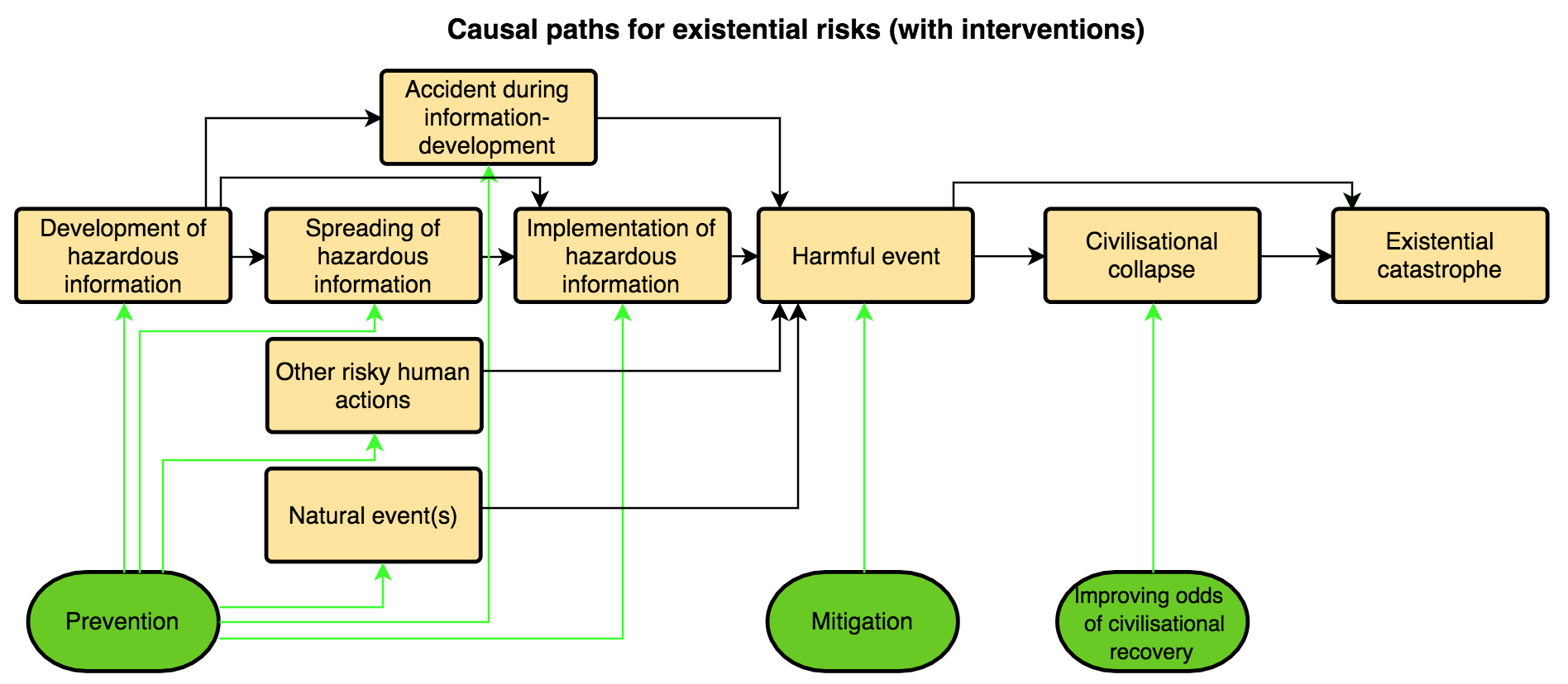
Risks that differ in whether they originate in risky technological development, other risky human actions, or natural event(s):
-
may often look very different at the early stages stages, and thus they may often require very different prevention efforts
- this is part of why I am no longer splitting prevention into the three subtypes mentioned earlier
-
but may often look relatively similar, and be addressable with similar interventions, from the start of the harms onwards
- For example, a sufficiently large asteroid could lead directly to an existential catastrophe, rather than to a collapse, just as certain physics experiment disasters theoretically could.
- For another example, refuges could be useful for mitigation and improving odds of recovery across a wide range of different risks.
I’m providing much less detail on the initial steps that may occur in cases of risks from “other risky human actions” or natural event(s), compared to cases of risks from technological development. This is partly because we (Convergence) are more focused on risks from technological development. But completely ignoring the other broad pathways would be unwise.
Things these diagrams weren’t designed to capture
-
“Slow” rather than “fast” catastrophes, using the rough distinction made by Baum et al.:
- “Some catastrophes could cause significant harm to human civilization in a short period of time, such as nuclear wars or pandemics. Other catastrophes work more slowly, such as global warming or the depletion of certain natural resources. Slow catastrophes give humans more time to adapt to the new conditions, though the conditions may also be more durable.”
-
Existential risks of the plateauing, flawed realisation, or subsequent ruination types, in Bostrom’s typology
-
Longtermist concerns other than existential catastrophes (e.g., getting to especially good good futures)
-
Feedback loops, other effects that propagate “backwards” through the causal paths, and interactions between different risks.
- E.g., risky research can influence other research; a non-existential catastrophe could make us more cautious about future research; a collapse we recover from could affect all other steps for later risks in hard to predict ways.
-
Getting actual quantitative estimates of risks, cost-effectiveness of interventions, etc.
While these diagrams weren’t designed for these things, I expect that they could capture some of them, serve as a useful starting point when considering them, and/or be adapted to capture them well.
For example, to get quantitative estimates of risks and cost-effectiveness, I think I’d find these diagrams useful as a starting point, and then I’d begin to factor certain parts out further and tailor them to the particular scenario I’m focusing on. A quick, illustrative example is shown below.
Ultimately, I would probably move to Guesstimate to flesh the model out further, input values, and calculate outputs.
That said, there are of course many other approaches and models one could use, and some may be more suitable for certain purposes, scenarios, and risks.
Some potential uses of these diagrams
In a nutshell, I think that these diagrams could help in:
-
Analyzing and communicating about risks
- E.g., it can highlight that there may be more steps a risk must pass through to reach existential catastrophe than one would have initially thought.
- E.g., it can highlight that some risks may bypass steps to existential catastrophe in easy-to-overlook ways, such as via bioengineering lab accidents, without any intentional spreading or implementation of information.
-
Identifying, assessing, prioritising, and communicating about intervention options
- E.g., it can highlight the potential value of also improving our odds of recovery from collapse, in addition to trying to prevent catastrophes or collapses from occurring in the first place.
- E.g., it can highlight the value of interventions that target in a general way a step that many risks would pass through, such as promoting more nuanced academic publication norms in order to reduce the spreading of hazardous information about many different risks.
-
Highlighting the value of distributing substantial resources to interventions focused on each step in the causal paths to existential catastrophe (rather than focusing mostly on just a handful of the steps)
- As the paper Defence in Depth Against Human Extinction notes: “What if each defence layer has a decent chance of stopping a risk? We’ll then be best off by allocating a non-zero chunk of funding to all three of them – a strategy of defence in depth, our third conclusion. The reason just is the familiar phenomenon of diminishing marginal returns of resources. It may initially be best to strengthen a particular layer – but once we’ve taken the low-hanging fruit there, investing in another layer (or in reducing another risk) will become equally cost-effective.”
Some of these benefits can also be provided by other, related work, such as that discussed below.
Brief comparison to previous work
The paper Defence in Depth Against Human Extinction has several things in common with this post, and helped influence this post. Most notably, they provide the following model:
And that paper’s authors make the above-quoted point about it likely being valuable to allocate resources across multiple different “defence layers”. A related concept is The Web of Prevention.
This post’s diagrams can also be thought of as a more abstract, general cousin of various more precise, more fleshed-out models of specific risks. For example, this model of the cost-effectiveness of interventions focused on agricultural catastrophes and AI-related catastrophes, or this paper’s models of the probability of a nuclear war.
Finally, this post’s diagrams capture somewhat similar ideas to those captured in Long-Term Trajectories of Human Civilization, particularly in its Figure 3, and that paper was an influence on this post.
Directions for future work
I think it would be valuable to:
-
refine and perhaps expand these diagrams, terms, and definitions, and/or my explanations of them, over time
-
discuss in more detail the potential uses and implications of these diagrams. This could include:
- building more fleshed out diagrams for specific existential risk scenarios
- discussing how that could be done
- exploring which risks are best analysed with substantially different diagrams or approaches
-
Review and make comparisons between similar work by others, and between that work and the diagrams in this post, in more detail than I’ve done here
I hope to do these things at some future point. I’d be grateful for any comments or feedback that might help with that process, including links to similar work by others which I haven’t mentioned. But I’d also be very excited to see others do any of the above things themselves, or something similar, either as comments here or as full posts.
It can be quite difficult to gain a foothold in thinking about something as massive, complex, and unprecedented as existential risks. I hope that the diagrams and ideas provided in this post can serve as one additional tool for breaking these risks down into the specific paths they might follow, and the points along the way where we could intervene to stop them. Ultimately, this is part of Convergence’s broader efforts to aid in people’s thought and communication on catastrophic and existential risks, so we can together build and execute strategies to secure a flourishing future for humanity.
Thanks to Justin Shovelain and David Kristoffersson for helping develop the ideas in this post, and for useful feedback and discussions.
Since writing this post, I've learned of two additional approaches to risk analysis that could also likely be usefully applied to existential risks:
And here's a generic example of the bowtie method (from the sourced linked to above):