I'm not an economist but I resonate with this- guilty as charged. I usually assume national figures are kind of the gospel truth and now that I think about it I'm not sure why...
"Strangely, economists pay a great deal of attention to statistical error when it comes to causal inference or survey data they collect themselves—but very little when it comes to national statistics."
I've also been interested in economic growth as global health EA funding looks to increasingly be funneled into ways to improve this. Given that GDP data is so poor how on earth can we figure out what interventions might reliably improve growth in poor countries?
Executive summary: GDP statistics from developing countries, particularly in Africa, are far less reliable than commonly assumed due to severe data collection limitations and statistical capacity constraints, suggesting we should treat these numbers with much greater uncertainty and explicit error margins.
Key points:
Statistical agencies in many African countries lack basic capacity to collect data, often relying on outdated censuses and crude estimations
Major GDP revisions (e.g., Nigeria's 89% overnight increase in 2013) reveal the scale of potential measurement error
Informal sectors (≈60% of working people) are typically estimated as a simple function of population, which itself is often poorly measured
Statistical error margins for developing country GDP are estimated at 20-35%, with growth rate errors of at least 3%
Recommendation: GDP statistics should include explicit margins of error (e.g., "2.9% ± 5%") to better reflect uncertainty
This comment was auto-generated by the EA Forum Team. Feel free to point out issues with this summary by replying to the comment, andcontact us if you have feedback.
How Much Should We Trust Developing Country GDP? — EA Forum
This post was crossposted from Oliver Kim's Global Developments blog, with the author's permission, by the Forum team. The author may not see comments.
A Review of Morten Jerven's Poor Numbers, A Decade On
Poor Numbers: How We Are Misled by African Development Statistics and What to Do About It, by Morten Jerven. 2013.
I think most users of GDP presume that, when they download an Excel spreadsheet from a slick-looking official website like the World Bank or the International Monetary Fund, what they get is something FDA-approved for human consumption—that, somewhere down the line, maybe in some other room down the hall, the real experts have done the shoe-leather work to make sure that the numbers are accurate and reliable.
Morten Jerven’s 2013 book, Poor Numbers, is about why that isn’t true.
The Late 1980s Tanzanian Growth Catastrophe
Perhaps the best illustration comes from Tanzania, where the socialist leader Julius Nyerere famously pursued a policy of ujamaa—“brotherhood” in Swahili—in which the newly independent state assumed control of large portions of the economy.
Initially, Nyerere’s ambitious project of socialist nation-buildingcaptured the global imagination. In some respects, it was a remarkable success—to this day, Tanzanians have a stronger sense of shared national identity than their neighbors. But it also had a dark side: a process of forced villagization, where Tanzania’s scattered rural population was coercively—sometimes violently—resettled into villages planned by the state.
By the 1980s, it was clear that ujamaa had fallen short in terms of delivering development. Under pressure from the IMF and the World Bank, Tanzania began to implement neoliberal reforms, loosening the state’s control of the economy.
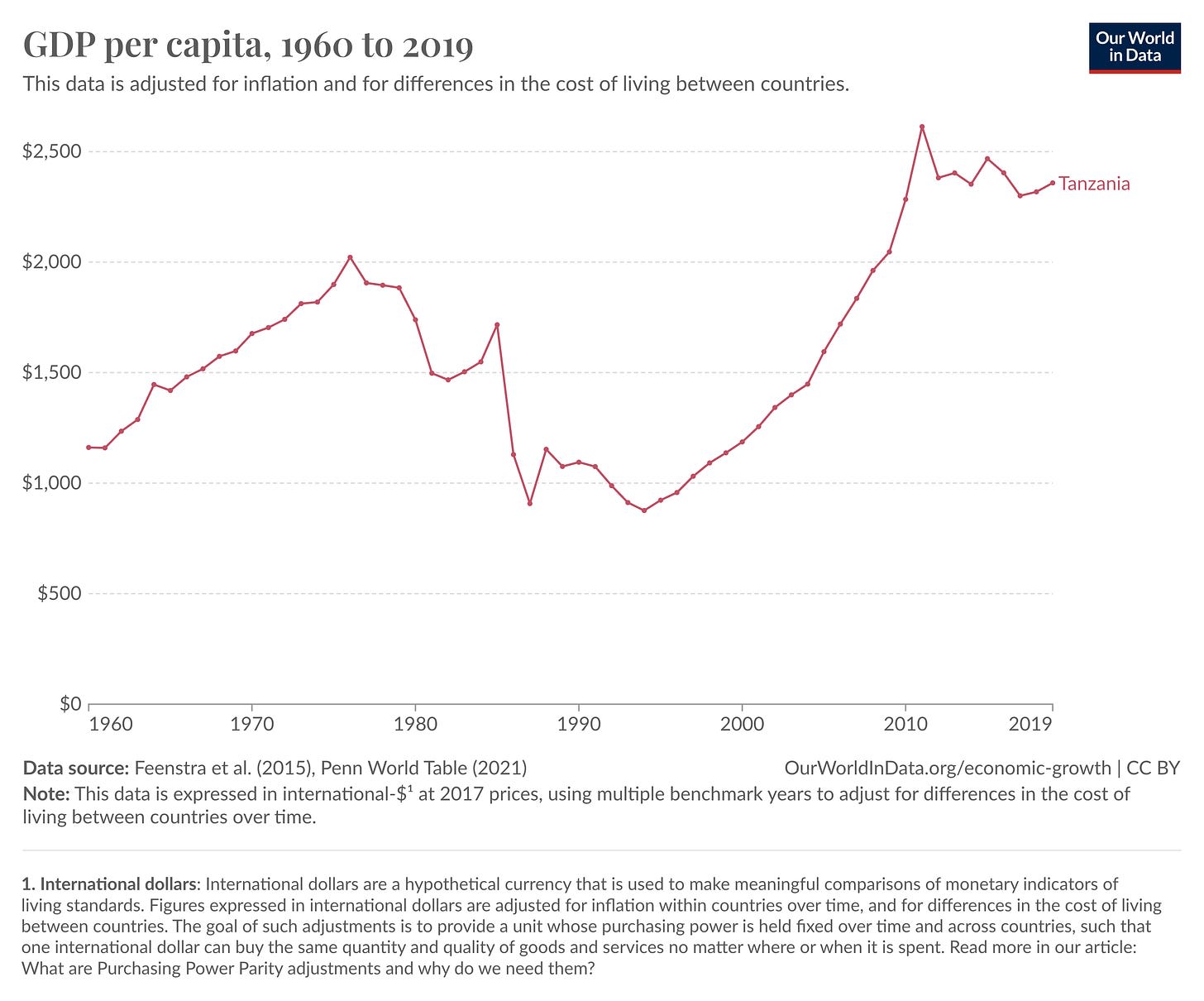
According to the Penn World Tables, one of academic economists’ favorite datasets, between 1985 and 1986, GDP per capita fell from $1,717 to $1,130 in 2017 international dollars—a 33% collapse, larger than what the United States experienced from 1929-33 during the Great Depression:
The only problem? It likely didn’t happen.
The Late 1980s Tanzanian Growth Catastrophe is largely a statistical artifact—a product of the simple truth that GDP measures what the state can see.
As ujamaa collapsed, the Tanzanian state atrophied, and economic activity retreated into the informal sector, with farmers switching from export to subsistence crops. But the GDP statistics largely missed this shift. In 1997, the GDP methodology was finally revised, using 1992 prices as a base. With this revision, the Bureau of Statistics admitted that GDP had previously been underestimated by anywhere between 30 and 200(!) percent.[1]
This left the question of how to reconcile the new numbers with the old ones. For somewhat murky reasons, the Penn World Tables chose to stitch the two series together in such a way to create the Late 1980s Tanzanian Growth Collapse. Not only that, but to get the reconciliation to work, the Penn data also shows a miraculous recovery over the late 1980s, with per capita growth rates averaging over 5% a year from 1995 to 1999. (This recovery has erroneously been used to tout the success of Tanzania’s structural adjustment program.)
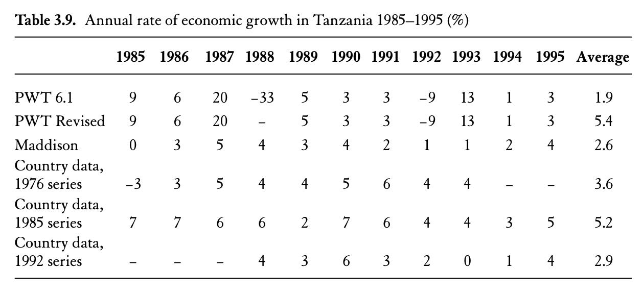
But no other estimate of Tanzanian GDP shows such dramatic volatility:
Jerven (2013), pg. 71. Figures may be slightly different from PWT above as they use an older vintage.
In the current Penn World Tables, Tanzania’s one-year GDP collapse is a large outlier—a three-standard deviation event. But it is by no means alone. In 2013, Nigeria revised its GDP estimates and, overnight, Nigerian GDP jumped by 89%, leapfrogging South Africa to become Africa’s largest economy. In 2010, a similar revision by Ghana caused its GDP to increase by 60%.[2]
In a sense, drastic revisions like the Late 1980s Tanzanian Growth Collapse or the Great 2010 Ghanaian Rebasing Jump are straightforward to deal with. If you know about them, you can drop them from your data. The scary thing is that decisions like these likely undergird most GDP numbers from poor countries. Your real concern should be the dogs that don’t bark—it should be the data fictions that lurk in plain sight.
“What Happens If I Disappear?”
Through a series of country case studies, Poor Numbers documents how African economic statistics are actually produced. Jerven’s examples, though not comprehensive, are collectively shocking. Hollowed out by years of state neglect, African statistical agencies are now often unable to conduct basic survey and sampling work. Jerven writes:
In 2010, I returned to Zambia and found that the national accounts now were prepared by one man alone… Until very recently he had had one colleague, but that man was removed from the National Accounts Division to work on the 2010 population census. To make matters worse, lack of personnel in the section for industrial statistics and public finances meant that the only statistician left in the National Accounts Division was responsible for these data as well. (pg. x)
Without the staff to collect and analyze survey data, statistical agencies are usually forced to improvise, guessing the size of the economy from population figures, which are themselves extrapolated from censuses that are decades-old.[3]
To name one prominent example, Nigeria (thought to be the world’s sixth-largest country) has not conducted a national census since 2006. With almost twenty years since the last data collection, the population figure of 230,842,743 that you can currently pull from Wikipedia is a quixotic monument to false precision.
Indeed, it would not be a great exaggeration to say that we have never known how large Nigeria is. The first census after independence, in 1962, was marred by regional infighting, because of its role in determining federal spending and assembly seats. The initial results, which reduced the population share of the politically dominant north, were rejected by the Northern People’s Congress. A redo in 1963 was also rejected as fraudulent—this time largely by southern politicians. The 1973 census was largely rejected as illegitimate; the 1980s and 1990s saw no censuses under military dictatorship; and the 2001 census produced an implausibly low number.[4] Even in the relatively successful 2006 attempt, census enumerators were attacked and killed, and the results were still disputed.
Many African states are failing at the basic task of knowing how many people live in their borders—let alone accurately measuring their economic activity. The vast, unobserved informal sector (which includes subsistence farming, and something like 60% of working people) is usually estimated just as a direct function of population.[5] Lacking direct harvest yields, estimates of agricultural output are often produced using FAO models based on planting-season rainfall data.[6] Even the minimal task of measuring the goods traveling across borders—in theory, the easiest thing for a sovereign state to accomplish—is occasionally beyond the reach of statistical agencies. Until 2008, landlocked Uganda only collected trade data on goods that eventually passed through the Kenyan port of Mombasa, ignoring the four other countries on its borders.[7]
In the absence of good underlying data, the prevailing approach for GDP in developing Africa can be summarized as:
Income estimates… derived by multiplying up per capita averages of doubtful accuracy by population estimates equally subject to error. (p. 39)
This is not the fault of the statisticians, who are doing the best they can with shoestring budgets. It is because of their work that we have estimates at all for what are some of the poorest countries in the world—and the most vulnerable. Earlier this year, Oxfam estimated that 84 out of Zambia’s 114 districts were hit by drought, leaving around a million farming households at risk of hunger. We are left with imprecise statements ("around a million”) and poor targeting of those in need, precisely because of our statistical ignorance.
I’m haunted by the words of the lone Zambian statistician, sitting in his empty office, who asks Jerven plaintively: “What happens if I disappear?”
A Marginal Proposal
Poor Numbers came out in 2013, attracting a wave of scholarly and policy attention (including by Bill Gates). Once you’ve heard its arguments, it’s virtually impossible to look at a GDP statistic the same way again.
But what actual progress has been made in the statistical capacity of nations?
Seemingly, not much. In late 2014, perhaps in response to Jerven’s book, the World Bank relaunched its website for its Statistical Capacity Indicator—a metric on a 0-100 scale which scores countries based on the strength of their “Methodology”, “Source Data”, and “Periodicity and Timeliness”. But even by this clunky internal metric, progress has been glacially slow: in 2004, the average score for African countries was 58.2; in 2019, it was just 61.4.
Moreover, over six years of an economics PhD, I have never heard of any economist using this statistic. Poor Numbers is well-cited and well-read (at least by Africa specialists), but its lessons about the fundamental unreliability of statistics have largely not been absorbed in how we actually do economics.[8] A separate data series with a clunky, hard-to-interpret scale is simply not going to cut it. The problem, I think, is that we economists need a tool that is internal to our statistical and quantitative frameworks.
And we actually have one: margins of error.
Strangely, economists pay a great deal of attention to statistical error when it comes to causal inference or survey data they collect themselves—but very little when it comes to national statistics. The presumption is the one with which I began this piece—and I shared, until fairly recently—that somewhere down the line, surely somebody has to have checked the work on something as important as GDP.
Here’s a simple bounding exercise. Remember Nigeria’s 89% GDP revision? If we assumed that Nigeria’s GDP estimate was exactly correctevery other year since 1960, the implied margin of error of GDP would be around 20%.[9] This aligns roughly with the pioneering work of the statistician Derek Blades, who estimated in 1980 that the errors in aggregate GDP for Botswana, Kenya, Malawi, Nigeria, and Tanzania ranged from 20-35%, and the errors in GDP growth rates were at least 3%.[10] (The correlation of year-to-year GDP estimates helps bring down the margin of error when computing growth rates.)
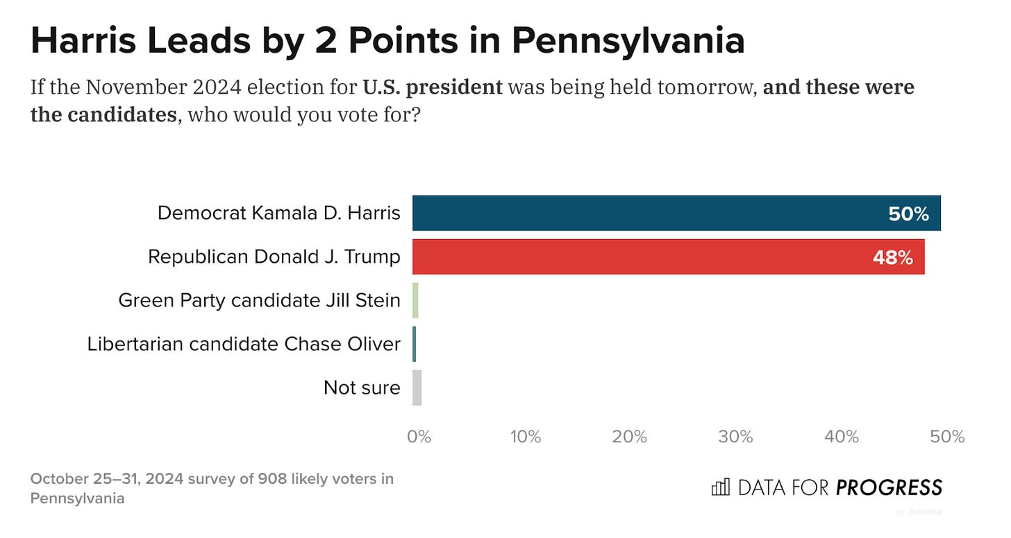
I am writing this in November 2024, not long after the bulk of the news-reading population of the United States just got a crash course in statistical literacy. (There will be just enough time in four years for everyone to forget again.) But hopefully we’ve learned enough to realize that, with a 3% margin of error, empirical arguments about policies that might raise GDP growth by around 0.5% are—like Kamala Harris’s 2-point polling lead in Pennsylvania—largely academic. We can recommend good policies on the merits, but their growth effects are essentially undetectable with our crude instruments.
Putting this on here as a reminder about statistical humility. Yes, it hurts me to see too. Source.
Problems of statistical volatility of macro data extend, by the way, to the recent past of developed countries. A famous paper on the US by Christina Romer shows that much of the perceived postwar fall in unemployment volatility may simply be a statistical artifact—applying the old techniques to new data yielded far more volatile series. Developing countries and the developed countries of the past exist on a continuum of statistical precision.
The far-and-away first-best option, of course, would be for African countries to sustainably develop their indigenous statistical capacities. (Never forget that large-scale sample surveying was an invention of the Global South!) But a second-best approach would be for researchers and policymakers to begin developing better estimates of the statistical error of GDP. An excellent habit would be to mimic political polling, and to start printing margins of error alongside GDP growth estimates. Seeing that Nigeria posted GDP growth of 2.9% in 2023 feels substantially different from seeing that Nigeria posted GDP growth of 2.9 ± 5%. The former is a reified certainty; the latter, a statistical estimate.
The world is fiendishly complicated: fuzzy, gooey, hairy, spiky, oozing with contradiction. The job of statistical measurement is to squish all this unimaginable complexity down to dimensions that human beings can manage. This exercise is never value-free, nor one immune to error. I haven’t even gotten into all the thornyideologicalcomplications of GDP; proposing margins of error is a purely internal statistical critique—a modest first step. Our goal should be a social scientific approach that doesn’t ignore this messiness, but is honest about how the data is made—one with a little less certainty and a little more epistemic humility—one that, when confronted with a graph of a particularly dubious GDP estimate, always remembers to draw out the missing confidence intervals with the mind’s eye.
Strictly speaking, these are rebasings, and earlier series were also revised. But the fact remains that, after a year, your estimate of the economy turned out to be 50% wrong.
Derek Blades, “What Do We Know about Levels and Growth of Output in Developing Countries? A Critical Analysis with Special Reference to Africa,” in Economic Growth and Resources: Proceedings of the Fifth World Congress, International Economic Association, Tokyo vol. 2, Trends and Factors, pgs. 60–77.
This post presents the executive summary from Giving What We Can’s impact evaluation for 2025. At the end of this post we share links to more information, including the full report and...
I used AI to fix transcription errors, rerrarange the ideas, and suggest tweaks to the title and some sentences.
Three of the most exciting projects to come out of EA in recent years are, in a vague sense, CEA spinouts:
* Kairos is directly a spinout of CEA and now handles most support for university AI safety groups. Basically everyone I've found who knows them is really excited about what they do
* NEST is an opinionated ideas-fi...

Similar post on population figures:
https://forum.effectivealtruism.org/posts/824rsHCXuqTmBb8se/nigeria-s-missing-50-million-people