Comments
I looked over an earlier version of this, just wanted to post my takes publicly.[1]
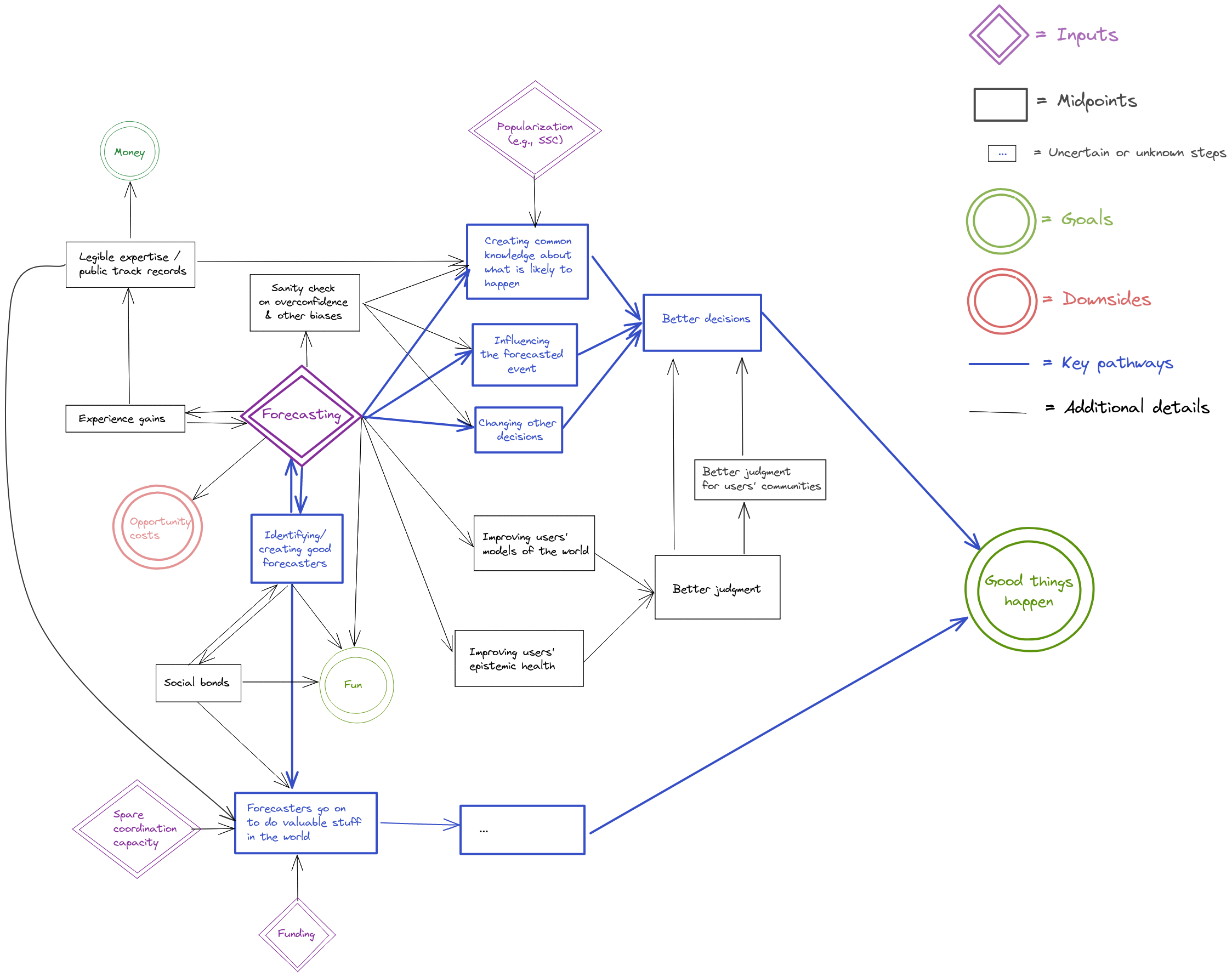
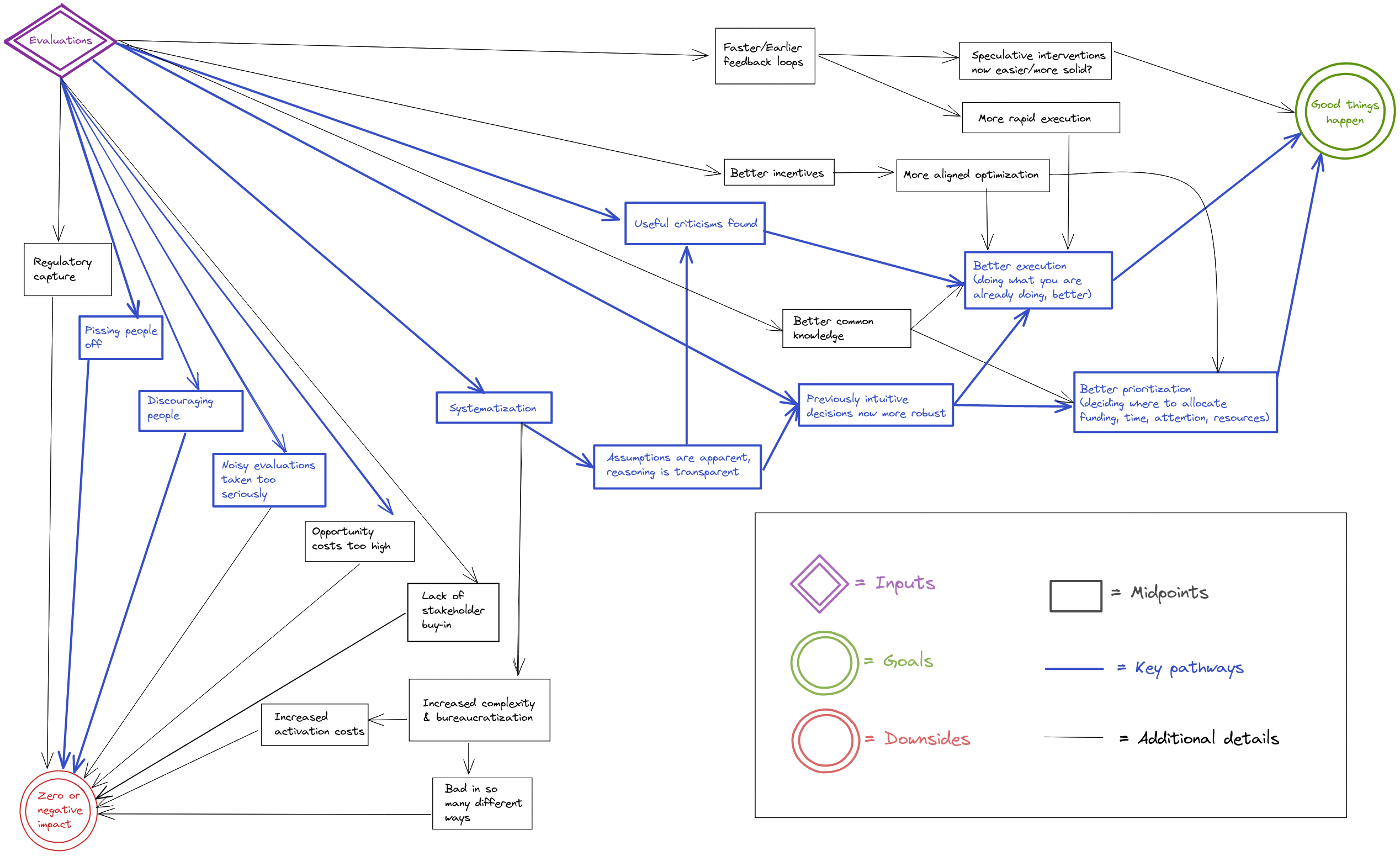
I like making diagrams of impact, and these seem like the right things to model. Going through them, many of the pieces seem generally right to me. I agree with many of the details, and I think this process was useful for getting us (QURI, which is just the two of us now) on the same page.
At the same time though, I think it's surprisingly difficult to make these diagrams to be understandable for many people.
Things get messy quickly. The alternatives are to make them much simpler, and/or to try to style them better.
I think these could have been organized much neater, for example, by:
- Having the flow always go left-to-right.
- Using a different diagram editor that looks neater.
- Reducing the number of nodes by maybe 30% or so.
- Maybe neater arrow structures (having 90% lines, rather than diagonal lines) or something.
That said, this would have been a lot of work to do (required deciding on and using different software), and there's a lot of stuff to do, so this is more "stuff to keep in mind for the future, particularly if we want to share these with many more people." (Nuno and I discussed this earlier)
One challenge is that some of the decisions on the particularities of the causal paths feel fairly ad-hoc, even though they make sense in isolation. I think they're useful for a few people to get a grasp on the main factors, but they're difficult to use for getting broad buy-in.
If you take a quick glance and just think, "This looks really messy, I'm not going to bother", I don't particularly blame you (I've made very similar things that people have glanced over).
But the information is interesting, if you ever consider it worth your time/effort!
So, TLDR:
- Impact diagrams are really hard. At these levels of details, much more so.
- This is a useful exercise, and it's good to get the information out there.
- I imagine some viewers will be intimidated by the diagrams.
- I'm a fan of experimenting with things like this and trying out new software, so that was neat.
[1] I think it's good to share these publicly for transparency + understanding.



I also drew some pathways to impact for QURI itself and for software, but I’m significantly less satisfied with them.
Software
I thought that the software pathway was fairly abstract, so here would be something like my approximation of why Metaforecast is or could be valuable.
QURI itself
Note that QURI's pathway would just be the pathway of the individual actions we take around forecasting, evaluations, research and software, plus maybe some adjustment for e.g., mentorship, coordination power, helping funding, etc.
I think the QURI one is a good pass, though if I were to make it, I'd change a few details of course.