Comments
Thanks, Jamie and David. Will there be a similar post for the 2024 survey?
Thanks, Jamie and David. Will there be a similar post for the 2024 survey?
Thanks Vasco. Yes, there will be a similar post for EAS 2024. But if you need any specific results in the meantime we can easily provide those.
Thanks, David! I am happy to wait for the post.
Can you say more about why you [EDIT: this is wrong] decided to categorize climate change as neartermist?
Is it something like, the names are not literal (someone who is concerned that AI will kill everyone in the next 15 years seems literally more neartermist than someone who is worried about the effects of climate change over the next century) but instead represent two major clusters of EA cause prioritization with the main factor being existential impact? And few people who put down a high ranking for climate change are doing it because they are concerned that it will lead to extinction?
Can you say more about why you decided to categorize climate change as neartermist?
The short answer is that we did not categorize climate change as neartermist.
As we explain in this post, we calculated "the average of cause prioritization ratings for biosecurity, nuclear security, AI risk, existential risk, and ‘other longtermism’ to indicate prioritization of ‘Longtermist’ cause areas, and the average of global poverty / global health, mental health, and ‘other neartermism’ to indicate prioritization of ‘Neartermist’ cause areas."
I imagine the confusion may be due to you looking at our linked post from last year. We note in the text that the previous post also took the approach of "creat[ing] indicators of leanings towards broadly ‘longtermist’ cause areas, relative to more traditional ‘neartermist’/global health and wellbeing cause areas." But the specific list of causes we used is the one described in this post.
As to why Climate change is categorised among the neartermist causes: as we explain in the linked post, this was based on the results of an exploratory factor analysis, where Climate change loaded on the same factor as the other 'neartermist' causes, Global poverty and Mental health. So this is an empirical approach, rather than based on a priori classification.
Ironically, we did not include Climate change in the measure of neartermist preferences this year, in part, to avoid people complaining on theoretical grounds that Climate change should be a longtermist cause. That said, it still shows a clear positive association with endorsement of neartermist causes and a negative association with the longtermist causes. Perhaps most tellingly, it is also negatively associated with an explicit longtermist statement: "The impact of our actions on the very long-term future is the most important consideration when it comes to doing good."
Is it something like, the names are not literal (someone who is concerned that AI will kill everyone in the next 15 years seems literally more neartermist than someone who is worried about the effects of climate change over the next century) but instead represent two major clusters of EA cause prioritization with the main factor being existential impact?
Yes, we note in the text:
As we noted in our FTX Community Response Survey report, although we refer to these groups of causes as “longtermist” and “neartermist”, which they are often referred to as in the EA community, we are not committed to the claim that support for these causes is explained by longtermism/neartermism specifically. For example, support for “neartermist” causes might be explained by beliefs about appropriate kinds of evidence rather than beliefs about the value of the future per se.
Thanks! Sorry for commenting without reading more closely!
Thanks so much for this - really clear, accessible and valuable data. I'm happy to see that the community is becoming more geographically diverse.
One minor nitpick: I found this graph confusing. The title is 'Longtermism - Neartermism' but the bars below are oriented 'Neartermism <> Longtermism'. At a glance, especially at the top, it looks like the Czechs strongly favour Neartermist causes but it's the opposite.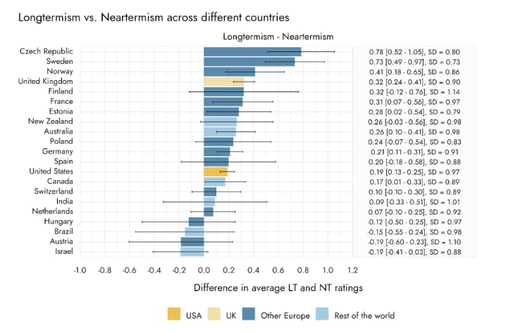
Thanks for highlighting this possible source of confusion. The ' - ' is intended to be like a literal minus sign, but it could be read more like a spectrum with Longtermism tending left and Neartermism tending right which seems to be how you (and possibly others) read it. I've adapted the labeling of the graph which I hope clarifies this
I think a useful/easy fix could be to change the title to "Neartermism - Longtermism"
I guess that introduces another potential confusion though, because the scores (e.g. 0.78 for the Czech Republic) is 'Longtermist score' minus 'Neartermist score'. "Neartermism - Longtermism" might lead people to think high scores mean strong interest in neartermist cause areas.
Thanks both! I think Jamie's adjusted version, where we spell out the word "minus" and write "Positive numbers indicate relatively more Longtermism prioritisation" hopefully clarifies things.
Good point
Thanks for putting this together! Learned some new things about my local group!
Could you tell more about the engagement metric? What was the questions asked to the respondents? Wondering if it about engagement with other EAs or local groups or generally with EA ideas and how the different levels are defined
Certainly, the full scale can be viewed here.


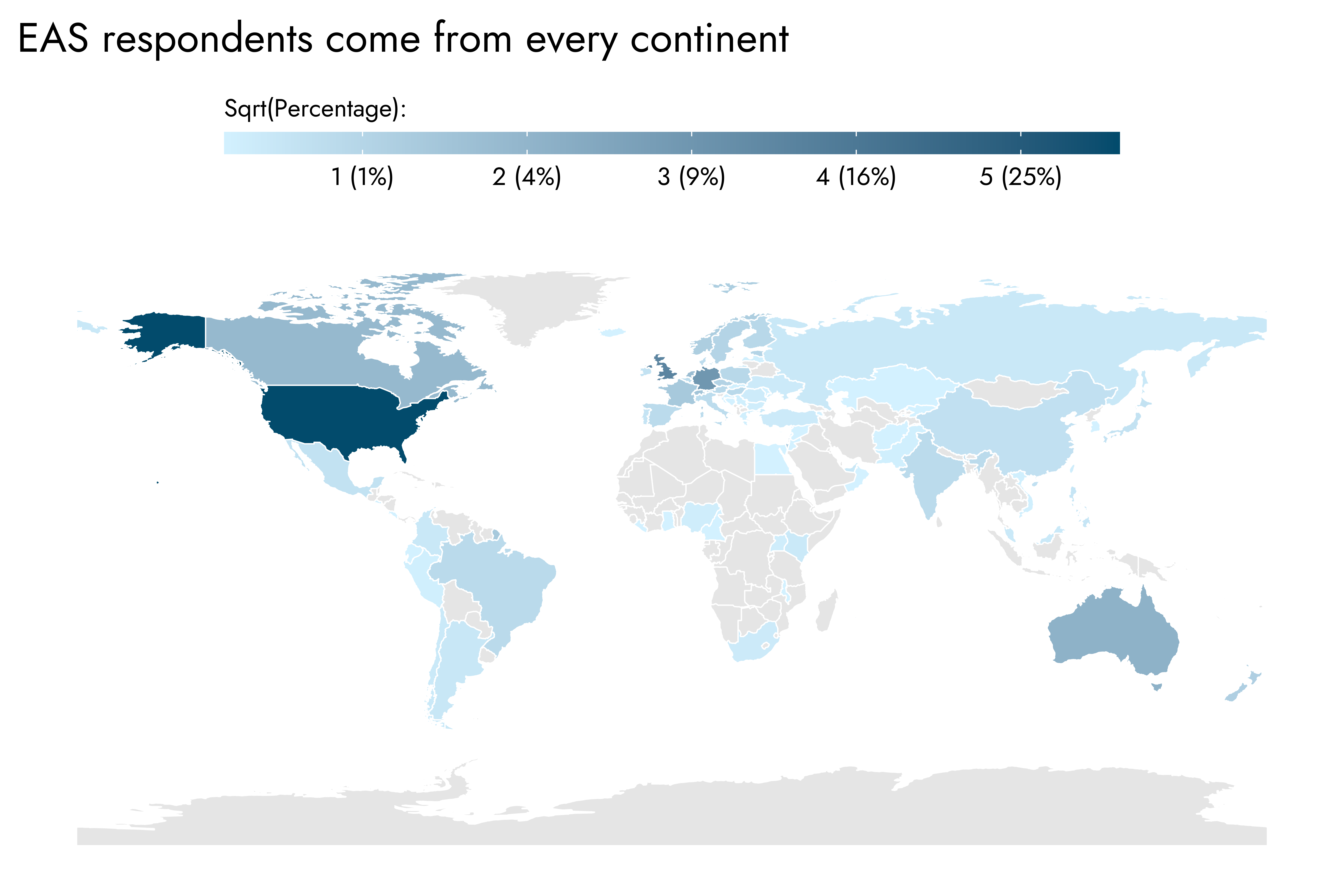
Respondents to the Effective Altruism Survey (EAS) in 2022 represent countries from every continent (excluding Antarctica). The United States has, by far, the greatest number of EAS respondents, followed by the United Kingdom. Most countries with the high numbers of respondents are either predominantly native English speaking countries (USA, UK, Australia, Canada) or European. Israel somewhat bucks this trend, although English is very widely spoken in the country as a second language. Areas of the globe that stand out as having no or relatively few respondents are South East Asia, Africa, and the Middle East. In a future post, we plan to examine factors that predict higher or lower numbers of EAs and EAs per capita across different countries.
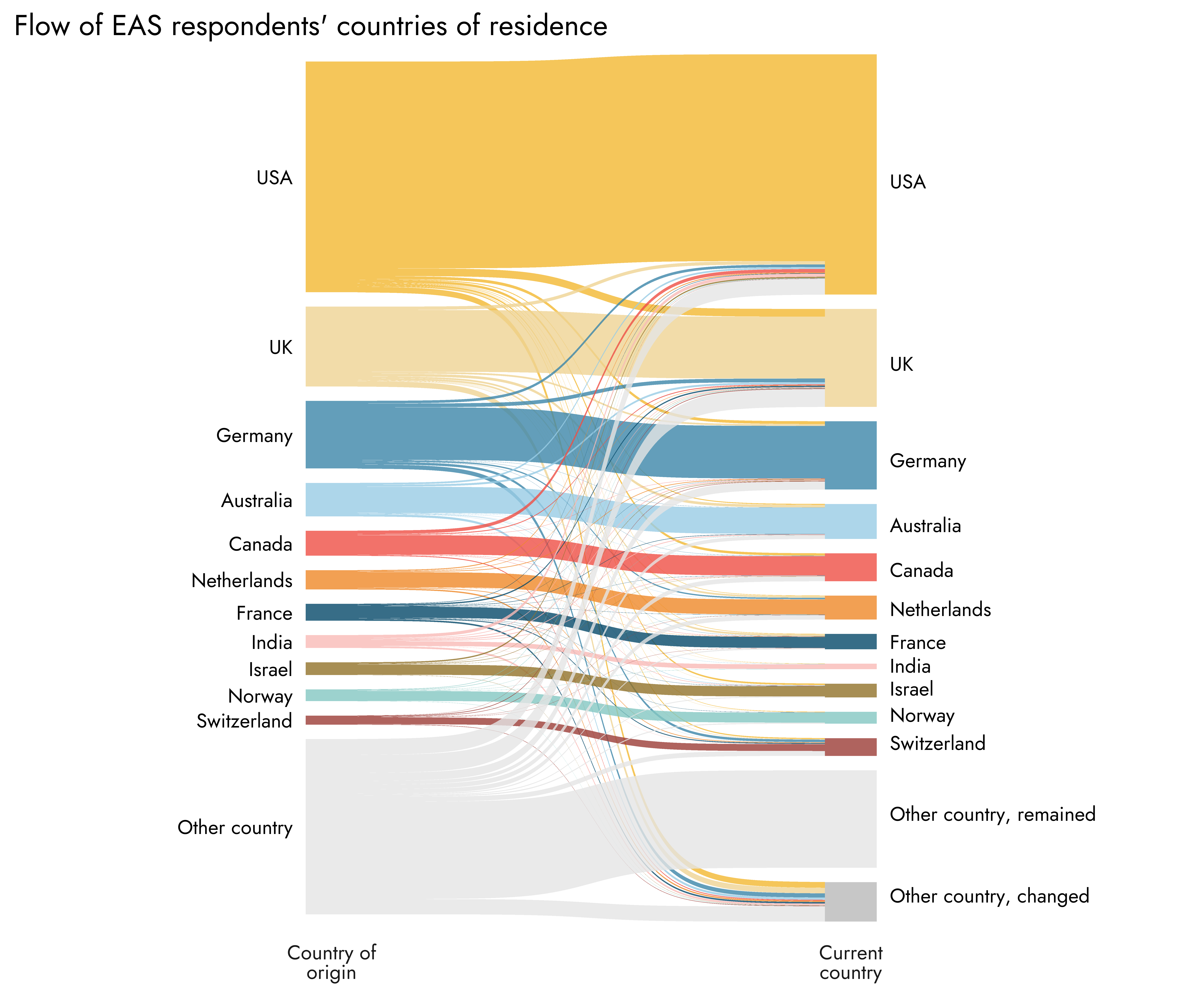
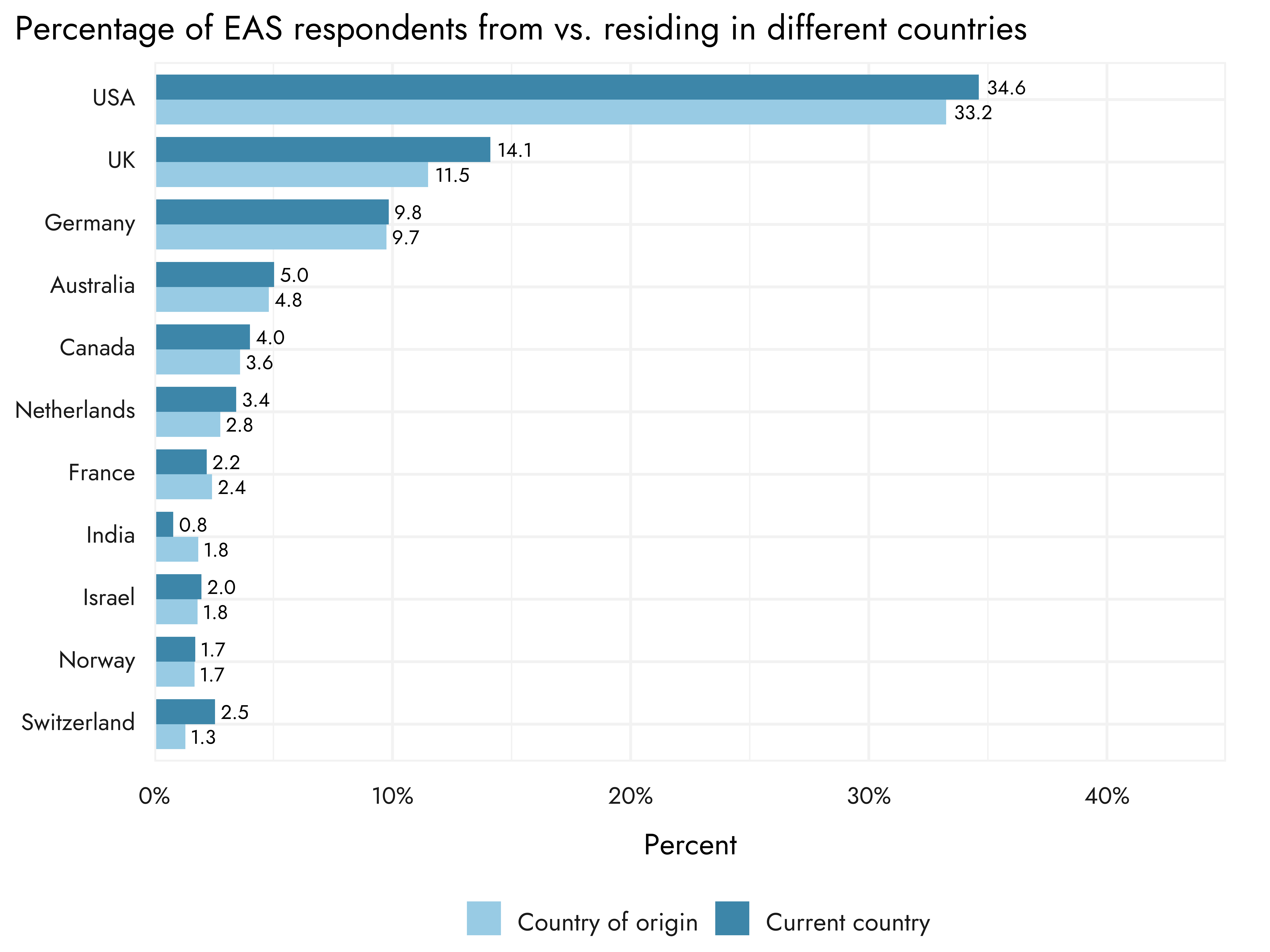
The same countries that represent the largest shares of current countries of residence are mostly also those with the largest proportions as countries of origin for respondents.[1] The two largest places of residence - the USA and UK - notably show a pattern consistent with an influx of respondents from other countries of origin. Switzerland, though a small country in terms of its share of respondents, also has an especially large ratio of residents to people who were born there - almost double. India also stands out as a location with substantial outflows of EAs: 1.8% of respondents reported India as a country of origin but less than half that presently reside there, with the most sizable outflow towards the USA.
Although the US and the UK still make up the largest shares of respondents, respondents who got involved in EA more recently are more likely to be from other European countries and countries outside of Europe. Based on data from 2022, the raw number of new EAs coming from the US and UK remains high, but there have been sizable and proportionally greater increases in the number of respondents coming from other countries over time.
Some of these changes might of course reflect differential dropout from different locations over time. However, we see a similar pattern if we simply look at the proportion of people in these different areas across EAS survey years: in more recent years, USA and UK respondents make up a smaller relative proportion of the total, with other European countries taking up increasing proportions of the share.

As might be expected, the most prominent hubs for EAs within countries are predominantly capital cities and other major metropolitan areas, or centers of major academic activity (0r combinations of these). London was the city with the single largest share of EAs, followed by four cities/areas of the USA - most notably the Bay Area.
In the plots below, we also present how the percentages of EAS respondents coming from the top 15 hubs have changed over survey years. We would caution somewhat against using these numbers to simply infer the growth, variability/consistency, or decline of different major hubs, however. Efforts by local leaders and groups to have people fill in the EAS in any given year could have very large effects that might exaggerate or obscure changes in the number of community members in that location.

Across all locations, the age of EAs in the EA Survey skews quite young relative to the general population, with the bulk between 20 and 40 years of age. There is, however, some variation in age across locations. Compared with respondents in the USA, UK respondents were on average about 1.5 years younger, with respondents from the rest of Europe being younger still - on average, by over 2 years. Of countries with at least 25 respondents,[2] respondents from Brazil had the highest average age, being nearly 13 years older than those in India on average.
Across regions, the proportion of men (vs. women or those of other identifications) tends towards almost twice as many men as women. There appears to be substantial variation across countries and cities, although the proportions have considerable uncertainty across many locations owing to the relatively small sample sizes.[3]
Racial identification across locations shows substantial variability. Respondents with white racial identification make up the very highest proportions mostly in European countries. As would be expected, places such as Brazil, India, and Israel - where white is also not the most common racial or ethnic background in the general population - show much lower proportions of white respondents. Clearly, there is also substantial variation within countries regarding racial diversity of the EA community. For example, Los Angeles, Sydney, and Toronto in particular have a wider range of racial backgrounds among their respondents - considerably more than the EA make-up of the overall country they belong to.
When considering these racial identification results, at least two things should be noted. Firstly, although respondents were able to provide their own description, the default categories provided were based upon racial identifications primarily from the US, and may not translate especially well to other locations. Secondly, it may not be as informative as it would first seem to compare the racial identification of EAS respondents with the general population in the different locations. Although we can see that there is a general tendency for the racial diversity to increase with higher racial diversity in the broader population, more specific deviations from this background population level may reflect other characteristics that are over-represented in the EA community which are also associated with race, and to different degrees in different areas (for example, income and education).
Student status varies substantially across different regions and countries. Understandably, countries with the highest proportions of students also tend to be those with younger average ages (e.g., Canada and Brazil are very low, and Hungary, India and Finland are very high - with the converse being the case for ages).
Engagement is significantly higher in the UK than the USA - the two biggest countries in terms of EAS respondents. Although when treated as numeric, this amounts to an average difference of .2 on a scale of 1 to 5, the percentage of respondents falling into the highest engagement rating was over 50% higher for the UK relative to the US. This may in part be driven by the presence of Oxford, which has the highest engagement among all cities by a substantial margin, with over 90% of residents reporting being Considerably or Highly engaged. Two other major hubs, London and the Bay Area, also have very high levels of engagement on average.
The two countries with the largest numbers of respondents - the USA and the UK - sit at the bottom of countries in average satisfaction with the EA community, although the average satisfaction rating is still 7 out of 10. The country with the highest satisfaction, and the only one to reach an average over 8, was Hungary. However, for most of these cases, the difference in terms of standard deviation units (i.e., Cohen’s d, an indicator of effect size) from e.g., the UK and USA to Germany would typically be considered of small-to-moderate size.
Across regions, global poverty and health, AI risk, and biosecurity tended to be rated very highly, whereas mental health tended to be rated lowest among causes as a priority.
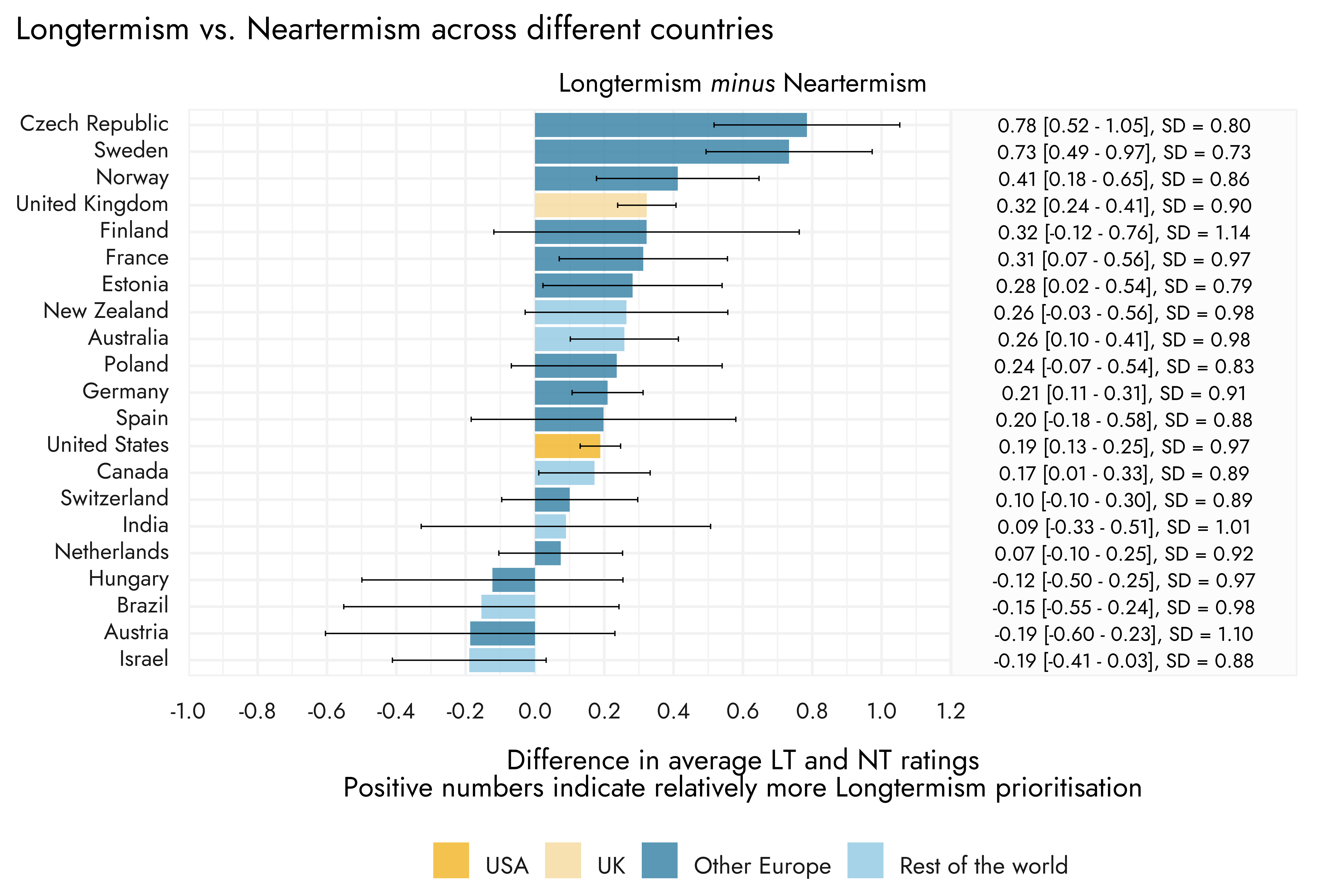
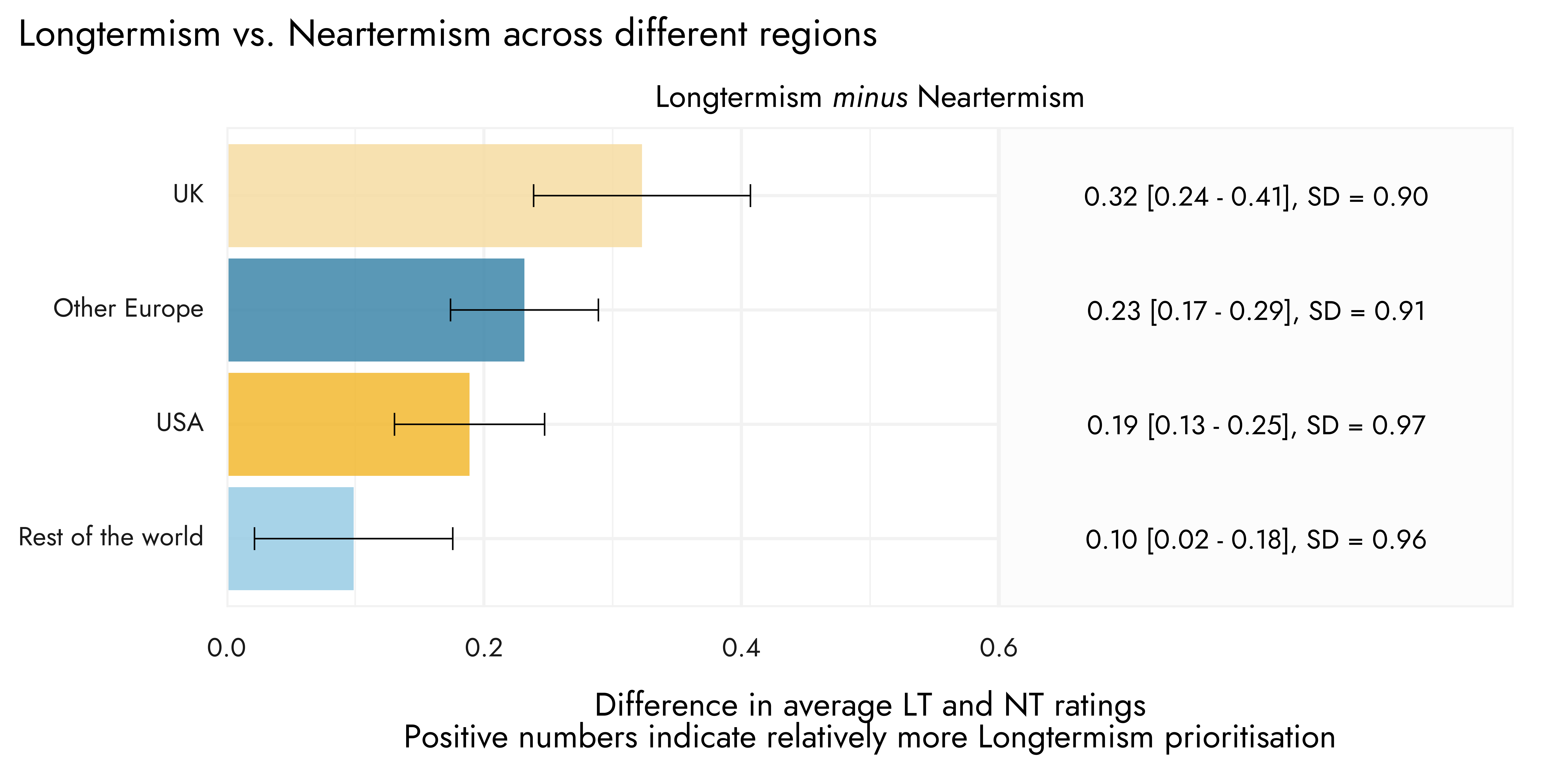
We would caution that these scores should not be interpreted as indicating the absolute level of support for longtermism over neartermism (with scores above 0 indicating net preference for longtermism and scores below 0 indicating net preference for neartermism and 0 representing neutrality). For example, from these ‘Longtermist - Neartermist’ comparisons it may look as if longtermism is, across countries, generally superseding prioritization of more traditional EA cause areas such as Global poverty/health, which is in the ‘neartermist’ bucket of causes. However, as noted, Global poverty/health remains highly prioritized across regions. Low ratings attributed specifically to mental health - the other main item in the ‘neartermist’ average - tend to bring the average down substantially. The overall ‘neartermist’ scores could be significantly higher or lower depending on whether Mental health is included/excluded (and, likewise, if we added or removed less popular causes to the longtermist group), which would shift the relative balance of the longtermism-neartermism scores. Hence, we would not conclude that different regions all prioritize ‘longtermist’ over ‘neartermist’ causes in some absolute sense, but their relative leanings towards these different cause categories can be informative.
In the figures below, we present the percentages of EAS respondents who reported being members of a local EA group across different countries and cities. It is notable that the two countries with the largest and longest-established EA communities - the UK and USA - have relatively low percentages of people reporting being members of EA groups, at about one third. The same might be said for some more specific cities/areas, such as Oxford and the SF Bay Area. However, it should also be considered that numbers for several of the smaller countries and cities with very high percentages could be slightly inflated: when there are relatively few EAs overall responding to the survey from a particular country or city, effective encouragement from group leaders in those places could lead to nearly all the people who are part of an EA group answering the survey, which would generate the appearance that almost all the EAs in that area are part of a group, but it is more indicative of a selection effect into the survey via the EA group in that area.
This research is a project of Rethink Priorities. This post was written by Jamie Elsey and David Moss. We would also like to thank Peter Wildeford and David Rhys Bernard for their comments.
If you like our work, please consider subscribing to our newsletter. You can see more of our work here.
Note that percentages reported in the chart below showing countries of residence vs. countries of origin may not exactly match the first chart that just show countries of residence, as data were filtered slightly differently to include only respondents answering both origin and residence questions.
In some plots you may see that the n is in fact below 25: for the most part we have continued to plot locations that, overall, had 25 respondents or more in the 2022 EAS, but for specific outcomes there may have been missing data, bringing the respective n for that item below 25.
For uncertainty around percentages, we use a Bayesian 95% Highest Density Interval (HDI), reflecting the 95% most likely values from a posterior distribution. Uncertainty around means reflects a 95% confidence interval.
As we noted in our FTX Community Response Survey report, although we refer to these groups of causes as “longtermist” and “neartermist”, which they are often referred to as in the EA community, we are not committed to the claim that support for these causes is explained by longtermism/neartermism specifically. For example, support for “neartermist” causes might be explained by beliefs about appropriate kinds of evidence rather than beliefs about the value of the future per se.


Super interesting, thanks for putting this together! I'd also be curious about a comparison of the number of EAs per country normalized by country population (i.e., per capita data).
Hi Irene - there is a forthcoming post that is going to be dedicated to looking at numbers per capita and also delving into possible predictors of this, so you should be able to see a thorough treatment of this soon!
Great, looking forward to it!