Hide table of contents

In the spirit of the Flag for Utilitarianism, I hereby propose this be the Flag for Longtermism: Longtermist Flag

Symbolism

The flag is divided into three bars, representing the progressive stages of technological development. The color scheme is derived from the Flag of the East African Community, which is an homage to humanity's origins in that region.

Green Bar

The first, green bar represents Earth. It is the home of humanity, and its position at the bottom of the flag represents that it is the most foundation piece of humanity's future. However, it also represents the state of nature and its Malthusian nature—hence, it is unadorned and sparse.

Blue Bar

The blue bar, adorned with a rising sun, represents enlightenment. The light of scientific and technological progress drives newfound flourishing and capabilities. However, this stage of technological development is not an unambiguous blessing—the sun is colored red to illustrate the rising dangers this carries with it.

Black Bar

The Blue stands in stark contrast to the final, black band, which marks the precipice between our current stage of technological development and our terminal one.

The black band can have two meanings. On the one hand, the blackness can represent a void—an immense loss of value due to existential catastrophe. Its position atop the flag is meant to symbolize longtermists' awareness of existential risks. However, it can also represent outer space, and humanity's ultimate destiny as creators of an immensely valuable interstellar civilization.

The star—which symbolizes that sort of existentially safe interplanetary civilization—is the only thing that disambiguates the two interpretations. It is positioned at the top and center of the flag so as to make that sort of civilization the lodestar for longtermist efforts—the thing that guides us. It is yellow in honor of the Utilitarian Flag, wherein yellow represents happiness.

Meta: Is There Value in This?

I don't want people to take this too seriously. This was mostly just a fun idea I dreamed up one evening. There is a real risk of harmfully "rallying 'round the flag" and turning this into a partisan shibboleth that promotes ideological loyalty over all. I do not want that.

On the other hand, mature and successful movements usually have symbols. It is reasonable for longtermism to have one, so long as we do not allow their effects to stymie open and honest discourse about longtermism, including criticism thereof.

Resources

I declare a CC0 license on this work. Please use it as you like.

A perma copy of the flag is available at https://perma.cc/M33D-7W4J. It looks black because the image is very large.

Some other files are here. I made this using OmniGraffle, so the raw file is in .graffle format. An SVG file is available here.

33

0
0

Reactions

0
0
Comments52


Sorted by Click to highlight new comments since:

That flag is cool, but here's an alternative that uses some of the same ideas. 

The black background represents the vastness of space, and its current emptiness. The blue dot represents our fragile home. The ratio of their sizes represents the importance of our cosmic potential (larger version here).

A "Pale Blue Dot" flag for longtermism

It's also a reference to Carl Sagan's Pale Blue Dot - a photo taken of Earth, from a spacecraft that is now further from Earth than any other human-made object, and that was the first to leave our solar system.

Carl Sagan's Pale Blue Dot

Sagan wrote this famous passage about the image:

Look again at that dot. That's here. That's home. That's us. On it everyone you love, everyone you know, everyone you ever heard of, every human being who ever was, lived out their lives. The aggregate of our joy and suffering, thousands of confident religions, ideologies, and economic doctrines, every hunter and forager, every hero and coward, every creator and destroyer of civilization, every king and peasant, every young couple in love, every mother and father, hopeful child, inventor and explorer, every teacher of morals, every corrupt politician, every "superstar," every "supreme leader," every saint and sinner in the history of our species lived there-on a mote of dust suspended in a sunbeam.

The Earth is a very small stage in a vast cosmic arena. Think of the endless cruelties visited by the inhabitants of one corner of this pixel on the scarcely distinguishable inhabitants of some other corner, how frequent their misunderstandings, how eager they are to kill one another, how fervent their hatreds. Think of the rivers of blood spilled by all those generals and emperors so that, in glory and triumph, they could become the momentary masters of a fraction of a dot.

Our posturings, our imagined self-importance, the delusion that we have some privileged position in the Universe, are challenged by this point of pale light. Our planet is a lonely speck in the great enveloping cosmic dark. In our obscurity, in all this vastness, there is no hint that help will come from elsewhere to save us from ourselves.

The Earth is the only world known so far to harbor life. There is nowhere else, at least in the near future, to which our species could migrate. Visit, yes. Settle, not yet. Like it or not, for the moment the Earth is where we make our stand.

It has been said that astronomy is a humbling and character-building experience. There is perhaps no better demonstration of the folly of human conceits than this distant image of our tiny world. To me, it underscores our responsibility to deal more kindly with one another, and to preserve and cherish the pale blue dot, the only home we've ever known.

I also thought along similar lines, although (lacking subtlety) I thought you could shove in a light cone from the dot, which can serve double duty as the expanding future. Another thing you could do is play with a gradient so this curve/the future gets brighter as well as bigger, but perhaps someone who can at least successfully colour in have a comparative advantage here.

test

I agree with others that this concept is great, but that the gradient probably isn't a great idea.

Here's a very quick inkscape version without the dot. (Any final version would want a smoother curve but I wanted to get this done quickly)

While I personally like monochrome a lot (the Cornish flag is one of my favourites), I worry that it will be a bit too stark for most people. Changing the colour could also help reduce the association with space a bit. Here's a couple of quick versions using Cullen's colour scheme from the hourglass concept below.

I'm not sure whether I prefer these or the hourglass concept.

I really like the aesthetics of these, though I'm not sure if that's because they resemble nautical flags, which for me trigger positive associations with sailing during my childhood.

In general, I would say the immediate appeal of the flag on a System-1 level is much more important that the story behind it, which a minuscule fraction of those exposed to it will ever learn. Moreover, it's easier to construct an adequate story for a relatively simple flag design, and such designs are also more apt to be aesthetically appealing.

In general, I would say the immediate appeal of the flag on a System-1 level is much more important that the story behind it, which a minuscule fraction of those exposed to it will ever learn. Moreover, it's easier to construct an adequate story for a relatively simple flag design, and such designs are also more apt to be aesthetically appealing.

Strongly agree with this.

I really like the aesthetics of these, though I'm not sure if that's because they resemble nautical flags, which for me trigger positive associations with sailing during childhood.

As an example, I in no way intended these to resemble nautical flags, but I think we can totally work that into our longtermist symbolism post-hoc. :-P

(Though I'd also probably be happy with other colour schemes)

Yeah, this is cool! Although maybe too expansionist - it suggests that we plan to conquer our light cone, which might mean defending it against non-Earth-originating life. Separately, I guess adding a colour gradient is bad, since that's harder to draw, and flags usually don't have them.

Also like this concept a lot

I like this. Ryan's original example, whilst a pretty good suggestion overall, gives the impression of insignificance, whereas this one gives the impression of insignificance mixed with vast potential and hope for something more.

The only reservation I have is that this flag might imply that longtermism is only valid if we can spread to the stars. I think the jury is still out on whether or not this is actually the case? It has been suggested that existential security may only be possible if we spread out in the universe, but I'm not sure if this is generally accepted?

Perhaps I'm being overly nitpicky though.

Another consideration is that one may want the flag or symbol to have relatively direct temporal associations (one way or the other), since longtermism concerns time. It seems to me that Ryan's suggestion doesn't have that; at least not very directly - it's more about us being small relative to the vastness of the universe, which  is something spatial rather than temporal.

Greg's suggestion has stronger and more direct temporal associations, I'd say.

Generally, it's of course not very straightforward to represent something temporal visually.

Oh man, this is pretty cool. I actually like the fact that it's sort of jagged and crazy.

Appreciate you drawing this, I like the idea.

I like the concept a ton, but think the dot is a bit too small, aesthetically and functionally.

Well we are working on making the dot bigger but that takes time; realistically we want to have a flag design before the generation ships reach their destinations. 

I think this is a fun idea and want to reward that. I also support the project of trying to come up with longtermist images and symbols. The EA lightbulb logo has been very powerful, it would be good to find similar things for longtermism. (Though I'm less sure about flags in particular, which feel very political.)

Unfortunately, I don't like this particular instantiation at all, and would be pretty sad if it became more widely used. I think I would be some nontrivial % less likely to want to hang out in longtermist spaces if they used this flag.

I'm hesitant to whale on this here since it's clearly to some extent a fun personal project. Also, design is hard and I'm not convinced I could do better. But I do also think it's important to give feedback in case anyone does decide to take this project forward more seriously. Sorry Cullen.

In my opinion:

  • The colour scheme is jarring and IMO ugly. There are also a lot of colours for a flag.
  • I don't like the sun aesthetically (I also don't like it on Malawi's flag). I also don't think we should be including symbols that are very distinctive to particular countries.
  • In general the design doesn't give me good vibes. It doesn't make me feel excited or at home. (I acknowledge that it's going to be very hard to design a flag that does well on that last point for everyone, but this is my feeling.)

I think if the utilitarian flag were a national flag it would be in my top 15% favourite national flags,  while this would be in the bottom 30%. 

In general I think homages and symbolism should come a firm second after aesthetics in flag design. You can generally make any colour or pattern stand for anything you want, so it's not very constraining. But to be honest I'm pretty sceptical about loading a flag down with loads of symbolism and double meanings, as opposed to just trying to embody one or two big things.

Another, simpler concept: Longtermist Flag v2

The hourglass represents time, as well as an "X" shape for X-risk.

It also resembles the light cone which is nice. I would consider putting more sand in the top though, and less in the bottom. Hopefully we have more time left than that!

An alternative is to just have the hourglass as a symbol/logo, and not a flag. There is an EA symbol (the lightbulb) but no flag.

Also, one might consider making the hourglass less stylised, and to drop the X-risk symbolism. Longtermism isn't intrinsically tied to X-risk. One approach would be to strictly focus on the long time duration, and drop associations with X-risk, space colonisation, and so on. It depends on how one conceives of longtermism.

I think it looks a bit too much like pizza, though.

I like this much better! I like the colour scheme, I like the simplicity, and I (mostly) like the symbolism.

Per Larks's comment, I'd like to see a version with the top triangle all yellow and the bottom one all blue, to indicate how much bigger the future could be than the past.

One wrinkle on the symbolism: an hourglass typically represents not just time, but limited time; time that is running out. Think e.g. the fact that Death is often associated with an hourglass.

This works great for the avoiding-X-risks angle, but I'm not sure it best conveys the vast abundance of time the long-term future might contain. Sure, it's still (probably) finite, but I don't think its finitude is core to the concept of longtermism.

Of course, we could always change the flag after dealing with the X-risks.

(It now occurs that the phrase "time is running out" might actually be an hourglass metaphor.)

To me it seems that longtermism is a quite simple idea. In a relevant sense it's just one idea or value. And it seems to me that a longtermist flag should capture or express that simplicity. Therefore, I might favour a flag with just one symbol and two colours, or so. 

That's similar to the utilitarian flag. Utilitarianism is simple, and the flag is correspondingly simple (or broadly so).

Another example of correspondence between the simplicity/complexity of the flag and the values it expresses is the French Tricolour. One interpretation of it (not the only one, but let's ignore that) is that the three colours stand for Liberty, Equality, and Brotherhood.

I agree with this, but I strongly prefer simple flags in general, so this is probably mostly my general aesthetic preferences rather than a specific belief about longtermism.

You don't have to apologize! I'm not a graphic designer; it's not surprising to me that many people don't like it.

Your feedback is good; I might try to iterate and incorporate in it.

What would you think about the same flag with the sun removed?

Might make it look a little unbalanced, but I kinda like that - longtermism is itself unbalanced in its focus on the future.

I tried it out, and yeah, it helps.

Thinking more about this helped me clarify some of my feelings here, and I think a significant part of my aversion to the original design is that it screams "national flag". The fact that it's a triband contributes strongly to this. I think removing the sun reduces that somewhat, but it's still there enough to cause me problems.

(Here we come to a more controversial vexillological opinion of mine, which is that tribands are massively overplayed and should be avoided in ~all modern contexts.)

(The utilitarian flag has a bit of a Micronesia vibe, but Micronesia's is a very unusual national flag.)

Upvoted. 

While I didn't like the initial design for various reasons others have stated, I think the ensuing discussion has been really fun, and this is the kind of content I'd like to see more of on several levels (covers art/design, aims to bring community together, is light and playful). Given its overall impact, I'm very glad the post was published.

Thanks Aaron! I think I made a mistake by calling it “proposed”, which probably implied more certainty than appropriate, and caused people to vote as if it was a proposal rather than a starting point for discussion.

I was sad to see the downvotes on this post. (Despite writing the most critical comment here, I did not downvote it.)

I'd be interested to hear whether people were downvoting because they didn't like the design or because they think this isn't a good kind of content to have on the Forum. The latter sounds like a good reason, but one that would be better to have communicated via comments. The former doesn't seem like a great reason to me.

I at least didn't upvote because I was concerned this would increase the probability of this specific flag getting traction (which I think would be bad), but I really liked the comments and would love to see more threads like this, and upvoted a lot of stuff in the comments.

Seems reasonable :-)

I downvoted for reasons similar to Stefan's comment: longtermism is not synonymous with a focus on x-risk and space colonization, and the black bar symbolism creates that association. In EA discourse, I have observed consistent conflation of longtermism with this particular subset of longtermist priorities, and I'd like to strongly push back against that. (I believe I would feel the same even if my priorities aligned with that subset.)

Personally, I like the symbolisms and explanations for the flag, but I like the aesthetic appeal and simplicity of the utilitarian flag a lot more.

I have two somewhat nitpicky comments on the aesthetics:

  1. Some people might not understand that what's on the flag is a sun (without seeing the explanation). It looks like a red, Chinese fan to me. The sun could be made to look simpler and more like a sun, i.e. fewer rays and being a circle instead of a semicircle.
  2. It's hard for me to like or get used to these colors, but I think the symbolism behind them means they should stay as is.

Nevertheless, even if the two aesthetic comments I said above aren't done, I think this is good enough!

Yeah, I do think it’s a bit more complicated than generally accepted vexillological best practices.

I had to Google vexillological - I learned a new word today!

Interesting point re the sun — I literally just copied it from Malawi’s flag and tweaked a few things :-)

I still understood it as a sun, but maybe 10-20% of people won't?

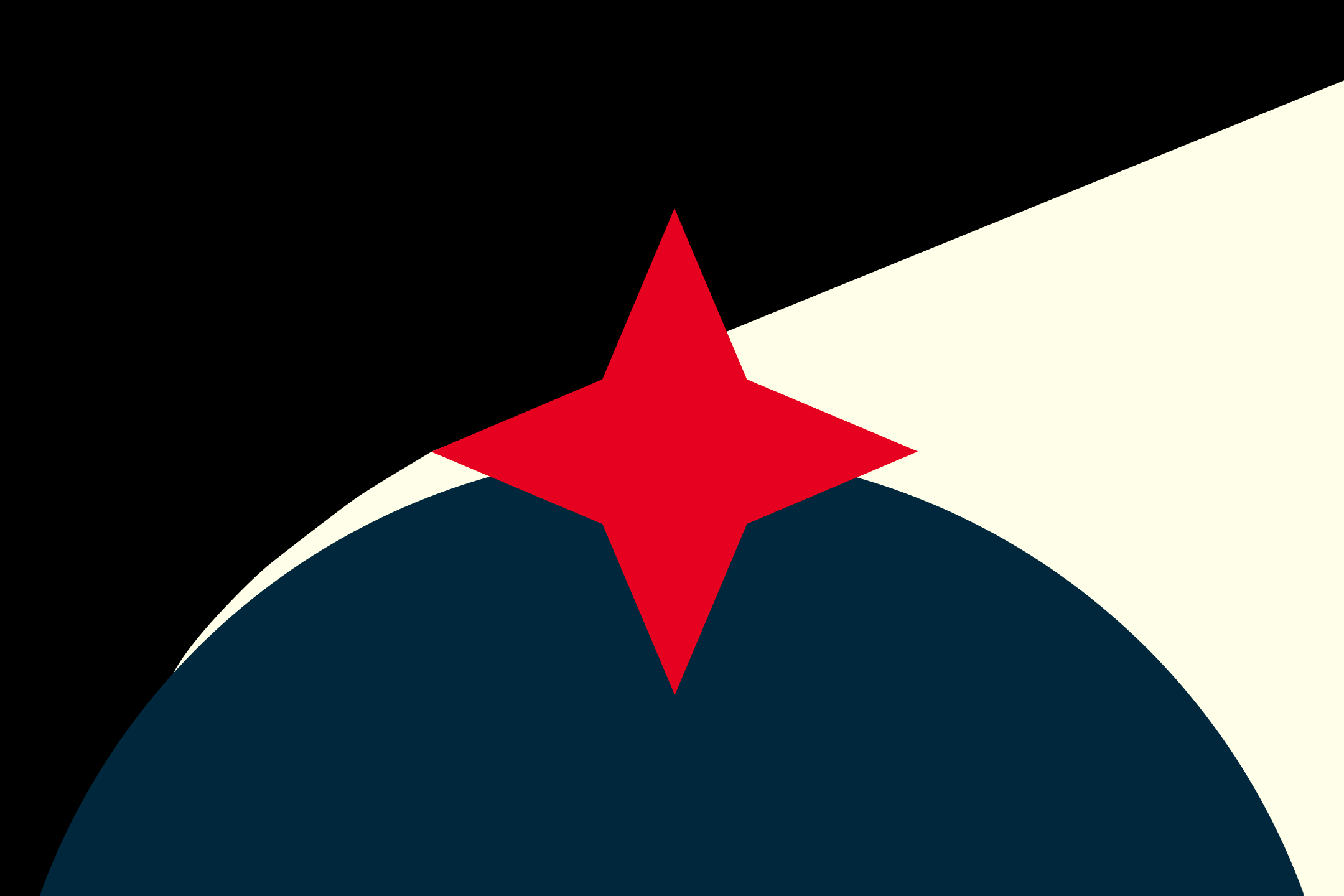
Continuing to play with the space, light cone, time, warning light, and blue dot elements, here's another. I'm not trying to symbolize longtermism specifically here, but I do think this arrangement fits something present.  

Colors

I like the thinking behind the color choices in the original, so I tried to do that too.

- Eigengrau instead of black: Eigengrau is the almost-black color humans see when we close our eyes in darkness, darkness as perceived by human vision. It's black with visual artifacts of uncountably many points of light. It rhymes with how we see space, and represents the eyes-closed opposite of enlightenment.

- pale yellow instead of white: stark white feels lifeless/barren/rhetorical, while sunlight is a human universal. Technically that color would be rather more blue, but I didn't want 3:1 in cold's favor, and our experience of sunlight is "warm".

- global blue : I like ocean blue, but global blue is traditional and recognizable.

- almost-red shocking pink: this color was tricky and unsatisfying. True traditional red is associated with the vigorous bloodshed of war. Amber felt slower, like plasma seepage and electronic running lights. But comparing them side by side, this weird in-between color feels more right. I don't know from whence it comes and it's troubling me, and that feeling seemed to fit, so I went with the red-pink. And disagreeing about whether this particular shade is red or pink would be the kind of moving-concepts-around time-wasting disagreement that so often distracts resources from problem-solving.


Shapes

Four-pointed star: a focus, or flaw that draws focus
- orienting star 
(compass star, North star, Star of Bethlehem, LessWrong, Alcor, Quaker star)
- how stars or points of light appear to us, for reasons I'm not competent to explain 
- Once I saw the bright "shadows" created by bubbles on the surface of water concentrating sunlight on the stone below, and at a certain depth the anti-shadows looked like curved four-pointed stars. 
- the shape of a wound created by an X-shaped cut

Semicircle: the known world
- as a sphere: planet, sphere of influence
- as a hemispherical bubble: habitat, growth, celestial heavens of antiquity
- as an arc: arc of history/narrative, rise and fall


Arrangement/assembly/explication

The darkness is unknown. Can contain risk, ignorance, space, void, death, etc. as you like.

Enlightenment is a growing buffer between the world and the unknown. Can contain hope, mercy, knowledge, skill, empathy, consciousness, energy etc. as you like.

Darkness holds three corners, and light one. However, darkness holds less than half the area.

The expansion of hope/mercy/enlightenment has both a linear and a non-linear growth aspect.

This star/wound/pain/warning/flaw connects the three, or is in all three. It sometimes obscures what's going on between the other three. It's the central focus. It's in the middle of everything.

From left to right, there's a progression in time from the beginning in void to the post-world end where enlightenment dominates, yet cannot eliminate the unknown.

Does the story arc get interrupted, or obscured? 
And is this burst of pain an event in time, or a constant element? 
Is the wound in the middle opening or closing? 
Does pain orient or distract?


Reflection

In retrospect, I may be guilty of being quite influenced by other brands I like. I was not consciously thinking of these when I was working on this design, so I'm not sure how much is my fault and how much is convergence/overlap. 
- Black triangle on top-left, yellow on the right: I have previously considered myself anarcho-capitalist. 
- red and black Quaker star: I don't know what the Quaker star symbolizes, but I like the connotations of humility, principles, service, and insistence on a kinder future. I don't "identify" as anything religious, but I occasionally attend the local Friends' Meeting.

The result also reminds me of Jordan Peterson's work: in a world made of chaos, order, suffering, and matter, one needs a negative motivation, a positive motivation, a foundation to stand on, and a direction in which to go. "Life is suffering," but what you do about that is up to you.

Made using Amadine. An editable SVG version is here in case you want to build on it further.

I was missing something important before about the aspirational nature of a flag.  While the star held something true about there being actually hard, knock-out problems to solve along the way, I think the inevitability of the star-less version is more suitably aspirational. 

There is not one singular problem to solve, there are many, and the other shapes already hold that. With the star, I had put an oppositional teleology before the indefinite striving for betterment, and that was out of order. That was more 'per ardua ad astra,' "through adversity to the stars," this is more 'sic itur ad astra,' "such is the way to the stars." Let us not be defined by the battles we have won, but by the ideals we pursue, through and beyond whatever difficulty may come...

I've kept the star's color. The hope is that the future is better in both quantity and quality, so having the color brighten as the area expands shows that it's not just more of the same. I'm annoyed with the gradient technically, I think it breaks the simplicity rule of flag design by making it a lot harder to draw the flag from memory or print it in a standard way.  Oh well. SVG here.

A more abstract one with some similar pieces...

This is a pretty stylish flag, and I liked the thought process behind it. I must admit that when I first saw it I thought it looked like the sort of flag the villains would have though! Would it be possible to check out how it might look if the central star was blue? I feel like the middle bit instinctually represents 'us', and we want to be the good guys.

Sure! 

Same energy as:

Here's the link to the SVG. I don't think you should have to pay for an SVG. I downloaded the JPG and put it through vectorizer.io. 

https://www.dropbox.com/s/4fvviw1s3yveeri/Longtermist-Flag.svg?dl=0

And here's a TED talk I really enjoyed about flag design: https://www.ted.com/talks/roman_mars_why_city_flags_may_be_the_worst_designed_thing_you_ve_never_noticed

Thanks; wasn't even aware it was a thing one could do :-)

Very late to this thread, but here's a design for a longtermist flag:

The ring of seven 7-pointed stars represents the seven classical planets, from which the seven days of the week are derived. This in turn represents the vastness of time and space. The dark blue field represents the vastness of outer space.

Here's another version:

The chevron is a symbol of progress, as in the South African flag and the progress pride flag. The gold, green, and lavender stripes represent humans, animals, and artificial sentience.

I'm curious, what about the colour lavender makes it associated with artificial sentience? Is there precedence for this?

I associate it with robotics because it's a purplish metallic color.

So after going through all the counter-proposals in the discussions below and reading how people don't like your design I feel compelled to voice that I like your design more than any other I have seen. For me it is aesthetically pleasing and I think the salient symbolism of paying homage to our evolutionary origins in East Africa is being under-appreciated. I find it quite compelling at any rate.

But perhaps this is a by-product of how partial I am to ideas such as the Epic of evolution. Longtermism  in a narrative sense just seems like a natural extension into the future of the same ongoing Epic, so linking the two in some way feels essential.

Can we get CGP Grey to consult on this?

Curated and popular this week
 ·  · 1m read
 · 
Science just released an article, with an accompanying technical report, about a neglected source of biological risk. From the abstract of the technical report: > This report describes the technical feasibility of creating mirror bacteria and the potentially serious and wide-ranging risks that they could pose to humans, other animals, plants, and the environment...  > > In a mirror bacterium, all of the chiral molecules of existing bacteria—proteins, nucleic acids, and metabolites—are replaced by their mirror images. Mirror bacteria could not evolve from existing life, but their creation will become increasingly feasible as science advances. Interactions between organisms often depend on chirality, and so interactions between natural organisms and mirror bacteria would be profoundly different from those between natural organisms. Most importantly, immune defenses and predation typically rely on interactions between chiral molecules that could often fail to detect or kill mirror bacteria due to their reversed chirality. It therefore appears plausible, even likely, that sufficiently robust mirror bacteria could spread through the environment unchecked by natural biological controls and act as dangerous opportunistic pathogens in an unprecedentedly wide range of other multicellular organisms, including humans. > > This report draws on expertise from synthetic biology, immunology, ecology, and related fields to provide the first comprehensive assessment of the risks from mirror bacteria.  Open Philanthropy helped to support this work and is now supporting the Mirror Biology Dialogues Fund (MBDF), along with the Sloan Foundation, the Packard Foundation, the Gordon and Betty Moore Foundation, and Patrick Collison. The Fund will coordinate scientific efforts to evaluate and address risks from mirror bacteria. It was deeply concerning to learn about this risk, but gratifying to see how seriously the scientific community is taking the issue. Given the potential infoha
 ·  · 14m read
 · 
1. Introduction My blog, Reflective Altruism, aims to use academic research to drive positive change within and around the effective altruism movement. Part of that mission involves engagement with the effective altruism community. For this reason, I try to give periodic updates on blog content and future directions (previous updates: here and here) In today’s post, I want to say a bit about new content published in 2024 (Sections 2-3) and give an overview of other content published so far (Section 4). I’ll also say a bit about upcoming content (Section 5) as well as my broader academic work (Section 6) and talks (Section 7) related to longtermism. Section 8 concludes with a few notes about other changes to the blog. I would be keen to hear reactions to existing content or suggestions for new content. Thanks for reading. 2. New series this year I’ve begun five new series since last December. 1. Against the singularity hypothesis: One of the most prominent arguments for existential risk from artificial agents is the singularity hypothesis. The singularity hypothesis holds roughly that self-improving artificial agents will grow at an accelerating rate until they are orders of magnitude more intelligent than the average human. I think that the singularity hypothesis is not on as firm ground as many advocates believe. My paper, “Against the singularity hypothesis,” makes the case for this conclusion. I’ve written a six-part series Against the singularity hypothesis summarizing this paper. Part 1 introduces the singularity hypothesis. Part 2 and Part 3 together give five preliminary reasons for doubt. The next two posts examine defenses of the singularity hypothesis by Dave Chalmers (Part 4) and Nick Bostrom (Part 5). Part 6 draws lessons from this discussion. 2. Harms: Existential risk mitigation efforts have important benefits but also identifiable harms. This series discusses some of the most important harms of existential risk mitigation efforts. Part 1 discus
 ·  · 2m read
 · 
THL UK protestors at the Royal Courts of Justice, Oct 2024. Credit: SammiVegan.  Four years of work has led to his moment. When we started this, we knew it would be big. A battle of David versus Goliath as we took the Government to court. But we also knew that it was the right thing to do, to fight for the millions of Frankenchickens that were suffering because of the way that they had been bred. And on Friday 13th December, we got the result we had been nervously waiting for. Represented by Advocates for Animals, four years ago we started the process to take the Government to court, arguing that fast-growing chicken breeds, known as Frankenchickens, are illegal under current animal welfare laws. After a loss, and an appeal, in October 2024 we entered the courts once more. And the judgment is now in on one of the most important legal cases for animals in history. The judges have ruled in favour on our main argument - that the law says that animals should not be kept in the UK if it means they will suffer because of how they have been bred. This is a huge moment for animals in the UK. A billion Frankenchickens are raised with suffering coded into their DNA each year. They are bred to grow too big, too fast, to make the most profit possible. In light of this ruling, we believe that farmers are breaking the law if they continue to keep these chickens. However, Defra, the Government department responsible for farming, has been let off the hook on a technicality. Because Defra has been silent on fast-growing breeds of chicken, the judges found they had no concrete policy that they could rule against. This means that our case has been dismissed and the judges have not ordered Defra to act. It is clear: by not addressing this major animal welfare crisis, Defra has failed billions of animals - and the farming community. This must change. While this ruling has failed to force the Government to act, it has confirmed our view that farmers are acting criminally by using