
Giving What We Can (GWWC) is on a mission to create a world in which giving effectively and significantly is a cultural norm. Our research recommendations and donation platform help people find and donate to effective charities, and our community — in particular, our pledgers — help foster a culture that inspires others to give.
In this impact evaluation, we examine GWWC's cost-effectiveness from 2020 to 2022 in terms of how much money is directed to highly effective charities due to our work.
We have several reasons for doing this:
- To provide potential donors with information about our past cost-effectiveness.
- To hold ourselves accountable and ensure that our activities are providing enough value to others.
- To determine which of our activities are most successful, so we can make more informed strategic decisions about where we should focus our efforts.
- To provide an example impact evaluation framework which other effective giving organisations can draw from for their own evaluations.
This evaluation reflects two months of work by the GWWC research team, including conducting multiple surveys and analysing the data in our existing database. There are several limitations to our approach — some of which we discuss below. We did not aim for a comprehensive or “academically” correct answer to the question of “What is Giving What We Can’s impact?” Rather, in our analyses we are aiming for usefulness, justifiability, and transparency: we aim to practise what we preach and for this evaluation to meet the same standards of cost-effectiveness as we have for our other activities.
Below, we share our key results, some guidance and caveats on how to interpret them, and our own takeaways from this evaluation. GWWC has historically derived a lot of value from our community’s feedback and input, so we invite readers to share any comments or takeaways they may have on the basis of reviewing this evaluation and its results, either by directly commenting or by reaching out to [email protected].
Key results
Our primary goal was to identify our overall cost-effectiveness as a giving multiplier — the ratio of our net benefits (additional money directed to highly effective charities, accounting for the opportunity costs of GWWC staff) compared to our operating costs.
We estimate our giving multiplier for 2020–2022 is 30x, and that we counterfactually generated $62 million of value for highly effective charities.
We were also particularly interested in the average lifetime value that GWWC contributes per pledge, as this can inform our future priorities.
We estimate we counterfactually generate $22,000 of value for highly effective charities per GWWC Pledge, and $2,000 per Trial Pledge.
We used these estimates to help inform our answer to the following question: In 2020–2022, did we generate more value through our pledges or through our non-pledge work?
We estimate that pledgers donated $26 million in 2020–2022 because of GWWC. We also estimate GWWC will have caused $83 million of value from the new pledges taken in 2020–2022.
We estimate GWWC caused $19 million in donations to highly effective charities from non-pledge donors in 2020–2022.
These key results are arrived at through dozens of constituent estimates, many of which are independently interesting and inform our takeaways below. We also provide alternative conservative estimates for each of our best-guess estimates.
How to interpret our results
This section provides several high-level caveats to help readers better understand what the results of our impact evaluation do and don’t communicate about our impact.
We generally looked at average rather than marginal cost-effectiveness
Most of our models are estimating our average cost-effectiveness: in other words, we are dividing all of our benefits by all of our costs. We expect that this will not be directly indicative of our marginal cost-effectiveness — the benefits generated by each extra dollar we spend — and that our marginal cost-effectiveness will be considerably lower for reasons of diminishing returns.
We try to account for the counterfactual
This evaluation reports on the value generated by GWWC specifically. To do this, we estimate the difference in what has happened given GWWC existed, and compare it to our best guess of what would have happened had we never existed (the “counterfactual” scenario we are considering).
We did not model our indirect impact
For the purpose of this impact evaluation, we focused on Giving What We Can as a giving multiplier. Our models assumed our only value was in increasing the amount of donations going to highly effective charities or funds. While this is core to our theory of impact, it ignores our indirect impact (for example, improving and growing the effective altruism community), which is another important part of that theory.
Our analysis is retrospective
Our cost-effectiveness models are retrospective, whereas our team, strategy, and the world as a whole shift over time. For example, in our plans for 2023 we focus on building infrastructure for long-term growth and supporting the broader effective giving ecosystem. We think such work is less likely to pay off in terms of short-term direct impact, so we expect our giving multiplier to be somewhat lower in 2023 than it was in 2020–2022.
A large part of our analysis is based on self-reported data
To arrive at our estimates, we rely a lot on self-reported data, and the usual caveats for using self-reported data apply. We acknowledge and try to account for the associated risks of biases throughout the report — but we think it is worth keeping this in mind as a general limitation as well.
The way we account for uncertainty has strong limitations
We arrived at our best-guess and conservative multiplier estimates by using all of our individual best-guess and conservative input estimates in our models, respectively. Among other things, this means that our overall conservative estimates underestimate our impact, as they rely on many separate conservative inputs being correct at the same time, which is highly unlikely.
We treated large donors’ donations differently
For various reasons, we decided to treat large donors differently in our analysis, including by fully excluding our top 10 largest GWWC Pledge donors from our model estimating the value of a new GWWC Pledge. We think this causes our impact estimates to err slightly conservatively.
We made many simplifying assumptions
Our models are sensitive to an array of simplifying assumptions people could disagree with. For instance, for pragmatic reasons we categorised recipient charities into only two groups: charities where we are relatively confident they are “highly effective,” and charities where we aren’t.
We documented our approach, data, and decisions
In line with our aims of transparency and justifiability, we did our best to record all relevant methodology, data, and decisions, and to share what we could in our full report, working sheet, and survey documentation. We invite readers to reach out with any requests for further information, which we will aim to fulfil insofar as we can, taking into account practicality and data privacy considerations.
Our takeaways
Below is a selection of our takeaways from this impact evaluation, including implications that could potentially result in concrete changes to our strategy. Please note that the implications — in most cases — only represent updates on our views in a certain strategic direction, and may not represent our all-things-considered view on the subject in question. As mentioned above, we invite readers who have comments or suggestions for further useful takeaways to reach out.
Our giving multiplier robustly exceeds 9x
- Our conservative estimate for our multiplier — which combines multiple conservative inputs — is 9x, suggesting that every $1 spent on GWWC in 2020–2022 is highly likely to have caused more than $9 to go to highly effective charities — and our best guess is much higher, at $30.
- This doesn’t imply funding GWWC on the margin will always yield such a high multiplier, but it does provide a strong case for scaling up some of GWWC’s most cost-effective current activities — or at least for making sure we are able to keep doing what we do well.
New GWWC Pledges likely account for most of our impact
- We estimate we generated 1.5-4.5x more value through the GWWC Pledge than through non-pledge donations.
- This can inform our work going forward — for example, on our marketing strategy and on whether we choose to support other effective giving organisations with pledge-related products.
We found an increase in recorded GWWC Pledge donations with time
- One of our most surprising findings was that the average recorded yearly donations of GWWC Pledge donors seems to increase with Pledge age rather than decrease: the increase in average donations among the Pledge donors who keep recording their giving more than compensates for any drop-out of Pledge donors. We have several hypotheses for why this may be and are not confident it will replicate in future evaluations.
- This is weak evidence in favour of promoting pledges among younger audiences with high earning potential, as retention is less of an issue than one might expect.
A small but significant percentage (~9%) of our Trial Pledgers have gone on to take the GWWC Pledge, and this plausibly represents the bulk of the value we add through the Trial Pledge
- This is evidence that our Trial Pledge is working as a step towards the GWWC Pledge, but there is also room to improve.
- Given our $22,000 estimate of the value we cause per GWWC Pledge, and the fact that we see a similar number of Trial Pledges and GWWC Pledges each year, this suggests there is value in experimenting with activities that could increase the proportion of Trial Pledgers who take the GWWC Pledge.
The vast majority of our donors give to charities that we expect are highly effective
- We estimate that more than 70% of all pledge and non-pledge donations we recorded went to organisations that would meet the criteria to be one of our top-rated charities and funds at the time.
- This suggests a lot of our value comes from highlighting and facilitating donations to these charities and funds in particular, which is a relevant consideration for — among other things — updating our inclusion criteria.
Our donations follow a heavy-tailed distribution
- Less than 1% of our donors account for 50% of our recorded donations. This amounts to dozens of people, while the next 40% of donations (from both pledge donors and non-pledge donors) is distributed among hundreds. This suggests that most of our impact comes from a small-to-medium-size group of large donors (rather than from a very small group of very large donors, or from a large group of small donors).
- This information can be relevant in deciding which groups we could put extra resources into reaching to increase our giving multiplier — though it’s worth noting that our short-term giving multiplier isn’t our only consideration for deciding which groups we target.
Nearly 60% of our donors’ recorded donations go to the cause area of improving human wellbeing
- For the remaining cause areas, slightly below 10% of recorded donations go improving animal welfare, slightly above 10% to creating a better future, and another ~20% to unknown or multiple cause areas.
- We don’t currently have a clear view of what (if anything) this finding implies we should do — as we generally don’t prioritise any of these cause areas over one another — but we think it can inform discussions on how much we highlight each area in our communications, and how we prioritise our time when investigating our recommendations.
We plan to report on how we have used these takeaways in our next impact evaluation, both to hold ourselves accountable to using them and to test how useful they turned out to be.
Where you can learn more
How you can help
If you are interested in supporting GWWC’s work, we are currently fundraising! We have ambitious plans, and we’re looking to diversify our funding and to extend our runway (which is currently only about one year). For all of this, we are looking to raise ~£2.2 million by June 2023, so we would be very grateful for your support. You can read our draft strategy for 2023, make a direct donation, or reach out to our executive director for more information.
Acknowledgements
We’d like to thank the many people who provided valuable feedback — including Anne Schulze, Federico Speziali, Basti Schwiecker, and Jona Glade — and in particular Joey Savoie, Callum Calvert, and Josh Kim for their extensive comments on an earlier draft of this evaluation. Thank you also to Vasco Amaral Grilo for providing feedback on our methodology early on in our process, and for conducting his own analysis of GWWC's impact.
We’d also like to give a special thank you to our colleagues Fabio Kuhn and Luke Freeman for their extensive support on navigating our database, to Luke also for support on our survey design, to Katy Moore for high-quality review and copy editing, to Nathan Sherburn for helping us compile and analyse our survey results, and to Bradley Tjandra for spending multiple working days (!) supporting the data analysis for this evaluation. Both Nathan and Bradley conducted this work as part of The Good Ancestors Project.



Thanks for sharing this!
One large worry I have in evaluating GWWC's impact is that I'd expect the longer someone has been a GWWC member the more likely they are to drift away and stop keeping their pledge, and people who aren't active anymore are hard to survey. I've skimmed through the documents trying to understand how you handled this, and found discussion of related issues in a few places:
How does this handle members who aren't reporting any donations? How does reporting rate vary by tenure?
Was the $7,619 the average among members who recorded any donations, or counting ones who didn't record donations as having donated $0? What fraction of members in the 250-person sample recorded any donations?
Where does the decline in the proportion of people giving fit into the model?
Thanks for your questions Jeff!
To answer point by point:
The (tentative) finding that Pledgers’ giving increases more each year after taking the Pledge assumes that members who aren’t reporting any donations are not donating.
We include a table “Proportion of GWWC Pledgers who record any donations by Pledge year (per cohort)” on page 48. In sum: reporting declines in the years after the Pledge, but that decline seems to plateau at a reporting rate of ~30% .
The $7,619 figure is the average if you count those as not recording a donation as having donated $0. Unfortunately, I don’t have the fraction of the 250-person sample who recorded donations at all on hand. However, I can give an informed guess: the sample was a randomly selected group of people who had taken the GWWC Pledge before 2021, and eyeballing the table I linked above, ~40-50% of pre-2021 Pledgers record a donation each year.
The model does not directly incorporate the decrease in proportion of people recording/giving, and neither does it directly incorporate the increase in the donation sizes for people who record/give. The motivation here is that — at least in the data so far — we see these effects cancel out (indeed, we see that the increase in donation size slightly outweighs the decrease in recording rates — but we’re not sure that trend will persist). We go into much more depth on this in our appendix section “Why we did not assume a decay in the average amount given per year”.
Thanks! I think your "Proportion of GWWC Pledgers who record any donations by Pledge year (per cohort)" link is pointing a bit too early in the doc, but I do see the table now, and it's good.
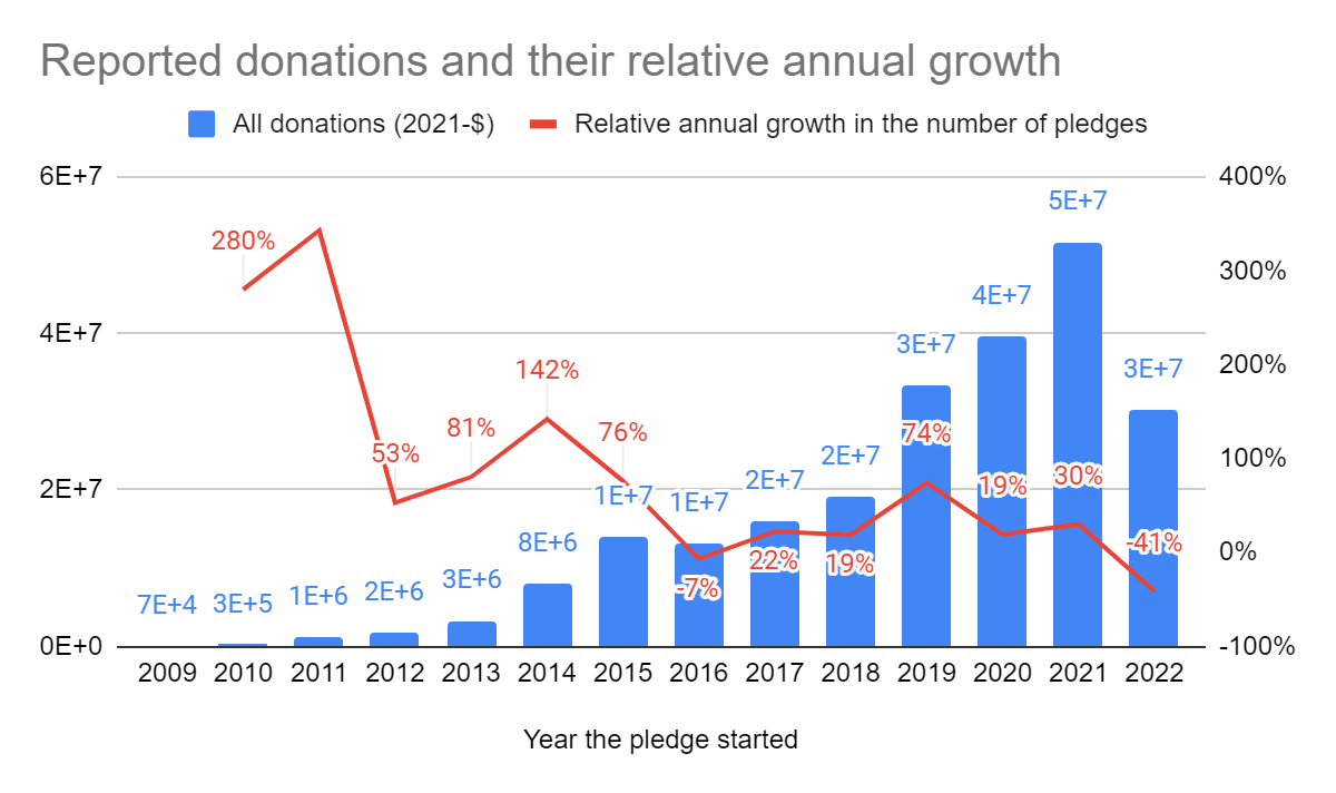
Here's a version of that table with lines colored by how many people there are in that cohort:
It doesn't look like it stops at a reporting rate 30%, and the more recent (high cohort size) lines are still decreasing at maybe 5% annually as they get close to 30%.
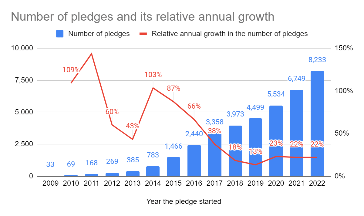
And here are the year/year decreases:
Looking at the chart, it's clear that decay slows down over time, and maybe it slows enough that it's fine to ignore it, but it doesn't look like it goes to zero. A cohort-size-weighted average year/year decay where we ignore the first six years (starting with 5y since pledging, and so ignoring all cohorts since 2015) is 2%.
(code)
But that's probably too optimistic, since looking at more recent cohorts decay doesn't seem to be slowing, and the reason ignoring the first six years looks good is mostly that it drops those more recent cohorts.
Separately, I think it would be pretty reasonable to drop the pre-2011 reporting data. I think this probably represents something weird about starting up, like not collecting data thoroughly at first, and not about user behavior? I haven't done this in my analysis above, though, because since I'm weighting by cohort size it doesn't do very much.
Really appreciate this analysis, Jeff.
Point taken that there is no clear plateau at 30% -- it'll be interesting to see what future data shows.
Part of the reason for us having less analysis on the change of reporting rates over time is that we did not directly incorporate this rate of change into our model. For example, the table of reporting rates was primarily used in our evaluation to test a hypothesis for why we see an increase in average giving (even assuming people are not reporting are not giving at all). Our model does not assume reporting rates don't decline, nor does it assume the decline in reporting rates plateaus.
Instead, we investigated how average giving (which is a product of both reporting rates, and the average amount given conditional on reporting) changes over time. We saw that the decline in reporting rates is (more than) compensated by the increase in giving conditional on reporting. It could be that this will no longer remain true beyond a certain time horizon (though, perhaps it will!), but there are other arguably conservative assumptions for these long time-horizons (e.g., that giving stops at pension age, doesn't include any legacy giving). Some of these considerations come up as we discuss why we did not assume a decay in our influence and in our limitations of our Pledge model (in the bottom of this section, right above this one).
On your final point:
Do you mean excluding it just for the purpose of analysing reporting rates over time? If so, that could well be right, and if we investigate this directly in future impact evaluations we'll need to look into what the quality/relevance of that data was and make a call here.
That makes sense, thanks! I think your text makes it sound like you disagree with the earlier attrition discussion, when actually it's that giving increasing over time makes up for the attrition?
Sorry, yes. I think it's probably heavily underreported, since the very early reporting system was probably worse?
Ah, I can see what you mean regarding our text, I assume in this passage:
What you say is right: we agree there seems to be a decay in fulfilment / reporting rates (which is what the earlier attrition discussion was mostly about) but we just add the additional observation that giving increasing over time makes up for this.
There is a sense in which we do disagree with that earlier discussion, which is that we think the kind of decay that would be relevant to modelling the value of the Pledge is the decay in average giving over time, and at least here, we do not see a decay. But we could've been clearer about this; at least on my reading, I think the paragraph I quoted above conflates different sorts of 'decay'.
I'd be interested in a chart similar to "Proportion of GWWC Pledgers who record any donations by Pledge year (per cohort)", but with 4 versions (median / average donation in $) x (inclusive / exclusive of those that didn't record data, assuming no record is $0). From the data it seems that both things are true: "most people give less over time and stop giving" and "on average, pledge donations increase over time", driven entirely by ~5-10% of extremely wealthy donors that increase their pledge.