We just launched a new version of our website!
We think the new design will make our content easier to navigate, so that readers have an easier time learning about our work and our thinking.
As part of the launch, we’ve updated language on a number of core pages to better reflect how our work has evolved in the years since our previous website was created.
This includes updates to our mission statement, which had been in place since our incubation as a project of GiveWell. The new statement is more concise, and we think it better reflects the breadth of our work:
“Our mission is to help others as much as we can with the resources available to us.”
Other updates include:
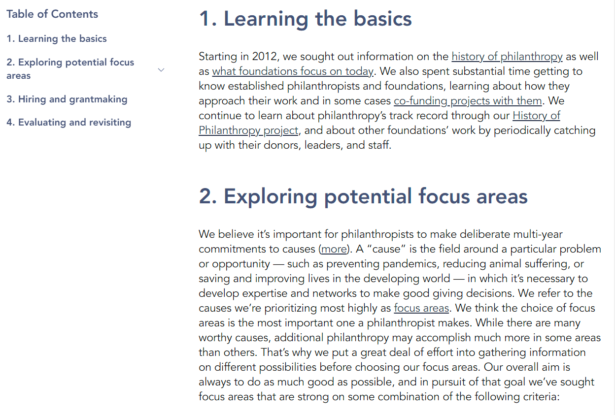
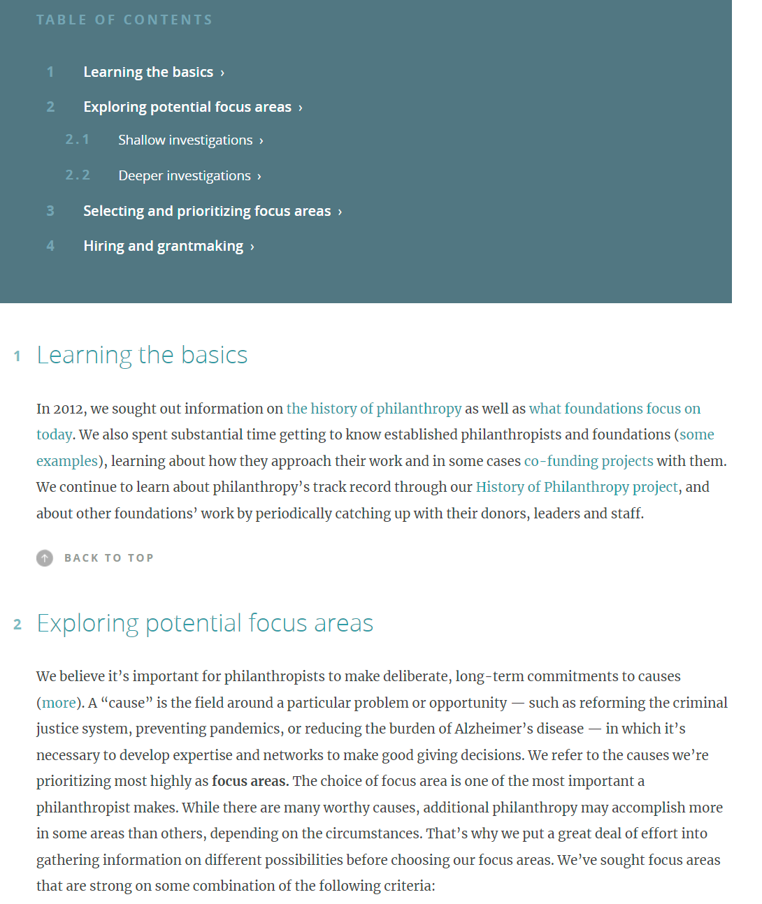
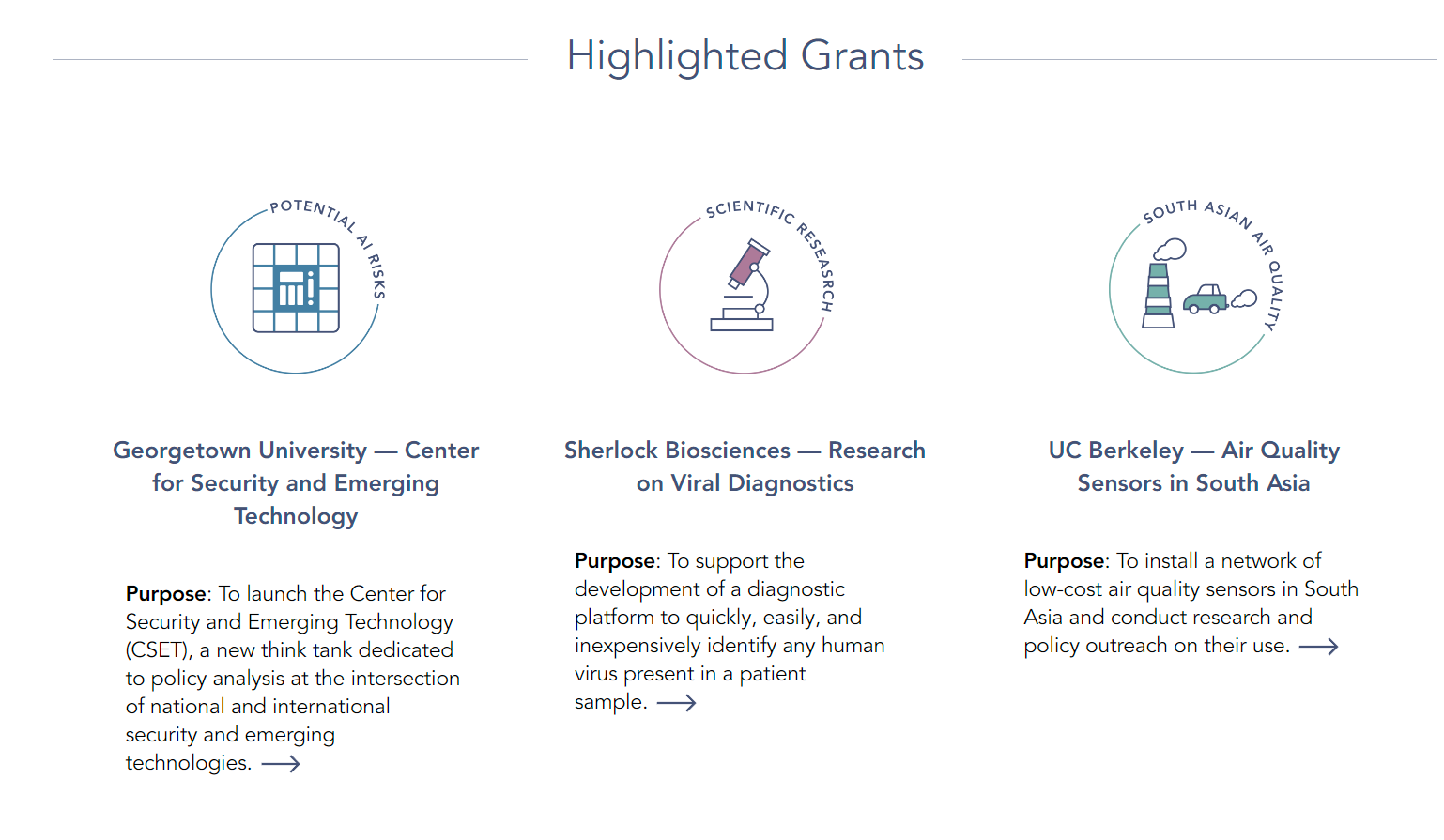
- The ability to sort and filter much of our published content, including blog posts, research reports, and notable lessons.
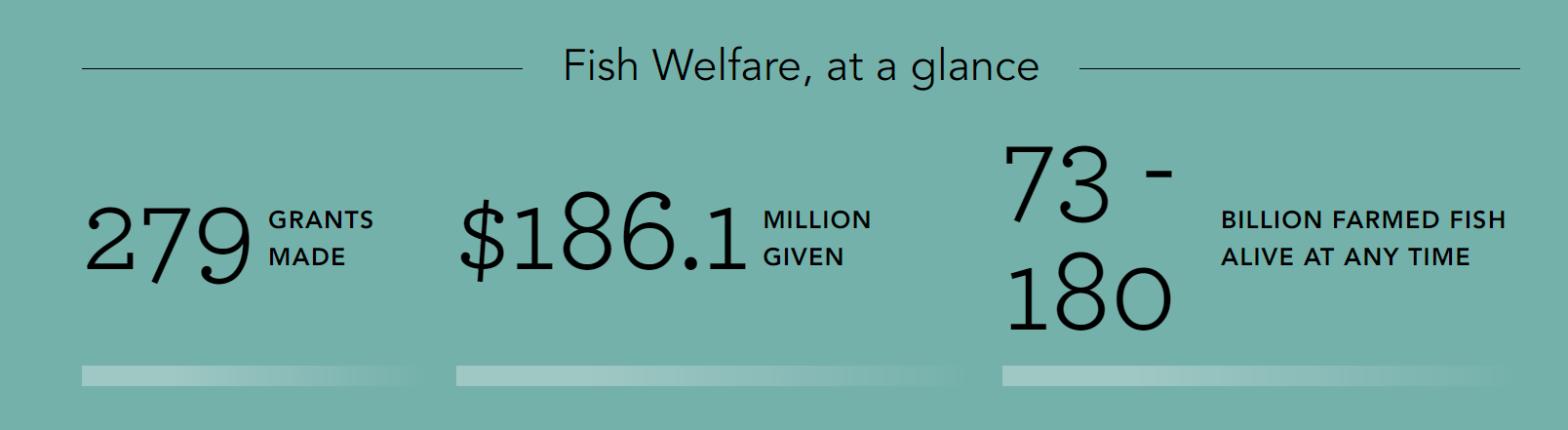
- Statistics on our giving in each of our focus areas.
- A new page explaining the difference between our two grantmaking portfolios (Global Health & Wellbeing and Longtermism).
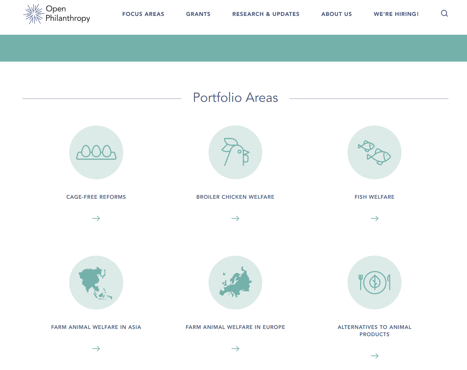
- Pages for our newest focus areas, South Asian Air Quality and Global Aid Policy.
If you experience any issues using the new site, or see something you think should be changed, we would appreciate your feedback. Contact [email protected] (or comment on this post) to get in touch.


I like the content changes. I think the design seems worse than the previous one. In-particular the information density has gone down a lot, which feels in-tension with OpenPhil's target audience. See e.g. this screenshot:
This screenshot feels to me almost like a screenshot from a tablet, but it's taken from my pretty zoomed out and large laptop screen. The site starts feeling a lot less cluttered and navigable at 75% zoom to me:
Some other comments:
Content wise:
I like the site more, and it seems to more accurately convey what OpenPhil is about. I could probably leave more comments on content, but I figured I have a particular comparative advantage about commenting on webdesign.
Thanks for all of this feedback! Lots of good points to consider moving forward, and exactly the kind of thing I hoped to get from this post.
This website was a weird project — passed around between owners and developers over a period of ~2 years. I think there was a good amount of usability testing before my time, but I'm not sure how much of that was holistic and focused on the final design (vs. focused on specific elements). I agree with most of your points myself and also trust your experience in this area.
Uh...
So I'm just going to say that, at this point, it seems like Open Phil should just consider a wholly new redesign, basically make a new website.
The considerations for "cost benefit analysis" for making a new website:
I think the budget justified by the above is large. Obviously, time cost or opportunity cost is a consideration.
So, like, maybe they can make Aaron Gertler like a super project manager ("Director Gertler"? "Executive Vice President Gertler"?) and give him a big budget. Then he can get bids, hire an agency and get a service agreement, etc.
This work isn't trivial, but presumably this should be possible for some up front effort without further encumbering him too much.
Despite the real visual + other issues, I still think the website is very reasonable!
The changes to make, including some to the grant page, are tiny relative to the overall size of the project. It seems very easy to find our grants and other content, and overall reception from key stakeholders has been highly positive. OP staff seem to like the changes, too (and we had tons of staff feedback at all points of the process).
If you have other specific feedback, I'm happy to hear it, but I don't know what e.g. "a little more focus and polish" means.
TL;DR I spent more time looking over the website (particularly on mobile) and I think I’m mostly wrong/bad in my comment above. There might still be some value in a redo, and I guess it is 30% likely to be valuable.
I am not a web designer, but I’ve interacted with several in the past. I guess my comments below are about “50% true”.
Why I changed my mind from my message above:
Why I think there could be a redo:
In some sense, Open Phil is a major expression of the heart and machinery of EA. So having a highly polished page that is highly professional is valuable.
I think some viewers of the site, will be really picky, especially newcomers and some kinds of talent (experienced professors). They might be judgmental and take on impressions, even if they can’t consciously articulate it.
So, uh, I have comments below:
These comment on the intro page, and the about page, as they seem like natural places where a newcomer would try to come to "gauge credibility based on a website".
I think this comment is lower value and I sort of don't expect many people to read it, I'll just put it here for completeness.
I emphasize I’m not a designer. But it’s easy enough to just present these ideas to an actual designer and see what they say, so it’s low cost to be wrong and just have people read this.
No header bar, front page content up against top of screen
For the front page, there's no header bar and that seems unusual.
As below, the image and content is right up against the top of the screen, with hamburger bar sharing the space space.
So the image with the scientist on a microscope, is in place of what often is the header image.
(By the way, the bright color in the image is slightly obscuring the logo and title.)
For contrast, see Oxford's site on mobile:
Room for scrolling seems like a desirable pattern
Many modern websites “give space” for scrolling on mobile. So a user loading a page, who often instinctively scrolls down, has a lot of content to see.
In contrast, the mobile site right now is pretty dense and there’s not much room to scroll down to find more content. For example, "cause selection" is right below the first section of content.
So I claim this is sort of fighting the “modern” tendency for people to scroll down a mobile website.
If you go on Square’s site and scroll down, you’ll see a long narrative with many pictures breaking up the text. This room seems desirable.
https://squareup.com/
You can also see this with the Gate’s foundation:
https://www.gatesfoundation.org/
It’s true that the target audience isn't the same as the average TikToker, but I still think many people are familiar with mobile sites like this, and expect a roomy scroll.
There’s other things that make this look different than a 100% polished page.
The about page on Open Phil is pretty dense with text.
In contrast, if you go to the above sites, for example, the Gates site, there’s a lot more visuals and "roominess":
Our Story | Bill & Melinda Gates Foundation
(I don’t have any prior interest or affinity to the Gates foundation, it just seems like a good reference).
In contrast, Open Phil’s about page is text heavy without pictures, and also the text doesn’t flow as naturally.
Each of these changes individually seem small, but I think there's many details like this.
I think they might add up and justify getting a designer to spend a lot of time doing revisions.
As mentioned in the top comment, a full redo might be valuable.
I think I'm 20-50% certain about what I said in these comments.
I thought this was particularly surprising because the width of the click area doesn't even match how far the text stretches to the right. Instead, it's a function of whether the text consumes more than one line. So 'Grantmaking process' has a wider click area than 'Get email updates', despite the latter being wider, because it stretches over two lines.
Another inconsistency with the menus is that the click area doesn't coincide with the hover area. For example, to click on 'Longtermism', the mouse pointer has to be above the text, but one can expand the menu that lists the three longtermist sub-areas even by hovering over the whitespace to the right of 'Longtermism'.