We just launched a new version of our website!
We think the new design will make our content easier to navigate, so that readers have an easier time learning about our work and our thinking.
As part of the launch, we’ve updated language on a number of core pages to better reflect how our work has evolved in the years since our previous website was created.
This includes updates to our mission statement, which had been in place since our incubation as a project of GiveWell. The new statement is more concise, and we think it better reflects the breadth of our work:
“Our mission is to help others as much as we can with the resources available to us.”
Other updates include:
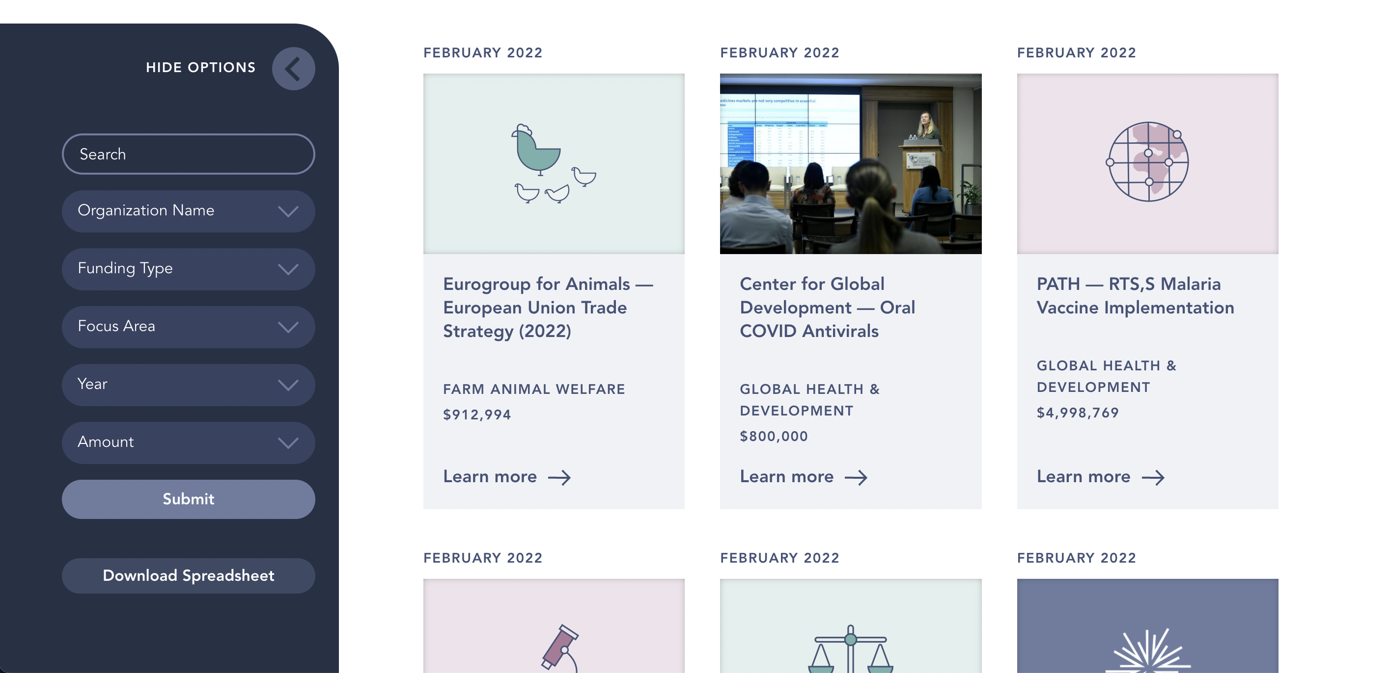
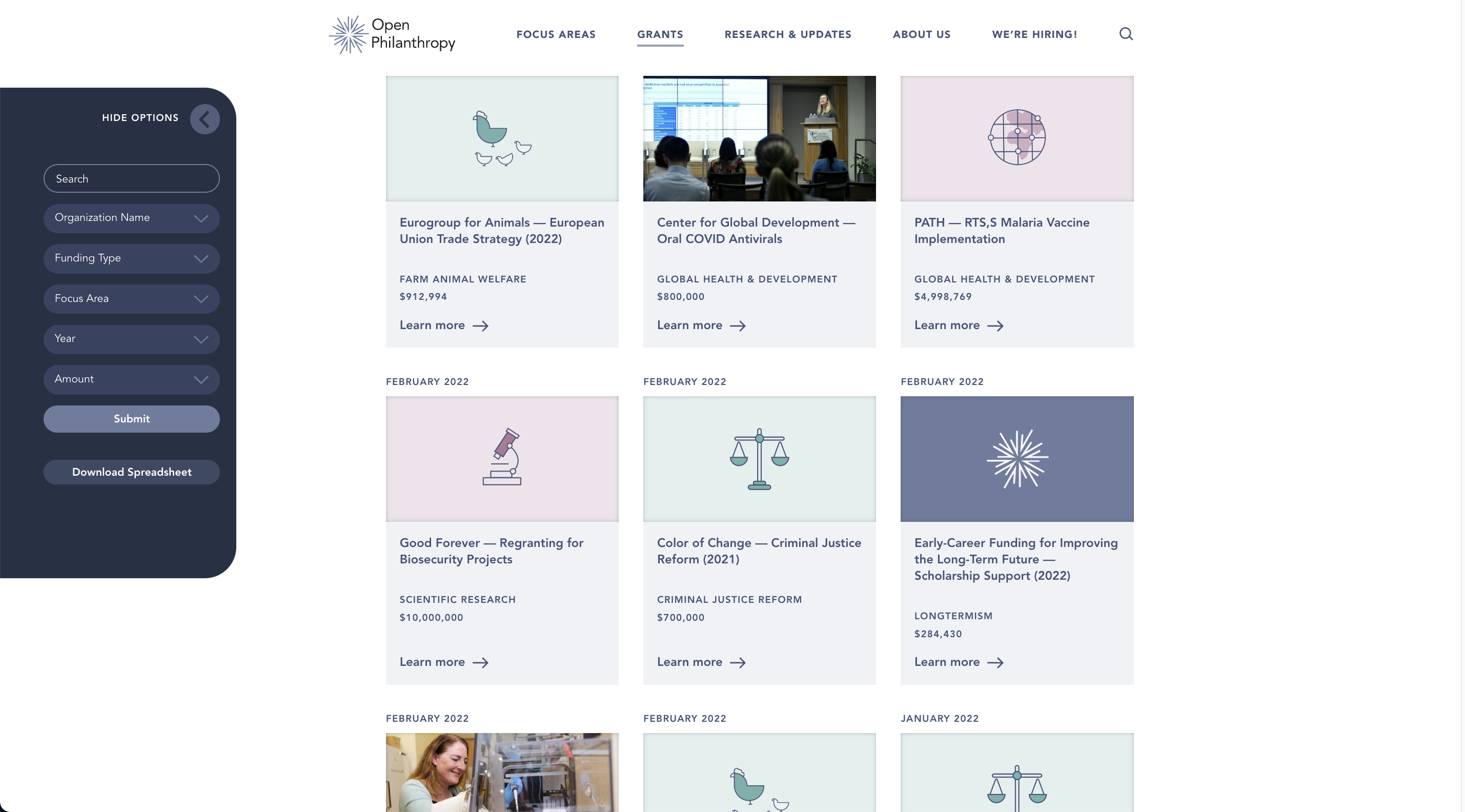
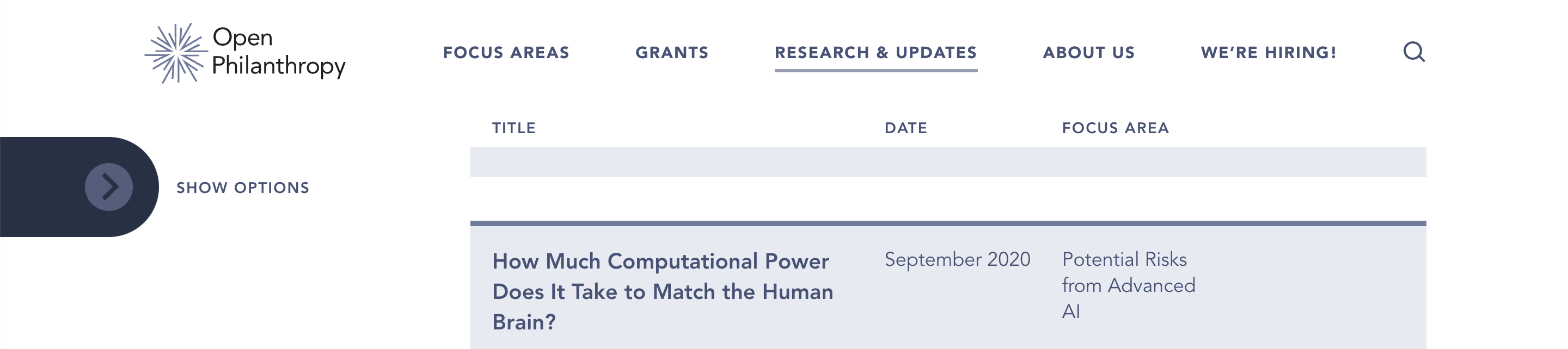
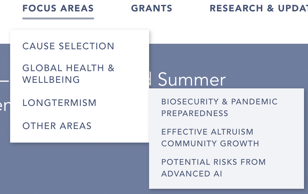
- The ability to sort and filter much of our published content, including blog posts, research reports, and notable lessons.
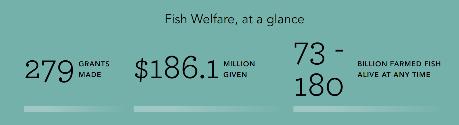
- Statistics on our giving in each of our focus areas.
- A new page explaining the difference between our two grantmaking portfolios (Global Health & Wellbeing and Longtermism).
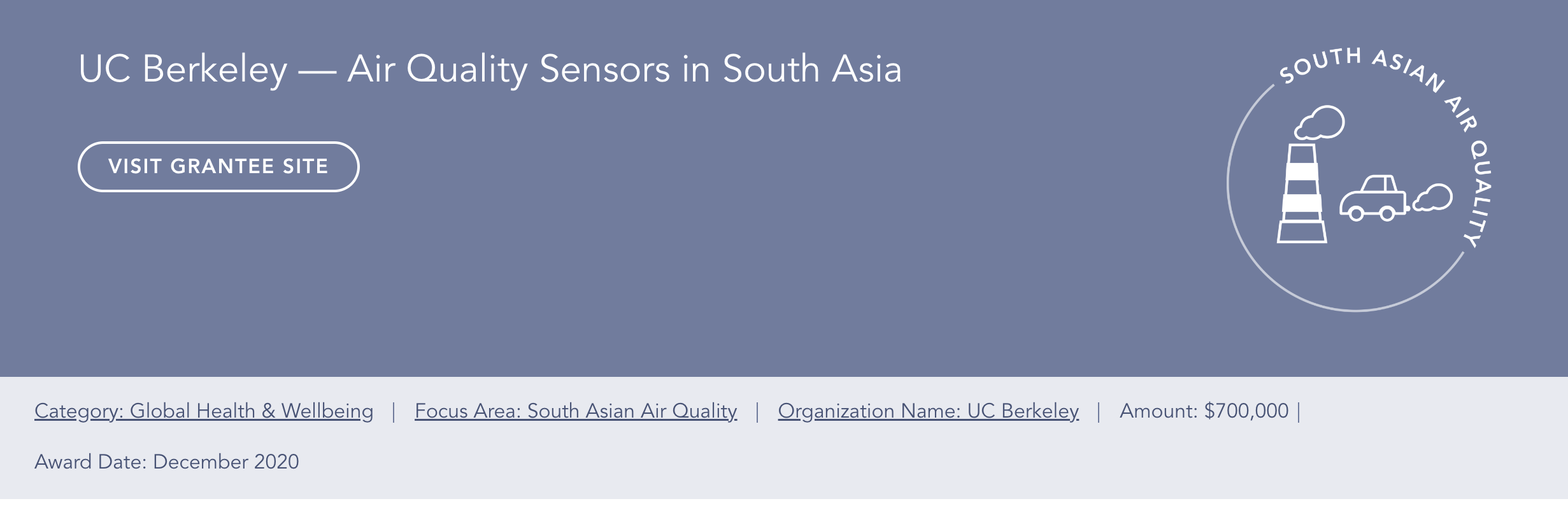
- Pages for our newest focus areas, South Asian Air Quality and Global Aid Policy.
If you experience any issues using the new site, or see something you think should be changed, we would appreciate your feedback. Contact webrequests@openphilanthropy.org (or comment on this post) to get in touch.

Beautiful website. There's so much great work done!
I think the first page and cutting to object level content right away is brilliant.
The logo is great and more fitting than the previous one.
As a crazy internet person with crazy internet opinions, some comments or ideas below:
Please don't ban me.
Analytics
Maybe this is being done, but especially given the text focus, I would closely check out analytics and how much time people spend reading and what pages they transition to.
Trying to understand this seems good. It's also interesting to see what people read.
Not sure the analytics should be shared publicly (but it would be cool to know).
I think one win with analytics is to understand the effort and actual time spent over the text, for all of time the EAs writing all this content.
Meta comment: the customer focus
I guess my view of these comments is sort of focused on:
I'm probably being a bit extra, and overengineering this.
But yeah, it makes sense to think of the highest marginal impact for the website, I guess.
Also, I may have absolutely no clue what the true purpose of the website is and it may have important roles I don't understand, making all my comments irrelevant.
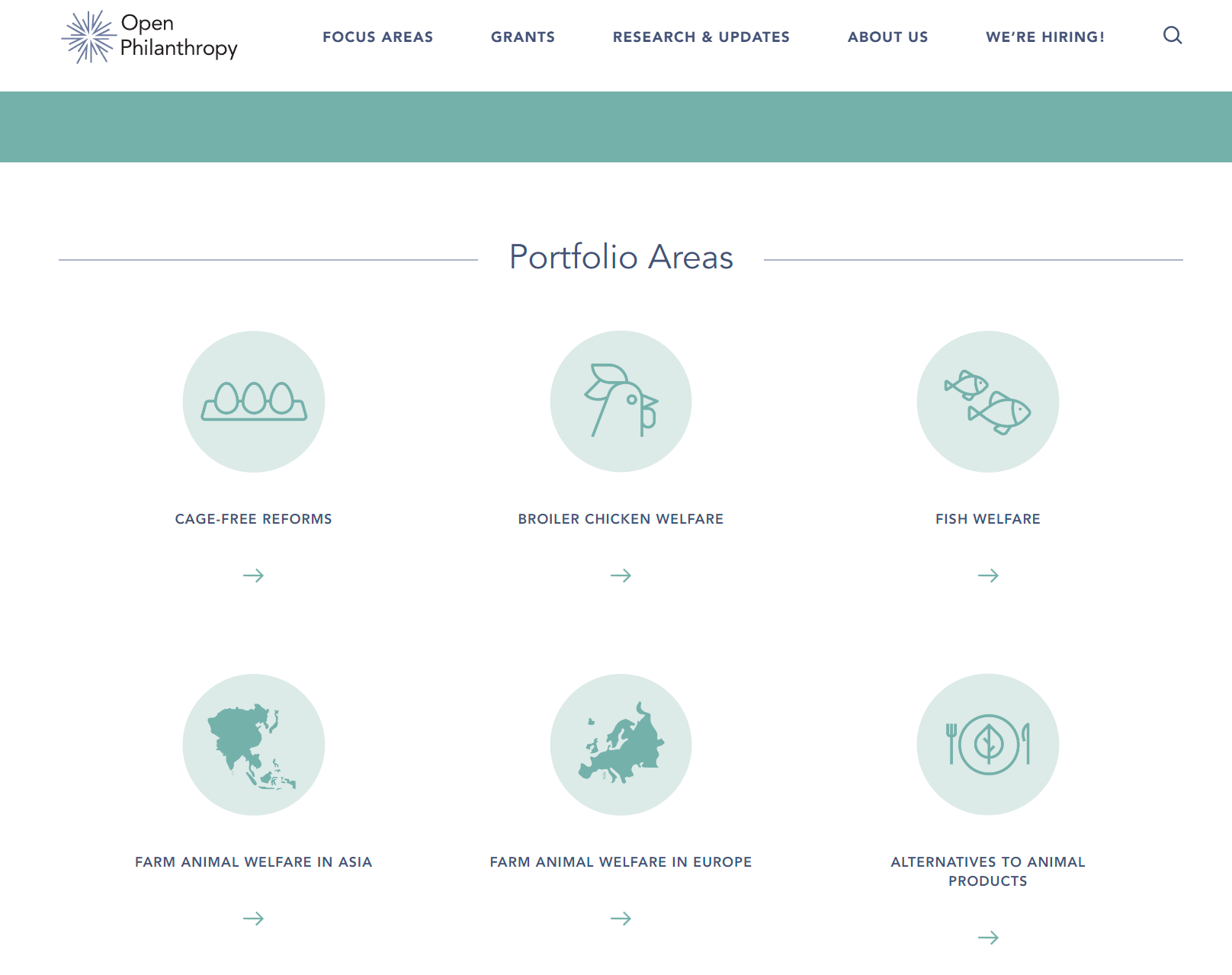
Note that in FAW, there is a lot of space and room taken up by logos.
This is more than just appearances, it sort of gates information flow.
There isn't a lot of information content in these logos. For example, I think many people would like to know about new events and updates in the topics they represent.
It seems harder to discover this content, as having to click through the logo to a new page, is slower.
It feels like it adds unnecessary friction, especially if people are already wading through a lot of text in general.
I could see a lot ... (read more)