We just launched a new version of our website!
We think the new design will make our content easier to navigate, so that readers have an easier time learning about our work and our thinking.
As part of the launch, we’ve updated language on a number of core pages to better reflect how our work has evolved in the years since our previous website was created.
This includes updates to our mission statement, which had been in place since our incubation as a project of GiveWell. The new statement is more concise, and we think it better reflects the breadth of our work:
“Our mission is to help others as much as we can with the resources available to us.”
Other updates include:
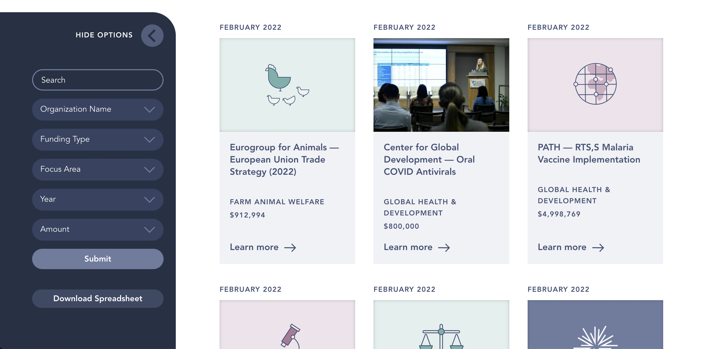
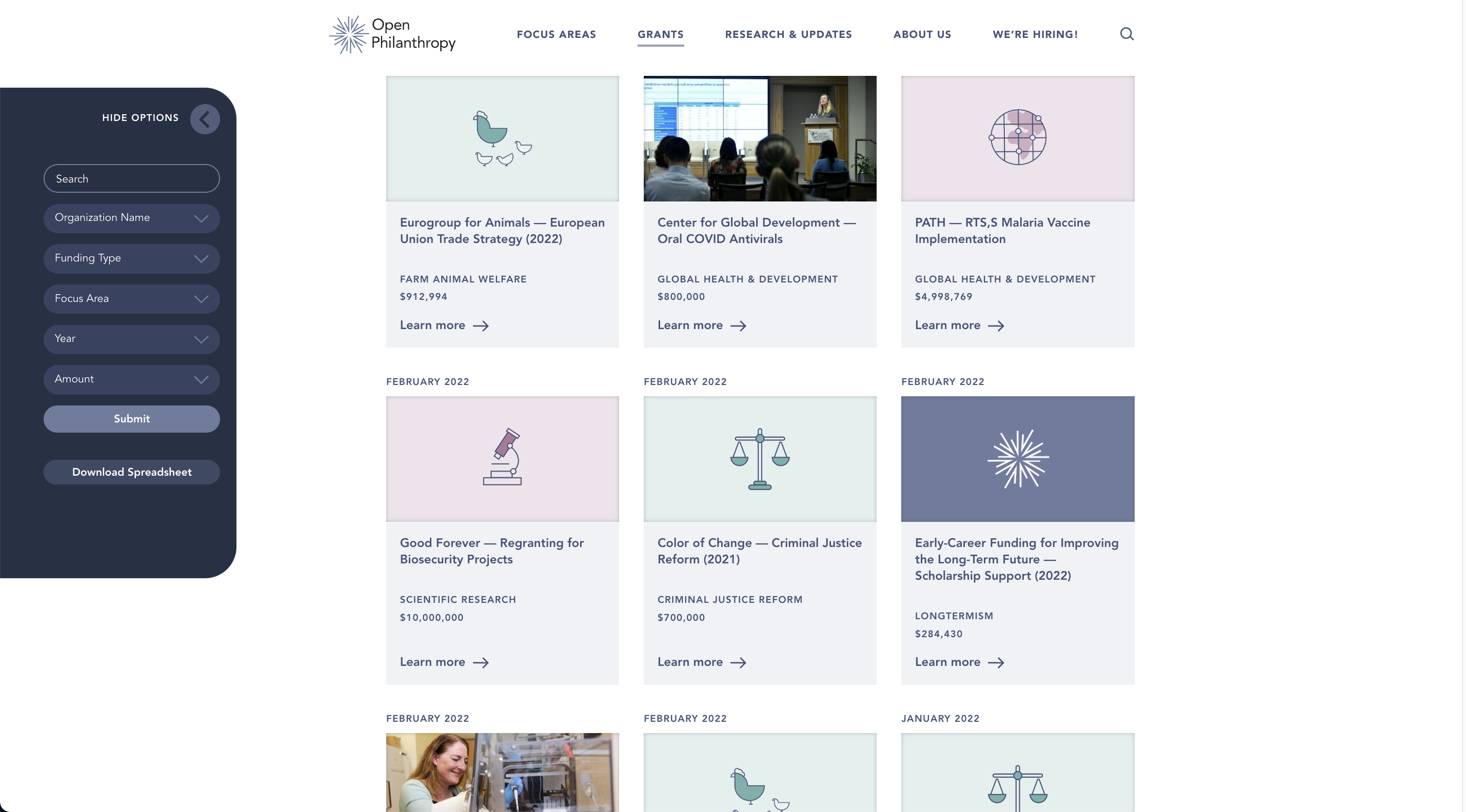
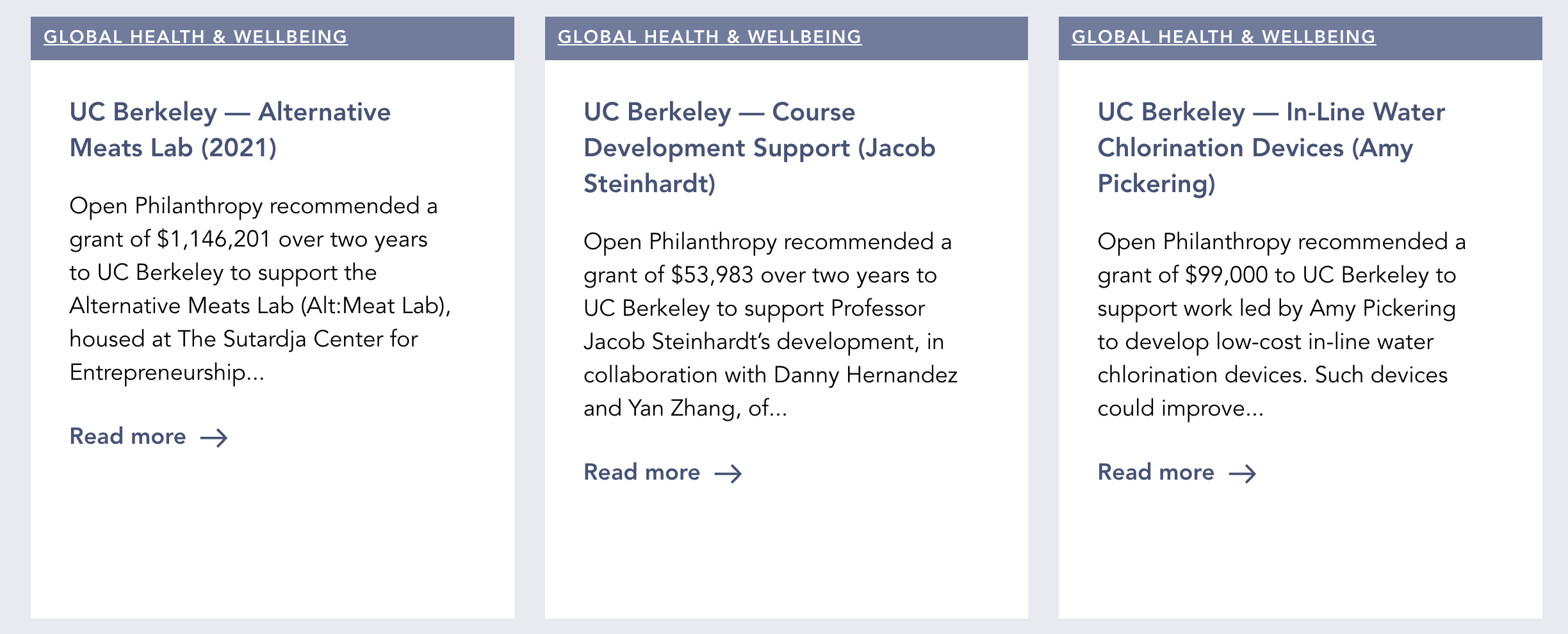
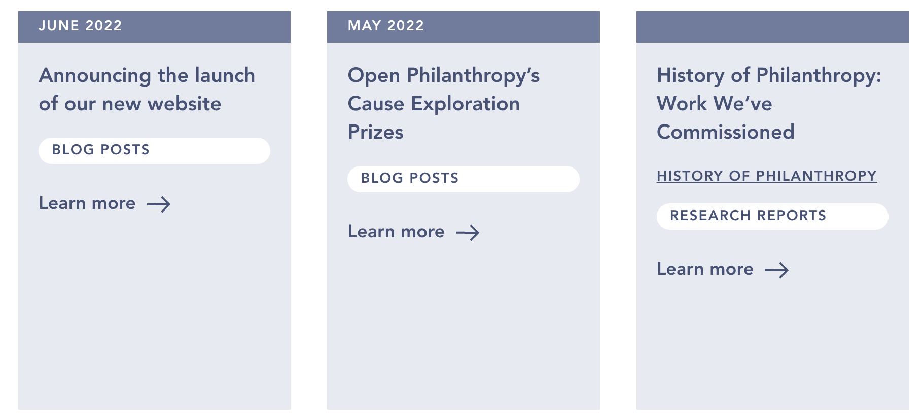
- The ability to sort and filter much of our published content, including blog posts, research reports, and notable lessons.
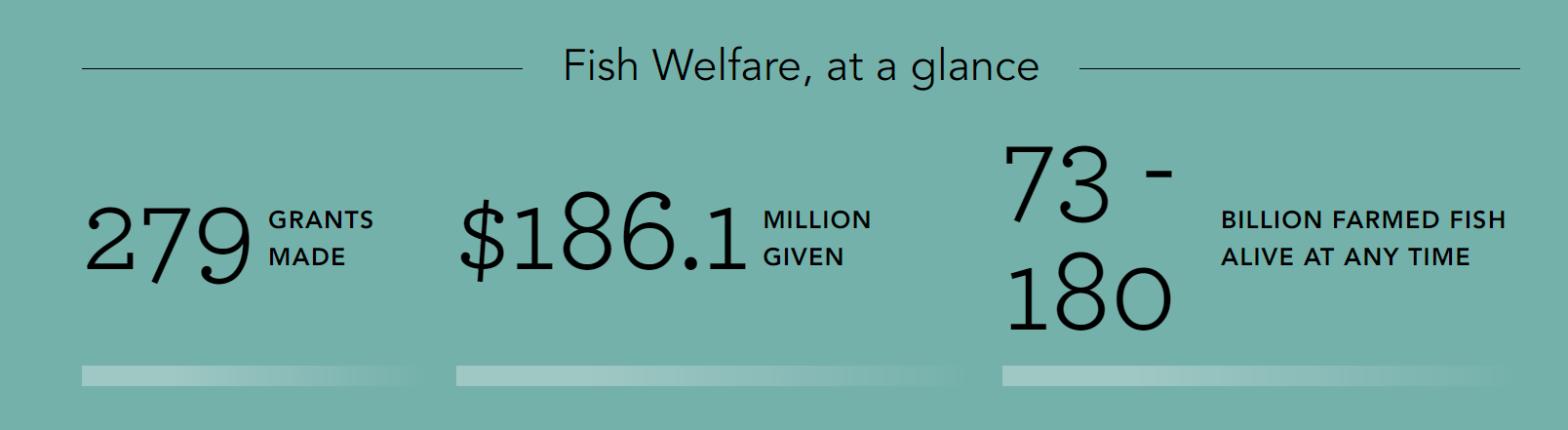
- Statistics on our giving in each of our focus areas.
- A new page explaining the difference between our two grantmaking portfolios (Global Health & Wellbeing and Longtermism).
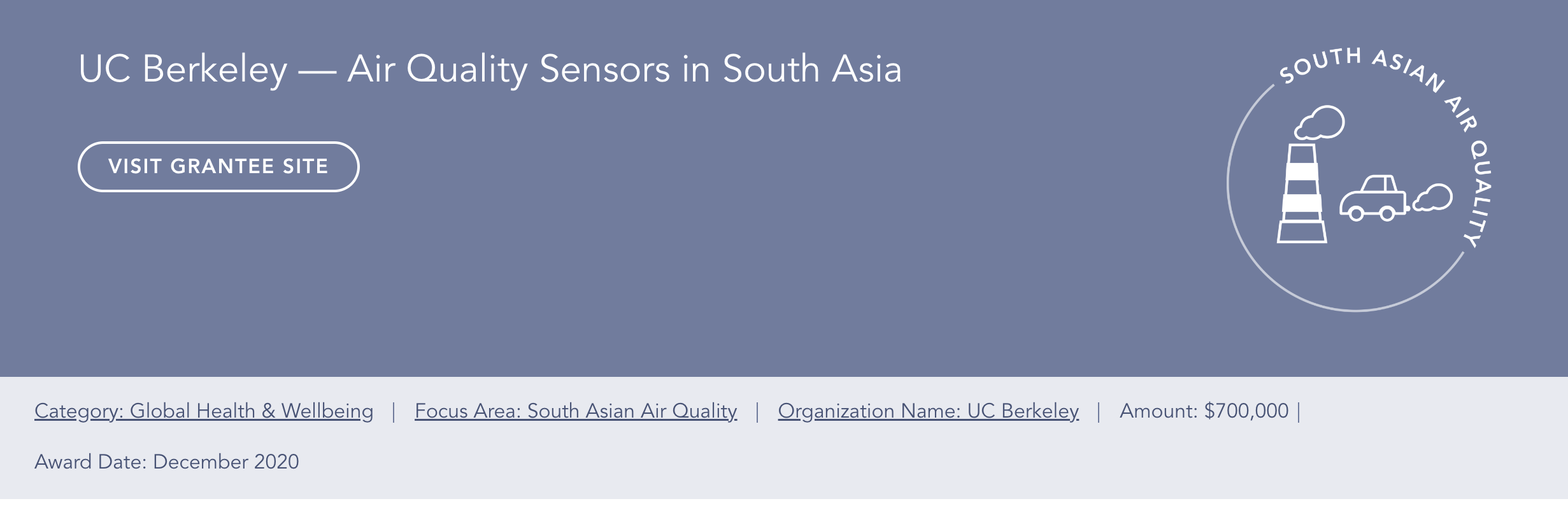
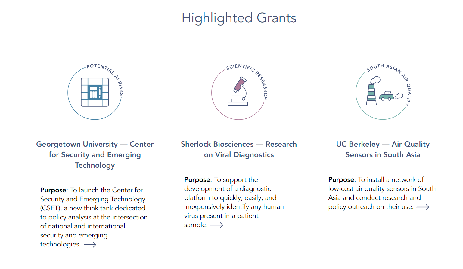
- Pages for our newest focus areas, South Asian Air Quality and Global Aid Policy.
If you experience any issues using the new site, or see something you think should be changed, we would appreciate your feedback. Contact webrequests@openphilanthropy.org (or comment on this post) to get in touch.

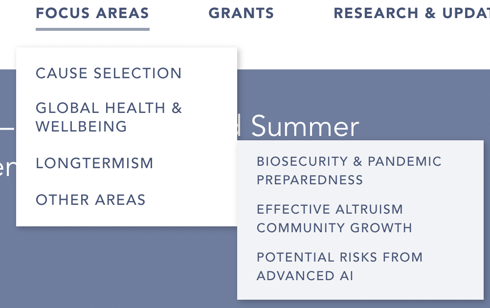

I like the content changes. I think the design seems worse than the previous one. In-particular the information density has gone down a lot, which feels in-tension with OpenPhil's target audience. See e.g. this screenshot:
This screenshot feels to me almost like a screenshot from a tablet, but it's taken from my pretty zoomed out and large laptop screen. The site starts feeling a lot less cluttered and navigable at 75% zoom to me:
Some other comments:
Content wise:
I like the site more, and it seems to more accurately convey what OpenPhil is about. I could probably leave more comments on content, but I figured I have a particular comparative advantage about commenting on webdesign.
There’s other things that make this look different than a 100% polished page.
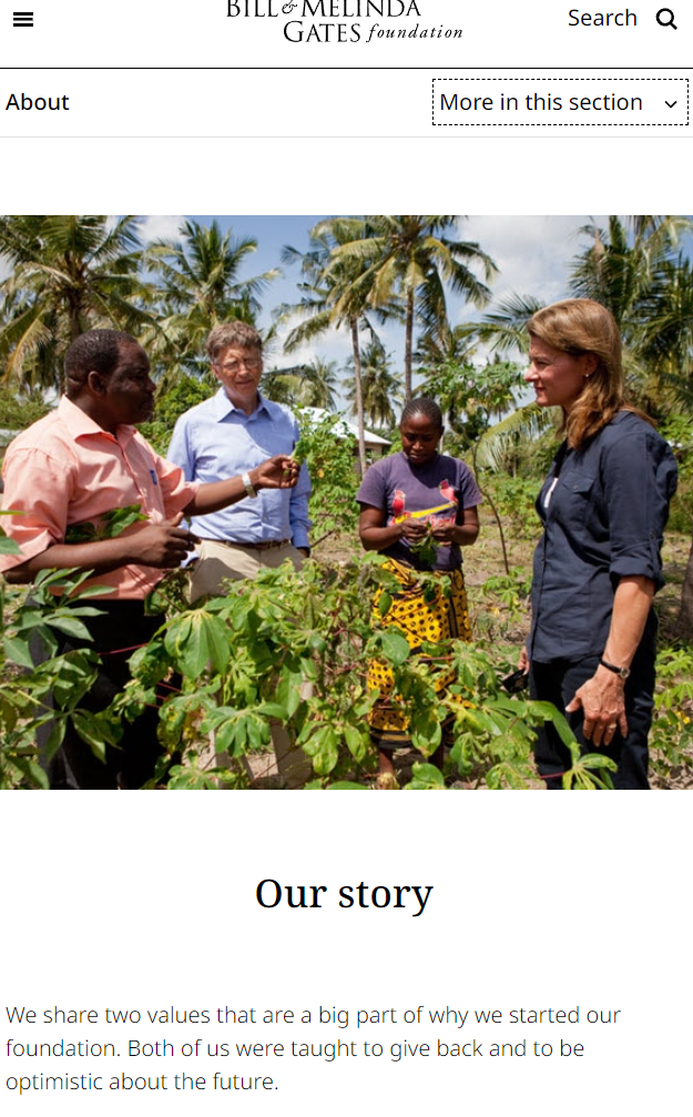
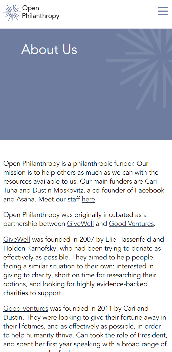
The about page on Open Phil is pretty dense with text.
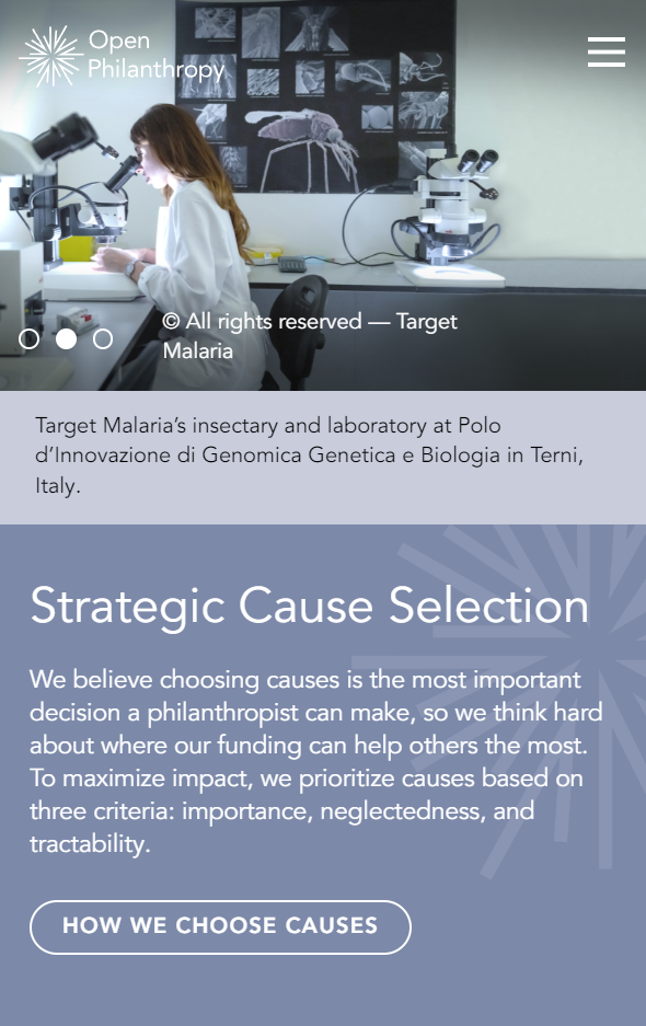
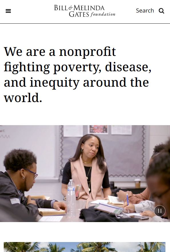
In contrast, if you go to the above sites, for example, the Gates site, there’s a lot more visuals and "roominess":
Our Story | Bill & Melinda Gates Foundation
(I don’t have any prior interest or affinity to the Gates foundation, it just seems like a good reference).
In contrast, Open Phil’s about page is text heavy without pictures, and also the text doesn’t flow as naturally.
Each of these changes individual... (read more)