Angelina Li
Bio
Hi! I'm a generalist on CEA's Executive Office, where I work on Growth, Operations, M&E/data, and other projects. I used to work on the EA Global team at CEA, and before that I did economic consulting. I was born and raised in Hong Kong 🇭🇰.
Think I'm making a mistake? Want to give me feedback? Here's my admonymous. You can also give feedback for me directly to my manager, Oscar Howie.
Posts 15
Comments225
I really enjoyed the version of this post that you shared at EAG SF. For posterity, my reaction after listening to the EAG talk was: "Wow, that talk was annoyingly helpful."
Annoying because: the core premise is so obvious, and yet I found spelling out the implications surprisingly clarifying! I think listening to that talk may have substantially accelerated my thinking on a key life decision I have been mulling on.
Thank you so much, @Toby_Ord :) I strongly upvoted.
I am really glad for your engagement on this question, Mia! I found this part of your comment interesting, especially the bolded part:
We have seen in Europe that welfare in cage-free systems improves over time as producers gain experience. The cage-free system has a high ceiling for welfare potential; the furnished cage has a very low one.
Do you have a quick explanation for why this is the case? I guess it makes sense intuitively to me (e.g. cages impose a fixed physical restriction on how much space a hen can have).
It is also really interesting and encouraging to hear that you think welfare in some cage-free systems is continuing to improve over time. I didn't realize that! If you have a quick sense for how much you think welfare is empirically improving in the European context, I would find this very interesting.
No worries if you don't have capacity to respond :)
Responded on the dashboard above, but wanted to quickly say thanks @MHR🔸 and @Vasco Grilo🔸 for letting us know you are invested in this project, that kind of feedback is useful for us.
I think it would also be helpful to see the number of people engaging in each tier across time. [...] Many past annual changes in engagement up or down of 10 % to 20 % would make a 25 % increase from 2024 to 2025 less impressive relative to a past downwards trend of a few years.
Thank you for the feedback, Vasco. As you have noted, we have some older data on growth trends (although not cost trends) in the dashboard. This is of course not formatted the same way, and plus how we think about growth (i.e. our funnel approach) has changed over time.
The team is presently busy preparing with EAG SF, but I'll make a note of your feedback so we don't lose it.
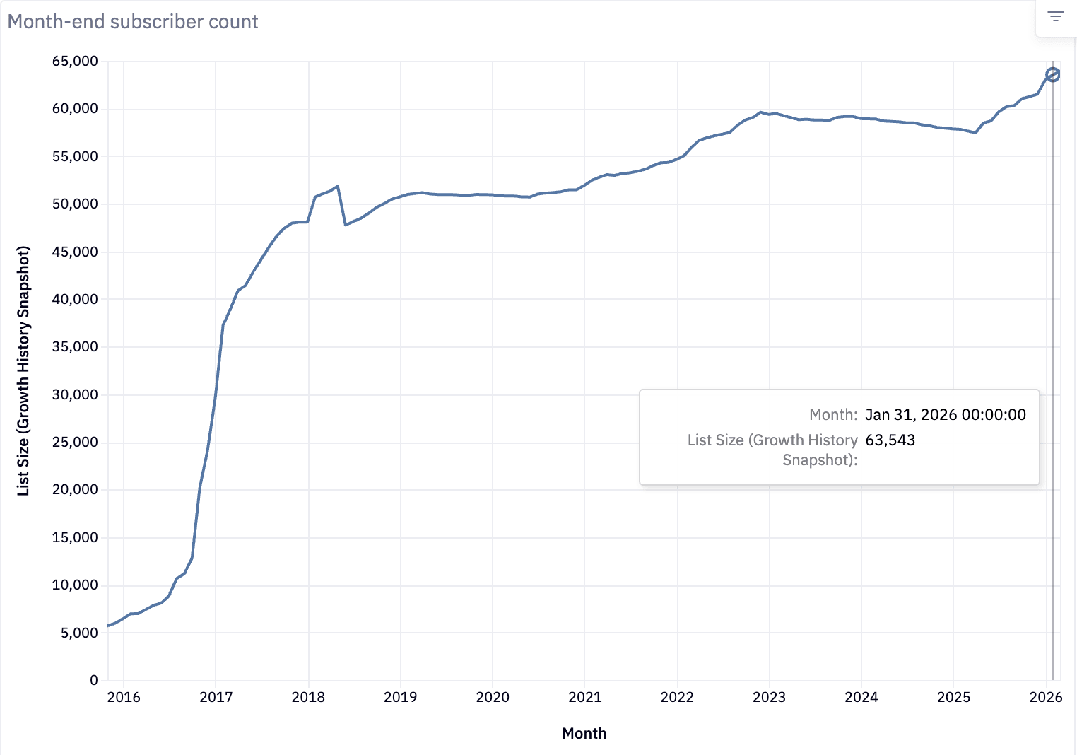
Thanks Vasco! Here’s the graph of EA Newsletter subscribers over time. We’re about to hit 64K subscribers :)

(Edit: replaced the tooltip to show our end-of-January totals, the last full month of data we have)
As a side note, the reason why we track actively engaged subscribers as our central growth metric is because many people who are subscribed never open the newsletter, and therefore we don’t think they get value from it. In general, we think “flow” metrics (like active engagement, attendance in a given year) are a better proxy for our present-day impact than “stock” metrics (like the number of people who have ever come to an EAG).
I’m glad the dashboard has been useful for you! Hearing about user demand is definitely valuable data for us. Unfortunately we’ve had to deprioritize maintenance on this for a while, due to higher priority M&E and engineering projects taking precedence over the last few quarters.
Relatedly, we will soon be hiring for a software engineer to join the Online Team and work on engineering projects across CEA. I’m really excited that we are building out our technical and analytical capacity (hi @Rory Fenton!). If any software engineers reading want CEA to have more capacity to execute on projects like this, I encourage you to apply!

It's possible you might find something on the EA Opportunities Board? If that ends up being fruitful for you, that would be interesting to find out. Good luck!