Comments
Thanks for the write-up. If you still have the time, could you increase the font sizes of the labels and replace the figures? If not, don't worry but it's a bit hard to read. It should take 5 minutes or so.
Thanks for the write-up. If you still have the time, could you increase the font sizes of the labels and replace the figures? If not, don't worry but it's a bit hard to read. It should take 5 minutes or so.
Upvoting this post even though it doesn't criticize EA. :-)
Looking at your charts, I find it really interesting to see the trend in animal welfare posts over time. As you summarize it: "The percentage of posts on animal welfare peaked in 2018-19 and has since decreased somewhat."
I've heard concerns from other animal-focused EAs that the EA movement feels like it is starting to de-emphasize animals. And that worried me. But these charts make me feel better.
Your analysis does validates peoples' perception that the EA movement feels like it has recently started focusing less on animals. Because your analysis suggests the movement probably has been focusing less on animals ever since the 2019 peak. So that shows that people aren't crazy to feel like something is changing in EA. :-)
But at the same time, your analysis suggests that the decrease in focus on animals is probably just a return to the norm. So there's probably no real risk that this trend will eventually lead to EA forgetting about animals altogether! Therefore, by showing the big picture, your post is reassuring.
Cool, thanks for the analysis! Should you have also looked into the upvote distribution within the categories; are there large differences or are upvotes generally similarly (normally?) distributed?
This is super interesting, thanks for doing this! One question: how did you decide to put the tags in the buckets you did? I'm wondering as some things seem fairly arbitrary, and by drawing different boundaries you might actually get quite different results. For example, I was just checking out your tags script and saw that you have things like nuclear security, nuclear winter, etc. in "Catastrophic risks" rather than in "long_term_risks_and_flourishing" although I would say it could also fit in the latter category. I think this is especially true for these two categories, as most things in "catastrophic risks" would fit neatly into "long-term risks" e.g biosecurity, great power conflict, etc. If this was the case, the number of existential risks-related Forum posts would be much higher than you indicate (although the trends might still be similar, even if the absolute values are different).
I appreciate this might be an annoying nitpick as the categories will always be subjective, but thought this might change the results somewhat.
(P.S I was trying to run an amended version of this myself to check for myself but had some problems with your code (apparently tags has no attribute tag_types). Agreed with David below though, it would be nice to have a dynamic version so others could more easily re-run your code with slightly varied tagging.)
Great question, I took the categories from here:
https://forum.effectivealtruism.org/tags/all
I have just gone off the assumption that whoever categorised the tags on this page, made a good judgement call. I agree completely that particularly longtermist stuff might look like a smaller fraction than it actually is, due to it being split across multiple categories. That said there are posts which fit under multiple longtermist categories which you'd have to ensure is not double-counted.
Thanks for the feedback, will put the code into a notebook when I have time tomorrow, should not take many minutes.
tags.tag_types causing you trouble is likely the python namespace giving you issues.
Anyways, I put all of the code into a notebook to make it easier to reproduce. I hope this is close to what you had in mind. Haven't used these things much myself.
https://github.com/MperorM/ea-forum-analysis/blob/main/plots-notebook.ipynb
Nicely done, and I appreciate the code-sharing. This work nicely complements our (RP) EA survey cause prioritization work ... arguably this one is incentive compatible in a way the direct questions aren't.
I see you've done the coding in Python. You might consider making it a nice dynamic document with Jupyter notebooks or Quarto (which I'm using now, and we're adopting on my team).
The single biggest limitation to the post above IMO is the small size of the fonts in the table headers. I think enabling other formats (maybe embedding plotly, things with popup labels) could help this a lot. (DM me?)
Thanks for the positive feedback! As far as I know there isn't a way to embed plots in the EA Forum, is there something I missed?
True, for Plotly I don’t think so. In general there are a few options, none of them perfect however. We’ve wrestled with this a bit. In future we may have a clean code + statistics + models + visualizations version hosted separately, and then use the forum post for narrative and nontechnical discussion.
My guess was that an external document would reduce readership too much to justify. Nevertheless here is a notebook with this post's content and the code:
https://github.com/MperorM/ea-forum-analysis/blob/main/plots-notebook.ipynb
I wish that I and others were able to easily collaboratively write a "state of EA cause areas article" with this data and the other data that from the other articles.
https://forum.effectivealtruism.org/posts/NxWssGagWoQWErRer/community-posts-a-new-forum-post-type-unofficial-pr-faq?commentId=iche8rTS6MyZtep6s
Thanks so much for writing this up! Even though not spotting much of a change or pattern isn't the most exciting of results, it's really useful to know - it can help people reason better about how EA is evolving as a movement.
I agree. But I also think there are probably some important changes in patterns we could discern if we dug in deeper. It's not that 'one topic seems to be radically driving out the other topics' ... but there do seem to be signs of some important changes.
Some modeling, dimension reduction, and statistical inference might bring out some meaningful insights.
Great post!
Couple of nitpicks: in the coloured charts some of the colours (eg global poverty/moral philosophy) are reeeally hard to tell apart.
I would also like to see absolute numbers of posts on eg the popularity posts, since high votes for eg 'career choice' could be explained by those posts being disproportionately likely to be important announcements from 80k or similar where what's really getting upvoted is often 80k's work rather than the words on the screen. And high stats for criticism could be (though I suspect isn't) explained by much fewer critical posts leading to greater extremes.


The other day there was a discussion on whether global development had been deprioritized within EA. I had been wondering the same thing, and more broadly how EA's interests have developed and changed over time.
So yesterday I downloaded all EA Forum posts and categorised them by tags to see if I could spot any trends. Here is what I found.
If the plots are too small to read, you can right click the picture and press 'open image in a new tab' to see a full-size version.
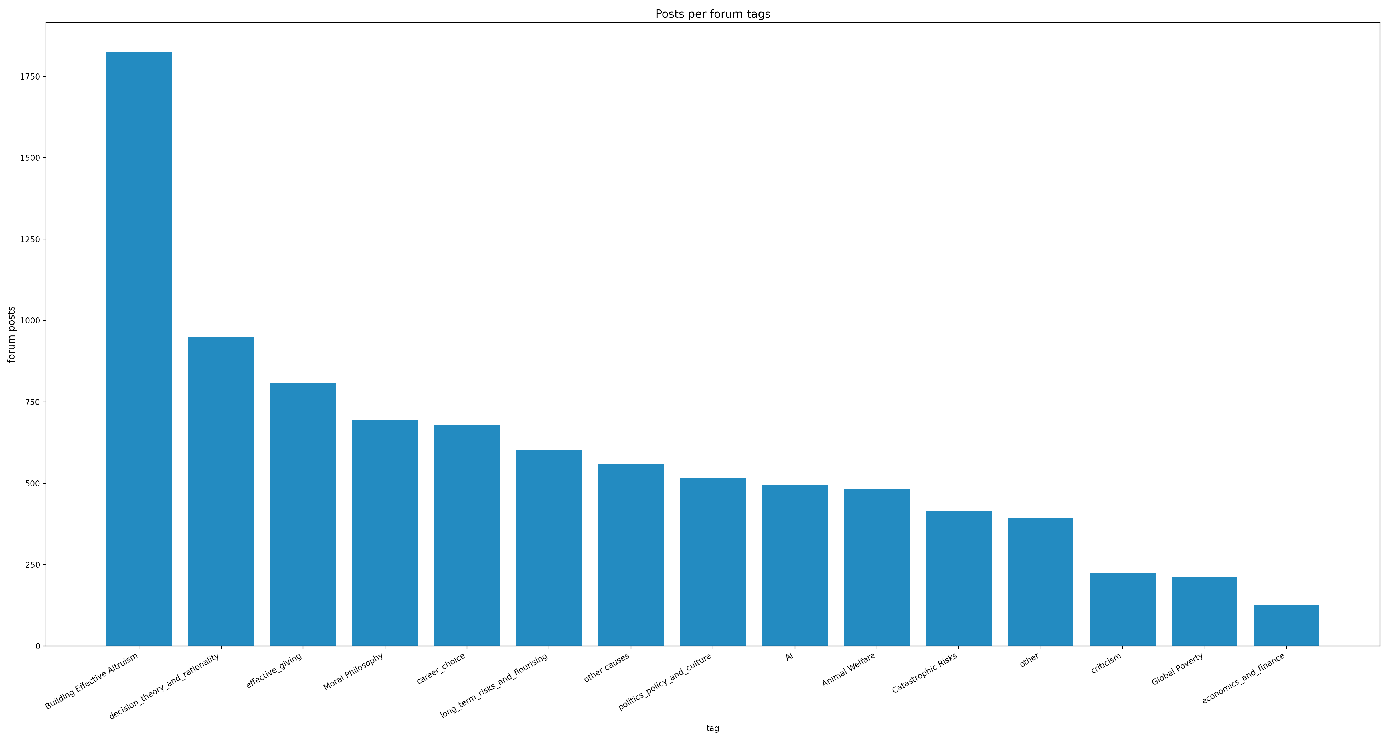
The first thing that stood out to me, is that there are many more posts on meta subjects such as community building and rationality, than there are posts about specific cause areas. This is maybe not that surprising, as many cause-area specific analyses and reports might be not be posted on the EA Forum, but instead on the websites of the organisations that produce them, whereas there is no better place to share work on community building than the EA forum.
In terms of cause-areas there have been roughly the same number of posts on each cause area (AI, animal welfare, catastrophic risks, and other causes) with the exception of global development which has about half. I think the most likely explanation as for why this is, is that EA global development reports are more likely to be solely published on the websites of the organisations that produce it.
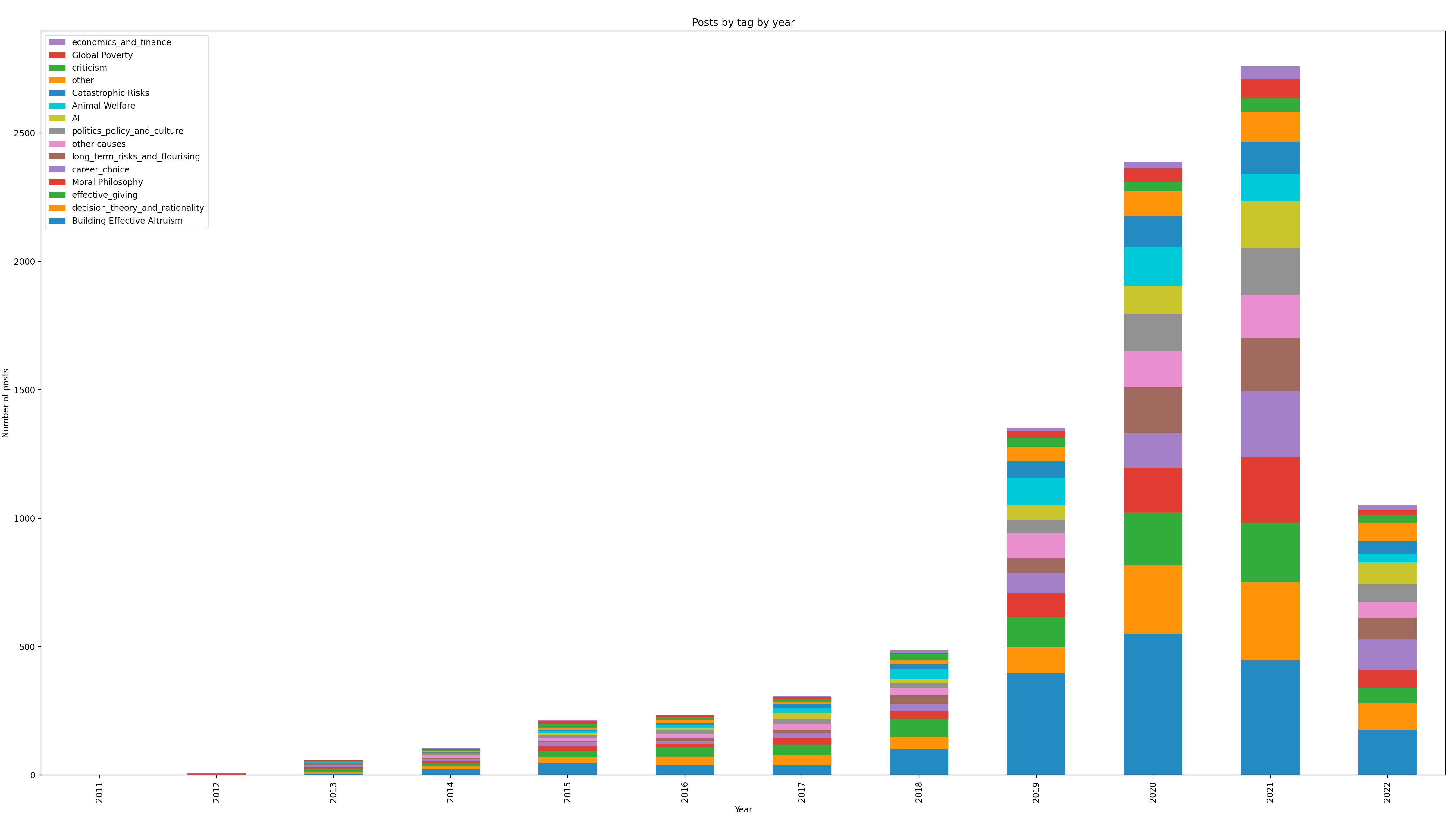
The EA Forum has exploded popularity in recent years, which I had expected would result noticable changes to what is posted on the forum. This seems not to be the case, and interest in each area (measured by amount of posts) has largely remained the same.
For easier comparison between the years, here is the same plot but normalized
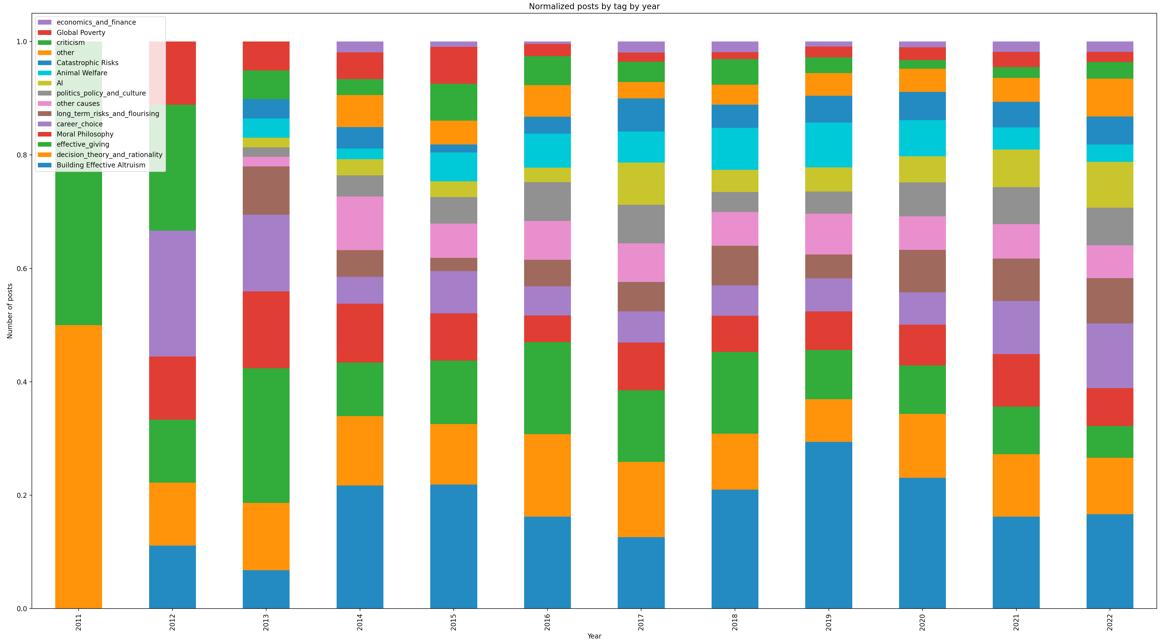
I was surprised to see how little change there have been in the make-up of posts over the years. Global development makes up a smaller percentage of the forum than it did in the early years, but has largely remained the same since 2016. The percentage of posts on animal welfare peaked in 2018-19 and has since decreased somewhat. Interest in AI looks to be going up, as are posts about career choices.
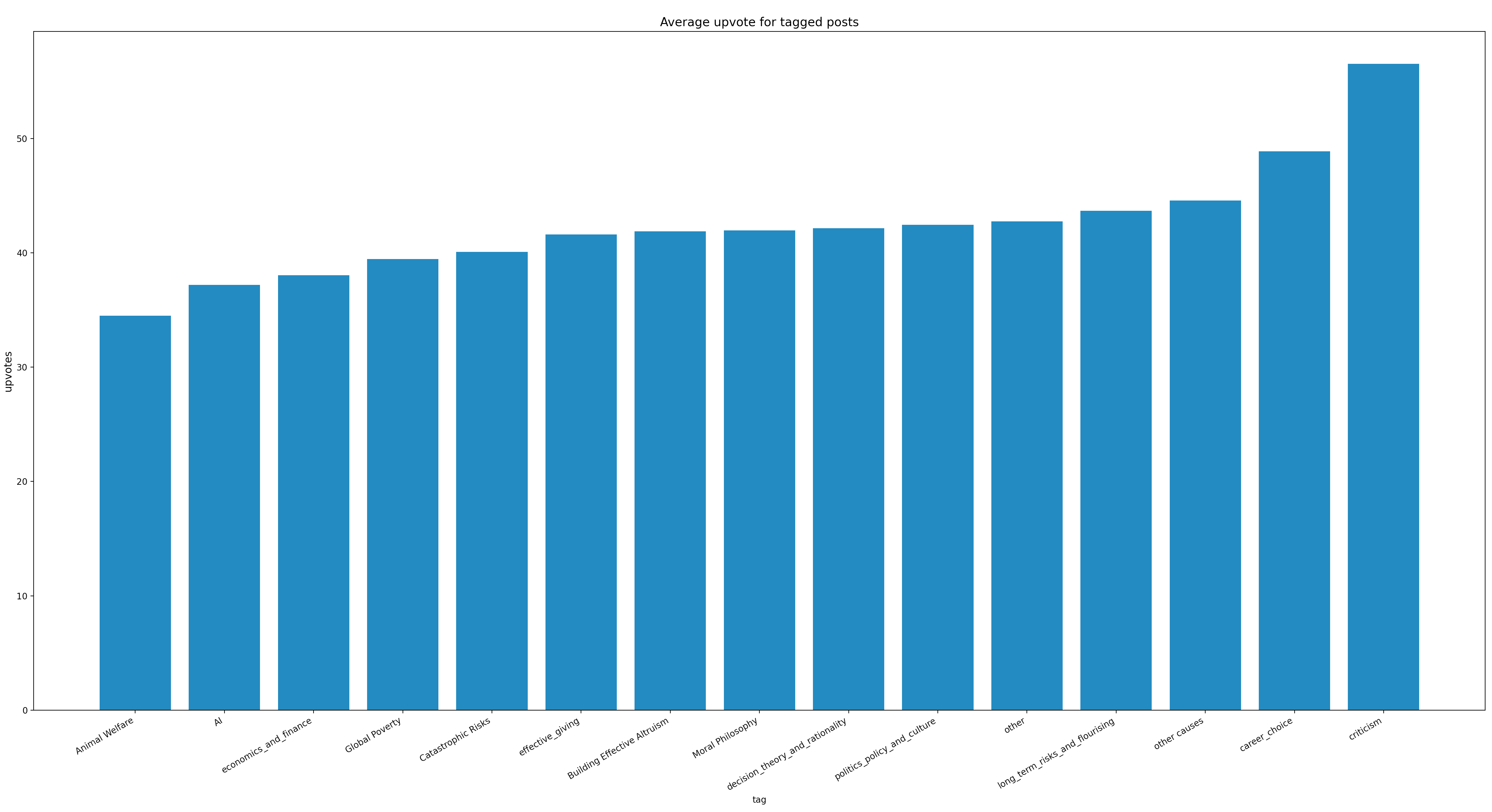
Posts criticising EA are on average the most highly upvoted!
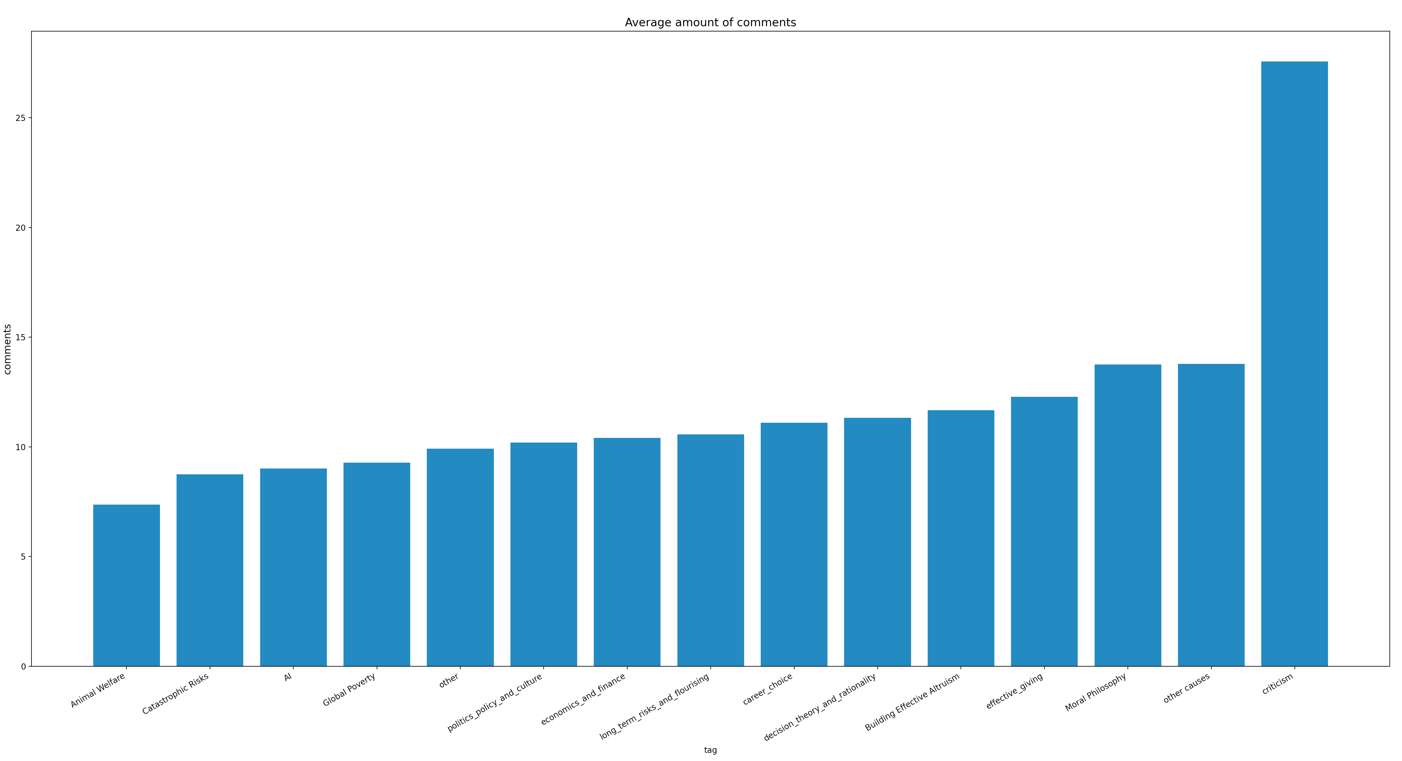
They are also by far the most highly commented posts!
Posts on cause-areas in turn tend to be the least upvoted with the fewest comments. My best guess as to why, is that it is a matter of engagability. It's difficult to provide much input to a deep-dive on some animal welfare issue without being highly informed on the topic yourself. There is too much of an assymmetry between the knowledge of the author and average reader for these posts to generate a lot comments and debate.
I do think it's a shame that cause-specific posts seem to get less engagement and upvotes. Reading throrough analyses and deep-dives are often the posts I learn the most from, it's a shame that the readership for this content isn't higher.
My main takeway has been that there aren't any clear recent trends in EA I could deduce, at least based on how posts are tagged.
Fluctuation in the amount of posts on each cause-area is within what can be attributed to noise. The different major cause areas get roughly the same level of engagement on the forum. Many of the trends that can be seen, can likely be explained away by noting that the EA Forum is a flawed representation of EA's interests.
Are there any plots I didn't make you would like to see? If so, let me know and I'm probably happy to create them[2] :)
If you're wondering which tags cause a post to be categorized as eg. 'other causes' or 'Moral Philosophy', I have categorized the tags based on this page on the forum: https://forum.effectivealtruism.org/tags/all
Note that a single post can belong to multiple catagories.
If you are interested in reproducing these plots or making your own, you can view the code: https://github.com/MperorM/ea-forum-analysis
Thanks, I thought this was great.
I thought it was very noteworthy that posts criticising EA were the most upvoted and the most commented on. I also find it noteworthy that posts on particular cause areas got the least upvotes and comments, and agree that that's a bit unfortunate. However, I guess one factor could be that only a sub-section of the community may be interested in posts about any individual causes, whereas a larger fraction may be interested in issues relating to the whole community (e.g. "meta"-issues).
The fact that there's not been more of a change over time is also an important finding, since I think it would have been reasonable to expect a change.
I agree with those who say that the fact that AI safety discussions largely occur elsewhere means that this isn't the best proxy for overall EA interest in AI safety. But it's still useful to know what the level of engagement with AI safety is at the EA Forum specifically.