
Agnes Hasselblad 🔸
Posts 15
Comments16
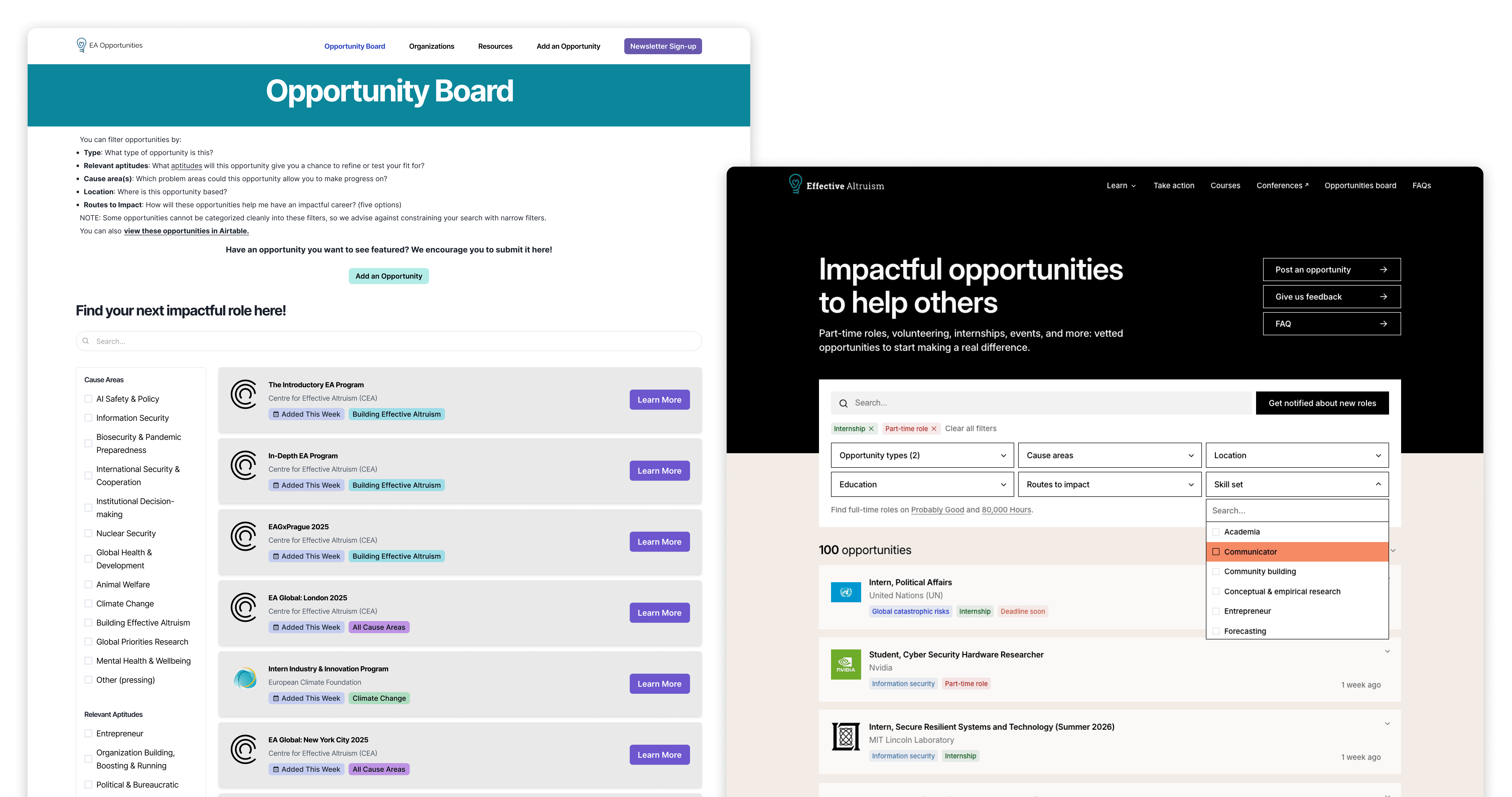
Question: Has anyone here applied to a role they found on the EA Opportunities board? (Attaching an image of what it used to look like + what it looks like now).
I’m curious if you ended up getting the role or not, and would really appreciate hearing either way. I’m trying to get a sense of how many applications and placements the board is leading to. Happy to DM if that’s easier!
I feel the same. I’m also generally wary when a name (or design) needs extensive reasoning to justify it. Most people will never hear the reasoning, so their gut reaction/ ability to remember it matters more. I’m not sure how the name agency worked, but I’d be more optimistic if I knew the name had been tested with your target audience vs. had a background story that made sense?
I can't speak for the choice of principles themselves, but can give some context on why the change was made in the intro essay (and clarify a mistake I made).
There are different versions of EA principles online. One version was CEA's guiding principles you mention from 2017, and had endorsement from some other organisations. CEA added a new intro essay to effectivealtruism.org in 2022, with a different variation of a list of principles and Ben Todd as a main author: you can read the Forum post announcing the new essay here, and see the archived version here.
After Zach's post outlining the set of principles that are core to CEA’s principles-first approach (that had existed for some time and been published on the CEA website, but not on effectivealtruism.org), we updated them in the intro essay for consistency. I also find Zach's footnote helpful context:
"This list of principles isn’t totally exhaustive. For example, CEA’s website lists a number of “other principles and tools” below these core four principles and “What is Effective Altruism?” lists principles like “collaborative spirit”, but many of them seem to be ancillary or downstream of the core principles. There are also other principles like integrity that seem both true and extremely important to me, but also seem to be less unique to EA compared to the four core principles (e.g. I think many other communities would also embrace integrity as a principle)."
I also want to say thanks to you (and @Kestrel🔸) for pointing out that collaborative spirit is no longer mentioned, that was actually a mistake! When we updated the principles in the essay we still wanted to reference collaborative spirit, but I left that paragraph out by mistake. I've now added it:
"It’s often possible to achieve more by working together, and doing this effectively requires high standards of honesty, integrity, and compassion. Effective altruism does not mean supporting ‘ends justify the means’ reasoning, but rather is about being a good citizen, while ambitiously working toward a better world."
This is something we’re still trying to figure out since taking over the project earlier this year (and it is, for good reasons, the most common question I get when talking to users about the board). For many people the other boards will already do a good job if you’re looking for these types of roles. We’re still evaluating the amount of resources we want to spend on improving the board, alongside talking to students and group members to better understand what they find useful.
My thinking on the unique value of the Opportunities board is still developing, but here are some ways I’m thinking about the board being useful:
- A less intimidating space for the specific audience it’s targeting. Many group organisers use the board to show group members or people who just heard about EA.
- By focusing only on part-time roles we may be able to get much more breadth here than the other boards are able to, including opportunities that don’t fit neatly on a job board. I’m especially optimistic about finding ways to source more local opportunities outside of US and Europe (something 80k isn’t focusing on right now but which @Conor Barnes 🔶 mentioned has been requested)
- I could also imagine the EA brand and EA website being more effective at driving traffic than e.g. Probably Good, which may mean we should in fact not be strongly niched but instead also start showing full time roles (especially with 80k’s move towards more AI Safety roles)
- More exposure to good opportunities seems valuable in general. Some people will come across 80k or Probably Good, others will find the Opportunities board. We’ve already heard impact stories from people who found a role here they wouldn’t otherwise have seen, either because it wasn’t on the other boards, or because they weren’t looking there at the time.
I’m still exploring if this is the right niche and how to communicate it more clearly. For now I’m fairly optimistic the board is helping people find work they otherwise wouldn’t, which makes me excited to keep developing and growing it.
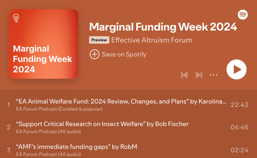
Like @Toby Tremlett🔹 I did a quick initial vote and will come back and edit my vote once I've read more marginal funding posts + see who's in the lead.
(Another plug here for the Spotify playlist we created with the marginal funding posts in case you (like me) prefer listening to posts)
🎧 We've created a Spotify playlist with this years marginal funding posts.
Posts with <30 karma don't get narrated so aren't included in the playlist.
I'd love this too, thanks both for pushing this forward. I think it'd be great to have a space similar to the Groups resource centre, but for comms about EA (including visualisations like these). Would probably make sense to host on https://effectivealtruism.org so that journalists, policy makers, etc. can also find and use them. This work could fit within the realms of redesigning effectivealtruism.org too, since a big part of that work is to better communicate EA to the world...
Also curious about this! Apart from the monthly sterilising it's recommended to wash your hands before handling the cup, which would happen every 5-10 hours or so when you need to remove and reinsert it. I know I've personally decided against wearing a cup when staying at places with limited running water and soap for fear of infection (like when camping). But similar to other commenters have no good sense of the real risks of this and would be keen to find out.