Comments
Have you considered A/B testing changes? As you note, looking at engagement numbers before/after isn't capable of assigning causality.


Have you considered A/B testing changes? As you note, looking at engagement numbers before/after isn't capable of assigning causality.
A/B testing in general is great. For UI-related changes you generally want to run the experiment sticky per user, to reduce confusion and allow the time for users to adapt to changes. This does add statistical complexity, though, because one heavy user in an experimental treatment can have a large impact on aggregate statistics like "total number of comments per category".
Happy to talk more about this if you'd find it helpful; this is an area I used to work in.
I am generally a fan of A/B testing. We have some nice architecture for doing so, custom-written by @jimrandomh, which I think we under-use. We were quite tempted to A/B test a specific change here, but were not tempted by A/B testing the entire UI refactor. Let me explain:
Getting our UI very-changed while also consistent was a large project. It totaled 4.5k lines of code changed. Making all those changes, while staying consistent with the old UI and the new UI, would have been a more challenging project. We would also have to maintain the correct behavior for LessWrong, who shares our codebase. Maybe it still would have been worth doing? I have an opinion on the answer, but the thing I want to communicate is the tradeoffs.
I'm a fan of serif fonts, so I'm a little sad about that change, and a little confused why posts and comments are in a different visual style. I'm definitely no expert on stuff like this, but I'm curious if there's a motivation for that difference.
edit: oh, and it's even different between section headings and post paragraphs, that seems weird to me too, but maybe it's more common than I realized
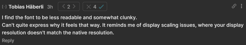
I find the font to be less readable and somewhat clunky.
Can't quite express why it feels that way. It reminds me of display scaling issues, where your display resolution doesn't match the native resolution.
Can't quite express why it feels that way. It reminds me of display scaling issues, where your display resolution doesn't match the native resolution.
Now that you mention it, I feel a bit the same. It might be that we just need to get used to it, but maybe it's the font-weight?
Is the second one better? I just changed font-weight from 450 to 400
I find the second one more readable.
Might be due to my display: If I zoom into the two versions, the second version separates letters better.
But you're also right, that we'll get used to most changes :)
As a quick clarification: none of the fonts in question were actually changed from serif to sans-serif. See here for how the Forum used to look.
(There are some changes from serif to sans-serif, such as in the post list items. But my read of your comment is referring to comments and section headings, which were always that way.)
(Agnes mentions this below, but I thought I’d call it out here.)
You can set your browser to not let websites choose their own fonts, and to use your settings instead[1].
Not only do you get your own font preferences but it is quicker (no more requests off to Google Fonts or other places to download custom fonts) and more private (no more sending personal info to Google Fonts who get which has caused publishers to be fined from time to time for not being GDPR-compliant)
In Firefox, go to about:config in a new tab, then set browser.display.use_document_fonts to 0.
Google Fonts who get fined from time to time for not being GDPR-compliant
I don't believe Google Fonts has been fined for GDPR violations? Are you think thinking about European publishers being fined for using Google Fonts, because this meant sending user IP addresses to an American company?
Yeah I like most of the UI changes but not a big fan of the sans serif font. Indeed weird that the use isn't consistent either. (ETA: don't agree with this sentence anymore). If people are divided on this, perhaps have a setting to bring it back so people can choose?
Thanks for letting us know! Choice of typeface is no doubt a subjective thing and some will prefer the old font. In terms of inconsistency–one of the most popular principles for typeface combinations is the one I've gone with here–pairing a sans serif header with a serif body. This combination can be found online on places like Medium and Substack, and was already the case inside of Forum posts before this change. Typefaces are often even created in pairs of serif and sans serif that are meant to be paired this way.
This is obviously not a hard rule and you may still prefer other combinations (it’s not uncommon to use all sans serif on web, or all serif if it’s a magazine), and I'm definitely open to trying different things to improve legibility and tweak the “personality” of the Forum through typefaces (but it's not something I expect to prioritize changing right now)
I think you're right (I don't mind the serif titles within the blog posts, nor do I mind the sans serif use on substack and medium). I am likely just too attached to the previous look, the most important opinion is that of new users :) Thank you for the work you've done!
I prefer the old font but that isn’t a big deal imo. One thing I really dislike is how when there are new comments on posts I have read, it doesn’t highlight the little number with a blue box anymore, it just boldens the number. I’m curious what the thought process there was because it just makes it more difficult to notice when there are new comments.
I appreciate this observation, this is something I'd like to keep an eye on. The reason I changed it is because many newer users we spoke to didn't understand why some comment bubbles were blue and some not. I assumed this to be because turning something blue when unread isn't a commonly used design pattern elsewhere on the internet (unless it's a blue circle next to the unread thing). My hope with the new design is that it will be more easily understood as "new and unread" since it uses a pattern more widely known to mean that. That said, I agree with you that it's less eye-catching than before, and if you feel like you constantly miss new comments due to this change, I'd love to know
FWIW I actively like that the new comments are less prominent now — the previous design made me anxious; it felt like there was pressure to click everything to make the loud blue stuff go away. The new design feels like less of an attention-stealing design.
Thanks for sharing the thought process behind this! It actually took me a really long time to know why it went blue too, but when I figured it out I found it a really useful way to quickly check for new comments in conversations I was following.
I feel like regarding the community posts change, this post is saying something like:
Seems like there's some tension between these points! Do you have a theory for what's happening here? Are the changes leading to people engaging in different ways that are better, even though they're not overall less? If so, how is that achieved by what seemed to me like a fairly uniform visibility reduction?
The functional/structural changes in the redesign seem good. I feel sad about the typographical changes.
The old Forum had a really nice, distinctive "bookish" style that I thought was classy, pleasant to read, and also somehow calming? The new design feels more crowded to me, and also more generic.
Thanks for this observation! Funnily enough, “bookish” is exactly the descriptor we were using for the old design.
I’m sorry the information feels overwhelming, and we’d like to see how this plays out as we all get more used to the new design.
I want to expand on some of the reasons we’re showing more information and using friendlier fonts.
One of our goals on the Forum team is to make the Forum accessible to people who are getting more engaged with the ideas of EA, but haven’t yet been part of the community for a long time.. Without getting into a full theory of change here, I think we’ve neglected designing for this user group a bit over the last several years. Some of the barriers to entry for these folks include:
Of course, we have to balance designing for this group of users with folks who actually use the Forum on a regular basis, and we’re hoping to strike that balance by collecting feedback like this, seeing how things play out, and continuing to experiment.
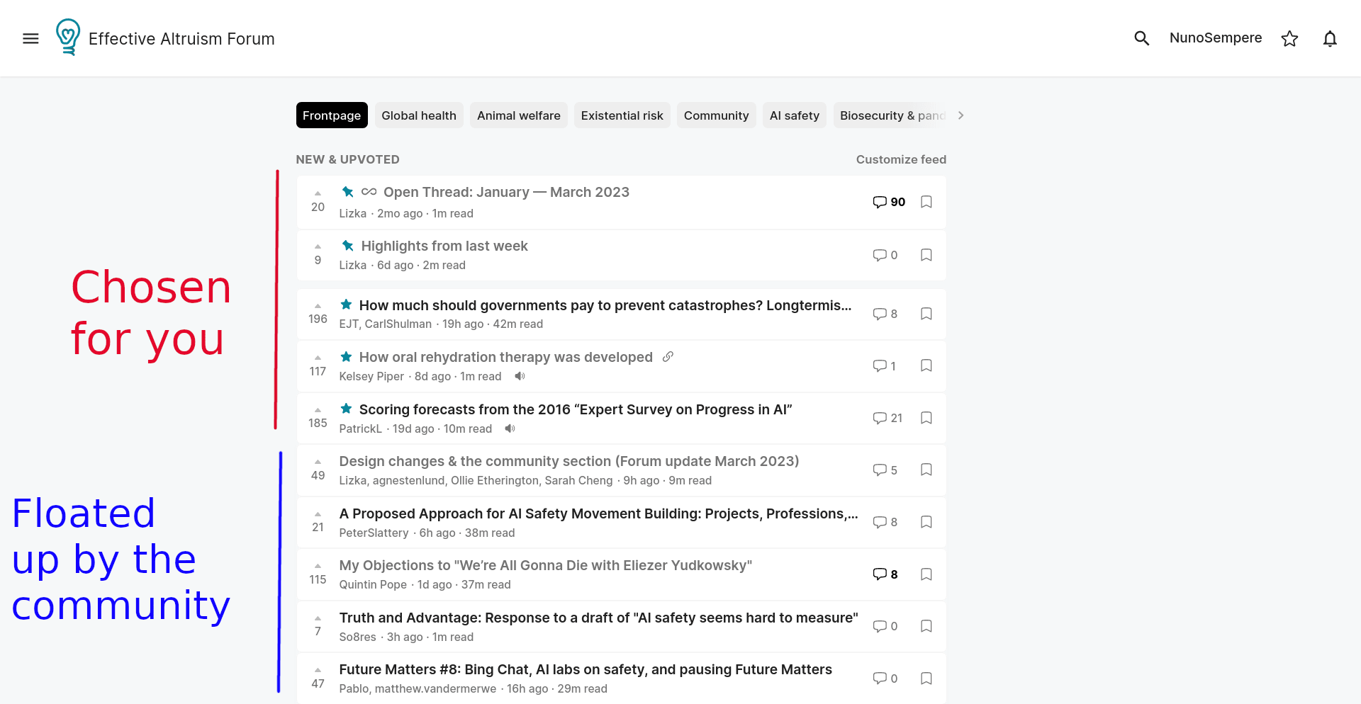
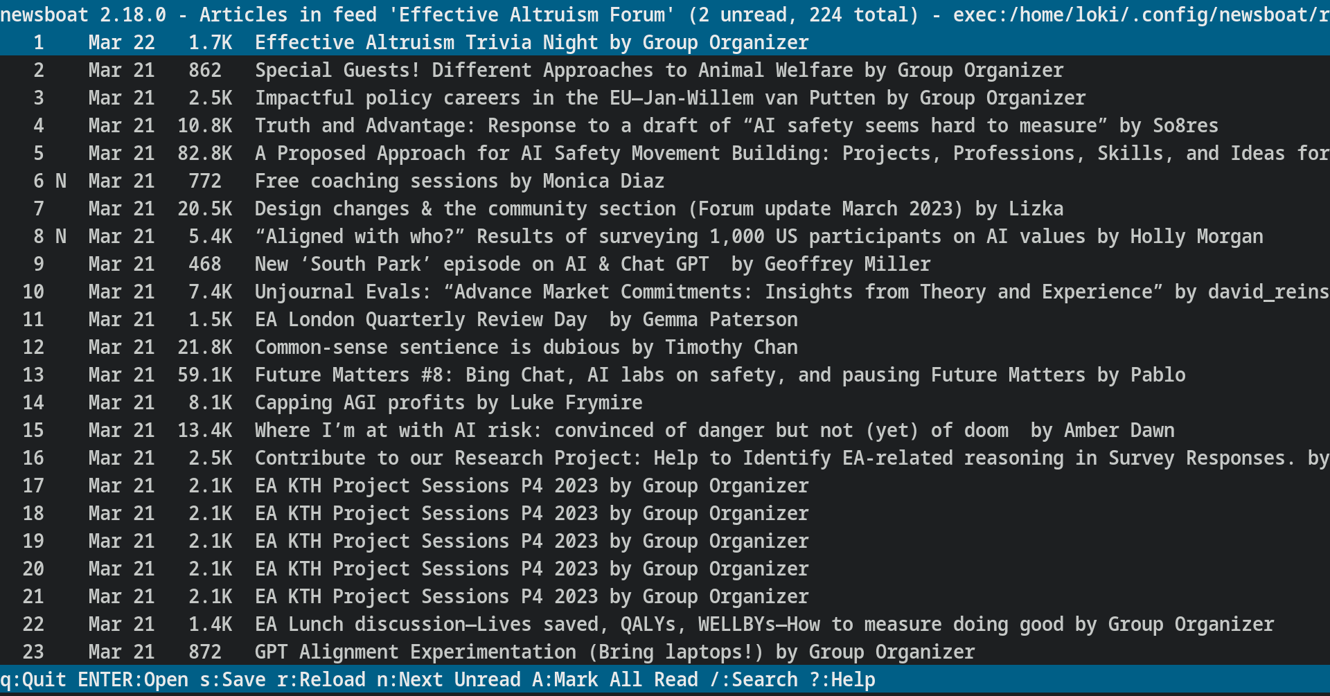
I continue to dislike how much space pinned and highlighted posts occupy:
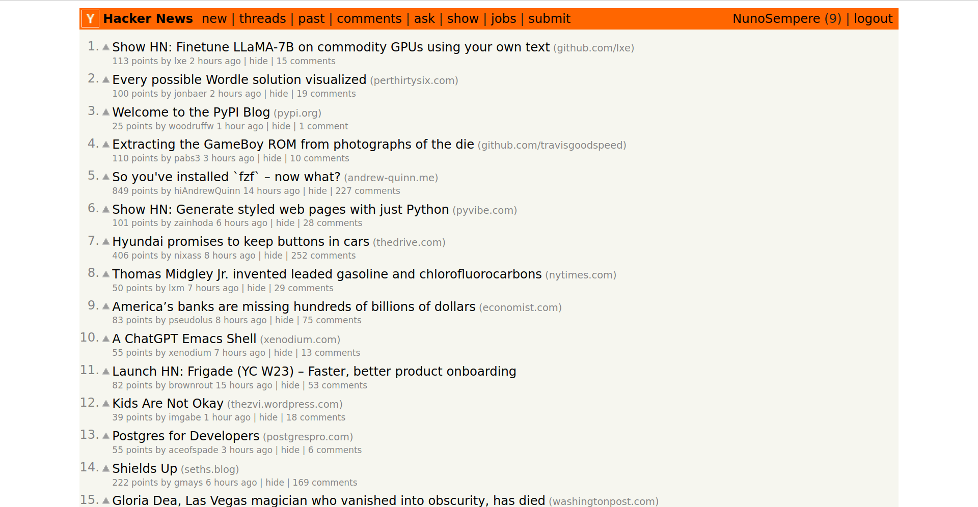
Compare for instance with hackernews:
In my particular case, I prefer to use an rss reader with a more dense presentation, in this case newsboat. Other users who prefer packed information might want to explore similar setups:
Also, personally I found it a shame that the community posts were removed from the general rss feed. Is there an rss feed for the community posts specifically?
Also, you can turn off the sidebar and the intercom with something like
@-moz-document domain("forum.effectivealtruism.org") {
    .SingleColumnSection-root {
        /* To do: tweak for current redesign */
	  /* width: 1000px; */
        /*  margin-left: 60.5px;  */
        /* max-width: 1200px    */
    }
    .NavigationStandalone-sidebar {
        display: none;
    }
    .intercom-lightweight-app{
        display: none;
    }
}
in an extension like stylus.
You can also turn off the intercom in "Site Customizations" here, and the sidebar by clicking on the hamburger menu on the top left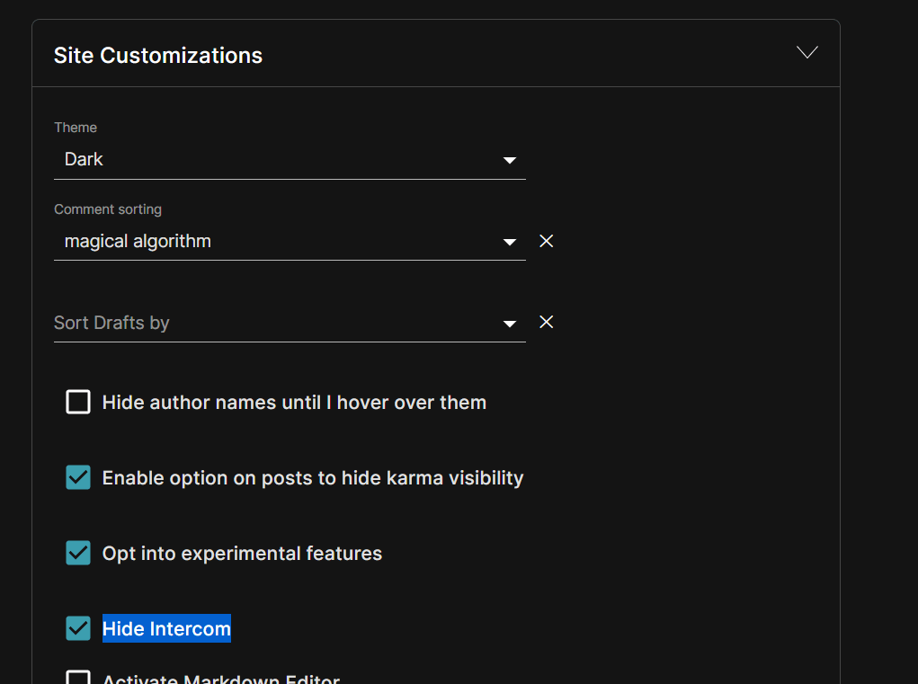
Oh nice. Maybe there could also be a setting for "do not show pinned post if you've already read it".
Quick note: community posts are still in our rss feed.
Wow, I love the new theme! 🤩
What's the new font called?
Big improvement on the left sidebar. Good job all 👍
As mentioned above, we are now testing out some changes designed to make the home page algorithm better suited for users who visit more or less often. This will make it so that people who visit every day will see a home page similar to the existing algorithm, while less frequent users will see a “slower” home page which is weighted less towards recency and more towards karma.
We are rolling this out as an A/B test, so initially only 1/3rd of users will get the new algorithm. You can deliberately opt in (or out) by going here and selecting “New ‘slower’ frontpage algorithm” in the final dropdown. Some more details about the changes:
We’d love to hear your feedback on this, such as “I’m a daily user but I still think the slower algorithm is way better for me” (or the opposite). You can reply here or reach out to us at [email protected]
Very happy with the changes, especially with the performance improvements on mobile.
Me too! It looks like long titles no longer get cut off on mobile too! A long standing bug I kept noticing. Well done team!
Is there (or could there be) a way to remove the 'Recommendations' section? I don't understand what algorithm generates these, but for me it is determined to tell me I should click on posts I read a long time ago (10 years ago in some cases!). I don't think I have ever seen a recommendation there that I've been tempted to click on.
Thanks for sharing this. There isn't currently a way to remove this section, but we are pretty interested in addressing this (no exact timeline, but I'd estimate in the next 2-3 months). You're right that these are largely something like old classics, and we're hoping to eventually move them somewhere that someone looking for this sort of content can go find it rather than in the "new and updated" feed.
It samples unread posts from a curated list, then when that list is empty samples weighted based on karma. Unfortunately if you read posts logged out, or on a previous version of the site, then old posts won't be marked-as-read so they'll come up again.
I like these changes a lot!
I was going to say that collapsing the community posts section by default goes a bit too far in the direction of hiding it for me, but then I realized it stays expanded in future sessions after I've pressed to expand it once, so now I won't say that (though I just did).
It’s now possible to hide the community section on the homepage entirely (so that you don’t see the collapsible version).
You can also turn it off and on by going to your account page --> Site customizations --> Hide community section from the frontpage.
Thank you for the explanation! Fwiw, I personally find the new front page fairly difficult to skim on mobile (though much easier on desktop). I'm not sure which aspect of the change is causing this, but I think the bold post titles (that are also confined to a narrower margin) might be causing more text wrapping. Is it possible to add display options, like the below from Reddit?
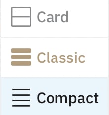
Thanks for the suggestion! Just to clarify, is it a more compact view that you're interested in, or is it expanding to show even more information?
I think my primary hope is for reduced text-wrapping of titles on mobile. One way to achieve that might be by providing an option that only shows titles? I don't have a clear mental image of what it looked like on mobile before the change, if there are screenshot comparisons for that.
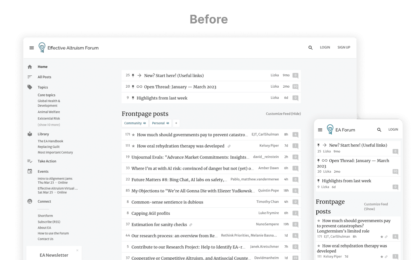
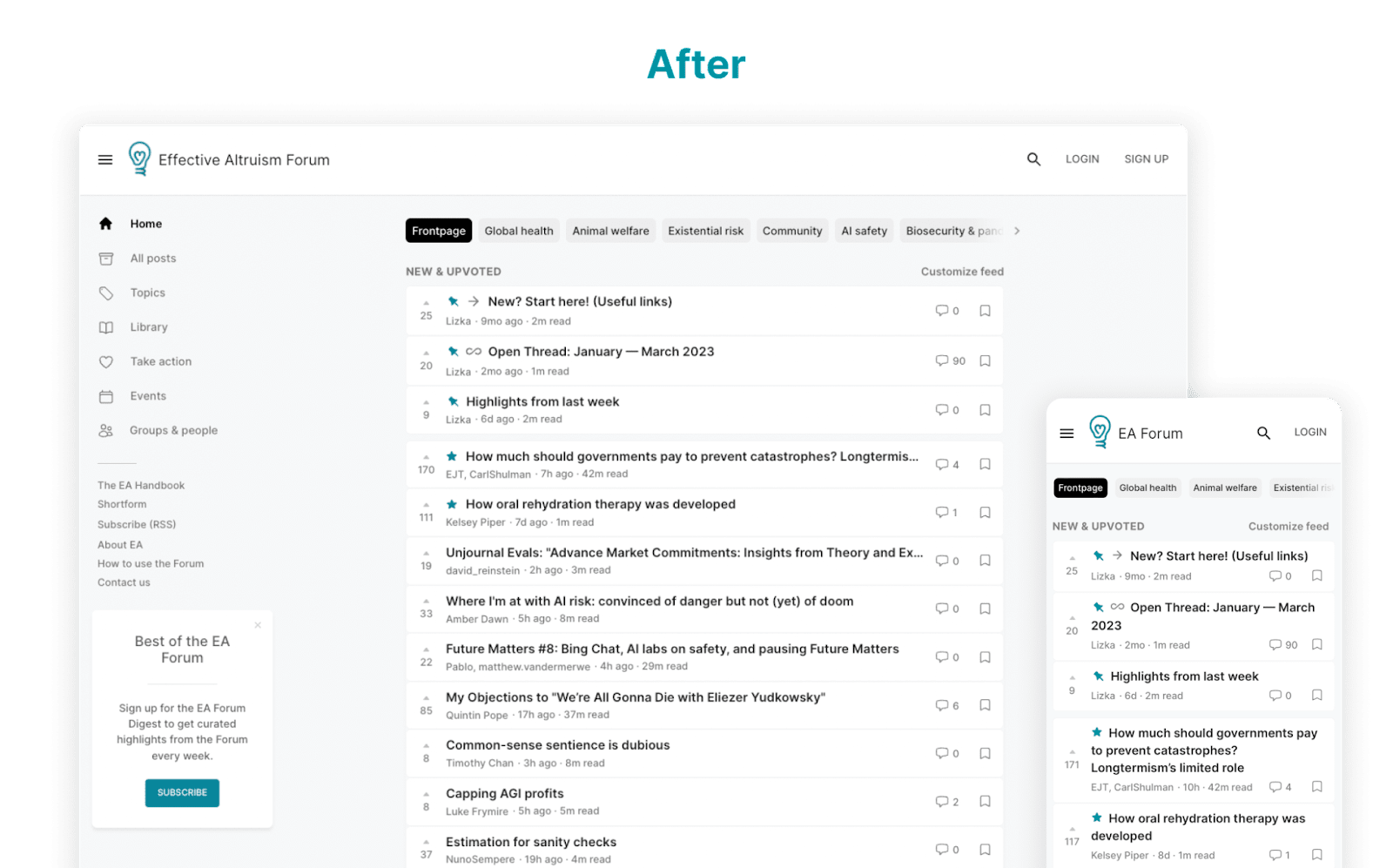
Got it, thanks for the clarification. There's a before/after mobile screenshot in this post if that's helpful. The amount of information is pretty similar, but the karma pulled out on the left hand side might be giving a pretty different feel.
We’re sharing the results of the Community-Frontpage test, and we’ve released a Forum redesign — I[1] discuss it below. I also outline some things we’re thinking about right now.
As always, we’re also interested in feedback on these changes. We’d be really grateful if you filled out this (very quick) survey on the redesign that might help give us a sense of what people are thinking. You can also comment on this post with your thoughts or reach out to [email protected].
A little over a month ago, we announced a test: we’d be trying out separating “Community” posts from other kinds by creating a “Community” section on the Frontpage of the Forum.
We’ve gotten a lot of feedback; we believe that the change was an improvement, so we’re planning on keeping it for the near future, with some modifications. We might still make some changes like switching from a section to tabs, especially depending on new feedback and on how related projects go.
Information we gathered
Outcomes and themes:
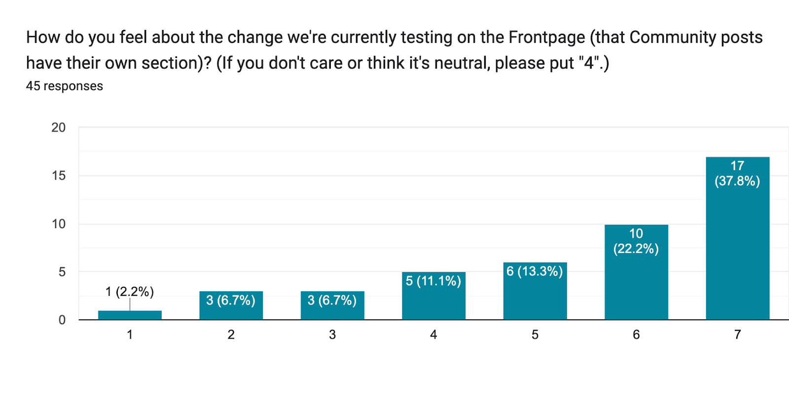
The responses we got were overwhelmingly positive about the change. People told us directly (in user interviews and in passing) that the change was improving their experience on the Forum. We also personally thought that the change had gone very well — likely better than we’d expected as a ~70% best outcome.[2]
And here are the results from the survey:
The metrics we're tracking (listed above) were within the bounds we’d set, and we were mostly using them as sanity checks.
There were, of course, some concerns, and critical or constructive feedback.
Confusion about what “Community” means
Not everyone was clear on which posts should actually go in the section; the outline I gave before was unclear. I’ve updated the guidance I had originally given to Forum facilitators and moderators (based on their feedback and just sitting down and trying to get a more systematic categorization), and I’m sharing the updated version here.[3]
Concerns that important conversations would be missed
Some people expressed a worry that having a section like this would hide discussions that the community needs to have, like processing the FTX collapse and what we should learn from it, or how we can create a more welcoming environment for different groups of people. We were also pretty worried about this; I think this was the thing that I thought was most likely going to get us to reverse the change.[4]
However, the worry doesn’t seem to be realizing. It looks like engagement hasn’t fallen significantly on Community posts relative to other posts, and important conversations have been continuing. Some recent posts on difficult community topics have had lots of comments (the discussion of the recent TIME article currently has 159 comments), and Community posts have been pretty consistently the top-viewed posts on the Forum. I also tentatively think that the discussion on Community posts has generally been somewhat better since we added the separate section.
I do think that “important conversations haven’t been hampered by the change” is a low bar, though, and I’m excited about trying to proactively make those happen or help them go better. I hope to write more about this soon.
Missing posts from specific categories that often intersect with Community
Some people worry that they’ll miss relevant announcements (like this one) if they keep the default settings on the Frontpage (which show Community posts only in the Community section). Others worry that they’ll miss things like retrospectives on community-building projects, or EA meta organizations’ updates.
I share a lot of the relevant content in the Forum Digest, so I hope this will help. And there’s a workaround for some issues like this.
And unfortunately, I think we’ll always have posts that some people would like to see outside of the Community section — people don’t agree on where the line should be. I endorse the current classification because it makes sense (in that it doesn’t seem significantly gerrymandered or overfitted to the feedback that we’re getting or to our experience on specific posts, it tracks this dynamic, and seems like a mostly “real” category). But we might modify it somewhat in the future. (There were also issues with all the other proposals we considered. E.g. we considered excluding some update-style posts from the Community classification, but we worried that this would create an asymmetry between posts by organizations and posts criticizing the organizations, and we did not want to do that.)
Implementation suggestions or requests
We got a lot of pretty specific feedback on how the Community section currently works, like suggestions that we should:
We’re viewing the Community section as a sort of bandaid on some of the issues with the Forum right now. It seems to be an effective bandaid, so we’re keeping it for now (potentially with some changes), but we’re also trying to investigate the causes of the broader problems and see what we can do about them.
Some of the broader problems include:
We’re exploring a fairly wide range of changes to the site and to Forum support/facilitation/moderation to try to address sub-problems of the above, and we’ll likely be testing some soon.
Depending on how all that goes, we might modify the current setup with the Community section.
The site’s design was (and continues to be) imperfect in various ways:
So we’ve made an update to the design of the Forum, which we hadn’t changed in a while.
The redesign didn’t solve all the issues above, and we don’t think it’s final. We expect to keep iterating on the design based on feedback and data we get about how people use the different features. (For instance, it may turn out that a feature whose prominence we just increased based on (2) above isn’t getting significantly more use, in which case we’d hide it again.)
Please don’t hesitate to share your feedback here, in the survey, or at [email protected].
1. Topic tabs on the Frontpage
You can now visit tabs on the Frontpage that let you see only the posts that have been tagged with that core topic.
We hope that this will help semi-regular users get quick overviews of what’s been happening in their fields of interest (and avoid missing posts that would have been useful for them), and that it will help people new to EA go deeper on topics relevant to them.
2. The Community section on the Frontpage is collapsible/expandable (and collapsed to start with)
Some people have asked for a way to hide the Community section entirely from the Frontpage, and we know that some people worry that they’re getting sucked into Community discussions they don’t endorse engaging with. We’ve made the section collapsible/expandable; the site will remember whether you last left the section collapsed or expanded, and keep it like that for the next time you visit.[6]
By default, we’ve chosen to collapse the section. This is largely because of the “getting sucked in” dynamics described above, and because discussions in the Community section seem like they’d be less relevant to people who are less involved with the community and those who are newer to the Forum (we think a large portion of Forum users — especially people who are logged out — aren’t involved with the EA community). We might reverse this if we see a noticeable drop in engagement with that section and depending on the feedback we get.
3. New information on posts on the Frontpage and other changes in the information displayed in various places (by default)
A quick list:
4. We changed fonts and styles in various places
Most of this is about usability and consistency.
We’ve been gathering more data on how people are using the Forum and what they’d like to change about that (you may have seen a survey about this).
In brief, we’re looking into things like:
This isn’t an exhaustive list (and it focuses primarily on future product changes), but I wanted to share it in case it gives people a sense for what we’re working on. As always, feel free to suggest features here.
This post was mostly written by Lizka (and then reviewed by others on the team), but most of the work was not done by me! Agnes is the Forum's designer, and a lot of the people on the team worked on the changes we're talking about. Thanks to @Clifford for work on the Community section, to @Sharang Phadke for work on the redesign, and @Ollie Etherington and @Sarah Cheng for implementing the UI .
I wish we’d made some concrete predictions here, but oh well.
There’s also a scrappy quiz that I made for people to get calibrated. I don’t want to share it entirely publicly, as it’s got serious flaws and I don’t want to spend more time improving it right now, but you can reach out and I’ll try to share a version with you.
Have I mentioned that I wish we had made some concrete predictions?
(The existence of the Forum user manual is also a result of this failure.)
We considered adding it as an option in site customization settings, but unfortunately, very few people use customization options like this, so we didn’t think that would be a good solution. Making the section visibly collapsible solves this problem (and it’s a common interface on many websites).


Man, I have a strong negative aesthetic reaction to the new frontpage that I struggle to articulate - the old one was just so pretty and aesthetic, in a way that feels totally lost! How hard would it be to have an option to revert to the old style?
Sigh. I do think we should reply to this. It is hard to do so well, but I will give it my best shot. Starting from the most important part of my reply:
We do have important things we have heard from new users about our site that we’re aiming to fix here. I do really appreciate the Book UI aesthetic, and have a huge amount of respect for Oliver Habryka for developing it while being an inexperienced designer and also being the project lead and a software developer. (That’s not a backhanded compliment! I genuinely love it!) Nevertheless, it is a constraining style, and it is hard for new users to navigate, as validated by my experience designing inside it, and by our user interviews.
Very hard. Maintaining two consistent styles for everything is quite difficult. I speak to this briefly in my response about A/B testing. A less models-y, but maybe pretty persuasive answer: I expect if you have friends who have experience in frontend engineering and you ask them what they would do in my shoes, ≥75% of them would agree with me that we should not support multiple design styles.
The weakest part of my reply, but which I think is important to state, is that I, personally, love the new design style. I predict that, in 9 months, if we survey people and ask them whether they like the old design or new design better, ≥50% would reply that they like the new style better.
This comment helped clarify my feelings here. It's not that the new style is bad, really - it's unremarkably fine, and after a while I'll probably stop noticing it. It's that the old Forum was a really unusually beautiful website, and throwing that away feels quite sad to me.