Comments

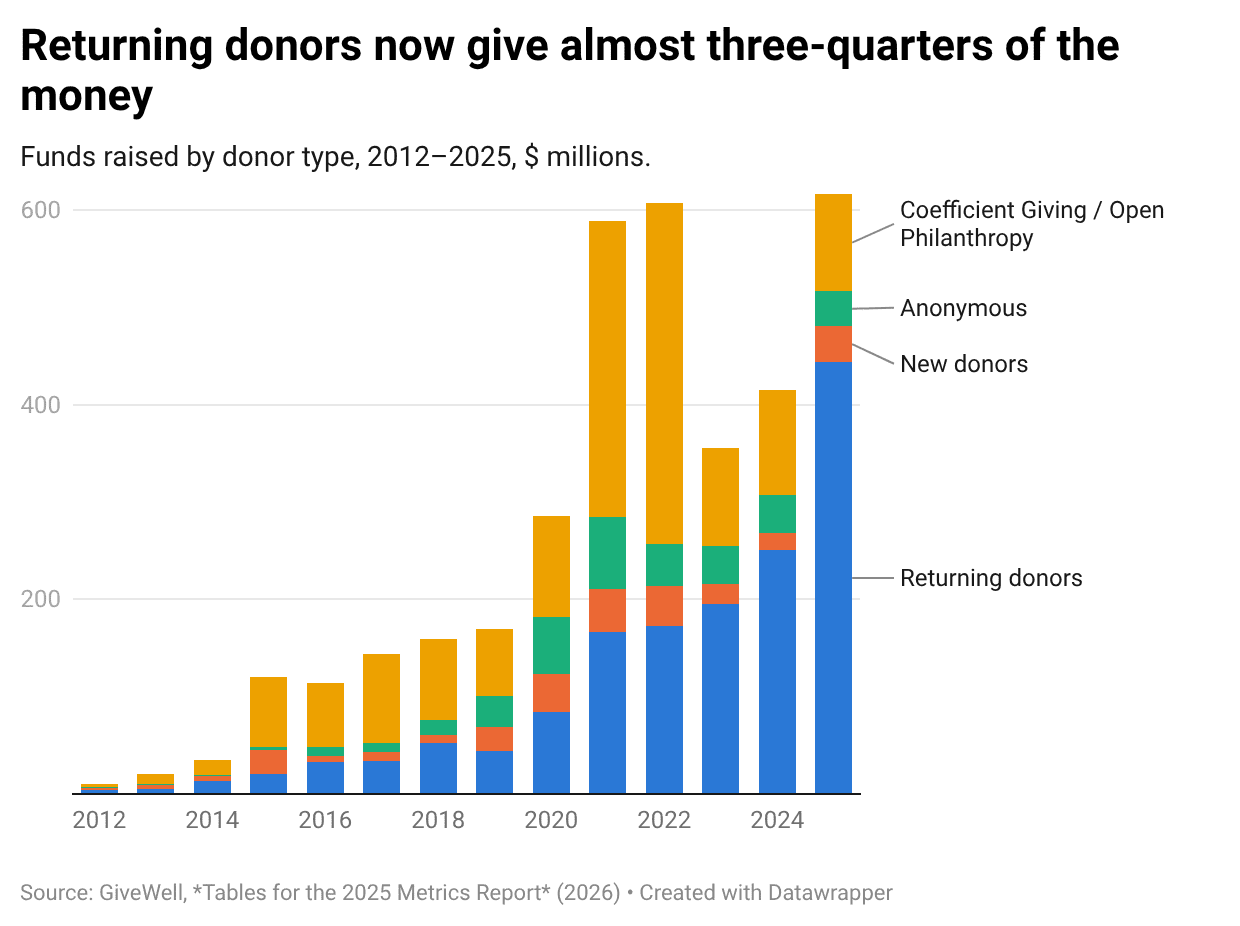
Edit from 2022: Consider checking the Forum user manual if you're not sure if something you're looking for might already be possible.
Hello, Forum!
This is Aaron and JP of the EA Forum team.
We spend a lot of time working on the Forum, and we’d like to hear your ideas for making it better. These can be new features or other kinds of requests.
Even if you don’t have suggestions of your own, consider upvoting ideas you like from the comments. That will have nonzero influence on the features we prioritize (though we also take many other factors into account).
If you’d rather make a suggestion privately, get in touch with us through this page.
Edit April 2022: This thread is still very live as you can see by the continual influx of suggestions. We have now synced our asana project with our public Github issues list, so you can see our recorded tasks there.[1] I'd still recommend suggesting features here so that other users can see and discuss them. — JP
Note: there's a delay between when we write tasks down and when they get triaged into a state that gets synced with Github.
It's still a crime that we don't support tables and it's a second crime that no one else has mentioned this yet.
They are supported in the new editor which LessWrong has currently shipped if you op into beta features (and I expect will go live for everyone by default in the next two weeks or so).
Awesome!
I'm stopping by to mention that this is now live: https://forum.effectivealtruism.org/posts/CMy2ueJ9WhZFNyBGs/ea-forum-update-new-editor-and-more
(Probably has been suggested before but thought I'd add): A small indicator for the original poster of the top-level post in the comments. Like the microphone on Reddit.
Came here to suggest this
Can we add agreement karma to comments on all posts?
Or all new comments at least.
By the way, this is now done
Footnotes are great!
One feature that would make then even greater is if I could copy paste text from a Google Doc that includes footnotes, and have them be formatted correctly.
Apparently, this is possible via a workaround explained here: https://forum.effectivealtruism.org/posts/Y8gkABpa9R6ktkhYt/forum-user-manual#Footnotes
It would very dramatically improve my experience of the Forum if there were the option to hide posts. This would mean that the first page of the Forum would always be posts that were relevant to me. As it stands, whenever I visit the Forum most of the posts which I can see are not relevant to me (perhaps because I've already read them and don't want to read them again or check in on the ongoing discussion), whereas posts which are relevant to me and which I would want to visit again are invisible if they are more than a few days old.
This feature just shipped. You can hide posts from the frontpage using the triple dot menu to the right of the post item. Let us know if you have any feedback. Thanks to trialing candidate Steven R for building it.
Many thanks! This will make the Forum a lot more usable for me.
Similarly, I would like for comments I have minimised to stay minimised between visits (unless there is a new reply in thread)
Yes, agreed.
You can hide tags, like the creative writing contest, from the frontpage, but if you scroll down those posts and their comments are visible (at least they do to me; maybe there is some way to hide them). It would be good if they could be entirely hidden.
And yes, it would be good to be able to hide individual posts (along with their comments) as well.
I’d like this too.
We should make it harder to manipulate your own comments' karma. My favoured approach would be to deactivate all voting on one's own comments. Also fine would be if by default, you strongly upvote and strongly agree with all of your own comments.
There was a good amount of agreement about this previously.
This has now been implemented. You cannot strong upvote your own comments, nor vote along the agreement axis.
Thank you!
As to whether voting on overall karma for one's own comment should be eliminated, I would prefer deactivating voting to a default strong-upvote, however a third option that I think might be better would be to default-normal-upvote and disable strong-upvote on one's own comment.
A fourth option (that I think I'd prefer the most) would be to retain the ability to strong upvote one's own comments while making the default for everyone normal-upvote or no-upvote (to preserve the ability to self-boost unusually important comments). Some other mechanism would be needed to prevent abuse of this.
For example, the mechanism could be that self-strong-upvoting only works if nobody else downvotes your comment.
Or it could be that you could only self-strong-upvote your comment if you strong-upvoted less than 9 in 10 (or whatever fraction) of your previous comments.
I think the key problem, both for upvoting and agreement-voting is that is that it hurts much more to have your comments in the negatives than it feels good to have your comments in the positives (and indeed, whenever I see a negative number, it feels really harsh and it does give me a sense that the community overall disapproves or disagrees with the content).
I think usually when a discussion is heated, I prefer the equilibrium where the two primary discussion partners have votes that cancel each other out, instead of an equilibrium where just all the comments are in the negatives.
This includes the case where the person you are responding to is strong-downvoting your comment, and then I think it can make sense to strong-upvote your comment, in order to not give the false impression that there is a consensus against your comment.
I don't currently know a good way to handle this. I also dislike the recent change to disagreement-voting for that reason, and would prefer a world where we also make agreement-votes automatically self-apply, since my brain definitely parses a discussion with everything in the negatives on agreement voting as "there is consensus against this" as opposed to "there are two people disagreeing".
I do think the thing where you can but don't automatically agree with your own post is confusing. Right now if I see something with one agree and one disagree vote it's ambiguous whether two other people voted, plus the comment writer surely agrees with themself, or if the one agree is from the comment writer so it's 1 to 1.
I think usually when a discussion is heated, I prefer the equilibrium where the two primary discussion partners have votes that cancel each other out, instead of an equilibrium where just all the comments are in the negatives.... This includes the case where the person you are responding to is strong-downvoting your comment, and then I think it can make sense to strong-upvote your comment, in order to not give the false impression that there is a consensus against your comment.
This problem won't arise if everyone strong-upvotes themselves by default.
The main downside to everyone strong-upvotes themselves by default in my view is that it punishes new users (or those with lower karma and thus weaker strong-upvotes) too much. Maybe this isn't that important of a factor?
Yeah, but I think the problem is then that in the case of comments the consensus seems actually too dominated by people's initial strong-vote, and arguing against Eliezer on LW with a 10 karma upvote would make it feel like consensus is heavily stacked against you in a way I also don't like.
Most people have strong upvote strength 3-7 though. Anyway, if this is a big problem, then just cap self-upvote strength around 5?
I mean, that would just make the total karma system in 90% of cases worse. For example I think it totally makes sense for posts by Eliezer to start with that much karma, since I think there is a strong prior that they are going to be pretty good.
I was thinking just for comments.
Ah, yeah, I think that's a kind of reasonable thing to do. My primary hesitation is that it's not super intuitive and adds complexity, but it seems like one of the reasonable ways forward.
I strongly agree about eliminating the ability to agree/disagree-vote on one's own comment. I expect everyone to agree with what they write by default unless e.g. they say they're playing devil's advocate. Giving people the option to agree-vote on their own comment just adds unnecessary uncertainty by making it so people can't tell if an agreement vote on a comment is coming from the author or another user.
I agree. This has been discussed for quite some time (it was first raised three years ago) so it would be good to reach a decision.
I'd like users to be able to attach/link a profile picture to their EA Forum profile, and that these pictures would be viewable next to their usernames in posts or comments. I think this would make the forum a bit more human and friendly!
I also like this idea. In addition to the effect you describe, I think it could help your eyes track the conversation more easily. It would also add more color to the site. Here are some reasons why I currently think it’s a little too much work. First, it’s more work than it seems, because the current layout of these comments feels very unsuited for slapping in all but the tiniest of avatars. So we’d need to substantially update the comments UI as well as build the profile upload. Also it makes the experience of engaging in the comments nicer, but my current guess is most of the value comes from people writing good posts and more people reading them. I don’t see the strong causal pathway between pictures and more of that happening. — Having written that, if it caused authors to find the comment section friendlier, I could imagine them having a smaller barrier to posting. OTOH, I could imagine authors being more intimidated by the “oh crap these are real people” feeling. I’d be curious to hear thoughts from authors.
Hey JP, thanks for your thoughts! When you're saying it's a little too much work, how many weeks are we talking about? I can understand how the profile upload part might take a bit long (1-2 weeks?).
For adding in the profile pictures beside author's usernames, I would think there isn't any big UI updating that has to be done there. It's only in the comments section that things might be a bit trickier. I've made mockups for my own suggestion here, including mockups for showing these on the frontpage, post header, and two different options for how to show pictures on comments. Even just showing pictures on the frontpage and beside the author's names in a forum post page would be great, if those are easier to do than adding on the comments.
But yeah it's good that you flag that the value of the forum comes from people writing posts and more people reading them. I'm also curious about what authors think on if they would prefer to have their face in posts, as well as if they prefer to see commenters' faces!
I think this has bad effects also. It’ll make the site appeal more to “normal” people, and look less serious. It also doesn’t give us any useful information, but take up real estate and use up attention. It might make groupthink more prevalent, too; I personally have found my thinking is most honest when I am thinking alone and don’t plan to share them socially.
Related to this what does our user research say that new users think about the forum? Do they think it is minimalist or stark? I guess we could learn this, particularly if we want EA to be more representative of the global population.
Yeah I think the EA Forum team could do usability testing on users if they haven't done it yet. Maybe they could do it on people interested in EA but have never visited the forum yet. I remember the first few times I visited the forum was quite daunting - long posts, usually no pictures on posts, no faces, and no onboarding.
I'm thinking that for users not logged in (which presumably means they're new to the forum?), they could be pointed to this article (maybe with some edits to make it a better first-read for new users): https://forum.effectivealtruism.org/about, and then they're encouraged to sign up in the end. A link to a short 2-5 minute video on the homepage about what the forum is and how to use the forum could work too.
I think some gamification for guided onboarding could work too, i.e. upvote your first article, upvote your first comment, message an author, write your first comment, write your first post, acquire x much karma (and get a badge)
Now that we have tags, tags could be part of onboarding and a more central part of the experience too. Similar to how Medium.com encourages you to follow or subscribe to certain topics.
But yeah I wouldn't want to speak ahead too much on feature suggestions without knowing what the user research and usability testing results are first! As a UI/UX designer myself, I'd much rather see user research and usability testing be done first. My experience in using the forum might not be representative.
I do actually quite like the UX mockups for the photo idea, which I think would have the positive effects already described (friendlier impression, easier to track comments). Here are two reasons I'm less keen:
Both of these effects are arguably present even in the current, text-only medium, but I think to a far lesser extent. I'm not claiming these effects would necessarily outweigh the benefits, but I think they're real and important, and on balance would currently cause me to lean against images.
(Separately, I'm pretty strongly opposed to gamification, which has a big effect on my behaviour in a way I virtually always think is bad for me. I think it's quite unlikely that the Forum will implement badges/achievements/anything of this sort except karma, but if they did I'd be quite mad. And I think it's quite important that karma is given by users in response to the content you add to the site, not the developers for jumping through hoops.)
Hi Will, I realize I never responded to some of these. Let me respond to them now:
My turn for a slow response.
I think you're more concerned with the effect of having images on a user's feelings about the Forum generally, while I'm more concerned with its effect on user's (differential) feelings about other individual users. I think there's a bit of a disconnect there that makes your responses not feel like they quite hit what I was getting at. I think you're probably right about the warm fuzzy angle with respect to users' impression of the Forum generally, but I'm not convinced this outweighs the inequitable effects on individual users.
Concretely, I think in a discussion between an attractive person with a good-quality, well-posed & -lit photo and a weird-looking person with a bad photo (or no photo), the former will be at a very significant advantage with regard to swaying the audience. This discriminates against several groups of people: ethnic or other minorities, poorer people, people with worse intuitions about self-presentation, etc.
The current setup of the Forum discriminates on the basis of writing ability, which has various downsides, but I predict the effect of photos to be much stronger and even less well-correlated with actually being right.
A bit more grumpy than I actually endorse, but a feeling I'm having here: The world is full of places where people are evaluated based on how they look. It's no bad thing to have some places where they are evaluated based on what they write.
Preface: I hate photos of myself and have been annoyed when past employers have required they be used in email profiles, so I get where you're coming from.
I may be unusual, but this doesn't match my experience with any discussion platform that includes profile pictures (Facebook, Twitter, Slack...). Profile pictures on these platforms are small enough that you'd actually have to expend effort (clicking through to someone's profile or at least hovering over the photo) to judge someone's appearance. (Though race and gender can usually be seen even at small scale, which I guess is something.)
I also think this dynamic, such that it exists at all, breaks down quickly when people use anything other than photos of their own faces. I assume all anonymous users would avoid photos, and that at least some other named users would do the same (including me). What ends up happening when an argument involves:
I grabbed these examples from four profiles that popped up quickly when I opened Twitter. And I think this kind of scenario will be much more common than "two people having a conversation where most onlookers would agree that person A looks nicer than person B, based on what you can see at a glance from their profile pictures". You'll get some instances of the latter, but I think that the effect will be quite small compared to the overall impact of having a warmer Forum with easier-to-track conversations.
I may be unusual, but this doesn't match my experience with any discussion platform that includes profile pictures (Facebook, Twitter, Slack...). Profile pictures on these platforms are small enough that you'd actually have to expend effort (clicking through to someone's profile or at least hovering over the photo) to judge someone's appearance. (Though race and gender can usually be seen even at small scale, which I guess is something.)
My own experience of these platforms is that someone's profile picture or lack thereof has a big effect on my impression of that person. (With Twitter > Facebook > Slack in terms of both size of image and size of effect, but I remember specific examples from all three platforms.)
This applies also to cartoons or other non-photo images. My clearest memories of this are from old Slate Star Codex comment threads, when almost no-one used photos but I was still very aware of my feelings about users being strongly affected by their images – and changing significantly when those images changed. As another example, my system 1 is often noticeably better-disposed toward people who use profile pictures which are nice drawings of themselves than it would be if they used the original photo.
It's possible I'm unusually impressionable here, but I currently doubt it.
Hey Will, no worries and thanks for the response! Yeah I think I updated my views a bit from some of these discussions I had with others on the Forum about whether it should have profile photos. I'm now probably just 50% in favor of the EA Forum having profile photos, whereas I was probably 80% in favor before.
I think a good compromise is maybe there are ways to make the Forum seem friendlier and more welcoming to newcomers without having to use profile photos. That's the problem I wanted to solve anyway. I see how profile photos can degrade the experience for more engaged Forum users, so maybe there are other solutions, but I won't try to talk about them here.
I think a good compromise is maybe there are ways to make the Forum seem friendlier and more welcoming to newcomers without having to use profile photos.
Definitely interested in seeing this explored more!
Dark mode.
Also seconded.
In the meantime, you can get pseudo dark mode with the dark reader extension.
I don't know if you've seen ea.greaterwrong.com - that has a dark mode (in the left hand menu).
Recently Less wrong has created this feature. C'mon EA Forum!
Co-authors on posts should also share the karma of the post. I don't know how they should, whether it's equal split, or some percentage of the whole (e.g. if there's 100 karma each person gets 75 or something).
(I noticed this on 1 account for a post the person had co-written ~6 months ago)
I suspect that many people don't post on the forum because they're worried about their post being poorly received and damaging their reputation in the EA community.
I believe this because I feel this way myself, because I've heard other people around me worrying a lot about posting to the forum, because Will MacAskill spoke on the 80,000 hours podcast of being anxious about their reputation being damaged after posting on the forum, and because of the existence of Aaron Gertler's talk "Why you (yes, you) should post on the EA Forum".
Perhaps, by default, new posts could be anonymous until a certain karma threshold (say 30 karma) is met. After that post meets the karma threshold, the true author of the post could become visible.
That way, authors could post knowing that their reputation wouldn't be damaged if their post wasn't well received, but that they would get the credit if the post was well received.
I'd expect this to increase the number of posts (both good and bad) from hesitant new users, and I think that the increase in the number of mediocre new posts would be a cost worth paying. It's good for people to contribute and feel valued for their contribution, especially if it encourages them to make more valuable contributions in the future.
I think it'd be important that the anonymous-until-threshold was the default (i.e. opt out), so that people didn't feel embarrassed about using it.
Do people not find it viable to post under a pseudonym? Is your worry about coming across as dishonest?
I do think pseudonymity is the right way to solve this. It's plausible that we might want to make name-changes easier, so if you create a pseudonymous account, you can later take ownership over it more properly, if it turns out to not have embarassed you.
Meanwhile, name changes aren't yet easy, but I'm happy to change a username if you ask! I can also transfer a pseudonymous post to your "real name" account if you have one and want to take ownership.
I'd like to see the experimental sequences feature rolled out to all users.
Soon™️
+1 on this, and on curated posts. (As also discussed here).
I'm stopping by to mention that this is now live: https://forum.effectivealtruism.org/posts/CMy2ueJ9WhZFNyBGs/ea-forum-update-new-editor-and-more
Inspired by an EA Melbourne planning event yesterday, we came up with concept of having a subtle but visible visual tag for posts/replies by folks who are in the same city as you (opt in option in your profile), to help build more in-person community and potential collaboration.
This is a really nice idea, thanks!
Something which has come up a few times, and recently a lot in the context of Debate Week (and the reaction to Leif's post) is things getting downvoted quickly and being removed from the Front Page, which drastically drops the likelihood of engagement.[1]
So a potential suggestion for the Frontpage might be:
Maybe some code like this already exists, but this thought popped into my head and I thought it was worth sharing on this post.
My poor little piece on gradient descent got wiped out by debate week 😭 rip
In a couple of places I've seen people complain about the use of the Community tag to 'hide' particular discussions/topics. Not saying I fully endorse this view.
This is a problem we have thought about, and personally I think it is quite bad, in that it causes a lot of randomness in which posts get past ~10 karma. We agree that essentially showing new posts to more people is the answer (even if they start to get downvoted).
The fairly standard solution in recommendation algorithms is to view this as an explore/exploit problem, and to add some randomness to tune the tradeoff between then (see Bandits for Recommender Systems). This would mean each user would get a slightly different ordering of the list (stable per user) in order to make sure each post gets an appropriate number of views (based on the quality signal we have so far).
Here's an internal doc with our plans on this. We may not get to it that soon, because of giving season and other stuff, but it is one of our priorities after that.
Hide the vote score of all new posts
I'm not that optimistic about this. For algorithm purposes the thing that matters is the number of opportunities a post gets to be voted on (~views) before dropping off the frontpage. Presumably the theory here is that seeing post has low karma makes you less likely to view it and/or biased towards also downvoting it.
Based on my own experience I don't think this is the case. If I see a 0 to negative karma post on the frontpage I think I'm more likely to click it out of morbid curiosity, and then if it's at least ok I'll upvote it because I think the current score is overly harsh. I know a lot of people apply this logic about voting (correcting the current score rather than applying a fully independent judgement), and we generally endorse this.
Some consideration should also go to engagement - some metric related to either number of votes or comment count
I think this is a good idea (thinking about comment counts specifically), although I agree it could be prone to going wrong, e.g. making doom threads even doomier. One solution I can think of is to give a boost for comments but only up to a fairly low cutoff (say, 6 comments). Thoughts on this?
For a ~20 karma post I think having 5+ comments is a good signal that its a valuable-but-niche post.
Digression but I would recommend reading about Thompson sampling :) (wikipedia, inscrutable LessWrong post). It's a good model to have for thinking about explore-exploit tradeoffs in general.
- Some consideration should also go to engagement - some metric related to either number of votes or comment count would probably indicate which posts are generating community engagement, though this could lead to bikeshedding/Matthew effect if not implemented correctly. I still think it's directionally correct though
I think number and weight of upvotes (not netted against downvotes) is an important criterion here, especially when it comes to the risk of controversial material getting buried before most users have a chance to see it. I think this may be practically much the same as what you're suggesting.
Having recently wrote a post that got a lot of silent downvotes, I've been thinking more about the general role of silent downvotes and how we could mitigate their downsides. (See some earlier discussion here.)
Silent downvotes are important for content ranking/visibility and providing a rough high-level signal of what the Forum community values/disvalues, but they have some pretty important disadvantages, especially when they represent a preponderance of a post's karma:
There's already a feature that allows authors to hide comment karma on selected posts. I'm not sure entirely how it works, but I think it means that if the author chooses, nobody can see karma scores on that post?
That might be what some authors want, and is maybe preferable to seeing lots of silent downvotes, but at least for me it seems way worse than seeing downvotes and knowing why. I want to be able to make that update, but it's often hard to do that based on silent downvotes alone.
It would be great to get more information from people about their downvotes, but any system for doing that needs to be super quick, simple, and easy – if a silent downvoter had time/energy/interest in providing an in-depth explanation of their downvote they'd just write a comment. But I think getting even a couple of bits more information from silent downvoters would be super valuable to authors.
The solution I have in mind for this right now is to provide a little optional pop-up next to the post karma total with a few common reasons for downvoting, plus an "Other" option (with or without the option to specify). You'd probably want to iterate a few times on the options, but my first pass would be:
Then show the results to the author somehow (e.g. on the analytics tab).
You could also do this for upvotes; this might be nice and would reduce asymmetry with downvotes, but I'm not too concerned about it. You could also extend it to comment downvotes, though this seems lower priority to me.
I'm guessing a new feature like this would be a fairly significant lift code-wise, but I tentatively think it would be worth it – right now I see this as a fairly big problem with quality of discourse and community on the Forum.
You might be interested in providing feedback on this mockup from LW (which the EA Forum might implement, if they develop it)
I forgot to respond to this!
Thank you for the link. That mockup is in some ways very close to my suggestion, which is exciting, but in some ways importantly different.
Level 3 headings should be supported. Unless it's changed recently, it currently jumps from Level 2 to Level 4, which makes it hard to logically format complex documents.
Strongly agree with this, have been very frustrated in the past with how the Forum (via LessWrong) coerces my header usage.
It looks bad in the sidebar too.
It has. We no longer apply the same styling to h2 and h3. While you still can’t create h3s using the editor, you can paste in from google docs and they will appear correctly. Sorry for not mentioning this anywhere, it’s such an invisible change — I don’t know what I was thinking.
(Unfortunately, I will need to remake this change once the new editor ships. LessWrong does not want its posts to have more than 3 levels of headings [h1, h2 and bold text]. I don’t think that’s the right choice for the EA Forum, but sometimes their updates won’t be checked for compatibility with minor features of the Forum).
The new editor has shipped (still just to beta users) but I have just reintroduced h3s.
H3s are still being converted to regular Paragraph format when I paste them in from GDocs. What am I doing wrong?
H3 headers should be available again soon; the feature broke after a recent migration.
I had the same problem when posting a few days ago.
Though I think level 3 headings work for me if I use the markdown editor (e.g., a paragraph that only has "### How often have people been wrong about such things in the past?" will show up as a level 3 heading).
And when I just put a sentence fragment in a line by itself and in bold, it at least showed up in the sidebar as if it was a level three heading. (Well, one of them didn't initially work, but then I fixed it somehow - I think the fix was simple, but can't remember.)
When a user moves a controversial post to drafts, other readers get worried of censorship. Two recent examples: https://mobile.twitter.com/erikphoel/status/1559527499188654085 https://forum.effectivealtruism.org/posts/sD4kdobiRaBpxcL8M/what-happened-to-the-women-and-effective-altruism-post?commentId=GpSneam3oSwaBYDWH
It might make sense to tweak the prose. Maybe let moderators add a reason, like for deleted comments (e.g. "spam", "moved to draft after a request from the author"), and for users write "the author of this post marked it as a private draft"
Thanks for this suggestion and for the examples. I'm going to add this to our list, I do think something better than "this page doesn't exist" is probably better.
Any thoughts or updates on implementing "two axis" voting? This feature is described here.
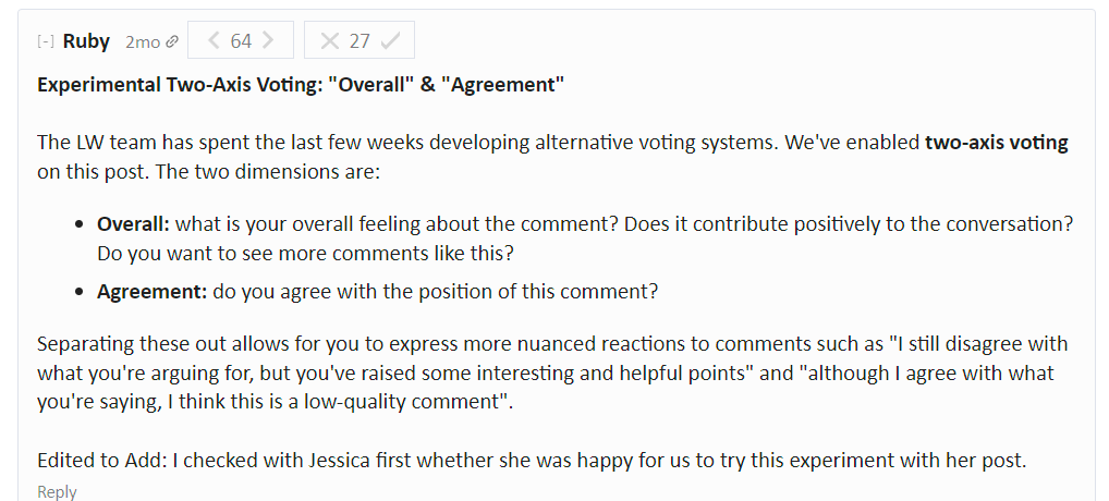
I don't really want to add pressure or pull things forward, I just wanted to check if there were thoughts on this.
For more context, the post below is a situation where this was useful :
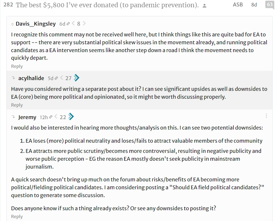
The above shows one comment chain where a good idea seems to be downvoted because of disagreement, and not content.
Basically, I didn't like (and really many others as well) how several comments in that post were treated voting wise, even if at the same time, we disagreed with the actual content.
It seems possible this could be alleviated by the two axis voting.
BTW I also really like a bunch of other features and I have ideas, but basically you don't want to get me started.
Expose "voting tribes" in the comments.
We could run a similar algorithm to X's Community Notes. Then, on contentious topics, we could easily see the main axis of disagreement. We could also have a comment sorting option, that upranks those upvoted by people from both sides of the disagreement.
See this thread for discussion and corresponding post for algorithm description.
Option to @mention usernames.
Should have something like an autocomplete and an opt-out-able notification/mail whenever one is mentioned.
Effective Animal Advocacy (EAA) forum
EDIT: I made this suggestion into an EA forum post so I deleted it from here to avoid duplication. The post contains the text that was originally here.
I'd like the Forum to support superscript and subscript.
This is also supported in the new editor.
While these are supported in the new editor, users can't access the functionality yet. However, subscript is currently possible in Markdown:
Adding subscript to my post
You need to start the subscript with a tilde, then put a backslash after every word but the last word (the closing tilde goes after the last word).
For example, see lines 2 and 14 of this file.
An automatic jargon-explainer for commonly used jargon. This gets the best of both worlds, for readers and writers. People can use jargon more often,[1] and not have to worry about it not landing with readers. And readers unaware of the jargon can hover over the word to see what it means, while readers who already do know can keep reading. Makes it easier to read for people within a wider range of inferential distance.
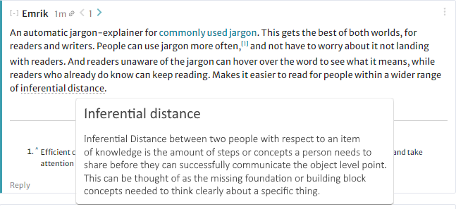
Efficient communication without having to link to each jargony word, since that might get distracting and take attention away from links they do want to emphasise.
This is really a fantastic suggestion, and complete with a screenshot with the UI that I like. Thanks!
Perhaps it's not clear whether adding agreement karma to posts is positive on net; but I think perhaps it would be worth adding for a month as an experiment.
A counter-consideration is that many voters on the Forum may not understand the difference between overall karma and agreement karma still. Unconclusive weak evidence: This answer got 3 overall karma with 22 votes (at some point it was negative) and 18 agreement karma with 20 votes:
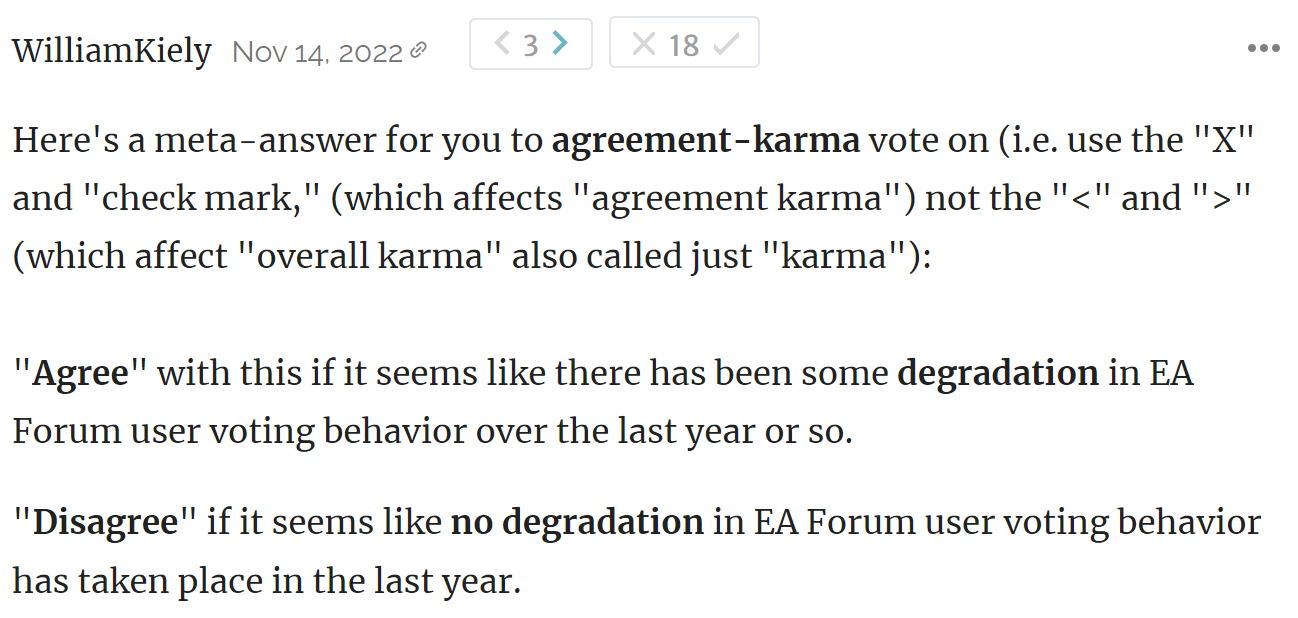
(It's unconclusive evidence because while the regular karma downvotes surprised me, people could have had legitimate reasons for not liking the meta-answer and downvoting it. My suspicion though is that at least some people down-voted this in an attempt to "Disagree" vote in the poll.)
I agree that maybe people don't get it (like kinda me) but I think both things, posts and comments, should have it or neither.
Something that came to mind after reading recent posts by Ulrik and Sarah, along with the reaction to them - Can we do better at distinguishing downvotes and disagreevotes?
In my mind, I view downvotes as saying:
Whereas disagreevotes are saying:
I think my concern is that the first two bullet points under 'downvotes' seem very different from the bottom two.[1] It feels, to me, that we rarely see posts that are highly upvoted but also have significant disagreevotes.
So I don't have a solution for this apart from some half-baked ideas, but wonder what the Forum team's perspective was?
I think in part I'm questioning whether the last two are valid uses of the downvote button.
Two notification-related suggestions:
Related to this:
Is that the intended behaviour? I find it quite jarring
Thanks for flagging these! And sorry for the delayed response. :)
I think the EA Forum should allow authors to pick one of the images they attached into their post as the "preview image" when the post is shared on social media sites like Facebook and Twitter.
I don't think this feature currently exists, and I think it would help drive traffic to the EA Forum whenever posts are shared. I'm assuming that the authors would link an image that is more enticing than the standard EA forum logo, which would result in slightly higher click-through rates. Medium.com and most other CMS's allow you to pick a preview image. I think Medium.com's UI for picking a "featured image" is a good example of how to design this feature.
Adding to the better preview image for twitter, I notice other sites have top quotes from the article as a cover image, which I think is pretty interesting.
(probably not worth implementing, but just for inspiration really)
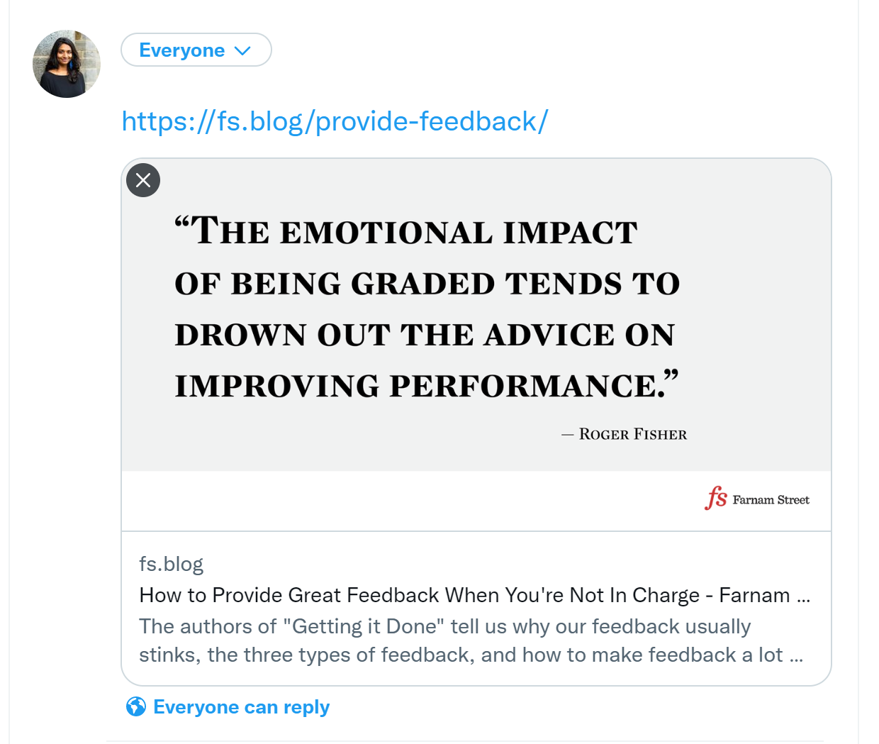
Thanks! No worries about suggesting "inspirational" features.
I am reasonably confident that we use the first image that is used in a post as the preview image, so you can already mostly do this.
Hm I tried linking a recent EA Forum post with an image (image is at the bottom) just now on Facebook, and the EA forum photo is still the one showing up. I tried running it via the Facebook sharing debugger and pressing "Scrape Again", but it still shows the same photo.
Huh, you're right. I will look into it.
1. Could analytics be displayed on the forum? I think it'd be interesting to people to see how many people read different posts. This is also related to the question re: the forum prize - I reckon many authors would be more motivated by seeing that their posts are widely read than by a cash prize.
2. I often see very long posts that jump right into the introduction without summary. Could one introduce a field that is mandatory if a posts is more than 300 words long that forces the author to provide a 200 characters (or so) summary? Or something like this:
https://www.elsevier.com/authors/journal-authors/highlights
could even be added by the mods.
On (2), we've considered adding a summary field in the editor, but I don't think we'd make it mandatory unless we did so for a much larger character count. Whether or not we eventually implement that, I encourage anyone reading this to include summaries in their long posts!
Thanks for providing the Elsevier link -- I could imagine us linking to that as an example of how one might compose a summary.
On-site image hosting for posts/comments? This is mostly a minor QoL benefit, and maybe there would be challenges with storage. Another benefit would be that images would not vanish if their original source does.
I'm stopping by to mention that this is now live: https://forum.effectivealtruism.org/posts/CMy2ueJ9WhZFNyBGs/ea-forum-update-new-editor-and-more
For Shortform:
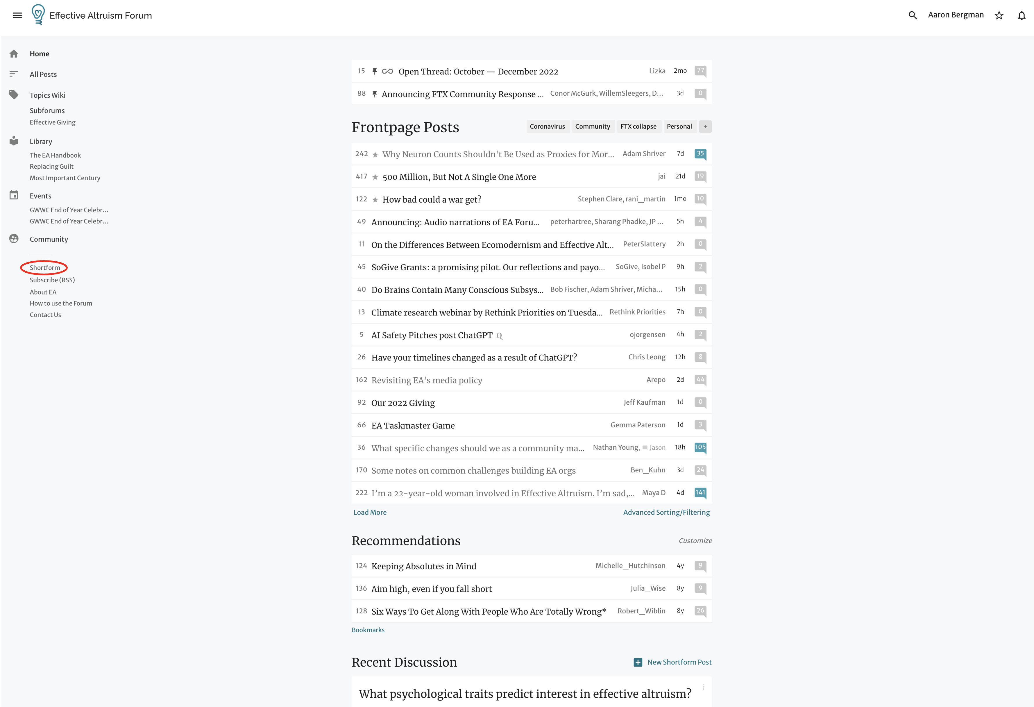
Thanks for the feedback! I do think we want to rethink our information architecture once we hire and onboard a designer, who is coming soon!
I'd like to have the option to make polls within a post. I recently wrote a short question post to see if an idea seems promising and I got a couple of upvotes and no comments. Having the option to get quick and cheap feedback from the community would've been useful.
The bucket this falls in for me is ... Widgets! I really want to make widgets. For example, making it so authors could add a button to donate. This is planned, but not concretely.
In case you haven't seen it, I created the Facebook group Effective Altruism Polls for this use case. Response rates are generally pretty high!
"agree/disagree" for posts, not only comments.
Might reduce downvotes on posts
The story of how it got that way is that agree/disagree was originally built as an experiment-with-voting-systems feature, with the key component of that being that different posts can have different voting systems without conflict. (See eg this thread for another voting system we tried.)
The main reason for hesitation (other ForumMagnum developers might not agree) is that I'm not really convinced that 2-axis voting is the right voting system, and expanding it from a posts-have-different-voting-systems context to a whole-site-is-2-axis context limits the options for future experimentation. In particular, there's a big unresolved fundamental issue in how votes conflate positivity with engagement, which I really want to solve some day.
On mobile, I think there's no way to remove your vote on your own comments. On desktop, I can just click my vote again, but on mobile the normal workflow is to tap to cycle between normal / strong / no vote, and I can't strong upvote my own comments, so I get "stuck" in the cycle.
edit: ok I think you can do it by just going through the cycle quickly enough, but I definitely struggled with this before, perhaps it depends on the latency of your connection to the server...
It could be cool if the EA Forum allowed for boxes of text that start off collapsed but can be expanded, in the way that e.g. Gwern's site does (here's a random example). This could be used for long sections that the author wants to signal (a) are sort-of digressions and/or (b) may be worth skipping for some people.
There are a few things authors can already do that serve a similar purpose:
But the first two of those options seem to less clearly signal "We really think fewer people should read this than should read the rest of this post", compared to having a collapsed but expandable box of text.
And the third option might sometimes signal that too strongly, and also doesn't allow things to show up when you use the Forum's search function.
And the fourth option doesn't seem to work well for fairly long sections of text; more than a few paragraphs in a single footnote would be unusual and might be a little annoying (due to the small text). Also, that would remove the option of the author including footnotes within that section of text.
(I originally raised this idea here, in the context of whether it'd be best to include full transcripts from 80k podcast episodes when link posting them to the EA Forum. I think it could make sense to include the transcripts as collapsed but expandable boxes of text, so that terms from the transcript will appear when doing searches on the Forum - which wouldn't happen if the transcript wasn't included at all - but people don't feel like they have to read the whole transcript before they comment on the post.)
Yeah, I generally want to have a bunch more interactive elements in posts. This was historically blocked by a bunch of improvements we were making to our editor, but that is now done, and I hope that soon we can make a bunch of improvements in this space.
A emoticon or image next to someone's first post either on the homepage or when you click into the post so that people know that they are engaging with a potential newcomer and maybe are nicer / more welcoming?
Could be obvious downsides to this I haven't thought of
I like this idea. Lots of other Forums have it, but we don't even have it in our task tracker yet. Thanks for the suggestion!
Can I opt out of Forum favourites? I'm sorry but I hate it
Variant of Korthon's comment:
I never look at the "forum favorites" section. It seems like it's looked the same forever and it takes up a lot of screen real estate without any use for me!
I just updated this section and it now shows randomized posts.
Same is true for me (as the person who built the feature). On LessWrong the recommendations are randomized but for some reason on the EA Forum the admins/devs decided to always have them be strictly ordered by the latest highest karma posts you haven’t read, so they never change, and inevitably end up in a configuration where you’re not interested in any of the posts.
I agree, I think the Forum has enough very-high-karma content now that randomising it here as well would be a good idea.
I also don't like this feature, although we should be aware that this feature is most helpful for new users, and new users are probably under-represented in this thread.
I agree it isn’t great. This was slated for a redesign, but then I deprioritized it. I should probably revisit what the right thing to do is. I’ve been meaning to randomize it, as Habryka mentioned. (I want it to not be randomized when you're logged out, which is why it’s like this. It’s supposed to be a way for newcomers to see the best of the Forum, so they don’t get lost in the weekly churn.) Maybe just randomizing it for logged-in users would be enough, but an option to hide it seems good, if more work.
Promoting shortforms to top-level posts, preserving replies. I wanted to do that with this, because reposting it as a top-level post wouldn't preserve existing discussion.
A commenter on this thread said it should have been a top-level post rather than a QT. Throwing in my vote for this feature.
Thanks for the suggestion. We've thought about this for a while, and I agree it's a good idea. Given the lack of a huge amount of use of the shortform feature, my guess is it's not winning the prioritization battle. But I've noted this as bump to the request.
Display a more detailed breakdown of karma and agreement karma by number of upvotes and downvotes rather than overall amount.
I think that the weighted voting system is counterproductive overall (it creates perverse incentives, it ascribes false authority to users who are more prolific or who may have expertise in one area and poor understanding in others, and it is needlessly undemocratic) and makes it harder to meaningfully understand the karma of a given post or comment, but this could go someway in making the actual impact of posts and comments more legible. I think there is a difference between how to read agreement karma for a comment that has 10 agreement karma overall from, say, 8 2 point upvotes and 2 -3 minus point downvote versus one that has 10 1-point upvotes, and the breakdown of how a comment achieved its agreement karma is not currently legible, which makes agreement karma a much less useful indicator than it could be otherwise.
P.S.: Similar suggestions have been made below on how the karma and voting system can be tinkered with to make it more meaningful, but seems different enough to warrant a new top-level comment.
I agree. I'm amazed how quickly I have gone from adding 1 Karma to adding 4 now. Maybe voting could only be enabled after a certain amount of engagement, but it does feel undemocratic.
Same here, I actually wasn't aware of weighted voting until I noticed I was able to do it. I don't think there's a problem with voting (even voting + flat rate strong voting seems perfectly reasonable to me) by weighing votes according to karma seems very high cost to very little or no gain
Couldn't see if someone already suggested this but:
I’d like this
I noticed that adding a tag to a post in draft mode now automatically adds the parent tag. But it's not clear to the user why two tags are being added at once. This also contributes to the overtagging of posts.
On Wikipedia, the guideline is to tag pages with the most specific categories they belong to. So if category B is a child of category A, then pages that belong to both A and B should only be tagged with B, whereas pages in A \ B should only be tagged with A.
In general, I think the EA Forum should be more thoughtful about tags. If we want to replicate what Wikipedia does, one possible approach is to automatically remove a parent tag from a post when a user adds a child tag to that post. However, this messes with the voting mechanism of tags. A less disruptive approach is to hide parent tags by default when both the child and parent are added to a post (or hide the child tags if the parent is a white tag), and then allow the user to expand the full list of tags.
Thanks, I think think this is good feedback. I recognize the way parent / child tags work now isn't ideal. We'll have to prioritize improving this against other things we could work on!
When LessWrong posts are crossposted to the EA Forum, there is a link in EA Forum comments section:

This link just goes to the top of the LessWrong version of the post and not to the comments. I think either the text should be changed or the link go to the comments section.
Hi there, as a fellow EA, developer and avid creator of Userscripts, here are my thoughts on first seeing the site.
The design is very different from other online communities. This makes for an awkward first impression, users like familiarity in their UI.
I believe the gold standard for forums are Reddit, Facebook, StackOverflow, Discourse. By gold standard I mean some of the best minds in software UX works on these site. I particularly love Discourse.
This is a forum, yet there are no topics / subtopics. It tries to do too much in one place. I don't think questions, articles and events belong in in the same listing. I am aware of the filters, my criticism still stands :-)
Everywhere I move the mouse I'm assaulted by a popup. Why do you hate me? :-D
Infinite scroll / load more adds uncertainty to the UX. It's hard to track context, I can't tell if I click somewhere all my "progress" will be lost.
Gray on gray! No gray background please!
Titles are long, yet the columns are narrow.
The comments font looks bold, it should be lighter.
Some pages have too much info. "How to use the Forum" shouldn't have a pages long comments section, specially with unrelated discussions.
Still, thank you for taking the time in trying to innovate and contribute to the OS community!
Thanks for the discussion here. Your suggestions seem to be a mix of preferences, some generally pervasive design patterns, and some content curation-type suggestions (eg with your reference to the vuejs forum). The Forum team is hoping to hire our first full time designer soon, and we're hoping this will help us bring a more specific set of opinions to various layers of design on the Forum.
Alright, here is a very crude preview
https://openuserjs.org/scripts/icetbr/Clearer_EffectiveAltruism.org_Forum
It does sadly look very broken for me:
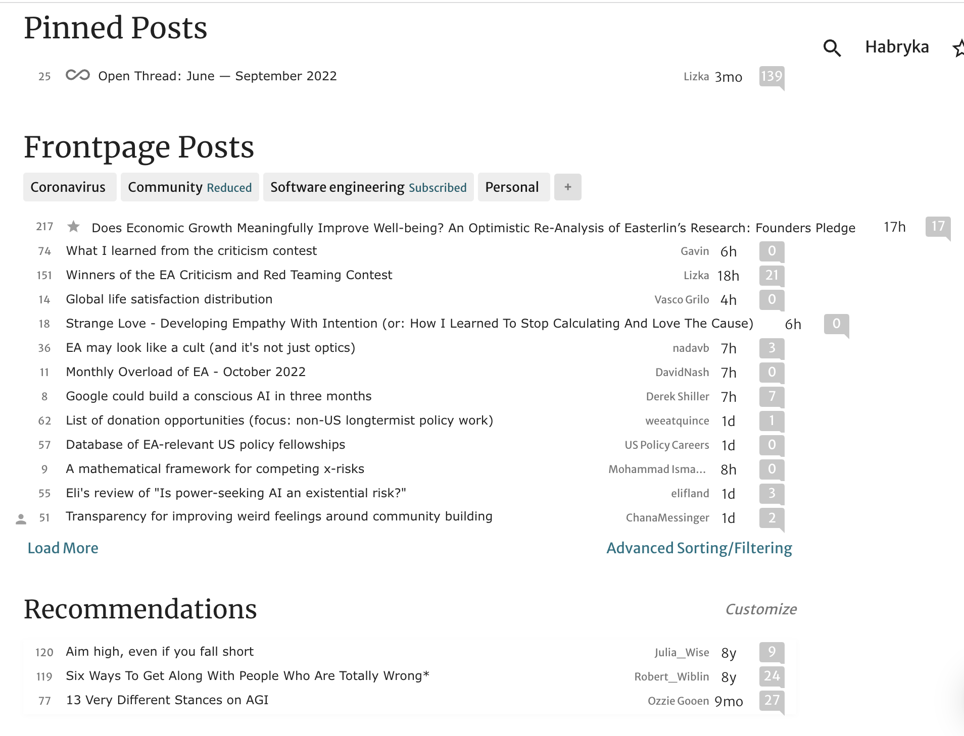
It does look better on the all-posts page:
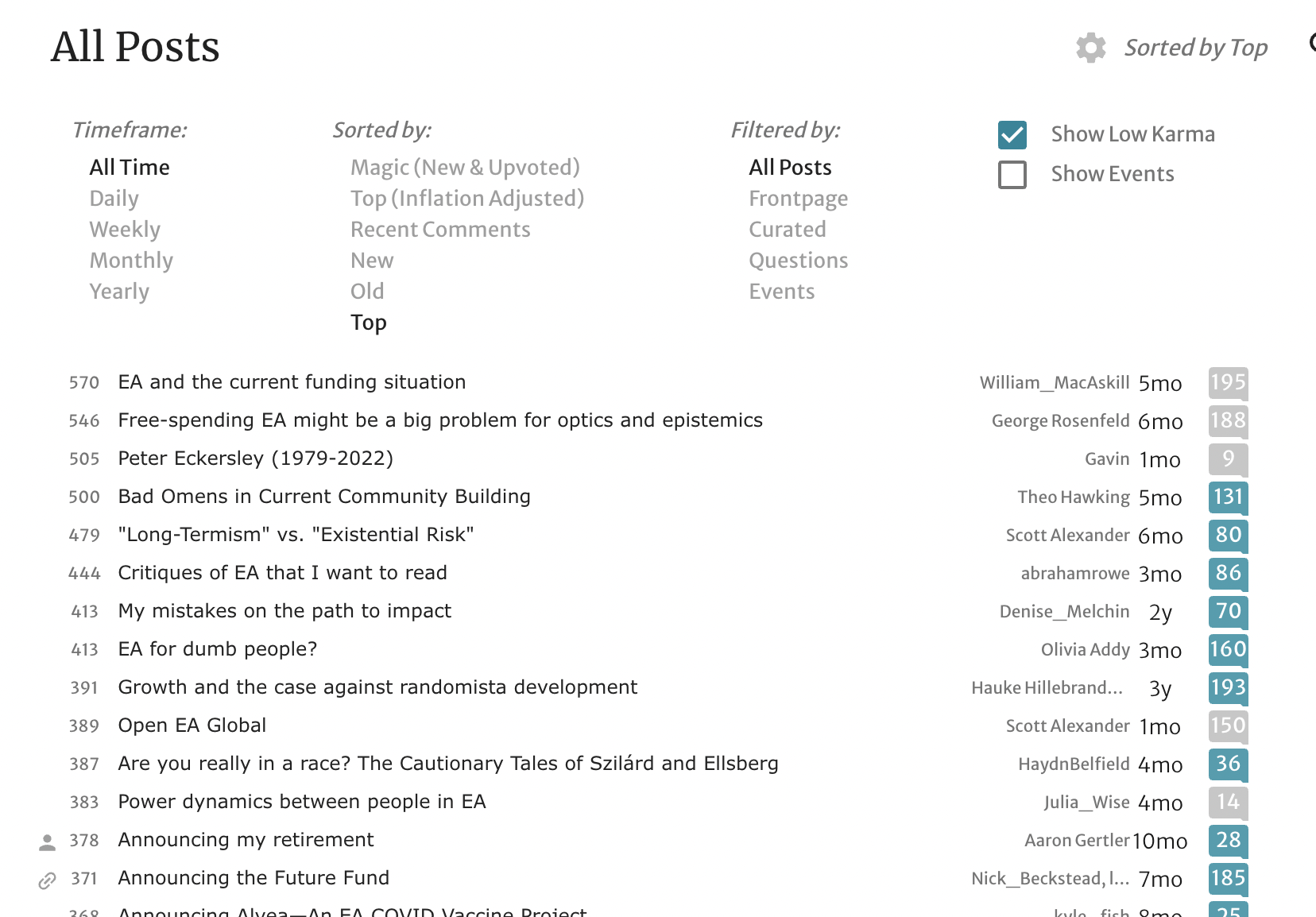
Some thoughts
Yeah, it messes up a few other pages as well. To be fixed.
I think the site needs a dark mode. More and more people are favoring it. I use my monitor in a nearly yellow tone, redshift -O 2800k so I like the white background just fine. I can't get behind the gray background though. I mean, how many sites does that? I find it harder to read.
The font I used could be one size larger, I did made an alternate screenshot to compare. Yet research suggests the current font size, not the one from my script, is ideal. I still favor higher density, as I can analyze the content faster.
Regarding skimming, I read titles by rows, not lines. I think we've been conditioned for this. Just look at Reddit or Medium. I find it easy to read a few words and skip to the next row. The title is too important to be trimmed away, I would sooner hide the author, date an comments count. I think it's very hard to find a site with this few characters in a title.
I haven't used the site enough to give a proper opinion on the icons. I think they either should be used more or hidden altogether. But I mix my feelings regarding topics, something I didn't touch yet. They will either be on the left of the title, on the end of the line, or below the titles, in a smaller font. I can't tell you how much I want to see 50 titles at a time and instantly know where they fit. Blue tagged AI, green tagged Animal Wellfare, etc.
I plan on enhancing my script as I spend more time here. It might take a while. I mostly wanted to take a feel if my experiences are in line with others. I'm happy to keep my preferences as a userscript and give the users another choice.
I think the site needs a dark mode. More and more people are favoring it.
The site already has one! Or more precisely LessWrong has one, and it probably wouldn't be too hard to adapt it to the EA Forum (which shares a codebase).
The font I used could be one size larger, I did made an alternate screenshot to compare. Yet research suggests the current font size, not the one from my script, is ideal. I still favor higher density, as I can analyze the content faster.
I am generally skeptical of research in this space, but yeah, the current font size is what seems to work pretty well in user tests I've done. I do also think sometimes it makes sense to have more density and smaller font sizes (and like, comment text is already almost that small)
I can't get behind the gray background though. I mean, how many sites does that? I find it harder to read.
I mean, how about Reddit?
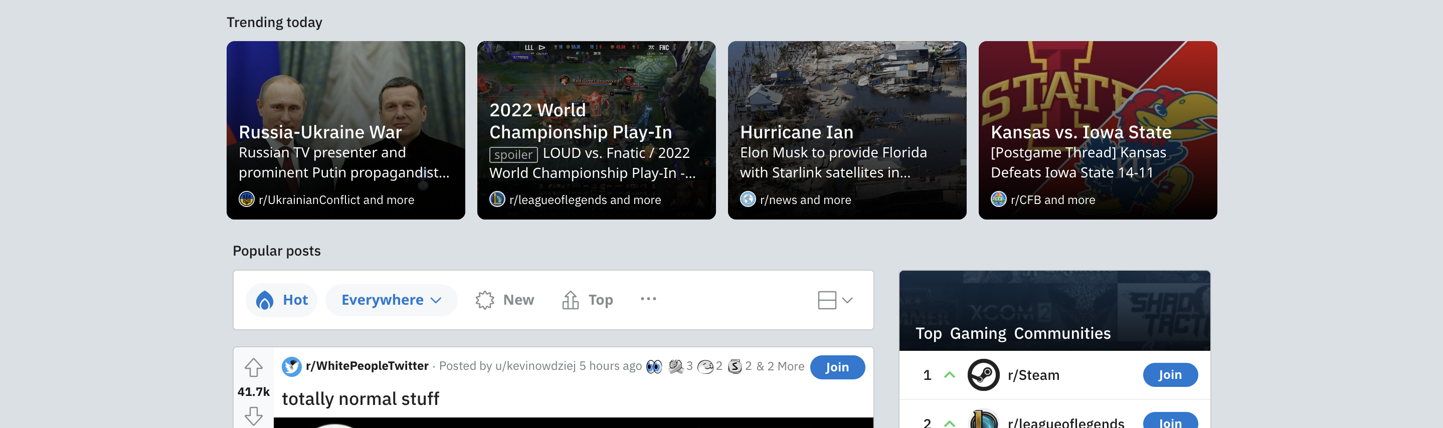
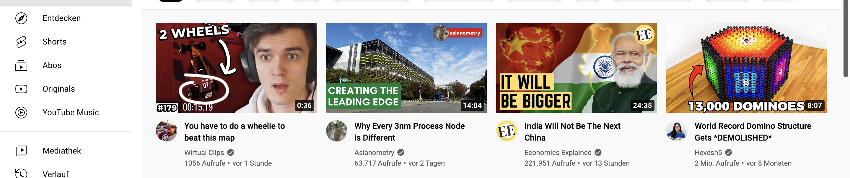
Or how about Youtube (the background of the videos):
Or how about Facebook:
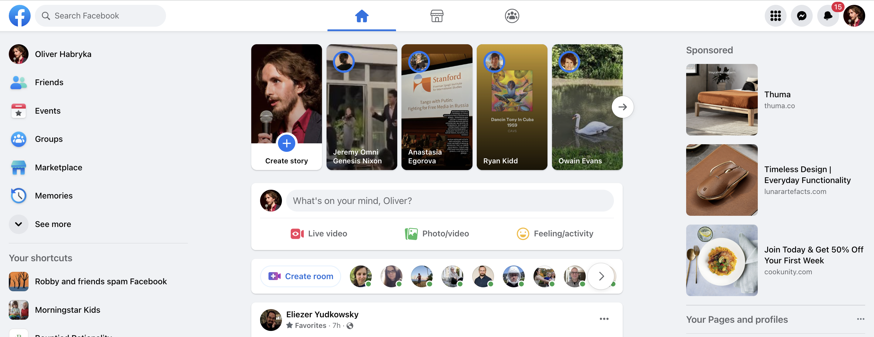
The pattern of "grey background with white boxes in front, occasional header or nav element on the grey background" is as far as I can tell the standard pattern to reduce eye fatigue while also ensuring high text contrast. I actually can't think of a content heavy site that doesn't do this.
I'm confused why the all white background is better, grey is easier on the eyes and the non-white color gives a natural framing to the other content. Both points seem pretty normal in design.
I disagree that those other sites are superior. Also a major issue is that they use visual/video content (reddit and FB) and have different modes of use/seeking attention. They are designed around a scrolling feed, producing a constant stream of content, showing 1-3 items at a time.
Setting the above aside, I'm uncertain why your changes reflect ideas from them. For example, your changes to text, make posts much more compact than Reddit or SO.
"Grey is easier" I don't think it is. Would you disagree that most publications use a white background? Could you provide at least some examples of ones that doesn't?
"I disagree that those other sites are superior." We would have to define superior. For me, the best (most well paid) minds in UX + the most number of users are objective measures. That doesn't mean we have to copy them, but it beckons to the familiarity factor.
I agree that they have a constant stream of content and this matters on design. What use is to have 50 compacted posts that I can scan in 1 second, if we have 30 posts a week? It is unfortunate that we don't have a higher traffic. I believe in reducing barriers of entry to help on this, and making a familiar site is but a very small of those.
To your third point, open a screenshot of my version, the current design here and any of them. See you can spot the ideas I try to incorporate. I don't know your background, but I can give you a a technical response. Fonts, spacing, that kind of thing. I basically copied the typography from them, while keeping the site identity and adding a few of my preferences.
Please note I did that in about 4 hours of work. The gross of it was very fast, some details took very long. 1 hour I spent fighting the pop ups before deciding to disable them
"Grey is easier" I don't think it is. Would you disagree that most publications use a white background? Could you provide at least some examples of ones that doesn't?
I checked two sites that you listed, FB and StackExchange, and they literally use a grey/off white background. Started with these two and I stopped after checking these two, I suspect I'll find more.
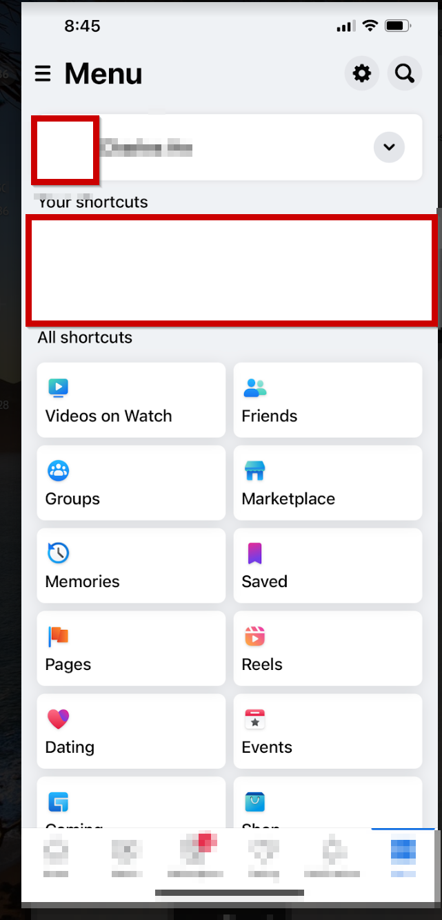
https://ux.stackexchange.com/questions/101876/why-not-use-darker-backgrounds-instead-of-white
The stackexchange site literally answered this very question and one answer pointed out that the very site is off-white (although less than grey or the EA forum). The top answer here supports grey backgrounds: https://ux.stackexchange.com/questions/23965/is-there-a-problem-with-using-black-text-on-white-backgrounds?rq=1.
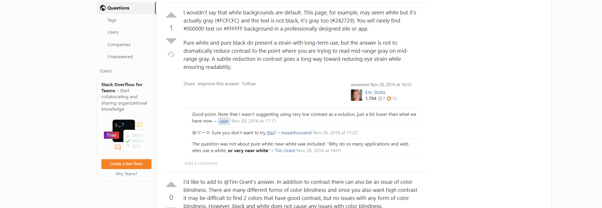
Before I thought this opinion about the use of grey (and avoidance of high contrast) was normal/standard before. Now I'm even more sure, and not knowing/ opposing about it seems sort of strange to me.
"I disagree that those other sites are superior." We would have to define superior. For me, the best (most well paid) minds in UX + the most number of users are objective measures. That doesn't mean we have to copy them, but it beckons to the familiarity factor.
There's a lot going on here, but IMO neither of those things make this view very promising. This is because they are designed for MAU/growth hacking and the audience is different (and I don't think this is some elite or niche thing). Also, since the business is multiple billions are year, you naturally get top talent.
As an analogy, tabloids are popular and well designed for their audience, but that doesn't make them dominant design choices. I do agree that the design on average is good and things work for those sites.
Also, I suspect some design choices from those sites have dependencies—I think having an infinite scroll or video or picture focus would affect other design choices, such as size/position/font of text, so copying those design choices to a forum might not be appropriate without more sophistication.
I don't want to be disagreeable or press too much here on you here. Honestly I want to learn about design and different perspectives, but I don't think I am?
Some of the other things you said suggested you have strong views that seemed more personal and also that you use some unusual color filter? This makes me speculate that you are applying a personal perspective disproportionately and ignoring "the customer", but maybe this is unfair.
??? Yeah, Reddit's design literally uses a grey background. It's darker than the EA forum.
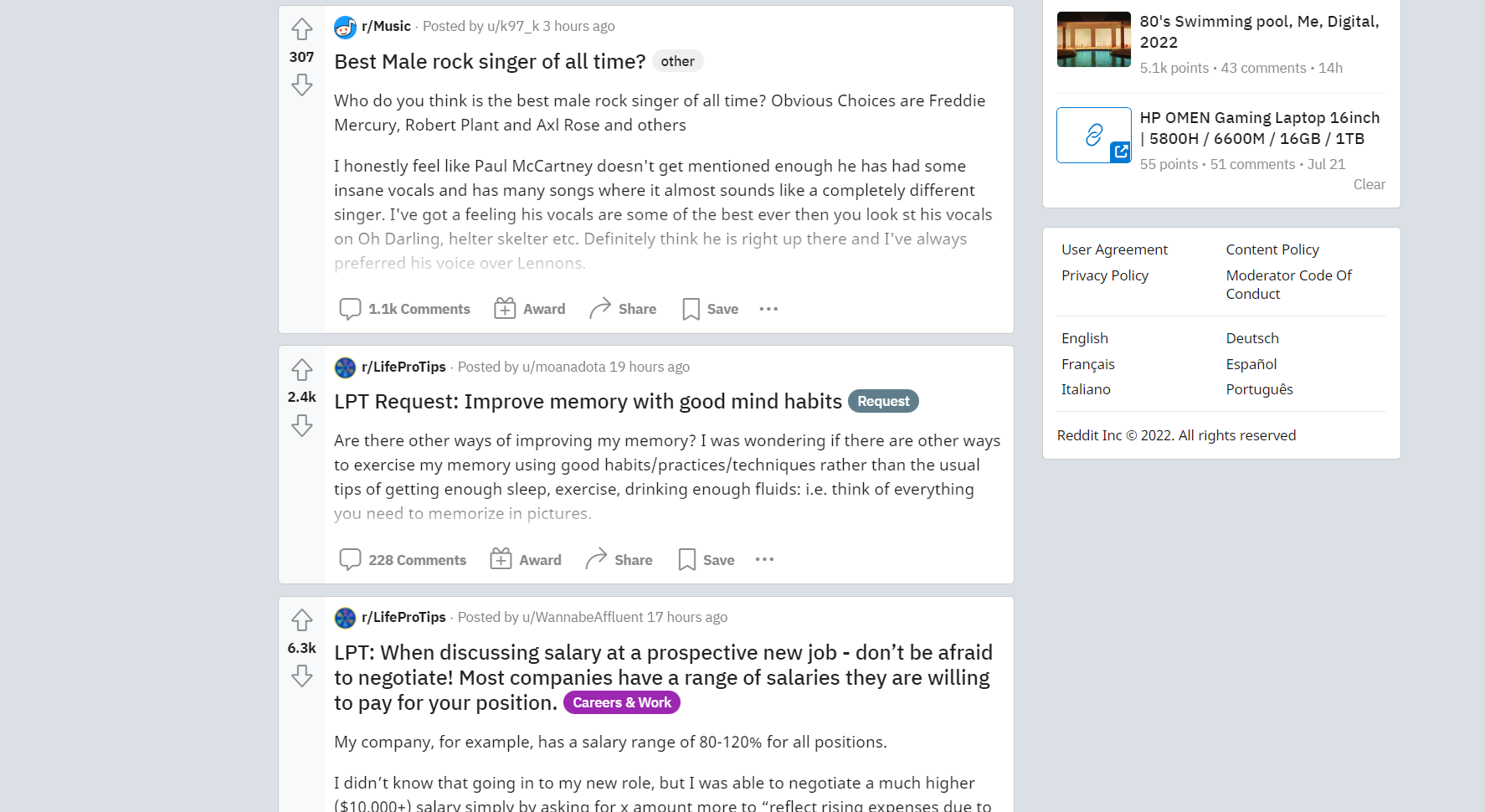
You're talking about the framing. Sorry, I didn't realize. It's not among my concerns to the site. Yes, It's a preference. There are a few main trends regarding framing, I'm on the one against it. Gray on gray refers to the comments section, and any other place where there is a gray background and a "gray" font. It is not an unusual choice, I just don't find it the best. As an argument, you read articles in a white background, why comments should have gray, aside from structural purposes?
Regarding audience, I kind of disagree. Yes, the audience here is not the same of that of Reddit. And I think this should change. Still I'd like to see a site like this. It literally created its own engine! Which is awesome by the way. I love VulcanJs. Here is an example of what I would like to see on hitting the main page: https://forum.vuejs.org/.
Just for reference, I have 20 years as a developer, and I have been part in maybe hundreds of design discussions, even though I'm a front/back end developer. So, no expert but I'm somewhat on the loop. The changes I propose are a mix of personal choices and experience/research based opinions.
Also, any discussion of familiarity starts with mobile, which I don't use. My focus is mainly on the 1080p 24inch desktop experience.
An option to post anonymously or non anononymously with your account (instead of having to create a new account to post anonymously, and spend hours on internet anagram server finding an anonymous account name)
Tags for tags: We should turn the "Related entries" sections of wiki pages into native tags so we can build a crowdsourced graph of links between the wiki pages. Links can be uni- or bidirectional and specify different types of relationships such as "A is related to B" or "A is a parent of B".
I second this. I think bidirectional links would be a better form for "Related entries" rather than manually adding the topics to the "Related entries".
User case: I've been trying to connect some topics on the Wiki with "Related entries"
While I think LaTeX is useful, it is not very intuitive or user friendly and posting long curated articles is quite tedious. It would be nice to have a feature like Elementor.
I think there would be a lot of value in a detailed how-to document for content creators explaining each step needed to go from a GDoc or WordDoc to a forum post. This would optimally include a directory for keywords like footnotes, typographical emphasis, Title/Header/Normal text functions, etc.
The reference to LaTeX here isn't very clear to me. Does Elementor provide an alternative equation-rendering system? Or did you mean something else?
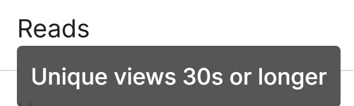
The posts' analytics include the number of reads. Does this refer to the number of unique users who engaged with the post at least 30 s uninterruptedly? I would clarify this in the note.
I think authors of a post should be able to add the "community" tag to their post.
See also this, this, and this comments. The first comment thread includes a workaround: creating the post on the http://forum.effectivealtruism.org/topics/community page
As an aside: I believe this will work right up until you submit it, but am not sure.
A non-moderator account currently sees this
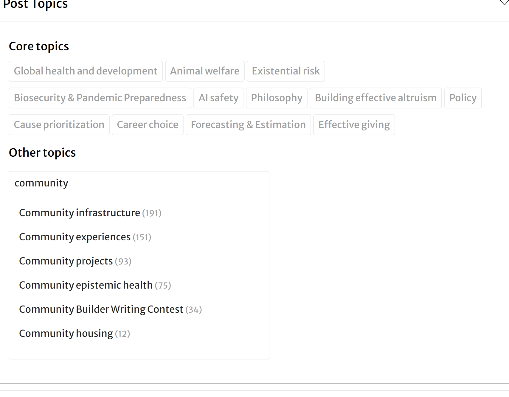
for comparison I see this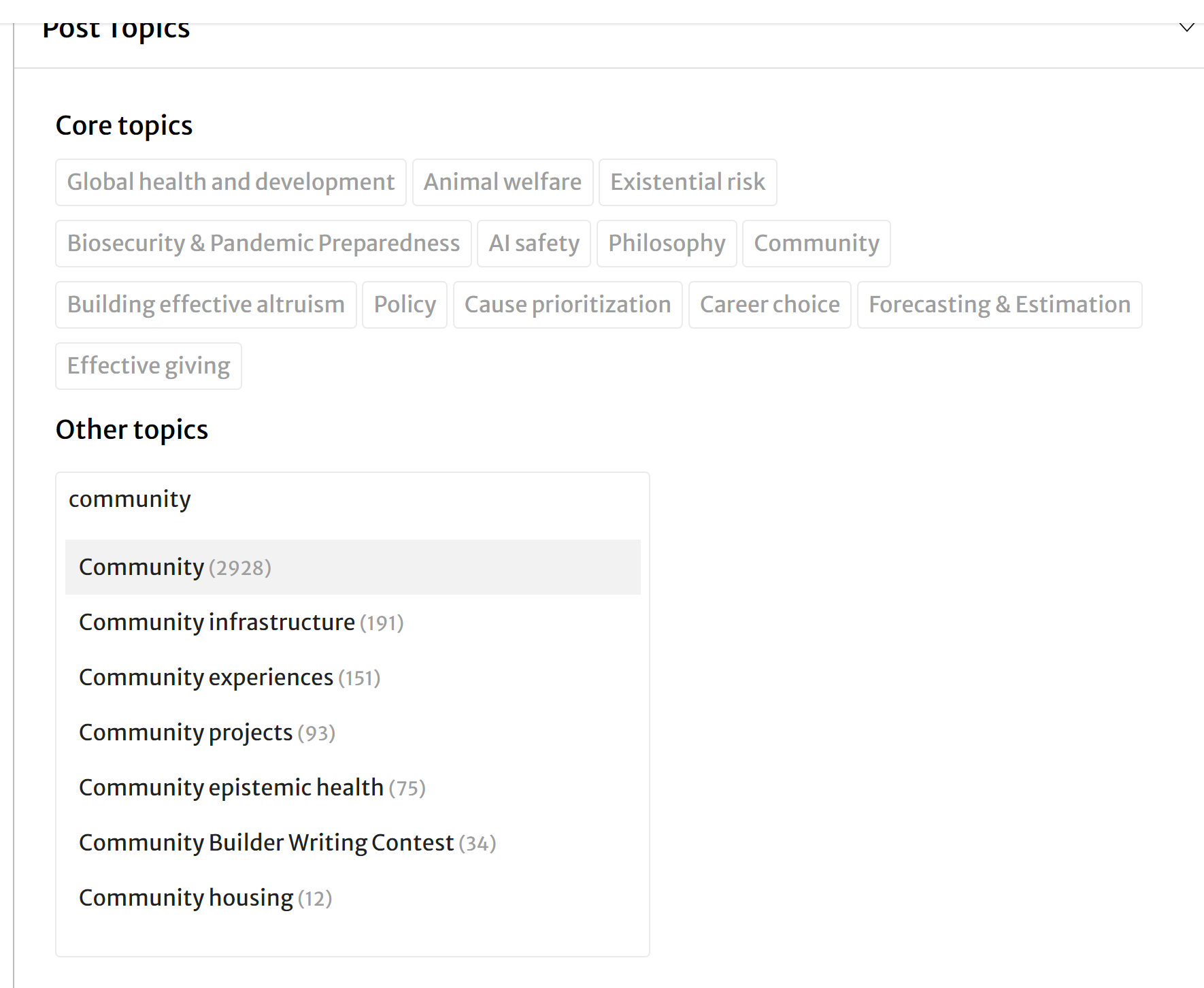
Sans-serif font in body text! The comments section is absolutely beautiful to read, but I find the body text of posts very difficult. Most blogs and online news sources seem to use sans-serif, probably for readability.
Alternatively, give users the option to pick their own font. Also, maybe make text black instead of a lighter grey?
When you say "make text black instead of a lighter grey," are you referring to all of the Forum's light-grey text (e.g. voting buttons, section subtitles), or something more specific?
I tried to check on the "sans-serif is easier to read" claim but didn't find conclusive evidence; checking Google Scholar, the first study of computer readability I saw found that serif fonts were easier to read. (This is just one study, of course, and knowing that the Forum's specific body type is tough for some people really helps us.)
I meant the body text of posts could be darker - I wouldn't change the buttons or other light-grey text.
Interesting that the study found serif fonts more readable. I'm not aware of conclusive evidence in either direction, I'd just heard folk wisdom that sans-serif is more readable on a computer screen.
My general opinion is that the comments section on this forum is extremely easy to read and clean to look at, some of my favorite formatting anywhere, but personally I find the body text of posts much more difficult to read than most sites. I wonder what most people think, I wouldn't expect everyone to have the same experience.
i would find it helpful to establish a norm to begin posts with a short (!) 'tl;dr'-section which summarizes the main results/arguments of the article, since sometimes it is hard to tell what a post is about only from the title/the preview one gets by hovering over the link.
I think it's already quite common for commenters on posts without these to request them; is there something in the UI you'd like to change to encourage this?
if im not mistaken, when you hover over the link to a post you just see the beginning of the post, right? this sometimes is not very useful. maybe you could give post creators another text field ("thumbnail"/"preview"/"tl;dr") where they can explicitly fill in what should be shown when hovering over the link. this field should probably be character limited then. this text should be displayed at the top of the post, too. (and if posters dont fill it out it could just fall back to showing the beginning of the post).
What you describe is almost exactly identical to an admin feature that we have from LessWrong. Which isn't much help to you yet, but might get released more widely.
This needn't be written by the author - it could be added by higher karma readers, for instance.
or written by anyone but approved by the author?
Yeah that works too.
I'd like to be able to add pinned posts or comments to my profile. Several people have asked me about my EA origin story so I've tried to refer them to this comment, but I always have a hard time finding the link.
Thanks for the suggestion! I've added this to our list for triage.
If someone downvotes, suggest that they explain why
I disagree and I downvoted this because explaining why you downvoted something is disproportionately likely to end up with me arguing with someone on the internet. I find this really unpleasant.
I'm happy to have a rule for giving an explanation to you if I downvote your posts. I've talked with you as a person outside of internet arguments, so I'm not as worried about getting into a protracted argument.
But as a general rule, I think I should be discouraged from explaining my downvotes so that I keep up my mental health.
Separately, if this was a thread that had agree/disagree enabled I would just click disagree! The comment is fine, and I try to reserve downvote for things that are mean or grossly incorrect if agree/disagree is available.
Hey (:
To be clear, my feature suggestion is something like a popup reading "you downvoted this, consider explaining why" as opposed to "in order to downvote this, you MUST explain why".
The pain point I'm trying to solve is "I don't know why people down vote my comments sometimes and it makes me sad and confused". Maybe my specific proposed solution isn't good; my pain point remains, though
I also acknowledge that "explaining why I downvoted" can lead into arguing-on-the-internet which could be negative in a way that I want to avoid (and I don't want to drag people into).
Oh for sure, I wasn't thinking you were implying making it a requirement. I was trying to say that even a nudge towards explaining downvotes is a nudge towards evil (for me).
Maybe the net advantage of explaining downvotes would be good, but I personally should probably be discouraged from explaining my downvotes.
Props for taking the time to explain, even though you don't like it!
Upvoted since you explained why you don't like my idea, and I like that! :)
(Not sure if that has been suggested before, but) you should be able to sort comments by magic (the way posts are sorted on the frontpage) or some other better way to combine top+new properties for comments. Otherwise new contributions that are good are read far too rarely, so only very few people will read and upvote them, while the first comments directly receive many upvotes and so get even more upvotes later. Still, upvotes tell a bit about what comments are good, and not everyone wants to read everything.
I would definitely use it myself, but I would strongly suggest also making it the default way comments are sorted.
(That wouldn't totally remove bad dynamics, but it would be a start.)
Few UX suggestions for post edit:
Add a "publish" button in the options below:
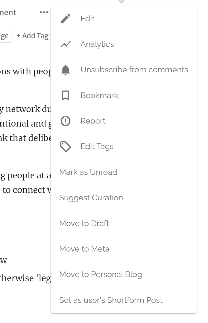
Have a Save Draft / Publish button on the top (not just bottom) when in edit mode / or a "skip to bottom" to make it easier to save /publish
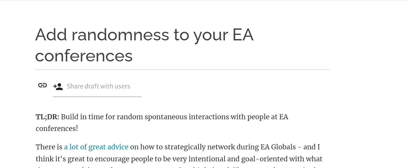
Meta suggestion: Could be nice to start a new features thread and/or use a feature suggestion forum at some point, this one is getting a bit difficult to navigate right now.
MVP option could be to create a copy of this thread but delete all the implemented features so that only WIP /not implemented ideas are here.
What would people think of adding SummaryBot functionality to some very long comments? The emergence of a new HLI/SM thread reminds me that some comments are post-length and post-complexity contributions; many of them would benefit from a summary. That can be particularly valuable where the original poster and commenter start a dialogue, with long replies to each other's comments. Those threads can take a significant time commitment to get through!
Unsure what the cutoff should be to trigger a comment summary -- maybe 500-600 words?
I wish the notifications icon at the top right would have have separate icon to indicate replies to my posts and my comments.
At the moment those get drowned out by notifications about posts and comments from people I follow (which are so numerous that I've been trained to rarely check the notification inbox, because it's such a rabbit hole...), so I often see comments weeks or months too late.
I'd also like to be able to get email notifications for just replies to my posts and replies to my comments.
Thanks for the suggestion! I like the idea of visually distinguishing the most important notifications (i.e. the ones you might want to reply to).
There are a lot of customization options for notifications, so I'd recommend looking through your account settings:
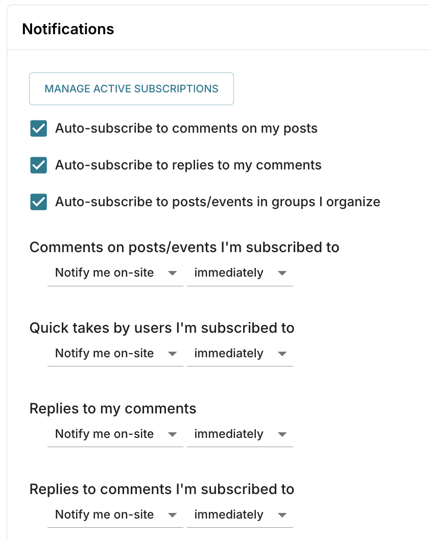
For example, you can set "Comments on posts/events I'm subscribed to" and "Replies to my comments" to notify you both on-site and via email.
You may also prefer to batch email notifications (rather than receive them immediately) if you get too many (for example, you could batch "Comments by users I'm subscribed to" to get an email about it once per day).
Though I agree that the notification customization UI is not the best — the wording is not super clear, and I think the way notifications are categorized is not ideal. I also agree that too many notifications is a UX problem, and we have a backlog item to explore better ways to batch notifications to improve this experience (though to be honest I'm not sure when we will get around to it).
It would be useful to schedule posts ahead of time.
I believe moderators can do this for you, but perhaps we should allow users to do this as well. I'll add it to our list for triage.
I worry a bit that all the suggestions are about details, whereas the macro trend is that public discourse is moving toward Twitter, and blog content linked from Twitter. One thing that could help attract new audience would be to revive the EA Forum Twitter account, automatically, or manually.
When you say "macro trend", do you mean within EA or across the internet as a whole?
Also, when you say "moving", do you mean away from Facebook? The Forum has been growing steadily since we launched the new version in late 2018, by all the metrics we measure.
(Neither of these questions takes away from the idea of having a Forum Twitter account, but I wanted to figure out where the ideas were coming from.)
Add the option to disable comments on your posts.
Strongly agree. I came on this thread to suggest this.
I have posted on the forum before, but I have recently developed some health problems (fatigue etc) that mean I can no longer afford the energy necessary to participate in comment discussions. This is the main reason why I am no longer posting. I would be far more incentivised to make future posts if I could turn off the options for people to make comments where I deem that comments would not add much value to the post (i.e. I would use this feature on lifestyle suggestions or resource recommendations, but not on philosophical hot takes).
Disagree. It's nice to have the space to talk about the idea for others, and I feel like both problems mentioned by both anon and Ren can be remedied by clearer communication:
Double the karma weight of votes made before the new karma system was implemented. All votes used to be worth one point. For example, let's take an old post like this. It currently has 43 karma and 43 votes (probably all of them are upvotes). For comparison, my newest post has 53 karma and 16 upvotes. If you think about it, that old post is clearly more endorsed by the community. There were fewer readers when it was posted and a very high percentage of them chose to upvote it and probably many would have strongly upvoted if that was an option. Nowadays, even a regular upvote by high-karma users is worth two points. Posts like that old post do not appear in forum favourites and other places like that but they should. If you doubled the karma of such old posts, the karma for that old one would be 86 instead of 43 - a much better representation of how much the community endorses that post. Ah, maybe you should even triple the karma weight. Posts like this would then actually make forum favourites and I think they should.
Changing the raw totals sounds confusing, but you could implement some form of regularisation in ranking contexts - for example karma relative to total karma across all posts for that month.
It is a little strange that if I go to an old post I upvoted, un-upvote, and then re-upvote, its karma increases I think.
It's not just about ranking. It's also about how much karma individual users have and (most importantly) about how worthy-of-reading a post looks when you open it based on its karma. I think that the situation where all votes made before the new system are worth one karma point is no less confusing than a system where they are worth two karma points.
I think the user bio editor in Settings should be a bigger text area with rich text formatting (like the ones for posts). This would make them more WYSIWYG since user bios are displayed in a similar style to posts.
If we had a tag called "Links" for posts that aren't displayed on the front page, then we could have a "Hackernews"/ "Reddit" style section were people can share -without comment- external links related to EA or that could be discussed in the context of EA. This would be different from current "link posts" which might have a higher (imagined) bar to posting.
Along a similar lines, there could be a low effort way for the current Shortform function to emulate Twitter, where the 'magic' sorting algorithm also takes into account the length of the post.
You can simulate this in your head by blending r/effectivegiving with the current forum. Problem is I think it devalues forum posts a bit. Kinda like (but milder than) if a scientific publication allowed authors to submit Tweets.
Personally, I'd be more excited about people just using those platforms - Twitter, Reddit, YouTube, Quora, Tiktok, etc to discuss EA-related arguments, and for EA orgs to offer prizes for that, rather than shoehorning activities into the forum.
The main draw of Hackernews is that the people on it are quite smart and so it might be nice to have it on the forum.
But I agree that the r/effectivealtruism sub is not that good in terms of quality of discussing and what gets upvoted and would benefit from core EA people engaging and voting more there.
Let co-authors access post analytics
I can get around this by asking the main coauthor to share the analytics, but I´d rather I could access them myself.
Thanks for making this suggestion! I think this feature now exists, but I'll double-check.
I can confirm I have access to coauthored post analytics! Great work dev team!
Related:
In-line commenting.
Invisible by default so they don't distract, but you can easily switch visibility.
So the reader particularly interested in some section could dive into the comments particularly about that section.
Also, as a further feature, you could color code different comment types, like:
Also see @Emrik's comment with more rationale.
I like this. Building on your idea with the yellow colour code, I think it would be good to have functionality to mark typos, with the option of providing a revision suggestion that the author can press accept or reject on. Similar to how edit suggestions work in Google Docs.
Have an optional Subtitle line to add more context on forums, and have it be expandable on the front page.
E.g. "Why The forum should have subtitles: an in-depth look into how subtitles help people get more context in less time"
Thanks for this suggestion, I do think an experiment with slightly more context on the front page would be really interesting, whether with subtitles or snippets of text. Will keep make a note of this!
Has anyone considered a hackernews-style section? I know there is already support for posting links, but:
This links section will create a distributed content aggregator for our community. Considering finding relevant content in our current era is a hard problem, this can be very useful. I think a lot of us here are distasteful of surroundings ourselves with news outlets, for example. It’d be great if we could get a filtered important news list through the community. Adding features such as an RSS feed for links with X+ karma will be helpful in this endeavor.
Also see lobsters.
I'd like to be able to bookmark comments, in the same way you can bookmark posts. There's a lot of really, really well thought out and written comments, in some cases containing just as much value as articles, and I'd like to be able to bookmark a comment to come back to.
I'd argue this is even more important than bookmarking articles, because articles have tags and titles to search for, whereas comments don't, and it's easy to loose track of what article and what thread the one you're looking for is contained in.
Thanks Matt, noted!
Import from HTML/gdoc/word/whatever: One feature I miss from the old forum was the ability to submit HTML directly. This allowed one to write the post in google docs or similar (with tables, footnotes, sub/superscript, special characters, etc.), export it as HTML, paste into the old editor, and it was (with some tweaks) good to go.
This is how I posted my epistemic modesty piece (which has a table which survived the migration, although the footnote links no longer work). In contrast, when cross-posting it to LW2, I needed the kind help of a moderator - and even they needed to make some adjustments (e.g. 'writing out' the table).
Given such a feature was available before, hopefully it can be done again. It would be particularly valuable for the EA forum as:
A direct 'import from gdoc/word/etc.' would be even better, but an HTML import function alone (given software which has both wordprocessing and HTML export 'sorted' are prevalent) would solve a lot of these problems at a stroke.
Alas, I don’t think this is possible in the way you are suggesting it here. We can allow submission of a narrow subset of HTML, but indeed one of the single most common complaints that we got on the old forum was many posts having totally inconsistent formatting because people were submitting all kinds of weird HTML+CSS with differing font-sizes for each post, broken formatting on smaller devices, inconsistent text colors, garish formatting, floating images that broke text layout, etc.
Indeed just a week ago I got a bug report about the formatting of your old “Why the tails come apart” post being broken on smaller devices because of the custom HTML you submitted at the time. Indeed a very large fraction of old LW and EA Forum posts have broken formatting because of the overly permissible editor that old LessWrong and the old EA Forum both had (and I’ve probably spent at least 10 hours over the last years fixing posts with that kind of broken formatting).
If you want to import something from Google Docs, then exporting it to markdown and using the markdown editor is really as well as we can do, and we can ensure that always works reliably. I don’t think we can make arbitrary HTML submission work without frustrating tons of readers and authors.
I have also been working a lot on making the new editor work completely seamlessly with Google Docs copy-paste (and indeed there is a lot of special casing to specifically make copy-paste from Google Docs work). The only feature that’s missing and kind of difficult to do is internal links and footnotes, but I have not discovered any other feature that has been running into significant problems (that we would want, there are some others like left or right floating images that we don’t want because they break on smaller devices). So if you ever discover any document that you can‘t just copy paste, please send a bug report and I think we can likely make it work.
+1 for internal links
Thanks so much to the team for their work. I really like the layout of this forum. It's clean and pleasant to use.
Thank you! Most of design credit goes to the LessWrong team, whose depth of focus on design I admire.
I'm not sure what the actual feature would be, but make it easy for people to cross-post from their personal blog (maybe just do substack to start) to the EA Forum. I recently saw the blog prize announcement and there were about 10 blogs linked there i'd never heard of. It would be great to get that content onto the forum.
Not quite a feature but it would be cool to have a monthly / quarterly round-up of interesting EA blog posts from off-the-forum that are cross-posted (as a sequence maybe?
Thanks Vaidehi! I've added it to our list for triage.
I believe we can rss-import blogs to the forum, and we currently do so for a few. We have to manually set it up on our end, so if you contact us we can work with you to start doing this. :)
Make it possible to only filter / see unread posts by default on the forum homepage.
This past month I've noticed I've missed a bunch of cool and relevant posts because they dropped off the home page too quickly for me to see them. I'd like that not to happen. Not a suggestion, but related: it seems like some good posts fall of the homepage way too quickly. It would be nice to give those posts a chance to be seen. Often if there are a couple really high popularity posts in a week then the people who happened to post less popular posts get unfairly disadvantaged, which seems suboptimal.
Thanks Vaidehi! Filtering only to unread seems like a good idea, I've added that to our backlog.
Regarding your second point: If you have a suggestion for how to increase visibility of other posts, let me know. My current best guess is to improve targeting, i.e. users who are most interested in animal welfare posts will disproportionately see animal welfare posts, which will give those posts increased visibility amongst the people who most want to see them (albeit at the expense of hiding non-animal welfare posts from these people).
Yeah so maybe I'm somewhat of a minority but as a meta person I'd like to see at least the headlines of most posts, and wouldn't want those to have less visibility. Mainly because I'm concerned about only consuming meta content and not staying in touch with object level advancements.
Not a suggestion per se - will comment later on if I have any.
Hi, sorry to be a complainer - I've just seen a new "continue reading" feature and I don't like it. If I stopped reading a sequence or article it means I'm aware of its existence and have chosen not to read it. This feature keeps reminding me of my least favourite articles (right now it's convinced I should read Aaron's placeholder post for a new sequence). I couldn't spot any way to remove it. Okay, that's all, thanks very much for your attention.
It sounds like the "placeholder post" you're seeing is a draft that should be invisible to you, which indicates a different bug.
Is the title you're seeing "Sequence Placeholder Draft", or something else?
Yes that's right - it has [Draft] [Unlisted] before that title
Oy vey, thanks for the notice. Definitely a bug, and one LessWrong is now looking into.
There should be a button that appears when you hover over the post on the frontpage that allows you to remove it from your continue reading queue.
Ability to mark items in this thread as “complete”
This thread is the best place to suggest feature requests and it's pretty hard to use because you can't tell which items have been done and which haven't.
Reading time estimates on older posts.
If I'm not mistaken, posts before a certain date do not have the estimated time in minutes to read the post near the publication date and author's name at the top.
The EA forum is one of the key public hubs for EA discourse (alongside, in my opinion, facebook, twitter, reddit and a couple of blogs). I respect the forum team's work in trying to build better infrastructure for its users.
The EA forum is active in attempting to improve experience for its users. This makes it easier for me to contribute with things like questions, short forms, sequences etc, etc.
I wouldn't say this post provides deep truth, but it seeks to build infrastructure which matches the way EAs are. To me, that's an analogy to articles which seek to describe how reality is. If we could only build a forum which suited how people wanted to interact, then we could do the work of EA faster.
I would like to see this article continued, with a focus on putting the most relevant additions at the top. I've suggested as much in the comments, moving to a sorting system which moves both new and upvoted comments to the top and allows for completed changes to be hidden.
TL;DR: I'd like to have a single board where to see a summary of the analytics for all my posts.
I've been really enjoying the analytics feature!
I used it for example to notice that my post on persistence had become very popular, which led me to write a more accessible summary.
One thing I've noticed is that it is very time consuming to track the analytics of each post. That requires me to go to each post, click on analytics and have them load.
I think Medium has a much nicer interface. They have a main user board for stats, from which I can see overall engagement with my writing. It also shows my posts, ordered by recent engagement. I can click on a post to go to the page with the specific stats for that post.
I think this is great, and I'd like to have something similar in the EA forum!
Good suggestion! I expect this would be a well-liked feature. Added to our project list. Thanks!
Start and end time are not readable for me when creating and editing events in dark mode.
Is that just me?
Browser: Firefox, OS: Windows 11.

Make the forum available in other languages. Right now the only option is English.
Also rely less on acronyms. For example, when selecting "program participation" it shows you the acronym VP:
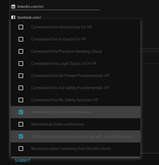
I happen to know that this stands for "Virtual Program" but a newcomer (especially one that isn't a native English speaker) might not know this (and might even assume it stands for something different like Vice Presidency, Virtual Profile, Video phone-call, Viewpoint, Value proposition etc).
Check if information cascades / social influence bias is a problem on EA Forum.
If it is, maybe we could implement Emrik's idea to counter it, or some similar mechanism.
See here for the explanation of the potential problem.
To test it, we could do an experiment where some bot (or server-side process) randomly upvotes or downvotes new posts. We measure final karma after some fixed time, and see if that single vote snowballed.
I love that as a mechanism for measuring the effect of info cascades. It's cheap, non-obtrusive, and certain. It's from this study.
But I no longer like the solution for it I suggested in the Occlumency post. I think there are better ways using karma to mitigate info cascades and diversify what people read/discuss.
Thanks for this suggestion. Do you suspect that this is a big deal and have any intuition as to why?
My intuition is that it's quite an interesting experiment, but seems unlikely to be a major influence on the Forum based on the fact that most posts with high karma are actually pretty decent.
I don't suspect it to be that bad. More like some noise added to each post's score, and some posts not getting enough attention because of that.
In the reddit experiment single upvotes caused posts to have 25% higher mean score later (this effect was present in all parts of the distribution).
But the effect size was very dependent on the topic, so I'm curious how would that turn out for EA Forum.
"this effect was present in all parts of the distribution"
I was curious about this when I skimmed the paper, but I couldn't find a breakdown of the impact of the random upvotes on, say, the top 5% highest upvoted posts. Do you know where to find that breakdown or what you mean with this?
Ah, no, I just read the report of results on Wikipedia (that's how they worded it). Hm, it's strange if that's not in the paper.
Ah, yeah, I read this on Wikipedia:
Positively manipulated comments did receive higher ratings at all parts of the distribution, which means that they were also more likely to collect extremely high scores.
But since I don't know what effect sizes they're talking about at the top of the distribution, I don't think this sentence is very informative.
Wasn't sure where else to mention this – the search feature on the forum is pretty bad. I tried finding a post from Claire Zabel by searching "Claire Zabel". I couldn't find it because her username is actually "ClaireZabel"
+1 I've found this problem a lot. Also the fuzzy search on the search bar is sometimes too fuzzy (e.g. the opposite problem)
Re fuzzy search... I couldn't find this post. Search shouldn't be converting 'EA' into a separate search for the word 'effective' absent 'altruism'. Also it feels like it isn't weighting the title heavily enough relative to post body, since the correct title isn't far from my search query.
Very specific and small comment, but I'd like to see the "Reply" button for comments be bigger and more noticeable. I would prefer it to be an actual button (with padding and an outline), and with a message icon beside it. It's happened to me twice where I couldn't figure out how to reply to a comment until ~30 seconds of searching for the reply button.
Organisation Badges/Tags next to author names on posts/comments
(sent through Intercom before I remembered that this existed)
I generally dislike when people write posts from their organisation - I think that it's hard to know who exactly I'm talking to, it's difficult to know what messages are from the author vs from the org, and it generally feels a bit intimidating to talk to 'Givedirectly' as opposed to Sally who works at Givedireclty.
I do understand the desire for organisations to say things as the org - maybe when someone posts in a professional capacity, there could be an option to post/comment with a little organisation tag next to your name. When you mouse over it, it says whether this means that it's to be taken as the organisation's position or not or whatever capacity the person is speaking in. I'd also like a strong norm against organisational forum accounts being the sole/main post posters (though tagging it as Open Phil or Givedirectly or whatever seems good to me).
For posts, I feel like the solution is to add the organization as a coauthor. It's what rethink does, for example. I agree we could probably go further in the direction of discouraging org accounts from being the only author.
Maybe a feature to let Google Doc headers/internal links be switched automatically to EAF headers? This will be mildly useful to me, and considering the most common type of broken links I see from others on the forum, probably to others as well!
Thanks, we've recorded this on our backlog, it does seem like something that should work properly.
Command + K should add a hyperlink!
This is also the case in the new editor! Sorry for not having this for so long!
I would be happy to know the total engagement time (reading the post, and reading and writing comments on the post) by post by day. As of now, one can only check the karma, comments, views, and reads by post by day on the posts' analytics.
An option to automatically move a shortform post to a top level post
Yeah, I agree with this. I actually think we have an admin-only version of a button that does this, but we ran into some bugs and haven't gotten around to fixing them. I do expect we will do this at some point in the next few months.
So like, when I'm logged into my account, I'll see every shortform post as top level?
No, sorry, though that might be a good idea. I meant an option to easily move a shortform post you have written to a top level post, because I've seen many cases where people write amazing shortform posts which might get a lot more visibility if they were forwarded to top level, perhaps after getting some feedback and comments from people who are more engaged with the forum to even look at the shortform.
That should transfer all comments and Karma with it, and simply have the option of adding a title.
I guess this should apply to all comments, not just in the shortform.
I like this idea a lot. It probably lowers the effort bar for a top-level post, which I think is good.
I agree this is a good idea. Not sure about regular comments, but it would be great if shortform posts had a "Promote to full post" button.
Groups tags which users can belong to or identify with. These can be displayed publicly in the user's bio, which would allow for automatic search of people with related interest or affiliations.
Perhaps using #hashtag for something like this, so that it will be easy to create non-official tags.
Perhaps such groups can have a default chat conversation with all members
I dont' know whether you want this to be a chat platform, but maybe having them function as email groups?
Link to profiles on the EA hub. How often do EAs use this website or the Hub to find people to work with? I guess someone tracks this?
People can already add this information to their Forum bios if they want to, and I encourage anyone who hasn't done this to do so!
I think linking a Forum bio to an EA Hub profile might backfire, in that a Hub profile might be more onerous to fill out than a quick bio (but maybe getting more Hub profiles would be worth the tradeoff?).
It seems there is iteration possible here. Are there more users on here or the EA Hub, if the former it might be worth using EA forum logins for the EA hub.
Perhaps these are not visible itially but you can toggle that.
I think that karma can be gamified more.
In StackExchange they have an option of offering bounties for questions which can be collected by answerers. If we'd have something similar here, that could serve as a good signal that someone cares about a question and has yet to get a satisfying answer.
I'd be curious about what kinds of trades people can do if there would be a process for (probably better publicly) exchanging karma. I can imagine bets being made, offers to help editing, seeking information, a bounty on finding mistakes or whatever.
StackExchange might have some great principles to implement here, though I don't know much about it
I do worry about people's incentives being unfavorably changed though, but it seems to me that getting more karma is sort of aligned with doing more good. Perhaps if all trades would be on a public ledger it would mitigate the possible harms as it would be easier to see who tries to game it.
Ability to include a poll in when you make a question post, à la Twitter! I know this feature has been suggested before, in response to which Aaron Gertler made the Effective Altruism Polls Facebook group, but it seems to have plateaued at 578 members after 2.5 years. Response rates in the forum would probably be much higher.
Yeah, I want this. Almost prioritized it recently, we'll see.
I was just about to suggest that. Reasoning explanations behind a vote could be also valuable.
Should max upvote be associated also with factors other than user karma, such as self-assessed professional expertise (according to broad criteria)? For example, someone who works in the EU Commission on Internet of Things could assess themselves as an ‘expert’ on a question that relates to valuable actions related to a new draft of the EU AI White Paper.
Voting can also seek to ameliorate biases by highlighting underrepresented perspectives. For instance, if there is a poll about priorities related to wild animal welfare, the vote of an AI safety researcher could be weighted more heavily if the majority of other votes are of wild animal welfare researchers. Voters’ organizational affiliations, professional and cause area expertise, and relevant demographics could be considered.
Unnecessary positive discrimination should be avoided. For instance, US college graduate male and female votes on an issue that does not relate to gender or gender norms should be weighted the same while the vote of Afghani women should be weighted more than that of Afghani men on any Afghanistan-related topic. This is based on the assumptions of equal opportunities for male and female students at US colleges but historically and currently unequal decisionmaking opportunities for women and men in Afghanistan.
Would it be interesting for EA Forum questions to have a feature to allow surveys and predictions? In theory, one could post a question with a link to Google Forms, but maybe some kind of integration would encourage more surveys and forecasts. Given the large number people who read the EA Forum, there is margin to collect lots of data.
We should add the ability to convert posts to questions (or back to regular posts, but that's tricky because answers would have to be converted to regular comments).
Also, the editor should automatically suggest converting your post to a linkpost or question post if the title or body text matches certain patterns. For example, if you write "Crossposted from X" or "This is a linkpost" at the top, it can infer that your post is most likely a linkpost. I see a lot of posts from inexperienced users that are classified as regular posts even though they're intended to be linkposts or questions, so I think this would be helpful to them.
Hi JP,
I think it would be good if there was an option to make the interests (in terms of EA Forum tags) in one's own profile visible, as this could be an easy way to see the topics someone is into.
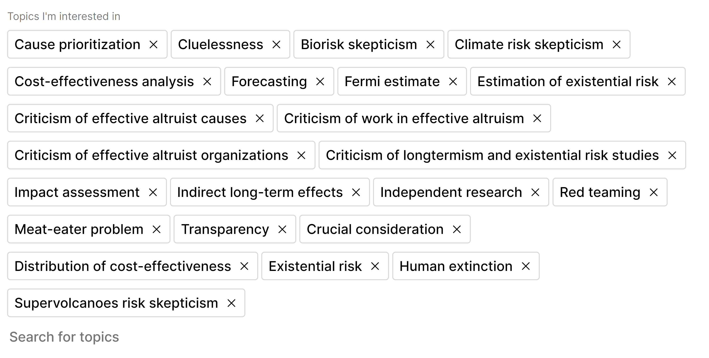
A way to report users for deletion.
There are a few spam accounts like this one (https://forum.effectivealtruism.org/users/msreeyaa) but I see no way of reporting them to the moderators.
Since they aren't posting or commenting the way in which they have an effect is when searching the forum. (You'll just have to take my word for it that I wasn't searching for 'escorts' when I came across that profile...)
Thanks for pointing this out, and for linking to the user! I've deleted their account.
For now, if you ever come across a spam user, please feel free to let me know (you can DM me on the Forum or you can email [email protected] ), but I agree that a feature like this should exist.
The "Risks from artificial intelligence (AI)" section could benefit from being updated. The majority of posts were written over three years ago, and AI is advancing so quickly that I think more recent posts would be more salient.
I think specifically the 80,000 Hours article "The case for AGI by 2030" could be worth including.
The Search Page doesn't seem to show results for basic questions. Some examples:
Not sure if this is an search indexing issue, or perhaps the actual "questions" user would put in the search field, aren't part of the posts answering them. This could maybe be solved by adding a new post - which basically explains the same as other informational posts (e.g. forum manual), but with a Q&A style, so search will index it.
For reference, there are some other new user navigation suggestion in this post.
I would like to suggest a rule/norm that people or orgs should not post the same article they are ready posted multiple times over the course of a few months, especially if there was already discussion in the comments the first time, unless they have significantly new points to make.
I have a feature removal suggestion.
Can the notification menu please go back to being like LW?
The LW version (which EA Forum used to have too) is more compact, which gives a better overview. I also prefer when karma and notifications are separate. I don't want to see karma updates in my notification dropdown.
Up/downvoting a post shouldn’t be possible within 30 seconds of opening a (not very short) post (prevent upvoting based on title only), or should be weighted less
@JP Addison are you open to me working on a PR that offers this to authors as a toggle-able option?
LessWrong is thinking about this. I don't want to make it user toggle-able. My guess is that removing the voting from the top of the post that's more the direction I'm going. LW wants to try it for admins to see how they find it before shipping it further.
Some potential improvements to the search function:
Another search results suggestion: Show bookmarked posts more prominently in search results by either:
Appreciate the suggestions! I've added them to our list for triage.
Two consecutive hyphens should autocorrect to an em dash!
That way, a parenthetical clause in the middle of your sentence - like this one - isn't offset by "space hyphen space" on either side--or, even worse, by "hyphen hyphen". Instead, autocorrect two hyphens to a nice, clean em dash—like that.
I think this is a common feature for text editors - Microsoft Word definitely uses it.
Interesting. I'm used to two hyphens for an en dash and three for an em dash.
Suggestion: Integrated search in LessWrong, EA Forum, Alignment Forum and perhaps Progress Forum posts.
I recently made RatSearch for this purpose. You can also try the GPT bot version (more information here).
This is a long series of comments (~1200 words)
TLDR; The EA forum team could transform the forum by introducing high status, high activity “focus posts” that are centered on object level discussion, at the same time greatly empowering the forum moderator.
This content below is quickly written, and tries to motivate a vision, not a specific plan. Also, “focus posts” seems like a bad name, someone please come up with another?"
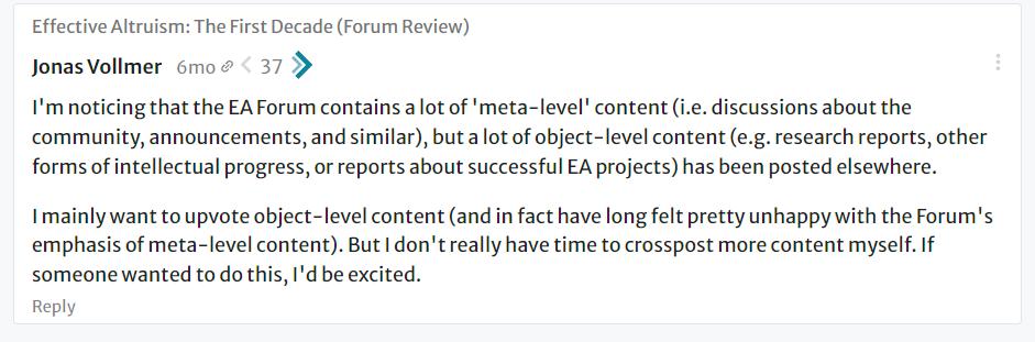
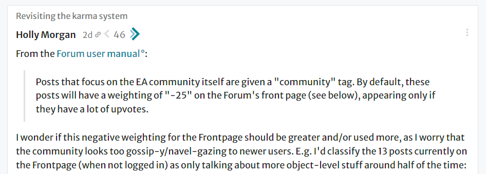
There is a sense that high quality discussions and comments on the forum are briefer and don't occur as much now.
Overall, there's sort of two types of issues people have brought up recently:
The forum has moved a bit toward being a place that demands attention. It's a place where people now enter often to make a point or react to others doing it. That's not as close to productive discussion as it could be.
The forum should be closer to a place for productive discussions between EAs. These discussions should often reveal the landscape of object level work to its readers, or even help make progress on projects. There's several interesting but elaborate solutions that might help.
However, this comment chain suggests a major solution that is direct and feasible.
We should foster and promote high status, high quality object level discussions.
These would be in the form of posts that involve prestigious outsiders, near-EA people, or EA leaders or small teams from strong EA projects. These people would create the content and/or star in the resulting discussion.
For lack of a better name, we can call them “focus posts”.
Overall, "focus posts" would:
The below is a crude mockup to show how this could appear.

(This is a quick, crude mockup, the actual version could be very different.)
These “Focus posts” and the culture and general interest that drives regular participation around them, will take effort to set up (but they shouldn’t be overly difficult or delicate to create).
Building up the supply of these posts can be done gradually, maybe by starting with relationships with existing EA leaders. There are precedents for this work, like the setup of AMAs, and series like Cold Takes, where a major EA leader wrote on the forum for a long time.
As discussed more below, the focus posts would be fostered, curated, and maybe partially developed by the EA forum moderator, who plays a integral, leadership role in the design of this entire feature.
While these new posts doesn’t seem to address voting or scaling issues, I think focus posts could be highly effective. I think ultimately, the sustained, high quality discussion in the curated focus posts can have wide positive effects on the forum, and satisfy a lot of present concern.
Underlying aspects of high status and moderator empowerment
I think this idea of focus posts might at first seem like a simple UX change.
But there are deeper aspects that I think are important to be deliberate about. These two aspects are:
This comment and the next one talk about these points.
The posts need to attract good discussion. A good supply of posters and commentors is needed, ultimately reducing active work by the moderators and create a virtuous cycle of discussion.
There are quick ideas:
Note that slowness when starting out doesn’t seem to be a problem. There might be only 0-1 “focus posts” for a while and that’s OK.
This is similar to the "bounty" system, which has been a really popular pattern among EAs.
But this use of prizes is different, as it is a fixed amount, divided monthly across "focus posts".
The benefits of this setup are that the prize size and incentive for writing is high when there are few high quality posts. When there are numerous posts, the incentive is smaller but no longer needed.
Also, this funding, maybe simply divided equally among curated posts, is more stable and predictable than most prizes. This means it can be principledly secured by being curated as a "focus post", which gives agency to the moderator (to enter into planning and fostering with participants).
This second point is really important. This project will greatly change the moderators role, increasing the prominence and even real world impact of the EA forum moderator.
The moderator would be the person to curate "focus posts", deciding which posts qualify (or possibly helping to create them outright).
This control by the moderator is a key aspect of “focus posts” (and ultimately a major change to the forum itself).
Note that this control has checks and balances. The moderator’s output and decisions are very visible work. Also, maybe later, additional features can be added that allow community input, such as voting that can promote (or demote) posts into focus posts. Finally, simple regular user discussions act as a check on moderators.
This change in the role of the moderator has additional effects:
Another way of looking at this: instead of seeing “focus posts” as a new prominent position for posts, you can see it as a vehicle to empower principled moderators.
I think both the current and past EA forum moderator are more than qualified, both in terms of subject matter knowledge, as well as virtue and judgement, for at least the control envisioned in this comment chain.
Hi JP,
I wonder whether it would be good to have a pop-up showing up each time one strongly downvoted a post or comment, saying something like, "Consider explaining what could be improved". If this was implemented, I also think there should be a way of disabling the pop-up in the settings.
Hi JP,
I have noted EA Forum's GitHub repository has 666 issues and 102 pull requests. I would be curious to know how you are prioritising what to develop.
Some good kabbalistic significance to our issue tracker, but I'm not sure how.
First, a note: I have heard recommendations to try to lower the number of issues. I've never understood it except as a way to pretend like you don't have bugs. For sure some of those issues are stale and out of date, but quite a few are probably live but ultimately very edge-case and unimportant bugs, or feature requests we probably won't get to but could be good. I don't think it's a good use of time to prune it, and most of the approaches I've seen companies take is to auto-close old bugs, which strikes me as disingenuous.
In any case, we have a fairly normal process of setting OKRs for our larger projects, and tiny features / bugfixes get triaged into a backlog that we look at when planning our weekly sprints. The triage process done in our asana and is intentionally not visible publicly so we can feel comfortable marking something as low priority without worrying about needing to argue about it.
Inline draft comments
I really like the forum editor. Unfortunately, I don't end up writing posts in it very much as I almost always ask for feedback and reviewers can not easily add their suggestions.
Google doc comments are probably the gold standard here.
Strong +1 the few times I have drafted a post in the forum editor i've then copypasted it into a gdoc to get comments.
I remember a while ago this was in the LW feature pipeline, not sure if it still is?
LW have been working hard on this, and are still ironing out the bugs. When it's more production-ready, the EA Forum devs will figure out how we might want to enable it (ex. we might want some different functionality here).
If you're excited for collaborative editing, I recommend you beta test it on LW and give them lots of feedback! :) That will help improve both forums.
HTML injections?
I wanted to write a post with color highlighting. This would have been easy to do if I could inject some HTML code into my posts. I imagine there are other use cases where people want to do something special that the code base does not support yet.
Being able to embed OWiD interactive graphs and other visualization would be a great plus too!
(This would introduce security concerns, but could be done safely, especially if the LW/CEA teams don't actually write the security code but use something ready)
As a group organizer, I want to know how many people are following our city group on the forum and find out when a new person starts following it. E.g., how many people are following our city group on the forum now compared to before a recent EAGx event?
As a group organizer, it might be nice to be able to DM people who follow our local group, though this may have privacy implications I have not thought through.
I appreciate this suggestion, and the really helpful context! I'll add it to our backlog. The Groups features of the site haven't gotten any love in a while and I hope we can circle back to them soon.
The "free mailing list for new events" aspect of following a city group (depending on your notification settings) could be pretty useful.
I wonder if we could make posts in a city group and have that be emailed to group followers (depending on settings), basically as a mailing list? I don't currently have something like a mailing list. Our group has an increasing number of platforms - a mailing list would be one more ... signing up to the forum and following the group is a bit more work than signing up for than a mailing list but would save me one additional platform and potentially a monthly fee, etc.
Thank you very much!
It would be useful to be able to have a change log add-on that shows up as a banner on the top of a post (and ideally but this might be a bit spammy, notifies people who have read, or maybe upvoted or commented on the post) so that they know when a correction has been made.
Many people may not go back to a post after reading, or notice the change-log (if the authors even include one) - and the changes can often be really important.
Quick solution: Have a box where people can add their change log and make it a pinned comment (but only for the purpose of updating / correcting posts) so people know what changes have been made before digging into the comments etc.
Ideally though it would be a banner at the top of the post (under the title / above the body)
(Use case: I just learnt I was an order of magnitude off in my recent post on funding flows from 2012-2016, and I'd like it to be really obvious that this is the case / for people to read this with a grain of salt.)
Thanks for the suggestion, I've belated added to our backlog.
When a comment is deleted in such a way that leaves a "comment deleted" block, it has a little [+] to expand the comment, but it doesn't do anything. I would prefer if it wasn't there so I didn't feel like I had to click on it to check if there's something I missed.
Also, probably voting should be prevented on deleted comments.
It would be fantastic if we could set up RSS feeds for individual tags!
There are multiple ways to accomplish something like this.
You can subscribe to a tag, which will notify you whenever a post gets that tag:
Or set a tag as "required". This will show you only posts with that tag, creating an instant "feed":
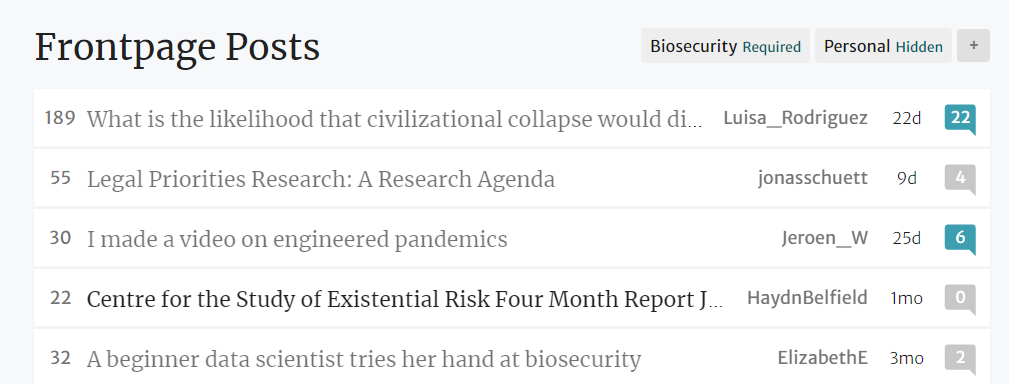
There should be a feature that points out broken links when you write posts/comments!
Yeah, I like it. Does seem like a good thing to have.
Categories / sub-fora / better overview of tags
I think it would be very helpful if the forum was made easier to navigate by creating categories/sub-fora, making tags more intuitively accessible, or some other method. E.g., how do I find the most-upvoted forum posts and comments about EA investing?
I think sub-fora is a somewhat contentious issue, the counter-argument being that it's good to have the Forum be a clearing-house of EA ideas without too much splintering.
I agree the tag interface could be more discoverable. If you go to https://forum.effectivealtruism.org/tags/all you can see a list of all tags and how many posts each one has, but there doesn't seem to be much functionality beyond a featureless alphabetical list (e.g. it would be cool to allow them to be sorted by number of posts, and for the tags page to be discoverable from the homepage).
Once you get to a specific tag, though, it seems to already have the functionality you're looking for, including different sort orders: https://forum.effectivealtruism.org/tag/investing
Could we have better help for those whose content has been (heavily) downvoted?
I often see people plaintively saying something like: "My comment has been heavily downvoted, but I have no idea why!" Can the forum be more helpful for this scenario?
Not sure what the best solution is, but here's an idea:
The feature could perhaps incorporate additional features
I think this could be more useful for people who are slightly downvoted, or whose posts just don't get much attention. I remember a few recent highly-downvoted posts and comments (below -10 or so), and all of them seem to have well-written feedback; sometimes more thought was put into the feedback than the original post (not necessarily a bad thing, but going even further could be a massive waste of energy).
People who provide feedback also have to want to engage. On Stack Exchange, closing a question requires a reason, but mods and high-rep users are known to close poorly-written questions for vague reasons without providing much feedback. An even worse failure mode I see is if users are disincentivized from downvoting because they don't want to be added to the feedback list.
I also don't know what the best solution is, or if the best solution is a codebase change (as opposed to just a norm that you should avoid silently downvoting things if you can, unless feedback you agree with is already there).
But I agree this is a problem: downvoting silently achieves the function of allowing the forum to sort and filter content, but fails the function of allowing users to learn and get better.
Having the option of suggesting edits easily, as in google docs.
I think that it being easy for readers to add links, explanations and corrections might improve the quality of posts and enable better participation between commenters and the OP. Specifically, I think that we should link more, especially to other posts on the forum, and it would be helpful if that could be aided by commenters.
Technically, that could work by saving a history of versions (which would perhaps be a good idea anyway), perhaps by remembering the diffs in a git-like fashion. Then, readers can propose a new version which they edit just like any other post, which waits for the OP approval.
If you allow anyone to verify edits to the post, that would be a nice way to do a mini-wiki.
That’s actually a lot of what the LessWrong team is currently working on! I don’t know yet whether we want to allow suggesting edits on all posts, but we are planning to allow wiki-like posts that allow people to submit changes.
For what it's worth I think you want this to have the minimal friction but that maybe suggestions are hidden as standard.
I've been working on something similar to this recently (I've added all my thoughts as sperate suggestions here). I am not sure you need live editing, but upovable suggestions, comments in text and requests for citations/citations seem valuable.
Would love to talk about this some time. My calendly is here https://calendly.com/nathanpmyoung/video-call
Can I get email updates about a specific tag?
Yep, that feature is live on LessWrong, so I expect it will go live within a few weeks on the forum.
This feature is now live! Any tag page will give you the option to subscribe to that tag.
In comment threads, I often am much more interested in the repeated back-and-forth between the two primary interlocutors than interjections from third parties. Would it be possible to somehow prioritize replies from the author of the grandparent to promote this 'conversation' style reading?
Copying Bob Jacob's suggestion here so that people can vote:
Right now most sequences are still displaying my name, even though I didn’t write them. The mods have thankfully already changed the name for the “moral anti-realism” sequence, but ideally the other sequences should be properly credited too. Maybe the whole sequence should just be handed over to the authors themselves, since they might not like the descriptions and images I have created (I did message them). That way they can also just add new posts to the sequence without having to contact me first.
Perhaps it would be useful to have a "Sequence author" tag or something? I have also created a few sequences I didn't write just to reference the group of posts, but it would be good if the author was somehow credited.
I think it makes sense for the default "sequence author" to be the person who actually put the posts together; many sequences have a bunch of different authors represented, and users can see who wrote each post in a sequence as soon as they click on it.
However, in cases where one user sequences a bunch of another user's posts, without other posts mixed in, it seems reasonable for the second user to "own" the sequence. For all sequences of that type currently on the sequence page, someone from our team will edit the author manually (looks like the functionality may not be available on my side, so I'll talk to the devs).
I think manual edits of this type will probably suffice for now, as I don't think anyone else is going to create two dozen sequences anytime soon. Being able to assign someone else as the "owner" of a sequence could be useful eventually, though!
On the wiki:
It seems like 'topics' are trying to serve at least two purposes: linking to wiki articles with info to orient people, and classifying/tagging forum posts. These purposes don't need to be so tied together as they currently are.
One could want to have e.g. 3 classification labels to help subdivide a topic (I think we currently have 'AI safety', 'AI risks', and 'AI alignment'), but that seems like a bad reason to write 3 separate similar articles, which duplicates effort in cases where the topics have a lot of overlap.
A lot of writing time could be saved if tags and wiki articles were split out such that closely related tags could point to the same wiki article.
Can my profile karma total be two numbers, one for community and one for other stuff? I don't want a reader to think my actual work is valuable to people in proportion to my EA Forum karma, as far as I can tell I think 3-5x my karma is community sourced compared to my object-level posts. People should look at my profile as "this guy procrastinates through PVP on social media like everyone else, he should work harder on things that matter".
We investigated how much karma from Community posts was distorting how much karma users had relative to what would happen if the Community section karma hadn't been there, and relative to our personal "overrated-vs-underrated commenter" ratings. There was somewhat surprisingly not that much improvement from changing the weighting, so we decided to stop working on the project.
Ultimately, you shouldn't take a user's Forum karma has much correlation with their impact. It's quite easy to have a lot of impact with low karma, or to be mostly a terminally online person who doesn't get much object-level work done.
Hi there,
I think links to Google Doc sections are not automatically converted to links to EA Forum sections when one copy-pastes a published-to-web Doc to the EA Forum editor. It would be great if the links updated automatically, instead of continuing to point to the original Doc sections.
Currently, the EA Forum editor has 3 levels of headers, and a 4th one using bold. Google Doc has 6 levels of headers. It would be nice if the EA Forum editor also had 6 levels of headers, such that the structure of the Doc is not broken when there are 4th to 6th level headers (I have never used 5th nor 6th level, but 4th sometimes, and 5th seems possible).
On the first paragraph: this is definitely something that bothers me a bunch, and I hear about often. Sadly it is quite hard to fix. We'd need a bespoke google docs importer to do so, and that's probably too large of a project.
On the second: Noted.
Several serious posts are drowned out on April 1st each year. I half intended to write a round up of these to help them avoid being drowned out, but didn’t get around to it before the work week; now I’m requesting that the EA Forum team consider doing this. In future years (assuming your timelines are that long) I would also be in favour of having a separate section for April fools (like the community section) even though this dampens the humour.
Please remove Google resources, like Google fonts, from the website. It will make it easier to visit the website from certain countries.
We appreciate your feedback! We will explore how to better support users without Google access.
The "hover over a username to see their profile preview" feature is neat. There appears to be a minor bug, however, wherein 5-digit levels of karma don't always display correctly in these previews (because the third digit gets omitted). Here's an example of an incorrect display:
And here's an example of a correct display:
As far as I can tell, it isn't possible to have line breaks in footnotes (though I may just be doing something wrong). This also precludes bulleted/numbered lists, block quotes, etc. Any chance that could be changed?
I subscribe to new posts from someone, and I got this in the notification dropdown
In the email notification it did have the full title in the subject
Though in the email notification, I would have liked it to have some context like "New post by a user you subscribe to: ", it just had the full post title as the subject, no other information

Aaron, can we write forum PR FAQs too?
Pros:
nice format
Cons:
Would dilute the legitimacy of current ones
Soultion
"Unofficial PR FAQ"
But if you're okay with this could you explicitly say so. If you don't I think me writing one will feel like I'm freeriding on the current legitimacy of the concept.
Others are welcome to write these — I think it's a good structure and works out better than the average suggestion post.
All of these would be fine:
I wish it was easier to find the best social media discussions of forum posts and quick takes.
E.g. Ozzie flagged some good Facebook discussion of a recent quick take [1], but people rarely do that.
Brainstorm on minimal things you could do:
a. Link to Twitter search results (example). (Ideally you might show the best Twitter discussions in the Forum UI, but I'm not sure if their API terms would permit that.)
b. Encourage authors to link to discussion on other platforms, and have a special place in the UI that makes such links easy to find.
I actually can't read the comments because I barely use Facebook and am not in the right group or something, but I guess many people can. ↩︎
The all-posts view gives excessive prominence to shortform posts: while for both ordinary posts and Wiki entries only titles are displayed, for shortform posts one gets to see the entire content. I suggest truncating such posts so as to show only the first line.
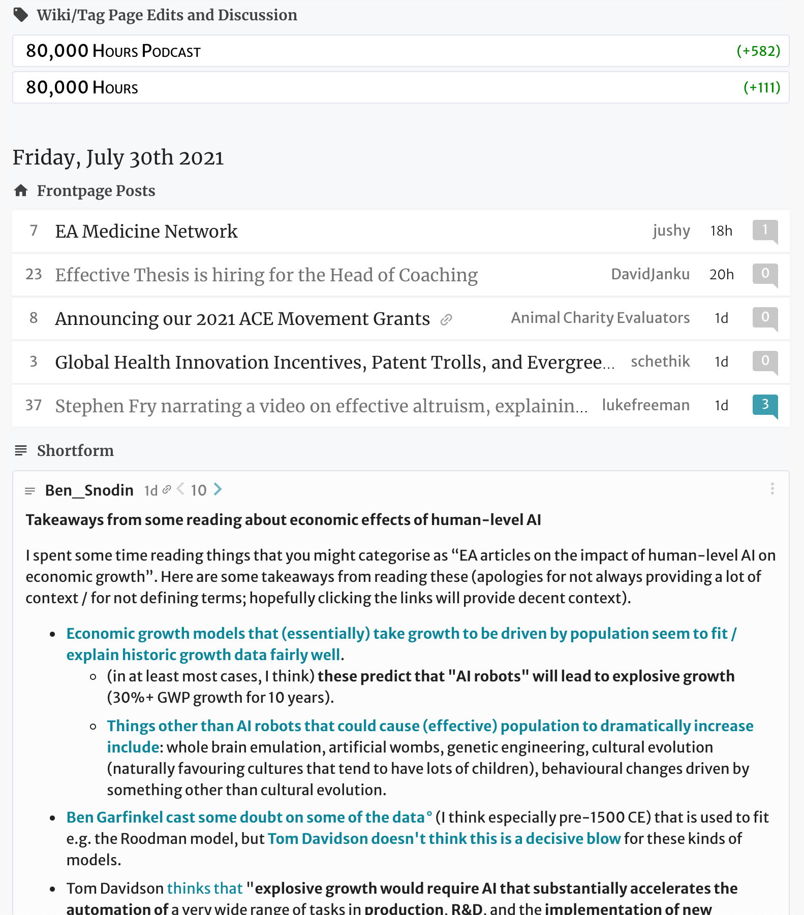
I can't reproduce this, can you tell me what browser you were using, what settings you have for the allposts page, and whether you can still see the issue?
Yes. Chrome version 92.0.4515.107 (Official Build) (x86_64).
However, (1) the issue persists if I change the view settings (selecting "magic", unticking "show low karma" etc makes no difference) and (2) the issue disappears if I open the page in incognito, or in another browser. From this I conclude it is likely caused by one of the many Chrome extensions I have installed. I will keep an eye on this and will let you know if I manage to identify the cause.
What happens if you log in in incognito? Do you have any of these settings set?
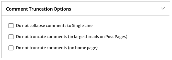
Ah, I had the first of those options ticked, and the issue disappeared after I unticked it. So this is the cause.
Is this behavior deliberate? I think the option should not affect how shortform posts are displayed in the "all posts" view.
Seems right. I doubt it was deliberate.
That’s a bug, thanks for reporting.
When editing a document, it would be nice to be able to link to headings/subheadings from the main editor when writing summaries or internally linking to other sections of a post, e.g. how it's done in Google Docs (see screenshot)
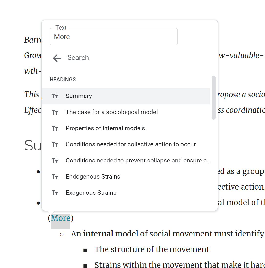
It would be useful to have and easy way to tag / untag job and request listings when they become open or closed (so basically binary tags?)
Would also be good to have an icon next to those posts how there is for the AMAs.
You can strong downvote on a "open listing" tag to try to get it removed from a post, and then just add a "closed listing" tag. I think once the tag score drops to 0, it gets removed.
Yes, a tag is removed when its score drops to zero. As long as multiple people haven't all used the job listings tag, it can be removed by the author's downvote. And in a pinch, any admin's strong vote will suffice to drop something below zero even if it has 2-3 votes.
Ideas coming out of a discussion yesterday evening
Problem: the eventual karma of a post depends a lot on the number of upvotes it gets in the first couple of hours/days after posting it.
Problem: The quality and relevance of new posts varies a lot nowadays. Readers need to (mentally) filter very quickly what to read. We tend to filter on easily available info, such as the karma that the post already has and the author's name (If your name is "Holden Karnofsky" and I've read many good posts from you in the past, I am much more likely to read the post than if your name is "OddHappy153"). This creates a disadvantage for newcomers and infrequent posters.
Idea: for the first X time, don't show the karma of the posts (unless it has really many downvotes). Maybe don't show the author's name on the frontpage either. Or hide it until the user explicitly clicks on "show author".
Oh. This exactly equivalent to what I suggested in Occlumency.
So to affect ordinal rankings, you need to deal with information cascades in real-time.
One way to do this could be to hide authorship and karma for 24 hours (or something) after the post has been published. Readers are now spread more evenly across day-one posts, which means that on day two, their relative karmas are more indicative of true conversion rates and less influenced by randomness and author popularity. So even if you let everything run as normal thenceforth, the information cascades would start on initial conditions that better reflect true conversion rates.
People seem to be converging on this as a suggestion, so I definitely think it would be good to test run it for a while. I'm not optimistic about it being net positive, however, but I think testing it could be usefwl.
Honestly, I'm pessimistic about the value of the frontpage, and I prefer searching for things to read by browsing tags.
Thanks for the suggestion - I've made a note of it!
It seems like the same co-author can be added several times to one post:
Thanks for flagging! :) I've updated that post, and I'll record this as a low-priority bug.
The default generated slugs for posts with non-Latin script titles are absolutely useless:
私たちは毎日、毎秒、トリアージに直面している - https://forum.effectivealtruism.org/posts/WvikY6ixzcwKtKveN/unicode-52
Generally, the slug should match the post title in some human-readable way, so that it is possible to see what the post is about based on the URL alone, without a title or link preview. A sensible way to do this would be to romanize the title if it is not in Latin script, producing something like:
https://forum.effectivealtruism.org/posts/WvikY6ixzcwKtKveN/watashi-tachi-wa-mainichi-maibyou-toriaaji-ni-chokumen-shiteiru (this URL works by the way)
I anticipate that as more content is posted on the Forum in languages that don't use the Latin script (e.g. EA Japan's translation project), this will continue to be an issue.
Should be fixed on our next deploy: https://github.com/ForumMagnum/ForumMagnum/pull/7618
Relatedly, the auto-generated audio narration feature breaks down for non-English posts.
For example, in the Japanese post above, the narration skips everything except for the bits of English.
The handling of this Spanish post is slightly better: all of the text, being in Latin script, is included in the narration, but the words are spoken as if they're English words.
Has anyone ever considered adding an is-an-alt-account flag to accounts, and requiring alts to be declared? When an alt account was declared, it could either be -- at the creator's option -- blocked from voting altogether, or confidentially linked to the person's main account such that double-voting could easily be identified.
I'm wondering if this could help address the multiple-account voting situations. After a transition period in which every active account would be required to declare alt/non-alt status, using two non-alt accounts itself would establish a violation of Forum norms. (Organization accounts probably shouldn't be voting because the wielder of the account probably has a personal account, so they should count as alts.)
We've discussed something like this, I'm generally in favor, subject to opportunity cost.
A way to get an RSS feed which is filtered int he same way as the main feed.

Sounds legit.
April fools' day request:
I was reading the openai blog post "learning to summarize with human feedback" from the AI Safety Fundamentals course (https://openai.com/research/learning-to-summarize-with-human-feedback), especially the intriguing bit at the end about how if they try to fully optimize the model for maximum reward, they actually overfit and get lower-quality responses.
My ill-advised request is that I would just LOVE to see the EA Forum's "summaryBot" go similarly haywire for a day and start summarizing every post in the same repetitive / aggressive tone as the paper:
"28yo dude stubbornly postponees start pursuing gymnastics hobby citing logistics reasons despite obvious interest??? negatively effecting long term fitness progress both personally and academically thoght wise? want change this dumbass shitty ass policy pls"
Allow registered users to post anonymous comments and generate a unique anonymous Id to track them so we can e.g. see the thread of anon1's comments.
I think ideally this should not be visible to mods / backend so it's truly anonymous.
Thanks for your suggestion! We're already considering adding the ability to create anonymous posts, but the idea of a unique id to track them is interesting - I'll make a note of it.
Curated posts could resurface to the frontpage at exponentially decaying intervals.
Wrote a shortform on it. Would be cool to have, imo! : )
Thanks Emrik, we do plan to reconsider how the frontpage should work in a few months!
I also made a suggestion on Sasha's post related to nudging people's reading habits by separating out FTX posts by default. I don't endorse the design, but it could look something like this.[1] Alternatively, could introduce 'tag profiles' or something, where you can select a profile, and define your filters within each profile.[2]
(P.S. Sorry for the ceaseless suggestions, haha! Brain goes all sparkly with an idea and doesn't shut up until I make a comment about it. ^^')
Oh I really like this, and I've had some similar ideas. Will make a note of it!
Linking Jason’s feature request. https://forum.effectivealtruism.org/posts/GMnbdDYoEJiXcsGpp/jws-s-shortform?commentId=hDCodcW9jANNbTDHj
Replying there.
I like the post analytics thing! One thing that would be nice (maybe as an option) would be to see a time series of cumulative unique views as well as the time series of daily unique views that you already get. E.g. that would help with
Cumulative time series of all the statistics could also be pretty nice.
Related question: I'm not sure whether the unique views time series plot is showing "number of views that were unique for that day" rather than "number of views from devices that never accessed the page before". E.g. if I looked at my post every day, and no-one else ever looked at it, maybe I'd see 1 unique view every day in the plot?
Footnote support in the 'standard' editor: For folks who aren't fluent in markdown (like me), the current process is switching the editor back and forth to 'markdown mode' to add these footnotes, which I find pretty cumbersome.[1]
[1] So much so I lazily default to doing it with plain text.
Yeah, this is the current top priority with the new editor rework, and the inability to make this happen was one of the big reasons for why we decided to switch editors. I expect this will happen sometime in the next month or two.
When I tried publishing a draft of this post with the cross-post to LW option, it didn't work, saying something about being able to cross-post to LW. (I instead posted directly to LW and used to the option cross-post to EA Forum.)
I think having a separate section for community posts has greatly improved my experience of the forum. However I think there are still quite a lot of posts that stay on the front page for a long time for similar reasons to why community posts did - because they '[interest] everyone at least a little bit' and/or are 'accessible to everyone, or on topics where everyone has an opinion'.
I want to see posts that do things like present the results of significant work get more attention, and to a lesser extent posts that are topical - i.e. announcements about recent news, events, and achievements also get more attention. I think these posts suffer from not having either of the above properties.
Could have filters/tags that promote these posts?
I would prefer a more failproof anti-spam system; e.g. preventing new accounts from writing Wiki entries, or enabling people to remove such spam. Right now there is a lot of spam on the page, which reduces readability.
I think it would make sense to exclude emoji from the audio narrations, especially now that a lot of users are adding diamond emoji to their usernames. The audio software currently reads aloud the emoji even if it is in a username, e.g. "Eevee orange diamond emoji".
Thanks. We're now filtering the diamond emojis out of the narrations. I've left the others in for now.
The posts' analytics include the mean reading time. Does this refer to "reading time across all reads"/"number of reads", or "total reading time across all views"/"number of views"? I would clarify this in the note, and use the term "mean engagement time" instead of "mean reading time", considering the time writing comments is included.
The expectation that *ALL* EA resources should be in this forum. Ideally people would post books (with the tag "book") and then new users could see which resources the community thinks are worth reading first.
That's an interesting idea for Forum v3: a wiki for all EA materials. Newcomers could go to the Forum and find Peter Singer, Doing Good Better, and links to 80,000 Hours research + new posts every day.
Related: "Should EA Buy Distribution Rights for Foundational Books?" by Cullen O'Keefe
I think EA wikis have been tried in the past.
For what it's worth I think rather than storing information you want to store connections and allow for easy error checking. I suggest this is the non-obvious value of wikipedia.
In that regard I think a roam board would be better than a wiki.
Soon after publishing, hide scores on comments so people aren't biased by them. Randomise the order of comments early on.
Thanks to whoever burned this early :P I suggest this is evidence towards my point.
Numbers in articles which get multiplied at the end. The ability for the community to forecast these numbers and it change the overall result.
A portal for booking a call with an EA.
How often are poeple connected throught the EA hub? How often did poeple connect at EAGx virtual. If connections are valuable, this is a way they could happen more.
I've put some different use cases in the comments.
Roots-based approach to the same outcome: Leave an open invitation and a Calendly link in your EAForum bio.
Sure but you could reduce the friction on that. And ideally make it more trackable.
There could be a "new to EA, book a call" button and EAs could sign up to a call. This would be very welcoming.
A way this could work is that EAs could log in wiht their calendly and then a visitor would choose a time and it would randomise among EAs who were free.
The main thing is that you want the friction to be low enough that it gets used.
EA seems to think networking is valuable enough to arrange conferences. This would expand that.
Make comments on specific sections of text which appear to the right of the text. And can be up and downvoted.
Perhaps these are not visible itially but you can toggle that.
This will be a distracting overhead though. Also, there can be many comments on a single paragraph.
I don't think so. As I commented, parhaps these start invisible (or with little markers you can mouse over). I find it works on google docs.
what do you think?
I don’t know :) I guess the idea itself is definitely sound, but implementing it correctly might be a challenge.
I think we should upvote features we'd like and let the tech team decide what is possible to implement.
It might be hard, it might not.
As assumption that there are some "evergreen" questions like this one, which periodically the community should spend time thinking on.
Please comment with other such questions
I nearly posted this just now and then realised I already did a year ago.
What are your most useful tools https://forum.effectivealtruism.org/posts/zY9grSFwxmskxGQY4/what-are-good-sofware-tools-what-about-general-productivity
"What should our community guidelines be?"
"Please order these cause areas by importance" -> how does the community's thoughts compare to 80k's?
This thread should be linked in the intercom button under "feature requests".
If you click "submit a feature request" it should send you here.
I'd love to have a weekly/monthly open post, where everyone could ask questions and post small ideas. I imagine something similar to LessWrongs "Open & Welcome Thread". This could make some people more comfortable with starting to contribute to the forum.
I used to do these, but I think I phased them out when Shortform posts came along, as those appeared to serve a similar role (sharing things that you don't think merit a full post).
As it turns out, while Shortform has been useful, I think it has a different feel than open threads, so bringing them back seems like a good idea. I or another moderator may start posting them soon.
Perhaps this can be done without an option of voting on comments, which might make this easier for people to participate in.
Aaron used to do these, I wonder why he stopped https://forum.effectivealtruism.org/posts/rB3kQng99cXDim7XH/open-thread-45
How long until we can bring Anthropic's Claude on as a moderator?
I'm finding him to be very good at demonstrating cognitive and emotional empathy for views that are in disagreement with his own, updating accordingly, and then gently proposing ways forward that incorporate both perspectives.
(Maybe a little too deferential at this point, although I expect there's less of that when he's moderating human discussion rather than talking to one human, plus of course it's a live debate in EA how much epistemic integrity to sacrifice for the sake of keeping the peace.)
I imagine that moderating this forum is very emotionally taxing and that you feel pressure to monitor it 24/7. Would be nice to give you all a bit of a break.
People should be notified if one of their posts is referenced in another post.
I recently realised that one of my less upvoted posts was mentioned in another post to have inspired a particular model. I then had a look at my other posts and saw more instances of having been referenced. It's nice to realise that people are using your work, but at the moment there's no easy way to know this!
On https://forum.effectivealtruism.org/allPosts, clicking on a shortform expands it, but there is no way to unexpand/contract it
This is not the case with topic page edit and discussion, where clicking on the topic title toggles between expanding it and unexpanding it
Ideally shortforms could be toggled unexpanded in a similar way
(Semi-serious), since we care about the long-term future, denote years with a 10,000 year digit, so 02023 instead of 2023, like they do at longnow.org
I ~never check the "Quick takes" section even though I bet it has some great stuff.
The reason is that its too hard to find takes that are on a topic I care about, and/or have an angle that seems interesting.
I think I'd be much more likely to read quick takes if the takes had titles, and/or if I could filter them by topic tags.
Maybe you can LLM-generate default title and tag suggestions for the author when they're about to post?
Another way to make me engage more with "Quick takes" is if I could get a feed of takes from users I follow. I can kinda get that in the "Notifications" list but again it's super hard to skim the list to find the ones of interest.
Hmm I think Twitter-ish feed containing posts, quick takes and comments from just the users I follow would be very useful. Not sure what it'd do to the forum dynamic overall though, but could be good, actually?
Just brainstorming here but what if quick takes from users you follow were interleaved into your forum frontpage feed? I.e. they would appear similarly to frontpage posts posts, but probably with an icon, and then expand on click.
Quick thought is that I'd want a separate section on the homepage called "People you follow".
Mixing it into the current "New & Upvoted" section seems bad to me but that's really just a hot take.
V reasonable- do you have an idea of why it seems bad?
Similar reasons that I want both of Twitter's "home" and "following" views.
I want "People you follow" to include everything and it should be chronological.
If quick takes are includedl, I guess the "People you follow" content could dominate the items that currently make the "New and upvoted" section.
Hi JP,
In recent days I've come to think I would appreciate being able to sort the posts I have saved for later (by date posted, time to read, karma, tags, etc). Is this possible?
Thanks!
No, sorry. I appreciate the question though, and I'll record a ticket about it.
Encourage short posts:
Thanks for the suggestions! I've made a note of all of them!
Hi JP,
I think it would be nice to have the possibility of filtering content by user. As of now it is not possible.
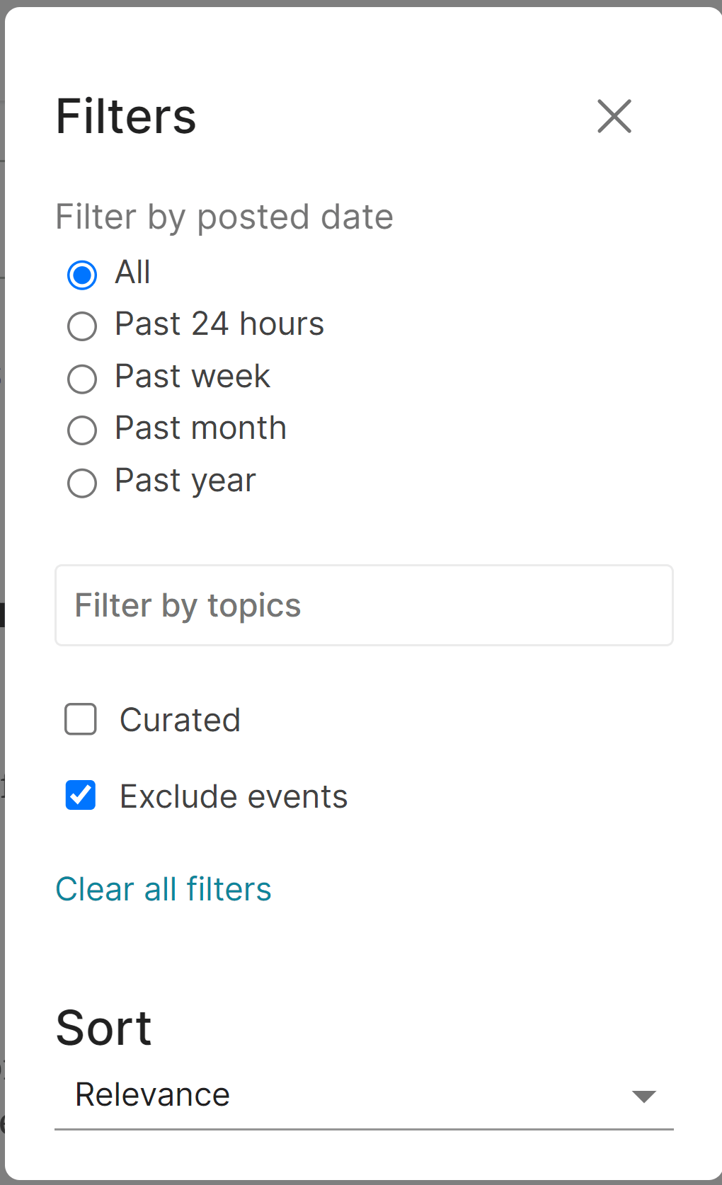
My use case was trying to find something I said.
I believe it should work if you search "foobar Vasco Grilo"
Thanks! That restricts the search to posts and comments from me, but then there are no results if I add a key word (e.g. "foobar Vasco Grilo 4.64").
'Commenting sprees' - blocks of time where discussion with more immediate replies would be encouraged.
We’re trying out moving our Italian translation of the EA Handbook to the forum, to see if participants of the next round of our virtual program prefer it that way compared to google docs. (most of the first chapter is now here)
Thanks
You'll need a site admin to help with both of these. Could you contact us with the details (ex. how you want the chapters organized)? Thanks!
You can subscribe to other users' new posts from their profile, but I would like to be able to subscribe to users' new comments which I don't see a way to do
I think the EA Forum software does a poor job at communicating the license terms of forum posts. (For context, all new forum content published on or after 1 December 2022 has been licensed under Creative Commons Attribution 4.0.)
The current license statement is buried in the forum terms of use which can be reached from the "How to use the Forum" page in the navigation sidebar, so many readers may be unaware of the license terms if they have not registered on the forum and clicked through the license agreement. By contrast, many sites that use CC licenses, like Wikipedia and Stack Overflow, display a link to the license in the footer:

I suggest adding a footer to each new post or the sidebar stating something like the following:
EA Forum user content posted on or after 1 December 2022 is licensed under Creative Commons Attribution 4.0. This license only covers content created by Forum users; third-party content may be subject to other copyright restrictions.
The second part of this statement is relevant for content such as linkposts and posts that incorporate quotes, where there has been confusion about whether the CC license would apply to third-party content incorporated into forum posts (the license text explicitly states that it does not grant rights that the licensor does not control).
Note that rel="license" should be added to the license link. If it's necessary to explain more, you could link to another page, like how Stack Overflow links to this page stating that content from different periods of time are subject to different versions of CC BY-SA.
Somewhat relatedly, the forum terms of use addendum currently does not mention the ForumMagnum software, which is GPL-v3. CEA itself might have obligations under the GPL to other contributors to the forum software (i.e. anyone who contributed to it and was not a CEA employee), like informing forum users of the terms and conditions of the GPL and not imposing further restrictions on them. I suggest looking into this to see if the EA Forum terms of service need to be modified in order to comply with the GPL. [edit: reworded to avoid being interpreted as legal advice]
When using search, the date on the search result card doesn't seem to always match up with the published date on the post itself.
For example, this post was published yesterday, 24th January, but when it appears in search it looks like:
which might be the date it was first created in draft form, and not published?
Which also leads to counter-intuitive things like:
If you press a footnote link in a post and the footnote is hidden in the 'View more footnotes' collapsable list the page scrolls to a footnote you can't see. I found it confusing until I realised you have to press 'view more footnotes' to expand them. It would be good if it opened automatically when you follow a footnote link
It's quite easy to gain a lot of karma by writing questions. I think that's fair, but I thought I'd flag it cos I've been doing very well on karma for that reason.
Did we try having this post sort by magic?
Also can we have magic as an option to sort all comments and answers?
Also maybe call it "hot" or "vogue (new or highly rated)".
Thanks Nathan! I see this is already in our backlog. :)
it would be nice to exclude text e.g. the appendix / pre-amble / introduction from the "time to read" estimate.
E.g. in our upcoming post the time to read the core pieces is 22 minutes, but the total read time is showing 39 minutes (almost double) because of our lenghty appendix and some introductory context.
See this comment.
This pattern of broken link, where the intended link is appended to another, distinct URL, has appeared in many comments or posts.
This defect seems common enough that it seems to justify investigation of the root cause (or even very crude automatic fix) especially since the pattern in the defect is so simple.
Ok, this issue has been picked up:
https://github.com/ForumMagnum/ForumMagnum/issues/5057
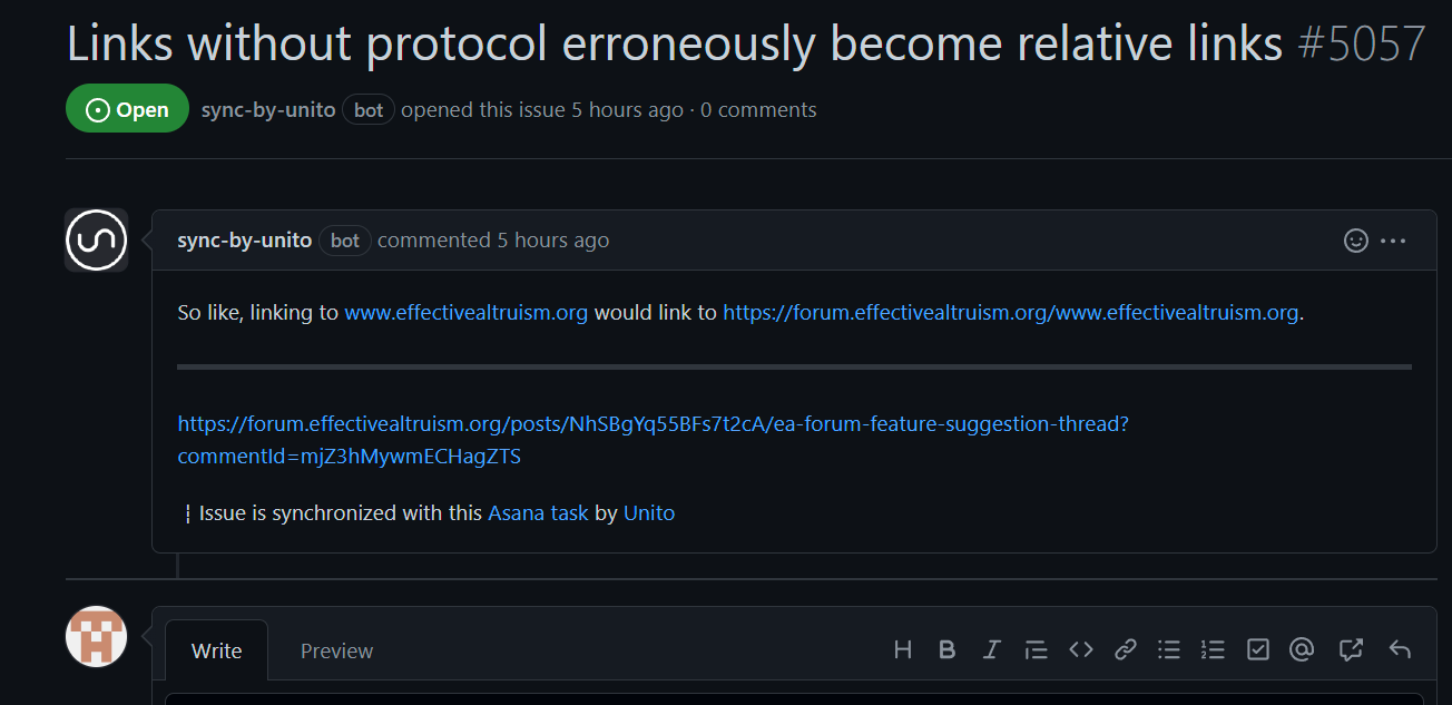
Yay! The system works.
The analytics page is great!
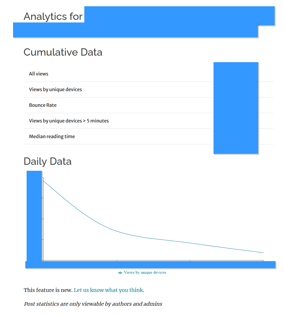
Low value ideas (but easy to implement):
In my view, more stats is always good. I guess things could get a little "extra" coming from a dorkier stats mindset, but the analytics page isn't at the risk of being overbearing, and can bear more stats.
Hi. I started drafting a reply but had to stop and now a week later I cannot find where I was drafting it. I would love to be able to see all the places where I have draft comments/replies autosaved. Thank you!
This is probably not useful anymore, but on Chrome you can open the browser development tools (Right click + "inspect element", or "ctrl+shift+I"), go to the "Application" tab, and in the Storage -> Local storage section you can see all your drafts. (The process on other browsers to access local storage is similar)
Hi,
Michael Aird suggested some time ago:
getting the EA Forum - and maybe other sites - to have a clearly visible option for putting a badge there if one is a GWWC member
I do not think this ended up being implemented, but it sounds like a good idea. Currently, it is already possible to say in the user profile whether one has attended EA virtual programs, and conferences.
Hi JP,
It would be nice to have the possibility of filtering the posts of a user by a given tag. As of now, it is not possible.
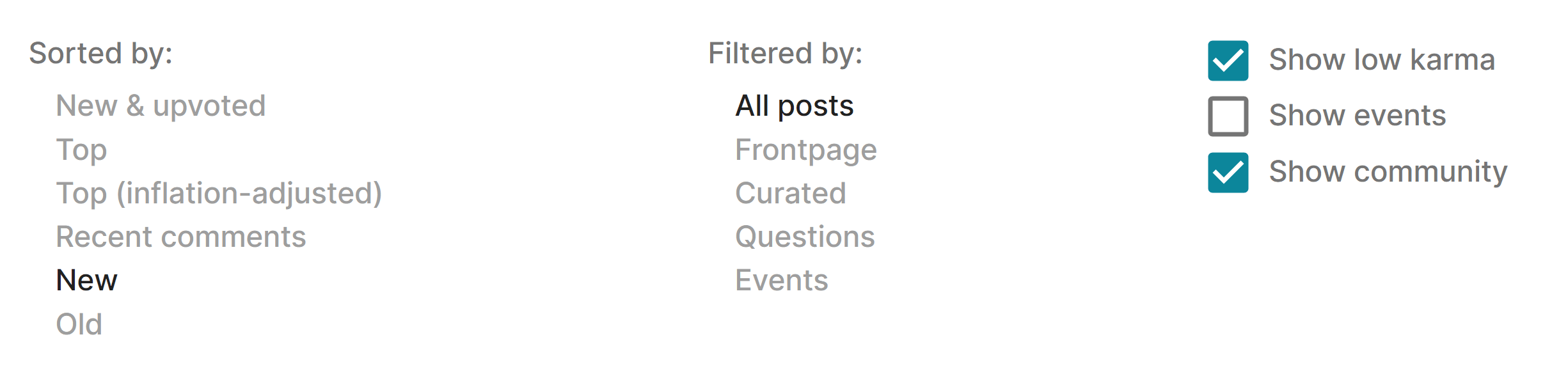
You can do this on the search page. (I agree it would be better for that option to appear on the user page filtering — it's a natural thing to want to look for.)
I would like feedback on this idea: Community Posts
MVP: Change "create topic" to "create community post" and reframe wiki topic summaries as community written posts. Currently they are introductions, not summaries.
Full change: Allow people to create posts which can be cowritten by anyone once live. Wikis produce high quality content, but the current wiki is framed around the topic tags, rather than any kind of article being able to be written.
Didn't read through all comments so unsure if this was suggested already, but could the karma / agree votes be located at the bottom of comments rather than at the top (or both)? For very long comments (especially in gnarly threads) it's a pain to scroll up to agree/disagree vote, and it incentivises liking based on the author or first few lines rather than reading through.
Listing of “all posts I upvoted/strong upvoted”
This is very hidden, but here you go: https://forum.effectivealtruism.org/votesByYear/2022
I would love to have more features for the Markdown editor, since I prefer it over the WYSIWYG editor. For example, I'd like to be able to upload images while editing in Markdown (like GitHub does). Also, a syntax cheatsheet would be wonderful.
Ideally, I'd like to be able to switch between the Markdown and WYSIWYG editors while editing a document, or have a rendered preview tab in the Markdown editor.
I think the UI for voting could be improved in the following ways:
I'm not sure if it's exactly a feature suggestion as a concern highlighted here that I agree with, which is basically: The number of Forum users seem to be growing quite a lot (congrats!), with many more posts, so some posts that might be high-effort slip under the radar or disappear quite quickly (see Ian David Moss' comment). Is there anything the Forum team is doing to mitigate this (someone suggested a higher density of posts on the front page) or other wise any thoughts on this topic?
Other possible solutions (some already mentioned and I'm not sold of any of them) could be:
''Next" and "Previous" arrows/buttons at the bottom of a post, to move to the next/previous post - useful when you haven't read the forum for a while and want to catch up. This would obviously have to assume a certain ordering (e.g. chronological vs karma) and selection (e.g. all or excluding Community/Questions), which could perhaps be adjusted in Settings.
Some suggestions for making tags more usefwl. I say some reasons I think tags are important in the post, but these suggestions are easy to see usefwlness of anyaway.
Right now, you can't tag a post while you're writing it. You have to "save as draft" and then add the tags to the draft, or add the tags after you publish it. This is needlessly annoying. I suggest making it like this:
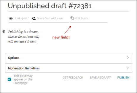
The miniscule effort encouraged by making it mandatory is probably outweighed by the benefits many times over on average. Consider that the effort is a one-time cost, while the benefits accrue every time someone finds it usefwl. The costs are consistently modest for authors, while the benefits can be enormous for some readers (e.g. I'm doing a lit review and the tags help me counterfactually find the perfect post.)
So I suggest making it mandatory. Maybe like this:
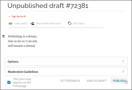
Great suggestion! I've added it to our list of features to consider.
There should be a way to suggest an author cross-post a post of theirs and/or give them karma if you x post a work they've posted.
To clarify, this is the situation where:
and then you might do something like:
?
I've made a task for this, let me know if I got anything wrong. Thanks for the suggestion!
Yep that seems like the MVP.
I think if you're xposting and sharing karma you should probably get <50% but even 50% seems better than the current status quo. I do think it could be cool if the person xposting getting some kind of "finder's fee" karma (e.g. 25% or something).
Would add that if someone does create the post on your suggestion, you should get a notification when its posted / some kind of like "thank you for making the forum a better place!" kind of message.
This loosely inspired a new feature, where you can now make a linkpost and add the author as a coauthor, with them having the ability to accept or decline the coauthorship. Thanks to trialing candidate Ollie E for building the feature.
I'm not sure if such a feature would be worth the work it would involve, but: a very simple "editor" to very easily create probability distributions (or maybe more generally graphs that don't require mathematical formulas but just very rough manual sketching) and embed them into posts or comments could be useful. I'm not sure how often people would really use that though. Generally however, it would probably be a good thing to make probability estimates as explicit as possible, and being able to easily "draw" distributions in a few seconds and having a polished looking output could make that happen.
If this is something people would find useful, I'd be willing to spend the time to create such a component so it would theoretically just have to be "plugged in" afterwards.
You might be interested in: https://www.lesswrong.com/posts/EQJfdqSaMcJyR5k73/habryka-s-shortform-feed?commentId=dQT4kmtd594nQFf85
Hi JP,
I think it would be nice to have an option to subscribe to sequences, such that one can be notified of new posts.
You can now subscribe to be notified when posts are added to a sequence. Hope this is helpful, and let me know if you run into any issues!
Thanks for the update, Sarah!
Definitely. I agree, and so do a few other users. We have an open ticket on it.
It would be nice to be able to order search results by date and maybe some other features like karma.
Hi JP,
Have you though about adding an option to filter the comments made by a given user by karma? Checking the comments from someone may be a good way of getting a better understanding about their worldview, and sorting them by karma would facilitate this process.
Is it hard to make here and Lesswrong more compatible? I am thinking of a cross-posting feature that has comments of both forums. Linking the accounts (for subscriptions, for example. Karma maybe.) also seems nice.
Probably this should go on LessWrong rather than here, but: it would be great if the Markdown editor could handle basic image formatting, rather than stripping out all the HTML so all my images revert to maximum-width.
For events it would be useful to get notifications a fixed amount of time before the event rather than when they are uploaded to the system. Right now I get 2-8 notifications at a time often for the same recurring event.
That's useful, thanks.
You do get notified/reminded 24 hours before the event if you RSVP to it.
I think if you’re subscribed to a group, it still makes more sense to get notified when events are posted rather than 24 hours before, but maybe there's a problem with a bunch of instances of a recurring event getting posted at once.
This is my current frontpage, logged in and logged out
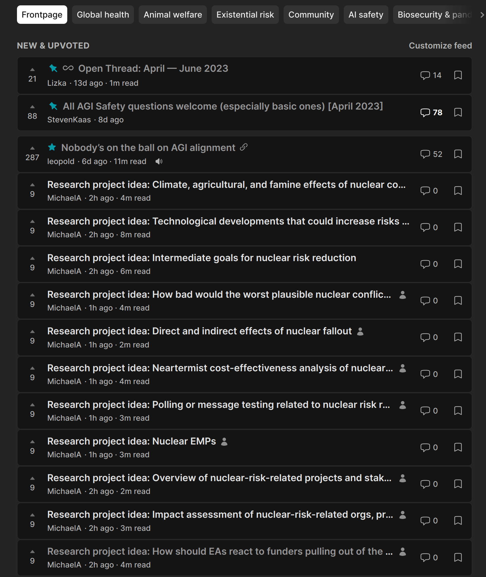

It would be nice to have a way to post sequences without having all the posts show up on the frontpage, we would definitely use it for EA Italy
Thanks for this suggestion, we've put this problem a bit higher up on our backlog, since we noticed it affected a few different users in the last few months! (no specific timeline on solving it at the moment)
So, proposing that we give everyone equal voting power gives those on the forum with more voting power an incentive to lessen mine (by downvoting this). So how about this: we make the agreement karma democratic. That way we can see what people actually agree or disagree on and since it doesn't affect karma we can make it democratic without affecting those with disproportionate voting power.
EDIT: Three people upvoted this suggestion, one person downvoted this suggestion, the result is negative karma. What we see is that the downvotes contain a lot more voting weight than the upvotes. This seems logical, people with more voting power have an incentive to use that power to make sure they don't lose it. Just keep in mind that we really cannot conclude what the EA community believes/wants based on the results of an undemocratic karma-system.
I'm planning to write a piece on animal welfare, as part of that post it will help to post a picture of a dead animal. I'd like to have it blurred until users choose to see it, is there a way to do that?
Side note: I can't see anything about this circumstance in the user manual or guide to norms.
No, sorry, we don't support that. It sounds like a very reasonable use-case though, and I'll add it to our tech backlog. In the mean time, I recommend a link to an off-site image hosting service.
Thanks, I appreciate it:)
I'd like it if I could paste a link into the editor (for either comments or posts), then click or hover over it to see an option to automatically covert the text to the name of the page, similar to how that happens in Google Docs.
This would be most valuable to me in comments, since I usually copy posts from Google Docs anyway.
I use a lot of links in comments, and think it's valuable to do so (to connect conversations to other relevant work), but sometimes I feel a bit inclined to not bother or not write the actual title (just leaving the URL) since it's a hassle.
I feel like I remember saying this somewhere else already, and it's very possible someone else has suggested it here too.
ETA: Oh, I just stumbled upon the comment of mine that I was half-remembering, which was for a somewhat different feature motivated by a similar issue:
I'd really like this for regular Forum posts and (especially) comments too; I'd like to be able to type "[[" and then start typing the name of the post, automatically see a drop down menu with posts that include that text in their name, and then just click on it to have the name appear in the text, with the right hyperlink. At the moment, I have to open a new tab, find the post, and either copy the title and then separately the link or write title and copy the link. I do a lot of linking to other Forum posts from within Forum posts and comments, so this is a little annoying.
I think ideally this would also show LessWrong posts, since people link to them fairly often too.
I say "(especially) comments" because I almost always draft posts in Google docs, where this feature wouldn't really help me, whereas I write comments in the Forum editor from the start.
Please let me search within my bookmarks.
In general, I read something and bookmark it if I liked it. Then that thing that I read comes up in conversation. I go into my bookmarks to find it so that I can share it with the other person mid-convo quickly but then I can't retrieve it from the bookmarks list as fast as I thought I could! This happens to me in almost every session as a facilitator of the EA Virtual programs!
A way to see what you have previously voted on with karma.
This exists here (https://forum.effectivealtruism.org/votesByYear/2022), not sure if that is documented anywhere, I found it elsewhere in this thread as a comment
Thanks for pointing out that this is not discoverable! I've added a note about this to the user manual, but I agree that it should also just be easier to notice as you're exploring the platform.
Hi JP,
I have just accidentaly published one post. It was not a big deal, as I moved it to drafts, and then published it again 45 min later. Have you considered having a pop-up saying "Are you sure you want to publish?" after one clicks on the button "Publish"? Relatedly, if one moves a published post to the drafts, and then publishes it again, what determines its positition in the front page is:
Thanks for the report. We currently do the second, which isn't ideal to be sure. If someone redrafts and republishes after a post has been up for a while, an admin will have to adjust the published date manually. This happens surprisingly infrequently relative to what I might've expected, so we haven't prioritized improving that.
We do actually have a way to hide the karma for everyone on the comments of your own posts. It's an experiment we decided to create to see if it would help certain discussions feel less like a gladiatorial arena. It's intentionally pretty hidden right now, and might not work well after multiple years of not being used. To enable it:
If you do this, consider reaching out to us to ensure it isn't completely broken.
We do actually have a way to hide the karma for everyone on the comments of your own posts.
Cool! I have now opted in to the feature, and plan to test it when I create another post.
You must have 2,000 karma
Hiding karma would be specially relevant for people with low karma, who are new to the forum?
Then you need to enable it on a new post
I assume it can be disabled later one (in the post editor moderation options)?
Hiding karma would be specially relevant for people with low karma, who are new to the forum?
At the time we wrote the feature, we wanted to experiment with it for only some posts, and generally we often roll(ed) out features to power users first. Rather than having someone new to the site who just happened to discover it but wouldn't be able to model the costs/benefits of turning on the feature.
I assume it can be disabled later one (in the post editor moderation options)?
No, actually. On the basis that karma does actually contribute a lot to the way people interact with comments, we wanted to avoid changing the system midway through a thread.
(TBC this really was a long time ago and I don't necessarily endorse the decisions that past!me made here.)
If you do this, consider reaching out to us to ensure it isn't completely broken.
I have published a post without karma visibility in the comments, and everything seems to be working fine. I thought the karma would only become invisible to me, but I see now it becomes invisible for everyone, so I can see why you implemented the feature such that one could not turn the visibility back on.
To clarify, my suggestion was about making karma invisible to the person activating the feature, in the same way that one can currently activate a feature to hide the names of users. In this case, I think it would make sense to make the karma invisible in all posts (not just in the ones published by the user activating the feature), and for it to be possible to turn on/off the feature whenever.
Again without defending past!me's decision, we deliberate thought it would be a bad idea to have some of the participants able to see karma and some unable to. Karma is an important part of the social landscape that some people would be missing.
I see, although I think one can argue it should not be possible to hide users' names based on the same argument.
If I were defending my past decision, I'd say that you'd probably hover over the usernames after reading and before you reply.
Fair. I was not clear above, but, by "in the same way that one can currently activate a feature to hide the names of users", I meant that karma could be invisible by defaul if the feature is activated, but then show up once one hovers over the karma placeholder.
Ah, I see. I don't hate that at all.
A thought I want to leave for posterity and because I just linked this conversation to someone: I really would like the comment hiding to also hide agree/disagree votes. I'm nervous about people feeling more pressure to disagree-vote in this world.
Also while I'm at it I should note that, as evidence of the feature being under-baked: someone reported it to me as a bug 😅
Hi JP,
Nice that user interests are now visible on the profile page. I think it would be good if they were sorted alphabetically.
Categorized upvoting suggestion
I have said this before but, I do feel like LW and the EA Forum should have ways to quickly input probability distributions to help prevent double illusion of transparency-type dynamics and help people be more concrete without making the text hard to follow.
One format that I like is people can mouse of a word and there will be a little tool tip pop-up thing with prob distribution. The UI for making it could be a cross between making a hyperlink and the metaculus prob distribution mixture creator.
Thanks for this, I do think we should have something along this direction.
Hi JP,
I imported this Doc to the EA Forum editor, and noted the 2nd to 4th bullets of the section "Cost-effectiveness of the Climate Change Fund" were not imported.
Relatedly, I imported this Doc to the EA Forum editor, and noted the figures in the section "Cumulative distribution functions (CDFs)" were not imported.
Hi Vasco, both of these bugs should be fixed now :)
Thanks, Will! Relatedly, I noted the importation makes the text in tables go from aligned to the centre in docs to aligned to the left/right on the EA Forum editor.
Unfortunately we don't support aligning text to the centre/right in our editor, so we won't be able to fix this any time soon. Sorry about that.
left/right
Are you sure the text was aligned to the right? I wouldn't expect that to be possible
Here is an example with text in a table aligned to the left (select all text -> cell properties -> table cell text alignement).
| Statistic | Annual epidemic/pandemic deaths as a fraction of the global population |
| Mean | 0.236 % |
| Minimum | 0 |
| 5th percentile | 1.19*10^-6 |
| 10th percentile | 3.60*10^-6 |
| Median | 0.0276 % |
| 90th percentile | 0.414 % |
| 95th percentile | 0.684 % |
| Maximum | 10.3 % |
Ah thanks, I didn't know we had that feature. In that case we should be able to fix this when importing, I'll get back to you when it's done
Hi JP,
Minor. In the messages' page, the screen is currently broken down into 2, with my past conversations on the left, and the one I am focussing on on the right. I would rather have an option to expand the screen on the right such that I do not see the conversations pane on the left, or have an option to hide the conversations pane on the left.
Could we have a no-frontpage tag that authors can apply that would (e.g.) give -99999 karma adjustment to a post for frontpage purposes?
I think breaking up larger posts into appendices or parts (cf. the new alcoholism sequence) can be helpful but also could clog the frontpage.
I believe what you're looking for is the personal blog distinction. Authors can decide that they want to post their writing on the Forum, but not submit it to the frontpage. Examples might be a post that is political, or if someone is dumping a larger number of posts. Devin actually did this, so you'll notice that the posts you mentioned are in the personal blog category. If you're seeing them on the frontpage, then my guess is you've customized your feed.
Ah yes, I think I changed a setting because I didn't like that the mod team was flagging stuff as personal blog (during the Bostrom affair, was it?) that I didn't think met the standard for that treatment. So I guess seeing Devin's appendices on my frontpage is the price I pay for opting out of mod-directed personal blog designations!
Easy and credible way to add a bounty and prizes for questions (like this one )
We don't have a "native" way to do this in the Forum. Perhaps we should — I've added a task to our tracker. The way that I'd recommend, that still uses the Forum's UI, is to put the offer in your Question post, and tag the post with Bounty (Open). (I've replied to your on your post as well.)
Embed iframes
Some use cases:
This feature is very versatile and would solve many things at once.
Thanks for this suggestion, I believe you can already embed a number of things in posts by default, but not arbitrarily anything, see here: https://forum.effectivealtruism.org/posts/Y8gkABpa9R6ktkhYt/forum-user-manual#Extra_cool_things
Oh great! I didn't know about some of them.
Still, the main thing I had in mind was to embed some custom interactive stuff.
Implementing it as iframe support, would be the most general, and you would solve all the possible "embed X" suggestions at once. So it seams to be the most efficient approach.
It might be too powerful. In particular, moderators can no longer fully control the content of the post. If you're sneaky, you can even engineer a post that appears differently to different people. I think allowing authors to embed totally arbitrary content is too much freedom.
Co authors (second authors and later?) of posts don't appear to have their posts in the profile?
Sidhu has no post listed:
This seems mild, but could be bad if someone likes to co author a lot.
Ah, maybe the above might be an async indexing thing? (e.g. async/chron tasks updates the indexes every 24 hours and the above example is too recent to be indexed)
Amber Dawn has her posts listed:

There should be a polis questions feature, where you can embed (or better it's a full feature) a polis question and people can write comments for it/see the visualisation. Not having to go to another page would give polis questions significantly more traction and they are a useful tool
Hi JP,
When I copy-paste a published-to-web Doc to the EA Forum editor, all bullet points are converted to 1st level bullet points, so I typically have to manually update all higher than 1 order bullets. If I copy-past the Doc (instead of its published-to-web version), the formatting of the bullets is maintained, but then I lose all the footnotes. It would be nice if both bullets formating and footnotes were maintained!
There appears to be a bug where a question post cross-posted from LessWrong goes up on this Forum as a regular post, as happened here.
I believe we fixed this here.
Add a 😂 emoji reply!
I'd expect clicking on my profile picture to take me to my profile (currently the click doesn't do anything) (but it does have a pretty animation)
I just added this to a recent related improvement. Should be fixed when that Pull Request gets merged.
Unclear: arguably deleted comments should not provide positive karma (e.g. this user, who has deleted almost all of her comments).
Vaidehi_agarwalla and I thought it might be a good idea to have sequences within sequences. For example: Vaidehi created sequences for the ea-survey results per year, because sometimes you want to only look at the survey results for that one year. Other times you want to look at all the survey results. If we add a new survey sequence every year it will clutter up the sequence page, but if you put them in one larger sequence it will take up less space and it will allow people to either read everything in one go, or select the "sub-sequence" they want to read and stop there.
Could we get notifications if someone comments on a thread we started, but not as a direct reply to us? Currently, if I make a comment, I get a notification if Alice replies, but not if Bob replies to Alice. And I suspect Bob's replies would often relate to what I said and be interesting to me.
I've just noticed I can subscribe to comment replies on a thread, but I'm not yet sure if that captures replies to replies, and really I'd like this to be default for every comment thread I start (rather than me having to manually opt in every time).
(Apologies if someone else already mentioned this; I haven't read the other suggestions on this page.)
If you select "auto-subscribe to replies to my comments", you'll be subscribed to each comment that replies to one of your comments. You can combine this with a notification for "replies to comments I subscribe to". This should capture your "replies to replies", though I haven't validated this through testing.
In the time since you left this comment, have you seen evidence that this method works, or that it doesn't?
Update: I think that this doesn't work, at least for me and in cases where I didn't start the comment thread. (Unless I'm doing something wrong.)
My specific observations:
(Is there something else I should do? Also let me know if screenshots would be useful.)
I've checked with LW's tech staff, and it looks like what you've seen is the behavior they'd expect -- it's apparently difficult to track longer comment chains in this way with the current tech setup. I'm sorry to have given you an incorrect theory.
That's a reasonable test, and I wouldn't have expected that result. I'll follow up with our tech folks and let you know what I find out.
One feature I really like on forums like Hacker News is the ability to traverse comments by having options to jump to a comment's parent, or next or previous sibling.
When you are deep in a gnarly comment thread, I find it useful to be able to hop up a couple of levels and then minimise a comment and its children
This is what comments looks like on Hacker News for example:

You can do both of these things.
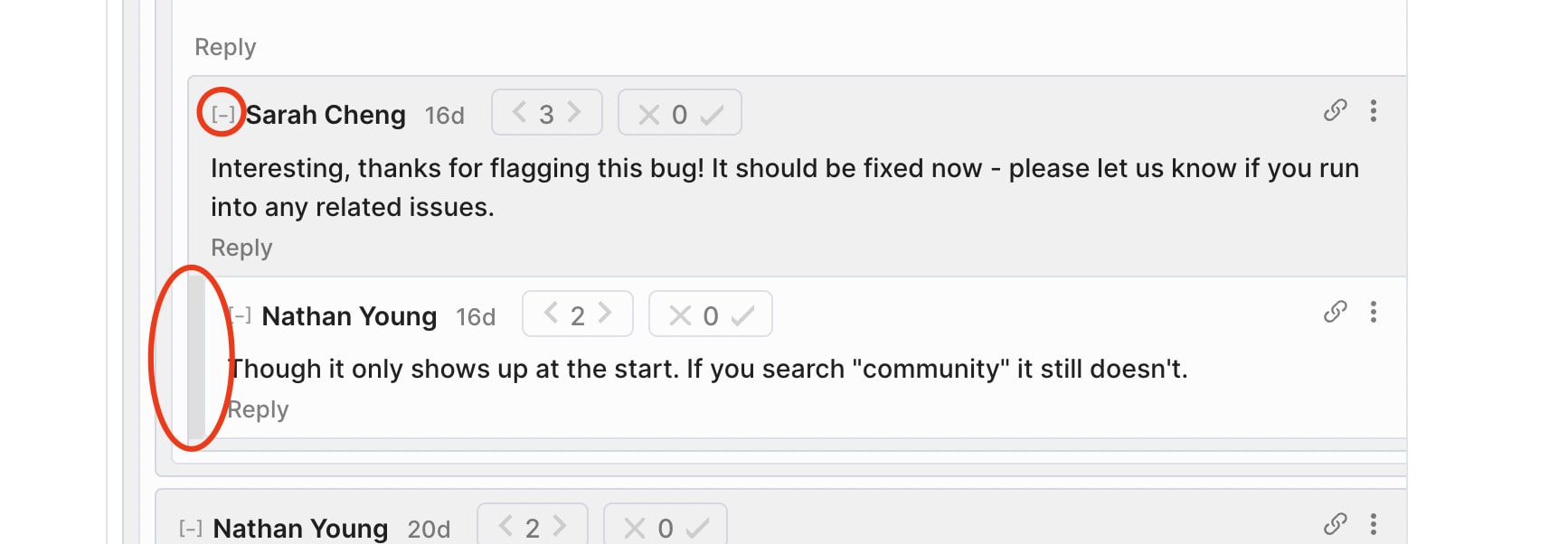
You can click to the left of a comment to get to the parent comment, and then collapse by clicking on the minus icon next to the username.
Cool thanks, I did not know about that first one.
I note that that is different to how it works on substack comments, where clicking to the left of a comment collapses the parent comment rather than scrolling to it like here
I did not know that, that's useful.
Reformat all shortforms so they have agreevotes.
Mine does, now, as does at least one other post that didn't before, maybe they're just global now?
Yup, we updated all posts and shortforms to include agree voting today.
I unhid community posts on the main posts section to see what would happen but now I can't rehide them. But I'd like to.
You can re-hide them from that section by opening "Customize Feed" and setting "Community" to be "Hidden":
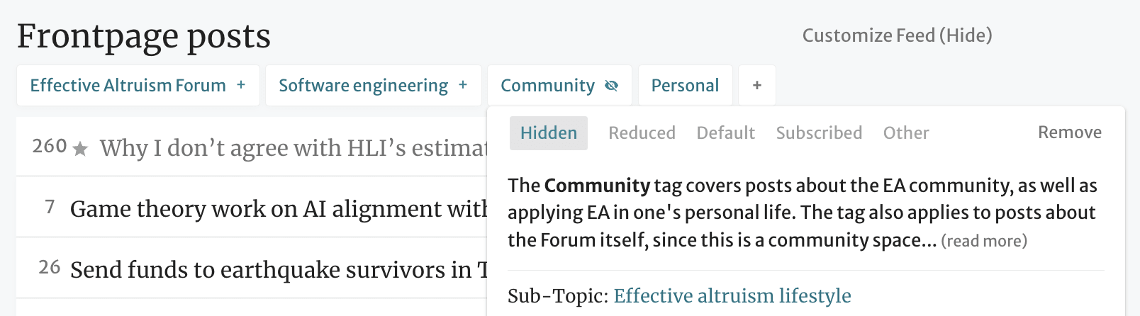
I don't see an option:
And your image isn't showing to me.
Also resizing images never works for me.
Oh sorry, a recent change to images caused a bug, but it should be fixed now. (You can fix your image by editing and submitting your comment.)
You can add "Community" as an option by clicking on the + button and searching for it.
It is not listed here. And I tried to resubmit my image. Still looks massive.
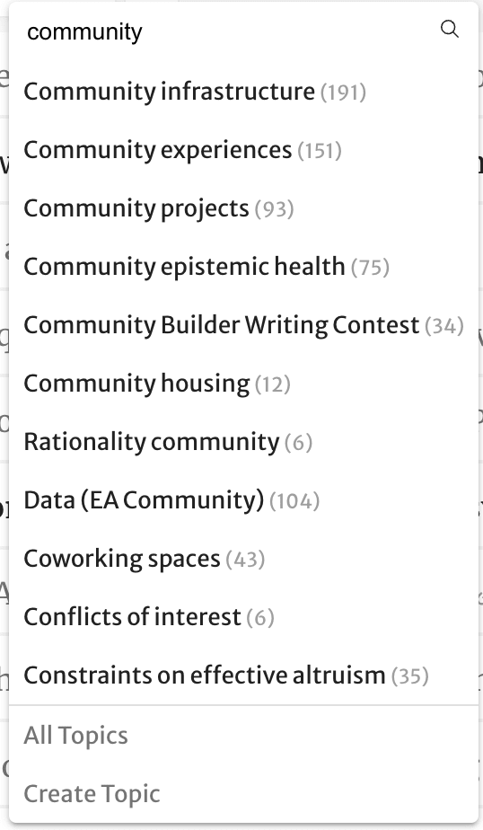
Interesting, thanks for flagging this bug! It should be fixed now - please let us know if you run into any related issues.
Though it only shows up at the start. If you search "community" it still doesn't.
Reformat this comment section so that it has agreevotes.
Done! :)
The link from linkposts like this one, don't work, I assume because the link needs to be prefixed with https://
Can this be added automatically if it is missing, or do linkposts need to go via https://forum.effectivealtruism.org/out?url=
Some basic functionality I would benefit a lot from:
Footnotes are a thing that I would use more often if it was easy to do so.
I love editing using the WYSIWYG editor, which does not support them. So when I want to add footnotes I would need to: 1) copy paste my article into a google doc, 2) run a plugin to turn the text to markdown, 3) change my editor settings to Markdown, 4) create a new article with the markdown editor, 5) copy paste the markdown generated by the plugin to the new article. And any edition afterward would need to be done on the markdown editor, which I like less. In practice, I just never do this and do not include footnotes or add them at the end of the article, to the detriment of the content.
In general I have the expectation that both editors should implement the same functionality. And ideally they should be completely interoperable, so that I could change between them at any time while editing.
Thanks for the feedback Jsevillamol! And good timing 🙂 Hope WYSIWYG footnotes are meeting your needs. Full interoperability is a pretty tall order, and I expect it won't be a near-term add, but I've added it to our list in any case. Cheers!
Thanks to you!
In hindsight, the footnotes was the thing I really wanted so I am a very happy user indeed!
Would be good to be able to switch between editors to do things like eg editing complicated LaTeX (right now its complicated to edit it in the WYIWYG editor). But maybe the more reasonable ask is to make the WYSIWYG equation editor span multiple lines for large equations.
Really glad to hear footnotes have met your needs!
maybe the more reasonable ask is to make the WYSIWYG equation editor span multiple lines for large equations.
Added to the list! Are you writing long enough equations that the text goes offscreen?
Yes, that is right.
I don't have any recent examples in the EA Forum, but here is an article I wrote in LessWrong where the equations where very annoying to edit.
I expect I occassionally would use larger equations, better formated (with underbraces and such) if it was easier to edit in the WYSIWYG editor.
Actually it looks like a version of this is currently possible! There's a handle in the lower-right corner of the equation editor that let's you resize it. Once you've done that, it remains at the set width and wraps the contents to fit. The way the equation editor follows the cursor can be a bit janky, but it does seem to work.
I would like to promote Wei Dai's suggestion that it would be nice if it was possible to share drafts privately and then potentially make them public at a later point. (I think there's some chance that this is already possible, but the UX doesn't seem intuitive, otherwise I would have noticed already.)
Before implementing, it seems worth talking to users to find out whether this would actually make them more likely to share their internal work publicly at some point. It could also be good to find out whether there are any other ways that could make people more likely to share their internal work publicly.
Some of this will appear with the new editor, which has collaborative editing features built in.
but the UX doesn't seem intuitive, otherwise I would have noticed already
I admire your confidence. There's a sense in which if an experienced user doesn't know about a feature, it isn't well designed. OTOH, I assign some probability you've forgotten what the new post dialogue looks like.

Very cool!
I think for me personally, this would work better if there were two buttons at the end – one called "publish", one called "share as draft with users" or something like that. That puts it more in the reference class of "this is a form of publishing my work" rather than "here's some additional feature that I don't understand how it works".
Also: I notice that my wording was a bit unfriendly – apologies, I would like to retract that. :)
EDIT: It seems that drafts don't support comments. I think this is one of the main features I was hoping for.
Re: your edit - yep, that will come with the new editor, though maybe not in the first iteration.
We should be able to add tags to sequences and have them cascade to the posts in those sequences.
We definitely want this, and have considered featuring sequences on topic pages more prominently.
@Matt Goodman thanks for all your suggestions. I think they all make sense or have been suggested before, and we'll have to prioritize them against our other work!
I would love it if I could scroll through all the comments and posts I have upvoted (so I can easily revisit/revise my own curated list of content that my past self thought was worth others seeing).
Thanks for this suggestion! You can in fact see your past upvotes, although the feature is really not easily discoverable right now, sadly.
Thanks for the suggestions. Responding here rather than on the post. I like the "Occlumency" idea, and have been thinking along those lines. I've recorded it.
I also like outdated, have passed on to Topics lead Pablo.
We've heard this before. I personally lean in the direction that this is the right sort of thing to think about, but does not make for a good Forum experience. There might be other approaches like "ratio of upvotes to reads" that would serve the final purpose while being less disruptive.
There's been murmurs about adjustments to the forum about voting and volume and this probably reflects broader sentiment.
Some considerations:
I think there might be a number of solutions that immediately come to mind that haven't been written about, and these solutions do account for the above considerations (and sort of do a lot more).
Maybe someone will write them out[1]. But for these solutions that come to mind, it probably isn't the best thing to just do them right away.
Note that in order to do this, for structural reasons, it might need to pull on some threads or open up one small can of worms[2].
spoilers: this is "voting federations" and "transferrable views" (views in like, the Airtable sense of a set of filters/rules/parameters that induce different presentations, is there a better word for this?). These ideas can be codified, and developed in sophisticated and transparent ways and can be really powerful and game changing
spoiler: this can of worms is—who can see the vote and view graphs for LW and the EA forum?
I don't expect to write more about these ideas soon[1].
While it doesn't seem directly related, I think this linked idea about focus posts, really helps fix most of the underlying issues around forum noise, voting and other recent issues. (The name "focus posts" is bad, someone come up with a better one).
They would like, literally involve computer science professors and applied math research, in addition to their design and implementation.
Add a tag: "Volunteering listing (open)"
(Just like "Job listing (open)")
In the forum main page, have a new title:
Help building our community:
This post has no comments yet: ...
This post is from a new user, help welcome them: ...
...
After editing Swapcard: "Do you want to update your EA Forum profile too?"
At least if it was done through a CEA form
"I'm open to job proposals" : Yes / Maybe / No
This will really help with EA orgs hiring, and is so easy, and CEA already asks this question for EAGx events
A chatroom
A moderated chat room that runs the whole time so you can chat to other poeple currently looking at the forum.
This might make the forum more welcoming.
(Probably possible to use a 3rd party for this, just integrating it, and at most adding an "opt in" capability)
1)
In links to tags, like this:
https://forum.effectivealtruism.org/s/HqxvGsczdf4yLB9FG
Also add a human-readable (slug) part to the url, similarly to what you do with posts:
https://forum.effectivealtruism.org/posts/NhSBgYq55BFs7t2cA/ea-forum-feature-suggestion-thread
2)
If someone enters a link that doesn't have the human-readable part, like
https://forum.effectivealtruism.org/posts/NhSBgYq55BFs7t2cA
then redirect to a url that does have the human readable part
P.S
I really can't think of anything lower priority than this :P but thought I'd write it anyway
I like listening to articles on "Voice aloud reader." I think that the easiest way to use this is to open a PDF file. So some method of converting forum posts into PDF's might be useful, even if it stripped out images, graphs etc.
(Pretty low priority, feel free to ignore if not common. It's also possible I just haven't played around with Voice Aloud Reader and similar software enough)
Spaced repetition cards
Ability to add spaced repetition cards to forum posts so that once you've read it, you can add the cards to a deck, which can either be exported or reviewed in the forum.
edit Ideally anyone could create these for any post, rather than it having to be the author
We have that! The functionality is a bit hidden, but you can see how to do it here: https://www.lesswrong.com/posts/yK8mKmMQ73TuzgCv6/you-can-now-embed-flashcard-quizzes-in-your-lesswrong-posts
I think to be used much it would have to be open to anyone to create the flashcards. As you imply, authors aren't currently using them.
Ah, yeah. I agree that that would be a natural next level of integration. I do think the current setup does cover that use case acceptably, and the biggest problem is more that the feature is completely undiscoverable. Like, you can create flashcards for any post, and then just leave them as a comment, which seems like the natural place to find them anyways.
Yeah that sounds great. I'll see if I can figure it out.
I would like to be able to subscribe to notifications for sequences like this one: https://forum.effectivealtruism.org/s/FxFwhFG227F6FgnKk
Just letting you know that you can now subscribe to be notified when posts are added to a sequence. Hope this is helpful, and let me know if you run into any issues!
Thanks for the suggestion!
I have also wanted this. My suggested bad workaround is to subscribe to posts by the author, often for the duration of the sequence the author is only posting posts to that sequence.
When sending a message to a user, it should open an old instance of the conversation instead of a new conversation
Option to donate to author.
Some blog articles are really good and I would pay a bit to authors I liked.
cf. the GitHub sponsor feature
Ability to add postive or negative citations to points in an article.
The ability to request a citation on a specific point.
Contest mode (random order for comments) for use cases like the Future Fund's Project Ideas Competition
There are some posts, for example this "EA Forum feature suggestion thread", the "List of EA funding opportunities", and "Propose and vote on potential EA Wiki articles / tags", which I think could be pages in their own right, findable via the home page's left menu. I make this suggestion because:
Case in point: I only found out about this post/thread after I wrote a forum-feature themed shortform, a site developer replied, I asked if there's a channel for making feature suggestions in my subsequent reply, and then I was pointed here. (Though I acknowledge the possibility that this post/thread is well signposted somewhere and that I'm in the minority who missed it.)
The "Library" page, accessible from the home page's left menu, appears to be a list of all(?) the sequences on the Forum. But the order in which the sequences are listed—I think it's just recency—isn't very friendly, in my opinion. My vision for this page has the sequences listed in order of (some combination of) importance and quality. This ordering could be determined by a site admin, or maybe it could be automated (e.g., based on the combined karma of each sequence's posts). Sequences are also filterable by topic in my vision: for this, sequence pages would probably need to be taggable.
Also, sequence pages don't appear to show up in the top right search bar. I think sequences should be searchable.
Re Library page: I agree with and appreciate this suggestion. I'd be excited for that to be a list you can sort in different ways. I think it's on the list of things to prioritize, but I'll make sure.
Re top right search bar: I think they do, but they're at the bottom of the results, and in some cases that might get cut off. But you can also use the full search page for this, e.g.: https://forum.effectivealtruism.org/search?contentType=Sequences&query=classic%20posts%20from%20the%20&page=1
But you can also use the full search page for this
Ah, I didn't realize one could search for sequences in this way, and I now feel silly for making my above assertion. Thanks for replying so quickly and for pointing this out.
Link to a Feature Suggestion of mine. Essentially it would be nice to be able to filter the Vote History by the actual reactions issued.
E.g. Imagine you wanted to find some comment from >1 year ago. You only remember it changed your mind on something important so you want to filter this list by "Changed my mind".
Thanks for the suggestion! It's cool to see that people use the vote history feature, since I made it as a random hackathon project. 😄 I like the idea of filtering by reaction! I'll add this to our backlog.
Ability for OP to pin comments to the top of the comment thread
(not actually sure about this - could have bad negative consequences)
Use case: I write a post about a project and a team member makes a comment that I want to make sure people see, or I make an update comment
Ways to reduce risk:
Why not just edit the post itself? I think sometimes people won't notice extra things that are added into the body of a post, but they would notice comments.
Case against: if there is good criticism of the post, it may get buried under pinned comments.
Thanks for the suggestion! I've added it to our list for triage.
I quite like the summary bot, and think it would often be useful (particularly for posts without author-written summaries) to read the summary first before deciding to read the whole post. Of course, it is easy to scroll all the way down, read the summary, and then decide whether to read the post. But humans are lazy and to make the user experience as frictionless as possible, how about the AI-written summary goes at the top, above the post? Not everyone would like this, so I think there should be an option for each user whether they want the summary at the top or at the bottom as a normal comment. And then an author of a post should be able to turn a summary off (or better yet move the default position of the AI-summary from top to bottom) if they give a good summary of their own at the top.
Mouse over probability distributions
Likelihood qualifiers (likely, unlikely) are a common source of miscommunication. Lots of content on the forum feels pretty nuanced to me and subtle differences in priors can often be cruxes e.g. most important century.
A step in the right direction could be being able to add prob. distributions as tooltips (maybe using an elicit like interface or maybe just 'freehand') to illustrate these qualifiers better. The user can highlight a word in their draft and press a button, this will being up the prob. distribution entering interface. When published the words appear in a different colour and mousing over them shows you the probability distribution (think creating and mousing over hyperlinks but for prob distributions).
EA Forum single sign-on (SSO)
Rough idea: You can use your EA Forum login on other EA websites that aren't affiliated with CEA, such as EA Hub and Impact CoLabs. This would be enabled using an OAuth2 interface that any developer can integrate into their apps.
Benefits: The main advantage of SSO is that users would not have to create new logins; they'd just need to create one for the EA Forum and could then use it on other EA community websites. This would make it easier to create and scale up new digital infrastructure for the EA community.
This exists! The EA Hub has keys for an OAuth integration with the EA.org login system, but did not prioritize building the feature. I hadn't heard of Impact CoLabs before, but they're welcome to ask us for one. You can use your EA.org login to sign in to EA Funds, GWWC, and to save your application data for next time when you apply for EA Global.
I think it would be better if agree/disagree voting didn't follow the typical karma rules where different users have different amounts of karma. As it stands I often don't know how many people expressed agreement vs. disagreement, which feels like the information I actually want, and it doesn't make intuitive sense that one forum user might be able to "agree twice as much" as another with a comment.
Thanks for the feedback. The tradeoff I see is that it could be valuable for folks to be able to express a strong vs weak opinion. Perhaps what we need is to give a better breakdown of how the votes went?
The ability to add links in bios would be great!
If we could make it so I can edit my bio like I would edit a post it would be even better.
EDIT: ohh the bio uses markdown, noted.
Thanks for the suggestion! Markdown formatting should work, though I agree it's very unclear how to add a link your bio. And it looks like we already have an item in our backlog to use the rich text editor for the bio. :)
Hi! I didn’t realize this thread existed until just now. Just wanted to make sure you were aware of my feature suggestion, “Fine-Grained Karma Voting”
This is minor, and probably not relevant to most people, but my work (Rethink Priorities) would definitely use an RSS feed version of the Forum so we can get notifications of when things with certain tags are posted in Slack. I think we could do this now with an account / notifications to email / email to Slack, but instead are using Greater Wrong for now for simplicity (e.g. this feed goes to our comms Slack channel) https://ea.greaterwrong.com/topics/rethink-priorities?format=rss). Thanks for all you do!
We do have a few different default RSS feeds, which you can find in the left sidebar. Does that meet your needs?
Unfortunately not! We use Greater Wrong because we can do an RSS feed for a specific tag for the forum. E.g., we have a communications Slack channel where any post made and tagged "Rethink Priorities" is automatically posted using an RSS feed.
This isn't really that big a deal for us - I just thought I'd mention it here :)
Allowing for photos to be smaller / in-line with text so you can have image on the left and text on the right.
Followup: fix the bug where pictures become really big / allow for emoji's to be copied from e.g. twitter.
What it should look like (from the editor view) 
What it actually looks like: 
Thanks for the suggestion, is there a particular post that you wish you had this view on? And I'm guessing you are suggesting this as an option for the post writer?
https://forum.effectivealtruism.org/posts/W2w7xA9AtDnjcK6DP/an-ea-s-guide-to-berkeley-and-the-bay-area
This one, in the people section!
Thanks for the example!
Some suggestions regarding sequences:
Great suggestions! I added them to our list for triage.
Button to automatically translate posts that aren't in the reader's preferred language.
Thanks for the suggestion! Could you expand on this idea a bit? Are you imagining that each post has a button that lets you translate the post body into any language you select?
I think most events have a specific language they will cater to, so if you can't read the Italian event description you probably won't get much from attending the event.
That said, I have been considering adding "languages spoken" to the user profile, and displaying what languages are spoken by the event attendees on the event page (based on people RSVPing). This could be helpful if you are looking for nearby in-person events but you don't speak the local language (ex. you are traveling or recently moved). But I assume users will generally ignore any events posted in a language they don't understand.
Sort of. I'm imagining that each post that is not in the user's preferred language would have a button that lets the user translate the post body into that language. This would work like the equivalent feature on Airbnb (example).
Speaking for myself, I'm curious about what events other EA communities around the world are organizing, so I think this feature would be nice. Right now, I'm able to right click on the page to have my browser translate it into my preferred language, which might be enough for most users who are interested in viewing forum posts in other languages. But having a translate widget on the page might still be more beneficial, if only because it'd be easier to use.
Thanks for the screenshot - that's helpful! I'll add this suggestion to our list for triage, though I think the browser's translation is good enough for most cases.
A text box to add your preferred pronouns to your profile in Settings (e.g. she/her or they/them). Here's an example of how to do it.
What would you like this to be beyond writing one's pronouns at the top of the bio box? I guess I don't have a good picture of the change you want.
I also don't have a great sense of what this request is requesting in practice.
I have had a request for uploading a PDF.
The LessWrong API does not seem to work using HTTP requests from a remote host (my machine).
To be specific, the following Python code shows an HTTP request for the GraphQL API.
# Python 3.9 code
import requests
query_text = """
{
comments {
results {
_id
}
}
}
"""
headers = {'Content-Type': 'application/json'}
url = 'https://forum.effectivealtruism.org/graphql'
requests.post(url, json={'query': query_text}, headers=headers)
# <Response [200]>
url = 'https://www.lesswrong.com/graphql'
requests.post(url, json={'query': query_text}, headers=headers)
# <Response [403]>The code demonstrates that the request returns the information correctly for the EA forum, but the same code does not work for LessWrong (see the response 403 versus response 200).
Note that the "visual" GraphQL API for LessWrong works fine, which suggests there is something wrong/unintended about the above behavior.
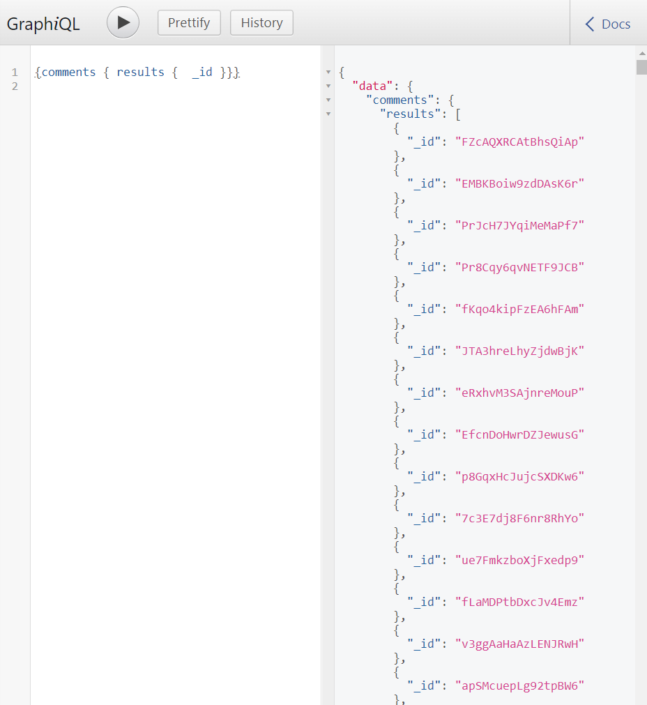
I happen to know that this is because they block user agents that declare themselves to be bots. However, as this is a purely LW problem, I recommend taking future such requests to the LW team.
Thank you for this information, this allowed me to resolve the issue.
Now, separately, and in a more formal/precise tone.
I want to inform you that there is a unintended leak of EA forum or LessWrong private user information, that is substantial.
To calibrate on severity: this is something you want to change soon. It is not extremely sensitive, (less sensitive than private messages) but in my opinion, it is about at least as sensitive as leaking email addresses.
I propose the following:
Note that the leak should not be difficult to correct.
I have no intention of suddenly deciding to turn off our openly explorable API, or restricting access. We're an open source codebase, and I highly value the ability of our users to develop experiments.
You can email us at [email protected] . If the above is not enough of a guarantee, please email and we can talk offline.
TLDR; Unfortunately, I think I am asking for a somewhat clearer statement from a senior source that CEA won't take such action. To be clear, this might be a clear, good faith statement from someone like Max Dalton or Habryka, that they will do best efforts not to restrict or adjust the open vision of API use, as a result of this leak. Because the EA forum technical development is closely intertwined with LW, this statement should include consent of the LW team, such as Habryka.
I believe the leak is substantial (it's not an emergency but there is some chance it's embarrassing).
Because of the moderate severity of the leak, I think something like the following scenario could occur:
Two weeks after being notified of the leak, JP, Ben West, Max Dalton and the CEA board have a routine, private meeting about CEA's online programs, like most organizations do.
In this routine meeting meeting, one of the conclusions was the suspension of further development of EA forum features in favor of another technical project. The leak had a large influence on this decision.
Three months after the private meeting, a message was posted "We're restricting use of [specific forum/API] use because of limited developer attention. Unfortunately, we decided to turn it off because of the maintenance demands".
While no connection with the leak is stated and other factors, including actually limited developer time played a role, the truth was that leaks/headaches was the causal reason the feature stopped being developed.
Note that the above does not require bad faith on the part of CEA. I actually don't think anyone wants the above to happen. The above scenario is just the logical, rational way of doing things if you're heading an entity that has a lot of projects and limited developer time.
Like, this is a confession, this is what I would do.
Another way of seeing this is that the forces are just the normal forces of being a public entity.
By this request, I'm trying to proportionately "tie" your hands (to the degree that a public good faith statement would) so that these forces can't act to deteriorate access.
I appreciate that ask.
Update:
I was wrong, this entire thread about a "leak", my last two comments, was wrong/noise.
What happened:
I thought I was obtaining private information through an API endpoint. Upon more examination, the information was not private, the data had no additional information, and I misinterpreted the meaning of the information.
We should have at least one dedicated "megathread" for EAG-related questions each year, so it's easier to ask such questions in public without creating dedicated posts for each of them.
The lesswrong way of dealing with lost and recovered text is much more pleasant on firefox. On the EA forum I have to tick through two boxes every time I edit anything.
On lesswrong there is a little box that I can click if I want to
With the deployment of the collaboritve editing rework, this will now work the same way here as it does on LessWrong.
I'd like to be able to permanently set the front page to sort by "top (inflation adjusted) unread"
Embed high impact jobs related to [the tags of] the post that the person is currently reading.
"You're reading an article about biosecurity, here are some open biosecurity jobs you might be interested in"
We can build a filter based on this, I don't consider it production-ready in that level yet, but if CEA is interested, it could be.
(I somehow don't predict you'll say "yes" to this, but I'm not sure what's the reason you'll say "no", so asking)
Curious for your idea of a mockup. Where would the embed go?
I think you are significantly better than me at this, I can take it to my Product/UX friend if you'd like me to take it seriously.
Or - is your pushback that there's no good place?
I can also play around with embedding it in different places and see how it looks.
My initial try would be "under the new-comment box"
I expected you to have a vision for where it would go, which maybe you did, or maybe you just came up with that in response to my question.
My take: I agree it works well below the post (I'd go above the comment box, I think), and not so well elsewhere. I kinda have a thing I'd rather go there for new users, which would be a banner-link to the topic page, but after a user logs in, and say reads 5 posts in that topic, I'd like that banner to go away. At that point I would replace it by this. I would only pushback as a matter of prioritization at that point.
Please forgive my run-on sentence. 😅
OMG that's way less push back than I expected!
Or, may I ask, when you say "prioritization", do you mean ~3 months or ~3 years?
Also, when you do implement this, please take into account this (potentially significant problems with the 80k job board vetting, and the suggestion to let people comment on jobs).
New users: Sounds good, like you're taking something important into account that I forgot, without losing any significant amount of value.
Run-on sentences are welcome! 🐈
Or, may I ask, when you say "prioritization", do you mean ~3 months or ~3 years?
I don't know, sorry. I find those things really hard to predict. It depends on how a different sub-team (Clifford's) evolve's their strategy.
Allow users to embed Airtables in forum posts, such as this
Thanks for the suggestion! I wish Airtable had a more neutral UI style, or we could customize it, but it's probably still worth.
Airtable colors can be customized in their paid version.
If you decide to enable embedding them (including "only if they're paid and look a certain way"), I'd be happy to know
When clicking on a tag, sort the post by "new" instead of by "relevant" by default. (What does "relevant" even mean? the newer posts are almost certainly more relevant)
It sounds like you're looking at topics where you already know the material.
When I think about what topic pages are best at, I think "presenting new material to an unfamiliar audience" is core to their value proposition. Relevance sorting is being done to allow the content that's most "core" to a topic to rise to the top. Relevance can be voted on by anyone. To see the difference between relevance and just "top rated" compare these two.
I understand, thanks!
A problem for me is that I don't often use the evergreen questions (like this one)
I've written feature suggestions elsewhere, but I sense people don't find them compelling, so I thought I'd just flag the problem as I see it:
- new answers get added to the bottom and are hard to find
- the question itself will never be seen for the first time again and receive the flood of interest it first did
- old questions are sometimes poorly phrased or framed
Do you think this is a problem, if so, how should we solve it?
I try to link to the evergreen questions in places people might find them (principally the "Useful Links" post, though I'll often send the links to people directly if they have a relevant idea).
There are only so many places to put something on the Forum that people are likely to actually find. Some options for upgrading e.g. the "what should someone write?" post:
These both use existing mechanisms of the Forum that don't require new programming, adding a new component to a crowded frontpage, or making people radically change their behavior. Of course, (1) and (2) can be combined — reposting the original posts could help people remember to use the tags for other posts as needed.
These are my proposed solutions from what I guess is least objectionable to most
- mark certain questions as "evergreen" that resurface once per year.They are sorted by newness and score rather than just score
- Edit the titles of these questions for maximum clarity each time
- Perhaps this is true for all posts which are in the top 3% of posts
- Evergreen questions start with effectively 0 karma and rise as normal. Likewise their comments reset in karma. After a month, their karma recofigures (voting on a comment in both its original and reset form only awards the user karma once)
- High karma users can edit the titles and grammar of evergreen questions of users with lower karma. I know you all hate this, but stack overflow does it and it's fine
(Late-night quick reaction, tried not to spend much time on it)
This sounds like quite a bit of new code for relatively little benefit, compared to just having a "Frequently Asked Questions" post with links to various question threads. Those links can have nice clean titles that don't match the original post titles, and subheadings should make the post fairly navigable. The post can then be recommended to new users (or more experienced users, in the sense of "do a good deed by seeing if you have something to add to one of these questions").
If your goal is to solicit new answers for certain questions every so often, you can always ask a mod to do this (we'll discuss it) or post the questions yourself, referring back to old threads so people can see past answers and a chain of continuity is created.
I don't disagree. However I think nothing compares to the initial flood of comments a post gets. I reckon for dinner it could be worth a lot to have a way of putting an idea at the forefront of people's minds regularly.
I guess the question is if it's worth enough.
What you suggest is worth doing too.
Can this thread be tagged with the words "features" and "requests". I often struggle to find it because I can't remember what exact formulation of words are in the title.
I've changed the body text to include those words. But I'd also recommend just bookmarking the thread under a title like "Forum features and requests", so that you can just find it from your main searchbar. (I have a bookmarks folder called "Quick Access" for links I file in this way.)
A different default sorting on this page
I have used this page about once a month for several years and only today decided to sort by new. It showed loads of great new comments.
I suggest a sorting which balances scores and newness (like reddit's "Hot")
Done. (This turned out to be existing functionality, albeit obscure. I'm going to apply it to a few other "evergreen" posts of mine.)
This is just sorting by new right? that's still an improvement, but I think that will make me post on this thread less. If you want I'll study and write the formula I'd use.
We already have an algorithm like that ("magic"), which is used for sorting frontpage posts. Based on your experience with the frontpage, does that sound useful, or would you want something else? (At the moment, the top comments might stay at the top for a few extra days, but I expect you'd want them up for weeks or months instead — the algorithm could be changed in the case where it applies to comments.)
Feels like "magic" would be better than sorting by new.
I guess I reckon 20 karma a month ago should be worth more than 60 karma 6 months ago. How does that sound?
Yeah now I come here and all my posts are at the top and that feels bad.
There's nothing wrong with using the suggestion thread — that's why it's here! But if we do implement magic sort for comments at some point, I'll use that instead.
I think if people come to this thread and see 8 of one persons suggestions as the first 8 they will probably grow to resent that person.
Also, I was using grammarly on this page and it was reaaally slowing down typing speed. FYI.
Now we need a way to hide this post since it's been answered.
When adding new posts to a sequence everytime I add a post, my search disappears and I have to type it in again to add the next one. Would be useful to just have the search not disappear.
(I find the shortform feature really valuable, and I think these two things would make it even more valuable.)
2.) Should already be the case. Linking to comments causes previews to show when hovering the link. (example)
Can we have a nice "Community Events" section like in LW? Can it integrate automatically with the International EA Events Calendar?
If I am on the main page, it might be nice if center-clicking on the 'Show Previous Comment' button opened that comment tree in a new tab. At the moment you can center-click the date to open a comment in a new tab, and then separately need to click 'Show Previous Comment'.
I am curious, why isn’t the greaterwrong frontend getting adopted as the primary UI? It’s much faster, much more touch-friendly, customizable, and generally rocks. Its only downpoint is that it lacks features compared to LW, which should be solved in, say, 6 months? That would be a major QoL improvement. The LW UI frequently hangs on my iPad, it’s so bloated.
Option to reply to personal messages directly from email. Say, some form of a widget in the email notifications with a text box.
WebMonetization - this takes about 30 minutes to add to a website, ask me how. Then anyone who has Coil would give money to this site - (maybe then just give it to charity).
Comment guidelines which suggest single points per comment to allow more effective upvoting.
Be able to edit the text of articles which leaves hidden suggestions. Others can turn this feature on and upvote them. Highly upvoted suggests appear as comments.
Perhaps this feature would only be available for people above a certain karma.
Within the community tab 'New and Upvoted' seems to still be the same posts, month after month. Perhaps new should gain more weight, given the current posting frequency and upvoting?
Within-post bookmarks
I often start posts but they are too long to read them in one go and the fact that I have to do that (or forever forget where I am) creates a big ugh field for me. Solution: Within-post bookmarks! I think it would be amazing if we could mark where we are in a post and the next time, we can just click to get ourselves back there!
(FWIW, I think that's a major feature of printed media, which I have much less ugh feelings about reading. You can always put it away without it being annoying later on.)
I expect this to be hard to get right, but I think it would in fact remove a major bottleneck to returning to a post. Claim: the hard part is getting people to set their bookmarks. Maybe we could do something automatic?
Would it be possible to track how far down the page someone had scrolled, and by default return them to that place the next time they visited?
That's what I mean by something automatic. I'm not sure without trying it whether it'd be a terrible and disorienting experience that was wrong most of the time, or whether it'd be successfully useful.
Not sure about the claim but possible! I certainly wouldn't say no to something automatic. But I think if setting it yourself is easy enough, it would still get a bunch of the value! I think if the feature was implemented in a similar way to in-line commenting on LessWrong, where you just hover over the correct line and it offers you a bookmark-button that you just need to click, that would be low-friction enough for people like me to use it. (I think anything that's two-click might be too much friction)
It would be great to have some way to filter for multiple topics.
Example: Suppose I want to find posts related to the cost-effectiveness of AI safety. Instead of just filtering for "AI safety", or for just "Forecasting and estimation", I might want to find posts only at the intersection of those two. I attempted to do this by customizing my frontpage feed, but this doesn't really work (since it heavily biases to new/upvoted posts)
You can do this! Filter by topics on the left hand side of the search page.
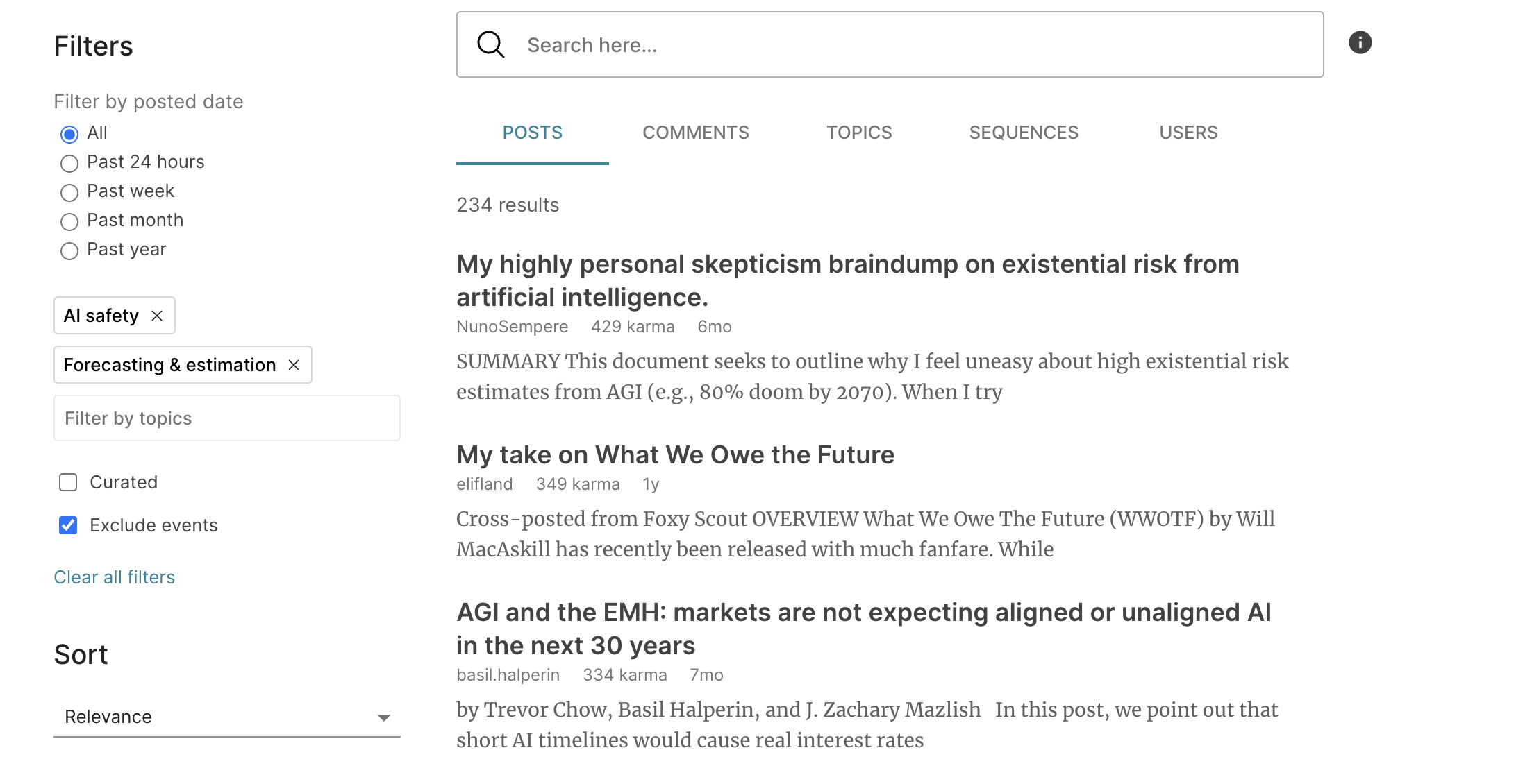
My bad, thanks so much!
I would love an option to switch off the total karma count from one's profile. I've found myself noticing that it can occasionally create perverse incentives.
I assume this is about for your own psychology? My recommendation here is to use your ad-blocker to block out the specific element.
I've just submitted a change that will make this uBlock Origin rule work:
###karma-info(Note the three #s)
Thanks, this is cool and I'll use it.
I think more broadly, my comment is roughly equally motivated by three main things: my own psychology; concerns about an author's karma influencing readers' subconscious evaluations of that author's posts and opinions; and, specifically for people who work full-time in the EA community, a vague sense that it feels a bit strange to have a numeric score attached to what is in many ways a professional, and often philosophical, body of work. (The third point of course has an analogy with academic research, but I think that's also a problem with academia.) But since you gave me a solution, I'm personall happy. Thanks again.
I was going to write a short suggestion about profile wikis, but it ended up long so I made it into a post. In a picture:
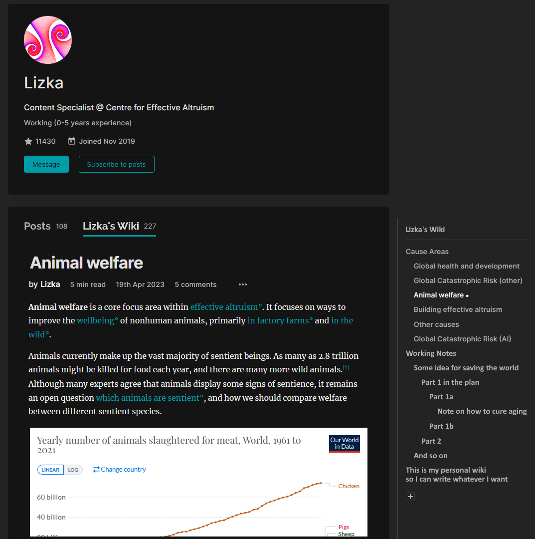
I'd like to be able to hide the amount of karma and agreement points a comment or post has. I think seeing how many people have upvoted a statement affects how likely I am to agree with or upvote that statement. I think it makes me more likely to vote in accordance with social agreement, rather than whether or not I think a statement is true or well written. I'd like to be able to turn this off from time to time. Strongly downvoted comments should probably still be hidden.
The formatting toolbar doesn't appear until after you highlight text. This means you can only format text after you've written it - you can't for example, select bold and have your text appear in bold as you write it. This is something I find unintuitive. It took me a a few minutes of looking for the toolbar and googling how to do it before I realised the toolbar only appears when you highlight text. I'd like the formatting toolbar to always be on the page when I'm writing.
I'd like to be able to highlight a word or phrase in text I'm writing and Ctrl-V a URL link directly into that phrase. This is something that other platforms, like Slack do.
Yes, you can highlight a phrase and bring up the toolbar to add a link, but being able to do it immediately through a well known keyboard shortcut is easier.
Ctrl+K is a pretty well-known shortcut, for example on Google Docs, and works here too
Thanks, I didn't know that one!
The reading time estimates on lesswrong crossposts seem to be wrong. For example, this says 1 but should be 5-10 (I would guess):
Seems correct, and I know exactly why. Thanks for the report!
In addition to enabling drop-down boxes for commonly used jargon, it would be great if drop-down boxes were an editable feature. I frequently try to balance my explanations so that they're able to cover the inferential gaps without being too longwinded. One way of dealing with this is to make separate articles for people with different backgrounds like what Arbital does. But I think I prefer just having drop-down boxes for deeper or alternative explanations that not everyone needs.
Automatically create a bibliography with all the links in a post.
Thanks for the suggestion - I've made a note of it!
Tagging users to notify them (@[username]). People should be able to ‘authorize’ friendly tags but ‘professional’ tags should be possible by default. Users should be able to turn on-off notifications for ‘friendly’ and ‘professional’ tags. In this way, people could make and maintain connections via the Forum.
Also, orgs (or departments) could have their own tags. For example, if someone does not make a writing contest deadline, they should still be able to notify the org about an idea. Organizations could be also able to filter their tag and another set of tags or keywords (for example, 'Open Philanthropy, Worldview Diversification, DALY' could allow an OPP researcher to skim collective intelligence related to their calculation methodology and possibly delegate further research to people who had thought about it already).
Thanks for the idea! LessWrong recently built something similar with the ability to use #Title to mention posts or topics. How do you think a user would distinguish their intent to do a friendly vs professional tag? What would the boundary be between them?
OK! I cannot find #Title on LessWrong but based on your description it seems analogous to linking a post or using a tag?
If a user is a fan of someone who they do not have an actual connection with (usually did not meet in person for 1-on-1 and have not shared common interests), they would use the professional tag (for example, one could tag Joel McGuire if they write something that they think that he would find useful, based on his posts). The friendly tag (that has to be authorized by the tagged person) should be used when people are confident that they know their friend's interests so well that they would recommend something that the friend would enjoy (while they may also find it useful). So, the intent difference is inform based on the user's professional presentation vs. notify of enjoyable content based on the users' friendly connection.
A page for current contests/prizes, just like there's a page for events. Been quite a few of them lately, and they seem to (anecdotally) generate quite a bit of interest for writing usefwl things.
The ones I know about:
Quite a few on LessWrong that recently ended too. I expect there are more that I just haven't seen.
Oh, there's a Topic for it. Another thing I didn't have the bell set to the right colour on. Black! But uh, I still think it could be usefwl to have a section on the sidebar for it.
Thanks, I'll make a note to think about ways to make the Topic more discoverable.
Quiz as a Service for posts
I stumbled upon this service:
That can generate a quiz out of anything.
Having a "quiz me!" or "did you fully get the article?" button on every forum post where it would provide an AI-generated multiple-choice quiz would probably be very valuable for everyone.
I'd be happy to work on the development of this.
Interesting suggestion, I think this could be interesting. When you say "would probably be valuable", what do you see as the value? Gamification? Remembering the post better?
I think there are a variety of caveats (below), but ultimately I'd be interested in you trying this out on a number of posts to see how useful it is, and maybe writing a post about it.
Caveats:
The value needs to be researched! I have tried the tool on "hard" mode and the questions are quite nuanced. You would only be able to get the answers right if you really read the article in detail and took your time.
The AI tool will not take additional input indeed.
I'll do as you suggested! Will try it a few times and post about it
Recommend posts using collaborative filtering ("people who like the same posts as you, also like:")
MVP could be done quite easily using some of these techniques.
I have some ideas how to do better. If you consider implementing this feature, hit me up to talk!
Bookmark folders.
There should still be the default one, but if you choose you could put the post in some other folder (sorta like youtube does with saving videos to playlists).
It can have many use cases, like:
Right now I'm doing something along these lines, but with an external editor and lists of links, so it's a bit awkward to use.
Thanks for this suggestion, we actually have something like this on our list (though it's not super high). Some of the team suspects that more people are likely to use other tools to track all their links and research across sources.
Yeah, good point. It may be mostly redundant.
An optional reading time indicator, like here: working example (and that tool's description).
The bar at the right of each post is the reading time indicator. Full bar means 30 min, half bar means 15 min, and so on.
You can find the code that implements that bar here: html, css
The post length is often the deciding factor in whether I want to read something, so it's nice to have it at a glance. Also I admit I kinda want to incentivize people to write more concise posts :)
Add an option for drafts: "Anyone with a link can read", but make it really anyone, not only forum users, as it is now.
(Recently I wanted to get feedback from some people who are not on the forum, and I had to copy draft to google doc, and later copy it back, and fix all the footnotes :/ )
Next step (but probably harder), would be to let anyone comment. If they aren't logged into forum, these comments are anonymous.
Also collaborative editing in markdown mode would be useful.
Allowing for selective shared list for post that may be drafts and or info hazards in a similar way in which I can do Facebook posts to close friends etc.
An option to subscribe (notifications on email or otherwise) to search terms.
Currently I'm hesitant to even glance at the Frontpage because there are so many potentially interesting things I would eagerly read and get nerdsniped by. So looking at it predictably wastes my time when I know I should (for now) be concentrating on the topics I'm currently focusing on. But I do want to catch the forum post I'm most likely to benefit from. Hence I want to be able to customize what I get sent by email (or the bell top-right).
This is probably a better way to match high-quality posts along some dimension with the readers who are looking for quality in that dimension. And in a system quality is a high-dimensional space, it's probably more important to optimize matching the qualities pairwise rather than optimizing a global metric (karma) for estimating latent quality.
Would you like to get notified of all posts that get tagged with some topic? That might be the right way to get what you want here. You can do so by going to a topic, Moral Philosophy say, subscribing to the topic and choosing to be notified.
Oh. Yes, that would capture most of the value. I had subscribed to topics before, but I hadn't clicked the bell. It's supposed to be dark if I want it to send me emails, right?
Thanks!
Yep
It was suggested to add the 'looking for a job' checkbox on the EA Forum (see MVP ideas 2.)
I would like the ability to sort search results by date. Often, I want to know who mentioned something in the past few weeks or months, this is currently not possible. (I'm guessing the current sort order is by magic, but there is nothing indicating this.)
Bunch of visual accessibility stuff. In particular:
*Night mode.
*The ability to make textblocks narrower for smaller saccades and thus easier reading. (I'm not sure this is more comfortable for everybody, so a variable-width widget like Royal Road or Fanfiction dot net have at the top of their display pages might be optimal? This might require experimentation.)
*Ability to change text size.
*Better visual distinction between widgets like the Tags, Post, Pingback, and Comments. Panel borders? Width variation?
On another note, I'm using uMatrix, and it's blocking 14,000 scripts - most of them Google stuff, I imagine; that aggressively-hegemonizing adware megacorp is fingering a downright inappropriate number of pies right now. Might be worth fixing?
Thanks for the suggestions! I've added them to our list for triage.
It would be great if I could link to a comment.
(And sorry if this was already suggested. I couldn't find it when I searched "link to")
If you click on the link icon next to the votes you will be redirected to the comment's URL.
For exampe, here is a link to your comment above.
Awesome. Thanks for letting me know!
Ability to submit questions to a monthy poll. Then everyone who has signed up gets the poll.
Feature Request: Allow users to make their comments display as collapsed-past-a-certain-point by default.
Why? Sometimes I want to post a long comment, but feel that it's not one that everyone needs to see/read. I'd happily post the comment if I could write a summary of what it's about at the top and have the rest hidden/collapsed-by-default, but without this ability I'm often reluctant to post the comment. This is especially true when there are many comments on a post (or when I expect there will be), since I don't want the experience of other users who are scrolling through the comment section to scan it to have to see the large body of a comment that is just taking up space. It'd be much easier to navigate the comments if long-comments were mostly collapsed, and I think giving users the ability to decide exactly when their long comments collapse would be even better.
This is an interesting idea! I'll keep it in mind as something to potentially implement later (I haven't discussed this with folks on the tech side yet).
I will say that I think you may be underestimating the value of your long comments relative to the inconvenience of scrolling past them. Every comment comes with a "collapse" button that people can use, and I'd hope that anyone annoyed by scrolling will learn to use it, though I can't be sure of how often this happens.
Have a nice format for linkpost in shortform.
With the goal of having the forum fully replace the EA subreddit at some point.
It has taken me a long time to find the EA online events calendar (thanks @EdoArad) could this be displayed more prominently
This post (which links to the calendar and other resources) has been pinned on the Community page for weeks. I could also pin it on the main page, but I have a much higher bar for that, because it means everyone will see it every time they come to the Forum (and it doesn't really fit the Frontpage category).
I sometimes think of an idea for a forum post that I want someone other than me to write about, perhaps because I don't have the expertise or time to write it.
An idea could be to have a dedicated area to suggest posts for someone else to write. These suggestions could be upvoted or downvoted so that we can see what the community would most like to see written about.
It would be good to have a way to stop say twenty people then writing the same post at the same time. Perhaps people could put their name next to the suggestions that they are interested in taking on. I'm not saying that we can't have more than one person writing on a specific topic, but this could give some indication of how many people feel like they can write on the topic and are interested in doing so.
Would be interested in hearing thoughts on this idea.
We have a thread for this! It's not on the homepage anymore, but people who track new comments will still see what you post there, it will come up in search results, etc.
It's possible that I should resurface this thread once in a while to collect new suggestions.
On mobile, you could shrink the menu bars on the top and bottom of your screen (where the top has the Forum logo, and bottom has “all posts” and other navigation bars). Smaller navbars -> More screen space for reading -> easier to read and comment.
What page are you on when you want this? Do you spend a lot of time reading Recent Discussion on the homepage? On posts the header goes away when you scroll down and the bottom bar never appears at all.
I posted some things in this comment, and then realized the feature I wanted already existed and I just hadn't noticed it - which brings to mind another issue: how come one can retract, overwrite, but not delete a comment?
I think in the case of regular comments there's a desire not to let people edit the record too much; if you say something you no longer endorse the intended action is that you retract it (which applies strikethrough but leaves the comment standing).
Of course, there are some issues with this setup:
Yeah, I really dislike that I can't delete comments.
We actually just deployed the ability for users to delete their own comments if they have no children (i.e. no replies) for lesswrong. So I expect that will also be up on the EA Forum within the next few weeks.
Making it possible for people to add a bio in their profile (that supports external links) so people can get a better idea of someone's background and interests when reading posts and comments.
I didn't know this was possible because the bio doesn't display when you are logged in and viewing your profile page, so perhaps displaying the bio itself with a button to edit it would be more obvious to users.
Is there an equivalent post on lesswrong for this discussion?
Perhaps include a short form subsection under the Forum Favorites section? It seems to me that most short form posts have very low visibility.
If the forum admins have traffic statistics, they should be able to get a better sense of the visibility issue than I can. In particular, I suspect the short form section receives a fraction of the traffic of the frontpage, but this should be verified empirically.
By the first suggestion, do you mean having each individual tag's page include a link to the list of all tags?
I was initially thinking of including a link to the tags page in the sidebar on the home page, but that is another good idea as well. Including tags in the metadata subheader under article titles on the home page would also increase the prominence/usage of this feature.
We now have a sidebar link to this page.
When performing a search, the search results page uses "LW Search - EA Forum" as the contents of the title tag. I doubt this is an intentional reference to this forum being a fork of the lesswrong forum, so I assume the "LW" part should be removed.
By the way, I looked for 60 seconds to find where to post this small bug report, but the only options I saw was the unlisted contact us page, which seems to send a message to content people rather than the people that work on the codebase of the forum. This page is the only place where I could quickly find a way to get a message to whomever does the technical side of the forum.
So I suppose my feature request is: Provide a new place for users to quickly submit bug reports; or, if such a place already exists, make it more prominent.
...and literally thirty seconds later, I appear to have found the bug report submission form is intended to be the Intercom on the side of every single page. I feel a little bit ashamed about this, but it just didn't occur to me that I should give bug reports there.
On the object level, the search title bug is fixed on staging and should be deployed soon. On the meta level, the contact us page is on the sidebar as well. You were correct that it reaches Aaron not me, but if it’s a technical problem it will quickly get forwarded to me. Aaron just clarified the page to say that emailing Aaron is a good way to get to me.
Community threads on each of impact, tractability and neglectedness of different cause areas. Would be interesting to see if their ordering agrees with 80k.
Ability to split comments into multiple seperate comments. This could be limited to poeple who are higher karma.
Icons on pages to show that other, anonymous people are reading them. I think this would increase engagement. This can be cheaply tested.
Examples, googledocs.
Must say that these usually causes me a slight anxiety for some reason. Something about other people knowing what I read and when I entered which document makes me feel uncomfortable.
I think it should be anonynous rather than showing which user you are.
Consider protections to prevent "pattern downvoting," that is, a single forum user downvoting every one of another user's comments and articles, particularly in articles and comments that have received few views.
Usually it's not the case that every comment made by a single person contains zero value and is detrimental to online discourse. However, some people seem to have a tendency to want to do so. Rather than allowing one person to suppress the views of another's right after publication, it would be better for other users to vote to ensure the content is being correctly suppressed.
See this thread as an example.
There is an "exploit" against anonymity on LessWrong
On a recent popular LessWrong post, the OP, Gwern, receives a "anonymous" critique, and then chooses to deanonymize his critic, very likely by using a trivial API call:
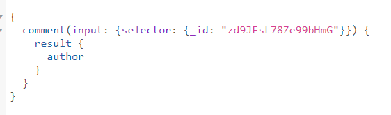
The above call produces the identity of the commentor, who turns out to be Mark Friedenbach.
Technical comment for onlookers:
The reason why this happened is that LessWrong, like all websites, represents the information you see (posts, authorship) with underlying data/variables. This data pops up in a lot of places, and the API is one of them.
Guaranteeing anonymity is hard, because there's often many dependencies or interlocking systems involved. It's really hard to scrub all occurrences of identity, not just because occurrences are numerous, but because masking them often requires editing or creating new "systems", often affecting a lot of other things, sort of like dominoes.
Also, my guess is that for principled reasons, the specific API framework LessWrong is using, isn't native or interesting to LessWrong developers, so it's understandable that something like anonymity isn't polished on it.
I wrote this section to say that I don't think this is a "fire" or major defect. I don't think it reflects on LW and I'm not sure it's a good use of skilled EA/LW developer time to tighten this issue down.
The moderators feel that several comments in this thread break Forum norms. In particular:
We’ve written to Charles about this, and we’re discussing further action. We’ve also explicitly added that doxing is not allowed or tolerated on the EA Forum, although we think this behavior was already banned or heavily discouraged as a corollary of our existing “Strong norms.”
I agree with this comment and it seems I should be banned, and I encourage you to apply the maximum ban. This is because:
Also, this has taken up a lot of time:
I think this use of time (including very senior EAs) is generous. While I’m not confident I understand the nature of the proposed call, I’m unsure my behavior or choices will change. Since the net results may not be valuable to these EAs, I declined this call.
I do not promise to remedy my behavior, and I won’t engage with these generous efforts at communication.
So, in a way requiring the least amount of further effort or discussion, you should apply a ban, maybe a very long or permanent one.
Instead of talking about me or this ban anymore, while you are here, I really want to encourage considerations of some ideas that I wrote in the following comments:
Examples of stories (found in a few seconds)
(These don't have a 80K sort of, long form in depth content, or cover perspectives from the founders, which seems valuable).
There is a lack of forum discussion on effective animal welfare
Welfarism isn’t communicated well.
Patterns of communication in wild animal welfare and other areas aren’t ideal.
Weighting suffering by neuron count is not scientific - resolving this might be EA cause X
Many new institutions in EA animal welfare, which have languished from lack of attention, should be built.
Dangers from AI is real, moderate timelines are real
There is no substance behind “nanotech”, “intelligence explosion in hours” based narratives
It is remarkably bad that there hasn’t been any effective effort to recruit applied math talent from academia (even good students from top 200 schools would be formidable talent)
A major implementation of AI safety is very highly funded new EA orgs and this is close to an existential issue for some parts of EA
I think this can be addressed by monitoring of talent flows, funding and new organizations
EA Common Application seems like a good idea
EA forum investment seems robustly good
I find it unseemly that Gwern made the choice to both find and publicly reveal Mark's identity.
Additionally, I find Gwern's presentation of this knowledge glib and unbecoming, which calls back to the very issues that Mark objects to.
I echo Mark's views in his critique. I often find that Gwern's allusions in his post contribute little. I also find his use of them overbearing.
EA and thinkers should be aiming at a very high tier. I think this tier should be aimed at, for example, by a high quality writer contest (which cites Gwern).
Writers and EA may not get second chances in these exclusive and opinionated spaces. I think that for writers or thinkers aiming to be influential in the ways EAs think are important, acts like this one, or cloudy aesthetics with the truth, could be enough to exclude them.
To explain: I did no API hacking. This was so trivial a bug that it was found entirely by accident simply browsing the page. Someone happened to be reading the page via the popular GreaterWrong mirror and noticed that I mentioned an 'anonymous' comment but that I was clearly responding to a "Mark_Friedenbach" and puzzled, checked the LW2 version, and loled. Oops. (Not that it came as too much of a surprise to me. I remember his comments from before he chose to go anonymous... Bullshit about 'Engrish' is par for the course.)
This was not intentional on the part of GW or saturn2, it's simply that GW has always cached the user ID & name (because why wouldn't it) and whoever implemented the 'anonymous' feature apparently didn't think through the user ID part of it. So, this entire time, for however many years the 'anonymous' thing has been there, it's been completely broken (and it would be broken even if GW was not around, because anyone with any way to access old user ID/name pairs, such as via the Internet Archive, would be able to link them).
Since the horses which left the barn have long since broken a leg and been sent to the glue factory, and it's obvious once you start looking (you didn't spot GW, but you did see the API problem immediately), I felt no particular hurry to disclose it when it served as such an incredible example for a comment claiming, among other things, that it is so absurd that anyone would ever make a stupid design choice that it constitutes grounds for ignoring anything I say. That is not a gift horse I will look in the mouth. Like a good magic trick, it works best when the viewer can't wave it away by coming up with a patch for it. ("I would simply not write a cryptocurrency which made any mistakes.")
Nor did I deanonymize him, contra your other comment. I was deliberate about not using his full username and using just "Mark"; had I wanted to use it, I would have, but I just wanted to prove to him that he was not anonymous, due to a stupid bug. There are many Marks on LW, even considered strictly as usernames containing the term and ignoring the real possibility they might use a username not containing '[Mm]ark*'. (Mark Xu & Mark Otaris just off the top of my head.
If anyone 'deanonymized' him (considering one can just read it right there on the GW page and many people already have), it would be you. I do hope we're not going to hear any preaching about responsible disclosure coming from the person who rushed to publicly post all the details and the full user name? (What sort of 'high tier' would we put you on or how would one describe 'acts like this one'?)
Additionally, I find Gwern's presentation of this knowledge glib and unbecoming, which calls back to the very issues that Mark objects to.
I find Mark's comments glib and unbecoming, and a good example of why we might not want to have not anonymous comments at all. If he wants to post comments about how a character thinking something in a story is wildly "unprofessional" or make up numbers, he can register a pseudonym and have a visible history tying his comments together like anyone else.
You called attention to the existence of a hack and said his name, that could be enough for some people to uncover identity. (Agreed that people posting the full name were not very considerate either). Did it even occur to you that saying some things in some countries is illegal and your doxxing victim could go to prison for saying something that looks innocuous to you? Do you know where Mark is from and what all his country's speech laws are? I am so completely disappointed that you would notice a leak like this and not quietly alert people to fix it and PM Mark about it, but doxx someone over an internet argument.
Did it even occur to you that saying some things in some countries is illegal and your doxxing victim could go to prison for saying something that looks innocuous to you? Do you know where Mark is from and what all his country’s speech laws are?
If Mark is in such a situation (which he was not, and I knew he was not), then the real culprit is whoever implemented such a completely broken and utterly unfixable 'anonymous' comment, and himself for being a security researcher and yet believing that retroactively making comments 'anonymous' on a publicly-scrape-able website would protect him against nation-state actors when anonymity was neither the goal nor a documented promise of the account deletion feature he was abusing and then crying 'dox!' about it not doing what it wasn't supposed to do and didn't do.
This was not intentional on the part of GW or saturn2, it's simply that GW has always cached the user ID & name (because why wouldn't it) and whoever implemented the 'anonymous' feature apparently didn't think through the user ID part of it.
I did think of it! But having documents without ownership sure requires a substantial rewrite of a lot of LW code in a way that didn't seem worth the effort. And any hope for real anonymity for historical comments was already lost with lots of people scraping the site. If we ever had any official "post anonymously" features, I would definitely care to fix these issues, but this is a deleted account, and posting from a deleted account is itself more like a bug and not an officially supported feature (we allow deleted accounts to still login so they can recover any content from things like PMs, and I guess we left open the ability to leave comments).
I would strongly advise closing the commenting loophole then, if that was never intended to be possible. The only thing worse than not having security/anonymity is having the illusion of security/anonymity.
While I agree that total privacy/anonymity is almost impossible, "pretty good" privacy in practice can be achieved through obscurity. For example, you could find my full name by following two links, but most people won't bother. (If you do, please don't post it here.)
Absolutely. But you know you are relying on obscurity and relatively modest cost there, and you keep that in mind when you comment. Which is fine. Whereas if you thought that it was secure and breaking it came at a high cost (though it was in fact ~5 seconds of effort away), you might make comments you would not otherwise. Which is less fine.
Yeah, that seems reasonable. Just made a PR for it.
If anyone 'deanonymized' him (considering one can just read it right there on the GW page and many people already have), it would be you. I do hope we're not going to hear any preaching about responsible disclosure coming from the person who rushed to publicly post all the details and the full user name?
Gwern's rhetoric elides the consideration that my message is extremely unlikely to be consequential against Mark, as he himself explains.
I point out that is a reasonable characterization that all the effects/benefits of calling out Mark accrue to Gwern by the device of using Mark's first name, yet he can escape a charge of "doxxing", by the same.
I call out to readers to consider what the substance of what my thread is about, and what the various choices I've made, and consequent content might reveal.
as he himself explains.
Yes, he does claim it. So, why did you do it? Why did you post his whole username, when I did not and no one could figure out who it was from simply 'Mark'?
I point out that is a reasonable characterization that all the effects/benefits of calling out Mark accrue to Gwern by the device of using Mark's first name, yet he can escape a charge of "doxxing", by the same.
Absolutely. I did not dox him, and I neither needed nor wanted to. I did what illustrated my point with minimum harm and I gained my desired benefits that way. This is good, and not bad.
I did not post screenshots explaining how to do it and who it was, which were unnecessary and potentially do some harm. So, why did you dox Mark?
I am proud of the work of many people who built the community of LessWrong and I hope to read the interesting contributions of talented people like you in the future.
[I was inspired to suggest this by the downvotes on this comment, but it's a problem I've seen more generally.]
The agree/disagree voting dimension is amazing, but it seems to me like people haven't properly uncoupled it from karma yet. One way to help people understand the differences could be to introduce a confirmation box that pops up whenever you try to vote, that you can opt out of from your profile settings.
This box could contain something like the following guidelines:
- Only vote on the karma dimension based on whether you personally benefited from reading it. Voting based on whether you believe others will benefit from it exacerbates information cascades and dilutes information about what people are actually likely to benefit from reading.
- Similarly, do not use the karma dimension to signal dis/agreement. This has the same problem as above, and just leads to people reading more of what they already agree with. Remember, people may benefit from reading something they disagree with, and we don't want this forum to be an echo chamber.
- Still, it's useful for readers to know something about the extent to which other readers agree with a particular post or comment, so there's a separate dimension you can vote on to help with this purpose.
[Discuss these guidelines] [Disable this popup] [Agree and submit vote]
High karma individuals can edit others comments for clarity.
I edited this for clarity.
No pressure, but I'd be really interested to know why everone hates this idea. Maybe I've phrased it badly.
I didn't vote on it (nor do I think I should be voting on any comments in this thread), but I'd guess it has to do with the following: How do you tell edits for clarity from edits that change the meaning? You could imagine this getting heated on high stakes threads.
It says who has edited it and how. I think you'd be careful when using it and if someone abused it it would be clear to everyone that they had done so.
I also didn't vote on it but I do kind of hate this idea. I definitely don't want anyone else editing my comments "for clarity"; if they want to clarify something, they can leave a reply comment and ask if that's actually what I meant.
I still think you are all wrong about this.
Down voting might be reconsidered. Allow down voting, encourage it even, but require at least a brief explanation of the down vote. Without an explanation, down voting seems more like a lazy high school popularity contest Facebook kind of thing, not really suitable for such an intellectual forum.
If up and down voting is being used to calculate the positioning of posts on the home page, then perhaps you could consider the following.
If popular ideas which can easily be widely accepted could solve a problem, the problem would likely already be solved. Thus, the opportunity for new solutions would seem to often lie in the realm of ideas which upon first glance may seem unworkable, unrealistic, or even offensive. If you're ranking posts via a popularity contest, the system serves mostly just to validate the status quo.
Sometimes users downvote because they disagree with the content. That's unfortunate, and I wish they had a better way of expressing themselves. We will soon have the ability for users to vote on disagreement separately from whether they thought the comment was valuable. Nevertheless, sometimes humans are gonna human, and downvote something for non-virtuous reasons. The effect you describe is real, where it will discourage contrarian takes, including correct contrarian takes, which can be extremely valuable.
Nevertheless, it is my view that downvotes are one of the most useful ways to reduce bad behavior on the Forum, and one of the reasons the Forum is so much healthier than twitter et al. Instead of needing to spend time arguing about the worst content, you can just "downvote and move on".
Nevertheless, it is my view that downvotes are one of the most useful ways to reduce bad behavior on the Forum, and one of the reasons the Forum is so much healthier than twitter et al. Instead of needing to spend time arguing about the worst content, you can just "downvote and move on".
Agreed. I have very strong "someone is wrong on the internet tendencies," and I find the karma system somewhat helpful in guiding me about which things I find worthwhile to argue about. If I see a low-quality argument, I may otherwise be tempted to argue with it, but seeing lots of downvotes tells me that few other people value it and I should probably move on.
On the other hand, seeing highly upvoted but invalid wrong arguments makes it more (rationally) tempting to engage or argue with. Less commonly, seeing downvoted-but-correct arguments makes me eager to defend them.
If I see a low-quality argument, I may otherwise be tempted to argue with it, but seeing lots of downvotes tells me that few other people value it and I should probably move on.
Certainly none of us can, or should, engage everything we don't agree with. We all have our filtering mechanisms, and to each their own seems appropriate.
That said, I am personally quite wary of allowing the group consensus to be my guide on anything. The fact that lots of people like or dislike something has little meaning here. A quick example that seems relevant to EA...
It's an overwhelming consensus of our society that nuclear weapons typically aren't important enough to discuss, even in presidential campaigns when we are selecting a single human being to have sole authority over the use of these weapons. And this isn't just "the stupid people", it's nearly everyone at all levels of society, including the most intelligent and highly educated among us. Even on this forum, the nuclear weapons which can destroy everything we care about without warning in just minutes is just one of a great many topics being discussed.
So, if a thread about nuclear weapons gets down voted by 100 million Americans and others beyond, why should I pay attention to that? We're all basically insane, thus our voting lacks any real credibility.
Further, if the ideas that most people find generally acceptable could solve the problems we are often discussing, wouldn't those problems most likely already be solved? If true, doesn't it logically follow that we should be investing much of our time in to exploring ideas which most people would object to? Maybe we should be going around the forum looking for the threads that have the most down votes?
Ok, I get it now, you've finally sold me on down votes. :-)
I don't have an objection to the down voting. I enthusiastically agree that all ideas can benefit from challenges and counter challenges. I'm very receptive to that. If members wish to come out of hiding and engage any of my posts and attempt to defeat the points being made, I'm all for that. Go for it! Make your case, support it, stand behind it.
I'm objecting to the anonymous no content popularity contest nature of the voting system here. It's juvenile and cowardly, and undermines the credibility of the forum in my eyes. I appreciate you are making a good faith effort to rise above the norm of social media, but implementing Facebook style features doesn't seem a good way to go about that. Honestly, even Facebook does this better, as they encourage positive feedback, while making negative feedback more obscure. You know, they don't have a "this sucks" button.
I came here to invest my time for free in helping you build this impressive well intended website, to the degree I am able. The insult mechanisms the mod team has put in place are not helping with my motivation.



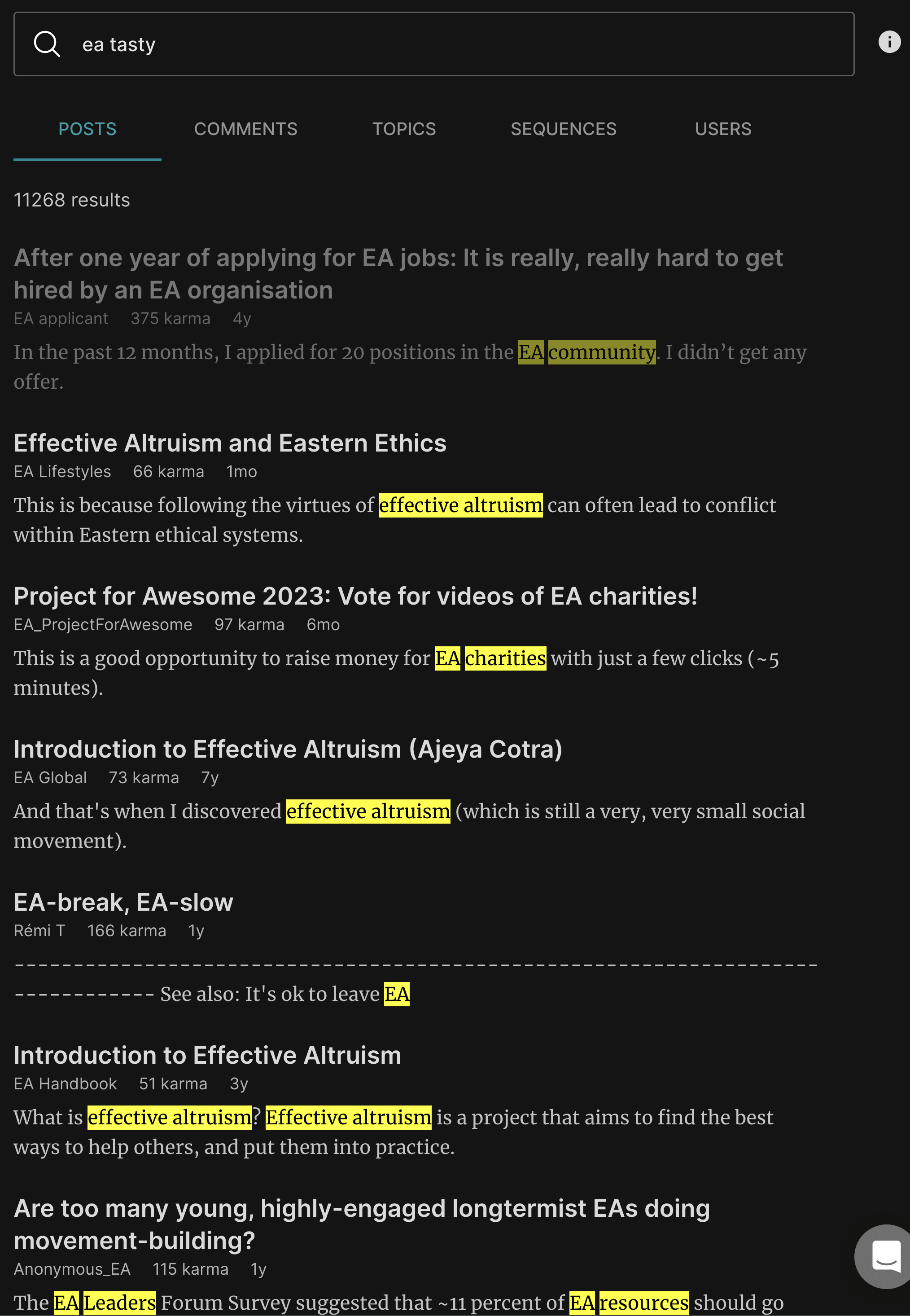

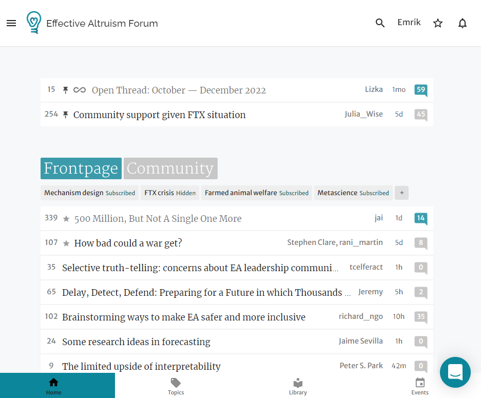
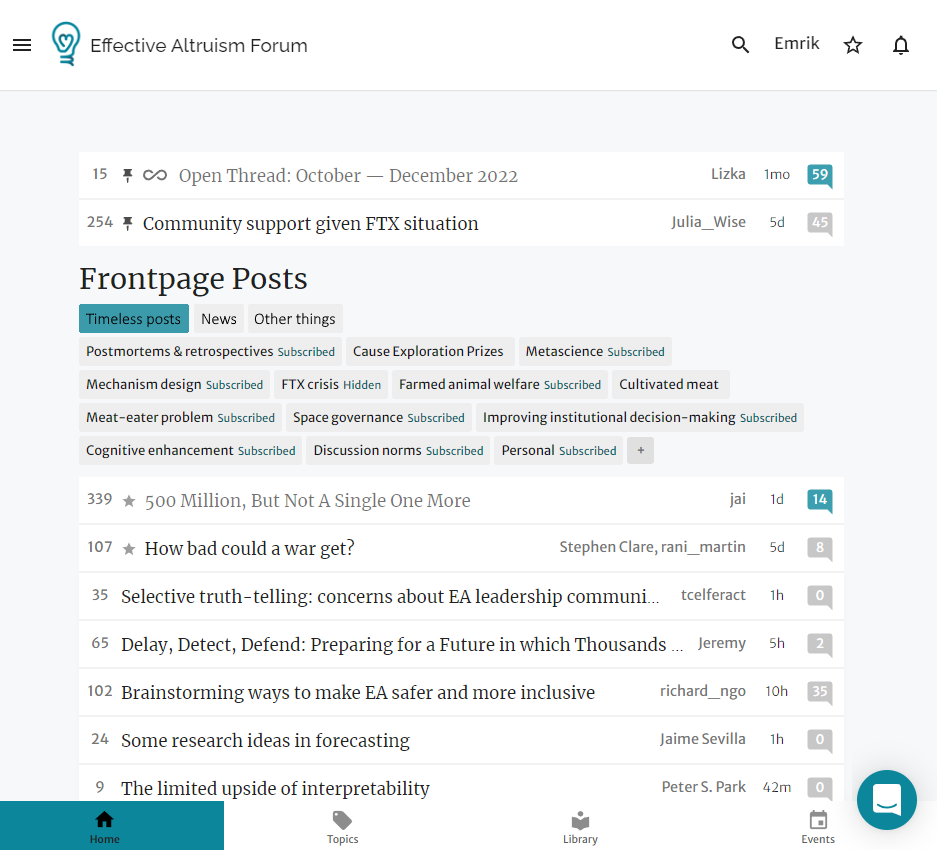

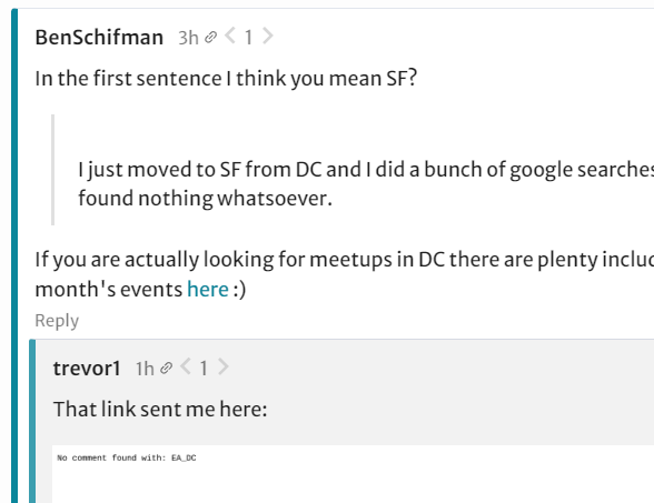
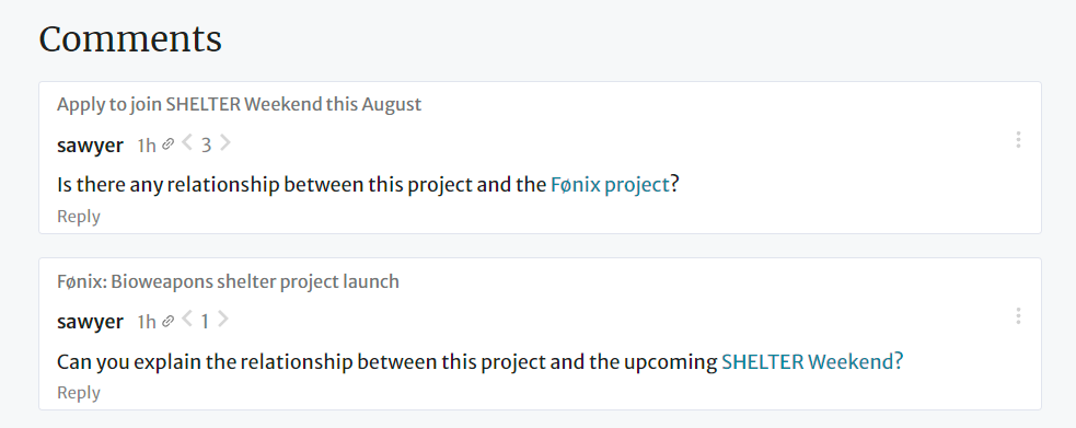



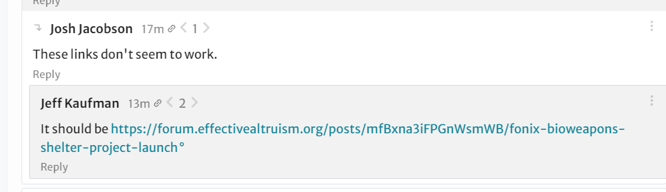
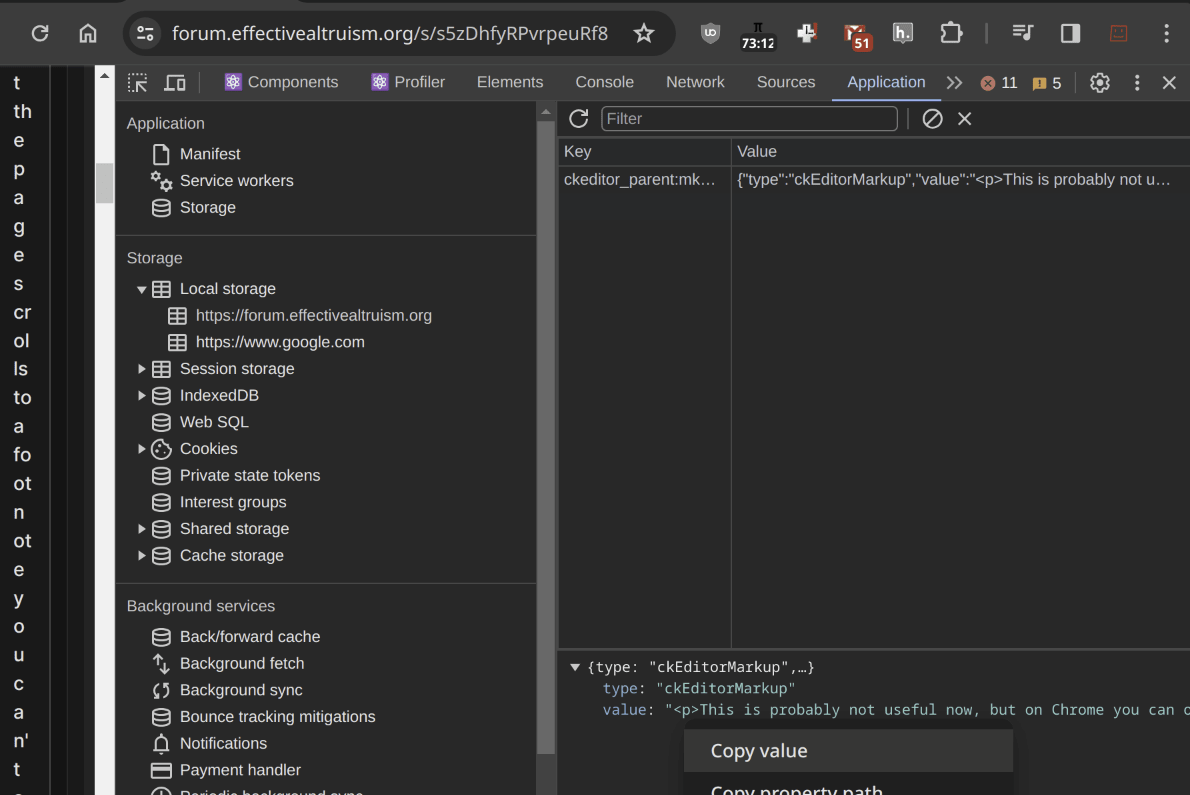
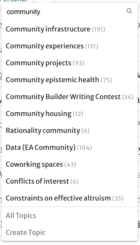

I would consider something to reduce the karma users can get from commenting on controversial posts. Right now it seems easy to get very high scores by making not really that great comments in such places.
As an example, I think this comment I made is decent. It makes a true and relevant point that no-one else had mentioned . But it's not great; the topic of that thread is not that important, and the all the comments in it, let alone mine alone, do not resolve the issue. Most importantly, that comment is definitely not over 50% as good as this article I wrote. I would say the article is at least a thousand times more important, and took at least a thousand times longer to write.
I'm not sure how exactly you would do this though, as all the most obvious methods have significant drawbacks.
Maybe turn off strong voting in comments or even comment karma from counting to users' total karma in such posts? How do we decide which posts to consider controversial, though? Just the mods do it (they kept object-level election posts in the personal blog)?
An approach some forum use is the ratio of up and downvotes: -38+40 is not the same as +2 ! This allows you to have a smooth measure of the degree of controversy rather than a binary classification.
One underlying reason your comment got a lot of upvotes was because the post was viewed many times. Controversy leads to pageviews. Arguably "net upvotes" is an OK metric for post quality (where popularity is important) whereas "net upvotes"/"pageviews" might make more sense for comments.
Side-issue: isn't Karma from posts weighted at 10x compared to Karma in comments? Or at least, I think it once was. And that would help a bit in this particular instance.
We no longer weigh frontpage posts 10x, though we might want to reinstitute some kind of weighing again. I think the 10x was historically too much, and made it so that by far the primary determinant of who had how much karma was how many frontpage posts you had, which felt like it undervalued comments, but it's pretty plausible (and even likely to me) that the current system is now too skewed in the other direction.
My current relationship towards karma is something like: The point of karma for comments is to provide local information in a thread about a mixture of importance, quality and readership, and it's pretty hard to disentangle those without making the system much more complex. Overall the karma of a post is a pretty good guess on how many people will want to read it, so it makes sense to use it for some recommendation systems, but the karma of comments feel a lot more noisy to me. As a long-term reward I think we shouldn't really rely on karma at all and instead use systems like the LessWrong review to establish in a much more considered way which posts were actually good.
We've also deemphasized how much karma someone has on the site quite a bit because I don't want to create the impression that it's at all a robust measure of the quality of someone's contributions. So, for example, we no longer have karma leaderboards.
A topic could be controversial in society but the votes could still go mostly one way on the EA Forum itself, though. For example, I wouldn't be surprised if Democrat-favouring election posts were not scored as very controversial on the EA Forum, given the political leanings of EA. Do we also want to consider posts on controversial topics more broadly?
Just saw this and wanted to add my strong agreement that (a) this is a problem, and (b) I don't know how to fix it.
My lizard brain has definitely learned that commenting on high-controversy posts gets me lots of karma, and I don't like it.