Edit from 2022: Consider checking the Forum user manual if you're not sure if something you're looking for might already be possible.
Hello, Forum!
This is Aaron and JP of the EA Forum team.
We spend a lot of time working on the Forum, and we’d like to hear your ideas for making it better. These can be new features or other kinds of requests.
Even if you don’t have suggestions of your own, consider upvoting ideas you like from the comments. That will have nonzero influence on the features we prioritize (though we also take many other factors into account).
If you’d rather make a suggestion privately, get in touch with us through this page.
Edit April 2022: This thread is still very live as you can see by the continual influx of suggestions. We have now synced our asana project with our public Github issues list, so you can see our recorded tasks there.[1] I'd still recommend suggesting features here so that other users can see and discuss them. — JP
- ^
Note: there's a delay between when we write tasks down and when they get triaged into a state that gets synced with Github.


Yeah, it messes up a few other pages as well. To be fixed.
I think the site needs a dark mode. More and more people are favoring it. I use my monitor in a nearly yellow tone,
redshift -O 2800kso I like the white background just fine. I can't get behind the gray background though. I mean, how many sites does that? I find it harder to read.The font I used could be one size larger, I did made an alternate screenshot to compare. Yet research suggests the current font size, not the one from my script, is ideal. I still favor higher density, as I can analyze the content faster.
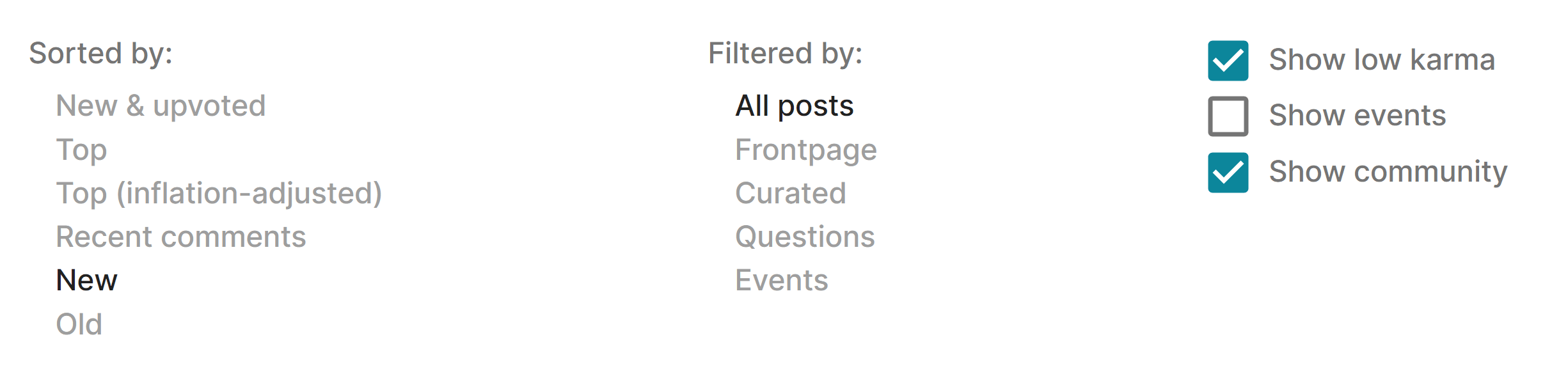
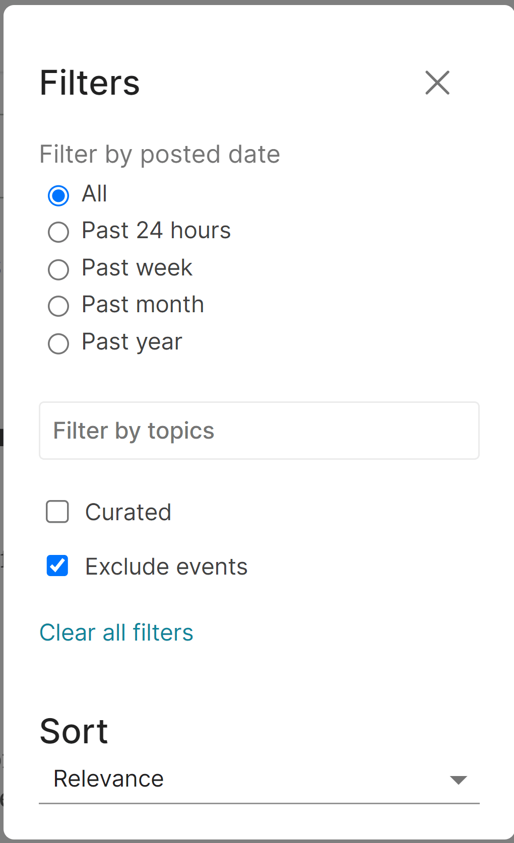
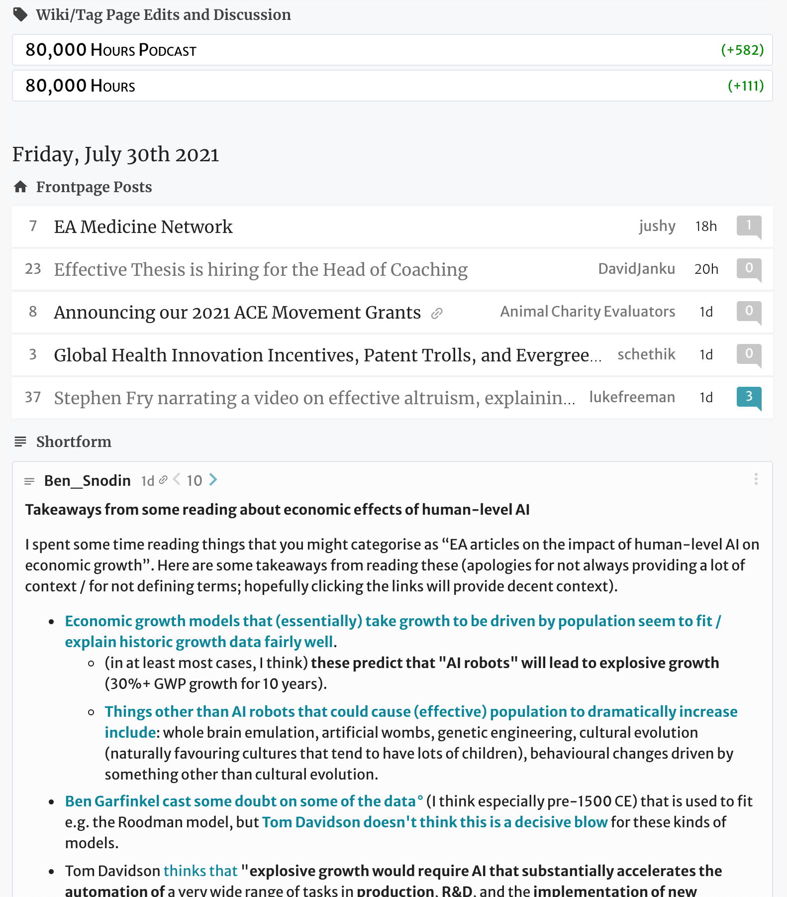
Regarding skimming, I read titles by rows, not lines. I think we've been conditioned for this. Just look at Reddit or Medium. I find it easy to read a few words and skip to the next row. The title is too important to be trimmed away, I would sooner hide the author, date an comments count. I think it's very hard to find a site with this few characters in a title.
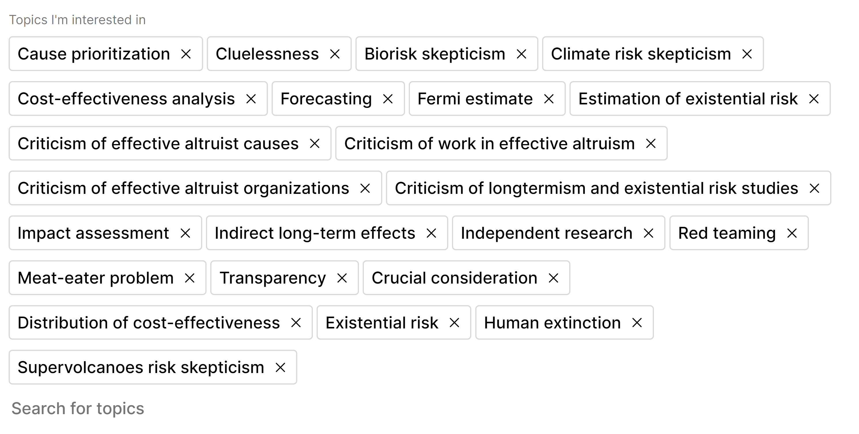
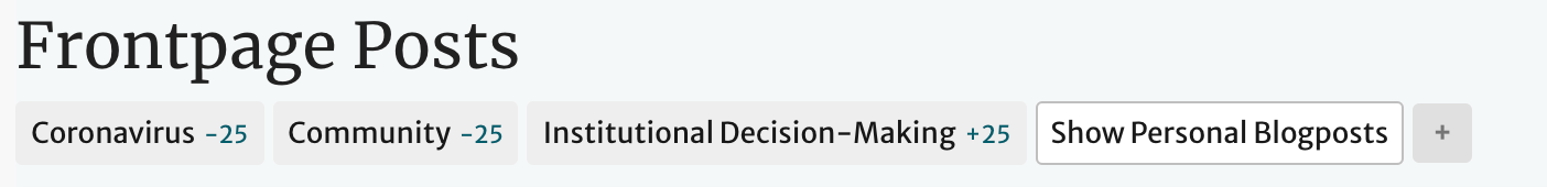
I haven't used the site enough to give a proper opinion on the icons. I think they either should be used more or hidden altogether. But I mix my feelings regarding topics, something I didn't touch yet. They will either be on the left of the title, on the end of the line, or below the titles, in a smaller font. I can't tell you how much I want to see 50 titles at a time and instantly know where they fit. Blue tagged AI, green tagged Animal Wellfare, etc.
I plan on enhancing my script as I spend more time here. It might take a while. I mostly wanted to take a feel if my experiences are in line with others. I'm happy to keep my preferences as a userscript and give the users another choice.